AI Summary
Wondering why you need a contact form on your website? Why not just publish an email address instead?
In this article, we’ll look at the importance of having a contact form and explain how to make one easily.
Create Your WordPress Form Now
Why You Should Use a Contact Form
Making a contact form sounds like hard work, but it’s easy with the right form builder. And a contact form is vital if you want to grow your business. Here’s why.
In This Article
- 1. Stop Spam Email In Its Tracks
- 2. Get Messages When it Suits You
- 3. Keep Track of Inquiries
- 4. Turn Website Visitors into Leads
- 5. Build Your Email Marketing List
- 6. Delegate Tasks to Your Team
- 7. Automatically Populate Your CRM
- 8. Automatically Start Projects and To-Do Lists
- 9. Offer Support to Customers
- 10. Get User Submitted Content
- 11. Make Quoting Easier with File Uploads
1. Stop Spam Email In Its Tracks
Publishing your email address to encourage visitors to contact you is a bad idea. Spambots frequently scrape email addresses from websites.
If a spambot gets hold of your email address, it can wind up being added to all kinds of spammy mailing lists online. That can result in serious security risks from scams or phishing emails.
When you use a contact form, your business email address is never revealed on your website, so it can’t be scraped. You don’t need coding or web design experience to build and publish a form in WPForms.
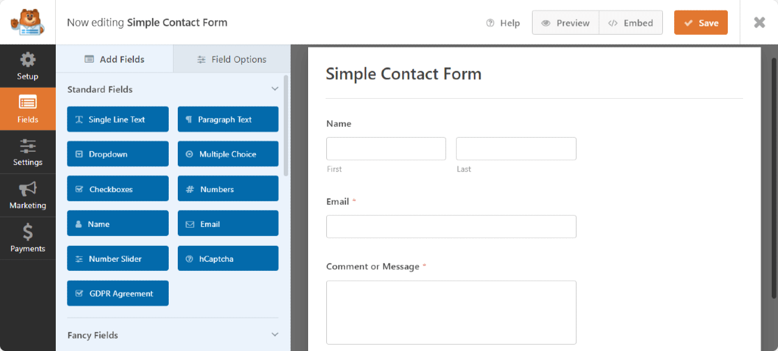
Of course, contact forms can’t stop all spam. You can sometimes receive spam through forms on your website. But it’s easy to tweak your form to prevent that from happening. For example, you can use a CAPTCHA to check if your visitor is human.
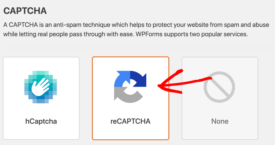
And in WPForms, you could also set up a denylist to block email addresses that are spamming you. This makes it easier to get in touch with those people who are actually “qualified leads” and not just contact form spam.

Keeping your site spam free and secure is important. That’s why WPForms has many different anti-spam tools to stop spam bots from sending messages to your inbox. Check out our guide to stopping contact form spam to get more details.
PS. Did you know that WPForms Lite has tons more anti-spam options than other free form builder plugins? Check out this comparison of WPForms Lite vs Contact Form 7 to get all the details.
2. Get Messages When it Suits You
Most businesses publish a phone number on their site along with their postal contact information. But what happens if a customer tries to call when you’re not there to answer?
If you don’t have a contact form, they’ll probably give up and go to a competitor. That’s why you need a contact form as well as a phone number.
WPForms makes it easy to publish contact forms on any post or page. In fact, it has an embed wizard that will even create a fresh ‘Contact Us’ page for your form.
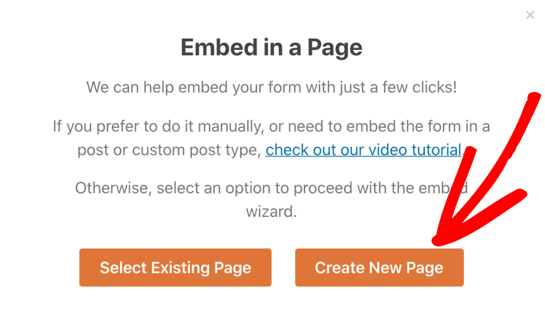
If you don’t want to make a contact page, you can:
- Embed your form in a post using a shortcode or WordPress block.
- Embed your contact form in the WordPress footer alongside your social media icons.
- Embed your form in the WordPress sidebar.
- Quickly add forms to Elementor or Divi without shortcodes.
3. Keep Track of Inquiries
As your business grows, you’ll constantly get more and more inquiries from your website. How will you keep up? Easy: by using the WPForms entry storage.
All paid versions of WPForms let you easily see every form submission in the WordPress dashboard.
If you already read our Ninja Forms vs WPForms review, you’ll know that the entry management features in WPForms are more advanced.
In this view, every form field is clearly shown on its own line. You can easily print your form submissions to a PDF from this page.
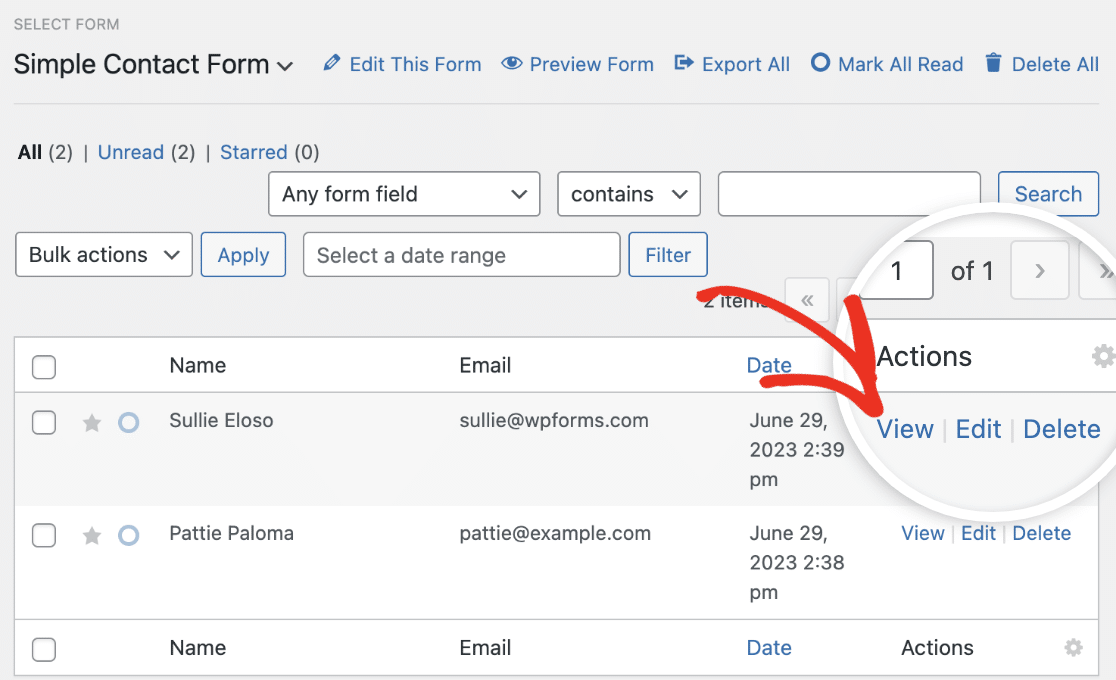
Your entries also show up in a list in the WordPress dashboard. If there’s a lead you really want to keep an eye on, you can star it or mark it unread as a reminder to check back on it later.
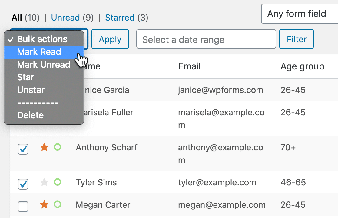
It’s also really easy to export file submissions in CSV format and turn on survey and poll reporting for any form.
4. Turn Website Visitors into Leads
Why do you want your visitors to contact you on your website? If you’re running a business, you’ll probably want to get more leads. It’s a huge reason why you need a contact form.
Publishing a contact form makes it easy for new customers to get in touch. If you only have an email link, you’re relying on the visitor to go through the trouble of creating an email manually.
Conversational Forms Addon
Plus, with the Conversational Forms addon, you can make your contact form feel more human. Conversational forms show 1 question at a time and can really help boost your form conversion rate.

You can also get maximum conversions by making your contact form really easy to fill in. Check out these common complaints about contact forms to see how to do that. And don’t forget to track your form conversions with Facebook Pixel so you can see how your forms are performing.
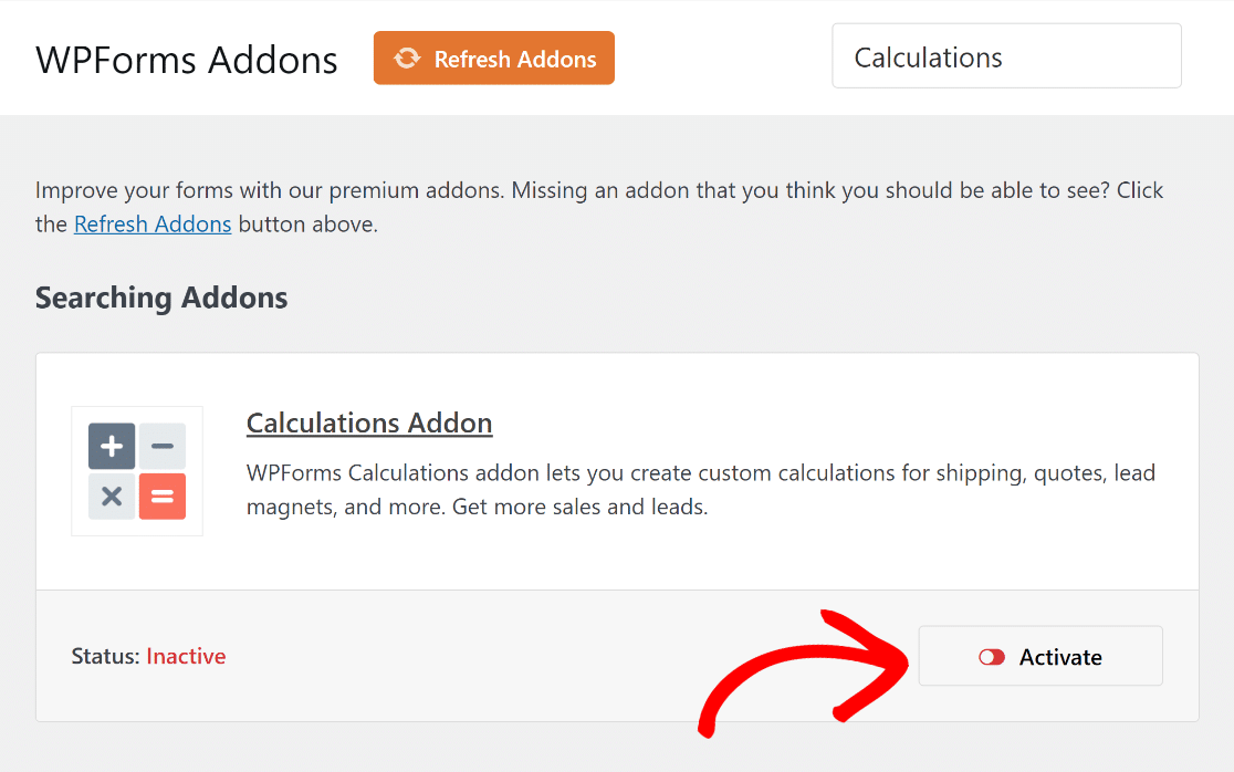
Calculations Addon
Using WPForms, you can also create numerous Calculation Forms for different use cases and industries, which can further help with your lead-generation practices.
You’ll also like the fact that WPForms offers numerous pre-made calculation templates. The range of options meant we didn’t always have to start from scratch.
This convenience, along with the ability to customize templates fully, makes WPForms a great option overall!
5. Build Your Email Marketing List
Email is the most powerful way to reach your audience at very little cost.
Every time someone fills in your contact form, it’s an opportunity to collect their information and ask to add them to your email list.
WPForms makes this easy. For example, you can add a Constant Contact checkbox to your contact form to sign up new subscribers when they get in touch.
You can also make custom forms to let people easily subscribe to your lists. In WPFoms, you can easily integrate signup forms with email marketing services like:
- Pardot
- MailerLite
- Mailchimp
- AWeber
- Brevo (formerly Sendinblue)
- GetResponse
- SendFox
- Drip, an awesome email automation platform
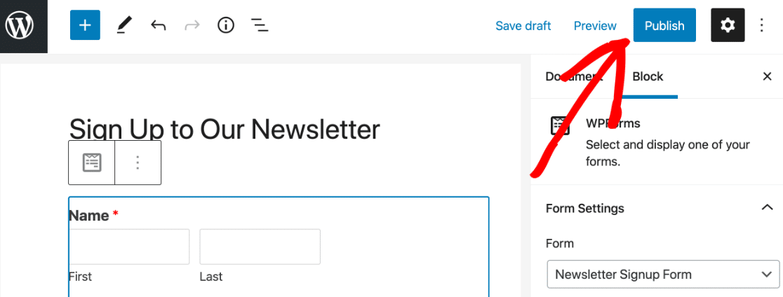
Publishing a newsletter signup form is as easy as hitting 1 button:
6. Delegate Tasks to Your Team
Most contact form plugins let you send email notifications. But wouldn’t it be great if you only got the notifications you actually need?
You can make your forms smarter by sending the right email notifications to the right people.
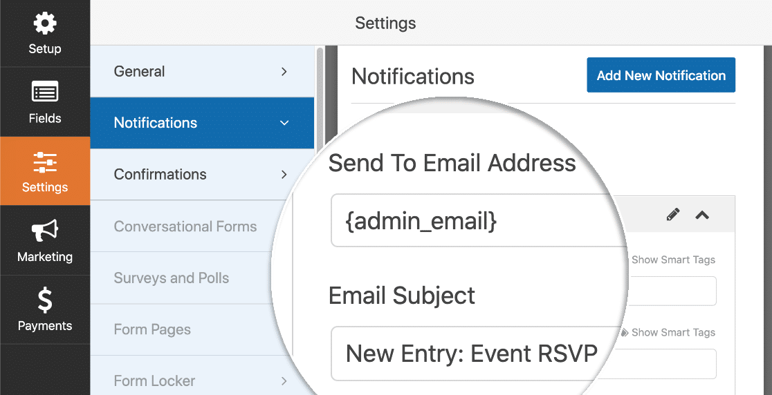
You can add more email addresses to the Sent To Email Address field so that the notifications go to multiple people.
And you can also add multiple notifications and control who receives each one using conditional logic.
7. Automatically Populate Your CRM
Managing leads can be tricky when you have multiple team members. Even a relatively small team can quickly get confused.
First impressions count. You definitely don’t want to follow up on a lead twice or lose track of the conversation.
That’s why WPForms lets you send the contents of any form submission to different CRMs.
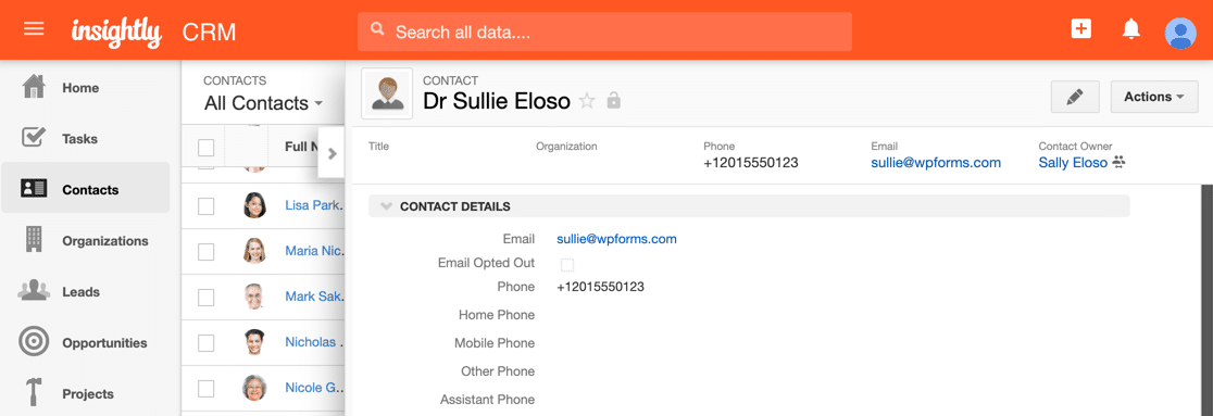
You can connect WPForms to a ton of different CRMs including:
- Salesforce
- Zoho CRM
- Insightly
- And more.
Check out our Zapier addon to see all the powerful integrations you can make.
8. Automatically Start Projects and To-Do Lists
Did you know you can use a contact form submission to kick-start a project checklist? WPForms makes it easy to send your contact form data to a to-do list application.
You can create a template for all the steps your employees need to take to process or follow up on the contact form entry.
This technique is perfect for anyone who wants to perform a set number of follow-up or onboarding tasks. In addition to contact forms, you can also use it for:
Here’s an example of a new project that was created automatically after a form was submitted in WordPress:
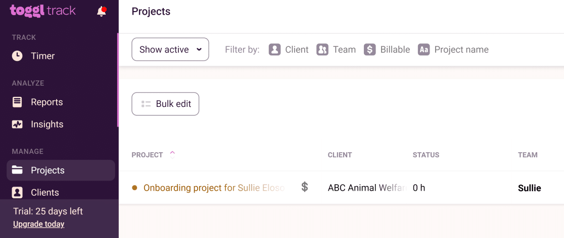
Within the project, there’s a whole to-do list that your team can work through so you can be sure that every single step is complete. Each form submission creates a brand new project with all the steps ready to go. Neat, isn’t it?
To see this in action, check out our article on how to create a Toggl project from a WordPress form. You’ll also enjoy learning how to make a WordPress form with a date/ time picker.
9. Offer Support to Customers
Most businesses offer some kind of customer support or tech support. And your contact form is just 1 of the ways customers can get in touch.
Wouldn’t it be great if you customized the form and help them out faster? With WPForms, it’s easy to turn any contact form into a support ticket form.
In fact, with WPForms’ huge library of form templates, you also get a support ticket form template to use right out of the box.

Want to know more? Here’s a guide to making a Zendesk WordPress form with WPForms.
10. Get User Submitted Content
Do you want to boost your website traffic easily? Publishing guest posts and user-submitted content is a great way to:
- Improve social proof
- Increase your blog publishing frequency
- Get more traffic
- Grow your audience
- Make professional connections
- And more
WPForms makes it easy to accept guest posts through your contact forms. In fact, it has a Post Submissions addon that adds a ton of extra functionality to your forms.
With the post submissions addon, you can get guest posts through a contact form without making the author log in to the WordPress dashboard.
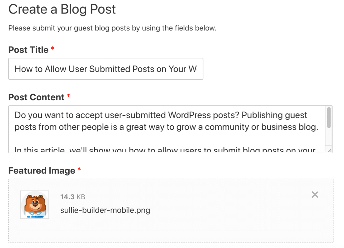
When you activate the addon, you get a post submission template that you can publish anywhere on your site.
This can help to reduce spam user registrations because you don’t have to let guest authors make accounts. And you can use a similar technique to get user submitted events.
11. Make Quoting Easier with File Uploads
Did you know that you can accept uploads through your contact form? WPForms lets visitors attach files to contact form submissions.
For example, if you need to assess files or documents before sending quotes to customers, you can add a file upload field to your contact form.
That way, you can quickly get all of the information you need to produce an estimate without extra admin.
WPForms lets you control:
- How many files you want to accept
- The file extensions or types you want to allow
- The maximum size for each file
You can also use our Modern-style file upload field to allow users to drag and drop files onto your form. It’s a lot easier than browsing for files one by one.
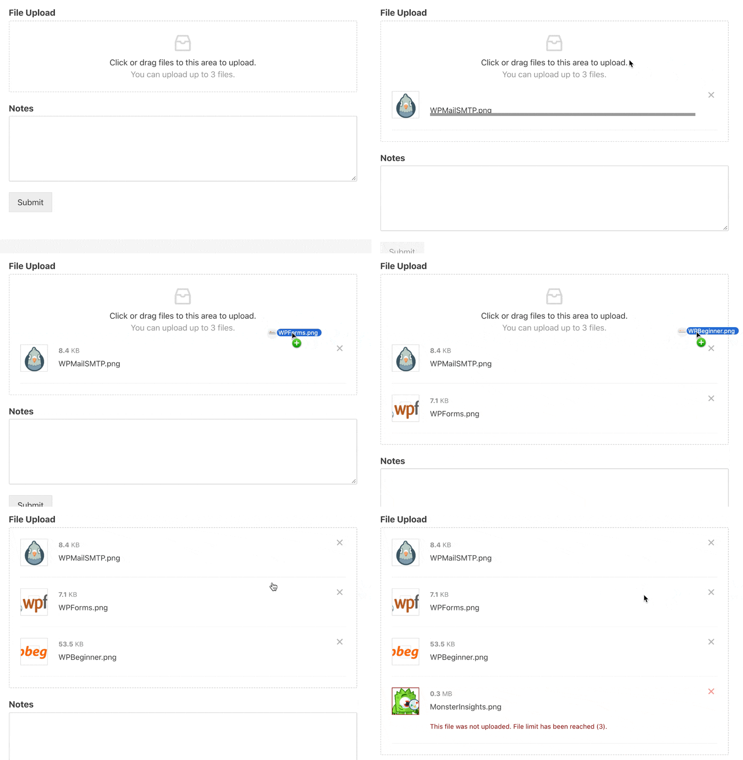
WordPress limits the file types people can upload, but don’t worry: we have a solution. We also offer the free File Upload Types plugin.
You can enable file uploads for almost any file in WordPress without getting a ‘file type is not permitted‘ error.
So in addition to the default files allowed in WordPress, your visitors can also upload:
- CAD drawings
- Zip files
- XML files
- RAR files
- Ebooks
- And more.
If you want, you can store the files in your WordPress Media Library so they’re easy to locate.
The File Upload Types plugin is provided by the WPForms team, so the 2 plugins work great together.
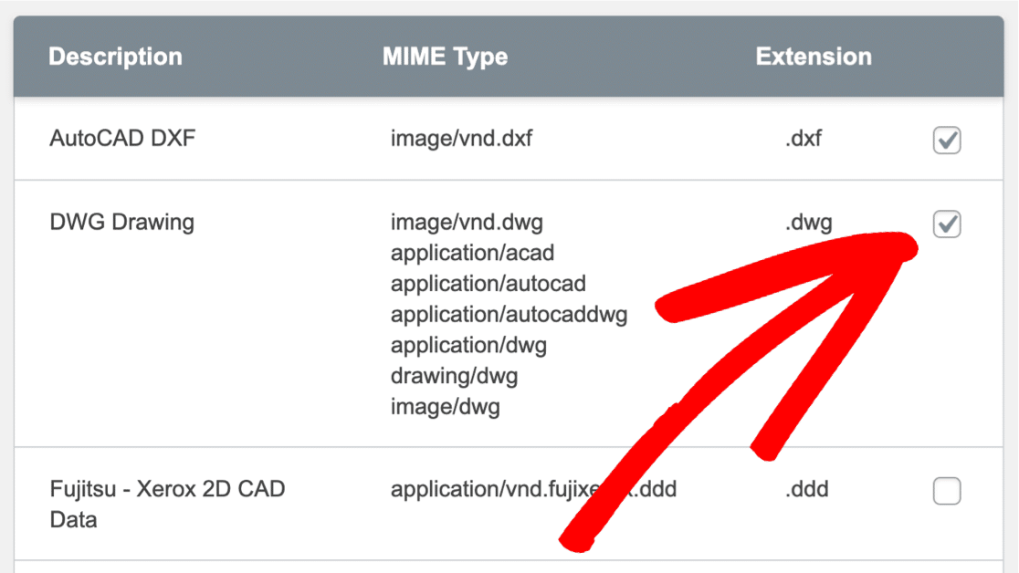
Check out our article on how to upload Adobe Illustrator files to WordPress to see how easy it is to let your visitors upload almost any kind of file through your contact form.
Create Your WordPress Form Now
FAQs about Contact Forms
Looking for answers to your questions? Here are answers to some common queries about why you should be using a contact form.
Why is a contact form important?
A contact form is crucial because it provides a secure way for visitors to communicate with you without exposing your email address to potential spam.
Additionally, it allows you to collect specific information from users, helping you to address their inquiries more efficiently.
Tools like WPForms enable you to create customized contact forms that can be integrated seamlessly into your website.
Do I need a contact form?
Yes, having a contact form is essential for any business website. It not only makes your site look professional but also helps manage inquiries more effectively.
Plugins like WPForms can also enhance contact forms with spam protection and other functionalities, improving the overall user experience and efficiency.
What is the function of contact form?
The primary function of a contact form is to facilitate a secure and organized means of communication between a website and its visitors.
It collects user information, helps in sorting inquiries, and ensures that communications are channeled correctly.
What is the purpose of a contact page?
A contact page offers visitors a dedicated space where they can find various ways to communicate with the business.
These can include a contact form, social media links, and sometimes phone numbers or physical addresses.
It serves as a central hub for all customer interactions, so that customers have a list of options available to contact you.
Are contact forms outdated?
No, contact forms are not outdated. They continue to be a vital part of digital communication strategies for businesses.
Modern contact forms, especially those created with tools like WPForms, come with advanced features like file uploads, conditional logic, and integration with email marketing services, making them more relevant than ever.
Next, Build Your 1st Contact Form Today!
And that’s it! Now you know why you need a contact form. It’s time to build your first form!
- Stuck for inspiration? You can take a shortcut with these contact us page examples.
- You can also hide your WordPress site until it’s ready if you need time to set up all of the contact forms before launch.
Create Your WordPress Form Now
Get started today with the easiest WordPress form builder plugin. WPForms Pro includes lots of free templates and offers a 14-day money-back guarantee.
If this article helped you out, please follow us on Facebook and Twitter for more free WordPress tutorials and guides.


Can you provide a script that runs on a non-wordpress site? It is important that it runs on my own server because of privacy regulations.
Hi Graham,
I am sorry for the confusion you are facing here! Please know that WPForms is WordPress plugin and it is not compatible with non-word press sites.
Thank you for understanding 🙂