
AI Summary
A website’s contact page plays an important role in turning visitors into customers. But this simple page is often executed poorly, leading to tons of lost potential customers.
While there’s no one-size-fits-all approach to designing contact us pages, it helps to find inspiration from other successful pages being used by brands online.
In this guide, I’ll share some of the most effective “Contact Us” page examples and give you tips to make yours stand out without wasting time or effort.
Create Your Contact Form Now! 🙂
The Best Contact Us Page Examples in 2026
I used to believe that a basic contact form would do the trick, but after exploring countless examples, I realized how much impact a well-designed page can have. Below are my top picks for great contact us page examples for you to check out.
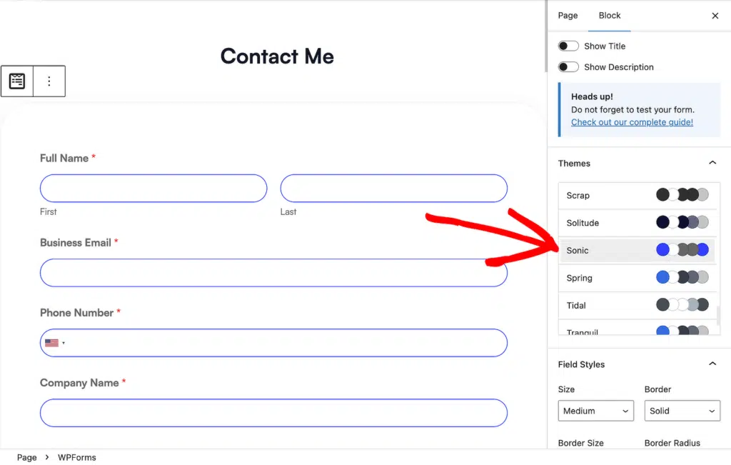
1. WPForms

I wanted to start with our own contact page because it’s a solid example for small businesses and SaaS teams.
The above-the-fold section is split into two paths. One for existing customers with a technical question, and another for presale questions from people still evaluating WPForms.
The contact form itself stays hidden by default and only appears once the Complete a Form button is clicked. Hiding the form keeps the page light, and it quietly filters traffic. People who click through are almost always qualified leads, which makes follow-up much faster on our end.
At the bottom of the page, there’s a link inviting existing customers to join the WPForms VIP Circle on Facebook, which is a nice community touch that most brands skip.
How to Create a Contact Page Like This
- Create a contact form popup that only appears when a button is clicked.
- Create a wiki knowledge base in WordPress to handle self-serve support for existing customers.
You can also use pre-built form templates for feedback, marketing, and business operations to spin up visually clean forms without starting from scratch.
If your audience speaks a language other than English, you can translate your contact forms without touching code.
2. Marie Forleo

Marie Forleo’s contact page does something clever. Instead of dropping a form in front of you right away, it asks what kind of question you have, then routes you to the right place.
Press inquiry? Here’s a separate email. Technical issue with your course? Here’s the help center. Looking for her team? Here’s a dedicated form.
This does two things well. It cuts down support load by sending common questions to self-serve resources, and it sets a friendly tone with copy that sounds like a person rather than a support ticket queue. The whole page feels consistent with her personal brand, which matters more than most site owners realize. When the contact page matches the voice of the rest of the site, visitors trust it more.
How to Create a Contact Page Like This
- Try a conversational marketing form to create a friendlier experience.
- Match your contact copy to the tone of the rest of your brand.
- Add chatbots and live chat to handle quick questions.
- Drop the distracting sidebar with landing pages.
3. QuickSprout
The top of QuickSprout’s contact page starts with an infographic, which is unusual for a contact page and sets expectations right away.

Scroll further and you get to the contact form itself, which is short and has a bit of personality in the copy.

The form instructs visitors to keep messages to a single paragraph, and tells them when they can expect a response. Both are simple but powerful. Setting a clear response time is one of the most underrated trust signals a contact page can have.
If your goal is to filter out low-effort inquiries, QuickSprout’s approach is worth copying.
How to Create a Contact Page Like This
- Tell readers how long your usual response time is and why.
- Customize your placeholder text so visitors know exactly what to put in each field.
4. HubSpot

HubSpot’s contact page does one thing really well. It lets visitors self-select their journey.
The top of the page splits traffic into two obvious paths. A “Contact Sales” button for people evaluating the product, and a “Get Support” link for existing customers. These two buttons do more for conversion than any amount of copy would, because they remove the biggest friction point on a contact page, which is figuring out where your question belongs.
Below that, HubSpot lists phone numbers for different regions, email addresses by department, and physical office addresses. The page even includes directions for visitors finding their headquarters. It reads less like a contact page and more like a directory, which is exactly what a company at HubSpot’s scale needs.
The takeaway for smaller sites is the split at the top. Even if you don’t have multiple offices, giving visitors a clear “I’m a buyer” versus “I’m a customer” choice saves everyone time.
How to Create a Contact Page Like This
- Offer multiple communication channels (phone, email, physical address, and social media) so visitors can pick their preferred method.
- Add clear calls to action that point visitors toward specific actions, like contacting sales or reaching support.
5. Semrush
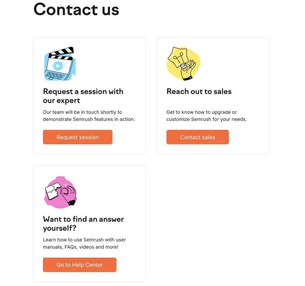
The Semrush contact page is one of the cleanest designs on this list. It splits contact options by visitor goal. From the same page, you can request a demo, fill out a sales inquiry form, or jump to the help center for tutorials.
The page also includes links to the Semrush affiliate program and careers page. I like how it pulls together every important contact point for different audiences (customers, partners, job candidates) on a single page. It’s a great example of navigation done right.
How to Create a Contact Page Like This
- Create sections for different departments with relevant details and direct links so visitors navigate to the right path.
6. Legalia

Legalia’s contact page is a masterclass in making a form feel short without cutting fields.
They use a multi-column form layout, so fields that would stack into a long vertical form sit side by side. This single design choice lowers the perceived length of the form, which directly helps the form abandonment rate. Visitors look at the form and think “this’ll take 30 seconds” instead of “this is a lot of work.”
They pair the form with a clean list of physical addresses, phone numbers, and an email address. That combination of a short-looking form plus visible alternative contact methods is the secret behind most high-converting contact pages.
How to Create a Contact Page Like This
- Use a multi-column form to make longer forms feel shorter.
- Pair the form with at least one alternative contact method so visitors who don’t want to fill out a form still have a way to reach you.
7. Grover Web Design

This site uses a simple contact form with a CAPTCHA field to block spam submissions. The best part is that users can pass the CAPTCHA with a single checkbox, so it doesn’t create friction for real visitors.
The contact page also includes a physical address, an email address, and links to their social media profiles. The layout is nothing flashy, but every element serves a purpose, which is more than most small business contact pages can say.
If you’re worried about spam (which you should be), modern anti-spam tools like hCaptcha and Cloudflare Turnstile have caught up to reCAPTCHA and in many cases beat it on user experience.
How to Create a Contact Page Like This
- Add hCaptcha, Cloudflare Turnstile, or reCAPTCHA to your forms to block spam submissions without slowing down real visitors.
- Use an HTML field in your form to drop in social media icons alongside the form.
8. Den Ersten

If your business depends on people showing up in person, a map belongs on your contact page. Den Ersten gets this right. Their page puts a map front and center so customers can see the shop location before they commit to visiting.
The form itself is short and visually balanced with the rest of the page, which makes the whole thing feel deliberate rather than tacked on.
How to Create a Contact Page Like This
- Add a map to your contact form.
- Add images to your form to show off your office or team.
- Shorten your form by using conditional logic to hide fields until they’re needed.
9. JetBlue

JetBlue’s contact page is built around self-service. The page leads with direct links to popular help topics and common questions. Only after scrolling past those do you find the email and phone options.
The trade-off here is deliberate. JetBlue handles a massive volume of support requests, so pushing visitors to self-serve resources saves everyone time. The downside is that there’s no contact form at all, which can frustrate visitors who need to explain a specific problem that doesn’t fit a prewritten FAQ.
This approach only works at JetBlue’s scale. For smaller brands, skipping the contact form usually backfires. A well-placed FAQ section plus a form is almost always better than the FAQ alone.
How to Create a Contact Page Like This
- Create a FAQ or knowledge base so visitors can answer their own questions before reaching out.
10. Tune

Tune’s contact page uses a strong hero image at the top. Below that, the left side introduces the company and explains why new prospects should get in touch, while the right side holds the form.
The form itself targets new leads, so it’s optimized for presale inquiries rather than support tickets. Just below the form, Tune places a separate call to action for existing customers, pointing them toward their support portal.
The one weak spot is the lack of a visible handoff. Some existing customers still end up sending support questions through the sales form, which creates routing headaches on the back end. A small label above the form saying “For new inquiries only” would clear that up.
How to Create a Contact Page Like This
- Optimize your header image for faster loading speeds.
- Use the Request a Quote template to spin up a presales form quickly.
11. Choice Screening

Using real photos of real people on your contact page is one of the simplest ways to make your brand feel more human. Choice Screening leans into this with photos of their team at the top.
They back this up with a headline that says “Talk to a Human,” which reassures visitors that their message will actually be read and replied to. It’s a small piece of copy that does a lot of work.
The form itself is long, with plenty of fields to qualify leads. That approach filters out low-intent submissions, so the sales team only hears from people who were serious enough to fill out every box.
How to Create a Contact Page Like This
- Use photos of real team members to humanize your brand.
- Add copy reassuring visitors that their message will be read and responded to in a timely manner.
- Consider creating a multi-page form to collect the details you need without overwhelming the visitor with one giant form.
12. Search Engine Journal
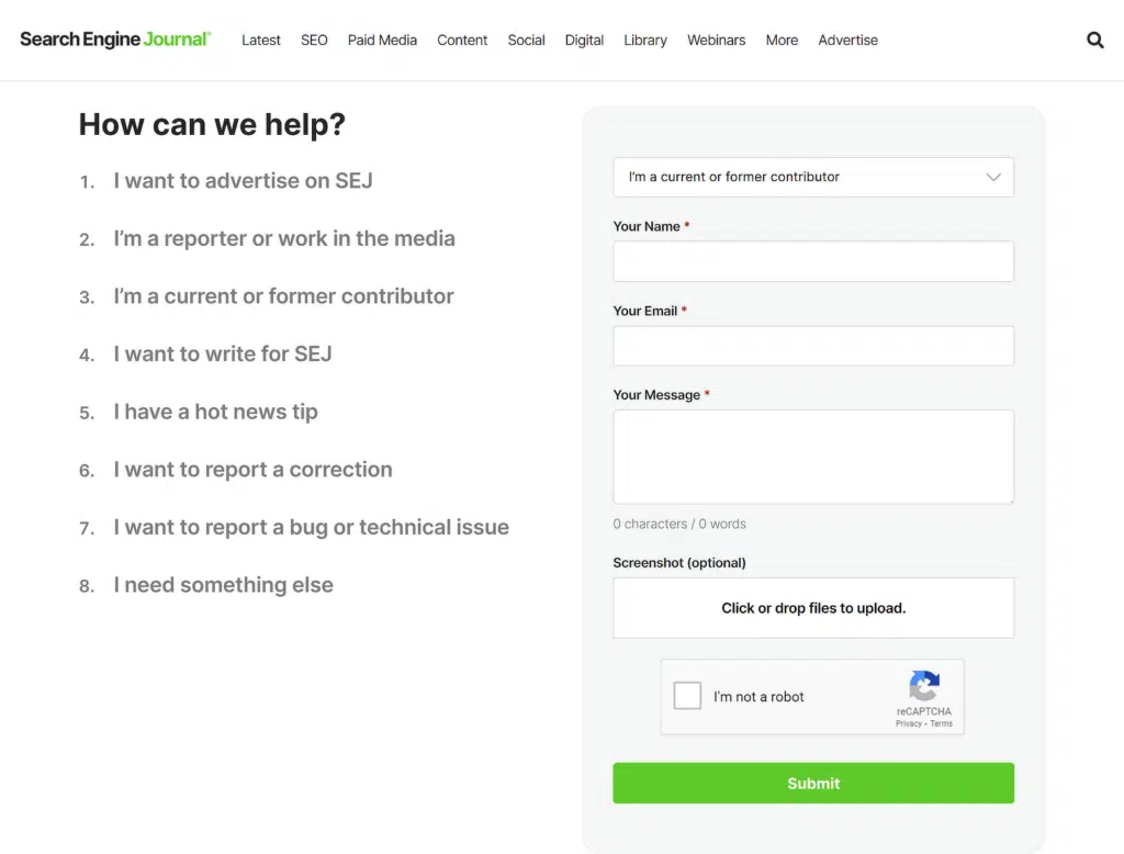
Search Engine Journal’s contact form is the most advanced on this list.
The form includes a dropdown field that forces visitors to pick a category before typing, which automatically routes the message to the right team. It also supports file uploads (useful for press inquiries and pitches) and uses a CAPTCHA to block spam.
For a high-traffic publication, these features aren’t optional. They’re the difference between a manageable inbox and chaos.
How to Create a Contact Page Like This
- Add security measures like a CAPTCHA to protect your form from spam and bot submissions.
- Use a dropdown field to route different types of inquiries to the right team automatically.
- Add a File Upload field so visitors can attach documents, images, or briefs. You can set this up with WPForms to add a File Upload field.
How to Create a Contact Us Page in WordPress (3 Steps)
Looking at examples is helpful, but at some point you have to actually build the thing. Here’s the short version of how to put a contact page together with WPForms.
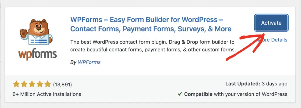
Step 1: Install WPForms
Grab WPForms Lite from the WordPress plugin repository and activate it. The free version includes everything you need for a basic contact page. If you want extras like multi-column layouts, conditional logic, or file uploads, you’ll want the Pro version.
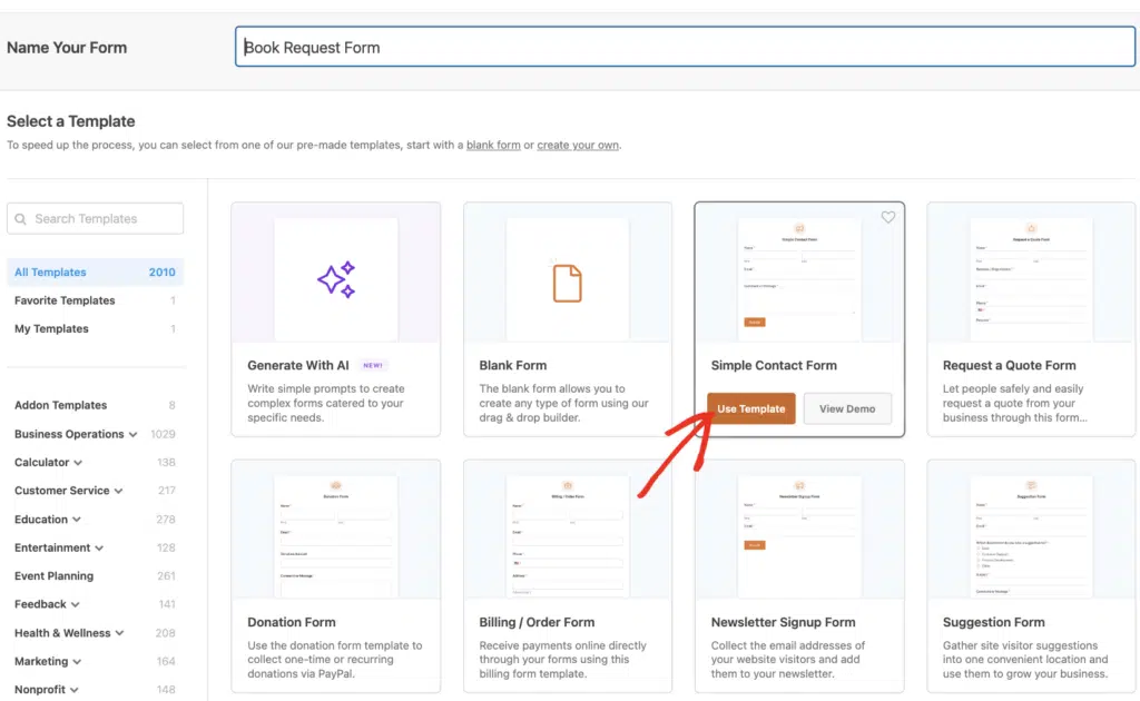
Step 2: Pick a contact form template
WPForms ships with pre-built form templates for common use cases. For a contact page, the Simple Contact Form template is a great starting point. If you’re running a service business, the Request a Quote template is a better fit.
Step 3. Add your form to a new page
Create a new WordPress page and drop in the WPForms Gutenberg block. Select the form you just built, pick a suitable theme, and it’s live!
That’s the whole process. You can have a working contact page live in under 5 minutes if you keep it simple.
If this is your first time, I’d start with our walkthrough on how to create a simple contact form in WordPress. It covers the whole process from installing WPForms to getting your first submission.
FAQs on Contact Us Pages and Forms
Contact us page design comes up a lot, and most of the questions I get are the same ones over and over. Here are quick answers to the most common ones.
What makes a contact us page effective?
A contact us page is effective when it makes it easy for visitors to reach you the way they prefer, sets clear expectations about response times, and matches the tone of the rest of your site.
The best pages offer multiple contact methods, include trust signals like team photos or a physical address, and route different types of inquiries to the right place.
What do I write on a Contact Us page?
The copy on your contact us page should explain how you prefer to be reached and set expectations about response times.
If you want people to call, use your form, or visit in person, say so clearly. The exact details depend on your business, but most pages cover these basics.
- An invitation to fill out your contact form.
- Copy that matches the tone of your brand.
- Social media links so visitors can reach you on other channels.
- A business phone number if you accept calls.
- A physical address or map if you run a storefront.
What should you not put on a contact us page?
Skip walls of text that nobody reads, long forms with fields you don’t actually need, and generic placeholder copy like “we’d love to hear from you” without any context.
Avoid aggressive CAPTCHAs that block legitimate users, and don’t list a contact option (like a phone number) if you don’t actually plan to answer it. The fastest way to lose trust is to promise a channel you can’t support.
What can I say instead of “contact us”?
A few friendlier alternatives you can use in place of “Contact Us” are listed below.
- Drop us a line
- Get in touch
- Reach out
- Let’s chat
- Talk to us
- Get a hold of us
How do I make a Contact Us page in WordPress?
The easiest way to build a contact us page in WordPress is with WPForms. It’s the best free form builder for WordPress, and it ships with pre-built templates so you don’t have to start from scratch.
You can even take payments in the free version if you need a donation or tip field on the page.
With WPForms Pro, you can also store your entries in your WordPress database and export form entries to Google Sheets for easier follow-up.
Want the full walkthrough? I covered the whole process in the “How to Create a Contact Us Page in WordPress” section above.
What is the best way to style my contact form?
You can style your contact form without any code using WPForms. The plugin lets you customize fields, labels, and the submit button to match your theme.
Your contact form styling should match the rest of your site. WPForms gives you easy controls to pick primary and secondary colors, so your form feels like a natural part of the page rather than a bolted-on widget.
Can I get notifications when someone contacts me through my form?
Yes. Most form builders including WPForms let you set up email notifications right inside the plugin. You can send alerts to yourself, to different team members based on the submission, or even to a Slack channel if that’s where your team hangs out.
Can I include other forms of contact?
Absolutely. A contact form is usually the main event, but you should list every other channel that makes sense for your business. That includes customer support phone numbers, live chat, scheduling links, and physical addresses. The more options you offer, the more likely visitors are to pick one and actually reach out.
Next, Learn How to Build Spam-Free Contact Forms
Once your form is live, you’ll want to make sure it’s not collecting spam and that notifications actually reach you. Our ultimate guide to spam-free contact forms covers the tools and settings that keep your inbox clean without blocking real visitors.
Ready to build your form? Get started today with the easiest WordPress form builder plugin. WPForms Pro includes lots of free templates and offers a 14-day money-back guarantee.
If this article helped you out, please follow us on Facebook and Twitter for more free WordPress tutorials and guides.


I can put for example the forms of one of my websites:
[URL Removed]
– Homepage (Adiestramiento)
– Contact Form (Contactar)
Hey Andrés– I’m sorry, but I’m not sure that I understand your question – but we’d be happy to help! Could you please contact us in support with some extra details about what you’d like to be able to do?
Thanks 🙂