
AI Summary
Looking for contact form design inspirations for your website? With some simple tweaks, you can create online forms how you want.
In this article, I’ll show you some cool contact form design examples and provide useful tips for creating one on your website.
I’ll also show you a really handy no-code method for changing the layout of your forms. Ready? Let’s dive in!
Style Your Contact Form Now! 😀
8 Contact Form Designs You Can Steal
Now, let’s examine some cool examples and the key tactics they use to inspire and recreate them on your site.
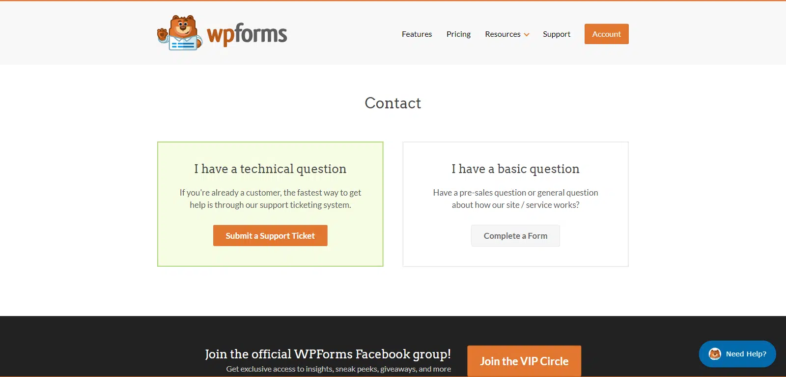
1. WPForms
I wanted to start with the WPForms contact page, as I believe it is an excellent example for SaaS products, plugin websites, and other small businesses.
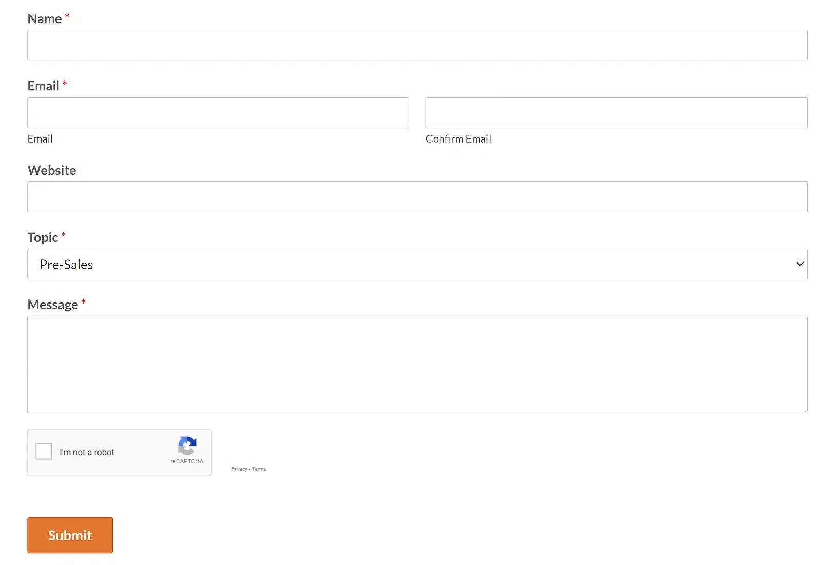
The top section of this page is divided into two parts: one for existing customers with technical questions and another for pre-sale inquiries.
Also Read: How to Allow Visitors to Duplicate Form Fields
Why I Think This Contact Form Stands Out
The contact form is not immediately visible, and it only shows up when someone clicks the ‘Complete a Form’ button under the ‘I have a basic question’ section.
This design choice minimizes the page size and ensures that new prospects use the form primarily since it’s only accessible through the pre-sale section.
This strategy helps to quickly direct users to the appropriate section, streamlining the process for both the business and the individuals making contact.
At the bottom of the page, there’s also a soft call-out inviting visitors to join the WPForms VIP Circle, which is a nice low-pressure way to nudge people toward a community without crowding the contact flow.
How to Create a Contact Page Like This
- Pop-up Contact Form: Design a contact page where the form pops up only when a specific button is clicked. This keeps the page neat and emphasizes other elements until interaction is required.
- Knowledge Base for Customer Support: Implement a wiki or knowledge base on your WordPress site. This serves as a self-help area for existing customers, addressing common questions and issues.
- Use of Templates: Choose from 2,100+ WordPress form templates for various purposes like feedback, marketing, and business operations. These templates help quickly set up professional-looking and functional forms. (also try these hidden WPForms templates for special situations).
- Form Translation: For websites serving non-English speakers or multilingual audiences, WPForms allows easy translation of contact forms to meet diverse linguistic needs.
Build Your WordPress Form Now! 🙂
2. Stripe
I decided to focus on the Stripe contact sales page because it’s a prime example of a specialized contact page that efficiently handles business inquiries.
In order to make the contact form look short, Stripes uses a Multi-Step Form on their contact page which surely helps lower their form abandonment rate.
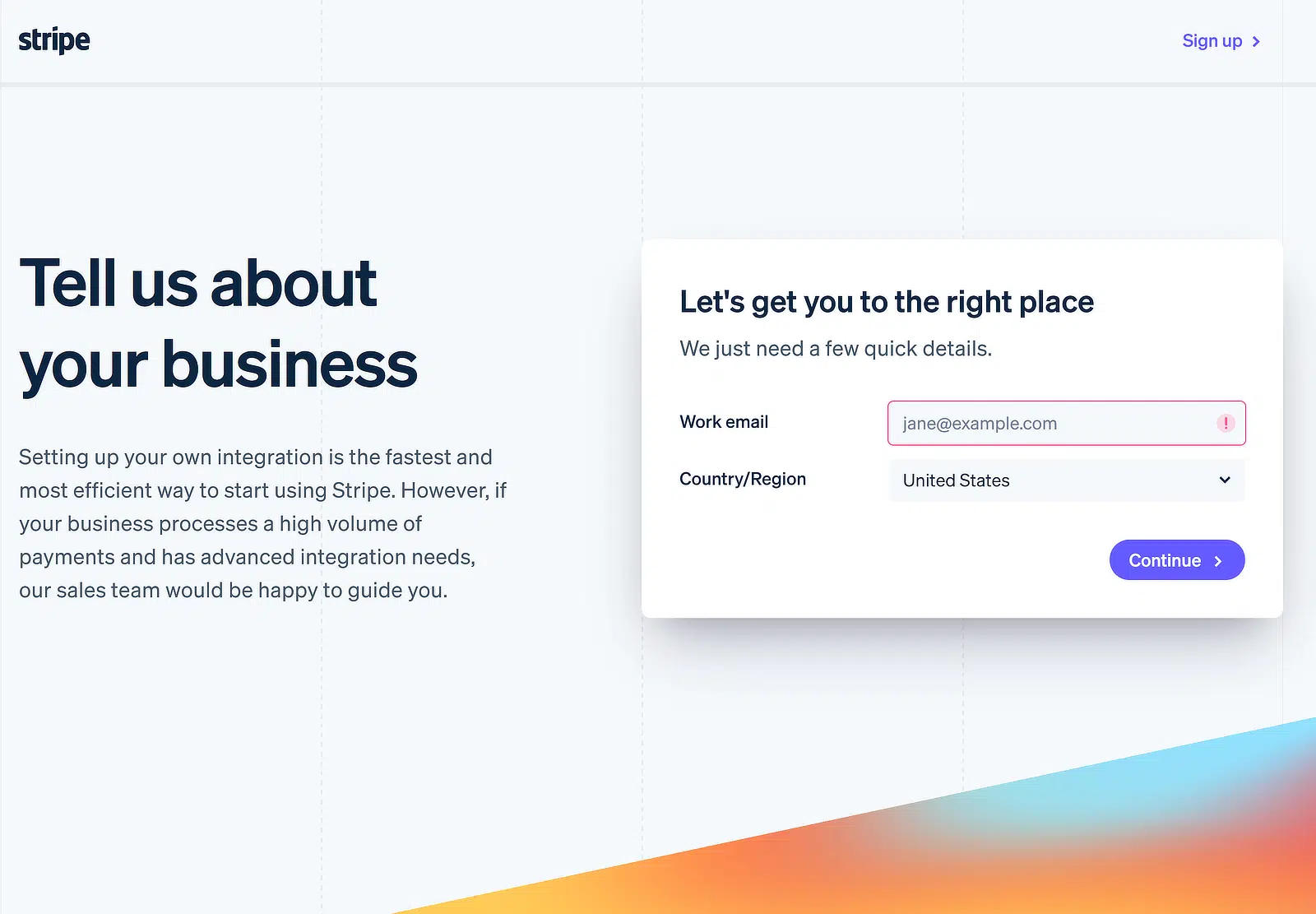
Why I Think This Contact Us Page Stands Out
What makes this contact form unique is that it focuses on gathering information relevant to Stripe’s sales team. It uses a Multi-Step Form approach that first asks for your work email and country/region to capture your information.
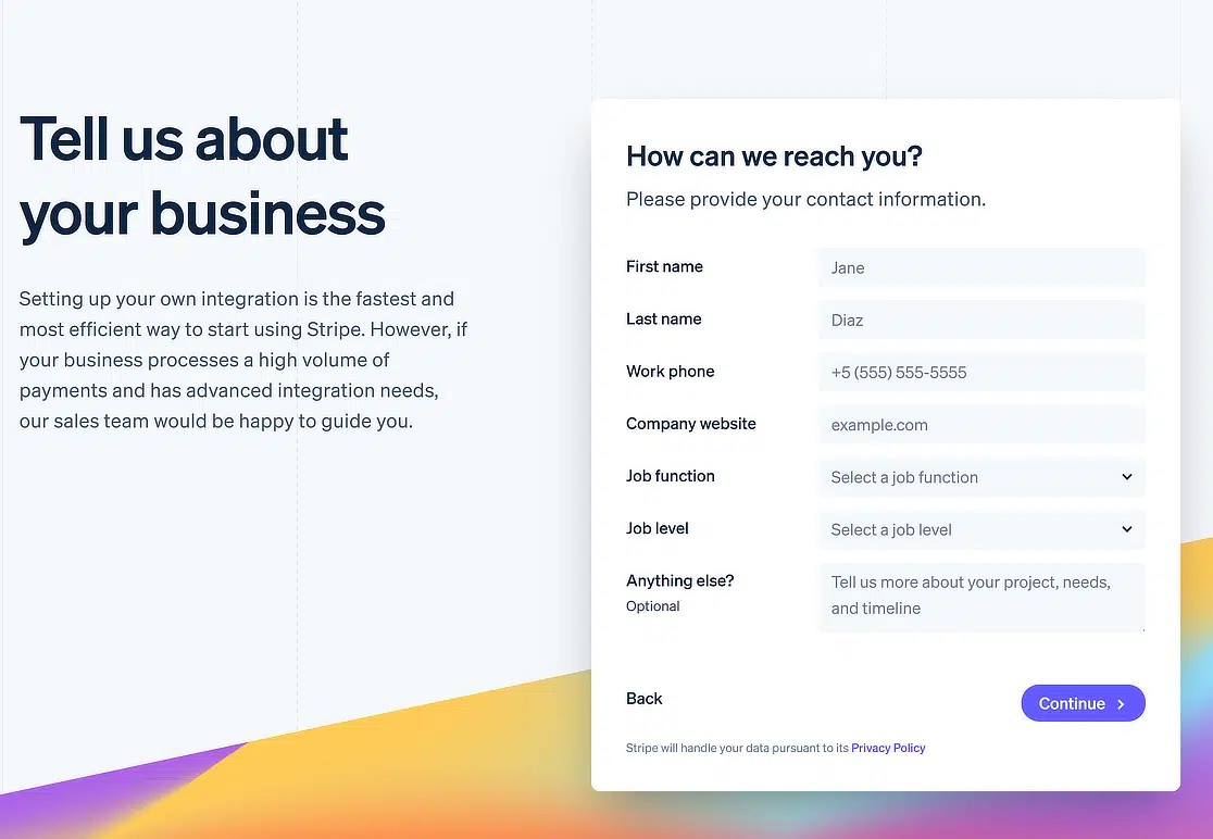
Once you click on the continue button, Stripe’s contact form aims to get a good understanding of your company and how Stripe can help you.
By asking about your business size, revenue, and integration needs, it allows them to route your inquiry to the most appropriate person.
How to Create a Contact Page Like This
- WPForms Lead Forms Addon: Use the Page Break field or the Lead Forms addon to divide your form into separate sections.
- Focus on relevant information: Consider what information about potential customers would be most helpful for your sales team.
- Keep it simple: Don’t overwhelm users with too many form fields. Just ask for the essential information you need to qualify leads.
- Clear labels and instructions: Use clear and concise labels for each field and provide any necessary instructions to avoid confusion.
Create Your Multi-Step Form Now! 🙂
3. Legalia
The contact form on Legalia Corp’s “Contact Us” page is a well-thought-out interface designed to facilitate seamless communication between the firm and its clients.
What stands out about this page is its multi-column layout, with a map on the left to provide location clarity and a structured contact form on the right.
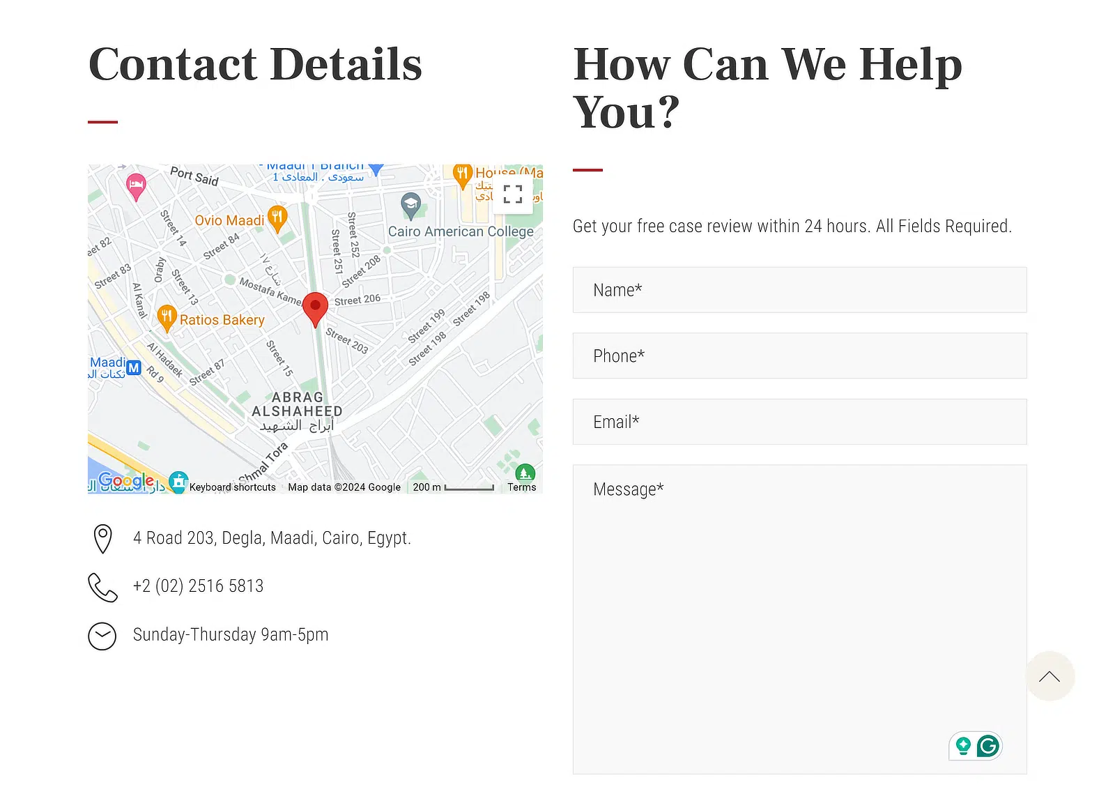
Why I Think This Contact Form Stands Out
The use of a multi-column layout is particularly effective, as it divides the form neatly into two different sections.
This allows users to visually separate the geographical information from the contact fields, which is an interesting approach.
I also feel that including a map not only helps in locating the firm easily but also increases the legitimacy and accessibility of the business.
The form itself is also quite straightforward, asking for essential information without overwhelming the user.
How to Create a Contact Page Like This
- Plan Your Layout: Start by deciding on a layout that balances user interface and design aesthetics. A split layout can be very effective for visually separating different information types while keeping them on the same page.
- Incorporate Maps: If your business has a physical location, embedding a map on the contact page can significantly boost user trust and simplify the location-finding process. Use tools like Google Maps for easy integration.
- Simplify the Form: Keep your form fields to a minimum to avoid deterring potential contacts. Request only the most critical information, such as name, email, and a brief message box, which I believe is quite sufficient.
Add a Map to Your Contact Form! 🙂
4. Search Engine Journal
The contact form on Search Engine Journal’s “Contact Us” page stands out due to its comprehensive features tailored to a variety of user needs.
This form incorporates advanced functionalities such as captcha for security, a file upload option, and categorization of queries.
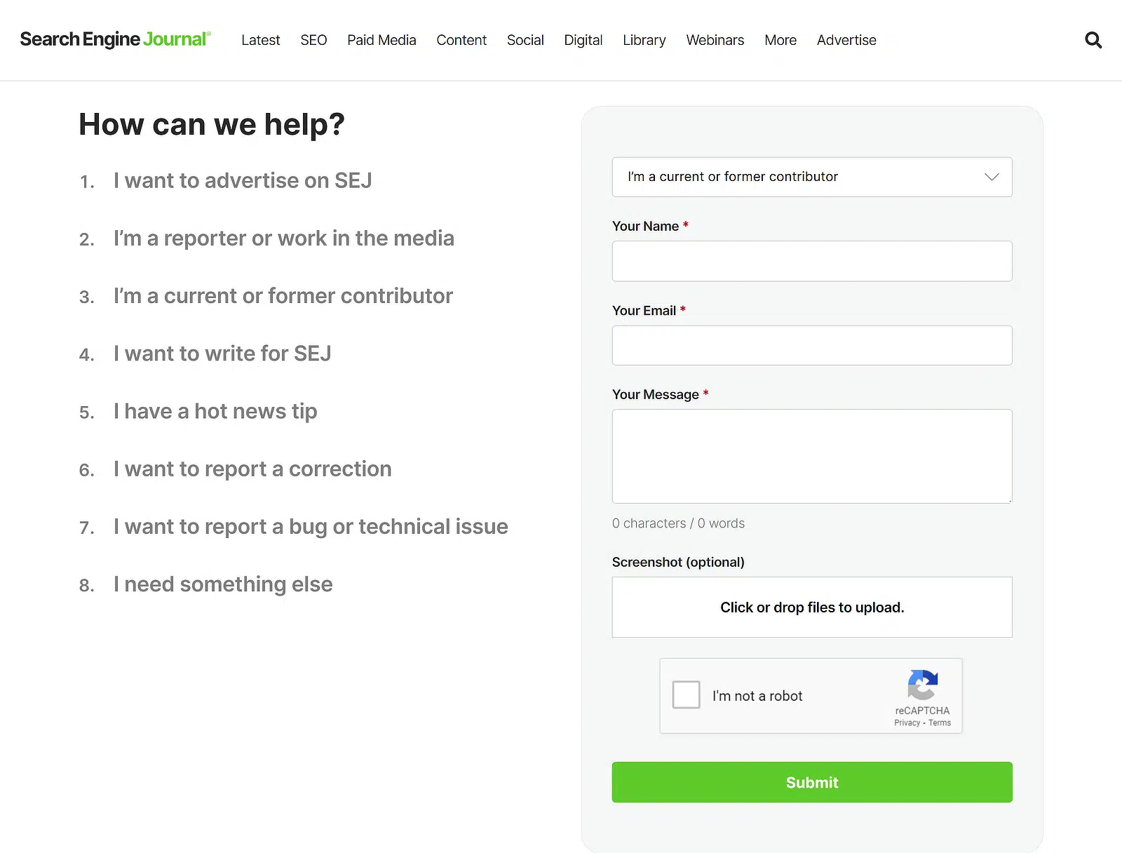
Why I Think This Contact Form Stands Out
The categorization is the part I want to call out. SEJ asks up front whether you’re writing about advertising, a technical issue, or something else.
That single dropdown probably saves their team a huge amount of triage time because the routing happens before the message hits any inbox.
The CAPTCHA is doing the boring but necessary job of keeping spam volume down. A site with SEJ’s traffic gets hammered by bots otherwise.
And the file upload field is genuinely useful for the kind of submissions a publisher receives, screenshots, pitch decks, sometimes draft articles.
How to Create a Contact Page Like This
- Implement Security Features: Include security measures like a CAPTCHA with the help of WPForms to protect your site from spam and abuse, which will help maintain the integrity of your communications.
- Focus on User Experience: Design your form with the user in mind. Ensure it is easy to navigate, fields are clearly labeled, and instructions are straightforward to avoid confusion. Use a dropdown field for categorization for user queries.
- Add a File Upload Field: If you want to give people contacting you the opportunity to attach fields to their inquiries, you can use WPForms to add a File Upload field to your form, which is quite easy to use.
Set Up CAPTCHA on Your WordPress Form! 🙂
5. Marvel
Marvel is a software design company that uses a multi-column layout on their contact form with an image on the right. The design is clean and modern, ensuring that users can find the information they need without hassle.
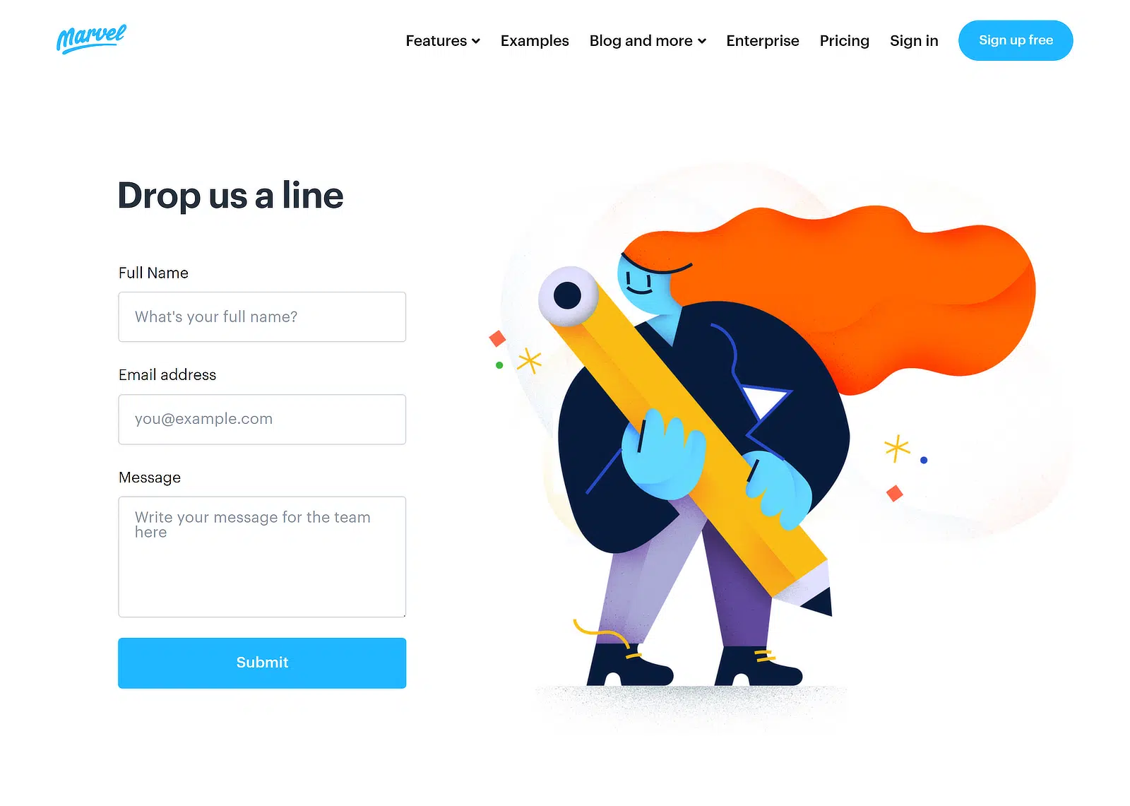
Why I Think This Contact Form Stands Out
The multi-column design is what really sets this contact form apart, and gives it that uncluttered and breathy sort of feeling.
It allows users to quickly scan the page and find exactly what they need without sifting through a lot of text.
The image on the right side of the form is not only visually appealing but also relevant to Marvel’s business, showcasing their commitment to design.
How to Create a Contact Page Like This
- Multi-Column Layout: Start by deciding on a layout that balances user interface and design aesthetics. A multi-column layout can be very effective for visually separating different information types while keeping them on the same page.
- Strategic Use of Imagery: Choose images that reflect your brand and relate to the page’s purpose. Adding an image to your contact form can make it look more engaging and interactive overall.
Add Images to Your Contact Form! 🙂
6. Medium
Medium’s contact experience is interesting because it isn’t really a contact form. It’s a help center first, and only if you can’t find what you need do you get the option to submit a request.
The page leads with direct links to popular help topics, search, and FAQs. You can categorize what kind of help you need before anything else.
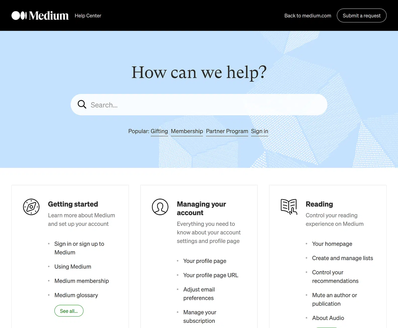
Why I Think This Contact Us Page Stands Out
The medium contact page typically includes dropdown menus or checkboxes that allow users to categorize their inquiries. Many help centers provide links to frequently asked questions or related articles before allowing form submission.
However, the main downside of their page is that Medium doesn’t use a contact form. This can be frustrating to users who urgently need to contact their support teams.
How to Create a Contact Page Like This
- Incorporate Self-Help Options: Integrate your contact page with your knowledge base. Provide articles or links to FAQs related to the user’s selections or input, potentially resolving the query.
- Show the form anyway: Don’t bury the form so deep that real support cases give up. A visible “I still need help” link at the bottom is the safety valve.
7. White Frontier
White Frontier is a Swiss craft brewery, and their contact page uses a transparent form layered over a background image. If you want a contact form that doesn’t sit in a plain white box, this is the pattern to look at.

Why I Think This Contact Us Page Stands Out
A transparent form keeps the brand’s visual personality on the page. You don’t lose the background photography to a giant grey form container. For lifestyle, hospitality, food and beverage, or anywhere the brand image carries a lot of weight, that matters.
The background image has to support legible text, or the form becomes unreadable. White Frontier uses a darkened beer photograph, which gives the white form labels enough contrast to stay readable. If you copy this pattern over a busy photograph, you’ll need an overlay to keep things legible.
How to Create a Contact Page Like This
- Style with CSS: WPForms lets you adjust container, background, and field styles directly from the block editor, no CSS needed. For full custom looks, see our beginner’s guide to styling your forms with CSS.
- Pick a background that supports text: Either a low-contrast photo or one with a dark overlay applied. Test on mobile, where the background usually crops differently than on desktop.
- Save your styles for reuse: Once you’ve tuned your style settings, copy the CSS the block editor generates and reuse it on every form on the site so the design stays consistent.
8. HubSpot
HubSpot’s contact page offers multiple ways to get in touch on the same page, a sales form, a sales chat, a phone number, and links into the support knowledge base.
This is the right pattern when you have buyers and existing customers with very different needs, and you don’t want to make either group feel like an afterthought.

Why I Think This Contact Us Page Stands Out
HubSpot treats contact as a routing problem first. The page is organized by what you want to do (talk to sales, talk to support, get a demo, find a resource), and each option has its own clear call-to-action. There’s no single mega-form pretending to serve everyone.
The sales chat sits side by side with the sales form, which is a quiet acknowledgment that some buyers want to type up a detailed inquiry and some want to ask one quick question before they commit. Offering both isn’t redundant, it’s covering the spectrum.
For smaller businesses, this can be overkill. But the principle scales down. Even on a small site, distinguishing “I want to buy” from “I need help with what I already bought” before the contact form loads makes both flows better.
How to Recreate It in WordPress
- Tabbed or grouped channels: Use a tabbed block or a simple grid of CTA cards to let visitors pick their path. Each card goes to its own form or page.
- Different forms for different intents: Have a “Talk to Sales” form with sales-qualifying fields, and a “Support Request” form with order numbers and product names. Don’t merge them.
- Show alternatives near the form: A phone number, an email address, a chat link. Some visitors will always prefer to skip the form, and offering the alternative reduces frustration without hurting form submissions.
How to Customize Your Contact Form Designs
Before getting started, ensure WPForms is installed and activated on your WordPress site and that you’ve verified your license.
Then, create a new form and add the form to a page or post. In the block editor, click on the form to open additional styling options for the WPForms block.
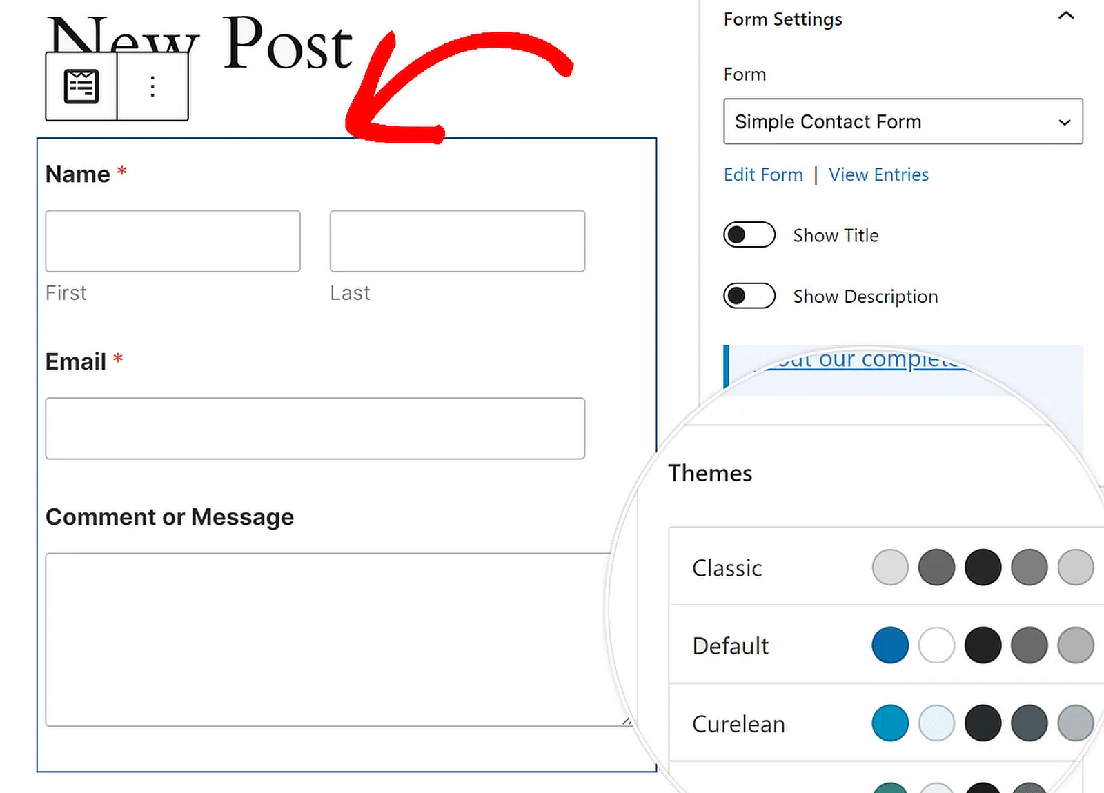
You can change the color theme, form fields, labels, buttons, and the container and background styles without writing any CSS in the WPForms block settings.

- You can choose a predefined color theme in the Themes setting to change the style of your form’s fields, labels, buttons, containers, and backgrounds.
- Under the Field Styles section, you’ll find the options to adjust size, border, border size, border radius, and colors for your form fields.
- Changing the size and color of your form labels is possible in the Label Styles section. Available size options include Small, Medium, and Large.
- Under Button Styles, you can change your buttons’ size, color, border, border size, border radius, and border style.
- The Container Styles settings let you change the color, shadow, padding, style, size, and radius of the border around your form’s container.
- The Background Styles settings give you control over your form’s background image and color to give your form a branded feel.
Once you’ve stylized your contact form, click on the Advanced tab. Here, you can copy the CSS code containing all the styles you’ve added.

Whenever you create a new form, simply paste the code snippet, and the form design will use the styles from the previous form.
Similarly, you can design your email notifications with ready-made templates, which is a great way to level up your branding across all channels of communication.
Just make sure to add a well-proportioned logo to your email (and website) to ensure perfect clarity and responsiveness across all devices.
FAQs About Contact Form Design
Contact form design is one of the topics I get asked about most. Here are the answers to the questions that come up over and over again.
What makes a good contact form design?
A good contact form design keeps fields to the minimum a visitor can stand, labels every input clearly, looks at home with the rest of your site, and lands the submit button somewhere obvious. The visual style matters less than the structural choices around it.
How many fields should a contact form have?
Three to five fields is the sweet spot for most small business contact forms. Name, email, message is the baseline. Add a subject or inquiry-type dropdown if you handle different request types, and add a phone field only if you genuinely call people back.
Can you customize WPForms?
Yes, WPForms is built to be customized without code. You can adjust field styles, label styles, button styles, container styles, and background directly in the WordPress block editor. For deeper changes, you can also paste custom CSS or build your own form templates.
How do I customize my contact form?
Start by picking a template or building a form from scratch in the WPForms form builder. Add, remove, and rearrange fields as needed. Then adjust labels, placeholders, and field sizes from the form builder, and use the block editor styling controls to set the colors and shapes that match your brand.
How do I style a contact form in WordPress?
WPForms and the WordPress block editor handle most form styling without any code. Pick a pre-built color theme to start, then fine-tune fields, labels, buttons, and backgrounds from the block editor. For one-of-a-kind designs, paste custom CSS into your form block.
How do I change form design in WordPress?
Open the form you want to edit in WPForms, then customize the design from the form builder for layout and field arrangement, and the block editor for visual styles. For detailed styling, use the block editor’s theme, field, label, button, and background controls.
Next, Build an Outstanding Contact Page Around Your Form
If you’re ready to pull together everything we’ve covered here, my guide to build an outstanding Contact Us page walks you through the supporting elements (headlines, trust signals, alternative channels) that surround the form itself.
If you haven’t built your form yet, the fastest place to start is the WPForms simple contact form template. You can create a simple contact form in WordPress in about five minutes from there.
Ready to build your form? Get started today with the easiest WordPress form builder plugin. WPForms Pro includes lots of free templates and offers a 14-day money-back guarantee.
If this article helped you out, please follow us on Facebook and Twitter for more free WordPress tutorials and guides.

