
AI Summary
Are you looking for great examples of landing page forms? When someone visits your landing page, you have one shot at converting them, so your form needs to be designed for maximum impact.
Although there’s no such thing as a perfect landing page, there are definitely best practices that can help you get great results and avoid losing valuable leads.
We’re going to look at some great landing page form examples in this article. We’ll also show you how to easily steal and use the same ideas in your own forms.
Create Your Landing Page Form Now
What Makes a Good Landing Page?
The goal of any landing page is to get your customer to complete a goal. Everything on the page needs to be geared towards getting that conversion.
For example, your landing page form might be designed to get:
- Mailing list subscribers
- Leads
- Sales
- Webinar signups
Each of these events needs a slightly different type of form.
Before you start designing your landing page form, it helps to understand the type of conversion you’re hoping to get. On a basic level, we can split your conversions into 2 groups:
- Primary conversion: This type of conversion happens when the customer is ready to buy. For example, your landing page form could be an order form or an appointment booking form.
- Secondary conversion: This type of conversion happens much higher up the funnel when the customer is still checking out their options. So if you’re hoping to create an email newsletter signup form, that’s a good example of a secondary conversion.
As a general rule, you can have a slightly longer form for a primary conversion than for a secondary one. Because when a customer’s made their purchasing decision – or is very close to it – they’ll likely be more willing to spend time filling a form out.
Now we understand how to decide on the structure of your landing page, let’s look at some best practices for your landing page forms.
Landing Page Form Best Practices
In This Article
1. Sell the Benefits Next to Your Form
On a landing page, you’ll want to make the benefits of your offer very clear.
This form from Asana asks visitors to sign up for a free trial. But it doesn’t rely on that to convert visitors. It also has a section on the right of the landing page to explain the offer with some short bullet points.
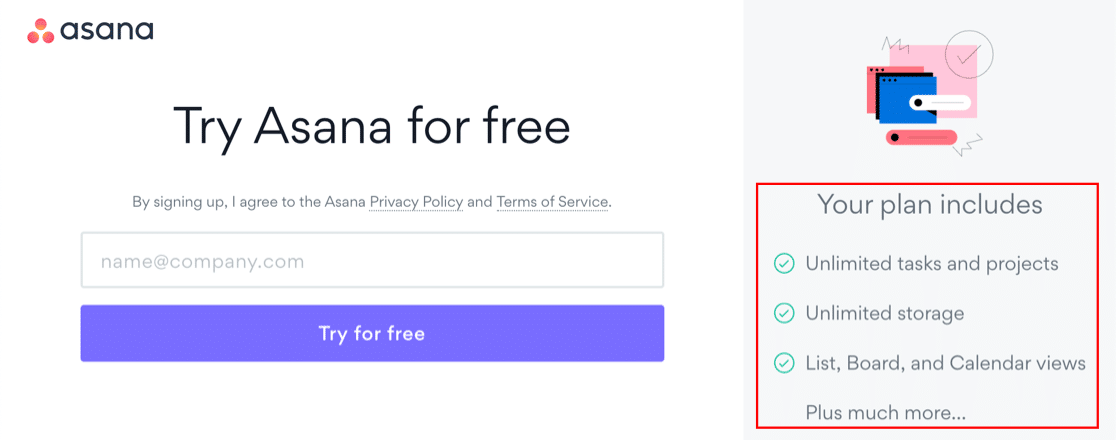
Did you notice that the word “unlimited” appears more than once?
If the user is excited about the potential of what you’re offering, they’ll be more excited about submitting the form.
Check out this awesome example from WPBeginner too:
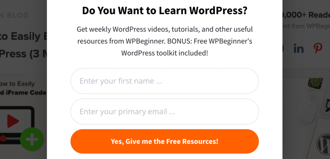
You get a ton of freebies and a bonus toolkit, so there’s tons of value hiding right behind the form. All you have to do is click!
Remember: you know what you’re offering is awesome, but the customer might not. So selling the benefits of filling in your form is a great way to remind them.
Want to learn how to use Asana with other tools? Check out our list of top Asana integrations.
How to Sell the Benefits on Your Form
This is one of the easiest best practices to implement.
With WPForms, you can easily drag a Content field onto your form to add extra text anywhere you want to. And you can use this field to add images and links, too.

Here’s our example. We’ve used a 2-column layout and put our Content field on the left side of this simple contact form with a list of branded resources users can check out while they wait for a response.

2. Reassure Your Visitor
If your customer is concerned about something, they’ll likely back off and go looking for answers elsewhere.
For example, most of us wouldn’t want to be tricked into:
- Getting emails we didn’t sign up for
- Being charged more than we expected
- Spending money on a product that turns out to be a bad fit
That’s why high converting landing page forms offer reassurance. The idea is to anticipate these worries and address them. Reassuring the customer right on the form boosts trust and shows that you understand their problems.
Here’s a great example of a landing page form from WP Rocket that offers lots of reassurance for the visitor:
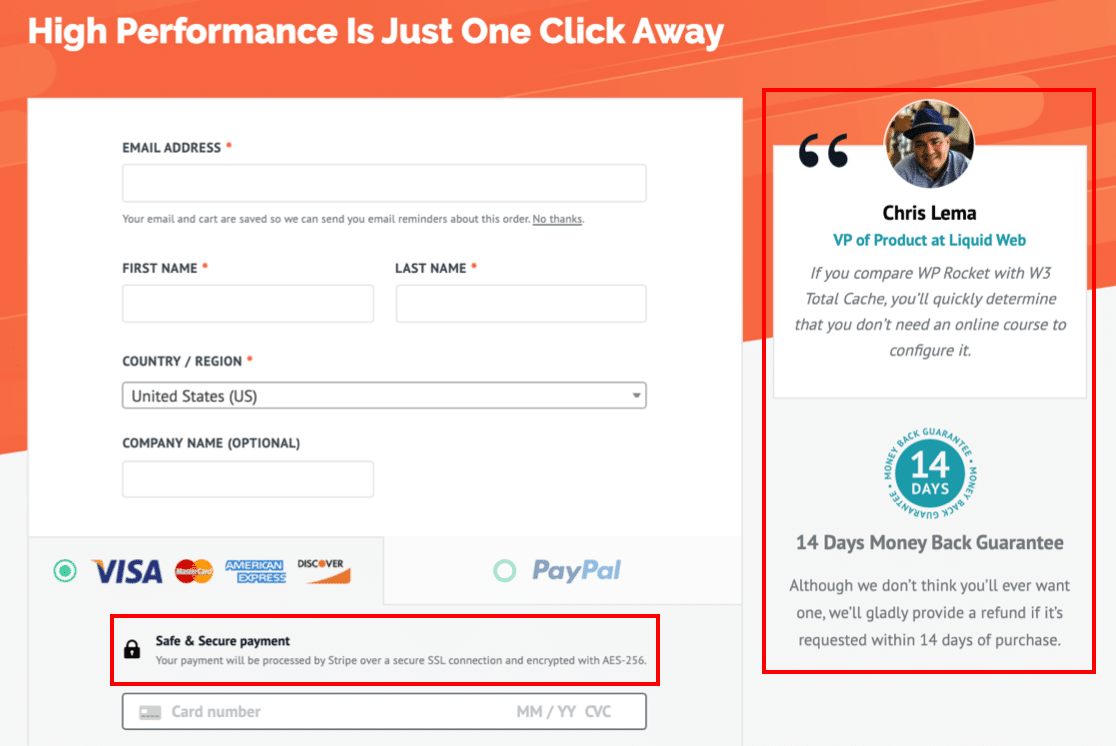
There are 3 separate areas on this form that make the visitor feel better about making a purchase:
- Customer testimonial: This adds social proof to the form. Using a photo and a real name helps to add authenticity, showing that other customers have already completed the form and are happy with the outcome. Check out these awesome examples of social proof for your forms.
- Money-back guarantee: Offering some kind of guarantee is important, particularly if the customer doesn’t get the chance to try out the product before they pay. This area of the landing page lets the customer know that they can get their money back if they aren’t happy, so they can’t possibly go wrong by trying it out.
- A secure payment reminder: If the customer is visiting you for the first time, it helps to remind them that you have the right security set up when taking payments.
When you look at landing page forms, you’ll notice almost all of them use one or more of these reassurances.
How to Add Reassurance to Your Form
WPForms makes it easy to add extra information to your form using an HTML field or a section divider.
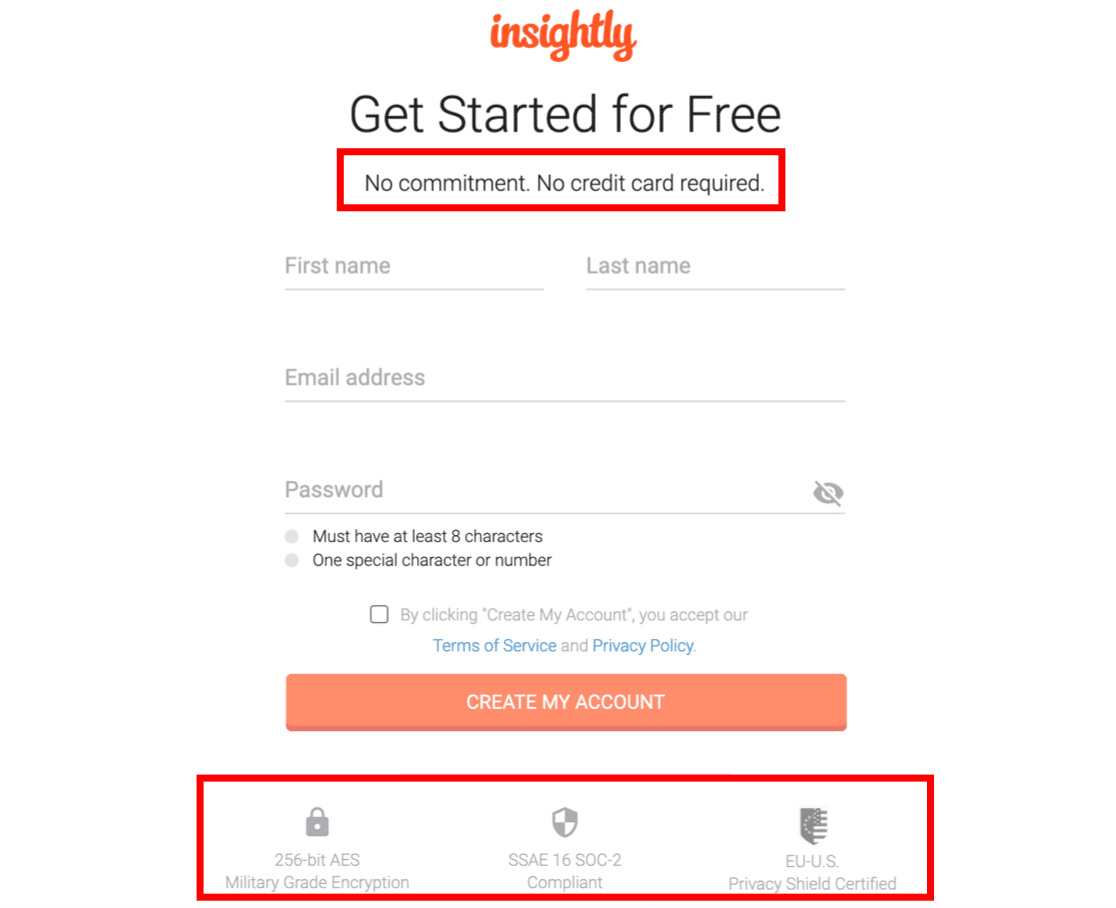
So if you’re offering something generous, like a free trial, boost the customer’s confidence and mention it prominently on your form. Insightly does an awesome job of reassuring the customer at the top and bottom of this form:
Finally, don’t forget to remind your visitor that you’ll store their personal data safely. WPForms makes it easy to add a GDPR agreement to your forms.

You can customize the wording to explain exactly how personal information will be processed or stored.
3. Remove Extra Fields
ECommerce statistics show that you get more conversions if you have 3 fields or fewer.
This isn’t a hard rule. For a primary conversion, you might be able to use more fields because the customer is more invested.
But for most secondary conversions, it helps to reduce the amount of information you’re asking for.
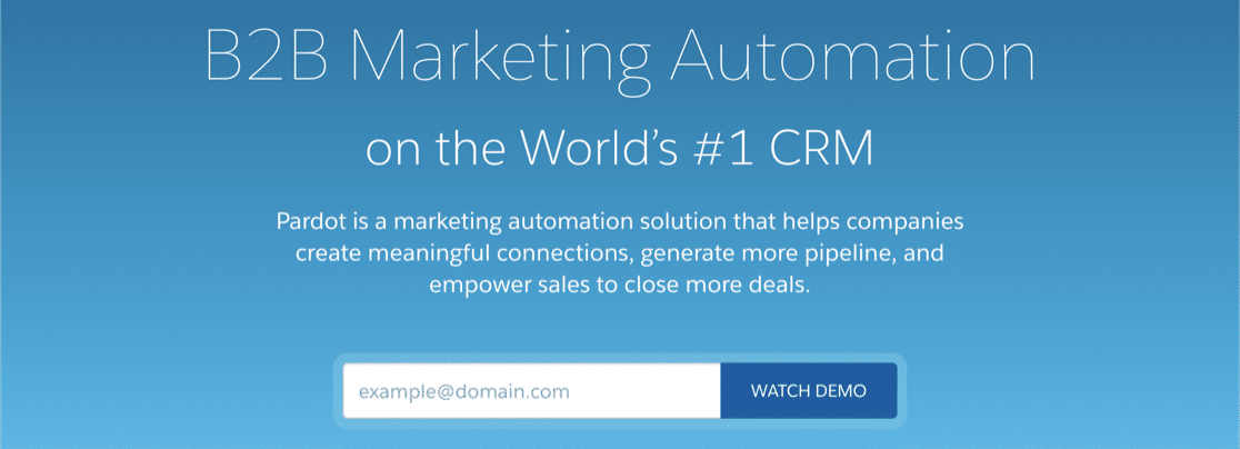
Here’s a great example of a short form from Pardot. This one lets the customer book a demo.
It would be tempting to collect tons of information about their company or intended use case. But Pardot gets it right and simply has 1 field:
If you need to take a booking time, you can also add a time or date picker so the visitor can schedule the demo without typing. When a visitor is just checking out your company, a short form removes a lot of friction.
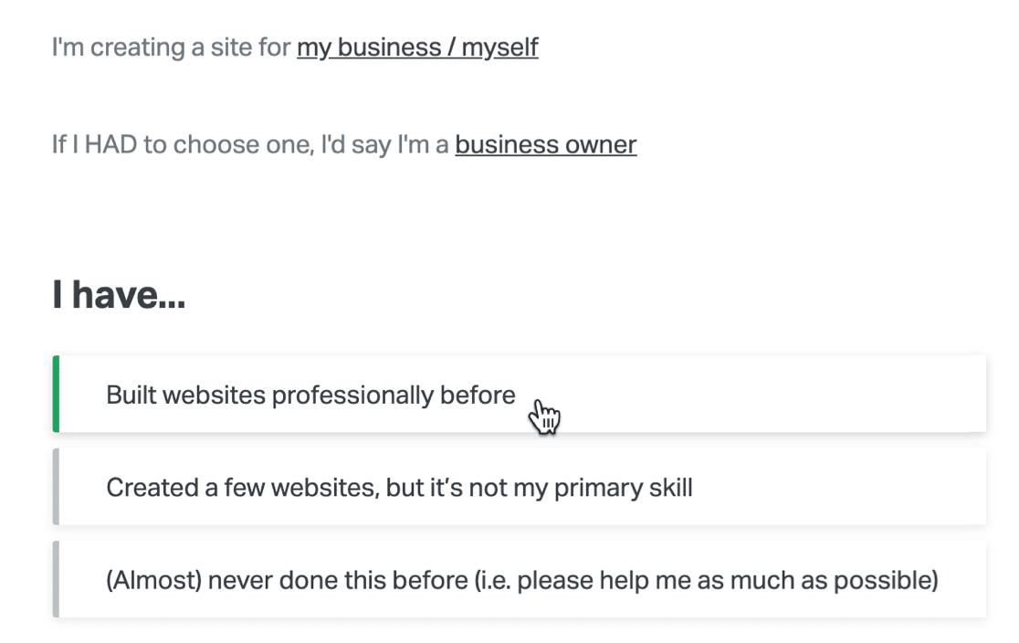
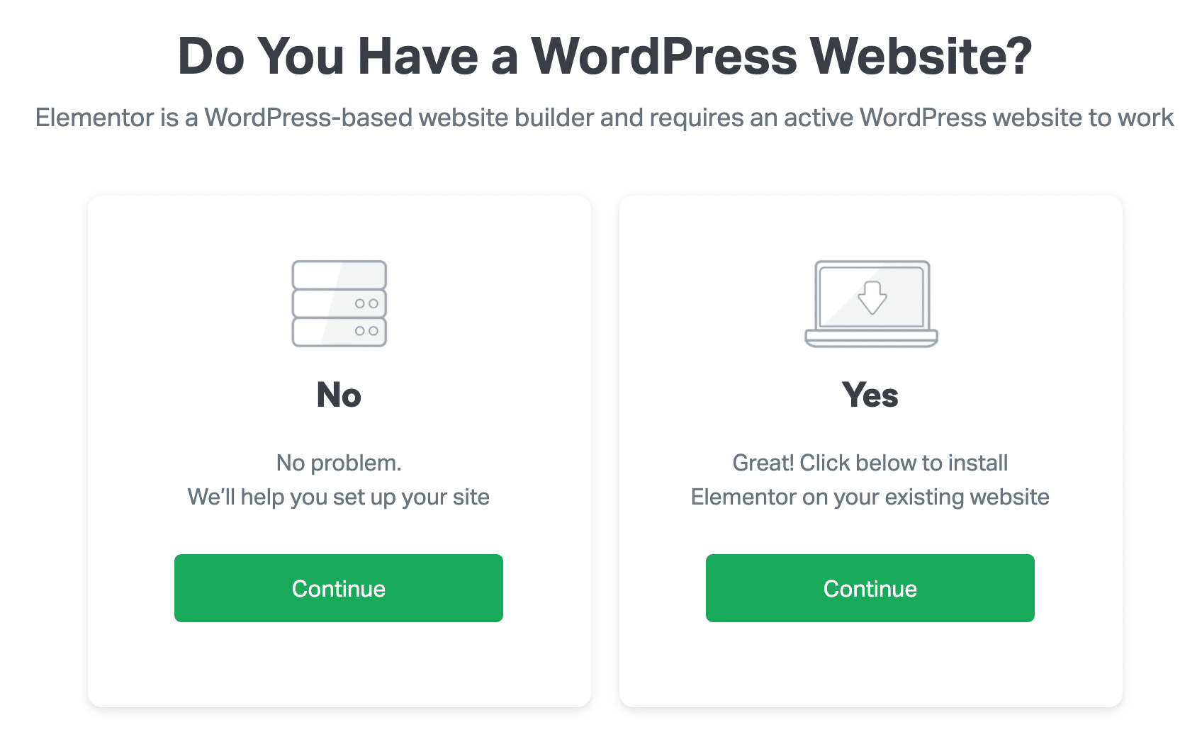
Here’s another great example from Elementor. This is a multi-step form with 1 multiple choice question on each page. Again, this form is perfect because you can provide all of the information without typing.
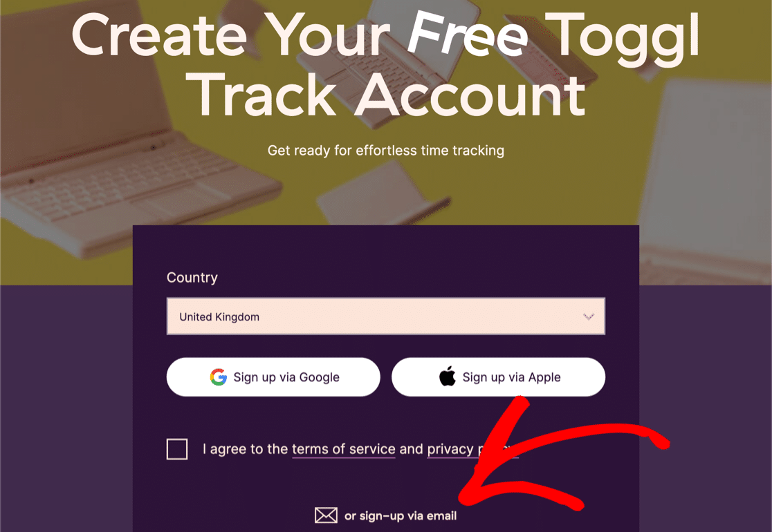
Finally, check out this awesome example from Toggl. With this form, you can sign up for a free account without touching your keyboard. But if you want to join by email, there’s a second form hidden behind the link at the bottom.
If you have tons of fields and you really can’t remove them, there are some tricks you can use to make your form look less intimidating.
How to Make Long Forms Shorter
WPForms lets you make your form shorter in 3 ways.
First, our favorite: the multi-step form.
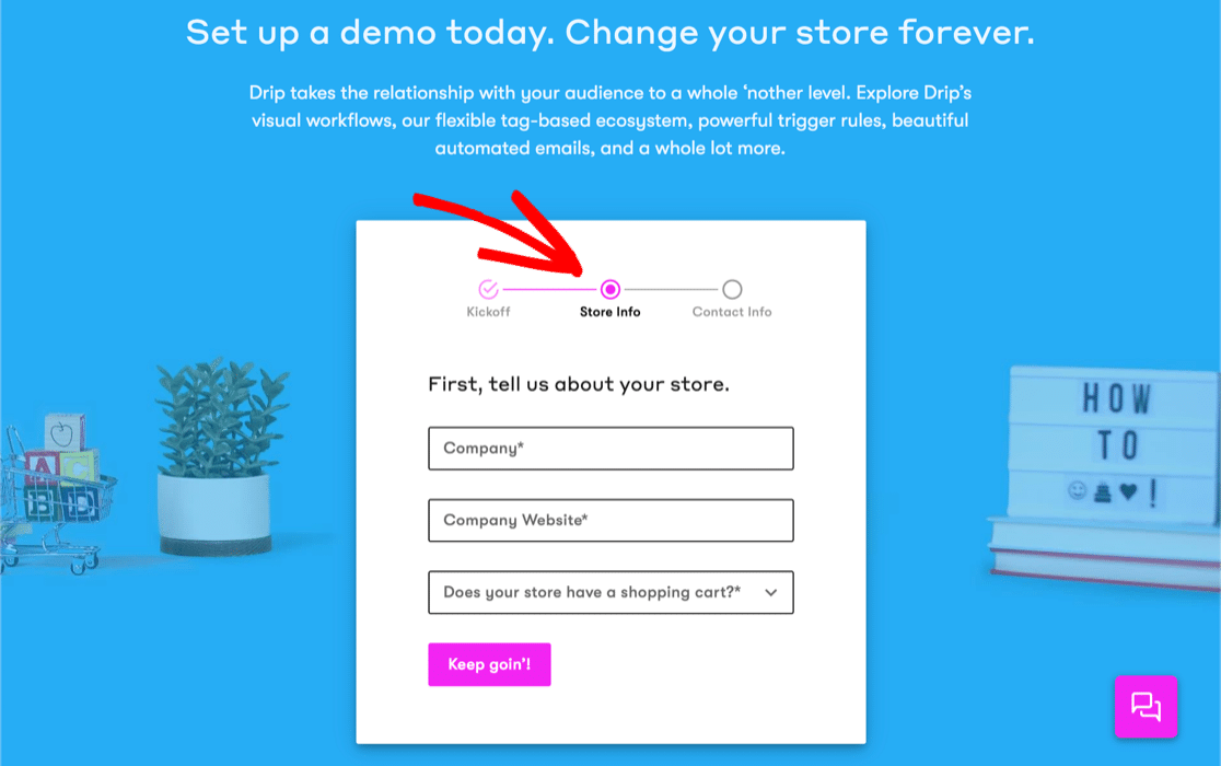
This format makes the form look less scary by hiding some fields behind a progress bar. Drip‘s signup page uses this tactic, and it looks awesome.
The second option is to choose the right form fields so that you reduce typing and clicking as much as possible. For example, you can use image choices to mimic the Elementor form we just looked at.

Finally, check out this example from Zoho CRM.
Zoho needs to know our location, but instead of asking us to type in address, it used geolocation to detect it automatically.
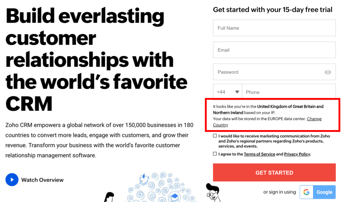
You can easily copy this technique by using the WPForms Geolocation addon. It lets you save every visitor’s location automatically.
Just switch it on and the addon will save your visitors’ location in the WordPress dashboard.

You can also use the Geolocation addon to enable address autocomplete in your forms. Just connect it to Google Map or Mapbox and turn on autocomplete for your Address or Single Line Text field.

If you want, you can also display a map next to the field so they can find their location by moving the pin.

If you want to use geolocation and geotargeting, check out our guide to the best geolocation plugins for WordPress.
4. Create a Compelling Call To Action
Your Call To Action (CTA) is the focal point for your landing page form. And to write a compelling CTA, you need to think about your user’s biggest problem first.
Then, make sure the words on the CTA button offer them exactly what they want.
This form from IsItWP combines a contrasting color with customized text on the Submit button.
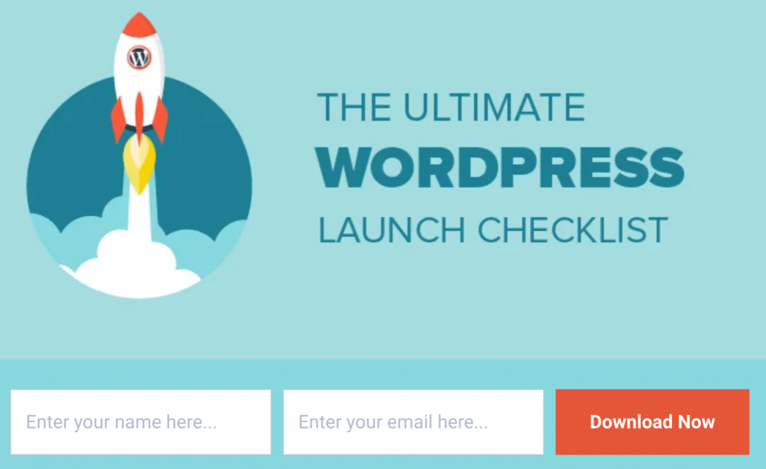
Using the words “Download Now” instead of “Submit” is powerful. It emphasizes the fact that you’re getting instant access to the WordPress checklist that you want.
In fact, this form is a neat example of a great lead magnet in action.
If you’re wondering whether you should use a full-length landing page or a lead form, see our article on lead form vs landing page.
How to Customize Your Call to Action
With WPForms, you can easily change the text on your submit button in your form settings.
That way, your visitors will know exactly what to expect when they click the button.

Don’t forget to use color to draw the eye. While IsItWP used an orange button on a blue background, this form uses a blue button so it stands out from the gray background.
If you want to style the submit button to add a contrasting color, that’s simple. You’ll just need to use a code snippet.
Here’s a doc on customizing the submit button in WPForms.
5. Harness the Power of FOMO
When you’re busy, the most urgent and pressing tasks tend to get done first.
Meet FOMO.
FOMO, or the “fear of missing out,” is a technique you can use to get your visitors to act straight away. It encourages the visitor to act immediately, rather than leaving your site and forgetting all about it.
Exclusives are great FOMO tactic. We all like to be first in line, right?
This landing page form makes it clear that you’ll always get updates before anyone else.

Also, think about offering a discount on your form. If it’s time-limited, it’ll encourage your visitor to act right there and then.
Here’s a great example from SeedProd. Check out now and save 60%, or leave and lose the discount. Which would you choose?

How to Add FOMO to Your Landing Page Form
WPForms makes it easy to add limits to your forms, like expiry dates.
When you combine these features with compelling landing page copy, you can encourage the visitor to act right away.
Using the Form Locker addon, you can:
- Limit by Time: Set up a limited-time offer, and add a form expiry date so that visitors only have a short time to sign up. You can also use this effectively for job application forms, pledge forms, or any type of WordPress form with a deadline.
- Limit by Quantity: Set up a discount code and send it out in your form confirmations. Then use the form locker to limit the number of times the form can be submitted. This is also a great option for RSVP forms if you have limited space at your venue.

Want to boost FOMO? You can use both of these features together.
For example, on a webinar landing page, you can set a limit for the number of seats and a time limit for the form to expire.
Want to show your form expiry date visually? We love the countdown timers in SeedProd. You can use the easy drag and drop builder to add a timer anywhere and have it automatically count down to a deadline.

Interested in learning more about using SeedProd for FOMO? Check out this SeedProd review.
6. Add Prompts and Placeholders
Placeholders are super helpful if you want to help your visitors without adding tons of extra text to your landing page.
This Drip signup form uses placeholder text inside the fields. It helps to guide the visitor, and it also makes the form look short because all the field labels have been removed.

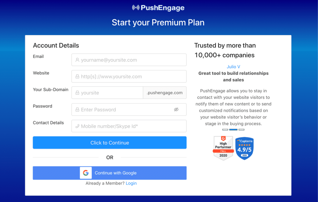
Next, check out this example for PushEngage. It’s really easy to fill in this landing page form because everything’s clearly explained.
The placeholders here even have icons in them so you can easily see what’s required:
How to Use Placeholders on Your Landing Page Forms
Use placeholders as prompts so your visitor types in the right information. This is a great way to avoid frustration because it’s more likely that the form will submit the first time.
WPForms lets you easily add placeholder text to guide your visitors as they fill in your form. Here, we added an email address as a placeholder so the visitor knows exactly what to type.

Once you’ve added the placeholders to your fields, WPFforms also lets you hide the field labels easily.
7. Make Your Forms Mobile Responsive
Have you ever tried to fill out a form on your phone, but then realized that the fields are too small? If your form isn’t mobile responsive, it could be difficult to even tap them to type.
It’s super important to make sure that all of your forms can be filled in on any device. This helps to make sure there are no barriers for mobile users.
Here’s a great example of a clear landing page form from ActiveCampaign.

Another great tactic for mobile is to use image choices or large buttons that are easy to select on a touchscreen.
How to Create a Mobile Responsive Form
All of the forms you make with WPForms are mobile responsive by default. So your visitors will find them easy to use on any device or screen size.
This is super helpful if you want to use WPForms to integrate with other services. For example, normal GetResponse forms aren’t mobile responsive, but you can build a GetResponse signup form with WPForms to overcome that.
On this form, Elementor has used a CTA button and an image so there’s a huge area to tap on. It would be impossible to accidentally pick the wrong option here:
If you’re willing to work with a little code, you can make a layout like this by turning checkboxes into buttons.
Also, consider making a stacked layout. With this trick, all of the fields are the same width on mobile.
Check out the difference between the stacked and regular layout on this landing page form.

If you’re willing to add a code snippet, you can achieve this easily using WPForms and a little custom CSS. Check out our doc making a stacked layout for your form.
Create Your Landing Page Form Now
Next, Make a Landing Page in WordPress
Now you know how to make optimized landing page forms, it’s time to make your first landing page in WordPress.
WPForms has a form landing pages addon that lets you turn any form into a standalone landing page. If you already built your form and you want an easy way to turn it into a landing page, this will be perfect for you.
If you want to add more elements to your landing page forms, we recommend SeedProd. SeedProd is the best landing page builder for WordPress, and it even lets you connect multiple domains to your landing pages from 1 WordPress site.
Ready to build your form? Get started today with the easiest WordPress form builder plugin. WPForms Pro includes lots of free templates and offers a 14-day money-back guarantee.
If this article helped you out, please follow us on Facebook and Twitter for more free WordPress tutorials and guides.

