AI Summary
Do you want to convert a multi-column form layout to a single column when viewed on mobile? While using multiple columns can look great on larger screens, changing to a single-column form layout on smaller screens will let your forms look professional and easy to use.
This tutorial will show you how to turn your multi-column layouts into a single column only for users visiting your site on a mobile device.
Note: We recommend using the Layout field for a simpler, drag-and-drop approach to building advanced form layouts that automatically adjust to the users’ screen size. However, the layout CSS classes covered in this tutorial are still supported.
Before getting started, you’ll first need to make sure WPForms is installed and activated on your WordPress site and that you’ve verified your license. Then, you can create a new form or edit an existing one to access the form builder.
Creating a Multi-Column Form Layout
With WPForms, you can easily create forms with multiple columns. For this example, let’s create a two-column layout using the following CSS class: wpforms-one-half. Here’s an example of how our multi-column form will look.
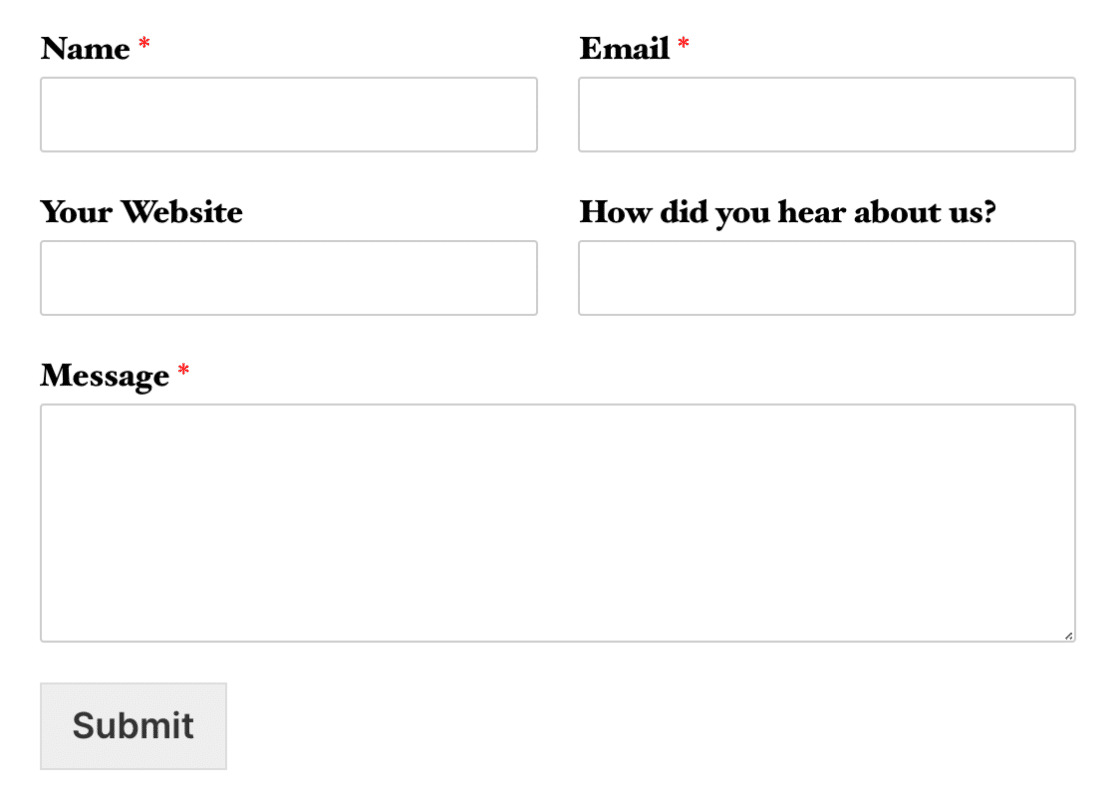
Note: The first field in each row in the image above also uses the wpforms-first class (i.e. wpforms-one-half wpforms-first. This class tells the field that it needs to start a new row.
After creating a two-column form layout, we want to make sure that the form fields are displayed in a single column only for users that visit your site on a mobile device.
Displaying Fields in a Single Column on Mobile
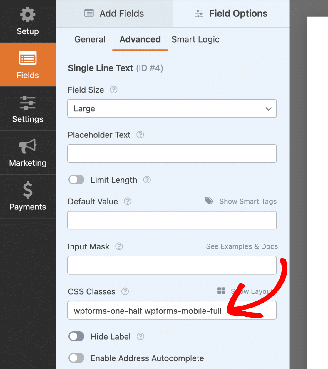
To display fields in a single column on mobile, we’ll need to use a preset CSS class. In the form builder, click on a field to display the Field Options. Then, under the Advanced section, add the wpforms-mobile-full class to the CSS Classes field.
Finally, do the same for the other fields in the form, and remember to click the Save button to keep the changes.
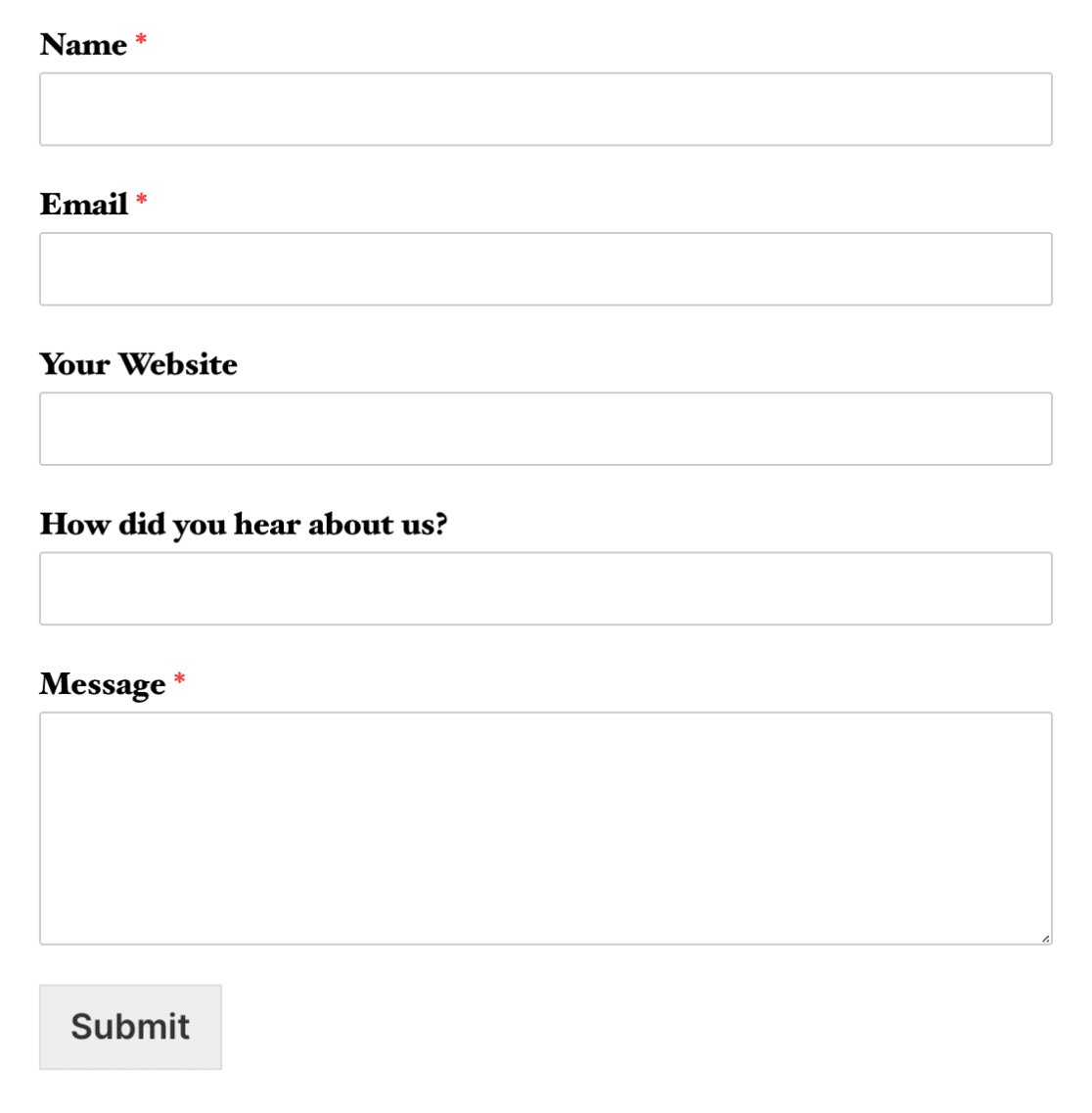
Now, for mobile visitors, your multi-column form layout will be shown as a single column. Here’s an example of how the form would look on a mobile device:
That’s it! You can now create forms that change from multi-column layouts to a single column on mobile devices.
Next, do you want to further customize the appearance of your form? Then be sure to check out our tutorial on adding custom CSS to your form.