AI Summary
Would you like to customize the submit button to better fit your site’s design or personality? Your form’s submit button can play an important role in submission rates.
This guide will cover how to customize the text and style of your form’s submit button.
Changing the Submit Button Text
To change the ‘Submit’ text of your form’s button, open the form builder to Settings » General. Here, you’ll see two fields for setting the text in the submit button:
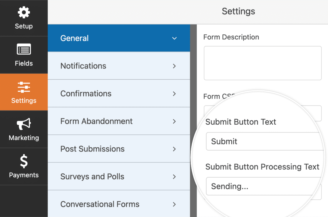
- Submit Button Text: The text shown when this button hasn’t been clicked yet
- Submit Button Processing Text: The text shown after the user clicks this button, but before the confirmation is shown to the user
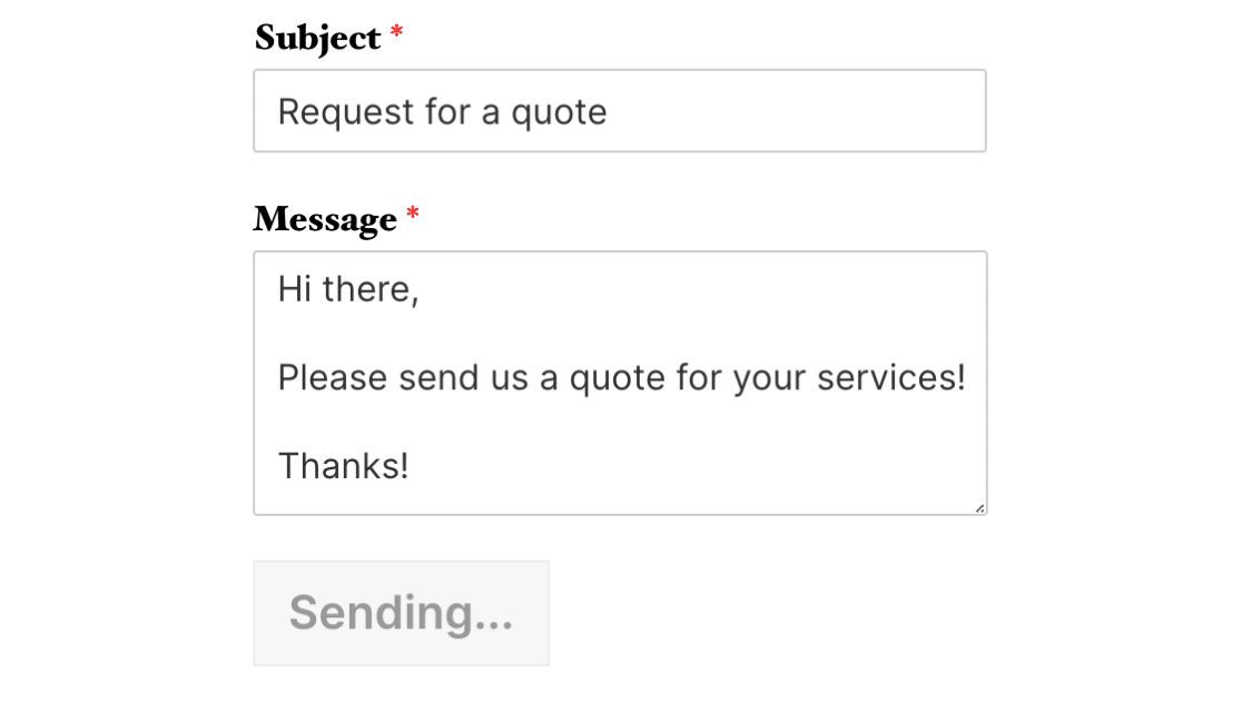
You can go ahead and change the text of the submit button according to your preference. Once you’re satisfied with the changes, go ahead and save the form.
Styling the Submit Button
CSS provides incredible flexibility to customize the submit button, as well as any other aspect of your form.
If you’re new to CSS or would like a refresher, the best place to start is with our introductory guide to CSS.
Here’s the default CSS for a WPForms submit button, as well as comments to note what each line of CSS does:
.wpforms-form input[type=submit],
.wpforms-form button[type=submit] {
    background-color: #eee; /* Grey background */
    border: 1px solid #ddd; /* Dark grey border */
    color: #333; /* Black text color */
    font-size: 1em; /* Size of text */
    padding: 10px 15px; /* Distance between text and border */
}
You can change any of these values to style the button differently. As an example, let’s start by giving our button a yellow background.
The first step is to find the hex code for the color we want – htmlcolorcodes.com or Adobe Color CC are handy free tools for this.
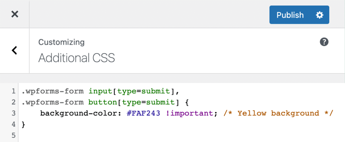
Once we have the hex code for the shade of yellow we want, we can create our CSS:
.wpforms-form input[type=submit],
.wpforms-form button[type=submit] {
    background-color: #FAF243 !important; /* Yellow background */
}
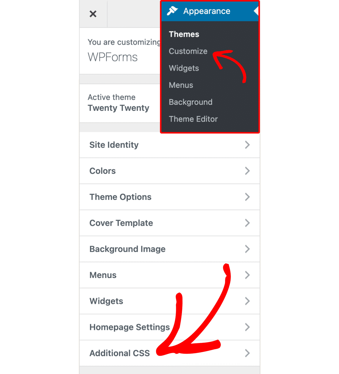
Next, we need to add this CSS to our site. The simplest way to do this is by using the WordPress CSS Editor. To open this, go to Appearance » Customize and select Additional CSS.
Once you’ve opened the Additional CSS section, paste in your new CSS. Then click the Save & Publish button, and you’re all set!
Below is what our button will look like now with this CSS applied:

Customizing Hover Styles
CSS allows you to apply completely different styles when a cursor hovers over a button. This change in style helps user experience because it lets the user know that this object is clickable.
Below is the default CSS in WPForms when a button is hovered over. As noted in the comments, the background color becomes a little darker and the border color becomes a little lighter:
.wpforms-form input[type=submit]:hover,
.wpforms-form input[type=submit]:active,
.wpforms-form button[type=submit]:hover,
.wpforms-form button[type=submit]:active,
.wpforms-form .wpforms-page-button:hover,
.wpforms-form .wpforms-page-button:active {
    background-color: #ddd; /* Darker grey background */
    border: 1px solid #ccc; /* Lighter grey border */
}
You might notice that this is a lot less CSS than we saw for the button when it’s not hovered over. This is because CSS will apply all of the earlier CSS to your hovered button unless told otherwise.
If you leave the default styles, for example, the text color will remain black when the button is hovered over. This is because the button’s text color would normally be black, and we haven’t told it to change upon hover.
As with the previous custom CSS example, you can change any of these values to style the button’s hover styles differently. For our example, we’ll give the button a darker yellow background when hovered over.
.wpforms-form input[type=submit]:hover,
.wpforms-form input[type=submit]:active,
.wpforms-form button[type=submit]:hover,
.wpforms-form button[type=submit]:active,
.wpforms-form .wpforms-page-button:hover,
.wpforms-form .wpforms-page-button:active {
    background-color: #e5da00 !important; /* Darker yellow background */
}
Here’s what the button will look like with the CSS applied:

Customizing Focus Styles
Just as you can set a hover style for your button with CSS, you can also set a focus style. The focus style is applied when the button is the focal point of any in-page events. For example, if you use the tab key to navigate the page.
Using a focus style improves user experience, especially useful for users who rely on keyboard navigation to browse the web.
Here is the default CSS in WPForms when a button is in focus:
.wpforms-form input[type=submit]:focus,
.wpforms-form button[type=submit]:focus,
.wpforms-form .wpforms-page-button:focus {
    background-color: #ddd;
    border: 1px solid #ccc;
    cursor: pointer;
}
In this case, the background-color is a slightly darker shade than the default, and the border is also subtly changed. This lets the user know that the button is now in focus and will receive any relevant keypresses.
For this example, we’re going to use a color other than yellow, to make the focus style distinct from the hover style.
.wpforms-form input[type=submit]:focus,
.wpforms-form button[type=submit]:focus,
.wpforms-form .wpforms-page-button:focus {
    background-color: #80ccf6 !important;
}
With this custom CSS applied, here’s what the button will look like when in focus:

Example CSS
Now that we’ve covered the basics, let’s go through a complete example of custom CSS for a submit button.
Here’s the CSS we’ll add for this example, which includes style changes for both hovering, and focusing:
/* New button styles */
.wpforms-form input[type=submit],
.wpforms-form button[type=submit] {
    padding: 15px !important; /* Increase distance between text and border */
    width: 100% !important; /* Make the button full-width */
    font-size: 1.5em !important; /* Increase text size */
    background-color: #af0000 !important; /* Red background */
    color: #fff !important; /* White text */
    border: 8px double #860b0b !important; /* Dark red, double-line border */
}

/* New button hover styles */
.wpforms-form input[type=submit]:hover,
.wpforms-form input[type=submit]:active,
.wpforms-form button[type=submit]:hover,
.wpforms-form button[type=submit]:active,
.wpforms-form .wpforms-page-button:hover,
.wpforms-form .wpforms-page-button:active {
    background-color: #860b0b !important; /* Dark red background */
    border: 8px double #af0000 !important; /* Red, double-line border */
}

/* New button focus styles */
.wpforms-form input[type=submit]:focus,
.wpforms-form button[type=submit]:focus,
.wpforms-form .wpforms-page-button:focus {
    background-color: red !important; /* Dark red background */
    border: 8px double #860b0b !important; /* Red, double-line border */
}
Below is what our button will look like now with this CSS applied:

When hovered over:

And when focused. Remember, the only changes are the background and border colors:

Frequently Asked Questions
These are answers to some top questions about customizing the submit button in WPForms.
Can I change the button position so it displays in the center?
By default, WPForms submit buttons are aligned to the left side of the page. However, you can use custom CSS to align the button to the center. To do so, add the following code snippet to your site.
div.wpforms-container-full .wpforms-form button[type=submit] {
    margin: 0 auto !important;
    display: block !important;
}
The CSS code above will apply the style to all forms on your site. If you’d like to apply the style on a specific form, you’ll need to use the #wpforms-submit-FORM-ID CSS selector. Here is an example snippet.
#wpforms-submit-FORM-ID {
     margin: 0 auto !important;
     display: block !important;
}
Here is how the button will look on the frontend.

If you’d like to make the button display at full width, use the width: 100% CSS property. Here is an updated version of the snippet above.
div.wpforms-container-full .wpforms-form button[type=submit] {
     margin: 0 auto !important;
     display: block !important;
     width: 100% !important;
}
Full-width button display.

Can I customize the WPForms submit button in Elementor Builder?
Yes. WPForms integrates with Elementor to provide form styling directly within the Elementor Builder. You can customize your form fields, labels, colors, and the submit button.
To learn more about customizing your form in Elementor, see our guide on adding WPForms to an Elementor page.
How do I hide the submit button on my form?
Hiding the submit button is particularly helpful if you’re using the Calculations addon to build calculators on your site. To hide your form’s submit button, you’ll need to add a custom CSS snippet to your site. The code snippet is available in the WPForms code snippets library.
For details on how to import this snippet to your site, be sure to check out our guide on hiding the submit button.
That’s it! You can now customize your submit button using custom CSS.
Want more examples? Check out our tutorial with even more submit button CSS that you can copy and paste right into your site.
