AI Summary
Would you like to add a WordPress form to your website using Elementor? You can easily use the WPForms Elementor widget to add forms to your pages and edit them to get them looking the way you want. Even better, you can do it all right from within the Elementor page builder.
This tutorial will show you how to add WPForms to an Elementor page.
Before you get started, make sure you’ve installed and activated the WPForms plugin and verified your license key.
1. Enabling Modern Markup
Note: If you’ve already enabled Modern Markup in your WPForms settings, you can skip this section and proceed to the Embedding Your Form section in this guide.
Before styling your forms in Elementor, you’ll need to enable modern markup in WPForms. To do so, go to WPForms » Settings and select the General tab.

Next, scroll to the General section and ensure the Include Form Styling option is set to Base and form theme styling.

After that, set the Use Modern Markup toggle button to the ON position to enable it.

Be sure to save your changes after enabling this option. Once modern markup is enabled, you’re ready to style your forms using Elementor as described in the following sections.
2. Embedding Your Form
First, you’ll need to open up the page or post where you’d like to embed your form.
If you don’t see the Elementor builder when you first open the page or post editor, click the blue Edit with Elementor button.

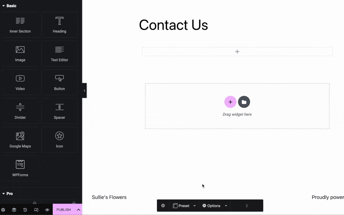
Once you’ve opened the Elementor builder, look to the left sidebar. In the Basic widgets section, you should see a widget labeled WPForms.
Go ahead and drag the WPForms widget into the widget area on the right side of the screen.

Next, you’ll need to choose between adding an existing form or creating a brand new one in Elementor.
Adding an Existing Form
If you’d like to add a form that you’ve already created to this page, then click the dropdown inside the WPForms widget. You’ll see all the forms you’ve created. Go ahead and select the one you want to add to your page.

Elementor will show you a live preview of your form as it will appear on your website. If you need to make changes to the form, click the Edit the selected form link in the panel on the left.

The form builder will open in a popup window so you can make changes to your form. When you’re done editing, click Save, then click the X icon in the top right corner to close the builder.

You’ll instantly see any changes you made in the Elementor builder.
Creating a New Form
If you don’t have any forms yet, or just want to build a new one for this page, then you can create a new form without ever closing the Elementor page builder. To do so, click the + New Form button in the panel on the left.

The WPForms form builder will then pop up so you can begin creating your form, starting with adding a name and choosing a template.

Note: If you need help building your form, take a look at our guide on how to create your first form. Also, check out our Multi-page Elementor form template if you’d like to use a prebuilt form template.
When you’re done building your form, click the Save button in the top right corner of the form builder, then click the X icon to close it.
You’ll then see your new form in the Elementor page builder. If you need to make more changes, just click the Edit the selected form link in the panel on the left.
3. Configuring Display Options
To show the form title or description on the page, click to expand the Display Options for the WPForms widget in the panel on the left side of the page builder.

Then toggle on the settings to Show the Form Name and Form Description to suit your preferences.

You can also change the way the form looks on the frontend in the Advanced tab of Elementor’s builder.

To learn how to use the settings here, see the Elementor documentation on Advanced widget options.
4. Customizing Your Form
WPForms integrates with Elementor and allows you to customize the appearance of your forms. To start, navigate to the Style tab from Elementor’s sidebar menu.

Note: If you don’t see the Style tab in your Elementor screen, you’ll need to check that the modern markup option is enabled on your site. Please see the Enabling Modern Markup section at the beginning of this guide on how to do so.
The Style tab in Elementor allows you to adjust the style of the form fields, labels, and buttons without needing any CSS knowledge. You’ll also find an option to copy these style settings from one form to another in the Advanced section.
We’ll cover each of these options in more detail below.
Themes
The Themes setting allows you to choose a predefined color theme to automatically update the style of your form’s fields, labels, buttons, container, and background.
To apply, simply click on your preferred theme, and it will instantly adjust the colors of your form’s fields, labels, buttons, container, or background.

If you customize individual settings after selecting a theme, these changes will be saved as a new custom form theme. This new theme will be added to your list of available themes, and it can be applied to any form just as you would with any other form theme.
You can also rename this theme for easy identification from the Theme Name field.

To delete a custom form theme, simply click the DELETE THEME button below the theme’s name.
Field Styles
In the Field Styles option, you’ll see settings for Size, Border Radius, and color options for the Background, Border, and Text.
The Size settings control the size of each field on your form. Available options include: Small, Medium, and Large.

Next, you’ll find the Border Radius setting. This changes the roundness of your field corners – a higher number means more rounded corners.

Next, you’ll find options to update the Background, Border, and Text colors of your form fields. To change the default colors, click on the color adjacent to the label.

This opens a color picker, allowing you to select the desired color. If you have a specific brand color for your forms, you can directly enter the color code into the HEXA field. While HEXA is the default unit, you can also switch it to RGBA or HSLA as needed.

Label Styles
Under Label Styles, you’ll see options to adjust the size and colors of your form labels. From the Size dropdown, you can choose either from Small, Medium, or Large, depending on your preference.

Next, you’ll find options to update the colors for Label, Sublabel & Hint, and Error message of your fields. Below, we’ve explained the available color options.

- Label: This option changes the text color of your labels.
- Sublabel & Hint: This option controls the color of field sublabels and hints that appear when WPForms suggests values to users in the frontend.
- Error: The color of the error messages that show if an error occurs when users fill out your form.
Button Styles
The Button Styles settings let you customize the style of your buttons. To change the button’s size, click the Size dropdown and select the option you’d like to use.

To give the button rounded edges, simply enter the value in the Border Radius field.

Next, you’ll see options to update the background and text colors of your button.

Note: The background color you set for your button will also be used as the default accent color. This means the focus state color for fields, progress bars, radio buttons, and checkboxes will use the button’s background color.
Container Styles
The Container Styles settings allow you to customize the padding, border style, border size, border radius, shadow, and colors for your form’s container. Below we’ve detailed the available container options.
- Padding: This option sets the space inside the form container’s borders. You can increase or decrease this value to adjust the spacing around your form content.
- Border (style): This setting lets you choose the outline of your container, with options for a Solid, Dashed, or Dotted border.
- Border Size: Determines the thickness of your container’s border. The default unit is pixels (px), but you can select the unit that best suits your design needs.
- Border Radius: This adjusts how rounded the corners of your container are, adding a softer or more defined edge to your form’s appearance. The default measurement is in pixels (px) but can be altered to suit your style.
- Shadow: Choose the size of the shadow effect for your container to add depth to your form’s design, with options ranging from none to large.
- Border (color): Update the border color of your container to align with your visual theme, enhancing the form’s overall aesthetic.

Background Styles
The Background Styles settings give you control over your form’s background image and color.
To begin, select an image source from the Image dropdown menu. For images already uploaded to your website or to upload new ones, select the Media Library option. To explore a wider selection of professional images, select the Stock Photos option.
After making your selection, click on the Choose Image section to proceed.

If you select Media Library from the Image dropdown, your website’s media gallery will open, allowing you to pick an image or upload a new one. If Stock Photos is selected, you’ll be presented with a selection of stock photos to choose from for your form’s background.
Once you have selected your image, the Background Styles section offers additional customization options:
- Position: This setting lets you align your background image within the form by selecting options such as Top Center, Bottom Center, and more to get the perfect placement.
- Repeat: Choose how your background image repeats. The options are No Repeat for a single image, Tile to repeat the image across the entire background, Repeat Horizontal for repeating across the width, and Repeat Vertical for repeating down the length.
- Size: This adjusts how your background image fits within the form. Cover ensures the image covers the entire background, adapting to the form’s size. If Dimensions is selected, you can specify the exact width and height for your image.
- Colors: This option allows you to select a background color, which will be visible when no image is used.
Advanced Styling
In this section, you can add any CSS classes to your form by typing the class name into the Additional Classes field.

Next, you’ll find the CSS code reflecting all the styles you’ve added to the form under the Copy / Paste Style Settings.
This option allows you to copy styles from one form to another.
If you’ve copied style settings from another form, you’ll be able to quickly paste it here. After pasting the code snippet, the form will use the styles from the previous form.
If you’d like to reset any customization you’ve added to your form, click the Reset Style Settings button. This would restore your form to its original state without any custom styling.

After styling your form, be sure to save your changes by either publishing the page or saving it as a draft.
5. Publishing Your Form
Before going live with your form, it’s a good idea to test it out and make sure it works the way you expect. Our guide on how to properly test your WordPress forms before launching includes a complete checklist to help you with this process.
When you’re ready to publish your form, click the Publish or Update button at the bottom of the Elementor page builder.

That’s it! Now you know how to embed WPForms on a page using Elementor.
Next, would you like to show or hide fields based on your users’ choices or input in your forms? Take a look at our easy guide to using smart conditional logic for steps on how to implement it.