How to Customize Checkbox and Radio Fields to Look Like Buttons

Would you like to customize Checkbox and Radio fields to look like buttons? Using CSS you can easily change the display of these inputs to buttons that are colors matched to your specific branding and even pop off the page when the user hovers over each selection and for any and all active selections. In this tutorial, we’re going to walk you through each step on how to achieve this.

By default, Checkbox form fields appear with a box in front of the label to be checked. Radio form fields also have the same default form styling.
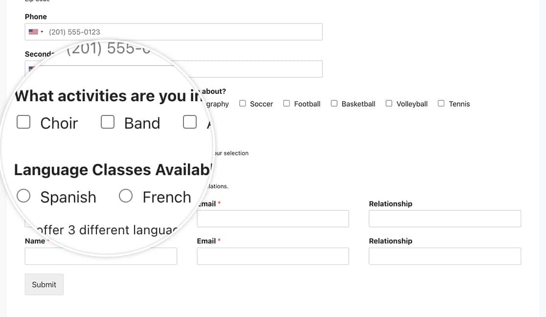
checkbox and multiple choice fields come with their own default base CSS for styling

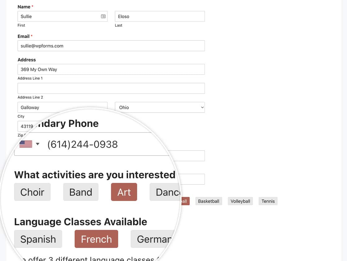
However, with the magic of CSS, you can easily style these fields to look like buttons instead of just boxes to be checked. In this tutorial, we’ll give you the CSS needed to make this styling change.

Creating the form

To begin, we’ll create a new form and add our fields. Our form will contain a single Checkbox field as well as a single Multiple Choice field.

As each of these fields are added, click on the Advanced tab and from the Choice Layout dropdown, select Inline.
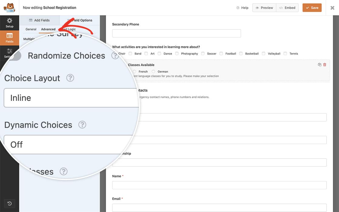
add your fields and set the checkbox and multiple choice fields Choice Layout to Inline from the Advanced tab

Adding the CSS

Now it’s time to add our CSS magic. Simply copy and paste this CSS to your site.

If you need help on how and where to add CSS to your site, please check out this tutorial.

Checkbox and Multiple Choice fields for a specific form

.wpforms-container form#wpforms-form-1015 input[type=radio], 
.wpforms-container form#wpforms-form-1015 input[type=checkbox] {
    display:none;
}

.wpforms-container form#wpforms-form-1015 input[type=radio] + label, 
.wpforms-container form#wpforms-form-1015 input[type=checkbox] + label {
    padding: 5px 10px;
    background-color: #e7e7e7;
    border-color: #ddd;
    transition: background-color 0.3s ease-in-out;
	border-radius: 3px;
}

form#wpforms-form-1015 input[type=radio]:checked + label, 
form#wpforms-form-1015 input[type=checkbox]:checked + label, 
form#wpforms-form-1015 input[type=radio]:checked + label, 
.wpforms-container form#wpforms-form-1015 input[type=radio] + label:hover, 
.wpforms-container form#wpforms-form-1015 input[type=checkbox] + label:hover {
    background-image: none;
    background-color: #b95d52;
	color: #ffffff;
    cursor: pointer;
}

.wpforms-container form#wpforms-form-1015 ul li {
    margin: 5px !important;
}

/* Start of media query to remove hover styles */
@media (hover: none) {
	.wpforms-container form#wpforms-form-1015 input[type=radio] + label:hover, 
	.wpforms-container form#wpforms-form-1015 input[type=checkbox] + label:hover {
		background-color: #e7e7e7 !important;
		border-color: #ddd !important;
		color: inherit !important;
	}

	.wpforms-container form#wpforms-form-1015 input[type=radio]:checked + label, 
	.wpforms-container form#wpforms-form-1015 input[type=checkbox]:checked + label, 
	.wpforms-container form#wpforms-form-1015 input[type=radio]:checked + label {
		background-image: none !important;
		background-color: #b95d52 !important;
		color: #ffffff !important;
		cursor: pointer !important;
	}

}

Please remember to change the form#wpforms-form-1015 to match you’re own form ID. For assistance in how to find your specific form ID, please review this tutorial.

All Checkbox and Multiple Choice fields for all forms

Alternatively, you could change all of your Checkbox and Multiple Choice fields for all forms using this CSS.
.wpforms-container input[type=radio], 
.wpforms-container input[type=checkbox] {
    display:none !important; 
}
 
.wpforms-container input[type=radio] + label, 
.wpforms-container input[type=checkbox] + label {
    padding: 5px 10px !important;
    background-color: #e7e7e7 !important;
    border-color: #ddd !important;
    transition: background-color 0.3s ease-in-out !important;
    border-radius: 3px !important;
}
 
.wpforms-container input[type=radio]:checked + label, 
.wpforms-container input[type=checkbox]:checked + label, 
.wpforms-container input[type=radio]:checked + label, 
.wpforms-container input[type=radio] + label:hover, .wpforms-container input[type=checkbox] + label:hover {
    background-image: none !important;
    background-color: #b95d52 !important;
    color: #ffffff !important;
    cursor: pointer !important;
}
 
.wpforms-container ul li {
    margin: 5px !important;
}


/* Start of media query to remove hover styles */
@media (hover: none) {
.wpforms-container input[type=radio] + label:hover, 
	.wpforms-container input[type=checkbox] + label:hover {
	background-color: #e7e7e7 !important;
    border-color: #ddd !important;
	color: inherit !important;
}
	.wpforms-container input[type=radio]:checked + label, 
	.wpforms-container input[type=checkbox]:checked + label, 
	.wpforms-container input[type=radio]:checked + label {
    background-image: none !important;
    background-color: #b95d52 !important;
    color: #ffffff !important;
    cursor: pointer !important;
}

}

Using CSS you can customize checkbox and radio fields to look like buttons

Just remember to update any color references in any of the CSS to match the colors you wish to use.

And that’s all you need to customize Checkbox and Radio fields. Would you like to also customize the Numbers field? Take a look at our tutorial on How to Remove the Arrows on the Numbers Field.