AI Summary
Do you want to know how to grow your email list and get more subscribers right away?
There are some really effective list-growing tactics out there for you to use today that can help get you more money online.
In this post, we’ll show you how to grow your subscriber list lightning fast with some of the best (and most helpful) tips people use with great success.
In This Article
- 1. Offer Optin Incentives
- 2. Enable Popups
- 3. Try Social Proofing
- 4. Lock Your Content
- 5. Use Power Words in Your Copy
- 6. Accept Guest Posts to Grow Your Email List
- 7. End Blog Posts with a CTA
- 8. Create a Quiz
- 9. Try Multipart Forms
- 10. Ask for Mailing List Signups
- 11. Make Users Feel Safe
- 12. Avoid the Word “Submit”
- 13. Stick to the Basics
- 14. Make Your Forms Mobile-Friendly
- 15. Ask the Right Questions
- 16. Get More Leads with Partial Form Submissions
- 17. Make Your Form Interactive
- 18. Encourage Focus With Form Landing Pages
- 19. Pin It for Additional Referral Traffic
- 20. Add a Sign Up Button to Facebook
- 21. Add Your Landing Page to Your Instagram Bio
- 22. Host a Webinar to Grow Your Email List
- 23. Run a Giveaway on Your Website
- 24. Collect Emails at In-Person Events
- 25. Comment on Related Blogs
- 26. Talk About It with Other Experts
- 27. Interact on Forums to Grow Your Email List
27 Ways To Grow Your Email List Fast
There are many ways to achieve email marketing success. However, there’s a common theme in the strategies that many expert marketers use.
We’ll share some of the most effective tips that have repeatedly produced excellent results for many brands over the years.
1. Offer Optin Incentives
Giving people a solid reason to subscribe is one of the easiest ways to convert more subscribers. You can do this with an email optin form.
Offer high-quality optin incentives (also known as lead magnets) such as a free eBook, coupons (if you have an eCommerce store), discount codes, access to exclusive online courses, white papers, cheat sheets, case studies, and even resource lists, and watch your email list grow like wildfire.
For instance, BedJet offers new subscribers an optin incentive of $50 off their purchases during the summer sale if they provide their email addresses.
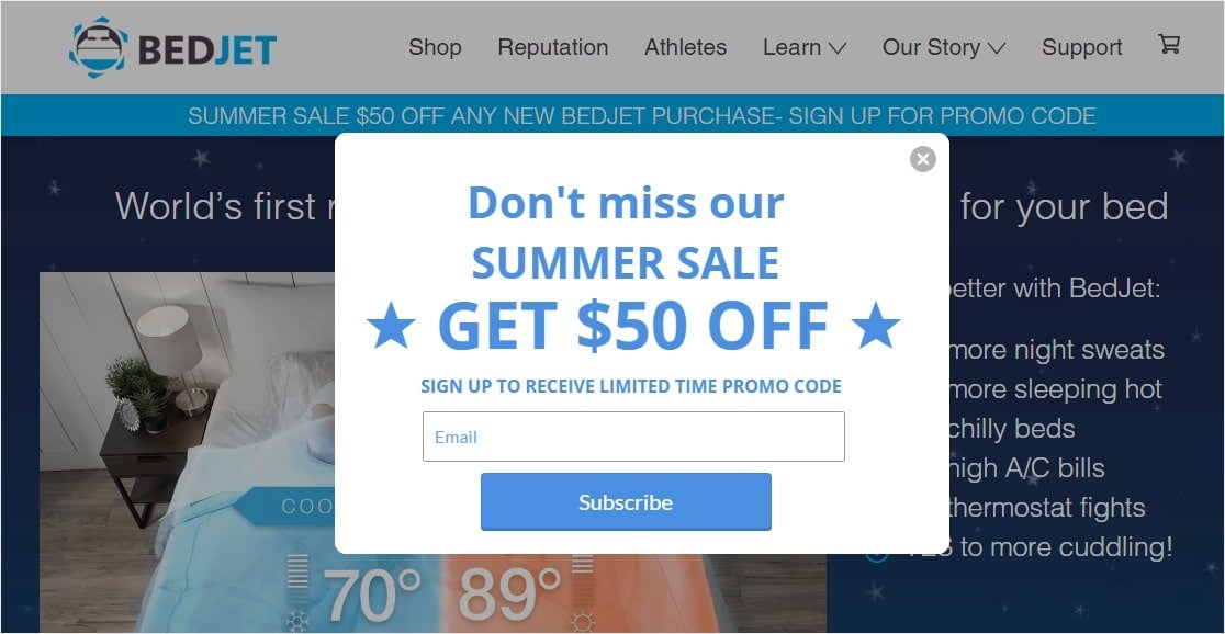
This entices people to sign up because it provides immediate value to them.
Some perks to using optin incentives include:
- You can offer your incentive on any of the email signups on your site, including sidebar forms, lead capture top bars, optin popups, blog post footers, and even author bios so all site visitors see it
- You only need to come up with one really great incentive piece, since the same offer will be available on all forms
50% of marketers who offer lead magnets to encourage signups report higher conversion rates. If you use this simple method for building a bigger email list, chances are high that your subscription rates will increase fast.
2. Enable Popups
If you’ve ever searched the web for how to grow your email list and how to increase your newsletter subscribers, you’ve surely noticed that most lists include enabling popups. That’s because it works.
Using a lead generation solution such as OptinMonster to create an exit intent popup is another quick and easy way to boost your site’s conversion rates.
Better yet, take advantage of OptinMonster’s Exit-Intent® technology and target visitors as they are about to leave your site. Or, run an a/b test to see what works well and what doesn’t.
This gives them one last chance to consider subscribing before they leave for what may be forever. Make it even more enticing by adding an optin incentive such as the ones mentioned above.
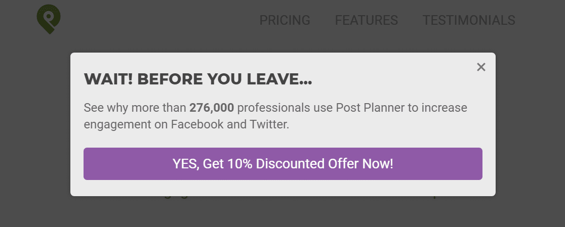
You can also use creatively placed MonsterLinks, that when clicked, enable a popup to appear — a perfect place to invite people to join your list.
Try this technique and you might boost conversion rates as much as Sportique.com did – a whopping 58% throughout their site, and an even more impressive 79% on the cart page alone.
If this sounds like something you want to try, check out OptinMonster’s full feature list.
3. Try Social Proofing
People love to make decisions based on what others do. It’s human.
That’s why using social proof on your subscribe forms is a great way to give your site visitors the perfect first impression and convince them to subscribe right away.
There are 6 types of social proof you can use:
- Industry experts making recommendations
- Celebrity endorsements or influencers
- Current user and customer reviews or testimonials
- Wisdom of crowds
- People like you sharing on social media and other platforms
- Official stamps of approval
You can add any of these types of social proof to your subscribe forms, but one of the most commonly used is Wisdom of crowds. Using the sheer power of numbers to show how reliable you are is a great way to prove to new site visitors that subscribing is worth it.
For example, TrustPulse can display a social proof notification whenever someone signs up for your email list:
After all, if all these real people have already signed up, it signals to someone considering signing up that it’s a good idea to do it too.
4. Lock Your Content
Gated content is content such as articles, white papers, videos, and more that can only be accessed by site visitors that have filled out your WordPress form and provided an email address.
For instance, Pardot does a great job of gating a white paper piece of content. They preview what’s in the white paper, which generates interest, and then require you to subscribe to see the entire thing.
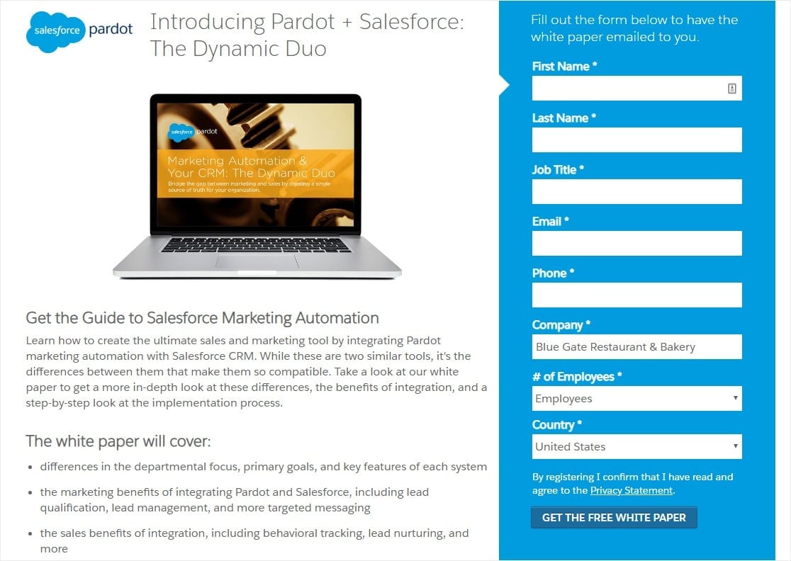
Gated content makes growing your mailing list super simple because you’re using content you’ve already published, as opposed to lead magnets or content upgrades, which take time to create and have to be changed or updated from time to time.
5. Use Power Words in Your Copy
Search engines and SEO aren’t the only ways to drive traffic to your newsletter.
Make your welcome email content and subject line rock, and you’ll start seeing more email list growth. Strong subject lines boost open rates, and good content helps emails get forwarded to other potential customers.
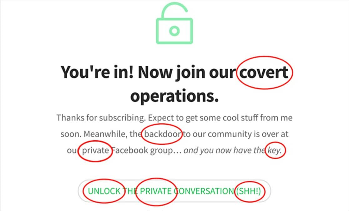
Try using words that set off an emotional response in your reader can definitely help boost the size of your email list. Here’s a great example of an optin form that uses 7 power words:
At WPForms, our editorial team often refers to this awesome list of 700+ power words that will boost your conversions.
6. Accept Guest Posts to Grow Your Email List
Another digital marketing technique to grow your email list is to accept guest posts. It’s also a fantastic way to get user-generated content for your site.
Guest bloggers often share their content once it’s published on your site. This brings their audience to your site. And, these visitors are probably already interested in your industry and want to subscribe to your email list.
The easiest way to accept guest post submissions on your site is by using WPForms’ Post Submissions addon.
7. End Blog Posts with a CTA
It’s a good idea to put your blog post layouts through some optimization.
You may already have an optin form in your sidebar, but there’s somewhere special that targets people that are extremely interested in what you have to say — the bottom of every post.
At the end of each blog post, try adding a Call to Action (CTA) asking your loyal readers to subscribe. Chances are, if they’re willing to read all of your post, they would love to hear more from you.
A great way to do this form of content marketing (that looks super sleek) is to use OptinMonster’s Attention Activation™ on an inline campaign so when someone scrolls through the bottom of a page, it will fade to gray and the optin will appear and grab your reader’s focus.
It won’t disrupt the user experience either, because if visitors continue to scroll, the page will return to normal.
You might also consider adding an optin CTA to your email signature to capture leads.
8. Create a Quiz
Another great tip on our list of how to increase email subscribers is to build a fun and useful quiz people will want to fill out. You can offer the results in exchange for an email address, and even use the quiz to provide details about your services or products.
Check out this post on the best quiz plugins for WordPress to find a tool that works as an email subscribers plugin for WordPress.
9. Try Multipart Forms
Sometimes the best way to get people to subscribe to your email list is to keep it simple. People don’t always want to deal with the hassle of filling out long forms.
Don’t believe us? Check out this infographic by QuickSprout:
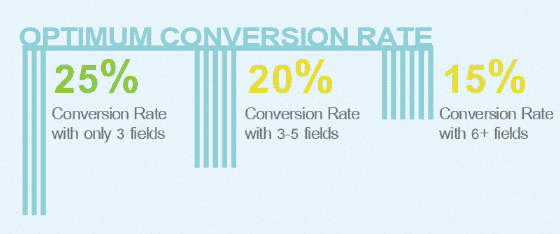
Notice that the more fields your forms have, the less likely people are to subscribe. That’s why using a forms plugin such as WPForms is one of the best email list building strategies. Not only is it beginner-friendly, but it’s user-friendly too.
With WPForms, you can build your email list faster by using Lead Forms. In WPForms, Lead Forms are essentially multipart or multi-step forms that only show one field at a time.
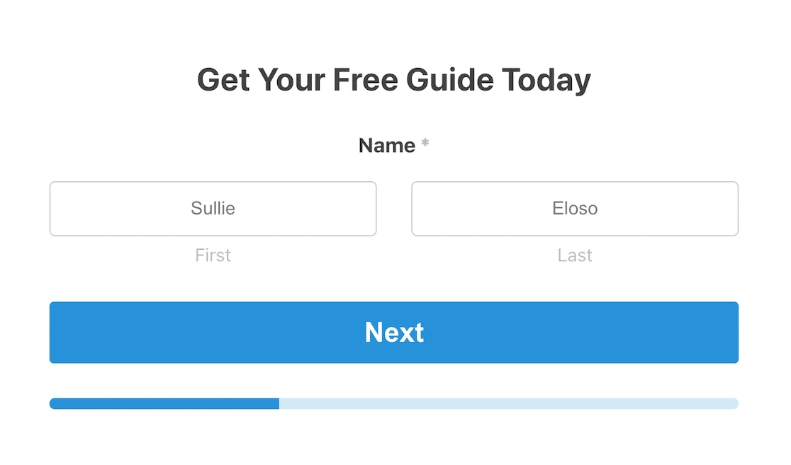
These types of forms are much more likely to convert your website visitors and grow your email list.
10. Ask for Mailing List Signups
Sometimes, the easiest way to grow your email list is to simply ask people if they’d like to join your email list.
You can do this inside of other forms (like your simple contact form) by creating a contact form with a checkbox allowing visitors to be added to your email list automatically after selecting it.
WPForms integrates easily with popular email service providers such as AWeber, Mailchimp, GetResponse, Drip, Constant Contact, MailerLite, and Campaign Monitor.
It also allows you to embed your signup form anywhere you want on your WordPress site. Add it to your posts, pages, sidebar widgets, and even footer sections using shortcodes. This guarantees site visitors have the chance to subscribe no matter where they are on your website.
Not to mention, you can create other cool forms that ask people to sign up like order forms, login forms, survey forms, and even donation forms.
11. Make Users Feel Safe
People decide not to fill out your forms for many reasons, especially security issues. For example, they worry about spam, misuse of their personal information, and hackers stealing their data.
Luckily, WPForms offers a few ways for you to assure potential customers subscribing to your email list that their info is safe and that you’ll use it responsibly:
- Add an anti-spam statement to your sign up forms such as “Your email address is 100% secure and we will never sell your information to a 3rd party”
- Add a GDPR form field so you can get consent from site visitors to collect and store their personal information, while also showing your visitors you care about how their information will be used
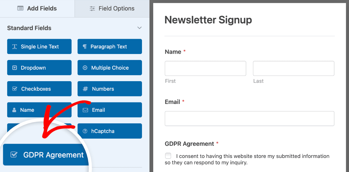
If you’re stuck trying to figure out the best way to make your forms GDPR compliant, WPForms is worth it because the GDPR field is super easy to set up.
You can also make it easy for people to unsubscribe at any time they want to, so they never feel trapped and don’t mark your emails as spam.
12. Avoid the Word “Submit”
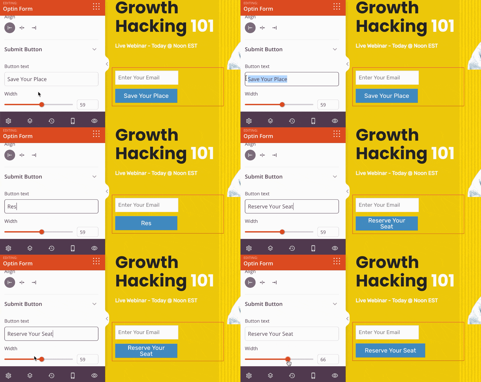
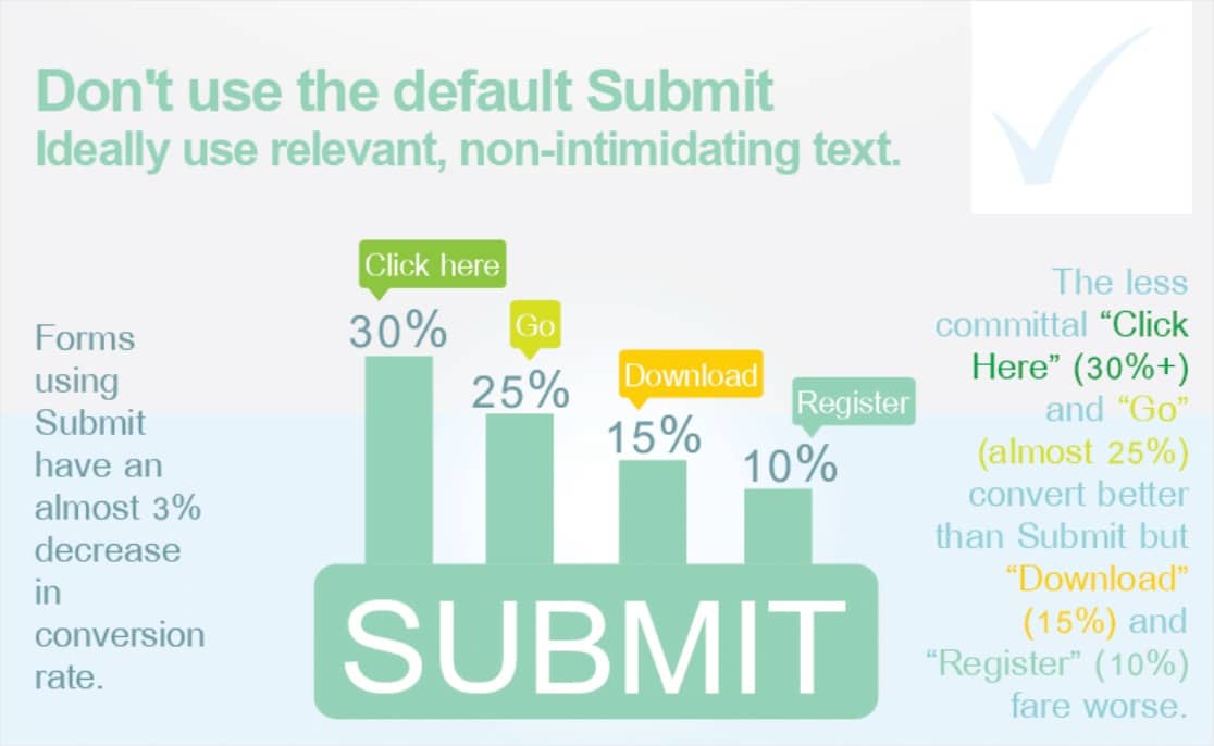
Surprisingly, your “join our mailing list” wording really matters. If you use the word Submit on your forms, you can expect to see a 3% decrease in your conversion rate.
Instead, mix it up and try ‘Click here’ or ‘Go’. Check out this example of a webinar landing page in SeedProd. It’s super easy to change the Submit button text to ‘Reserve Your Seat’ in the page builder.
13. Stick to the Basics
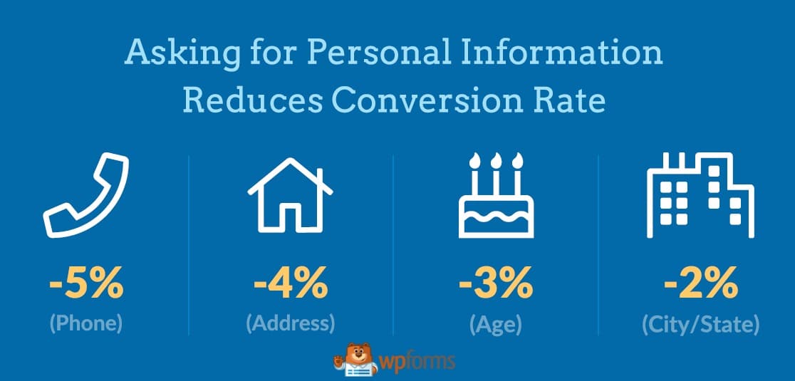
Avoid asking for too many personal details. Asking for personal info can have a negative impact on your conversion rate.
14. Make Your Forms Mobile-Friendly
Make sure you have a responsive theme (most modern themes are). Check out our list of free WordPress themes.
If you’re using WPForms, all of your forms are 100% responsive and mobile-friendly.
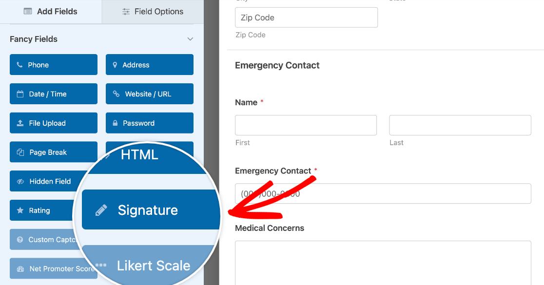
And, a great trick is to use Mobile-Friendly Signatures, too. It’s super easy to add a Signature field to your forms with the Signature Addon.
15. Ask the Right Questions
You can easily show or hide something to a site visitor on your forms once they select something that triggers this.
With Smart Conditional Logic, you can customize forms by having fields automatically show or hide other fields depending on a user’s selection.
For example, you may want to set up an extra field to appear when someone selects ‘Other’ in your form. In that case, you’d show another field.
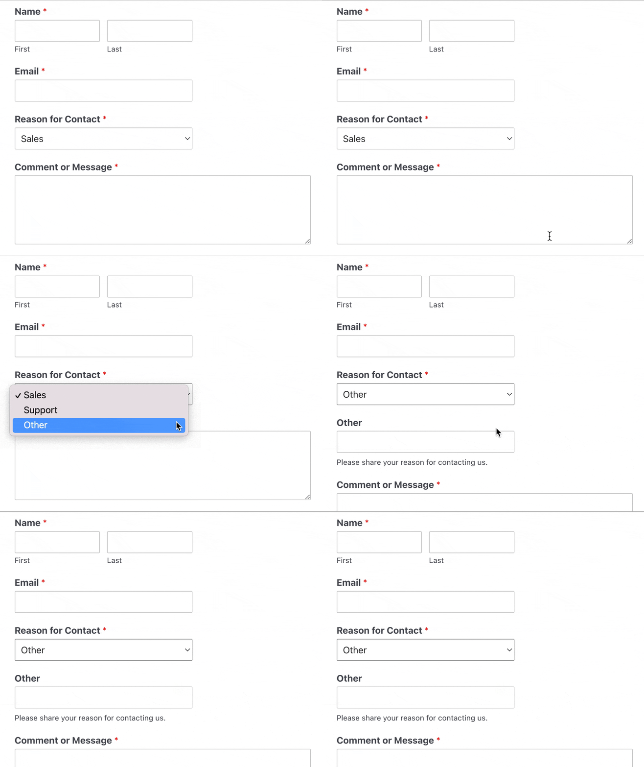
This makes your forms appear less cluttered. And, it gives you the ability to gather more data if you need to without messing up the user experience. Check out our tutorial on how to use conditional logic with WPForms.
16. Get More Leads with Partial Form Submissions
This may come as a surprise to you, but most visitors stop filling out forms before they hit submit. This could be a huge reason why your email list isn’t growing as fast and you’d like.
Form abandonment is one of the biggest challenges you need to tackle to grow your business online, and the Form Abandonment addon will help you capture those partial entries as leads.
It lets you save partial form submissions and follow up with those interested prospects with an abandonment email to invite them back to complete the form so they don’t forget about you.
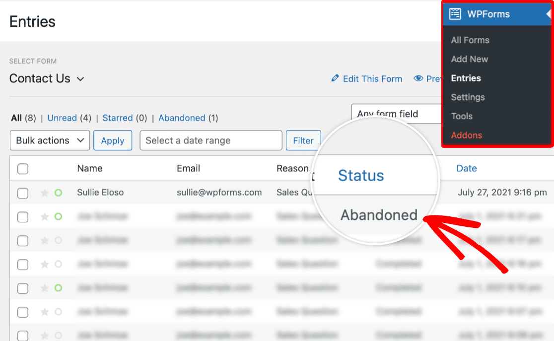
Check out our guide on how to install and use the Form Abandonment Addon with WPForms to grow your list by uncovering way more leads from your forms than you’ve been getting. You may be shocked to see how many visitors who didn’t finish submitting to your form end up subscribing.
17. Make Your Form Interactive
If your forms are interactive they’ll be easier to complete. Try creating interactive forms by using effective and great-looking Conversational Forms.
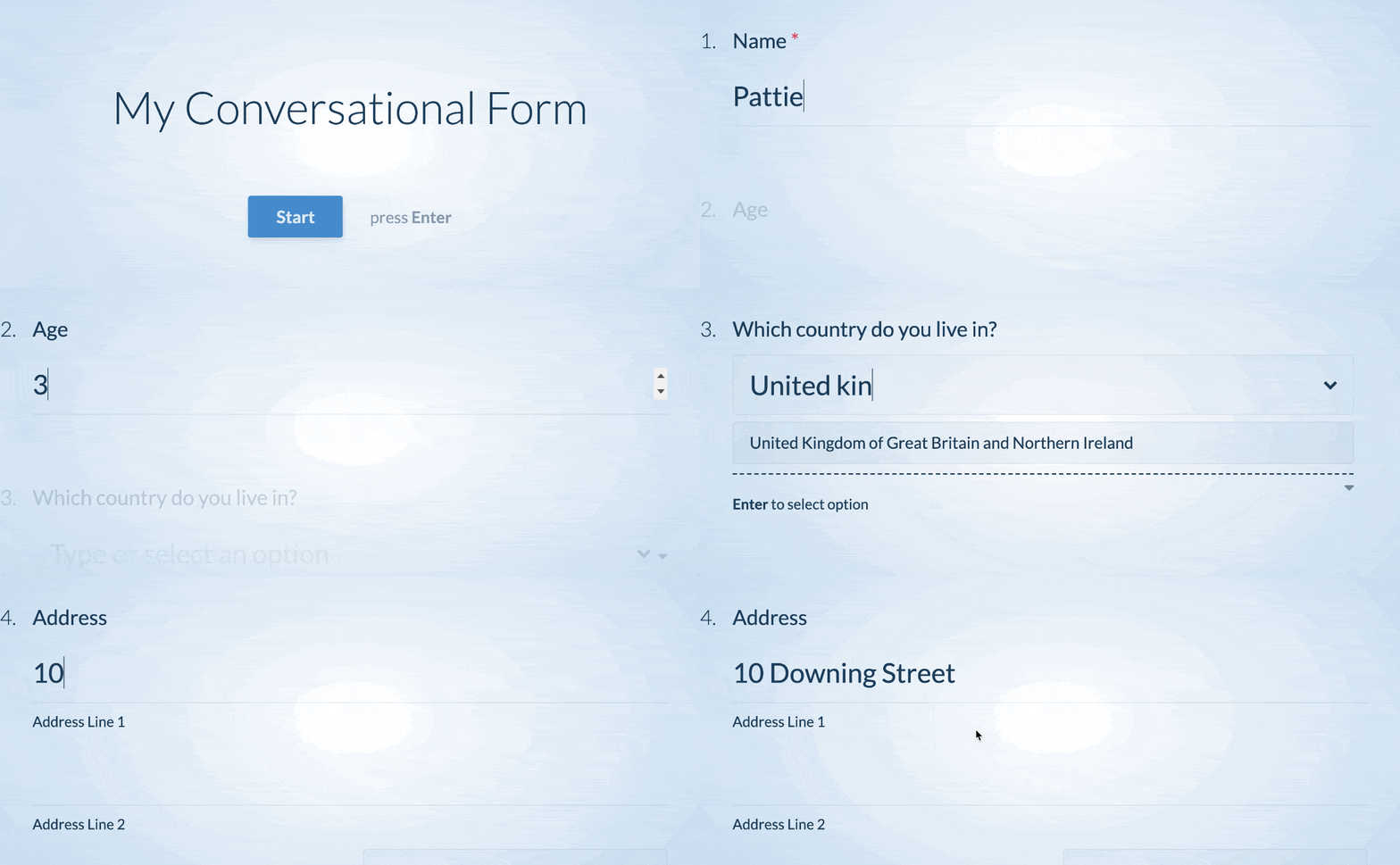
It’s interactive because it asks people for their info one question at a time, much like a face-to-face conversation. It’s the first true interactive form layout built exclusively for WordPress that’s guaranteed to boost form completion and conversions.
Best of all, you can turn any of your existing WordPress forms into an interactive form with just a click. Check out our tutorial on how to create a conversational contact form.
18. Encourage Focus With Form Landing Pages
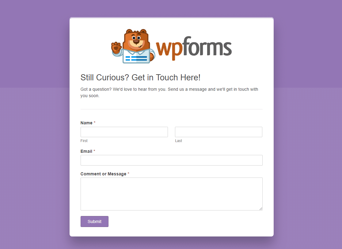
A big reason people abandon your website without filling out your form is distraction.
You can use the Form Pages addon to create customized and distraction-free landing pages to build your email list.
19. Pin It for Additional Referral Traffic
Are you asking yourself, “how do I get more email subscribers?”
Social media platforms like Pinterest can be a great way to find new leads. Try pinning your landing page to your Pinterest page for additional traffic.
You might also consider adding Pinterest share buttons to your website to help spread the word about your email list.
20. Add a Sign Up Button to Facebook
Would you like to know how to grow your email list using Facebook? Optimizing your Facebook page is a great way to grow your email list for free.
If you have a lot of followers on your Facebook page or are using Facebook Ads to bring people to your page, you should definitely add a Call to Action button to your page to turn those followers into subscribers with an email sign up on your social network.
21. Add Your Landing Page to Your Instagram Bio
Turn your Instagram followers into subscribers by adding a CTA to your Instagram bio. This is an awesome tactic for a webinar landing page or special promo.
22. Host a Webinar to Grow Your Email List
Host a webinar for free using tools like YouTube Live or Zoom and you’ll likely get a lot of email subscribers interested in attending. People know you’re taking time out of your day for a webinar (for free), so webinars have a high perceived value for the reader.
When something has a high perceived value, people are much more likely to give out their email address for it.
You can use WPForms to create a custom GoToWebinar registration form for contact information. Using this method, you could add a newsletter signup box so that your registrants are able to sign up for your mailing list at the same time.
23. Run a Giveaway on Your Website
Growing your email list happens quickly with successful giveaways and online sweepstakes. People can increase their number of entries by subscribing to your newsletter and providing their email address, on top of other amazing giveaway benefits.
- Get more website traffic — Traffic naturally spikes with successful blog giveaways, especially if you have a giveaways page on your site or success redirection where you redirect entrants to another page.
- Promote a new product or service — You can drive excitement among the email subscribers you already have for something you’re selling, even before it’s released.
- Get more leads and new customers — Boost revenue through lead generation and additional sales as more readers means more conversions.
- Skyrocket your social media following — Gain brand recognition and use the power of social proof when the number of your social media followers increase. Your audience can get extra entries by referring a friend and bringing you more followers.
- Increase engagement — Build trust with your audience by keeping them active with your brand.
An easy way to successfully run a giveaway that grows your email list is to use the RafflePress plugin. There’s a free version as well as a pro version that includes some great giveaway templates, so anyone can use it.
And if you’ve been wondering how to grow your email list and the best way to get email subscribers using Facebook, a giveaway plugin is a great marketing tool to try.
24. Collect Emails at In-Person Events
Your methods to capture email addresses don’t always have to be digital. If you’re attending a conference or business event, try boosting your marketing efforts by collecting emails at events.
This helps grow your mailing list and get your marketing emails in front of more eyes. Check out our list of top WordPress email subscription plugins to find the best tool to integrate email marketing services to WordPress.
25. Comment on Related Blogs
Comment on blog posts within your niche. When you fill out your information, make sure to include the URL to your optin landing page. The same goes for relevant YouTube videos.
26. Talk About It with Other Experts
If you’re building your small business with a Podcast, add a Call to Action at the end of your show or rotating during ad breaks telling people where to go to sign up.
27. Interact on Forums to Grow Your Email List
You might frequent forums like Quora on a regular basis to find out what your target audience is talking about, generate blogging content ideas, and promote your brand.
But did you know you can also interact on forums like that to build your email list? It’s true, this is a brilliant marketing strategy that’s underrated.
Try answering questions on popular forums or on places like LinkedIn. Leave a link to your site’s landing page (not your homepage) that has a WPForms email newsletter signup form on it. And, get people to subscribe to find out more on the topic that was answered in the forum.
This strategy works because you’re showing people in forums that you are real and care about what people are talking about. It also drives people to your website who you know are already interested in what you have to say. This makes your chances of converting visitors into new subscribers much more likely.
You can also use forums to find great ideas for lead magnets to add to your subscribe forms. After all, if you know firsthand what people are asking about, you can use that information to create a lead magnet that meets their needs.
FAQs on How to Grow Your Email List
Do you have more questions about growing an email list? Take a look at some of the commonly asked questions:
How often should I send emails to my subscribers without overwhelming them?
Generally, one email a week is a reasonable frequency for your newsletter. Many successful brands use weekly email sending schedules. Remember that quality always trumps quantity and there’s always a risk of receiving higher spam complaints with a higher sending frequency.
At the same time, you should always factor in seasonality and the nature of your campaigns before deciding on a sending schedule. For instance, it’s common practice to send multiple emails a week during a customer’s onboarding to help them become familiar with your product.
Similarly, you can send a short series of emails through the sale period during events like the Spring Sale, Black Friday, 4th of July, and so on. Ultimately, you should always consider the nature of your emails and your audience’s interests when deciding on your email sending frequency.
What are some common mistakes to avoid when trying to grow an email list?
While there are many mistakes commonly repeated, new businesses often make the mistake of making the signup process too complicated. We recommend keeping your newsletter signup forms super simple and avoiding adding unnecessary fields. You can also increase signups by taking advantage of the WPForms Lead Forms addon to make your forms more engaging.
Is it safe to purchase email lists?
No, purchasing an email list can seriously harm your domain reputation and lead email marketing failure in the long run. This is because email lists ignore recipient consent and it consists of people who have never had a chance to engage with your brand before or show any interest.
Instead, focus your efforts on building your email list organically so that it consists of people who are already interested in your brand and are likely to engage.
How can I encourage website visitors to subscribe to my email list?
The best way to encourage visitors to subscribe to your email list is by offering value in the form of your products, services, and/or content. If you have a good product, you can use additional incentives like using lead magnets to get more people to subscribe.
Next, Find the Best Email Marketing Services
And that’s it for today! You now know how to grow your email list fast. And how to get more subscribers into your email marketing campaigns with a few quick and easy tricks.
If you’re in need of a new email service provider, but aren’t sure which one to choose, check out this roundup of the best email marketing services (with free options, too).
Create Your WordPress Form Now
Ready to build your form? Get started today with the easiest WordPress form builder plugin. WPForms Pro includes lots of free templates and offers a 14-day money-back guarantee.
If this article helped you out, please follow us on Facebook and Twitter for more free WordPress tutorials and guides.





Hey
This is really a useful post.
I started my blog 3 months back and still looking for initial traffic.
Building an email list is one of the best methods to make continuous engagement with the audience.
I will definitely gonna try these tips.
Thanks for the sharing
Hi Amit, thanks for your feedback!
We are glad to hear that the information writen in the article was helpful for you.
Have a good one 🙂
Hi the raffelpress link is not working its redirecting somewhere else please correct it
Hi Maria!
Thanks for letting us know. We will correct it.
Have a good one 🙂
very nice article for list building.
Hi Shivam!
Thanks for your feedback!
Have a good one 🙂