Are you looking for ways to boost newsletter signup form conversions? Making a killer form is all about giving your visitors plenty of reasons to sign up.
In this article, we’ll look at some of the simple techniques that pros use when designing newsletter signup forms. We’ll also show you how to easily copy these techniques on your own website.
Create Your Newsletter Signup Form Now
How Do I Create a Newsletter Subscription Form?
WPForms is the easiest form builder plugin for WordPress. It’s super easy to build any type of form using the drag-and-drop builder and connect them to your email marketing service.
You can display your signup forms anywhere on your website without writing any code.
WPForms integrates with services like:
- Constant Contact
- Mailchimp
- AWeber
- Drip
- Campaign Monitor
- GetResponse
- Brevo (formerly Sendinblue)
- MailerLite
You can also make neat integrations using the Zapier addon or Uncanny Automator if you want to connect to other marketing platforms.
Let’s go ahead and look at ways you can tweak your forms to boost your conversion rates. Under each example, we’ll explain how to create a newsletter signup form the same way as the example.
Easy Ways to Improve Your Newsletter Signup Form
In This Article
- 1. Put Your Newsletter Signup Form in a Popup
- 2. Use 1 Field on Your Form
- 3. Make Your Form Stand Out
- 4. Embed Your Form on a Landing Page
- 5. Reassure Your Visitors You Won’t Spam Them
- 6. Give a Gift… and Deliver It Quickly
- 7. Include Social Proof
- 8. Offer a Discount Coupon
- 9. Segment Your Signups
- Bonus Tip: Combine Multiple Tactics
1. Put Your Newsletter Signup Form in a Popup
Popups are a great way to attract attention. You can really focus the visitor on the signup form and show them the benefits of signing up.
Some of the most striking newsletter signup forms pop up right over the web page so you can’t ignore them.
Here’s 1 example:
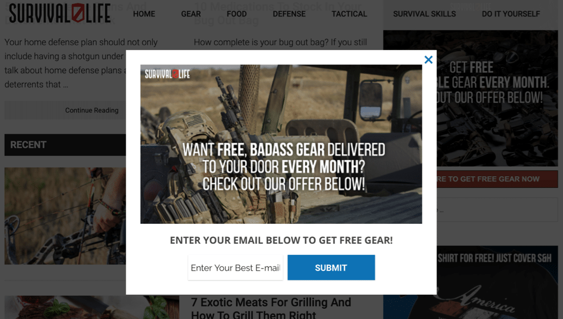
The popup takes over the window, but the visitor can still close it if they don’t want to sign up yet.
It also has some short, sharp content right in the center of the image to tell you exactly what you’ll get when you join.
How to Make a Popup Newsletter Form
You can create a popup like this by using WPForms and OptinMonster together. You don’t need to write any code to make a popup just like the one in the example.
Check out this tutorial on making a popup form in WordPress to see how WPForms and OptinMonster work together.
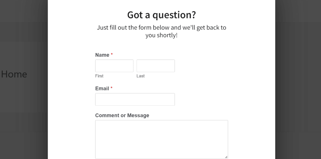
If you’re not familiar with the awesome features in OptinMonster yet, jump over to our full OptinMonster review.
2. Use 1 Field on Your Form
It’s really easy to add different field types in WPForms. But for a newsletter signup form, you want to make signup as quick and easy as possible.
Here’s a great example of a signup form that has 2 options for different audiences. The form has been expertly designed so that it still has just 1 field.

This layout makes it really easy for visitors to sign up for the mailing list. The more complicated form is on another page, accessed by the button on the right, so there’s no confusion about where to sign up.
Making a really short form is considered best practice for conversions. You’ll want to make it as easy as possible for people to sign up without putting any obstacles in their path.
How to Use Just 1 Field on Your Form
WPForms doesn’t put any limit on how many fields you can add to your form. You can have just a single field in your form or a hundred. It’s entirely up to you.
For a newsletter signup, you can just use the Email field and combine it with powerful microscopy and visuals to accompany your messaging. The WPForms Content field makes it easy to add text and media right inside your form, so make sure to take full advantage of that!
And depending on your email marketing service, you can offer either double optin or single optin signup methods as well.
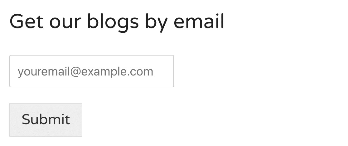
WPForms has built-in email validation to help prevent errors when providing the address. You can tweak the validation message so that it fits with the rest of your branding.
3. Make Your Form Stand Out
You won’t get any conversions if you hide your signup form away on a page nobody looks at.
Here, the newsletter signup form is right up top so every visitor sees it. But it also doesn’t cover up the main content.
Even though the colors blend in, it’s still very noticeable above the main navigation:
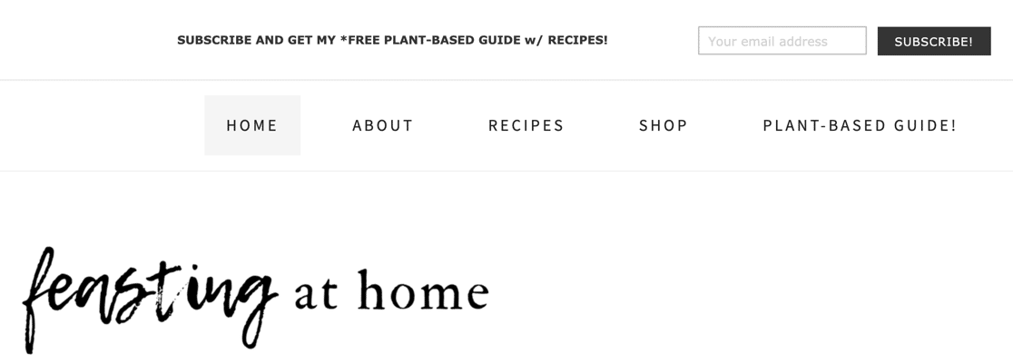
If your homepage has different images competing for attention, you can use a contrasting plain background to make it stand out.
This example shows how a pop of color makes the form stand out from the images around it:
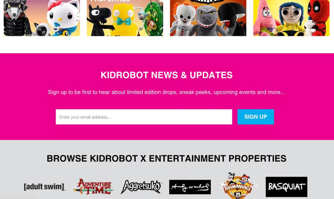
How to Make Your Form Stand Out
It’s really easy to achieve the same result using WPForms in WordPress without using any code.
Just create a section across the full width of the page, then pick a contrasting background color for it. You can then place the WPForms block inside it to display the form.
You can use the same steps to add an Elementor contact form. In fact, if you want to add forms easily in Elementor without copying and pasting shortcodes, WPForms is definitely worth it.
4. Embed Your Form on a Landing Page
Creating a landing page for your form is a great way to focus the visitor on what you want them to do.
This subscription form is for a daily news recap email, so the content here sets expectations right from the start.
There are more elements on this form than some of the others we’ve looked at. But if you look closely, this is truly a distraction-free landing page. There’s nothing else to click on except the Sign Up button:
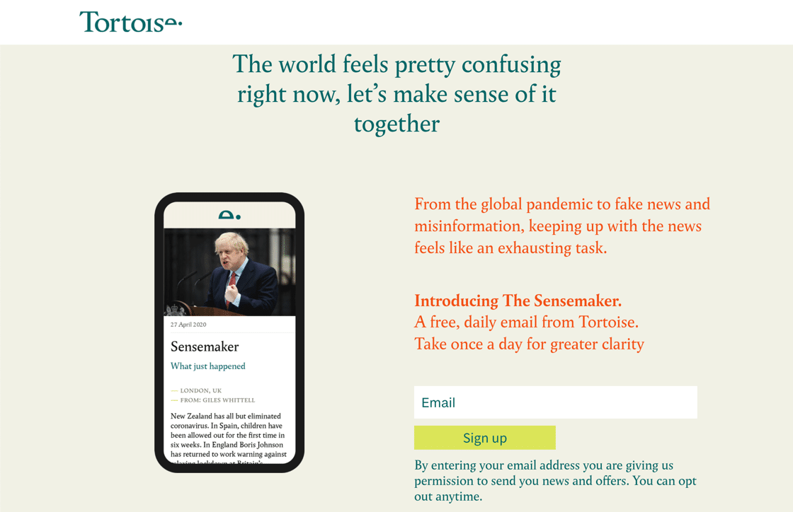
How to Put a Form in a Landing Page
You can build a killer landing page in WordPress, then embed your form anywhere you want using the WPForms block in the block editor.
If you want to know how to make a great landing page that will grab your visitors’ attention, check out this article on how to create a landing page in WordPress.
And when you’ve done that, you can steal some ideas from these examples of landing page forms.
5. Reassure Your Visitors You Won’t Spam Them
Many people are wary of handing over their email address in case they get spammed.
If you’re clear about your intentions on your newsletter signup form, it’ll help to reassure your visitor that they won’t get any unwanted emails.
This newsletter form does that well. It tells the visitor exactly what will happen to their email address when they sign up.
Although the message is small, it’s right underneath the signup form:
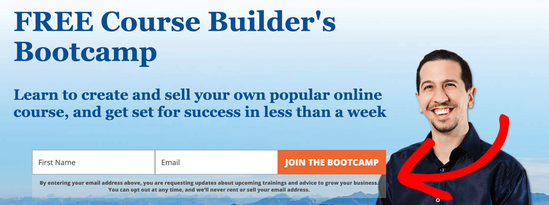
Here’s another great example from BlogTyrant. It explains exactly what will happen when you sign up:
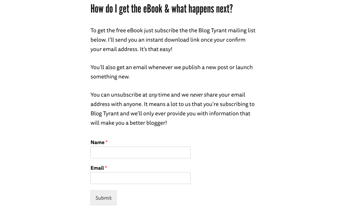
The BlogTyrant signup form is also a good example of knowing what your visitor needs and clearly explaining how you will help them.
How to Add an Anti-Spam Statement to Your Form
You can add text to any form you create in WPForms using the Content field. It makes it easy to add a message anywhere on your form.
You can also customize the message so that it fits neatly underneath the email field. That way, it won’t detract attention from the main call to action button.
6. Give a Gift… and Deliver It Quickly
Offering something for free is a great way to encourage visitors to sign up.
The more desirable and valuable your freebie is, the better chance you have of converting your visitor into a subscriber. That’s why gifts are called lead magnets.
It also really helps if you can provide the free gift right away.
Here’s a great example from IsItWP:
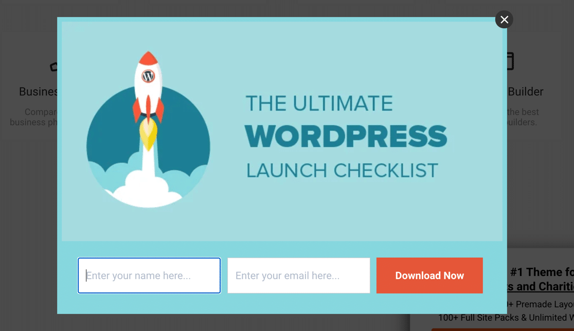
You just have to enter your email to get a really helpful ebook that will save you tons of time. Sounds like a no-brainer, right?
Also, did you notice that the submit button says Download Now? It reminds the visitor that they’ll get something right away.
In this example, the visitor gets a free guide and a free bestselling book:
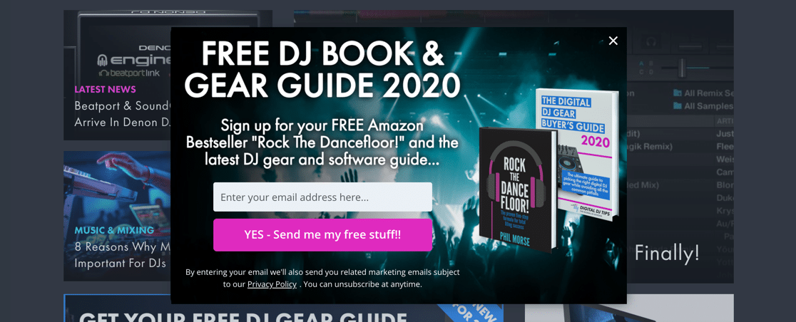
This example has a really strong CTA that stands out from the other colors around it. The background image helps it to stand out over a generic newsletter signup form.
How to Add a Download Gift to a Form
Giving your new subscribers a free download is easy. To copy this trick, just send your visitors to a download page when they submit the form.
You can learn how to do this in this guide on how to redirect users after they submit a WordPress form.
Don’t forget to hide the download page from Google when you publish it so that it only appears when the form is submitted.
If you have multiple CTAs or different freebies, consider tracking your CTA button clicks in WordPress. This lets you easily see which buttons are performing best on your site.
7. Include Social Proof
Social proof means that people are more likely to do something if someone else has done it already. If they recommend it to others, that’s even better.
Do you check out reviews of products before you buy them? Reviews are a great example of social proof.
This example uses a fullscreen welcome map popup. Inside it, you can see the social proof in the form of a photo and testimonial:
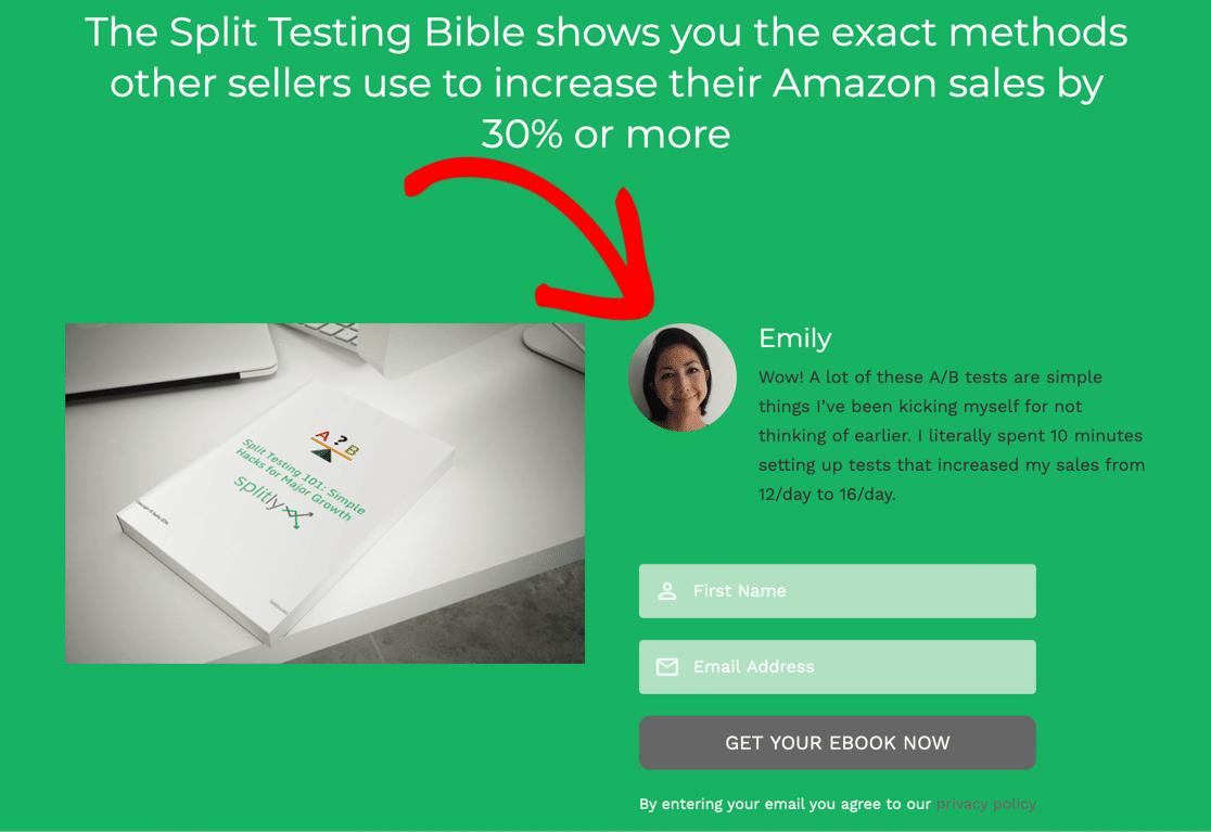
Adding social proof is a great way to build a pipeline of leads who may be interested in buying from you later.
How to Add Social Proof to Your Newsletter Signup Form
For social proof to work, it needs to be credible. Using real feedback is the best way to achieve that.
Contact some of your customers and see if they will provide a testimonial and photo, or pick some positive feedback you received and ask permission to share it.
There are many different types of social proof that you can use on newsletter signup forms. Pick the right one and your newsletter signups will skyrocket.
To learn more, check out this article on proven ways to use social proof to increase conversions.
8. Offer a Discount Coupon
Everyone likes to save money. Offering a discount is a great way to build an email list while also boosting your sales.
This popup newsletter form promises a discount on your first purchase and includes a sneak peek at some of the items you could buy:
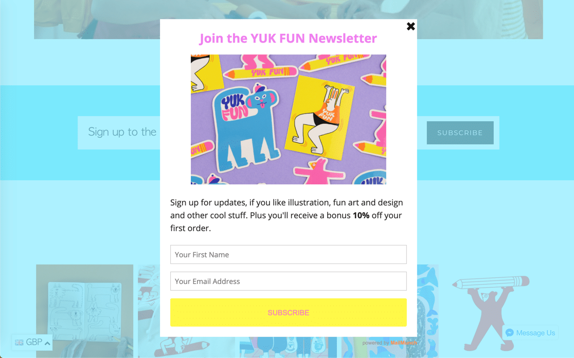
We like how this form has an opaque background. It doesn’t take you too far from the page you’re browsing because you can still see the store underneath.
How to Offer a Discount Code for New Signups
The trick with this method is to create a confirmation page that shows the code once the user has signed up.
You can easily create a confirmation page like this using OptinMonster. Just place the coupon on the page that loads after the form is submitted.
You could also set up form confirmations in WPForms to show a confirmation message with a code.
And if you want to get that opaque background look, take a look at this list of awesome lightbox plugins for WordPress.
9. Segment Your Signups
Segmenting your email list is a great way to make sure your subscribers only get content they’re interested in.
This technique helps them, and it also helps you. By having a segmented list, you will get better engagement because the content of your emails will be more relevant to the people who receive them.
This form promises early sale access, which is compelling. But many people will only want to see sale items that they might actually buy.
So the form solves this by segmenting subscribers into Womenswear and Menswear groups right from the start:
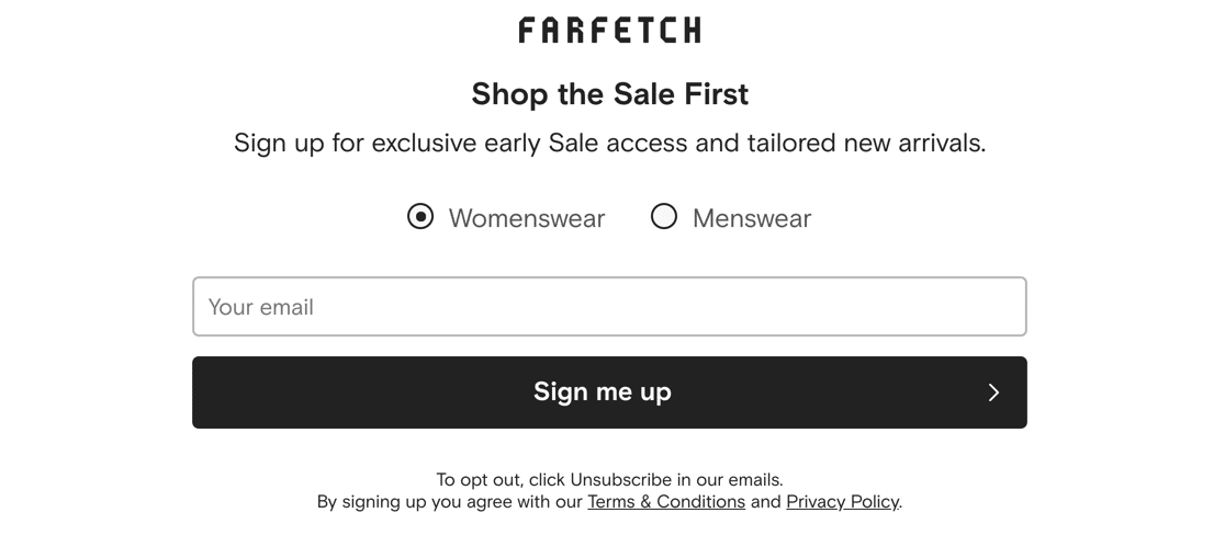
This is a win-win technique. It improves the user’s experience and helps you to target your marketing emails more effectively.
How to Segment Signups From 1 Newsletter Signup Form
Most mailing list providers have a way to segment or group subscribers.
In WPForms, you can easily create multiple choice or radio buttons like the example above. You can then use conditional logic to add the user to the right segment.
Here’s a tutorial that shows you the easy way to set up Mailchimp Groups with WPForms. You can also create custom MailPoet WordPress forms and send messages to different segments in your lists.
Bonus Tip: Combine Multiple Tactics
The most powerful forms combine multiple newsletter signup form tactics in 1 place.
But you need to avoid making your form too complicated.
Take a look at this example:
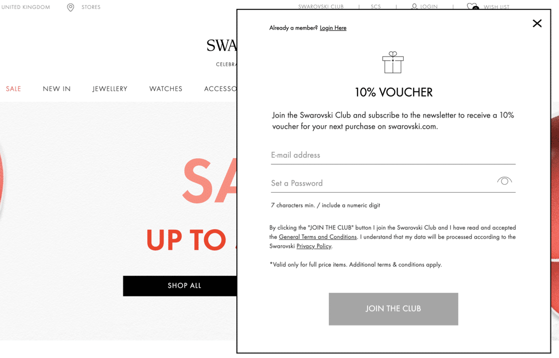
This form looks simple. But it’s actually doing a lot of work.
It’s combining 5 different tricks that we talked about already:
- The signup form is short to make it easy for the visitor to fill out
- It’s in a popup window to focus the visitor’s attention
- The subscriber gets a gift – club membership – which entitles them to in-store benefits
- They also get a discount code right away
- And there’s a strong call to action button.
You don’t have to make something this complicated at first. Just pick 1 tactic that makes sense for your website and the audience that you want to attract.
Over time, you can create additional newsletter signup forms and split test different combinations to see what works best. Then check out our tips on how to get more leads.
Create Your Newsletter Signup Form Now
Next, Create Your First Survey Form
Now you can start to think about other forms for your business. Gathering feedback is a great way to improve your website and engage with your customers.
Here’s a tutorial on creating a survey form in WordPress.
You’ll also need to track the links on your site to see which ones are leading the most visitors to your newsletter signup form. To set that up, check out this guide to WordPress link tracking.
Ready to build better newsletter signup forms? Get started today with the easiest WordPress form builder plugin. WPForms Pro includes email marketing templates and offers a 14-day money-back guarantee.
If this article helped you out, please follow us on Facebook and Twitter for more free WordPress tutorials and guides.




Good morning. I was wondering if you had ever done a survey on pop-ups. You clearly rate them and half of our team like them too. The other half, including me, dislike popups and our SEO specialist tells me they are proven to annoy people. Do you have any stats on that at all?
Hey Neil- We do not have specific stats on what you’ve mentioned. However, we do have a good number of users embedding their form on popup plugins, especially for subscriptions and exit intent.
In case if it’s helpful, here is a guide on how to embed forms on a popup.
Hope this helps 🙂