AI Summary
Are you using form design best practices to get the most out of your WordPress forms?
When designing forms, creating simple, streamlined, and responsive forms that your users enjoy filling out is crucial.
You’re likely to get more submissions and covert more leads if your forms are following key best practices that have withstood the test of time over the years.
This article will show you the best web form design practices to boost conversion and make visitors love your forms.
Form Design Best Practices to Boost Conversions
Following form design best practices is easier if you’re using a form-building tool equipped with all the features associated with professional forms.
WPForms is the best form builder plugin for WordPress, trusted by over 6+ million WordPress-based businesses actively using it.
With an easy drag-and-drop form builder interface and 2,100+ form templates, WPForms has all the tools you need to build forms that apply form design best practices.
In This Article
- 1. Use Conditional Logic
- 2. Add File Upload Field for Application Forms
- 3. Stop Spam Submissions With Custom CAPTCHA
- 4. Capture Variable Amounts of Data with Repeaters
- 5. Use Professional Form Styles
- 6. Let Visitors Choose Custom Donation Amounts
- 7. Leave Some Fields as Optional
- 8. Condense Forms Into Multi-Column Layouts
- 9. Use the WPForms Smart Phone Field
- 10. Use Address Autocomplete
- 11. Use Multi-Page Layout for Longer Forms
- 12. Use the Right Type of Field for a Given Purpose
1. Use Conditional Logic
Conditional logic allows you to create dynamic forms, display custom text, or set custom field values based on user selection.
The reason why conditional logic is such a great feature for efficient form design is that it allows you to show extra fields only when a user’s responses require them.
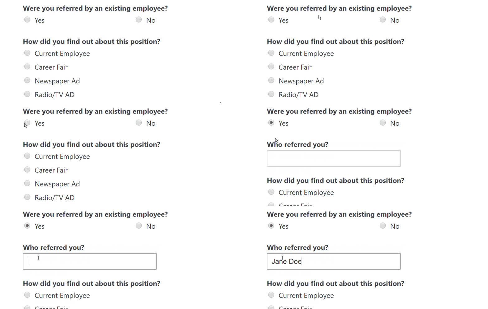
Without conditional logic, you’ll often find yourself forced to include the same fields for all visitors, even if these fields may not be relevant to them. This introduces needless distractions for such visitors, increasing the chances of abandonment.
The most common use cases for conditional logic in WordPress forms are:
- Add a user to your email list only if they checked the box to subscribe to the email list from the contact form (Great for businesses).
- Hide entire questions if the customer doesn’t select a specific option (Great for long-form surveys).
- Show a Content field with an exclusive offer if the user purchases the highest price option (Great for upsells).
WPForms includes an easy conditional logic system that you can use to control the display behavior of any field in your form.
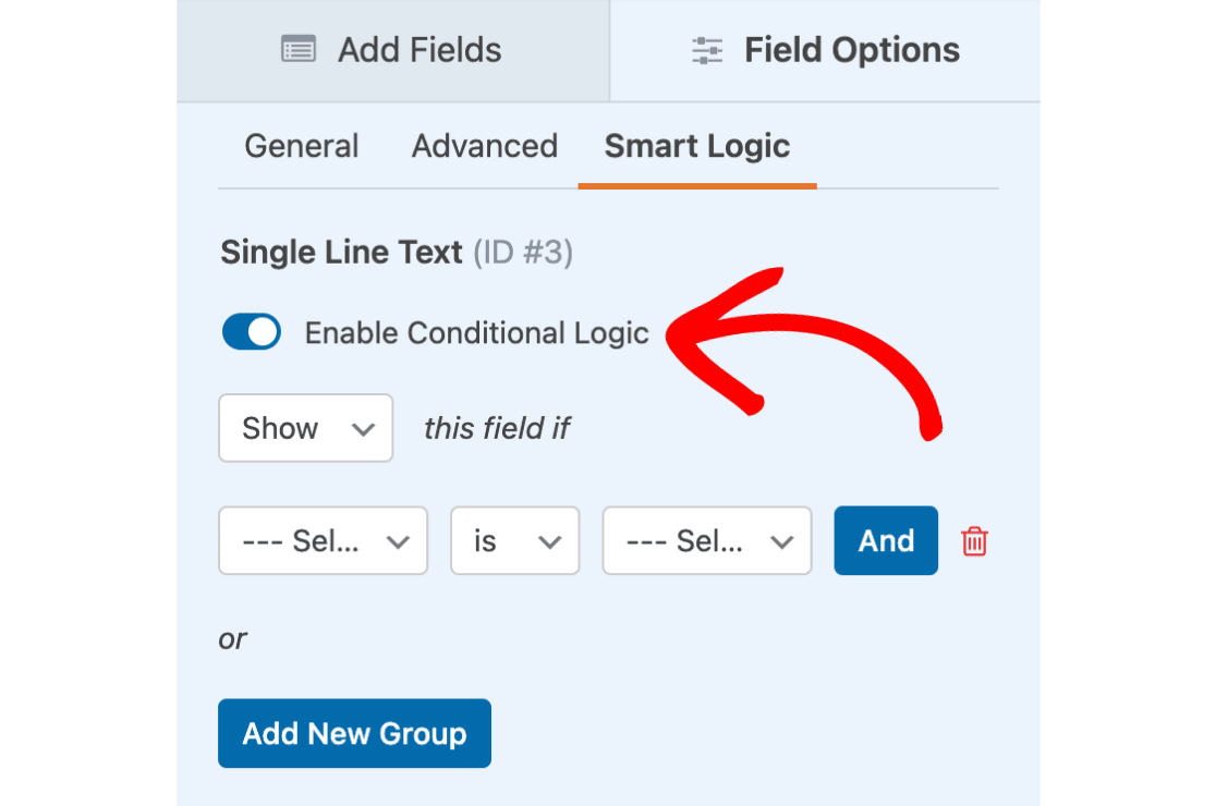
You can define your logic to be as simple or as complex as you like,
With conditional logic, your forms look cleaner, more focused, and more streamlined. So whenever you have a form where you need fields that might only be relevant to a fraction of your visitors, try to add conditional logic to deliver a better user experience.
2. Add File Upload Field for Application Forms
If you’re making a job application form, it makes sense to give applicants the ability to upload their résumé and other files directly through your form.
WPForms comes with a File Upload field that allows you to collect files through your online forms.
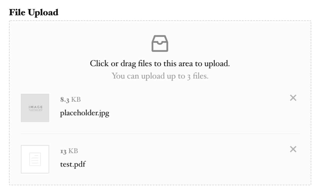
💡 Pro Tip: To keep file uploads secure, set size limits and acceptable file types. This ensures that your server isn’t overwhelmed with large files and only accepts formats you can process. See our guide on creating file upload forms for more details.
When a user submits an entry, you can easily access the files they submitted while also viewing the rest of their application details from the same interface.
This is good for keeping your applications organized with the complete files and details of each applicant stored separately within your WordPress dashboard.
Besides, it simplifies things for applicants because they can provide all the details and attach any documents they need from the same place.
3. Stop Spam Submissions With Custom CAPTCHA
Form spam is a major issue that every website has to deal with. While Google’s reCAPTCHA has helped combat contact form spam, it can also be privacy-invasive and frustrating for users to solve its image challenges.
WPForms is equipped with plenty of anti-spam tools other than reCAPTCHA. One effective method that’s also very user-friendly is to use custom captcha.
WPForms’ Custom Captcha addon allows you to create a simple question and define its answer. This can be something as simple as a math sum, which humans can solve effortlessly but spam bots typically fail to.
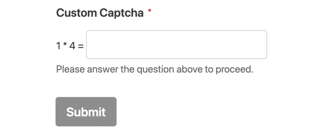
Check out this guide on creating spam-free WordPress contact forms to learn more ways to prevent unwanted form submissions.
🎩 Pro Tip: Custom CAPTCHA questions can be tailored to your audience. Use simple, relevant questions that your typical user can answer easily but bots cannot. Can’t think of any good ones? Try these AI prompts for inspiration.
4. Capture Variable Amounts of Data with Repeaters
Repeater fields are very useful when a website doesn’t know how many times a visitor will need to fill out the same type of information. For instance, adding details of multiple attendees to an event or inserting additional rows of fields to add job experience registrants.
The repeater field is the perfect example of a user-centric element because it gives control to the visitor, letting them create multiple copies of the same kind of field as needed.
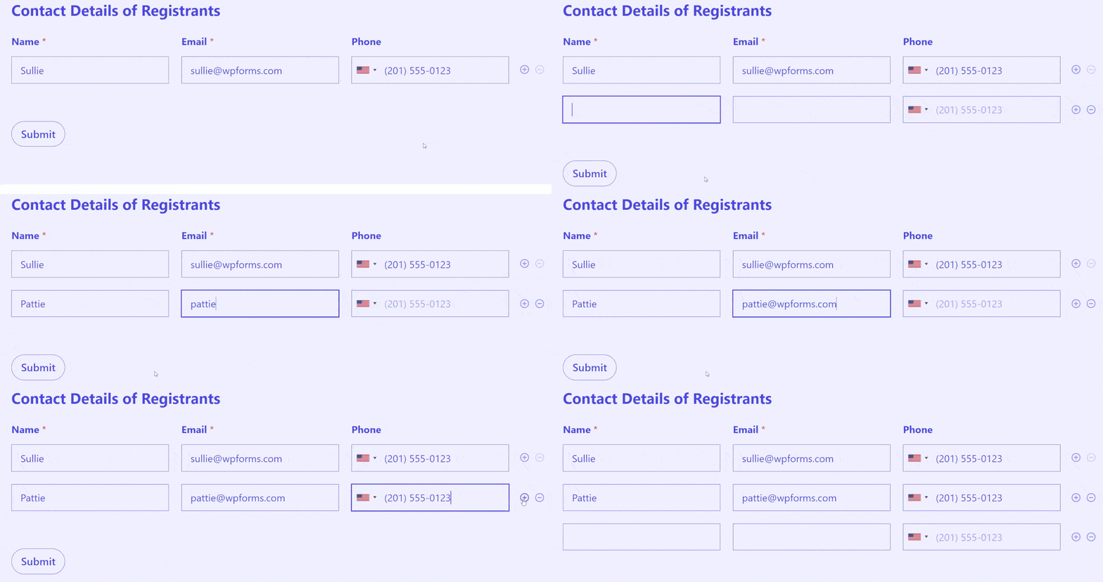
When configuring your form with a repeater field, you can set the maximum and minimum number of times a visitor can duplicate the repeating section of your form.
In addition, you can choose multi-column layouts for the repeater and select whether it should display as larger blocks or single rows.
Because repeaters are dynamically interactive, they’re powerful elements to include in your forms to enhance the user experience.
5. Use Professional Form Styles
A well-designed form reflects the professionalism of your brand and can lead to higher completion rates. One impactful way to improve your form design is by using custom styles matching your brand.
WPForms gives you the flexibility to customize every important element of your form individually without any code. That means you can customize the color and shape of your submit button, field labels, field borders, form container, background, and more!
If you’re looking for a quicker yet equally impressive solution, there’s another option – ready-made form themes.
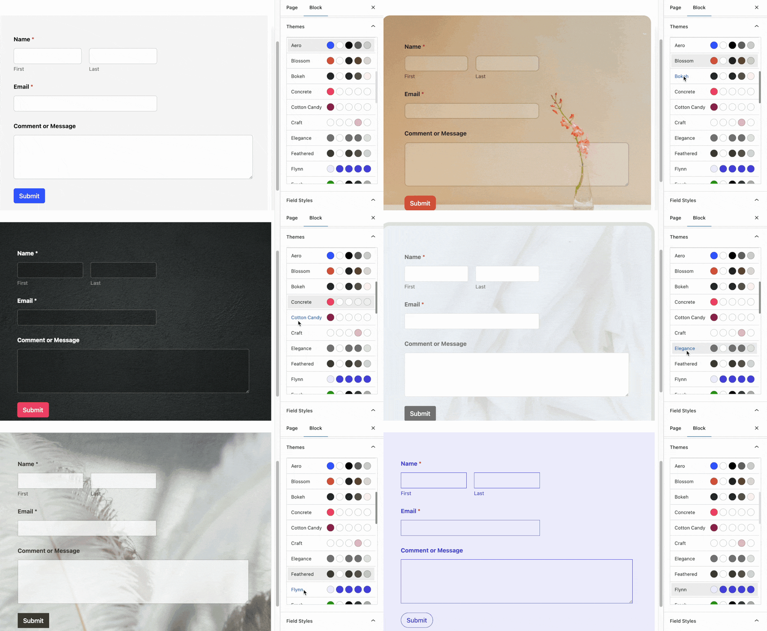
There’s absolutely no reason why your forms should look plain and boring.
So don’t be shy to experiment with different styles, and you’ll be catching the visitor’s eye far better than before.
6. Let Visitors Choose Custom Donation Amounts
When collecting funds on your donation landing page, you don’t want to force them to give a certain amount. Instead, it’s better to provide them with the freedom to choose how much they’d like to donate depending on what’s manageable for them.
WPForms offers different types of payment fields. The Single Item field can be set to accept user-defined input, which allows a user to enter any donation amount of their choice and get charged for exactly the same.
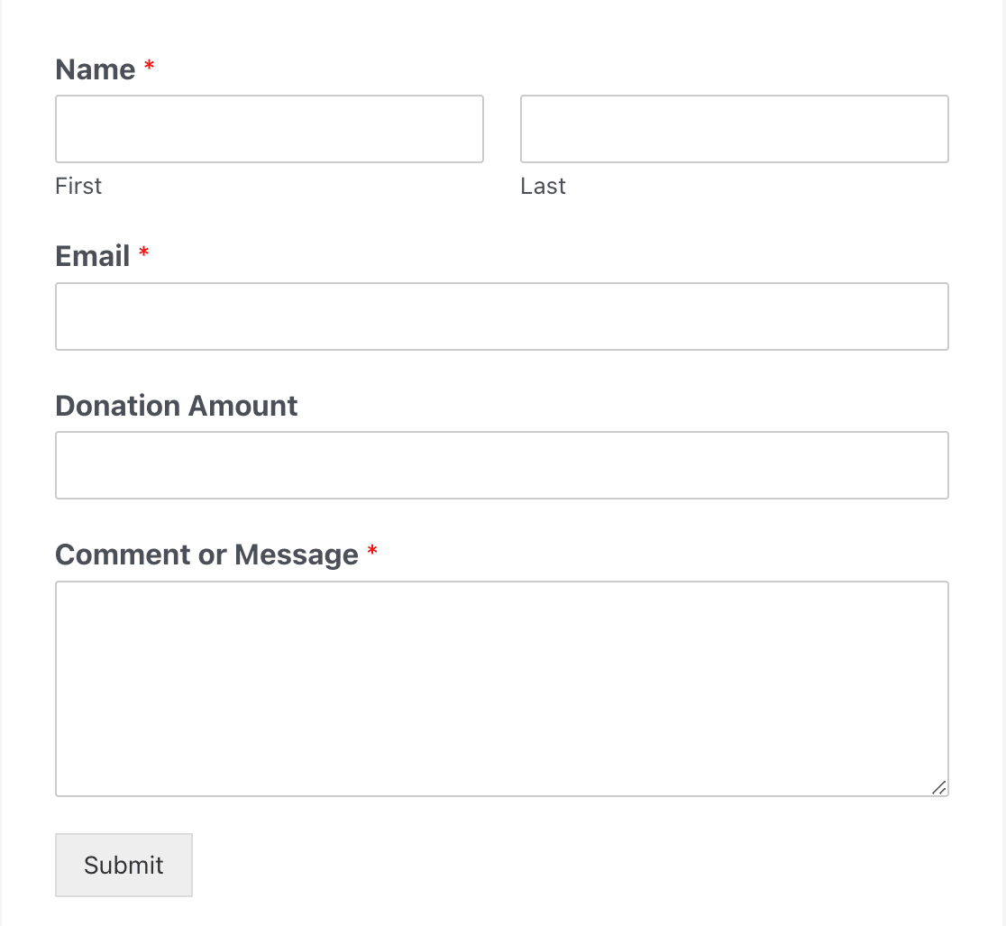
As a non-profit organization, your donation page should encourage visitors to contribute in whatever way they can, and specifying fixed donation amounts can sometimes restrict them from freely making donations.
7. Leave Some Fields as Optional
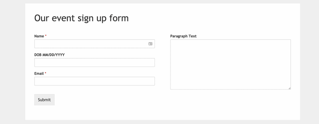
You should always strive to keep your forms as short and simple as possible. This means ensuring that you only mark those fields as required which are absolutely necessary for your needs.
Marking too many form fields as required is a bad design practice and can turn off visitors who want to fill out the form quickly.
In WPForms, you can mark any field as required or leave it optional using a toggle button from Field Options.
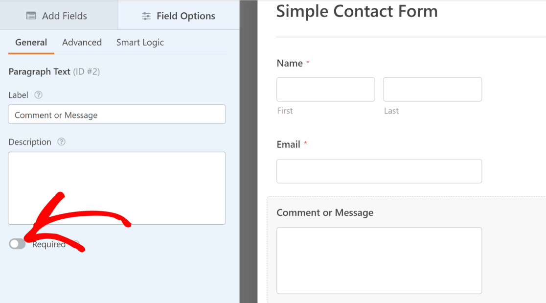
If you want visitors to fill out more information, you can mark the optional ones instead of marking the required fields.
8. Condense Forms Into Multi-Column Layouts
Sometimes, you want a form to take up as little space as possible. This is especially true when you’re adding a form to a blog post or widget area.
When you don’t have a lot of room for your form, it can help to use a multi-column layout. WPForms makes this easy with the Layout field.
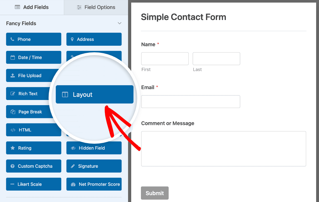
Once you drag it onto your form, you can choose a layout in the Field Options tab.
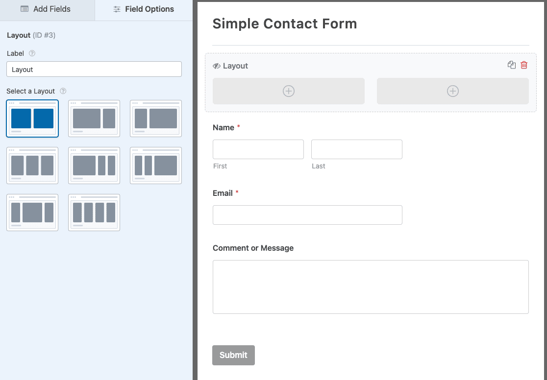
Then drag your form’s fields into the columns to create your custom layout.
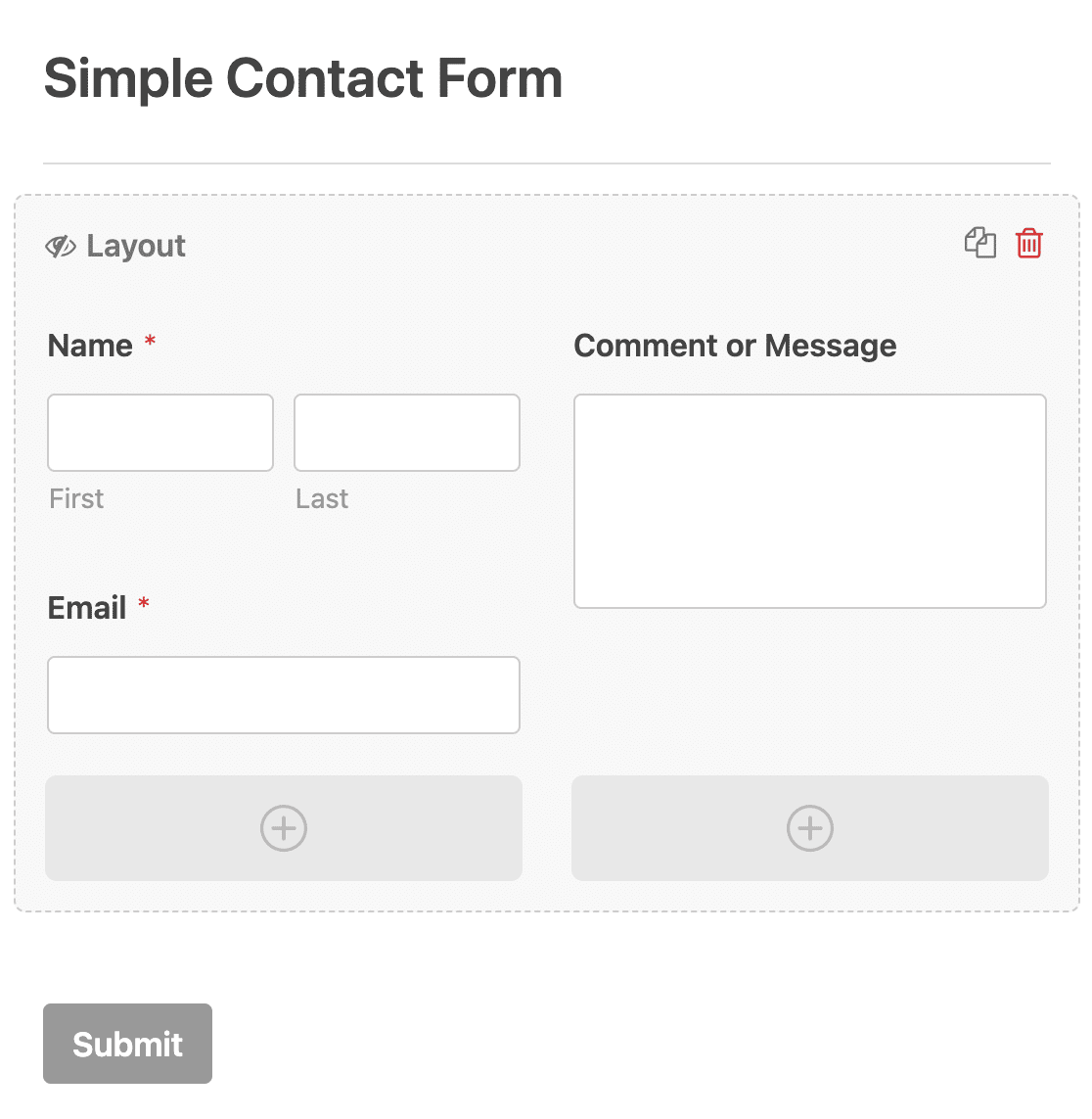
This is a great design choice if you want to add a contact form to your website’s footer. For more form layout ideas, take a look at our guide to form layout best practices. And, since there may be instances when a single column layout is what you’d prefer, be sure to explore our single column form examples and inspiration.
9. Use the WPForms Smart Phone Field
To boost conversions, you must make the form-filling process effortless, requiring the fewest clicks and button presses from the user.
WPForms’ Phone field can automatically display the correct phone number format based on your geolocation. So, no matter where your user is from, the Phone field will automatically add the phone number format used in the visitor’s country.
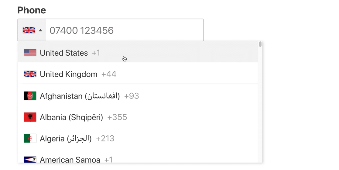
It’s a simple convenience, but your users will certainly appreciate the personalized experience of having their correct country code pre-filled by your form.
10. Use Address Autocomplete
Address autocomplete is another feature that can greatly enhance the user experience for your web forms, making it faster for the users to fill in their addresses.
This is an easy way to help your visitors save time so that it can reduce form abandonment.
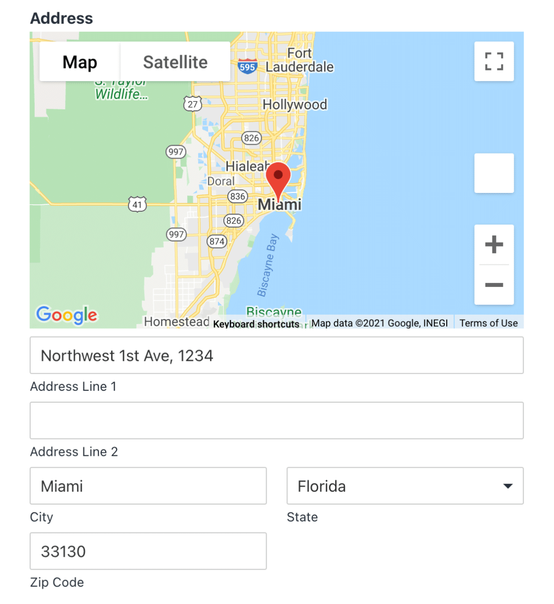
WPForms works really well as a geolocation plugin for WordPress as it is capable of detecting the location of your users while also allowing them to pinpoint their location on an interactive map.
You’ll need the WPForms Geolocation addon to access this functionality. WPForms can integrate with Google Places or Mapbox to enable geolocation features for your forms.
11. Use Multi-Page Layout for Longer Forms
Long forms can be overwhelming for your visitors. One of the best long web form design practices is to split your forms into multiple pages. This is really good for conversion because they manage to hold the user’s attention for a longer time.
WPForms’ multi-page layout also adds a progress bar to the form, which effectively encourages users to get over the finishing line and complete the form. This makes a big impact on improving conversion rates for longer web forms.
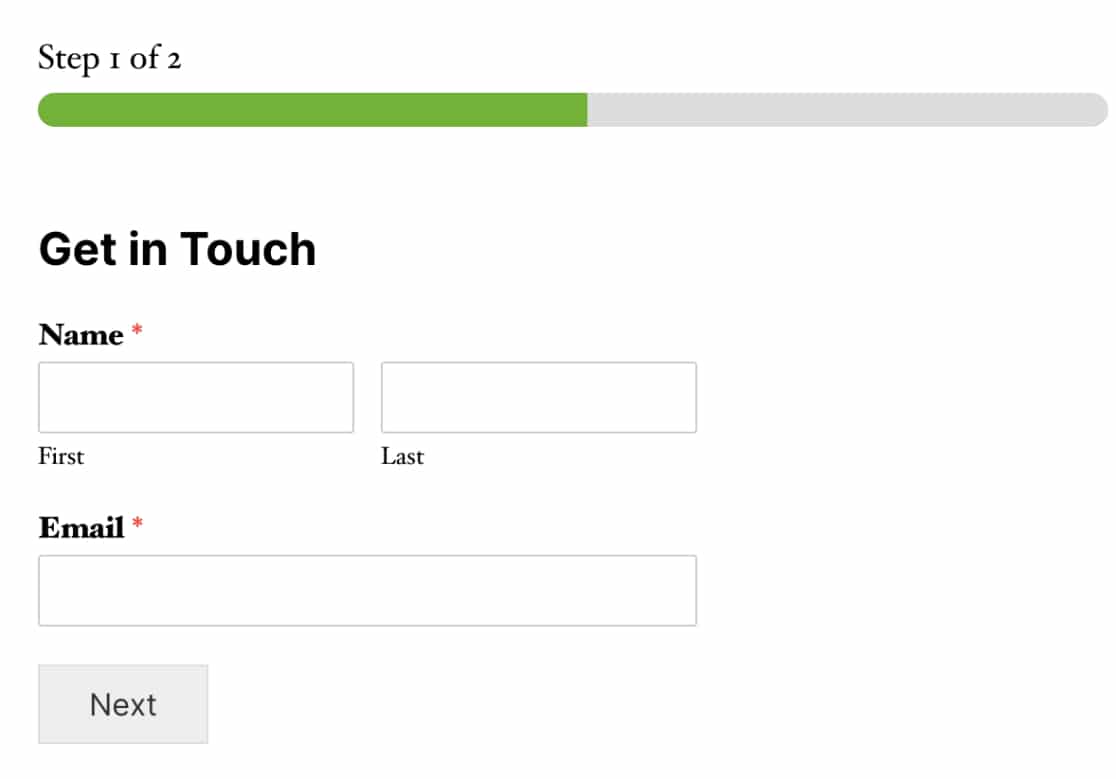
A good rule of thumb is to include no more than 3-4 fields on a single page of your web form. Here’s a guide to creating multi-step forms in WordPress.
12. Use the Right Type of Field for a Given Purpose
Web forms typically contain different types of fields depending on the nature of the question that the field is asking.
For instance, the Multiple Choices (also known as radio button) fields are great when you want users to make only one selection from a list of various available options.

On the other hand, checkbox fields are great if you’d like a user to select one or more options from the available choices.

And the Dropdown field is most suited when you want to condense multiple options into a single dropdown menu that only expands when a user clicks on it. This is great if you want to reduce the vertical scroll of your form.
Like the Multiple Choices field, you can select only one option at a time from a dropdown field.

If you want to know more about radio buttons and checkboxes, check out our article on radio button vs. checkbox fields.
And there you have it! These are some time-tested web form design practices that top marketers have been using to boost conversions.
Use these in the next web form you design, and you’re likely to see an impressive completion rate for your forms!
Next, Apply Landing Page Form Best Practices
When someone visits your landing page, you have one shot at converting them, so your form needs to be designed for maximum impact.
Check out this article on great landing page form best practices to learn how to get great results with your landing page and avoid losing valuable leads. You might also be interested in learning how to show a confirm email address field on WordPress forms.
And, you can check out this Gravity Forms vs Typeform vs WPForms comparison to learn which form builder is the best suited for your business.
Ready to build your web form? Get started today with the easiest WordPress form builder plugin. WPForms Pro includes lots of free templates and offers a 14-day money-back guarantee.
If this article helped you out, please follow us on Facebook and Twitter for more free WordPress tutorials and guides.

