AI Summary
Do you want to keep your form simplified so that users are more likely to complete and submit it? A single column form might be the design you’re looking for.
And if you need some examples and inspiration, I’ve got you covered. In this post, I’m sharing the ideas and design tips for creating single column forms that our team has curated after building hundreds of forms with our drag and drop form builder.
Let’s get to it!
Single Column Forms: Examples and Inspiration
A Quick Look at Single Column Forms
Single column forms are forms that have their fields arranged in a single, vertical line, one after the other. Each form field spans the full width of the form container, so users can focus on one field at a time as they move from the top of the form to the bottom.
Here are some key characteristics of single column forms:
- Linear Flow: Fields are organized in a straightforward, linear sequence, making it easy for users to follow and complete the form without confusion.
- Simplicity: The single column layout eliminates the complexity that can come with multiple columns, making the form appear less daunting to users.
- Mobile-Friendliness: Single column forms naturally adapt to various screen sizes, especially mobile devices, since they require less horizontal space. This responsiveness guarantees an uninterrupted user experience across all devices.
- Focus and Clarity: With each field spanning the full width of the form, users can easily concentrate on one task at a time. This reduces the chances of errors and improves completion rates.
- Ease of Scanning: The vertical alignment allows users to quickly scan the form, which can be particularly beneficial for shorter forms like contact or signup forms.
- Better Usability: The straightforward layout is user-friendly — it’s easy to understand and complete — which can lead to higher submission rates.
These characteristics make single column forms an ideal choice for many types of forms, but especially those where simplicity and ease of use are top priority.
Create Your Single Column Form Now
When to Use Single Column Forms
For small business owners, single column forms are popular because they are easy to design and implement, even without advanced technical skills. These forms offer consistency across different platforms, are cost-effective, and are versatile enough to be used for various purposes. So they’re a practical choice for small businesses.

But, is it always the best design choice for your form? When determining whether to use a single column layout, consider these factors:
- Form Length: Use a single column layout for shorter forms or when the number of fields is limited, as it keeps the form simple and easy to complete.
- Mobile-Users: Opt for a single column layout if your audience primarily accesses your site though mobile devices, since these forms ensure a responsive user experience across all screen sizes.
- Accessibility Needs: If accessibility is a priority, single column forms are generally easier to navigate for users with disabilities. So they’re a better choice for promoting inclusivity.
Did you know? All of the form templates offered free to WPForms Lite subscribers are single column forms.
Single Column Form Design Tips
One of the main purposes of single column forms is to offer a simple design that users can easily fill out.
When forms are easy to understand and complete, users are more likely to submit their information — leading to higher conversion rates. Add to that clear labeling, logical field order, and minimal required fields to reduce user frustration and enhance the overall experience, which also encourages repeat interactions.
Also Read: How to Create a Custom Data Entry Form in WordPress
Use WPForms
All of the examples and inspiration I’m sharing here are created with WPForms, and we provide incredibly useful tools and features to help you build the best single column forms for your website.
Not only do we offer hundreds of single column form templates that are designed for you to start using right away, but we also encourage you to utilize our drag and drop form builder to create your own single column form.
With the single column option available within the Layout field, you can quickly organize your entire form into a single column, or use this field to keep certain portions linear while organizing other parts into multiple columns.
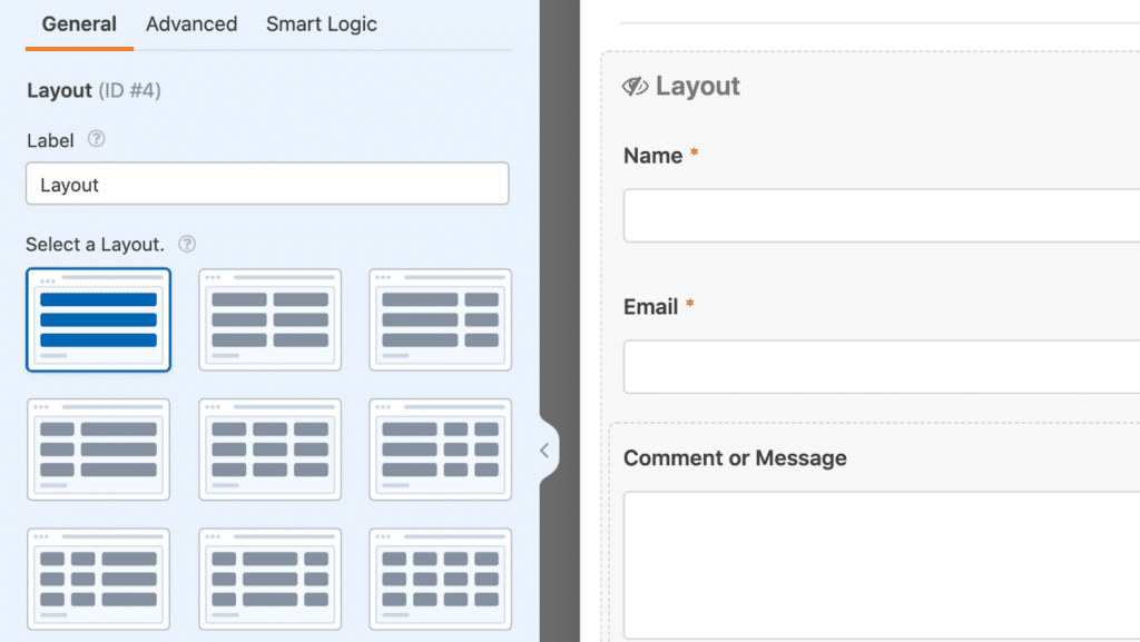
That said, you can also organize your form fields in linear fashion by simply not using the Layout field — the fields will automatically go into a single column when you drag and drop them onto your form.
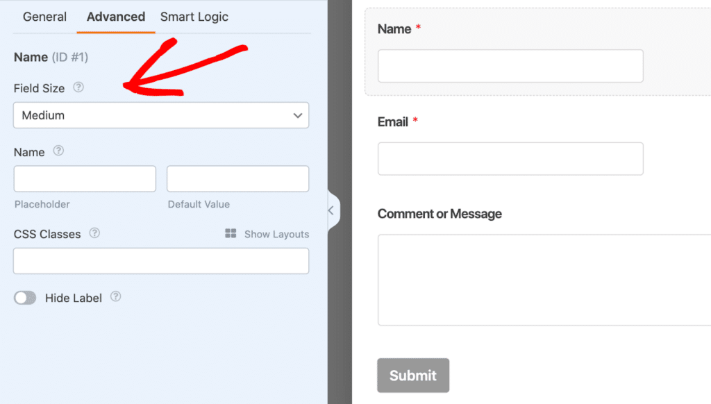
You just might want to adjust the field size of those which don’t span the width of the of your form. Set the field size to Large and it will!
Did you know? With the WPForms Lead Forms addon enabled, fields used on these forms are automatically formatted to span uniform widths of the screen.
Reduce Form Fields
In general, it’s a good idea to eliminate any unnecessary fields and information that are on your form. That’s the case with single column forms, too. Striving for simplicity is one of the intentions of these forms, so consider reducing the number of fields (only if and where you can) to enhance the user experience.
Don’t know which fields to keep and which ones to get rid of? Keep these tips in mind:
- Prioritize Essential Information: Focus on the fields that are absolutely necessary for achieving the form’s purpose, and remove any fields that don’t contribute directly to your goal.
- Use Conditional Logic: Employ conditional logic to only display certain fields when they are relevant, hiding unnecessary fields unless specific conditions are met.
- Combine Related Fields: Where possible, merge related fields into a single input to reduce the total number of fields.
- Consider User Effort: Remove any fields that require users to provide information you can easily obtain through other means, such as using location data or auto-filling based on user input.
- Ask for Information Later: If some information is not immediately necessary, consider asking for it at a later stage or after the initial submission, rather than crowding the initial form.
Optimize for Mobile Devices
I’ve mentioned the importance of mobile responsiveness so many times in this blog post that you’re probably tired of hearing about it, but it’s true! With so many website users visiting sites on mobile devices, it’s crucial to have your forms optimized for these screens.
Luckily, single column forms naturally lend themselves to mobile-friendliness. So, if you have a form on your site or love a template we offer but it utilizes multiple columns — simply hop into the drag-and-drop form builder to edit the form to one column.
Then, before you publish the form on your WordPress page, select the mobile preview option to see what your form looks like on smaller devices.
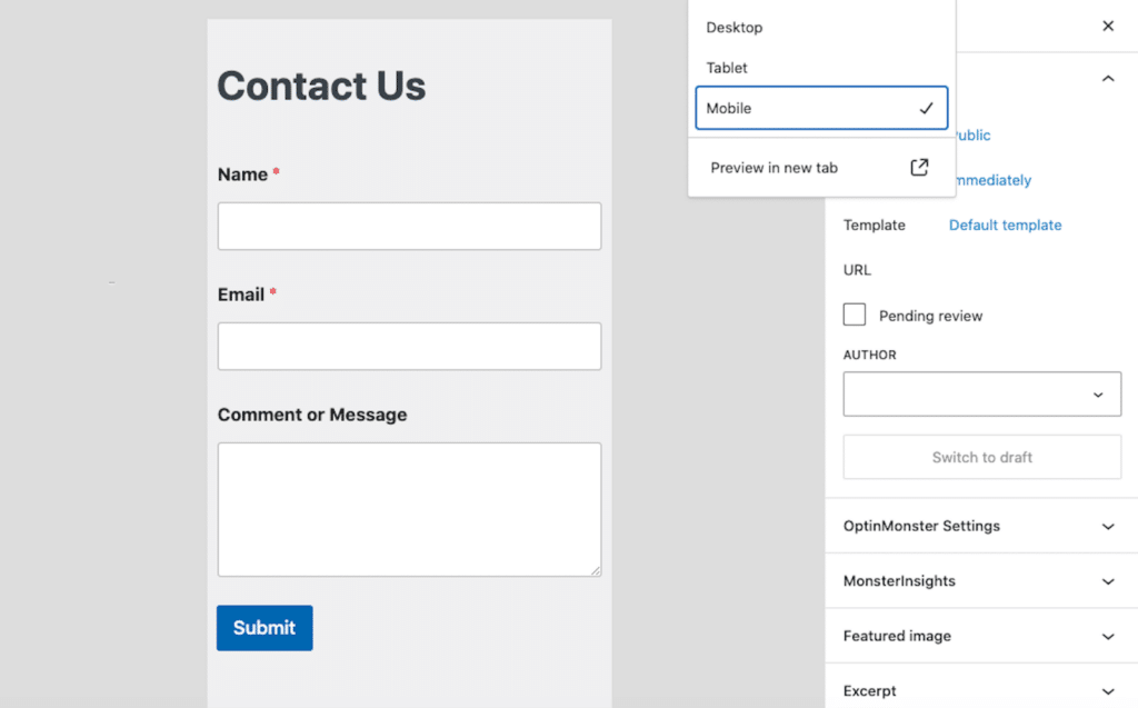
Really, it’s probably a good rule of thumb to preview any of your forms with the mobile view before publishing. You might discover that your multi-column form might be better suited in a single column format.
Write Clear Field Labels and Descriptions
Within each form field’s settings, you have the ability to customize the label and description, as well as other options for including instructional text.
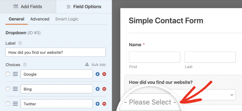
It’s important that these labels and instructions guide users smoothly through the form, without visually cluttering up the form fields.
To help users avoid confusion and reduce errors, you might consider adding placeholder text to your form fields. This provides visitors with guidance on how to fill out the form, either by offering instructional text or showing an example of the expected input.
Examples of Effective Single Column Forms
Now that you have a better idea of the functionality and uses of single column forms, lets take a look at some of these forms in action.
Contact Forms
Single column contact forms are short and sweet. They don’t require many fields to function, and are organized in a visually appealing way.

In the contact form above, the Content field is utilized first to include directions for the form user. The Name field has been simplified to one line, and each field on the form is housed within a single column of the Layout field.
Don’t forget that our template gallery offers many contact form templates just like this one!
Newsletter Signup Forms
Newsletter signups are another type of form that usually don’t include a lot of fields and are left fairly simple. All you need for a newsletter signup form are the Name and Email fields.

In my newsletter signup example, I’ve left the Name field as-is, which breaks the field into the first and last name (rather than the simple version like in the contact form above). So, for mobile users, these two text boxes will be stacked on top of each other.
That said, this is still a single column, since I didn’t utilize the Layout field at all with this form. I did, however, adjust the field sizes to Large as I mentioned in the design tips earlier.
Order Forms
Here is an example of a pet supply order form. While there is a quantity option displayed with each of the product selection fields, this form is a also single column design.

This linear flow is user-friendly for users, so they’re more likely to submit the form. And when that form is an order form, that means your site visitor converts from shopper to customer!
Order Form Pro Tip: Arrange the fields in a natural, sequential order that aligns with the user’s thought process, such as following the product selection with contact information, followed by shipping details, and then payment information.
Feedback Forms
Feedback forms should utilize a single column design if the form includes rating fields, surveys, polls, or other interactive features that could become easily crowded with multiple columns.

In this feedback form example, I’ve also employed conditional logic to keep this single column from running too long.
If users select the Dine in option, they will fill out a survey based on that experience. If they select Delivery, different questions are provided.
Lead Generation Forms
Lead forms advance one screen at a time, with only one or a few fields at a time. These are a unique example of single column forms, but I’ve included it here due to the fact that a form must be organized this way to enable to Lead form functionality.
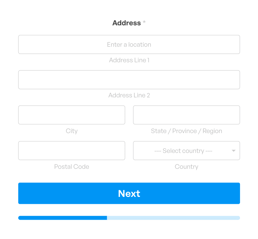
As you can see above, a few elements of the Address field are separated into side-by-side portions, but the overall layout of the form is a single column.
Appointment Booking Forms
It’s a good idea to organize appointment booking forms in a single column because many form users will be looking to schedule their appointments from a mobile device.

The form example above utilizes a single column so that it looks good on a cell phone.
And, while the Date and Time fields can be contained to a single field with side-by-side boxes — which would automatically adapt to mobile screens — I’ve separated them here into 2 fields. Similarly, the preferred communication method options can be organized in-line or into columns that are mobile responsive, but they are left in one column for this example.
Login Forms
Forms on pages where users log in to a website are another type where you can expect to see a single column design. These forms are super simplified because they really only require 2 pieces of information — username or email and a password.
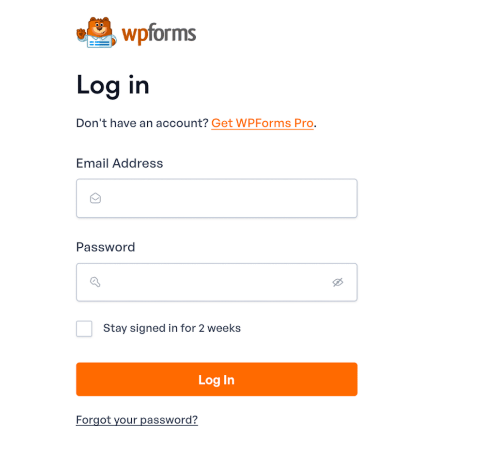
That’s the login page above we use here at WPForms. Isn’t it nice?
And that wraps it up! These examples just scratch the surface of all of the reasons and ways to use single column forms. In fact, every single form you publish on your site could use a single column layout, if needed. They’d be guaranteed to be mobile-friendly, that’s for sure!
Create Your Single Column Form Now
Single Column Form FAQs
Whew, we’ve covered a lot of ground! To recap, check out these frequently asked questions for a summary of highlights:
What are single column forms?
Single column forms have their fields arranged in a single, vertical line, one after the other. Each field fills the full width of the form, so users can focus on one field at a time as they move from the top to the bottom of the form.
Why use single column forms in web design?
Single column forms are ideal in web design because they offer a clean, straightforward layout that promote a positive user experience by guiding users through each field in a logical, linear flow.
This simplicity not only makes forms easier to complete, especially on mobile devices, but also improves accessibility and reduces the likelihood of user errors, leading to higher completion rates.
How do I create effective single column forms?
To create effective single column forms, start by focusing on simplicity—include only the essential fields to keep the form concise and user-friendly.
With WPForms, you can easily drag and drop fields into a single column layout, creating a clean and organized flow. Customize labels, placeholders, and form descriptions to guide users smoothly through the process.
Be sure to also take advantage of WPForms’ responsive design features so that your form looks great and functions well on all devices, especially mobile.
Next, Check Out These Additional Layout Design Tips
A single column layout is just one of many different ways to design your forms. With WPForms, the customization options are nearly endless! But if you’re looking for some tips to get started, take a look at our suggested best practices for user-friendly design.
Ready to build your form? Get started today with the easiest WordPress form builder plugin. WPForms Pro includes lots of free templates and offers a 14-day money-back guarantee.
If this article helped you out, please follow us on Facebook and Twitter for more free WordPress tutorials and guides.

