AI Summary
Do you want to change the look of your forms’ buttons?
WPForms allows you to customize button styles using built-in styling controls in the block editor or via CSS.
Customize Form Button Styles Now!
In this article, we’ll show you how to customize button styles using both methods. See which one works for you!
In This Article
How to Customize Button Styles in WPForms with CSS
Before we start, you’ll need to install and activate the WPForms plugin on your site. Also, you’ll need to create at least one form. See our tutorial on creating a simple contact form as an example to get started.
Option 1: Making Sitewide Customization (CSS)
Customizing button styles of your form buttons is pretty easy once you have the CSS code you want to use. If you like, you can just copy and paste one of the examples below or even combine them.
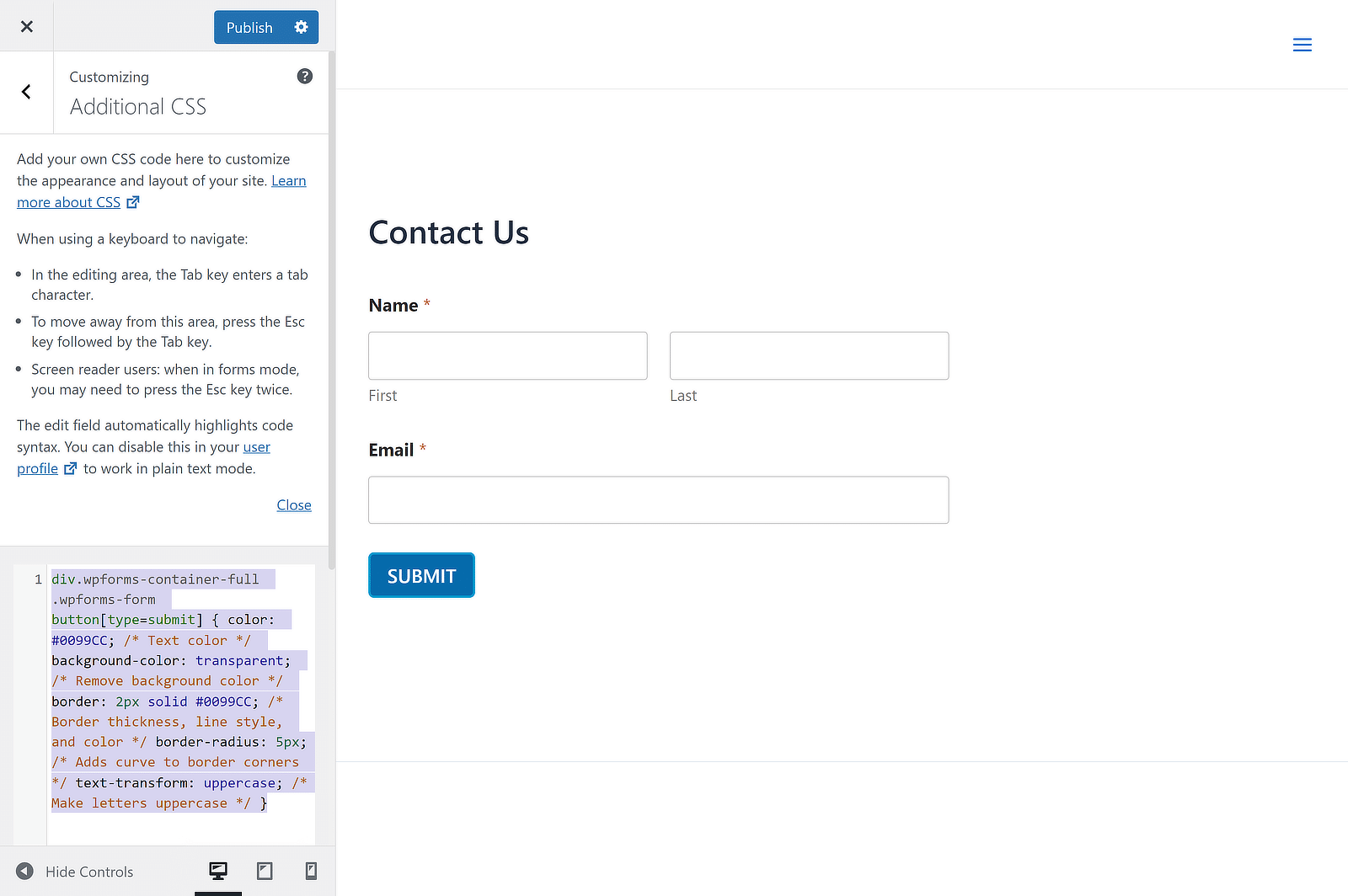
The code snippet must be pasted into your Additional CSS section in the Customize panel. This can be done by navigating to Appearance » Customize » Additional CSS. Then just click Save & Publish, and you’re done.
An even easier method is to use a plugin like WPCode, which allows you to add different types of code snippets to your site. In this case, you’ll just need to paste the CSS code for the button style by clicking the Use Snippet button.

Now let’s take a look at a few different ways to style your form buttons with CSS.
How to Create a Button With a Transparent Background
Do you want to create a transparent background for your WPForms button? Transparent background buttons, also known as ghost buttons, are a popular web design trend.
It is usually used in forms and call to actions placed on top of wide background images. Take a look at a few examples of transparent buttons on different websites.
Example #1: Transparent Form Button

Example #2: Transparent Call-to-Action Button

To create a transparent background button, all you need to do is to copy the below code snippet into your Additional CSS section.
 div.wpforms-container-full .wpforms-form button[type=submit] {

color: #0099CC; /* Text color */

background-color: transparent; /* Remove background color */

border: 2px solid #0099CC; /* Border thickness, line style, and color */

border-radius: 5px; /* Adds curve to border corners */

text-transform: uppercase; /* Make letters uppercase */

}
Here’s how the button will look:

How to Create a Button With a Color Gradient
Unlike ghost buttons, using a gradient button isn’t a new trend. However, if those multicolored gradient style buttons are best suited for your website, you can follow this tutorial.
As it’s done with CSS, you can easily scale it up or down without losing resolution. If you’re looking for a tool to create CSS for gradients, you may use ColorZilla’s gradient editor.
In the CSS below, we’ve used browser-specific styles to ensure that the gradient appears on as many different browsers as possible.
 div.wpforms-container-full .wpforms-form button[type=submit] {

border-radius: 30px; /* Curve of border corners */

text-transform: uppercase; /* Make letters uppercase */

color: white; /* Text color */

background: #0099cc; /* For browsers that do not support gradients */

background: -webkit-linear-gradient(#e5f4f9, #b2e0ef, #7fcce5, #0089b7, #0099CC, #b2e0ef); /* For Safari 5.1 to 6.0 */

background: -o-linear-gradient(#e5f4f9, #b2e0ef, #7fcce5, #0089b7, #0099CC, #b2e0ef); /* For Opera 11.1 to 12.0 */

background: -moz-linear-gradient(#e5f4f9, #b2e0ef, #7fcce5, #0089b7, #0099CC, #b2e0ef); /* For Firefox 3.6 to 15 */

background: linear-gradient(#e5f4f9, #b2e0ef, #7fcce5, #0089b7, #0099CC, #b2e0ef); /* Standard syntax */

}
Here’s how the button will look:

How to Create a Rounded Corner Button
Do you want to draw users’ eyes to the call to actions? According to some research, rounded corners enhance information processing and draw our eyes to the center of the element.
If you’re looking to attract users’ attention, you might want to test your form conversion rates by creating a rounded corner button for your WordPress form.
 div.wpforms-container-full .wpforms-form button[type=submit] {

background-color: #0099CC; /* Blue background color */

border-radius: 30px; /* Curve of border corners */

text-transform: uppercase; /* Make letters uppercase */

color: white; /* Text color */

}
Here’s how the button will look:

How to Replace Your Button With an Image
Using a graphic button is probably the easiest way to customize the button of your form.
You can easily find several graphic buttons to download and use on stock photo sites. Then you can replace your form’s button with a graphic button.
Make sure to upload the button graphic to the media uploader by going to Media » Add New. Then replace the below URL with your image URL:
http://yoursite.com/your-image.jpg
div.wpforms-container-full .wpforms-form button[type=submit] {

background-image: url(http://yoursite.com/your-image.jpg);

background-repeat: no-repeat;

background-size: cover;

background-position: center;

color: transparent; /* Hide the 'submit' text */

border: none; /* Remove the border */

}
How to Create a Multi-Line Button
Before submitting your form, your users will have several questions on top of their minds. To boost conversions, you can answer those questions with the appropriate copy in or around your button.
When creating a button for your form, look at it through the eyes of your visitors. It helps you to write the appropriate copy for your button geared towards conversion.
In most cases, to include all those details in your button you’ll have to create a multi-line button. Here’s how to create a multi-line forms button in WPForms.
 div.wpforms-container-full .wpforms-form button[type=submit]:after {

content: 'Second line text'; /* Text for second line of button */

display: block; /* Puts this text on its own line */

font-size: 10px;

margin-top: 5px; /* Add distance from first line of text */

font-weight: normal; /* Remove bold style */

}
Here’s how the button will look:

Option 2: Customizing a Button Style Individually
What if you just want your new style to be used on a single WPForms form, but not every form on your site?
If you prefer to change the button style of an individual form button using CSS, you need to find the unique ID of your form.
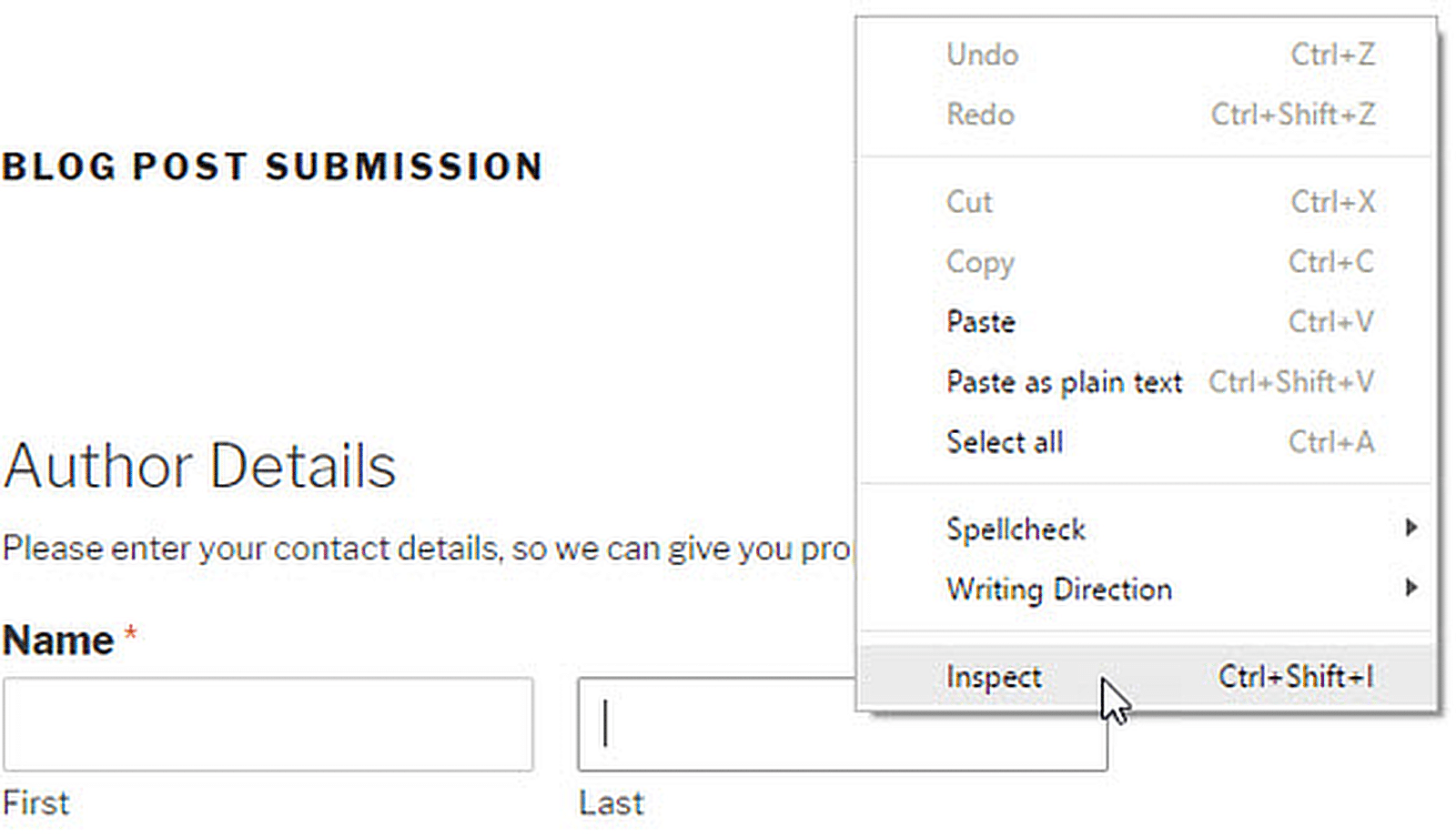
First, open a page containing the form you want to modify. Take your mouse to any field in the form, right click » Inspect Element.
The browser screen will split, and you will see the source code of the page. In the source code, you need to locate the starting line of the form code.
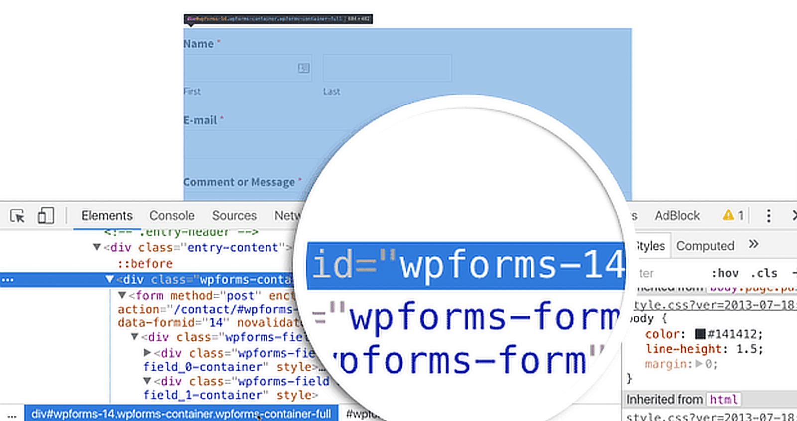
As you can see in the screenshot above, our contact form code starts with the line:
div class="wpforms-container wpforms-container-full" id="wpforms-14"
We will use this ID in our CSS to style our contact form. We will replace .wpforms in our first CSS snippet with #wpforms-14.
The id attribute is a unique identifier generated by WPForms for this particular form, so the style won’t apply anywhere else.
For example, you may simply insert the following snippet at the beginning of the first code snippet.
div#wpforms-14 {background-color: transparent; !important}
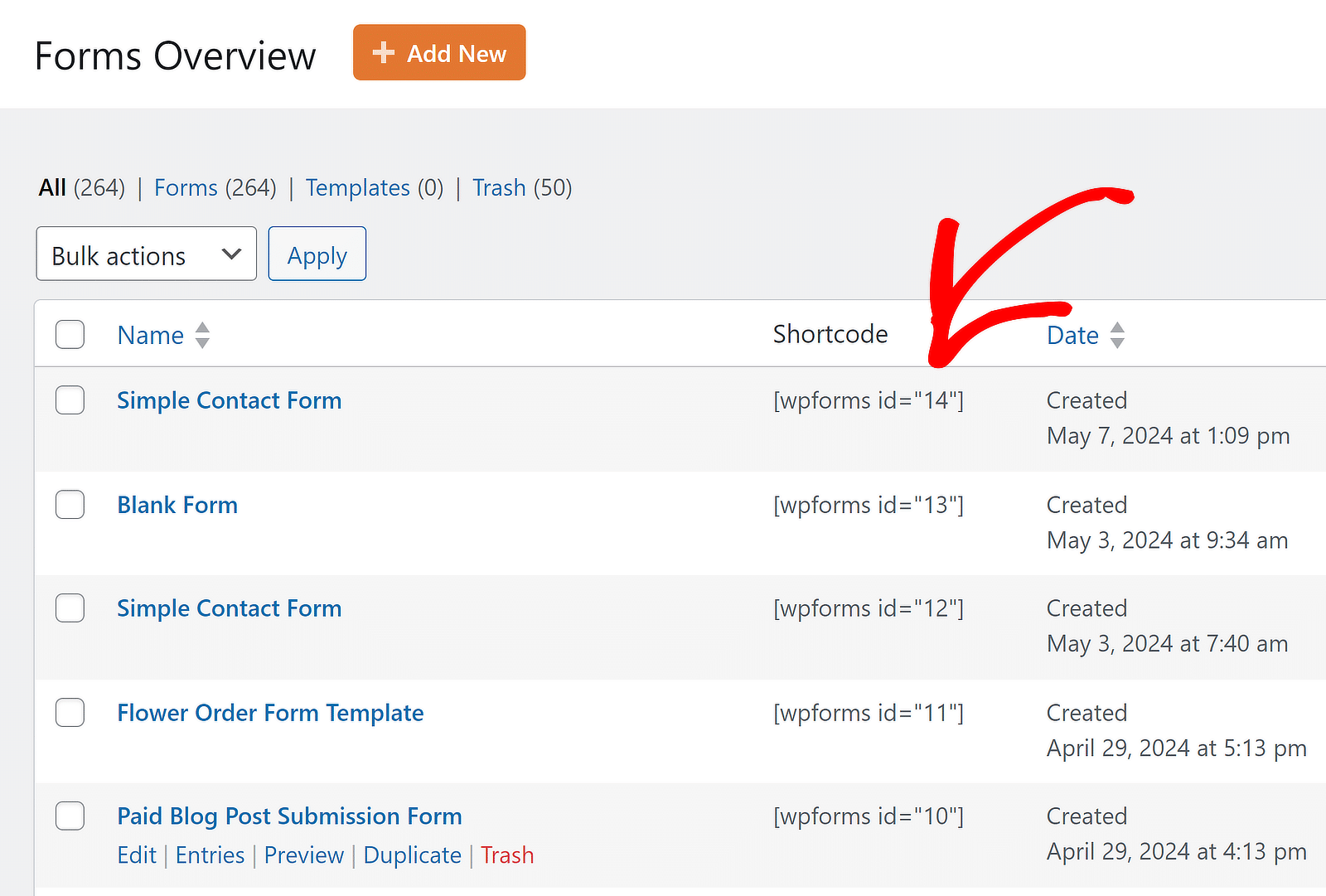
For a more direct method to locate your form ID, just head to All Forms and locate the Shortcode column. You’ll find the form ID here within no time.
Customize Form Button Styles Now!
How to Customize Button Styles Without CSS
Before adding CSS, consider whether the built-in styling controls in WPForms will help you achieve the button style you want more easily.
This post on how to style contact forms in WordPress explains more about WPForms’ no-code form styling options within the WordPress block editor.
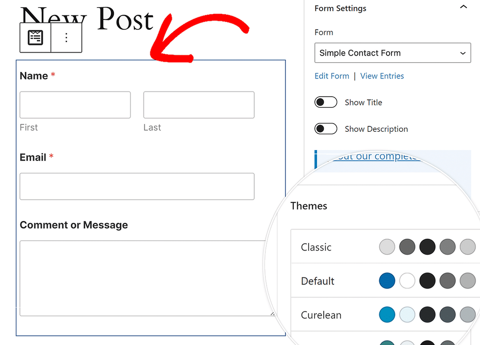
The process is simple. Open up a form, and in the block editor, click on the form to open additional styling options for the WPForms block.
Styling Options for the WPForms Block
You can change the color theme, form fields, labels, buttons, and the container and background styles without writing any CSS in the WPForms block settings.

Access the Button Styles Settings
Under Button Styles, you can change your buttons’ size, color, border, border size, border radius, and border style. Here are the options that you can choose from.
- Size: This option tells the button what size it is. You can choose from Small, Medium, and Large.
- Border: With this setting, you can give your buttons a border that is either solid, dashed, or dotted.
- Border Size: This tells your buttons how thick their edges should be. You can choose a different unit if pixels (px) are not what you need for your design.
- Border Radius: You can change how round the corners of your buttons are to make them look softer or sharper. While pixels (px) are the standard unit, you can change it to suit your design needs.
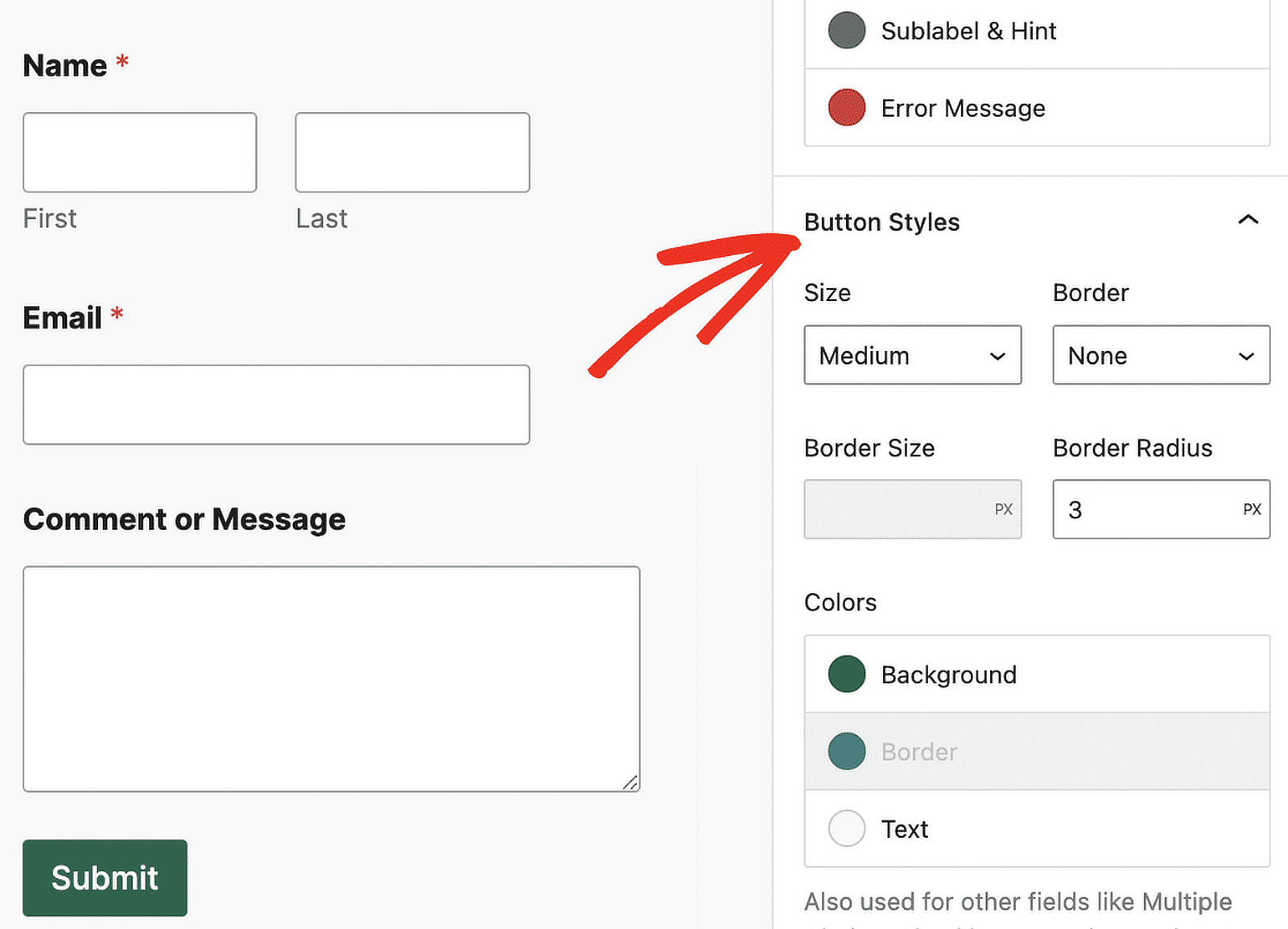
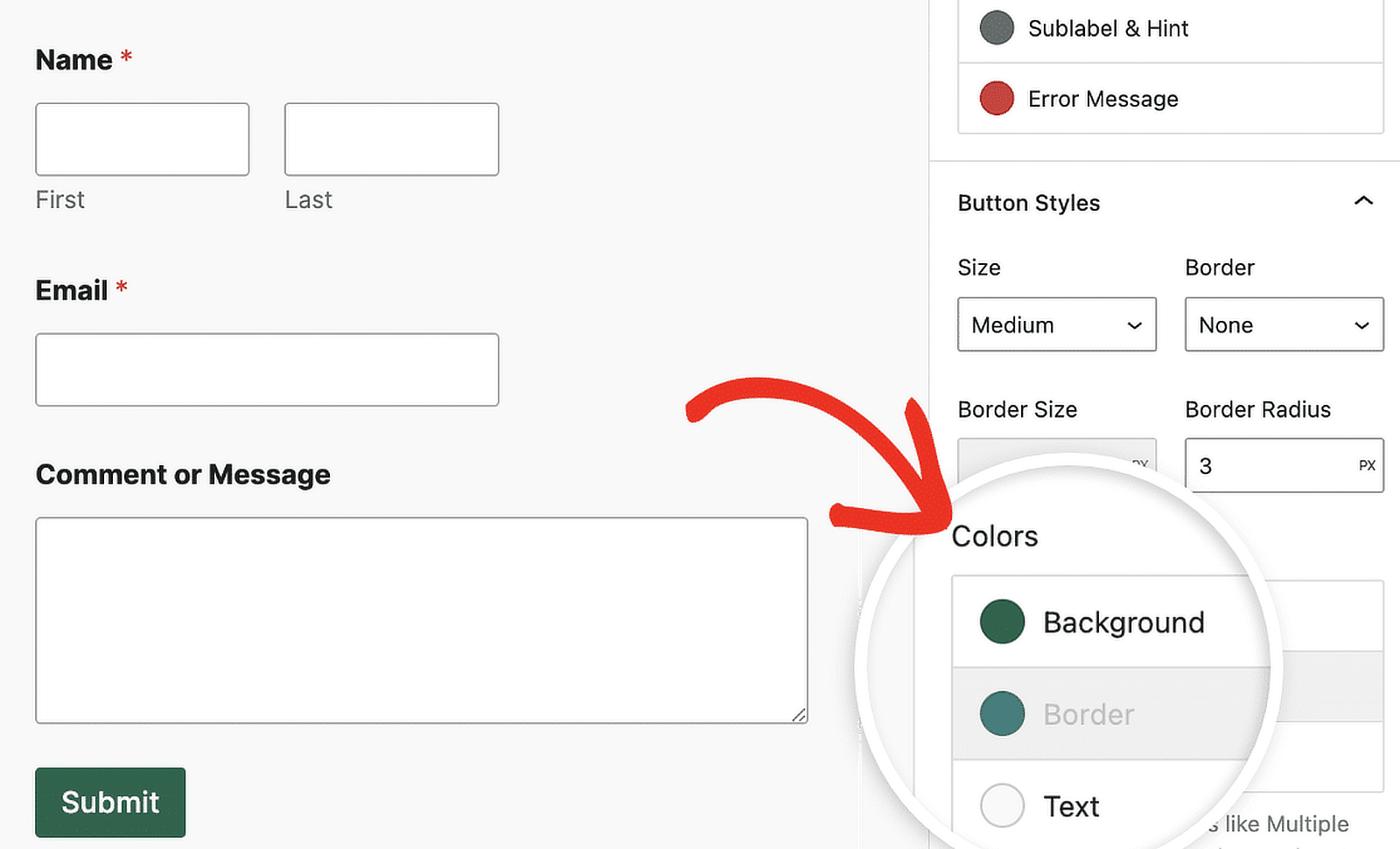
You can also change the background and text colors of your button in the Colors panel below.
Customize Form Button Styles Now!
FAQs about Customizing Button Styles with CSS
Customizing button styles is a popular topic of interest among our readers. Here are answers to some common questions about it:
How to change the styling of a button in CSS?
To change a button’s appearance using CSS, you can specify custom styles for properties like background color, border, font size, padding, and more. In WordPress, you can paste your CSS styles into Additional CSS in the Customizer.
How can I make a form with custom buttons?
To build a form with custom buttons, consider using a WordPress plugin like WPForms. It provides drag-and-drop tools to make form building easy.
For custom button styles, go to the Additional CSS section in WordPress and input your CSS code, targeting the specific form or button class names WPForms gives.
How do I customize my submit button?
To customize your submit button in WPForms, edit the form, select the “Submit Button,” and directly modify the text label. Use the Block Editor or Additional CSS to further adjust the button’s styles with custom colors, fonts, and sizes.
Next, Check Out How to Customize Your Login Page in WordPress
Now you know how to style contact forms with CSS, you might want to take a look at how to create a custom login page for your site. We’ve also got some plugin roundups to help you choose the best plugins as your site grows:
- Best SEO Plugins
- Best Social Media Plugins
- Best Backup Plugins
- Best Email Log Plugins
- Best TikTok Plugins
- Best SMTP Plugins
Create Your WordPress Form Now
Ready to build your form? Get started today with the easiest WordPress form builder plugin. WPForms Pro includes lots of free templates and offers a 14-day money-back guarantee.
If this article helped you out, please follow us on Facebook and Twitter for more free WordPress tutorials and guides.


How can a add a quantity function into a basic WP form.
I have a number of shop items that can be selected using a check box. I need to be able to allow someone to pick amounts of each item and then be able to submit it by e-mail.
Item and cost are all in one field. I just need to be able to add a button +/- next to each item.
Any ideas how I can do this easily?
Thanks
Hi Paul,
We don’t have the ability to include item quantities in quite this way yet, though it’s on our radar to add down the road!
If you’re willing to consider a modified alternative, you can leverage the Dropdown Items field to do what you’re asking for in a slightly different way — the easiest demonstration of that is to view the short video here: https://cl.ly/3Y2f3o3q1C0M. Basically, you create a Dropdown Items field for each product and fill in the dropdown options with various quantities and associated prices. This allows you to offer both multiple products and various quantities of each of those products.
I’m sorry we can’t offer quite what you’re looking for, but I hope this helps!
If you have any other questions with this, please feel free to contact us in support 🙂
These are all great examples. But how do you deactivate the shadow on hover? I just want a button that is pure text in bold caps that says “SUBMIT”. The text should change to gray on hover and active. No border, background, shadow …
Hi Gary,
Our submit button doesn’t include any shadow by default, so if you’re seeing one this is probably being added by your theme. Since all themes do this a bit differently, we’d need to see an embedded form to help remove it.
To remove all of these other styles, you’ll need a few extra lines of CSS. We have a tutorial here specifically on customizing the submit button, including hover styles. The examples shown there should walk through everything you’d need to create the custom look you’re describing.
I hope this helps! If you have any questions, please let us know! We support all paid licenses in our private support channel and WPForms Lite in our forum 🙂
I tried copying and pasting the code to the transparent button style to my Genesis Child Theme and it had no effect at all in changing the look of the buttons. Why do you suppose that is?
I followed the instructions – Appearance>Customize>Additional CSS>Save.
Thanks!
Hi Toni,
That’s a great question, and the answer can vary a lot from site to site (even within the same theme). I’d suggest starting with our How to Troubleshoot CSS Not Working tutorial, which goes through all of the most common issues and how to address them.
If you give that a shot and are still stuck, please feel free to contact us in support so we can help you troubleshoot further 🙂
I can’t figure out why this won’t work. I inputted the Code into the Customizable CSS section but the button stayed the same.
I want to make it transparent like the first transparent example you have above, but it just doesn’t register.
I also am hoping to move the actual form down further on the page but that doesnt seem to working either
Hi Jeremy,
Sorry for the trouble! Some themes make it tougher to apply custom CSS, though usually adding
!importantwill help. Here’s a simple example to demonstrate how to add this:div.wpforms-container-full .wpforms-form button[type=submit] { background-color: transparent !important; }We have a bunch more tips on getting CSS to work over in this troubleshooting CSS tutorial.
If you give these troubleshooting ideas a try and are still seeing issues, please let us know! We provide support to our paid license users here and to our Lite users here.
I hope that helps! 🙂
Just wanted to say thanks for creating this post…Great job, this helped me out a lot!
Nancy,
Really happy to see that you find the post helpful 🙂
Hi,
How can I change the height of the submit button. Its height is bigger that other buttons in Wordpress and I don’t know what css to use.
Thanks in advance.
Hi Lewis,
The easiest way to customize the submit button’s height is by adjusting it’s padding (the distance between button text and border). Here’s the CSS you’d need to do that:
div.wpforms-container-full .wpforms-form input[type=submit],
div.wpforms-container-full .wpforms-form button[type=submit] {
    padding-top: 10px;
    padding-bottom: 10px;
}
These are currently set to the default values (10 pixels on top and bottom), but you can change these to any numbers you’d like. To keep the text vertically centered, just be sure to keep both top and bottom padding to the same value.
And in case it helps, you can find our full tutorial on customizing the submit button here.
I hope this helps! 🙂
Hi,
How can I change the size of the checkboxes to make it smaller?
Thanks in advance.
Hi Lewis,
I apologize, however checkboxes are actually generated by the browser and so we’re not able to customize their size. While some themes will provide extensive code modifications to style checkboxes in custom ways, these tend to cause issues (run into conflicts on some browsers, sometimes even break some functionality, etc) which is why it’s generally avoided.
Hello @ JESS i have observed you are the rockstar here, i am currently having issue with my submit button, as soon as you mouse over the submit button, the hover colour spreads beyond the submit button and that is very ugly and not professional, how do i resolve that. I suspect it is picking up the colour from my theme, but i don’t know how to turn it off. Here is the link for better understanding. Just hover on the submit button and see the ugly effect. [URL removed]
Hi Emmanuel,
We’d be happy to help! When you get a chance, please drop us a line in support so we can assist.
If you have a WPForms license, you have access to our email support, so please submit a support ticket.
Otherwise, we provide limited complimentary support in the WPForms Lite WordPress.org support forum.
Thanks 🙂
Any plans on making an add-on pack with a few different submit button styles?
Hi Alex — We don’t currently have plans for this, but I’ve noted the idea on our feature request list. Thanks for the suggestion! 🙂
Hi there
Just wondering how we can add this to all the form fields? I have my form over an image and would like a white border around white font with transparent background. Thanks
Hi Jennifer,
Sure, so the examples above are specifically for buttons but we also have tutorials to help you style your overall forms! I’d suggest starting with our beginner’s guide (which covers adding a border, etc). Then if you’d like a bit of extra inspiration you could check out our additional style ideas (CSS included).
I hope this helps! 🙂
Hello
Is it possible to hide the submit button? I have tried different CSS but i cant make it work. I want to use the form just for info, so i dont need the button.
Thank you
Hi Nicole,
We’d be happy to help! To do this, we’d just need you to get in touch with the URL for your form (this will allow us to put together a CSS snippet for you).
If you have a WPForms license, you have access to our email support, so please submit a support ticket.
Otherwise, we provide limited complimentary support in the WPForms Lite WordPress.org support forum.
Thanks 🙂
Hi, thank you for the article. I would like to change the position of the submit button to the right side. The standard is on the left side. I can’t find any CSS description on how to do this. Could you please help out?
Thank you.
Efkan
Hi Efkan,
You can reposition the submit button to the right using the following CSS code:
div.wpforms-container-full .wpforms-form .wpforms-submit-container {text-align: right !important;
}
In case it helps, here’s a great tutorial from WPBeginner on how to add custom CSS like this to your site. 🙂
Hello!
Thanks for all of this helpful information. I still have a question, though.
I have successfully changed the background color for the submit button, and I have also successfully added a separate color on hover–and on focus, so that the color of the button changes when users tab to it.
What I can’t seem to puzzle out is how to keep the hover color in place once the button has been clicked and is actively submitting. Once a user moves the cursor away from the button, the hover color reverts back to the original color, which can make it look like the button hasn’t been clicked at all (even though the text does read “submitting . . .” ).
Is this an :active selector issue that I’m missing, or is there something else that I’m missing?
I appreciate any guidance that you can offer.
Hi Joe,
We may need to take a look at the code itself so when you get the chance, please contact our support team and we’ll look into it further and guide you through it. 🙂
i’m keen to change the background color of the validation messages. Any recommendations?
Hi Janine,
You can use the following code snippet to change the background color:
div.wpforms-container-full .wpforms-form label.wpforms-error {background-color: #FFFFFF !important;
}
And in case it helps, here’s a great tutorial from WPBeginner on how to add custom CSS like this to your site.
I hope this helps! 🙂
thanks Daisy
i tried that code to change the validation message background color and it hasn’t changed anything. It keeps presenting in the light green color it originally came with.
Any suggestions?
Hi Janine,
If you have a caching plugin installed on your site (or if your host does caching) you’ll want to clear/flush that out first and try the code again. If the problem still continues and you have a paid license, please contact our support team and they’ll take a look at it. 🙂
Hi Daisy,
I’m just following up on my inquiry about 5 posts above. As instructed, I sent my inquiry to the support team about three weeks ago, and I haven’t heard anything.
I did find a kind of workaround, but I’m still interested in knowing if it is possible to get the color of the submit button to change–and to stay changed–when forms are being submitted.
Thanks for the help.
Hi Joe,
I’m sorry for the confusion – it seems like one of our support team members did respond to your email on March 25th but we’re not sure if you ever received it (it may have been filtered out as spam/junk so it’d be worth checking in there just in case).
To summarize their response, however, unfortunately we don’t have a way of accomplishing what you’re trying to do. The issue is that the “Submitting” text is displayed by JavaScript, and does not change the CSS of the button — and so there isn’t something good to, in a sense, “grab onto” in terms of custom CSS. It might be possible to achieve by using some creative JavaScript/jQuery but we can’t provide any support for this degree of customization. I apologize for the inconvenience!
Hello, How can I make Submit button to be inline with Name and Email text boxes.
I made Name and Email test boxes inline using layout option.
Hi Mike,
I’d definitely recommend checking out our guide showing you how to display your form on a single line.
I hope this helps! 🙂
Hello! How do I change my submit button to be only a single line of text?
Now the button is huge because of two rows of text…
The contact form is made with inline as a one row form.
Hi Thomas!
Sure, you can try customizing the submit button with the custom CSS. We have a great tutorial on how to do this here.
I hope this helps!
Have a good one 🙂
Hello!
What happens when we want the Wpforms Submit button to look the same as the rest of the theme buttons?
I thought it would be enough to paste the CSS class of the primary theme button into the “CSS class of the submit button” field of the form builder.
However, the button does not change appearance at all … Should we enter the class name in any special way?
Hi Juanma.
I apologize for any confusion!
You can achive this with custom CSS. Please check this article on our site for more details.
I hope this helps!
Have a good one 🙂
Hi support team!
What CSS code should I use to change location of the button? For example, I would like to move the Submit button to the center of the form and lower.
Thanks!
Hi Jacqueline.
Please note, that custom code is out of our support scope, we can’t help with the custom code customizations or implementation.
However, I’ve checked in our system and I see that we have a suggestion to achive what you are looking for:
div.wpforms-container-full .wpforms-form .wpforms-submit-container {text-align: center !important;
}
I hope this helps.
Have a good one 🙂
Hello! How do a change the button background color for the color the button is while it is “sending” after submit is pushed? Thank you!! (^_^)y
Hi Kate — We’d be happy to help! When you get a chance, please drop us a line in support so we can assist.
If you have a WPForms license, you have access to our email support, so please submit a support ticket. Otherwise, we provide limited complimentary support in the WPForms Lite WordPress.org support forum.
Thanks 🙂
How can I change the hover background color?
Hi Francesco- Great question!
The easiest way to customize the submit button’s hover background button is by adding the CSS code as shown here in the tutorial
I hope this helps!
Thanks and have a good one 🙂
Maybe simple, but I didn’t find it:
Please, how to get the button “Submit” a function to redirect (link) to another page? So not send but redirect?
Hey Roman – Good question!
Yes, you can redirect to another page by navigating to Form Builder > Settings > Confirmation > select ‘Confirmation Type’ as ‘Go to URL (Redirect)’ > and add the confirmation redirect URL. Here is a great guide on this.
I hope this helps! Thanks, and have a good one 🙂
Please help. I have tried to change the submit button to have a radius of 5px. I don’t know if I’m inputting the CSS code wrong?
Thank you!
Hey Jillian – We’d be happy to help 🙂
In case it helps, here’s a great tutorial from WPBeginner on how to add custom CSS like this to your site.
If you have a WPForms license, you have access to our email support, so please submit a support ticket. That way we can discuss more details and investigate this further.
Thanks 🙂
Hi,
Here is my website link where I put the WPForms.
[URL Removed]
I want the “Next, Previous, Submit etc” Buttons to be the same style of my themes button.
Please help
Hey Abubakar- Thanks for reaching out 🙂
You can customize the Submit Buttons on your site by referring to this article. Also, we do have a great guide on customizing individual form fields.
If you need any help, please do not hesitate to contact our support team.
Thanks, and have a good one 🙂
Hi! Great article!
How do I add an icon on hover to the submit button? I’ve literally looked everywhere for this code and can’t find it.
Thanks!
Hey JP– Thanks for reaching out!
To do what you mentioned you can consider using FontAwesome, and one way to add Font Awesome to your site is to use the ‘Better Font Awesome’ plugin
When you’ve added Font Awesome to your site, we’ll need some custom CSS to add an icon to the Submit button, which I’ve included here
This snippet with the code ‘\f1d8’ will display a paper plan icon, and you can replace it with your preferred icon’s code by going to Font Awesome’s gallery
Hope this helps! 🙂
Hi. Using Lite version. When I hover, the button moves slightly and appears to have a white outline. The CSS I’m using:
.wpforms-form button[type=submit] {
border-radius: 5px;
box-shadow: 0 4px 8px 0 rgba(0, 0, 0, 0.2), 0 6px 20px 0 rgba(0, 0, 0, 0.19);
background-color: #024488 !important;
color: #fff !important;
}
.wpforms-form button[type=submit]:hover {
background-color: #d62598 !important;
}
How do I remove the hover focus or button moving? Thanks
Hi Kas- The CSS codes looks good to me. I suspect this to be a theme styling conflict that is causing the odd behaviour with hover styling.
In this case, please reach out to our complimentary support in the WPForms Lite WordPress.org support forum.
Thanks 🙂
Hi there,
I am looking for help on how to center align my submit button on my forms. I haven’t seen any way to do that, and the normal center align CSS isn’t working.
How do I solve this? Thanks!
Hey Seth- Please use this CSS code to center the submit button.
Hope this helps! 🙂
Hello
I have an inline-fields form, but it doesn’t accept my padding settings on the submit button, the submit text is misaligned.
I’ve already tried the options above:
padding-top, padding-bottom, and just padding – but none worked…
Can you help me?
Thanks in advance!
Hi Rodrigo- Looks like theme styling is overriding with the Form in this case.
If you have a WPForms license, you have access to our email support, so please submit a support ticket. Otherwise, we provide limited complimentary support in the WPForms Lite WordPress.org support forum.
Thanks 🙂
Hey
Absolut newbie to CSS, but I do know how to copy and paste 🙂 so..
How can I add a PayPal Buy Now, check out submit button?
Thxz for any help. Google is not being nice to me… 😉
Darren
Hi Robert! I apologize for any confusion here. PayPal buttons are specifically provided by PayPal, with code that is provided by them as well. You can refer to their documentation here: https://www.paypal.com/buttons/
In case it helps though, our plugin does have the ability to process payments with PayPal through one of our addons. It is available with our Pro level license, and you can find more details about it here: https://wpforms.com/addons/paypal-standard-addon/
I hope this helps to clarify 🙂 If you have any further questions about this, please contact us if you have an active subscription. If you do not, don’t hesitate to drop us some questions in our support forums.
How can I make the Submit button blink so people won’t overlook it on a long form?
Hey David. To achieve what you are looking for you would need to make use of animations and keyframes styles on your button. However, this is not something we are able to assist with from our end.
For further customization, we suggest you codeable or WPBuff.
Thanks and have a good one!
Dear WP Form staff,
I would like to know how I can embed a form into an Elementor button.
I have prepared the WP form already and tried to use the ‘shortcode’ embed option on the WP form. However, when I copy and paste the shortcode to the button URL using Elementor, it redirects it to a blank page.
Can you please help me with that without the need to upgrade to a paid plan (either on WP Form or on Elementor)?
Thanks
Hi Reni- Here is a complete guide to embed WPForms on an Elementor Page.
Hope this helps! 🙂
Buenas tardes, mi pregunta es la siguiente:
Como puedo configurar los campos para que en vez de que me salga un rectángulo, en el que se escribe, salga una línea continua.
Gracias
Hey Marcos, In order to make sure we answer your question as thoroughly as possible and avoid any confusion.
Would you mind reaching out to us with additional details so that we can help you further on this case?
Thanks.
Can you change the Confirmation Redirect URL code so the link opens in a new window?
Hey Allison, to achieve this, you will need to implement some custom code, and here is our developer’s guide on the same
Since we what you are looking for would require some custom code we’re not able to provide support for the custom development that would be required. In case it helps, you could consider looking into a service such as Codeable or Upwork for potential developer options.
Thanks!
Hi, WP Forms Staff! I love WP Forms and I’m currently creating a smart form using conditional logic options. Love this, btw. To make my form perfect though, is there a way to apply the same conditional logic to the SUBMIT BUTTON? In other words, I want my SUBMIT BUTTON to hide until the appropriate boxes are checked (or required fields are completed). Thank you so much for any help!
Hey Christine,
I am sorry as we currently do not have an inbuilt feature to hide/ show the submit button conditionally. However, this can be achieved by using a little bit of the custom code as shown in this developer guide
Hope this helps 🙂
Hello,
Is it possible to add an icon to the submit button?
Thank you.
Hey Arnold – You can consider using following CSS to add icon to submit button:
.wpforms-form button[type=submit]:after {content: "\f345"!important;
vertical-align: middle!important;
font-size: 1em!important;
transition: all 0.5s ease!important;
opacity: 1;
}
Hi!
I noticed wpforms is replacing the ‘–theme-button-padding’ variable and setting its own:
.wpforms-submit { –theme-button-padding: 5px 35px; }
May I ask why you’re overriding the theme’s custom property setting here, instead of using the less specific padding property?
Thanks 🙂
Hi Team,
I have a multi page form and am keen to place two sets of “next & previous” buttons on the form. One set at the top and another at the bottom of each page, is this possible?
Thanks
Hello Grant, we currently do not have this feature by default. For a personalized advice, you can get in touch with our Trusted Advisors in the support team if you have a WPForms license. Please submit a support ticket and they will get back to you as soon as possible (usually within 1 working day). If you’re using our free version, please head to the WPForms Lite WordPress.org support forum and open a new thread. Thanks!