


AI Summary
Wondering how to optimize forms for better conversions? I’ve spent years building and tweaking forms, and from what I’ve seen, the difference between a form that converts and one that doesn’t usually comes down to a handful of small details.
So in this article, I’ll share research-based form conversion best practices you can use to improve your contact form completion rate. And now that WPForms tracks form performance for you, you can actually watch these tweaks pay off.
What Is Form Conversion?
Form conversion is the event when a visitor submits a form on your website. Common form conversion actions include newsletter subscriptions, purchases or donations, feedback submission, and lead generation.
How to Optimize Your Forms for Better Conversions
The difference between a high converting contact form and a low converting one is often very small. Success is found in the details, and something as simple as choosing red over green could increase a particular form’s rate.
If you want to effectively use your contact forms for maximum conversions, then you need to focus on the right techniques. Here are some research based tips to get you started:
1. Use the Right Layout
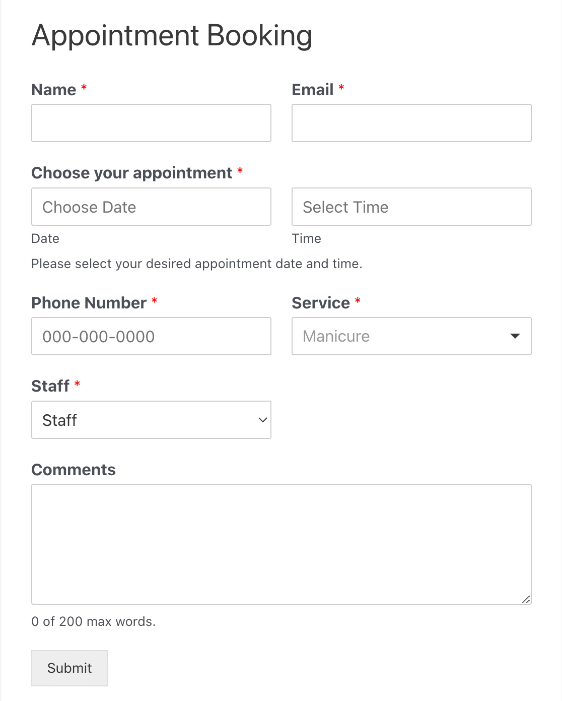
The right layout is everything. It’s important to make it easy for your users to fill out your form.
- According to an old eye tracking study supported by Google, it helps if the size of your input fields matches the expected length of the answers. In other words, most people have 8 or fewer letters in their first name. Don’t make your name input field 20 characters long.
- In another eye tracking study, forms with long blocks of text sharing additional information had lower conversion rates. These lengthy descriptions were distracting to users. Place field labels above the corresponding input fields for quick reference.
- HubSpot ran an A/B test that found using a 2-column layout for a long form resulted in more conversions. Users may be intimidated by a form that extends all the way down the page. Try a more compact layout to avoid scaring them off.
All of these details matter. They help establish a sense of comfort with the audience and avoid unnecessary confusion.
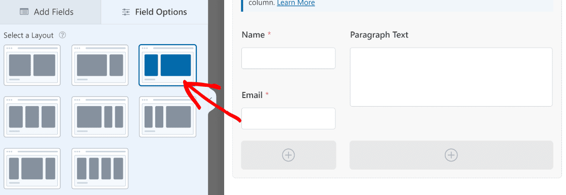
Note: in WPForms, the Layout Field lets you put your fields neatly into columns so that users can fill it out easily.
2. Position the Form Properly

This one is pretty straightforward, but make sure the conversion form is located in an obvious place.
Conversion forms should always be above the fold and should clearly stand out from the other on-page elements. Putting a conversion form at the bottom of a landing page means the majority of visitors will never see it.
3. Limit the Number of Fields
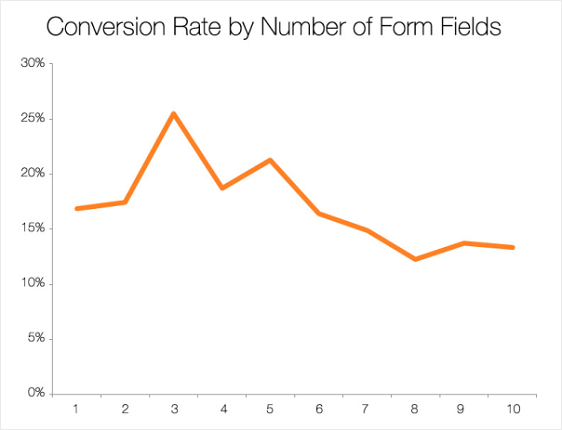
The last thing you want to do is overwhelm the user. If you can help it, never include more than 3 fields on your form.
According to this infographic by Quicksprout, limiting the number of fields to just 3 can guarantee a minimum conversion rate of 25%.
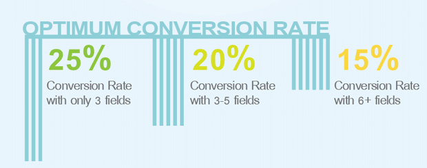
Another study by Hubspot verifies this concept, showing that reducing the number of fields from 4 to 3 brings a 50% improvement in form completion.
4. Use the Right Color for CTA
The color of your CTA button matters, especially when it comes to form conversion best practices. The key is to choose a color that fits your current design and layout, but also pops out and screams “click me.”
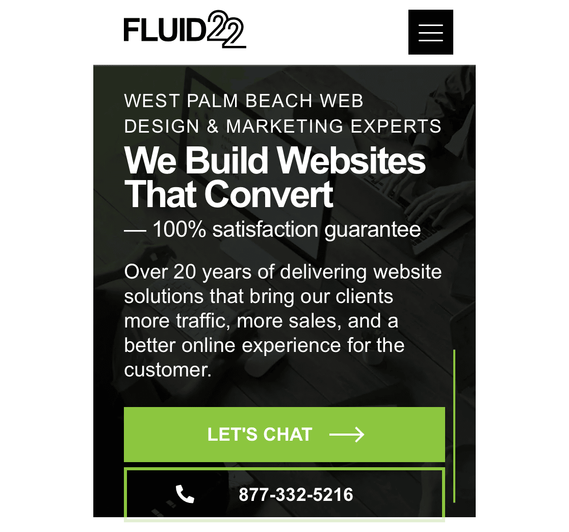
According to a number of case studies, red is the highest performing color. However, don’t underestimate orange and green. In certain situations, these colors can perform better.
Be sure to track CTA buttons as custom events in WordPress so you can see which colors work best for your campaigns.
We wrote more on how great performing forms look in our post on survey form design best practices.
5. Get Rid of CAPTCHA
While captchas do a good job of filtering spam, nobody likes them.
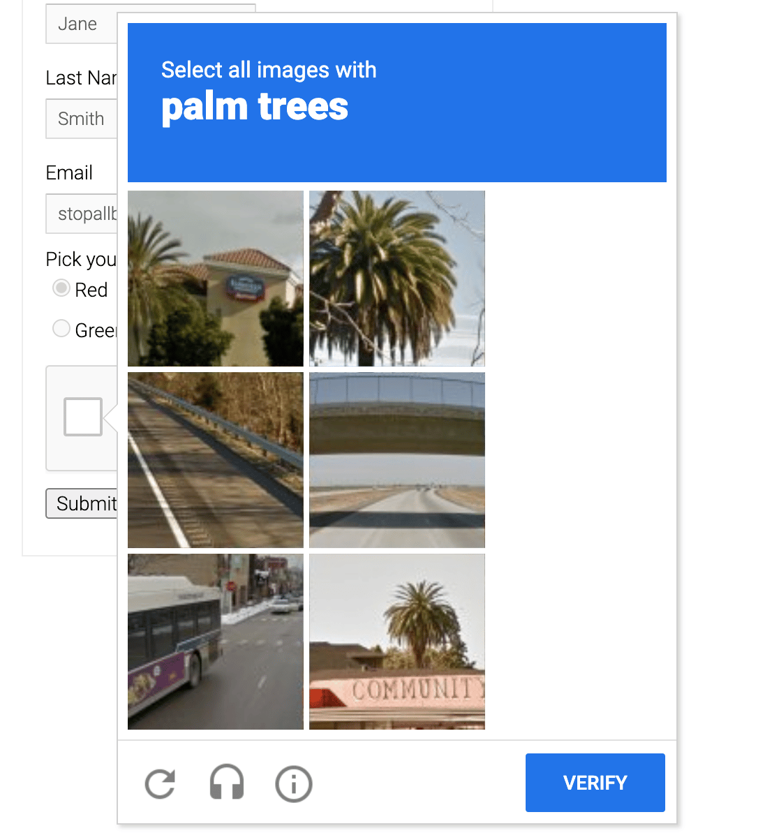
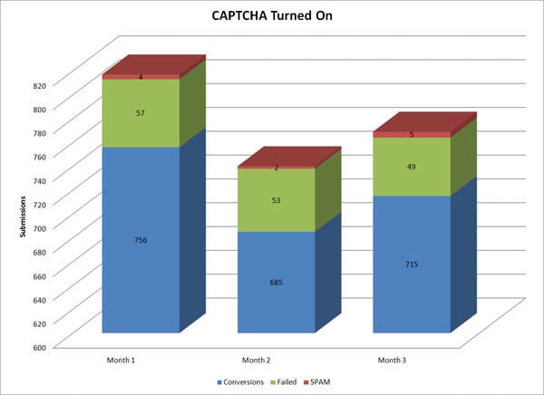
One study shows that they actually have a negative impact on conversion rates – losing around 3% of total conversions.
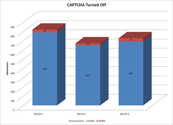
This isn’t to say you should forget about WordPress security. It’s obviously a very important component of building trust. However, if you want to avoid spam, the better solution is to use one of the many alternative anti-spam tools in WPForms to protect you from spam.
The good news is that modern spam protection can be invisible. You can switch to options like reCAPTCHA v3 or Cloudflare Turnstile, which screen out bots quietly in the background without making real visitors solve a puzzle.
To learn more ways to prevent spam in WordPress, check out the best anti-spam plugins.
6. Don’t Get the Digits
If there’s one piece of information users hate giving away, it’s their phone number.
Research shows that asking for a phone number leads to high form abandonment in almost every situation.
Not only is the phone number an additional field, but users are wary of giving away this information. They already deal with enough distractions and don’t want a sales person calling them.
Different types of forms need different fields. But if you absolutely must ask for a phone number, give the user a choice. Edit the settings on your form and make it optional.
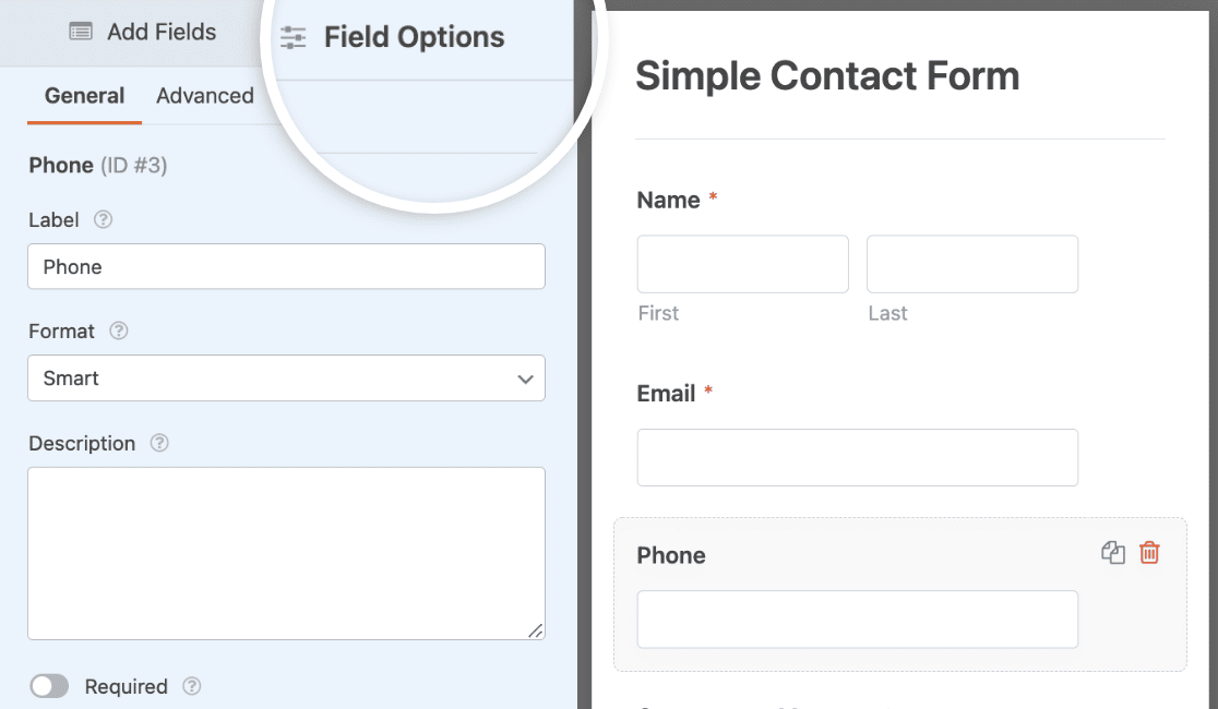
According to this study, changing the phone number field from mandatory to optional decreases abandonment from 39% to just 4%. Also consider adding a high-converting Click-to-Call button if you want leads to reach out to you.
7. Show Social Proof
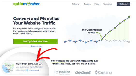
Another one on our list of form conversion best practices is to use social proof.
Quite frankly, people don’t go out of their way to fill out a sign-up form. Sign-ups are spontaneous and happen because of influential factors.
One of the best ways you can positively influence people to give you their information is by incorporating elements of social proof.
Examples include:
- “Over 20,000 other users have already downloaded our eBook!”
- “Industry expert John Doe calls our daily email ‘the most interesting part’ of his morning.”
- “97% of first-time users report high satisfaction with our program.”
- “Jane from Boston just signed up for our email newsletter!”

You can easily set up a popup like this using social proof app TrustPulse. (They even have a free plan! Check out what’s included in our TrustPulse review.)
As you can see, there’s a lot of flexibility when it comes to social proof. The important thing is that you incorporate at least one element in or around your conversion form. It’ll do wonders for your conversion rate.
Make sure to give the post 11 ways to use social proof to increase your conversions a read.
8. Explain What Happens Next
People don’t want to be left in the dark. They want to know exactly what will happen after they click the submit button.
By improving the copy on your call-to action button — or adding another field that tells them what to expect — you can greatly enhance your conversion rates. We’ve got an informative guide outlining best practices for submit buttons. Don’t forget to check it out.
According to studies, the word “submit” is not descriptive enough. Words like “go” and “click here” see conversion rate increases in the neighborhood of 25-30%.
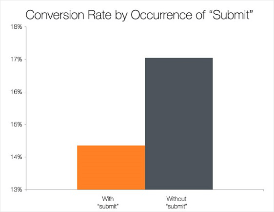
Another study shows that if you use 1st person in the call-to-action button, it improves the conversions by as much as 25% when compared to using 2nd person point of view.
9. Don’t Be Picky
You shouldn’t be picky with the personal information you want from the people filling out your forms. Sometimes, it can be just as simple as an email address.
There’s nothing more frustrating for a user than filling out a form and then being told that their birth date had to have forward slashes, not dashes. Just let people fill the form out!
Error messages kill conversion rates. There simply aren’t enough people who are willing to fill out a form twice.
That said, some errors are unavoidable, and how your form handles them makes a real difference. A vague “invalid input” leaves people guessing. A message like “please enter a valid email address” tells them exactly what to fix, so they can recover and hit submit instead of giving up.
Inline validation helps here, too. When a field checks itself the moment someone finishes typing, mistakes get caught right away instead of piling up into a wall of red text after the submit button. WPForms does this for you by validating email, phone, and website fields as visitors fill them out.
And whenever you can, accept multiple input formats. If someone types their phone number with dashes, parentheses, or neither, your form should take it. Every formatting demand you drop is one less reason to abandon the form.
10. Try Optional Fields
Another idea on our list of form conversion rate best practices is actually adding fields (but with a special trick).
You can keep your forms clean and short but offer optional fields if you need more info. It’s not magic; it’s smart conditional logic.
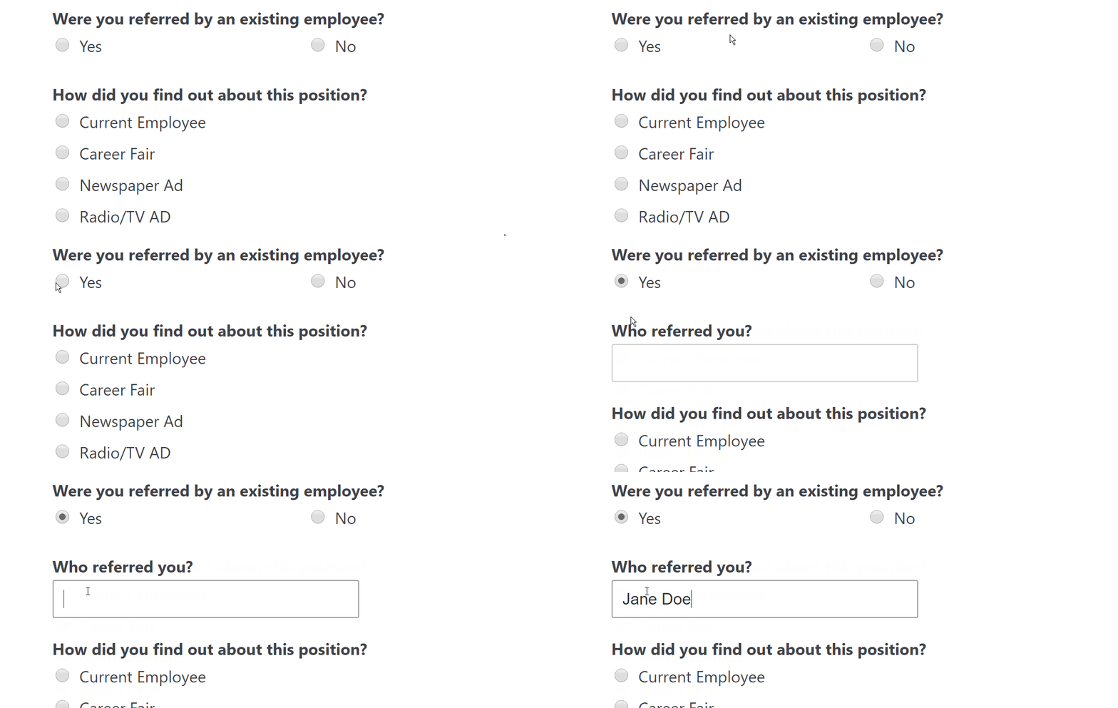
Not only does it get you more details, but it helps with your sign up form conversion rate by improving user experience! People don’t love long forms.
Conditional logic helps keep the form looking clean and brief, and only asks for more info if needed. Conditional logic is one of the features of WPForms that helped IT consulting firm Huna increase form submissions by 30%.
11. Provide a Reason to Believe
Ultimately, users need a reason to believe. Why should they give you their information? This all starts with the value proposition.
Determining the right reward is key with form optimization.
Does a user really care about being on another email list? No. What they really want to know is what value your email provides them.
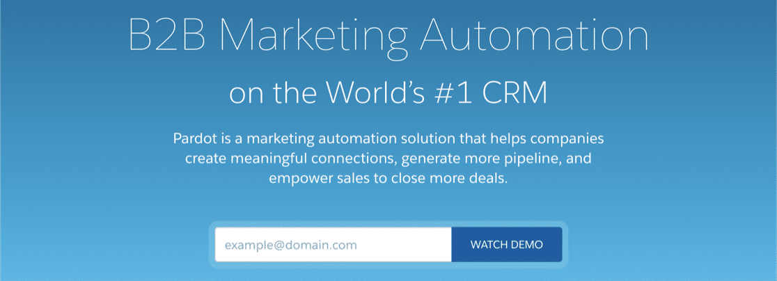
A smart form conversion best practice is to clearly convey this value. Once you do you’ll experience better results.
12. Break It Up
Split your long forms into multiple pages to improve the user experience. Online form statistics show that multi-page forms convert better than a single-page long form.
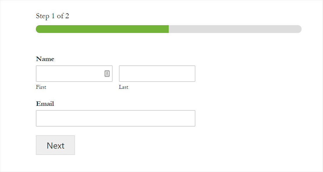
Want to ask a few more questions but don’t want to scare people away and tank your conversion rate?
- Try another one of our form conversion best practices – using breadcrumbs with multi-part forms.
- Drive even more conversions with a Lead Form.
If you really want to boost form conversion rates, the second method is essential. We believe the WPForms Lead Forms addon is one of the most powerful tools at your disposal.
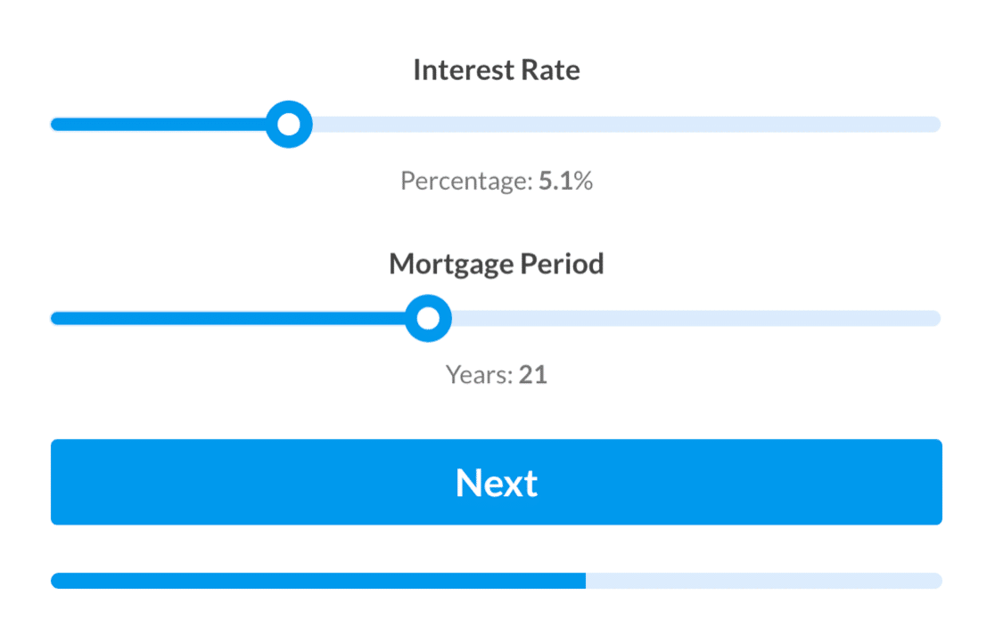
Break up your forms by letting people know how far away they are from completing a form. It helps keep them engaged and filling out their info.
13. Make It Responsive
When thinking about form conversion best practices, don’t forget about mobile devices! Mobile-friendly, responsive forms can explode your conversion rates.
Making sure your forms are mobile-friendly is so important because tons of people use their phones as the main way to browse the web.
Be sure you’re using a form builder that’s mobile-responsive like WPForms so your forms look and work great on any device. And, don’t forget to optimize your WordPress forms for mobile lead generation.
14. Be More Human
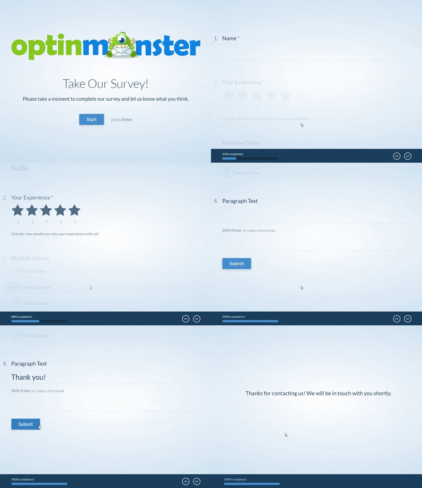
Ever noticed how it’s a lot more fun to talk to a person than a robot? Use conversational-style forms to turn your normal forms into something that feels more like a face-to-face conversation.
Natural language forms are skyrocketing in popularity because they are great for conversion rates. They look fantastic, too.
15. Analyze Your Results
You’ll never be able to boost your form conversions if you aren’t able to figure out what’s working and what isn’t.
This used to mean setting up a separate analytics tool and wiring up event tracking. Not anymore. As of WPForms v2.0, WPForms Analytics tracks form performance right inside your WordPress dashboard, and it starts working automatically as soon as you update.
Head to WPForms » All Forms and you’ll see Views, Interactions, and Conversion columns next to every form. One glance tells you which forms are pulling their weight and which ones need attention.
Open a form’s analytics page and you get the full picture. Stat cards show views, interactions, conversion rate, abandonments, and errors, and you can filter by the last 7, 30, or 90 days or set a custom range. There’s even a built-in AI chat that reads your form data and tells you what’s hurting your conversions.
My favorite part is the field-by-field table. It shows interactions, time spent, errors, and abandonment for every single field, so you can find the exact question where people give up. Pair it with the Form Abandonment addon to capture partial entries from those visitors.
You can also set a conversion rate goal for any form and watch your progress over time, then export the report as a CSV when you want to share the numbers. The complete guide to Form Analytics walks through every metric.
Once you know your numbers, put them to work. Change one thing at a time, like your button copy or field count, and watch whether your conversion rate moves. If you want to run proper split tests, these A/B testing tools for WordPress forms make it easy to compare two versions of the same form.
For the story of what happens before someone even reaches your form, there’s the User Journey Addon.

This feature lets you see the pages and posts your visitors looked at before they submitted your form. You can also find out when they searched and what they searched for, the URL that referred them to your site, and more.
With these insights, you can discover which pages are most effective in getting form submissions and then optimize your entire site for higher conversions.
And if you want your form conversions inside your Google Analytics reports, you can still track form conversions with MonsterInsights.
FAQs About Optimizing Forms for Conversions
Form conversion questions come up a lot, whether you’re building your first contact form or fine-tuning a whole library of lead forms. Here are answers to the ones I hear most often.
What is a good form conversion rate?
There’s no universal benchmark. Conversion rates vary widely by industry, traffic source, and form type, and a newsletter signup will never convert like a simple contact form. Instead of chasing someone else’s average, establish your own baseline and work to beat it. WPForms Analytics lets you set a conversion rate goal for each form and tracks your progress toward it.
How do you calculate form conversion rate?
Divide the number of submissions by the number of form views, then multiply by 100. For example, if your form was viewed 14 times and submitted 3 times, that works out to a 21.4% conversion rate. WPForms Analytics calculates this for you automatically for every form on your site.
How do I track form conversions in WordPress?
If you use WPForms, tracking is built in. Update to WPForms v2.0 or later and go to WPForms » All Forms to see views, interactions, and conversion rates for every form. No separate analytics tool or custom event tracking is required, and the data stays in your own WordPress database.
Next, Put Your Form Analytics to Work
We hope this article helped you learn some great form conversion best practices so you can improve your contact form conversion rate.
Now that WPForms measures your form performance for you, learn how to use WPForms Analytics to improve your forms. And if you’d like to see today’s techniques in action, check out these examples of landing page forms.
Create Your WordPress Form Now
Ready to build your form? Get started today with the easiest WordPress form builder plugin. WPForms Pro includes lots of free templates and offers a 14-day money-back guarantee.
If this article helped you out, please follow us on Facebook and Twitter for more free WordPress tutorials and guides.
Disclosure: Our content is reader-supported. This means if you click on some of our links, then we may earn a commission. See how WPForms is funded, why it matters, and how you can support us.