AI Summary
Are you looking for donation page examples for inspiration to create your own?
Having a donation page for your nonprofit that converts really well is super important for your organization to meet its fundraising goals.
So in this post, we’ll show you some cool donation page examples, and also explain what features they include.
In This Article
- 1. Mozilla
- 2. The Obama Foundation
- 3. United Nations Population Fund (UNFPA)
- 4. World Wildlife Fund (WWF)
- 5. GetUp
- 6. Invisible Children
- 7. Children’s Minnesota
- 8. Special Olympics
- 9. Asian Pacific Fund
- 10. Future in Sight
- 11. Oxfam
- 12. Pencils of Promise
- 13. Project CURE
- 14. NextGen Climate
- 15. She’s the First
- 16. Code for America
- 17. Black Girls Code
- 18. Make a Wish Ireland
- 19. United World Schools
- 20. Community Environmental Council
20 Donation Page Examples to Inspire You
Check out these great examples of donation pages from around the world, so you can skyrocket your online fundraising efforts.
1. Mozilla
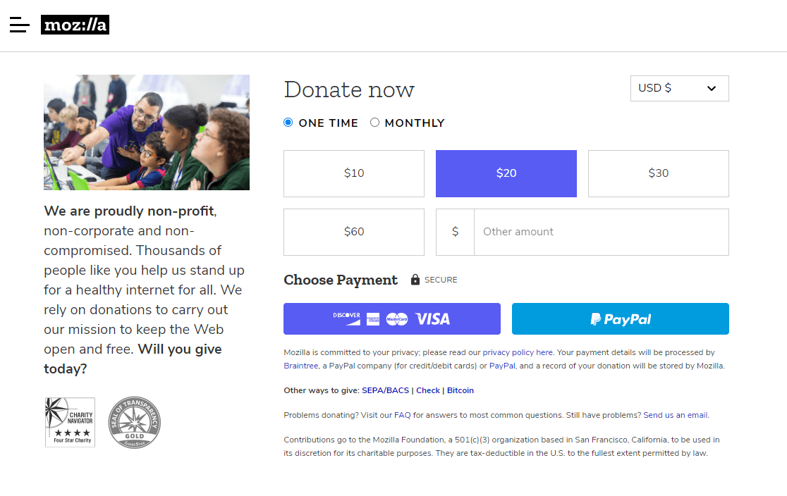
Mozilla’s donation page is a super simple and straightforward donation form.
Features
- The mission statement is stated briefly on the left side. So this can motivate people to make a donation to support them.
- The entire form is visible above the fold, so donors don’t need to scroll down to find the form.
- Users can easily choose from Stripe or PayPal payments.
- Distractions like external links are kept to a minimum to boost conversions.
- A pre-selected donation amount for a helpful suggestion.
2. The Obama Foundation
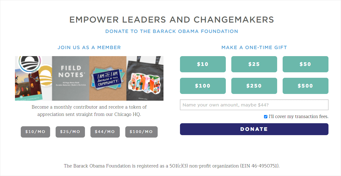
The Obama Foundation has a visually appealing donation page that has a recurring donation suggestion on the left or a one-time donation option on the right-hand side.
Features
- Users can also easily activate recurring payments by selecting a checkbox, a great way to use forms to help your cause.
- Uses the Obama campaign logo displayed in the picture to create a sense of credibility with donors.
- The images aren’t too large so it won’t impact WordPress loading speed.
- A checkbox is preselected that agrees to cover the transaction fees on the donation. So this can avoid disappointment down the line when they see an extra fee during checkout. Or, it can help save you a ton of costs by covering your processing fees.
3. United Nations Population Fund (UNFPA)
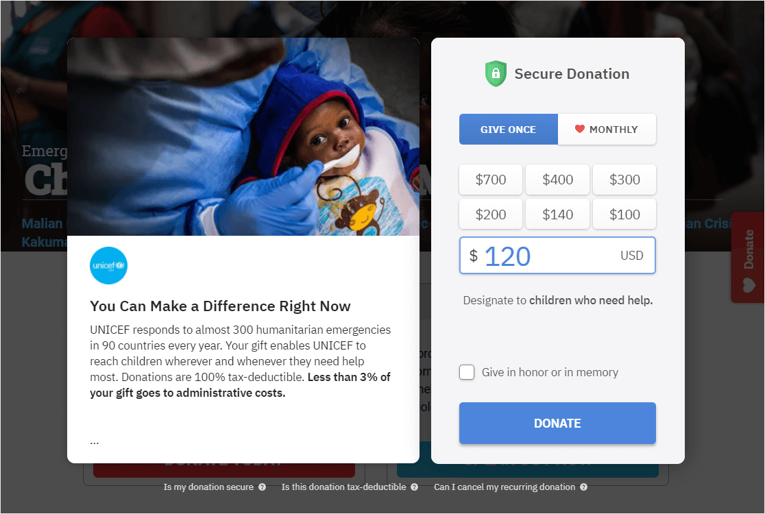
UNFPA’s site is a great donation page example. They sometimes use online pledge forms on different landing pages on their site. However, the main UNFPA donation page is shown below and shows a striking image and 2 different call-to-action buttons.
Features
- The image on the page invokes emotion and shows a bit of what the nonprofit does.
- An option to choose between giving once or monthly.
- A FAQ section on the bottom to address security concerns and other questions.
- Displays 2 sections side by side to keep the form above the fold.
4. World Wildlife Fund (WWF)
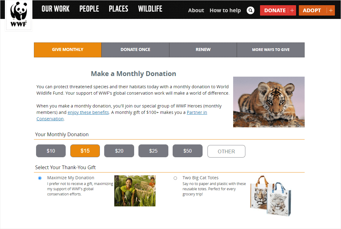
The WWF donation page processes donations on the same page without redirecting donors to a different page.
Features
- A clear statement is displayed about why people should donate.
- A donation amount is preselected, so donors can easily continue to the next step in checkout.
- A thank you gift is offered.
- The page contains many external links, which may hurt the form abandonment rate.
5. GetUp
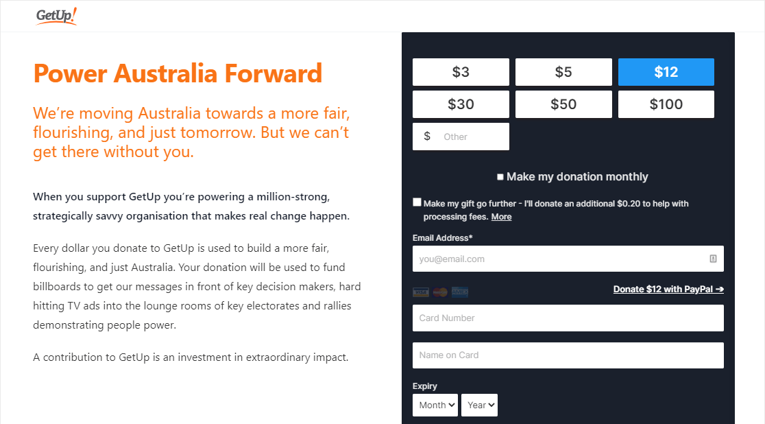
GetUp splits the donation page into 2 sections side by side. One to explain their mission statement and why you should support it. The other contains the brief donation form.
Features
- The form is split into different pages, which reduces the length of the form, leading to boosted donations.
- Use of Multi-step forms in WordPress.
- A checkbox for a monthly donation option.
- An option to pay with a credit card and a link to pay with PayPal.
6. Invisible Children
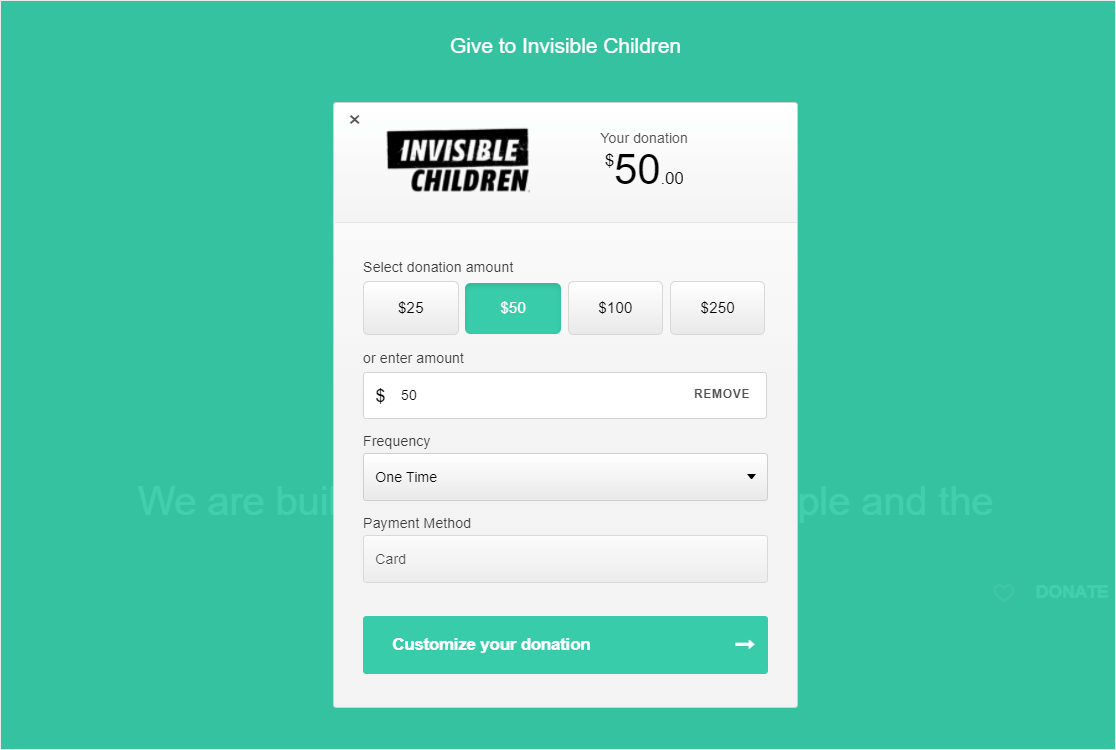
The main donation form from Invisible Children contains only a single field to enter the donation amount. After entering the amount, when a button is clicked, it will redirect donors to a secure payment page.
Features
- We really liked its simplicity. It is another great example of a simple donation page.
- It’s a floating popup that’s being used here.
- A dropdown option to change the frequency.
7. Children’s Minnesota
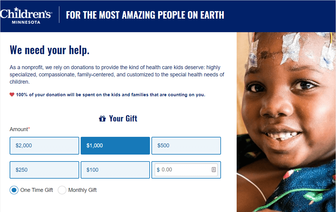
The donation form on Children’s Minnesota’s website follows some contact form conversion best practices.
Features
- External links are kept to a minimum and the navigation menu is not used on the page.
- The page clearly explains how they’re going to spend donated funds.
- The form uses the conditional logic feature that shows certain fields only if a specific option is selected from the radio buttons.
- A relevant image right next to the form.
8. Special Olympics
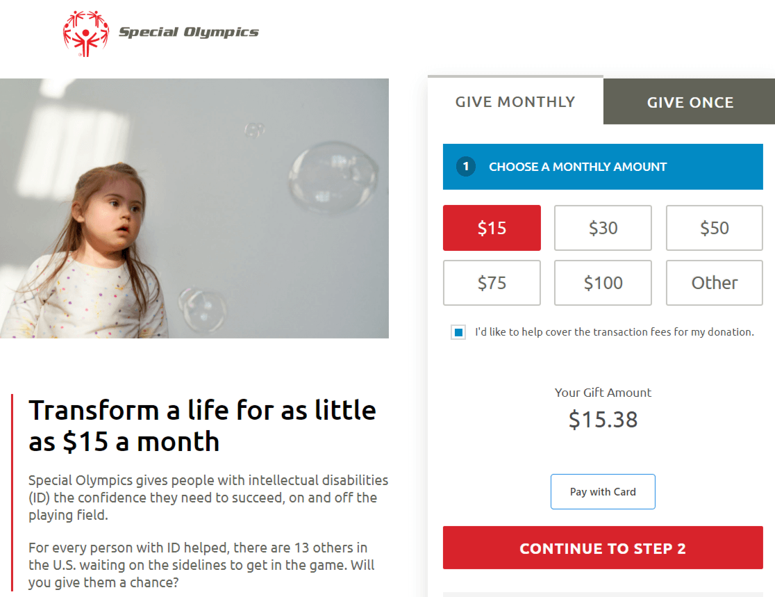
The donation form for the Special Olympic’s website is placed on the right-hand side of the page, next to both an image and their mission statement.
Features
- A strong header showing a benefit of what will happen when you donate.
- Faces and sightlines can often draw attention to a call to action. On this page, the child in the background image is looking towards the donation form, which will draw your visitors’ eye to the form.
- A donation amount is preselected, so users can easily continue to the next step.
- Use of a checkbox is also preselected that agrees to cover the transaction fees on donation.
- A multi-step form that encourages donors to ‘continue to step 2’.
9. Asian Pacific Fund
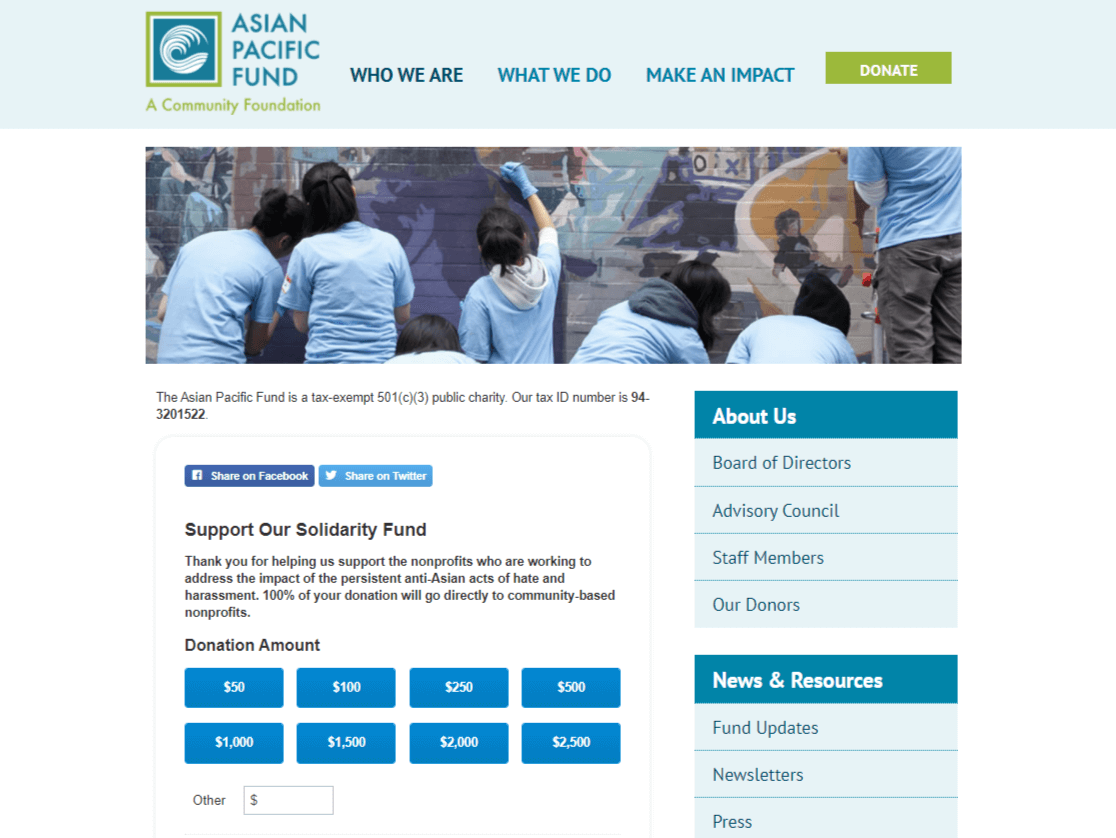
This page displays an image banner at the top and the form is placed below it.
Features
- The color scheme used in the page blends well into the brand’s colors.
- The donation form is also integrated with their email marketing provider so they can grow their email list. This can be a great choice for nonprofits to connect with their donors.
- Social media sharing buttons.
- The sidebar with the external links can be a bit distracting.
10. Future in Sight
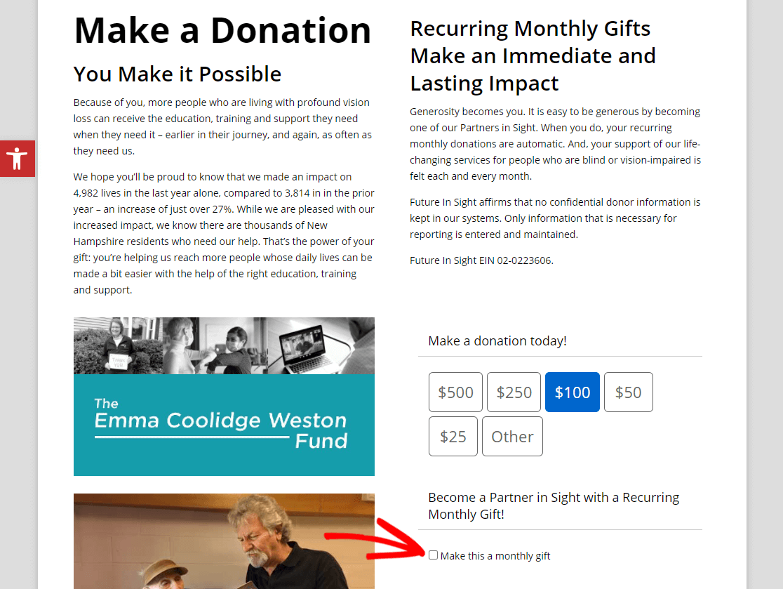
This donation page example from Future in Sight uses a 2 column method, and it’s easy to see the donation buttons/options.
Features
- The overall design is simple and every section in the form is well organized.
- The form uses conditional logic to display certain fields only when a specific option is selected.
- A donation amount is preselected in the form, so donors have an idea of what you’d like to see them donate.
- The form really focuses on the benefits of monthly recurring donations, which is a great way to make more money from your donation forms.
- There’s a ton of info on this page, which is helpful but may overwhelm donors from taking action.
11. Oxfam
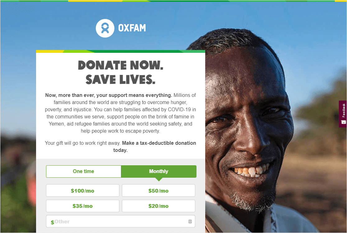
The donation page example from Oxfam gets right to it, and it looks great.
Features
- Oxfam uses a large background image to get the visitor’s attention.
- When either the One time or Monthly button is clicked, it uses conditional logic to show different amounts.
- On the bottom of the page, there are trust symbols and badges displayed to help with social proof.
12. Pencils of Promise
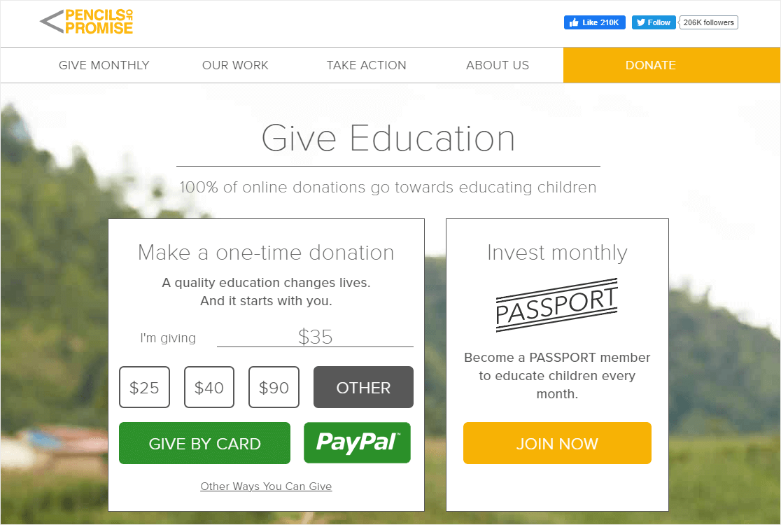
Here’s another great example of a simple and beautiful donation form page.
Features
- A simple page with a clear call to action to ‘Give Education’.
- A recurring donation option on the right side phrased as a ‘membership’, so the donor feels special.
- Donors can also choose their preferred payment option of credit card or PayPal.
- No sidebar displayed so it keeps the focus on the form.
13. Project CURE
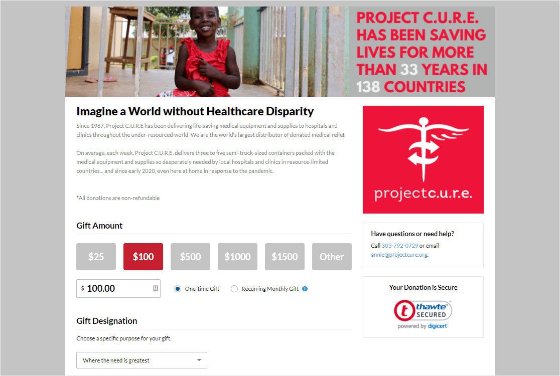
External links are kept to a minimum to improve conversions on this donation page example.
Features
- The bold header asks the donor to ‘imagine a world…’ which is great persuasive copy.
- A suggested donation amount is preselected.
- There’s an option to give one-time or as a recurring gift.
- You can choose where the gift goes from the dropdown, and this can be fun for a donor to get to feel like they are choosing something specific to donate to.
- An email list is integrated with the form, so organizers can connect with donors.
- Several security indicators are shown, which creates a trust factor.
- It’s on a mostly distraction-free landing page.
14. NextGen Climate
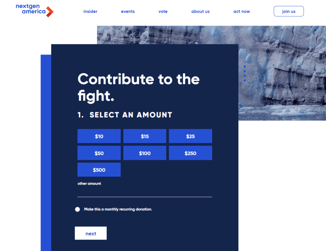
NexGen Climate uses a modern and bold donation form and has a header image behind it.
Features
- Totally simple and no distractions (a great tactic for increasing donation form conversions).
- The page is split into multiple pages in order to make it look shorter.
- The page makes it easy to make a recurring payment. Users will only need to click a checkbox.
- None of the donation amounts are preselected, so some users may find it difficult when deciding how much should they donate.
15. She’s the First
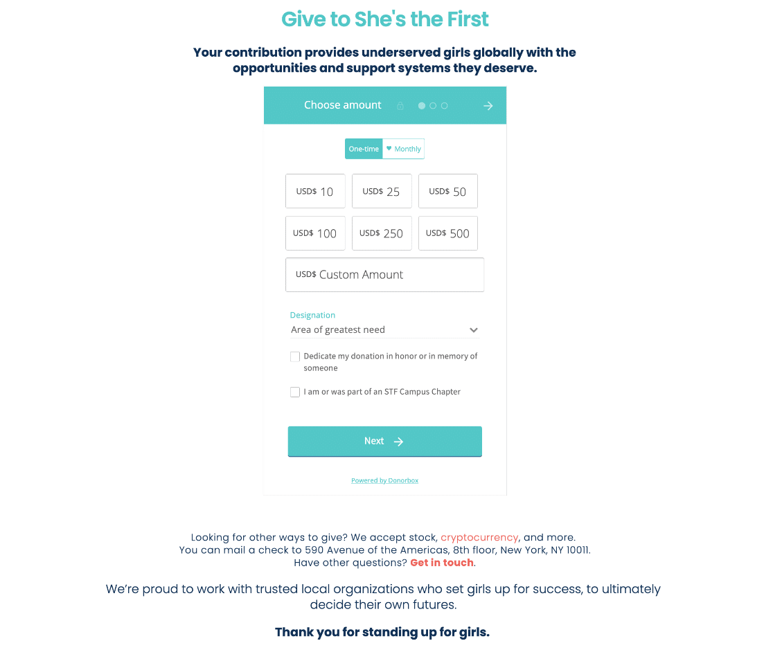
The She’s the First donation page is effective because it clearly communicates the impact of donations, which is expanding access to education for girls. It also offers various ways to give, including stocks, cryptocurrency, and checks.
Features
- Links to additional information about corporate giving, partnerships, and other ways to get involved.
- Multiple donation options (stock, cryptocurrency, checks, Donor-Advised Funds).
- Clear message about the impact of donations on girls’ education.
- Contact information for further inquiries.
- Easy navigation with a direct call to action.
16. Code for America
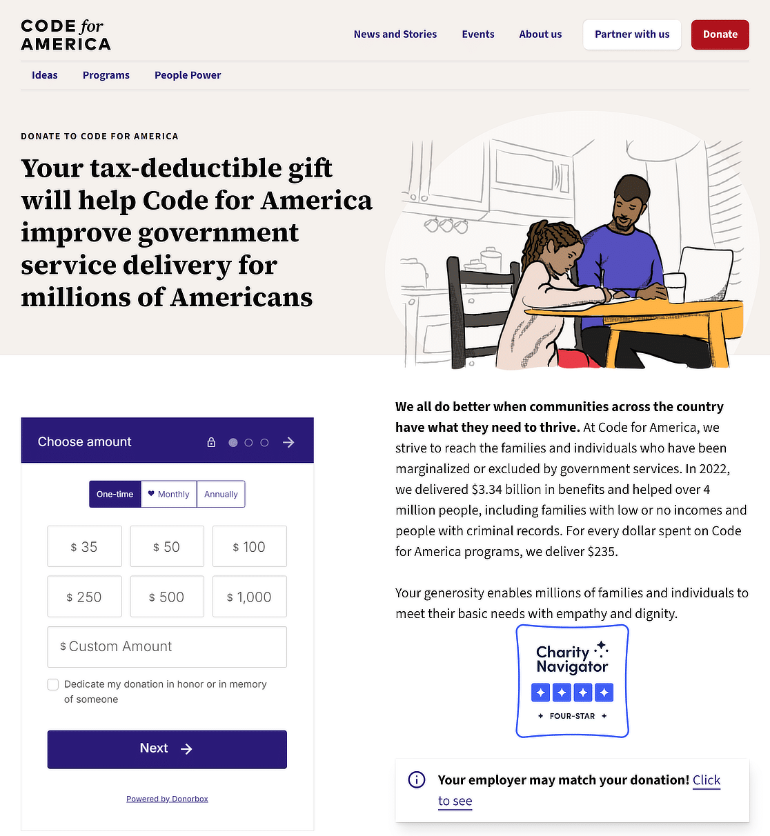
The Code for America donation page shares the significant impact of donations through specific examples and outcomes. The page is straightforward, making it easy for people to understand and act.
Features
- Impact statement with outcomes of donations (e.g., benefits delivered, people helped).
- Information on tax deductibility and nonprofit status.
- Frequently asked questions section for donors.
- Simple, clear call to action for donating.
17. Black Girls Code
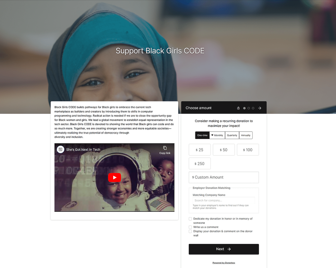
The Black Girls CODE donation page connects donors directly with the cause—empowering Black girls in tech. It shares the mission and vision of the organization, making it easy for donors to understand the impact of their contribution.
Features
- Clear mission statement.
- Space for donors to leave comments.
- Employer donation matching feature.
- Recurring donation options (monthly, quarterly, annually).
- Transparency about tax-deductibility and nonprofit status.
- Option to dedicate the donation in honor or memory of someone.
- Various donation amounts with the option for custom contributions.
18. Make a Wish Ireland
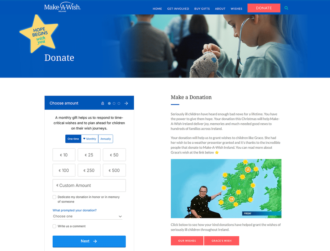
The Make-A-Wish Ireland donation page effectively inspires potential donors by sharing heartfelt stories of how donations have transformed the lives of seriously ill children. The page is clear, engaging, and easy to navigate, making the donation process simple and appealing.
Features
- Secure payment methods.
- Clear and easy options to donate.
- Option for monthly or one-time donations.
- Information about the impact of donations.
- Emotional stories of children benefiting from donations.
- Details on tax-effective giving and how it benefits both the donor and the organization.
19. United World Schools

The United World Schools (UWS) USA donation page motivates donors to contribute. Its clarity and focused message make donating simple and impactful.
Features
- Secure payment methods.
- Tax-deductibility notice for donations.
- Option for donors to leave comments.
- Impactful statistics and achievements.
- Clear options for one-time or monthly donations.
- Variety of donation amounts with custom options.
- Information on the organization’s efficiency and impact.
20. Community Environmental Council
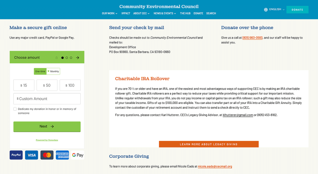
The Community Environmental Council’s donation page effectively highlights the urgency of combating climate change and outlines the organization’s approach and achievements.
Features
- Multiple giving options (online, check, phone, IRA rollover).
- Urgent and compelling message about climate action.
- Information on corporate giving and legacy giving.
- Explanation of tax benefits for donors.
- Contact details for further inquiries.
FAQs about Donation Page Examples
Creating donation pages that attract donors is a popular topic of interest among our readers. Here are answers to some common questions about them:
What to include on a donation webpage?
Your online donation page is probably a huge part of your online fundraising strategy with your nonprofit website. So, we want to make sure you have some ideas on where to start with online donations.
From our research, we’ve included some ideas of things to include that donors prefer and help with conversion rates (so you can get more money).
- An order form with a credit card and online payment field.
- A user-friendly experience (even for mobile devices) so the donation process and donor experience are as easy as possible.
- An option for monthly recurring donations (the Stripe integration is perfect for this).
- Suggested donation amounts to help encourage higher amounts.
- A visually appealing and distraction-free form page.
- A suggestion to share the page on social media or other places so donors can ask for a matching gift from their social network.
And many of these things are very easy to add using a pre-built WordPress Nonprofit theme.
How to create forms like these with WPForms?
We hope this list of donation page examples inspires you to create your own donation page to meet your online fundraising goals.
Ready to make your own? There are tons of ways you can style your donation forms, and you can even suggest amounts for your donors to give.
ays nonprofits can use WPForms.WPForms Pro can help you build forms like the ones on this list by giving you access to:
- Deep Discount for Nonprofits: If you’re a qualified nonprofit, WPForms offers a generous discount of 75% off WPForms Pro.
- Conditional Logic: Make your forms hide and show fields based on previous selections. This helps keep them concise and organized, while you segment your list.
- Email Marketing Integration: Connect your donation form to your favorite email marketing service to grow your donor list.
- Multi-step Forms: Make long forms feel shorter by using breadcrumbs that break them up into multiple pages for better conversion rates.
- Stripe, Square, and PayPal: Build order forms in minutes with Stripe, Square, and PayPal integrations. Stripe and PayPal both include powerful recurring payment features for monthly donations. Do you need to collect one-time donations or charges? Then you can work with WPForms’ Square integration.
…and so much more.
To see more information about how nonprofits like these use WPForms for fundraising and managing their operations, read our case study that details how the American Legion Arizona uses WPForms.
How do you write a good donation page?
Creating an effective donation page involves sharing a compelling story that connects emotionally with potential donors. Start with a clear, powerful headline that captures the essence of your cause.
Use simple, engaging language to explain how donations will make a difference. Include high-quality images or videos that show your work in action. Make the donation process easy by offering various payment options and suggesting donation amounts.
Transparency about how funds are used builds trust. Finally, thank donors and explain their contribution’s impact, reinforcing the value of their support.
How do I start a donation page?
To begin a donation page, first choose a reliable platform that suits your organization’s needs. Create a clear, concise title that reflects your mission. Write a heartfelt description that explains why donations are needed, highlighting the impact of contributions.
Add compelling visuals like photos or videos to illustrate your cause. Set up a simple, secure donation process with suggested giving levels to guide donors. Ensure your page is mobile-friendly to reach a wider audience. Promote your page through social media, email, and other channels to maximize visibility and support.
Next, Learn How to Set Suggested Donation Amounts
Do you collect donations through your nonprofit website? Check out this guide on how to creatively customize a form that accepts donations on your site and provides donors with suggested donation amounts.
Ready to build your form? Get started today with the easiest WordPress donation plugin. WPForms Pro includes lots of free templates and offers a 14-day money-back guarantee.
If this article helped you out, please follow us on Facebook and Twitter for more free WordPress tutorials and guides.

