AI Summary
The lead generation cycle for many websites starts with a landing page.
As a crucial component of your lead capture strategy, it’s always worthwhile to ensure your landing page adheres to the best design and marketing practices.
In this article, I’ll share my tips and observations based on the landing page best practices that I’ve personally used to great success and also seen many real examples of by successful websites.
In This Article
- 1. Have Your Value Proposition (or CTA) Above the Fold
- 2. Focus on One Conversion Action
- 3. Deliver the Offer Without Delay
- 4. Make the CTA Stand Out
- 5. Prioritize Benefits Over Features
- 6. Use Multiple Calls to Action (for Longer Pages)
- 7. Design for Mobile
- 8. Test and Experiment Big
- 9. Optimize Offers & Copy for Your Traffic Sources
- 10. Write Focused Page Headlines With Power Words
- 11. Leverage Social Proof
- 12. Minimize Load Time
- 13. Use Landing Page Templates
- Landing Page Design Best Practices – FAQs
Why Landing Page Best Practices Matter?
The average customer today has tons of options available when they’re looking for products, services, or solutions online. Whether you’re a SaaS company or an eCommerce store, you need to make a strong first impression in order to grab your customer’s attention and be persuasive.
Like most components of digital marketing, good landing pages have certain qualities that are strategically ensured to help brands boost conversions. These best practices are a set of tried and tested rules that have produced excellent results for marketing professionals over time.
So if your current landing page is failing to convert well enough, chances are your page is missing some of the elements typically found in high-converting pages.
This is why it’s very important to make sure that your page is following landing page best practices, so you can meet your conversion goals.
Top Landing Page Best Practices
Let’s explore all of these in some detail with some notable landing page optimization examples.
1. Have Your Value Proposition (or CTA) Above the Fold
If a user clicks on your landing page, there’s never a guarantee that they’ll scroll through the whole page. But there’s a very good chance that they’ll read everything above the fold.
The concept of “above the fold” isn’t new – it’s a practice that newspapers have been following for centuries and remains the best conversion rate optimization tip still used by marketers (including my team).
Usually, the most important news and headlines make it above the fold, where they’re likely to get the most attention.
Here’s a great example of this in action used by my colleagues at MonsterInsights.
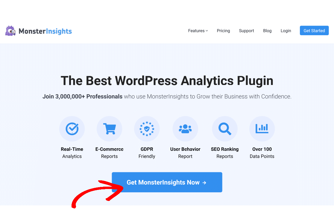
In the context of landing page design, the same theory holds true. Keep your value proposition, call to action, and headline above the fold (which is the area of the screen visible without having to scroll down).
Pay special attention to your homepage because it’s the most important page for your whole website.
2. Focus on One Conversion Action
Every landing page should ideally be optimized for a single main goal. For instance, if you want users to download an eBook, then your page should have a clear download button above the fold.
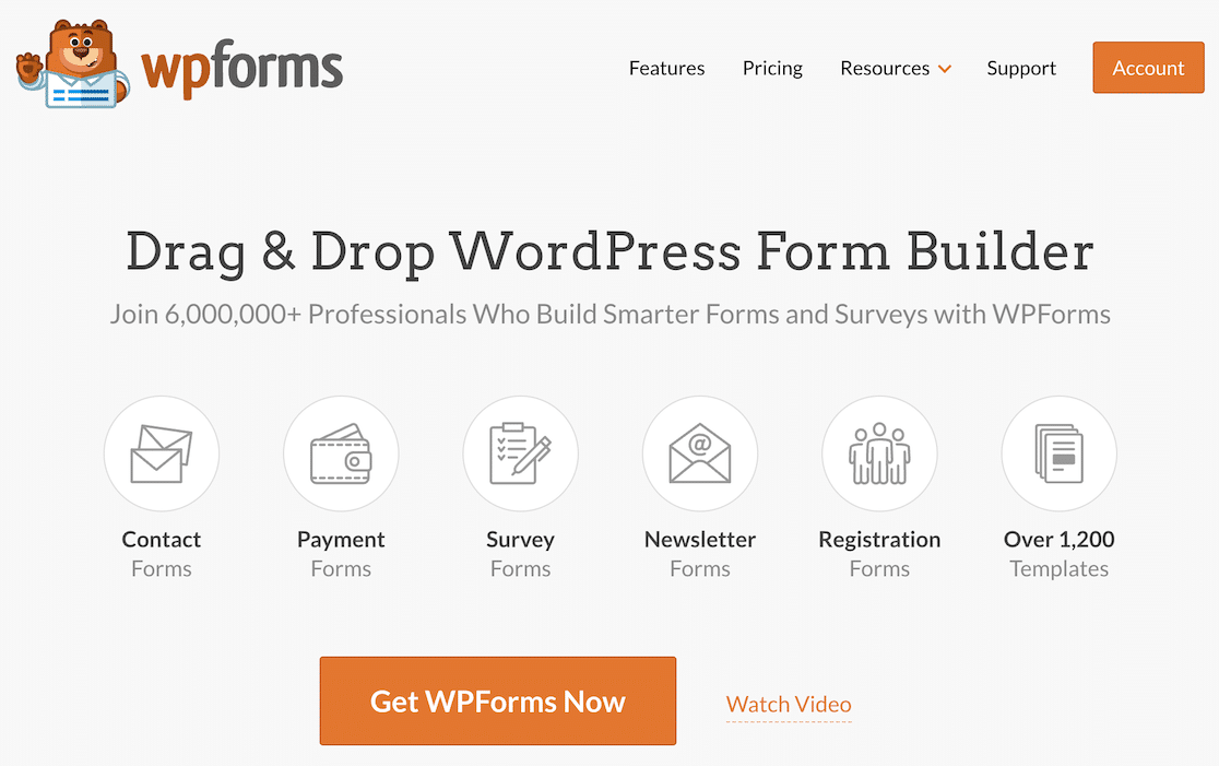
If you add too many options and actions that users can perform, you’ll only be confusing site visitors who may struggle to decide where they actually want to click. Therefore, it’s generally more effective if your landing page is designed with a single goal in mind.
💡 Pro tip: There will always be a percentage of visitors who will abandon before converting. This is why smart marketers proactively plan to tackle abandonment. Rather than fighting to eliminate abandonment entirely (an impossible task), I suggest setting up abandonment workflows to target abandoning users later with special offers. WPForms’ form abandonment features can also help by capturing partial entries in your checkout forms.
3. Deliver the Offer Without Delay
Every landing page has a goal that a business wants to attain and an offer that visitors are interested in. Ideally, you should make sure that your potential customers get what they’re signing up for immediately.
For instance, if you’re offering downloads in exchange for contact information (email address, phone number, etc.), then you can use a thank you page containing the download link that appears as soon as a user submits a form.
With WPForms, you can display customized confirmation messages easily so you can include the download link in it. It’s a powerful way to reward your visitors with your offer right away.
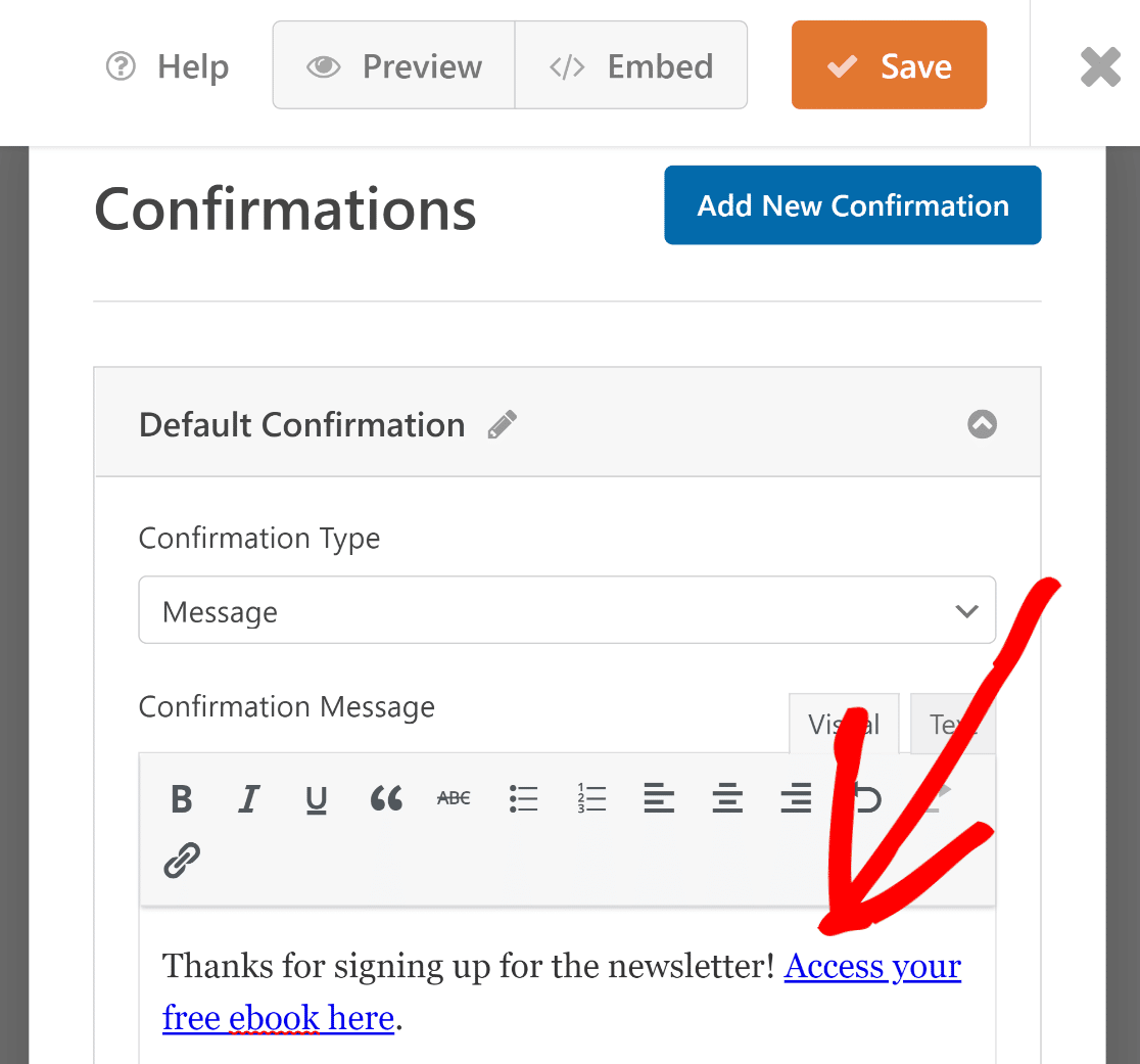
WPForms also lets you create complete form pages containing your online form as the main conversion feature of a landing page. This feature is very useful if you want to quickly build a simple landing page centered around your web form, driving your lead generation strategy.
Also read: landing page vs lead form.
You can also track WordPress form submissions in Google Analytics, which allows you to measure how well your forms are converting and optimize your landing page conversion strategy.
Besides, forms made with WPForms are 100% responsive so they adapt perfectly to mobile landing page dimensions as well.
4. Make the CTA Stand Out
The best way to grab your visitor’s attention is to use contrasting colors that stand out on your landing. Ideally, your CTA should be so well-placed and color-highlighted that it should be immediately obvious to your visitors.
At WPForms, my team follows a simple set of rules when creating CTAs:
- Keep the CTA text concise and focused on benefits
- Add contrasting colors that draw attention to your CTA button
- Place the CTA button at a prominent part of your page for maximum visibility
💡 Pro tip: When creating CTA for landing pages, I often ask a colleague outside of marketing to check out my proposed page design. If it requires them effort to locate the CTA on the page, I know my design needs reconsideration. The goal is to make it entirely effortless for visitors to find the CTA.
5. Prioritize Benefits Over Features
Every user that reaches your landing page does so because they’re looking for a solution to a problem. Naturally, focusing on the benefits that your product or service can provide is more relatable for your audience than a list of features.
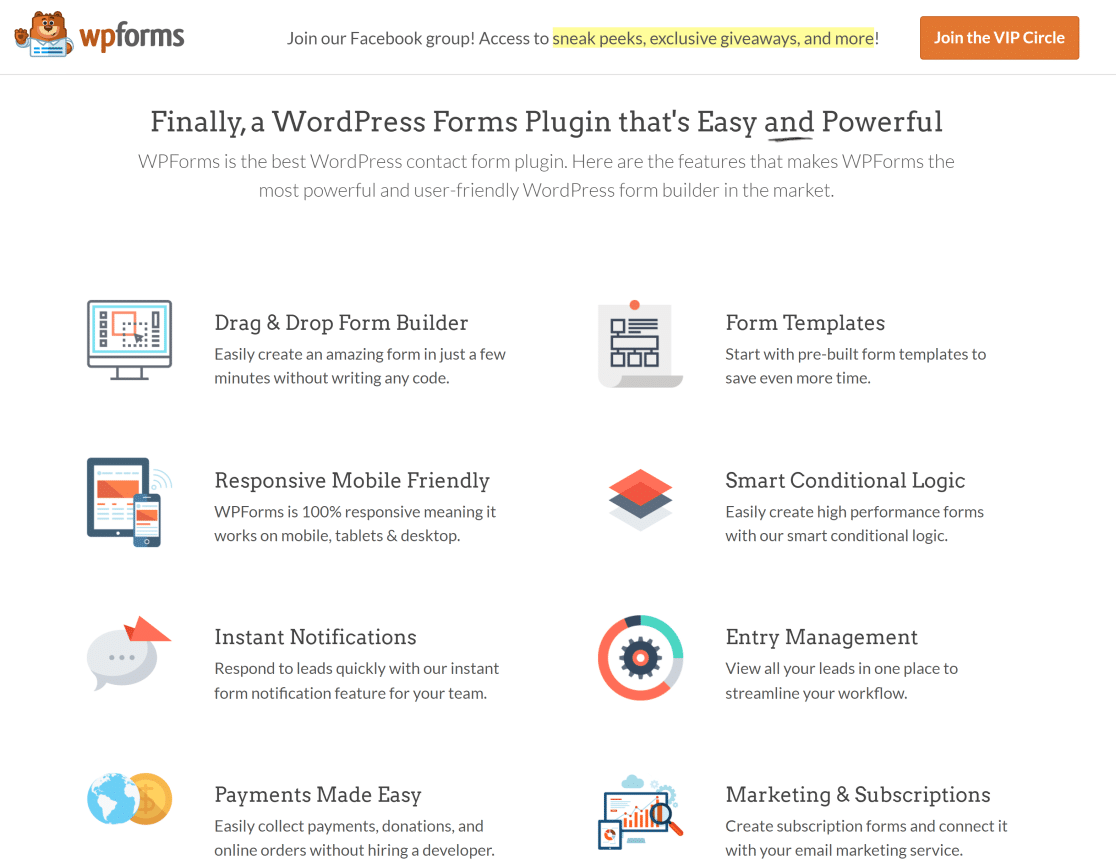
A good tip for emphasizing benefits is to think about the particular pain points of your audience and build off that knowledge.
For example, the language in the landing page example above caters primarily to users looking for an easy-to-use form builder plugin, and we don’t shy away from emphasizing that.
6. Use Multiple Calls to Action (for Longer Pages)
In most cases, your first call to action button should be above the fold. But if the user has to continue scrolling to be sold on the product, it can be very frustrating if they have to scroll back up to click your CTA when they are sold.
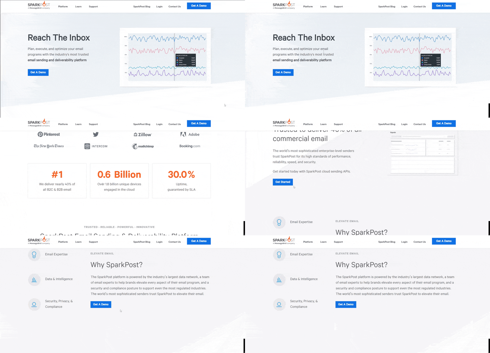
Keep in mind that you should still be focusing on a single landing page conversion goal rather than giving users different options as they scroll down. Make sure that your CTAs are consistent in terms of color, font, layout, and even the text through the landing page.
And if your landing page includes a form, make sure to keep it simple with form fields arranged in a logical order. If you have relatively long forms for any reason, it helps to use multi-step forms split into several pages and sections.
7. Design for Mobile
Today, the number of mobile users has surpassed the number of desktop users. Still, many websites simply ignore mobile devices
This is a mistake in most cases because landing pages that are poorly optimized for mobile devices can have functionality problems and poor user experience when viewed on anything other than a desktop.
The best practice is to use a responsive design that adapts to different kinds of screen sizes automatically. And if you aren’t providing the best user experience to your users, you’re only going to be losing valuable opportunities and leads.
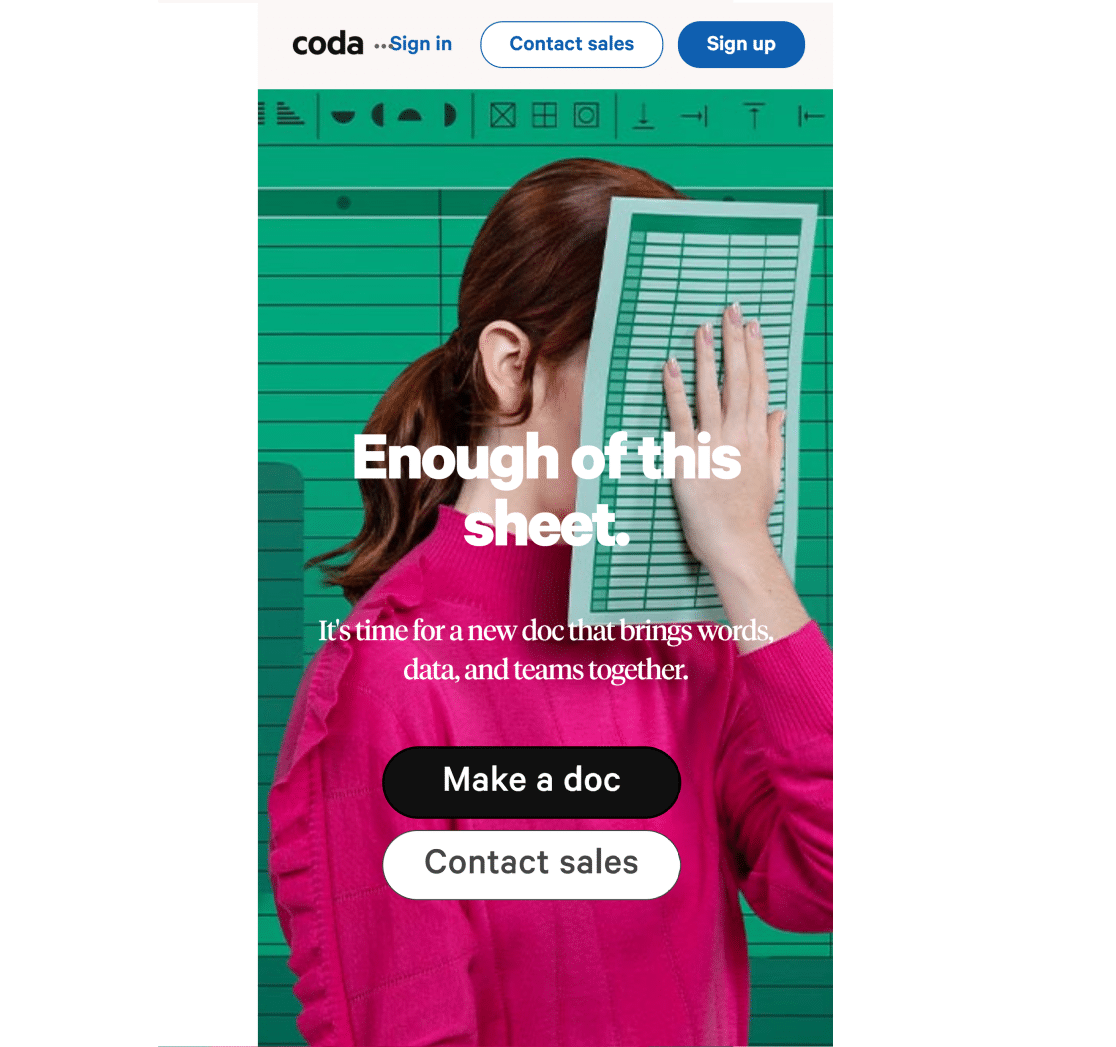
In some cases, however, it might make sense to still focus on desktops. For instance, B2B businesses and industries with an older demographic still prefer browsing the web on their desktops.
As always, take into account your particular analytics data to ascertain the device preferences of your target audience and optimize accordingly.
8. Test and Experiment Big
All too often, websites tend to be shy about experimenting with bigger elements of your site and only test the easier things like color changes. But this is a mistake.

Successful websites frequently experiment with different layouts, color palettes, headlines, and directional cues using A/B testing. This is important because not all experiments promise a high magnitude of returns.
For instance, changing the color of a button might help by a fraction of a percent. However, redesigning the layout of your landing page to ensure the most streamlined user experience can have a significantly higher impact on conversions.
There are lots of great tools that enable you to test your landing pages. You can try these Google Optimize alternatives to run experiments without code.
9. Optimize Offers & Copy for Your Traffic Sources
It’s imperative that you understand the sources you’re drawing traffic from and build the page and what you’re offering based on your audience’s expectations.
For example, traffic from social media is not as conversion-oriented as traffic from PPC sources. Social media users not familiar with your brand may simply not be that far ahead in their journey to be ready to do business with you yet.
In that case, running a lead magnet campaign would generally make more sense than selling your products or services right out of the box.
Similarly, pages optimized for organic traffic typically have a lower conversion rate than shorter pages featuring intent-driven copywriting. When your focus is exclusively on high purchasing intent traffic arriving at your page from PPC sources, it’s best to avoid the urge to optimize your page for search engines and SEO traffic.
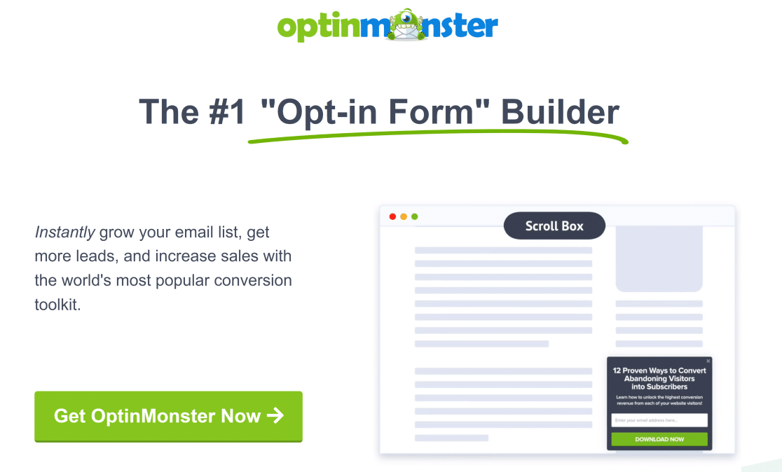
Match your conversion goals with the intent of your primary target audience. Your landing page campaign is likely to be a lot more successful that way.
10. Write Focused Page Headlines With Power Words
Of all the elements of a landing page, the headline is arguably the most impactful in engaging customers and driving conversions.
Compelling headlines include certain power words capable of triggering an emotional response in people. Smart use of these words in your landing page copy can compel users to click where you want them to click and have them perform your desired actions.
Here’s an excellent resource of over 700 power words. Try to include some of these words the next time you’re writing landing page headlines and copy. But bear in mind that these words shouldn’t be forced into your copy at the cost of relevance and fluency.
11. Leverage Social Proof
Social proof is an incredibly powerful way of persuading your users to take action.
Everyone likes to belong, and if your users have visible proof in the form of testimonials, case studies, and real-time purchase notices from other users, they’re highly likely to be the next ones to press that CTA button.
One of the best ways to utilize social proof for your landing pages is to use a free plugin called TrustPulse.
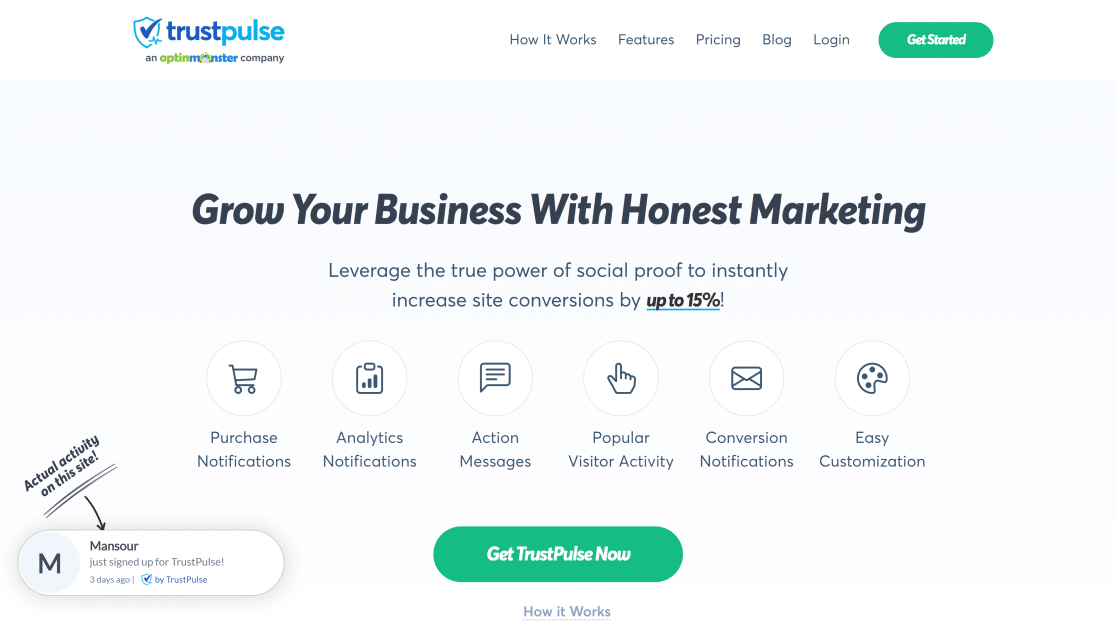
TrustPulse displays live customer activity on your site, which helps other active users trust you more and feel more comfortable doing business with you.
12. Minimize Load Time
With high internet speeds available today, users expect your web page to load almost the very instant they click on it. A slow-loading page leads to a high bounce rate and that can really hurt your conversions.
Sometimes, marketers can go overboard and add too many fancy elements like gifs and images to a landing page. But design-heavy landing pages often backfire because they lack focus.
Plus, with so many scripts and loading elements on your page, the load time increases massively. The result? Poor user experience and below-average conversions.
Media files have the strongest impact on your page load times, So, if you must use gifs and lots of images on your landing page, make sure to compress these files before adding them.
13. Use Landing Page Templates
It can be overwhelming to make landing pages that follow all of the suggested best practices all the time.
If you’re only starting and don’t have a lot of prior experience designing high-converting landing pages, then it’s a good idea to use pre-made templates.
SeedProd is the best landing page builder for WordPress. This tool is designed for beginners, so you can build great-looking pages that follow landing page best practices without touching a single line of code.
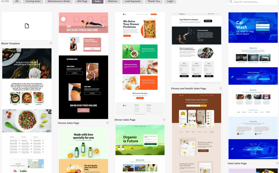
SeedProd features a drag-and-drop page builder and has over 100 pre-built landing page templates that are designed to maximize conversions.
Below, we’re using a landing page template for app sales, which perfectly mimics all the landing page best practices we’ve discussed above:
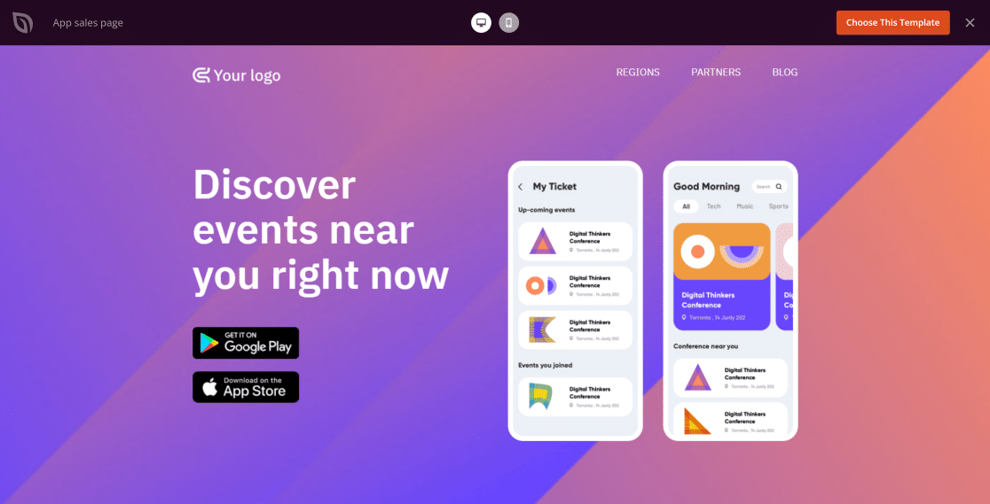
Plus, pages built with SeedProd are highly customizable. You can change pretty much every element of the page using the drag-and-drop builder, making sure that your landing page copy stands out.
When combined with additional tools like TrustPulse for social proof, landing pages made with SeedProd can skyrocket your conversions and sales in no time.
And that’s it! These are our top landing page best practices that are proven to convert and contribute to your brand’s bottom line.
Landing Page Design Best Practices – FAQs
If you need additional insights, take a look at some of the commonly asked questions on this subject. 👇
What are some common landing page design mistakes?
- Uninspiring copy: Promoting your features without tying them up directly with how they effectively solve a problem.
- Confusing CTAs: Using vague or multiple CTAs that distract visitors.
- Lack of social proof: Missing elements like testimonial, real user reviews, and ratings that build trust and credibility.
- Poor mobile responsiveness: Ignoring mobile experience when designing the page.
What are the key metrics to track for landing page success?
- Conversion rate: The primary goal of a landing page is conversions so if there’s one thing you need to track closley, it’s this metric.
- Abandonment rate: This is very helpful in understanding if people are abandoning too frequently and if you need to change something up to reduce abandonments.
- Engagement rate: Another important measurement to learn if visitors are engaging with your landing page to a satisfactory degree.
You can also track a bunch of other metrics like page views, session duration depending on how deep you want to dig into your landing page analytics. But if you want to keep it simple, the above three metrics should paint a fairly accurate picture about the success of your landing page.
How can I ensure my forms are secure and compliant with data privacy regulations?
WPForms comes with controls to ensure GDPR compliance. You can turn off cookies and even stop your form from storing other types of metadata from visitors submitting your forms to adhere to data privacy regulations.
What information should I ask for in my lead capture form?
Your lead capture form should have as few fields as possible. Generally, I recommend having a Name and Email field. If your marketing channels also incorporate phone, you can use a Phone field as well to capture phone numbers.
You can also include a paragraph field to capture any additional comments or a Multiple Choices or Checkboxes field with options for specific problems or solutions the visitor is interested in.
You can get started immediately with our optimally designed lead capture form template.
Next, Use Visitor Tracking to Understand Your Audience
Do you want to take a peek at your site visitors and see what they’re actually doing on your website? Check out our review of the best website visitor tracking tools to make more informed decisions when planning your marketing funnel.
You might also want to see our list of the best WordPress notification bar plugins, which can help you display the latest announcements and promote coupons at the top of your page.
Create Your WordPress Form Now
Ready to build your form? Get started today with the easiest WordPress form builder plugin. WPForms Pro includes lots of free templates and offers a 14-day money-back guarantee.
If this article helped you out, please follow us on Facebook and Twitter for more free WordPress tutorials and guides.

