AI Summary
Lead generation forms aren’t just boxes where you throw in a few fields and hit publish. They’re your first shot at sparking interest and building trust.
Think of them as the initial handshake in a business relationship. One that needs to be firm enough to establish credibility but welcoming enough that people want to continue the conversation.
In this post, I’m going beyond the usual templates and talking about some fresh, effective lead generation form examples that do more than just collect names and email addresses.
- 1. Back to the Roots
- 2. Chamaileon
- 3. SnackNation
- 4. Yumi
- 5. Expat.com
- 6. Daily Harvest
- 7. Yumble
- 8. Entrepreneurs On Fire
- 9. MikeLardi.com
- 10. Basepaws
- 11. LinkedIn
- 12. Shark
- 13. Netflix
- 14. Peloton
- 15. OkCupid
- 16. Social Media Examiner
- 17. Simple Habit
- 18. Marie Forleo
- 19. Bulk.ly
- 20. Modsy
- 21. Neil Strauss
- 22. Medium
- 23. Cracku
- 24. Single Grain
- 25. Twilio
- 26. Newfound
- 27. Pete & Pedro
- Mobile Lead Generation Tips
What Is a Lead Generation Form?
A lead capture form or lead gen form is a web form meant for capturing emails and other information about potential customers.
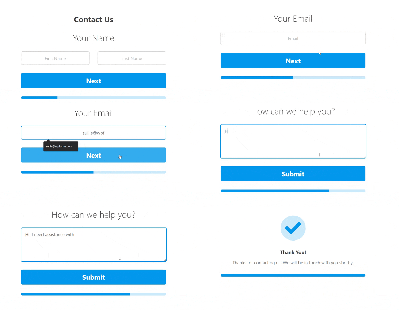
The most common types of lead generation forms include contact forms, registration forms, and simple newsletter signup forms. Each type of form can be crucial in generating new leads, depending on your target audience and business use case.
You can recreate most lead forms using the WPForms Lead Forms addon. It lets you create a form with a conversational layout that can be embedded anywhere on your WordPress site.
If you like the appearance and functionality of multi-step forms, the Lead Forms addon will give you both, all packaged in an optimized layout that helps to prevent form abandonment.
Lead Generation Form Examples
To help you navigate the different niches of businesses online, here’s a list of the brands on our list of lead generation examples on forms. Ready to start generating leads like the pros? Let’s get started.
1. Back to the Roots
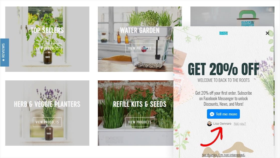
The Back to the Roots website has some great lead form examples, including this very wise use of automation with a chatbot.
Key Tactics:
- The ManyChat integration through Facebook Messenger shows the user already “logged-in” — giving a sense of trust and reliability
- A slide-in scroll box optin that doesn’t disrupt the user experience
- Call to action copy “Tell me more” is actionable and written in 1st-person.
2. Chamaileon
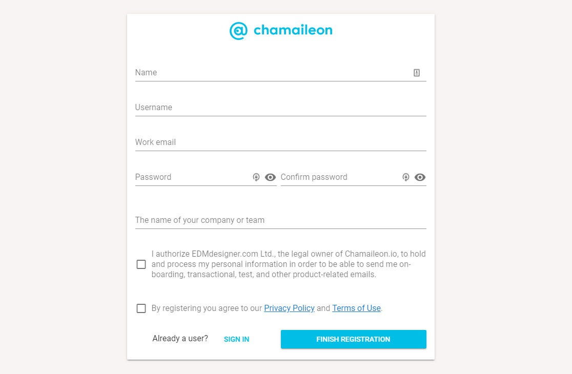
This form from Chamaileon is straight to the point with no distractions and a simple, effective design.
Key Tactics:
- Form submission is more likely with a distraction-free landing page
- Call to action button uses a bright color and actionable copy
3. SnackNation
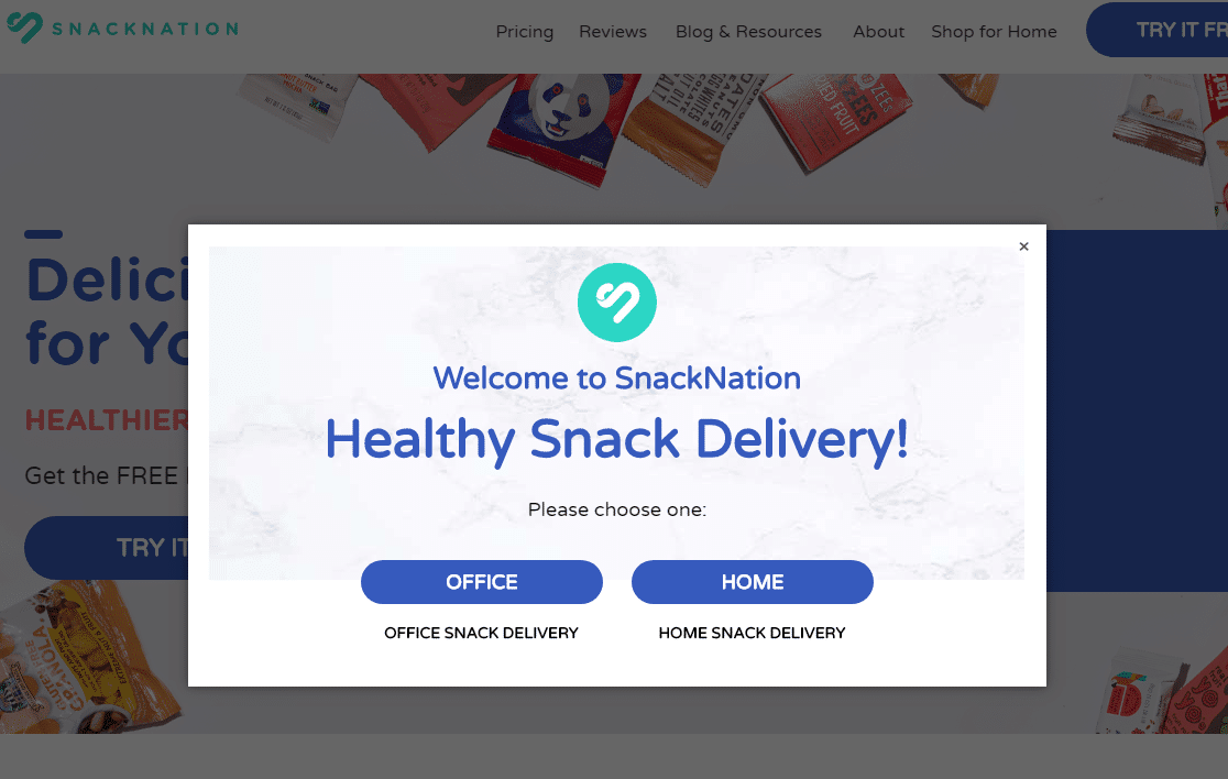
SnackNation does an excellent job in this example of using effective yes/no forms to get visitors to click something and personalize their sales journey themselves.
Key Tactics:
- Personalized questions to identify the type of lead and send them to a page/form based on their needs
- Offers limited options for easier completion, including no “submit” button
4. Yumi
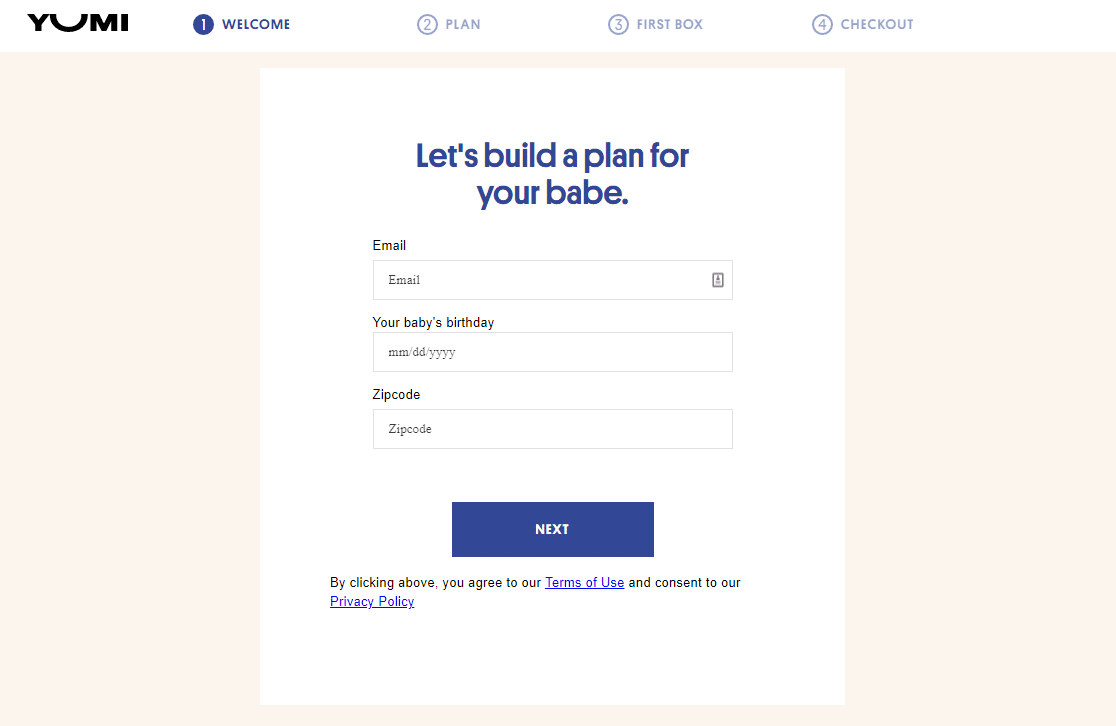
This straightforward multiple step lead form has a contemporary, sleek design to match the brand and help boost conversions, on top of other tactics.
Key Tactics:
- Custom placeholder text in the form fields
- Different stages of the long form are broken down into a multi-step form
5. Expat.com
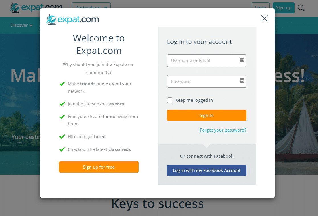
What makes Expat.com’s lead generation form so impressive? The list of bulleted benefits on this split-style form helps give visitors the best reasons to convert without taking up too much space.
Key Tactics:
- List of benefits that lead the eye to a call to action button
- Bright colors for the CTA buttons
6. Daily Harvest
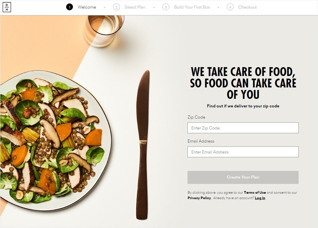
What is a lead generation page and how do you create a lead generation page? Take a look at this Daily Harvest example of a lead generation page with lots of smart conversion tactics, then read our post on how to create a dedicated form landing page in WordPress
Key Tactics:
- Distraction-free form page
- Stunning hi-res visual
7. Yumble
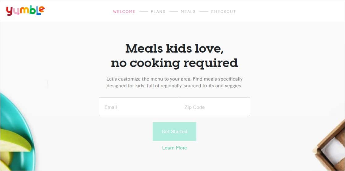
Yumble does a great job keeping their lead generation form focused on conversions and the user experience, all at the same time.
Key Tactics:
- A multi-page form for their long form
- Distraction-free full-page design
8. Entrepreneurs On Fire

This confirmation checkbox above the email field is a great tactic to get better conversions.
Key Tactics:
- Adds a confirmation checkbox to help get higher quality leads by confirming consent in the form instead of in their inbox
- Uses bold colors
9. MikeLardi.com
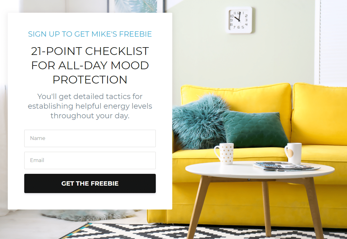
Key Tactics:
- Full-page campaign with a stunning custom background visual
- Direct call to action copy with the power word “freebie”
10. Basepaws
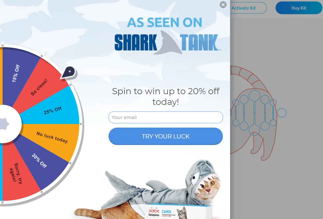
Basepaws made sure to mention their Shark Tank appearance right away on their lead generation form, using social proof in addition to a few other tactics like popups to increase conversions.
Key Tactics:
- Exit Intent style popup triggers work wonders to minimize abandonment
- Spin-to-win coupon wheel for a fun user experience and high conversions
11. LinkedIn
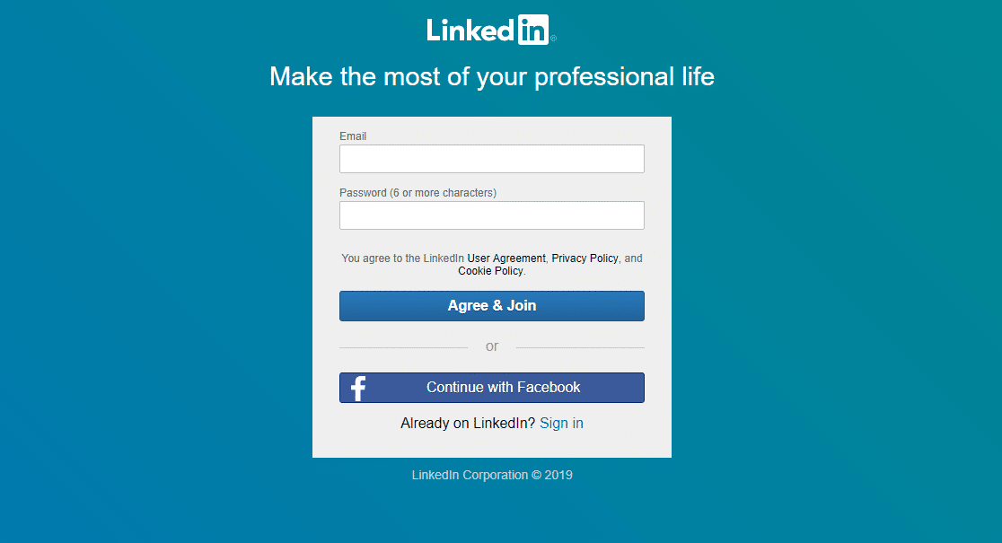
Most of the content people want to see on LinkedIn is gated content that requires you to sign up, so this lead generation form is the first thing many website users see unless they’re registered.
Key Tactics:
- Distraction-free landing page
- Social media integration for easy registration
- Branded colors create trust in the page since they’re recognizable
- Encourages visitors to share their business email address
12. Shark
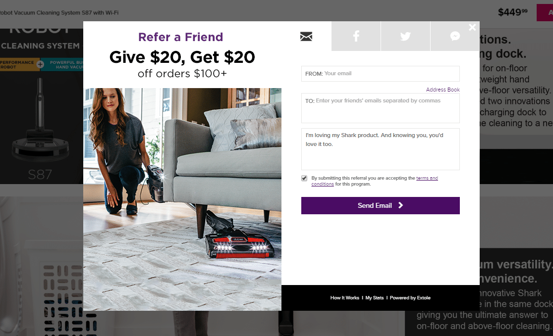
Shark’s lead generation form example shows how a refer-a-friend form is a brilliant way to explode your conversions by getting more than one email address per form.
Key Tactics:
- Uses social proof to gather not one but 2 leads at once
- Adds a comment box form field to create the idea the user is sending a personal message to a friend
13. Netflix
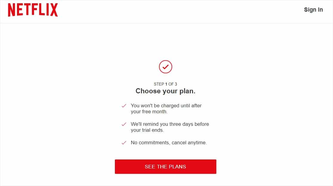
Netflix’s lead generation form is straightforward, clean, and distraction-free for maximum conversions.
Key Tactics:
- Clear and direct form submission button catches the eye immediately
- Multi-step form to break up a long form
- Actionable copy in the call to action button
14. Peloton
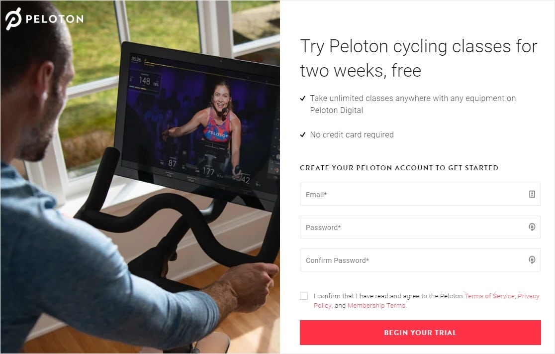
Peloton uses a very popular marketing strategy in this lead generation form — the free trial.
Key Tactics:
- CTA button is brightly colored and has a customized submit button with actionable copy
- Split style template of a fullscreen optin with only 3 simple form fields
15. OkCupid

OkCupid continues the use of the very popular tactic of distraction-free form pages, on top of some other tricks.
Key Tactics:
- Fullscreen landing page to keep potential customers focused
- Strategic psychological use of the color blue to create trust
16. Social Media Examiner

In this example, Social Media Examiner’s lead generation form hits a lot of the right tactics to get people to convert into subscribers in exchange for an in-depth report.
Key Tactics:
- Social proof to show how many people have already signed up
- Bold call to action button helps with email marketing
17. Simple Habit
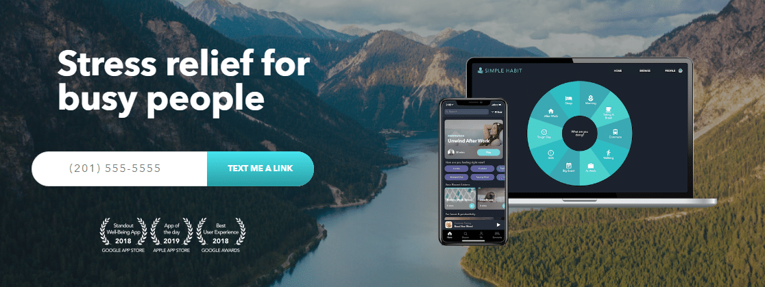
Because this product is an app, Simple Habit gets right to what they need to do to get their website visitors to convert — download their app.
Key Tactics:
- Only 1 form field asking for phone number on this especially mobile-friendly form
- A clear call to action written in 1st person and a colorful button
- Social proof by displaying awards/recognition on the form
18. Marie Forleo
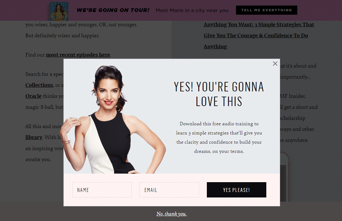
To get her visitor’s email address, this lightbox style popup lead generation form uses a minimalist design, which matches the overall theme of the entire site.
Key Tactics:
- Asks for just name and email address so the user doesn’t get overwhelmed
- Offers a strong lead magnet to gain trust with the visitor while also capturing email
19. Bulk.ly
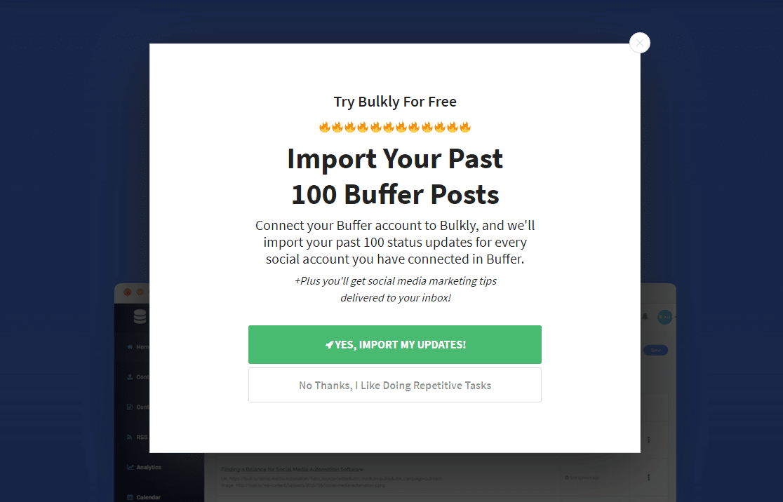
Where do your eyes land when you look at the above image? In this lead generation form example, Bulk.ly made sure that the submit button was the most noticeable part of this popup with bright colors and compelling copy.
Key Tactics:
- Offers an excellent incentive that’s targeted at their customer’s needs
- Uses a yes/no button tactic along with a psychological use of color on the button they want users to select
20. Modsy
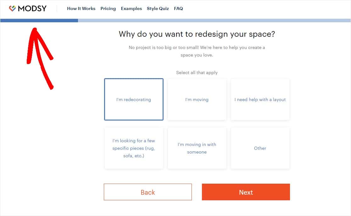
Modsy knows a smart way to ask for a lot of data and personal information but still get conversions is to break a long form up into steps.
Key Tactics:
- Multi-part form displays breadcrumbs to create a better user experience when filling out a long form
- Asks for personal information for a targeted experience
- Multi step lead form for making the form more user-friendly.
21. Neil Strauss
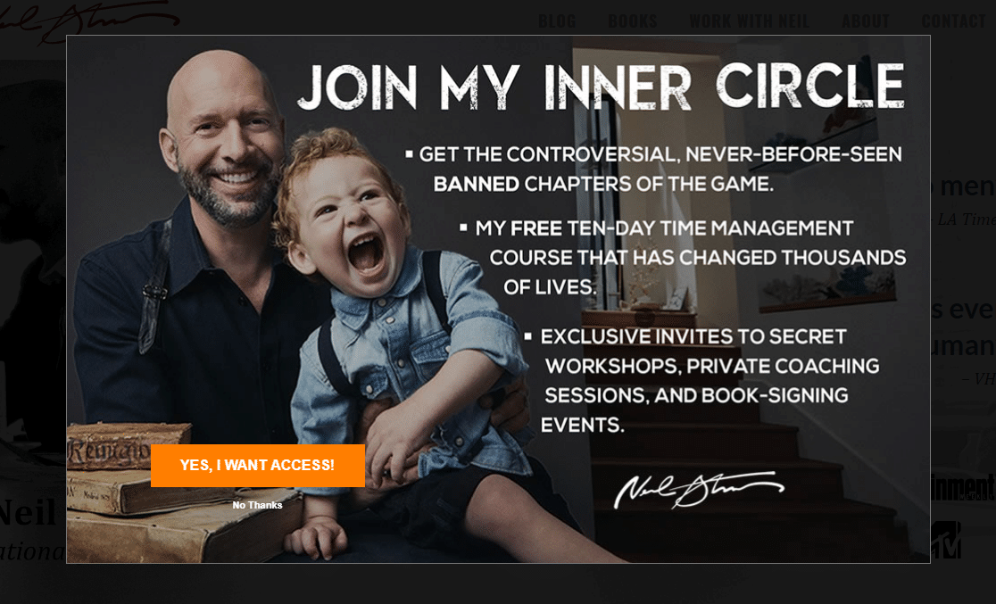
Author and entrepreneur Neil Strauss’ website uses a few tried-and-true lead conversion tactics to promote his email list.
Key Tactics:
- Bright call to action button on a fantastic lead magnet
- Displays benefits for signing up and includes power words like “controversial” to spark emotion
- Fullscreen popup to remove any distractions
22. Medium

Medium very wisely targets visitors based on their browser cookies and display a custom campaign for returning visitors.
Key Tactics:
- Uses browser cookies as a way to customize the message to returning or new website visitors
23. Cracku

On top of using a bunch of color psychology, this lead generation form from Cracku creates a sense of urgency to drive conversions and sales.
Key Tactics:
- Countdown timers are known to skyrocket form conversion rates
- Call to action button color draws the eye and user to click
24. Single Grain
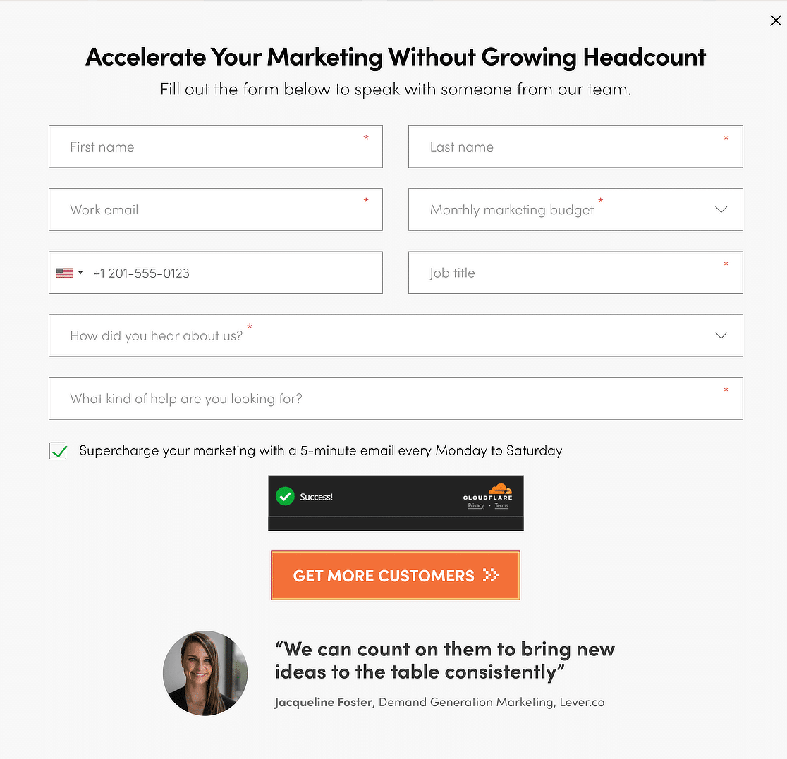
Single Grain uses a very clever tactic on their sign up form, where they display a customer testimonial right beneath the CTA button to create an element of trust.
Key Tactics:
- Testimonials help increase trust in the brand
- Call to action button color draws the eye and user to click
25. Twilio
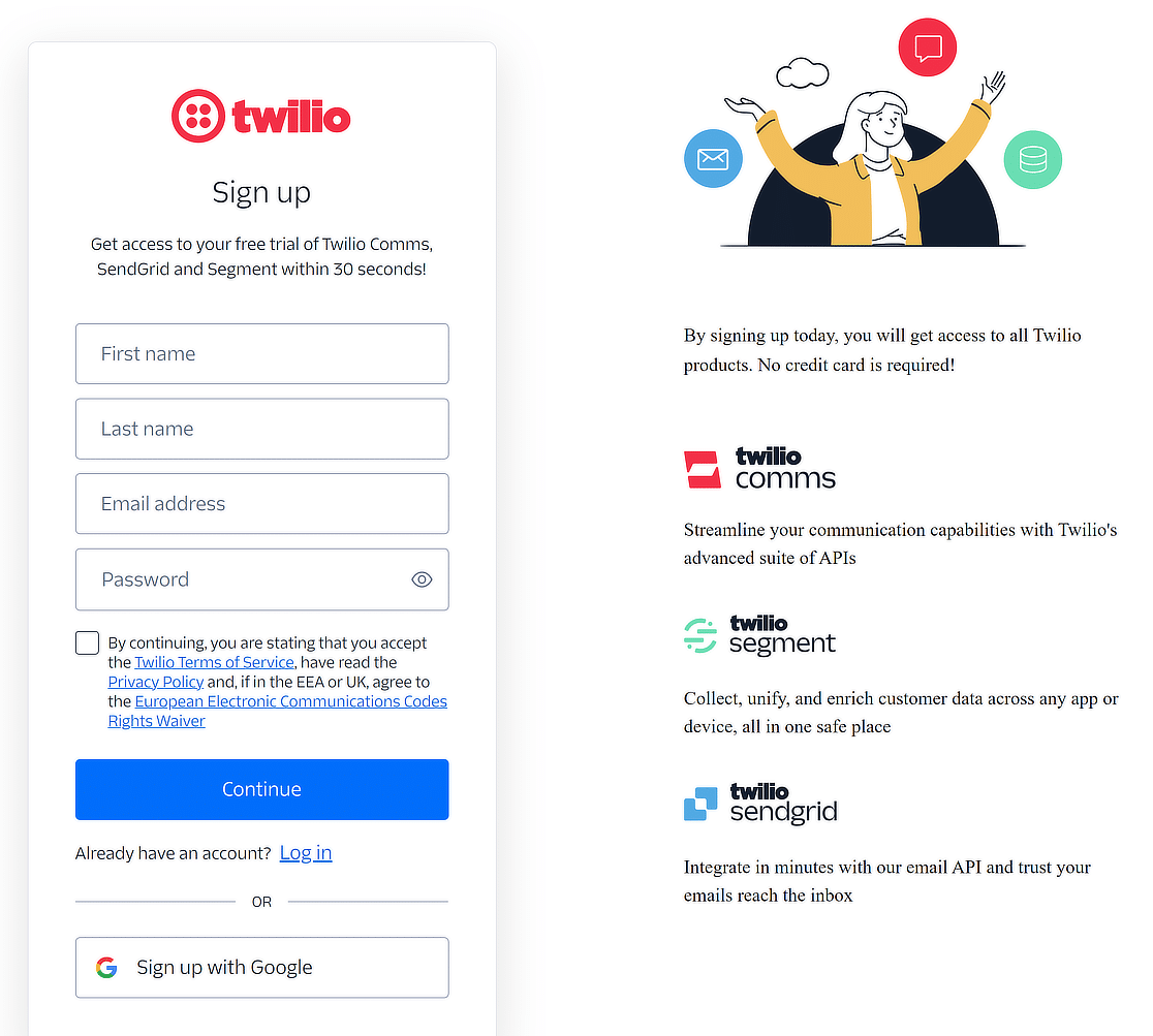
Twilio uses a very clever marketing strategy where they promote other services/sub-brands to convince users that they offer solutions for every need.
Key Tactics:
- Displays other brands to show an all-inclusive solution
- Easy sign up available with Google integration
26. Newfound
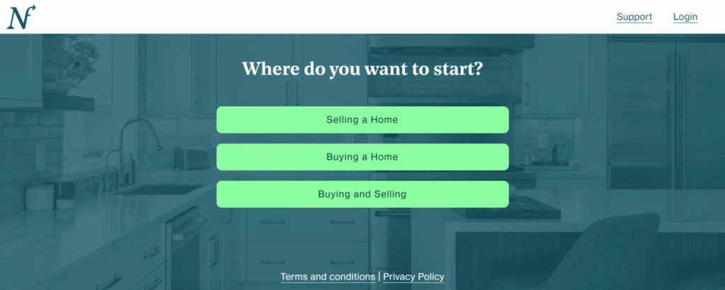
Newfound takes a straightforward, conversational approach to lead generation with their introductory form. As soon as visitors land on the page, they’re guided by a simple question: “Where do you want to start?”
Key Tactics:
- Newfound presents clear, distinct choices—Selling a Home, Buying a Home, and Buying and Selling.
- The form uses a minimalist design with vibrant buttons that stand out against the background.
27. Pete & Pedro
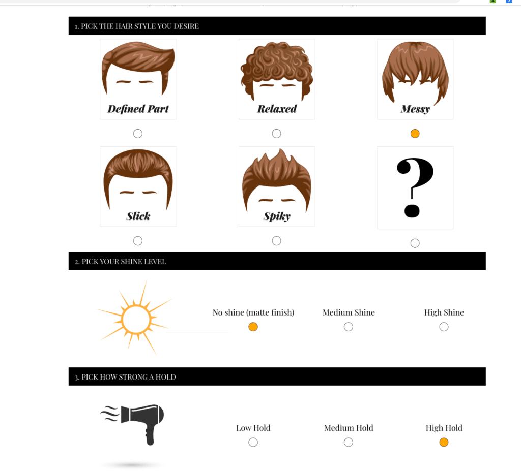
Pete & Pedro’s lead capture form takes a fun, interactive approach by guiding users through a visual quiz to determine their ideal hair styling product. This method not only keeps visitors engaged but also helps them make confident purchasing decisions.
Key Tactics:
- Users can easily choose their preferred hair style, shine level, and hold strength, which leads to a personalized product recommendation.
- By breaking the form into segments, Pete & Pedro manages to reduce the feeling of overwhelming users with too many questions.
Mobile Lead Generation Tips
For many businesses, a huge chunk of the audience uses mobile devices to consume content, fill out forms, and place orders.
It can be an absolute disaster if you use lead gen forms that appear broken and clunky on a mobile device. Here are some tips that can help create mobile optimized lead generation forms to ensure smooth user experience:
- Use Responsive Forms: A responsive form adjusts to the dimensions of different screen sizes automatically. Most modern forms are responsive by design but it’s still imperative to test your forms and check them on an actual mobile device. Fix any mobile-specific issues you find and you’ll have fewer abandonments from mobile users. WPForms is designed to be mobile-friendly by default.
- Single Column Layout: Multi column forms aren’t ideal for mobile forms as they’re likely to add a horizontal scroll. The flow of information on a narrow screen like mobile is more intuitive when it follows a linear top-down direction. For that reason, single-column layouts in lead gen forms work best on mobile devices as they offer the minimum friction to user experience.
- Short and Action-oriented CTAs: CTA buttons can look different when viewed on different devices. A common issue I’ve encountered is text wrapping over multiple lines on mobile vs. desktop. The easiest way to avoid this is by using short but action-driven CTA text that clarifies the next step. For example, if you’re taking a client’s contact info in a service request form, you can say something like “Let’s chat” rather than a generic “Submit” in your CTA. This is an example of a CTA that’s both short and specific, just the way it should be for mobile.
More Questions about Lead Generation Forms
Lead generation forms are a popular topic of interest among our readers. Here are answers to some commonly asked questions about them.
How do you optimize for lead generation?
You’ll see a few themes of effective tactics on this list of lead form examples. Many of these examples use a combination of some of these simple form optimization tricks:
- Use a compelling call to action button
- Offer a discount
- Optimize your pre-existing content as a lead magnet
- Create distraction-free landing pages
- Make multi-step forms if you have a long form
- Try gamified discount wheel popups
What are the best lead generation tools?
There are a lot of high-quality products out there, but only some are the best lead generation tools. Based on ease-of-use and flexibility, WPForms and OptinMonster are our 2 picks. They offer easy ways to set up most of the lead generation form tactics in the examples above. WPForms includes ready-made form templates to get you started faster, while OptinMonster also provides various lead capture form templates of its own.
On top of that, they integrate with all the best CRM and email marketing services so they make it incredibly easy to capture and manage your leads (so you can start making more money online). Plus, both products offer a 100% money-back guarantee.
What is an example of a B2B lead generation form?
An example of a B2B lead generation form might be a simple online form on a company’s website. This form typically asks for basic contact information and some relevant business details.
For instance, it might include fields for the person’s name, company name, job title, business email, phone number, and perhaps a section for comments or specific inquiries.
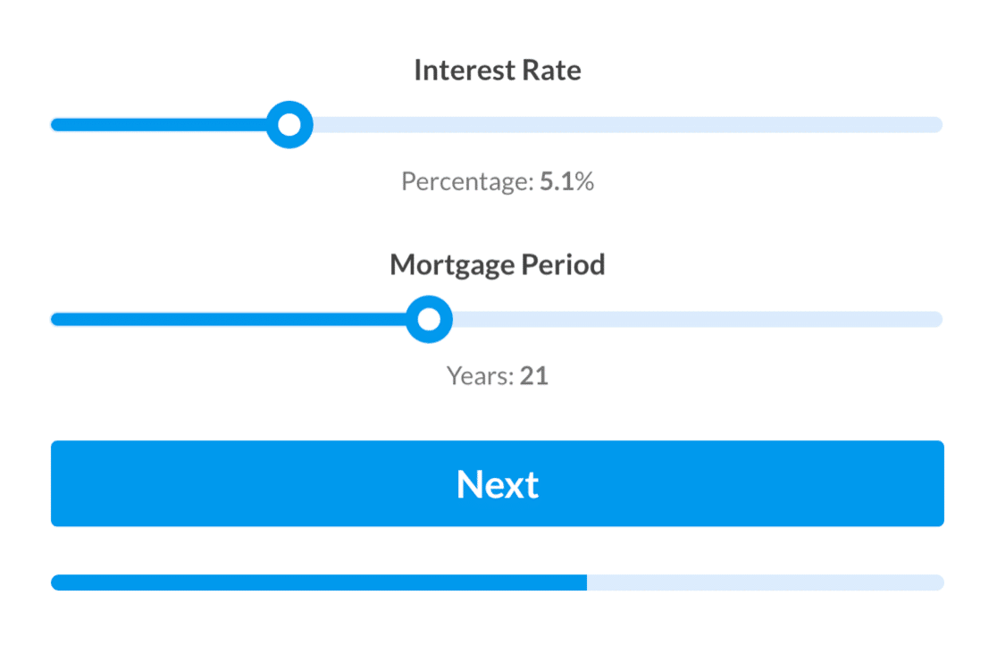
The purpose of this form is to collect information from potential business clients or partners who are interested in the company’s products or services. For instance, you can check out the lead generation tips for those in the mortgage industry.
How many fields are there in a lead generation form?
The number of fields in a lead generation form can vary, but it’s generally recommended to keep it concise yet informative. Typically, a form might have around 5 to 10 fields. These often include essential contact information like name, email, phone number, company name, and role in the company.
Additional fields might be added depending on the specific needs of the business, such as industry, company size, or specific interests related to the company’s offerings. The key is to balance the need for information with the user’s ease and willingness to provide it.
Which are the 4 steps of the lead generation process?
The lead generation process can be broken down into four main steps:
- Step 1: Attraction – This involves drawing potential leads to your business. This can be done through various marketing strategies like content marketing, SEO, social media marketing, or paid advertising.
- Step 2: Conversion – Once potential leads are attracted to your platform, the next step is to convert them into leads. This is typically done through lead generation forms where interested individuals can leave their contact details.
- Step 3: Nurturing – After collecting information, the nurturing process begins. This involves maintaining communication with the leads through emails, newsletters, or personalized follow-ups, providing them with valuable information.
- Step 4: Closing – The final step is converting these nurtured leads into customers. This involves making sales pitches, providing tailored solutions, or offering special deals based on the information and relationships developed in the nurturing phase.
Can I connect a WordPress lead gen form with my CRM?
Yes, you can easily connect your WordPress form with a CRM like HubSpot. WPForms comes with native integration for HubSpot, so you can automatically send the lead info you collect into your CRM, making collaboration easy for your sales team.
Next, Build Lead Forms With WPForms
And there you have it. Hopefully, these lead generation form examples gave you some great ideas on tactics you can try to increase your own conversion rates.
You can build optimized lead generation forms with the WPForms Lead Forms addon. Take it for a spin and see what you can create! You can also check out our huge list of lead generation templates.
Ready to build your form? Get started today with the easiest WordPress form builder plugin. WPForms Pro includes lots of free templates and offers a 14-day money-back guarantee.
If this article helped you out, please follow us on Facebook and Twitter for more free WordPress tutorials and guides.

