AI Summary
Are you looking for the best form layouts to improve your contact forms? Designing form layouts for maximum conversions can be tricky if you don’t have much experience to rely on.
For this post, we’ve put together 7 form design best practices to take your form layout to the next level and boost conversions.
Create Your WordPress Form Now
What’s the Best Way to Design a Form?
We’ve found that the best way to design a web form is to think about user experience.
Your visitors won’t feel like filling out a long, complicated form, particularly if it looks intimidating.
Using columns is just one technique that you can use to make your form designs more appealing. Another is using multi-page forms with progress bars. Ultimately, your form should be clean, concise, and easy for users to follow.
Designing Form Layouts: Best Practices
In This Article
- 1. Use a 2-Column Layout to Condense Forms
- 2. Match Form Layouts to Input Requirements
- 3. Split Long Forms With Multi-Page Layouts
- 4. Use Mobile-Friendly Layouts
- 5. Use Conversational Forms
- 6. Customize Your Form Styles
- 7. Use Inline Error Messaging and Validation
- FAQs on Form Layout Best Practices
- How Should Forms Be Structured?
1. Use a 2-Column Layout to Condense Forms
Single-column forms are widely believed to offer better conversion rates than multi-column forms. But the truth is, there is no one-size-fits-all approach to form layouts.
In fact, HubSpot’s form conversion A/B tests show that 2-column forms convert better than single-column forms in specific situations.
For instance, it’s generally not good for user experience (UX) if you have a long list of fields stacked onto a single column.
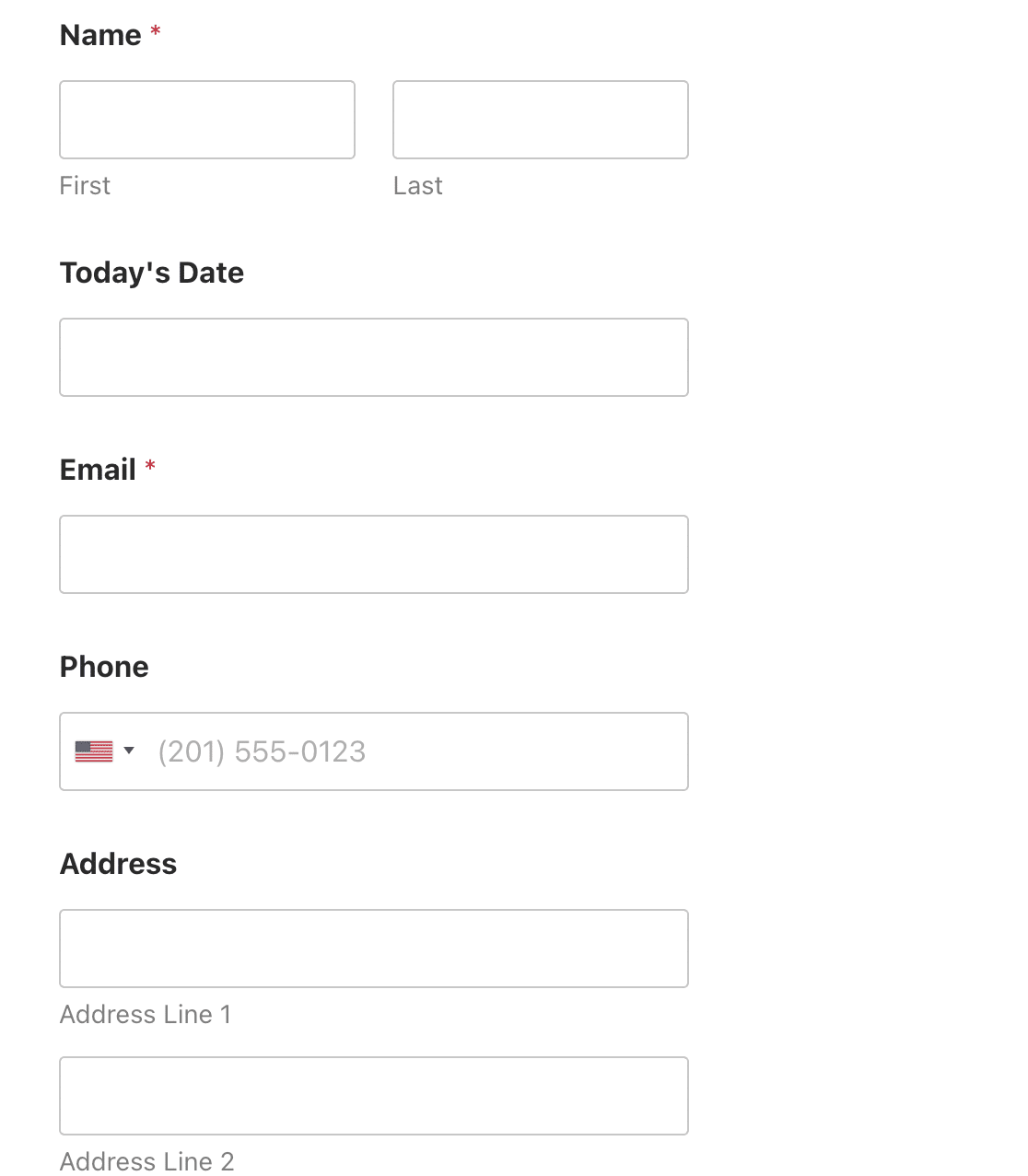
The single-column online form example below has a considerable vertical scroll with even more fields below what’s shown here, so we can expect users to encounter some inconvenience when filling this one out.
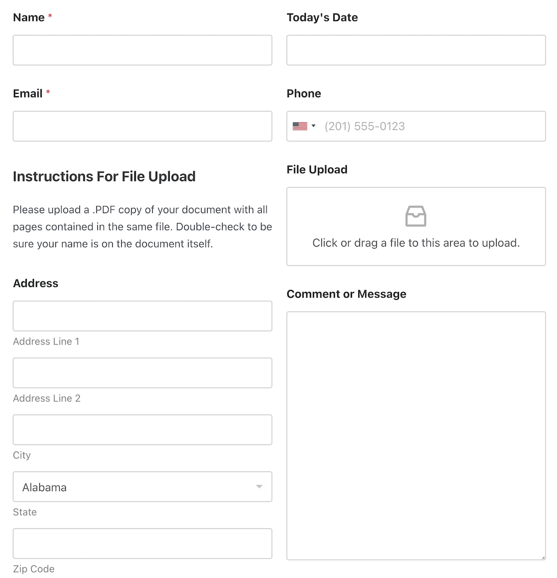
But the form becomes much more compact if we organize the same number of fields neatly into 2 columns instead.
The good thing is that you can easily create multi-column layouts using the WPForms Layout field.
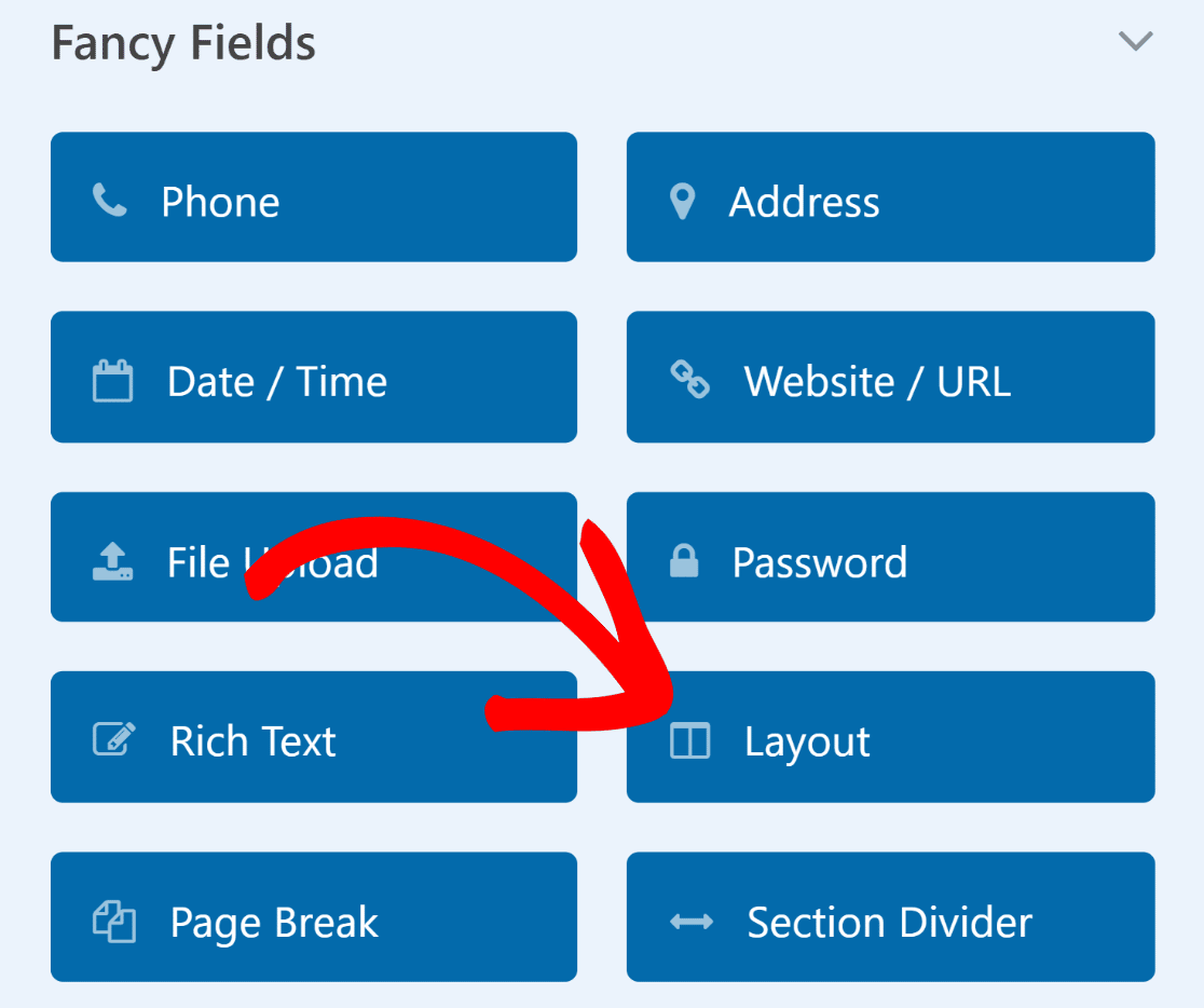
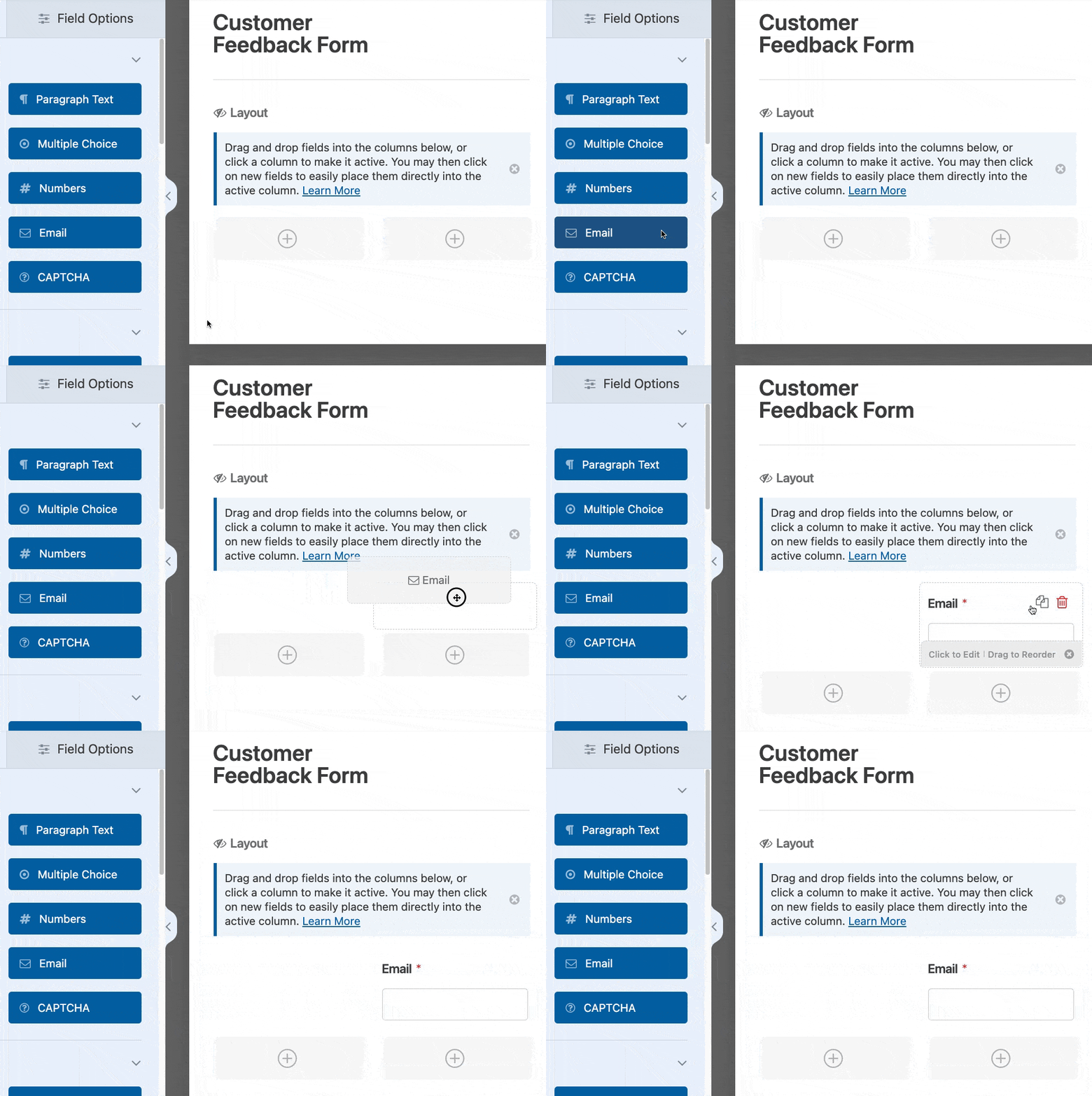
Once you add the Layout field to your form, you can select how many columns you want to use and drag and drop other fields into your chosen layout.
If you use numerous form fields, you can always experiment with different layouts to find one that can reduce form length and improve conversions.
Read Also: Single Column Forms: Examples and Inspiration
2. Match Form Layouts to Input Requirements
When designing forms with advanced layouts, the width of your columns is just as important as the number of columns you’re using.
For instance, if you expect users to input detailed text in your text box field on the right, it makes more sense to make the column for that field wider.

Another way to use this layout would be to have contact information on one side and a credit card number input field on the wider side.
In other scenarios where both columns of your form have similar fields, you can use equal-sized columns. This works well with smaller input fields, such as phone numbers, checkboxes, dropdowns, and radio buttons.

WPForms has very flexible layouts and includes 8 different layout presets to choose from. You can switch from one layout to the other with a single click.
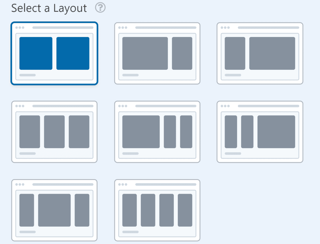
Every form layout offers benefits for different situations. It’s just a matter of using your best marketing judgment to choose the layout most appropriate for your fields.
3. Split Long Forms With Multi-Page Layouts
When you have a short form, all the fields should naturally fit into a single page without any problems.
But things get tricky when you have a lot of fields. It’s not a good idea to stuff all fields onto a single page if your form is too long and has a longer completion time.
Instead, you can make longer forms more easily manageable and improve usability by splitting them into multiple pages.
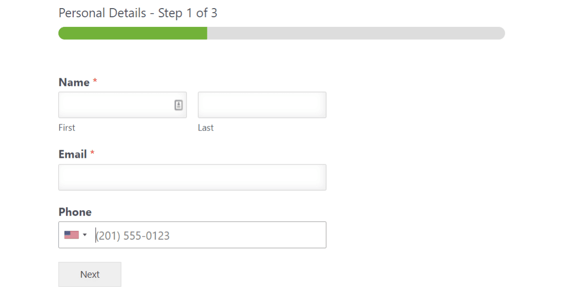
WPForms lets you create multi-page forms. Each page typically only contains a question or two. This keeps forms compact and creates a good user experience while still collecting the necessary information.
💡 Pro Tip: Another way to reduce the perceived length of your form is by adjusting the spacing between your fields. To learn how, see our tutorial on inserting gaps between fields.
Our favorite part? Creating a multi-page form is as easy as dragging and dropping a Page Divider wherever you want to split it up.
These forms also include a progress bar that helps users see how much of the form they’ve completed and what they have left to finish.
You can even combine two-column layouts within a multi-step form. If one of your form pages is longer than the others, you can use a two-column layout for that section to make your form appear more even from page to page.
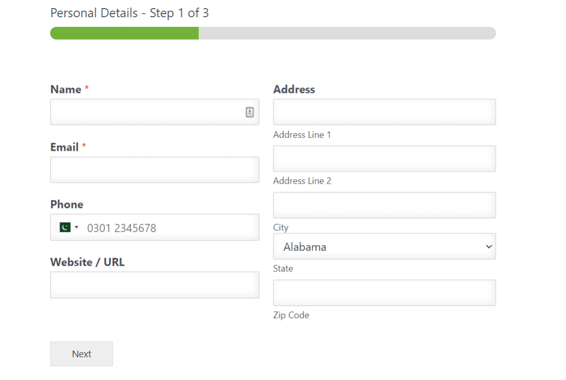
If you want to boost conversion rates with your forms, we recommend giving the WPForms Lead Forms addon a try. It also lets you create a multi-page form, but for the sole purpose of lead generation. The Lead Forms addon gives you the ability to customize and style your form a bit more, as well.
WPForms has many different features to help you minimize form abandonment and improve your form completion rate. In the end, it’s entirely up to you whether you want to use different layouts to get more conversions or simply add a progress bar on the top.
4. Use Mobile-Friendly Layouts
Sophisticated form layouts look great and even convert well on desktops. But mobile is a different animal.
A multi-column form functioning perfectly on desktop may break or render incorrectly when viewed on mobile if you aren’t careful.
Some form builders aren’t mobile responsive unless you put in extra effort to tweak CSS codes. Of course, that requires you to have CSS knowledge.

Thankfully, WPForms has top-tier functionality. Even the most advanced multi-column forms built with WPForms are mobile-responsive by design. No CSS needed.
This means that mobile forms will collapse into a single column automatically if a device can’t load your multi-column layout properly.
As a result, you can be sure your visitors always get the best experience, even on mobile devices.
5. Use Conversational Forms
Conversational forms allow users to answer one question at a time. This form layout can be very useful when you want users to focus on each specific question with minimal distractions.
It’s usually a good idea to use the conversational layout for surveys or feedback forms.
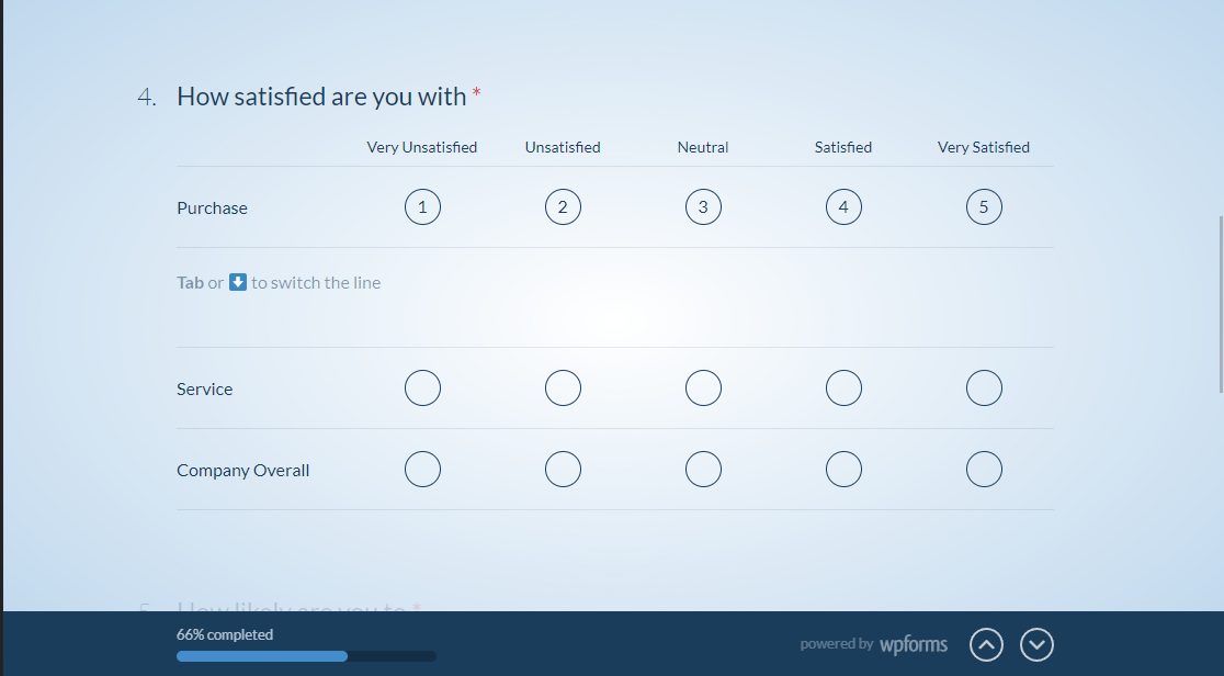
If you use conditional logic with your conversational forms, you can direct respondents right to the page they need. This means they don’t waste any time sorting through irrelevant form questions. Instead, the form almost mimics a kind of responsive chat.
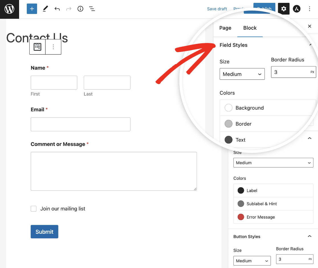
6. Customize Your Form Styles
Jazz up your form styling a little bit! Creating a modern, professional form doesn’t mean it needs to be boring.
WPForms lets you style your forms to match your website colors or theme, meaning it’s easier than ever to integrate your form into your site.
Once you’ve created and embedded your form in a post or page draft on your WordPress site, you can easily edit styles for field labels, submit button, and more. You don’t need to know anything about CSS code to use this feature and create beautiful forms.
7. Use Inline Error Messaging and Validation
No matter how well-designed your form is, you should expect users to make input errors occasionally. For example, they may leave required fields blank or enter information in the wrong format.
As a result, it’s smart to show inline validation messages that clearly highlight the problem and offer guidance for easily fixing it.
WPForms automatically uses inline error messages that appear right under a field in question. This lets visitors fix errors in real time and proactively reduces user confusion.

There are many different kinds of field validation messages in WPForms that appear depending on the nature of the input error. So you can deploy your forms freely and let WPForms take care of any validation issues.
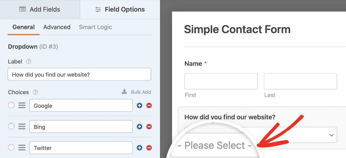
Another way to minimize confusion with your users so they don’t make errors is to add placeholder text to your fields. This will show visitors how to fill out your form with either some instructional text or an example of how the input is supposed to look.
FAQs on Form Layout Best Practices
Want to know some of the most important questions we get asked about form design? Here are a few of the most popular ones.
How Should Forms Be Structured?
We recommend that your forms are structured according to the type of information you collect in each section.
First, start with personal information and group all of those fields. Then move on to the next logical group of fields.
In WPForms, you can use Section Dividers to add headings so that your form structure is clear and easy to follow.
It’s also a good idea to provide instructions on your form. To help with that, take a look at our article on how to add instructional text to a form.
Why Should I Limit the Number of Fields on My Form?
You should limit the number of fields to prevent form abandonment. Form abandonment means that someone started filling out your form, but gave up before they submitted it.
Often, form abandonment happens because users feel overwhelmed by the length of a form. You can try using the Lead Forms addon to get boost lead generation by breaking your form up into smaller chunks.
Next, Create Conversational Surveys
Surveys that show one question at a time are great for user experience. They are also easy to implement, using WPForms conversational forms. Here’s how to create surveys that show one question at a time.
For more tips on effective form design, here’s our guide to adding a confirm email address field to ensure users enter their email addresses accurately. You might also be interested in our guide to the best ‘how did you hear about us’ survey questions.
Create Your WordPress Form Now
Ready to build your form? Get started today with the easiest WordPress form builder plugin. WPForms Pro includes lots of free templates and offers a 14-day money-back guarantee.
If this article helped you out, please follow us on Facebook and Twitter for more free WordPress tutorials and guides.



You combined the first name and last name fields into one field in the two-column example. This can cause problems if you want to import this data into a database. Most databases have an FName field and an LName field.
Hey Shonn – You can split the First name and last name using 2 single-line text fields. Here’s a screenshot for quick reference.