AI Summary
Lead forms are among the most powerful tools any website can have. Close to 50% of the marketers surveyed stated that lead forms are the highest-converting tool on their website.
And my experience confirms this statistic. However, merely using a lead form is unlikely to produce the results you’re after. There’s a method and strategy for creating impactful lead forms.
In this guide, I’ll try to define lead forms by sharing tips for building ones that drive results based on my own past marketing experience.
What Is a Lead Form?
Essentially, a lead form is a tool for collecting email addresses and other contact information.
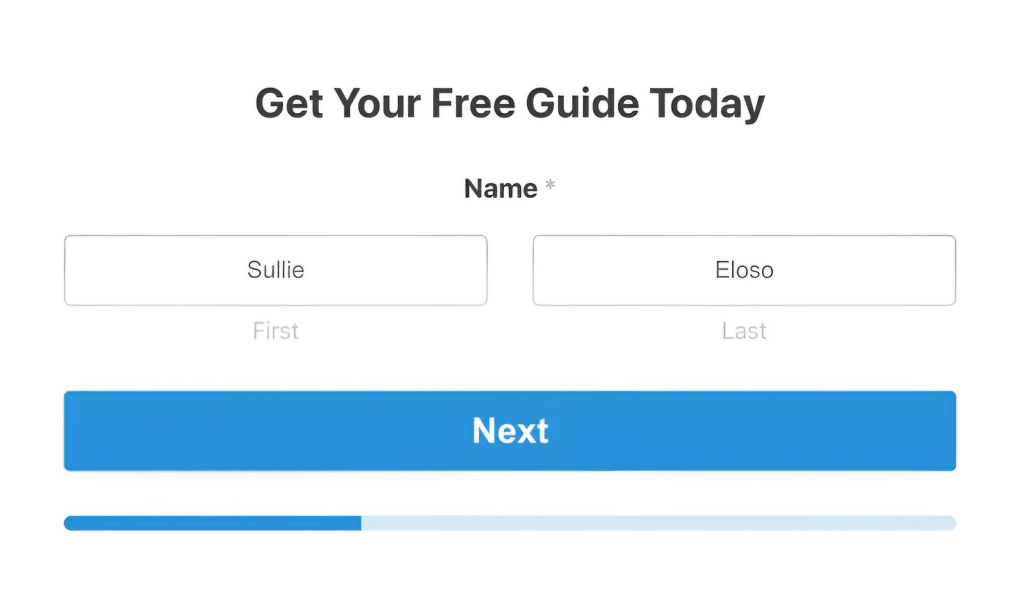
These forms give your visitors a simple way of expressing their interest in your business without fully committing to making a purchase at this point.
While a lead form doesn’t directly contribute revenue to your business, it brings prospective customers one step closer to seriously considering buying your product or service.
For that reason, it’s very frequently the case that the customers who do end up converting on your website overwhelmingly come from the leads you acquired through your forms.
Prominent Features of an Effective Lead Form
Lead forms come in all shapes and styles. But when you look for successful examples of lead forms, you’ll always come across certain common features shared by them all:
- Eye-catching headline: This is your first impression. Make it count by writing a punchy and reasonably descriptive headline.
- Concise form fields: Ask for essential information only, like name, email address, website, and phone number. Adding unnecessary fields increases abandonment rates and risks poor conversions.
- Clear call-to-action (CTA): Your submit button should be impossible to miss. It should be prominent and consist of relevant text other than just “Submit”.
- Value proposition: Clearly state what the user gets in return for their information, whether it’s a free eBook or a newsletter with valuable information.
Optimizing Your Lead Forms for Conversion
Creating a lead form is just the first step. To truly harness their power, you need to optimize them for conversions. Here are some excellent strategies and lead capture best practices that have proven effective for me:
1. Keep It Short and Sweet
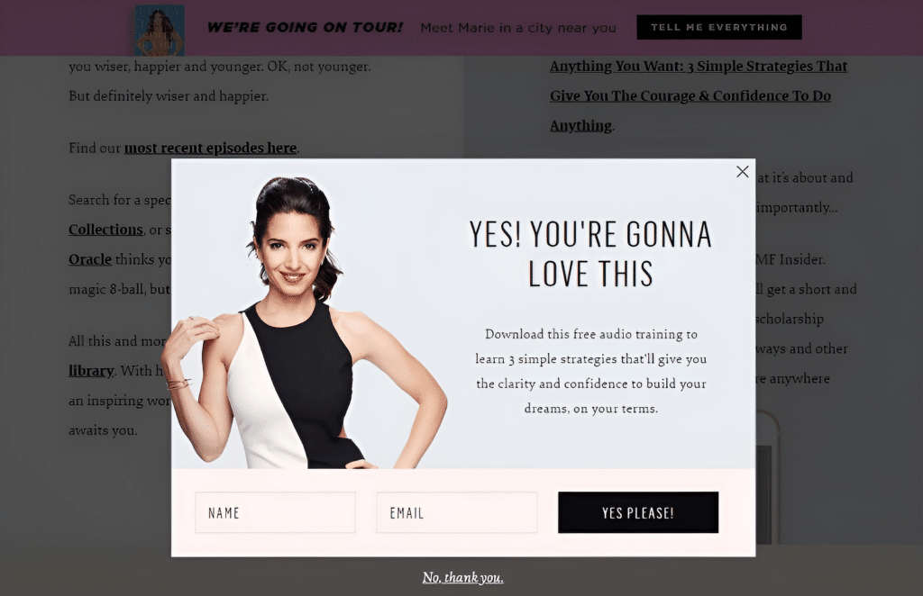
In my experience, shorter forms generally perform better. Ask for only the information you absolutely need. If you’re just starting out, try sticking to a name and email address.
This is a good example of a form having only name and email address fields. No more, no less.
2. Use a Compelling CTA
Your submit button is more important than you might think. Instead of a boring “Submit”, try something more engaging like “Get My Free Guide” or “Start My Free Trial”.
Here’s an example that I like sharing about a simple yet compelling CTA text.
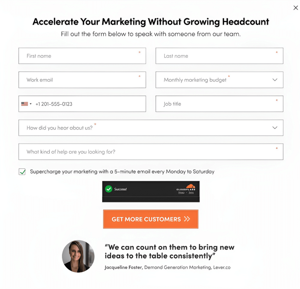
While this form isn’t perfect, the CTA does a fantastic job of grabbing visitor interest by emphasizing a specific and highly exciting result they can achieve by completing the action.
3. Offer Something in Return
People are more likely to share their information if they’re getting something valuable in return. This could be a free ebook, a discount code, or exclusive content.
I love this rather adorable example of a pet DNA testing service, offering a gamified discount in return for just the visitor’s email address.

4. Use Social Proof
If you have impressive statistics or testimonials, display them near your form. For example, “Join 10,000+ satisfied customers!”.
WPBeginner makes great use of social proof in their lead form, and the fact that they have pretty insane numbers to boast makes it hard to miss!
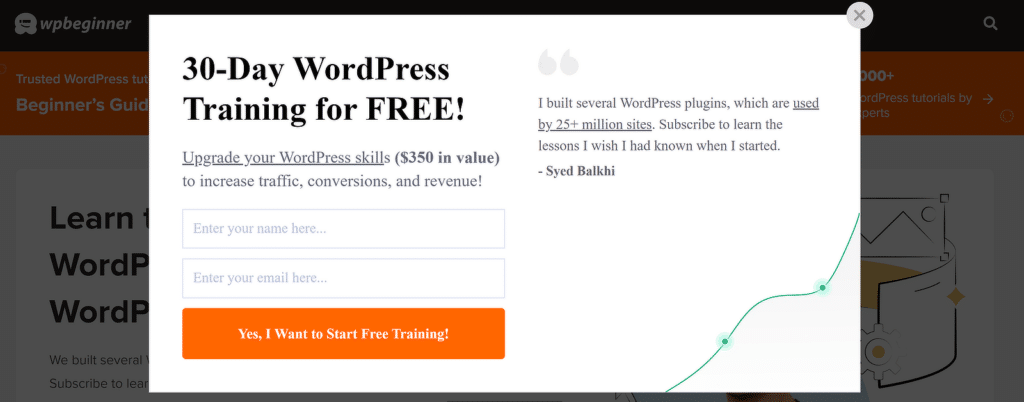
It’s one of my favorite examples of lead forms and you can steal this idea to create a highly engaging form that drives the results you want.
5. Optimize for Mobile
With more and more people browsing on mobile devices, it’s crucial that your forms are mobile-friendly. WPForms makes this easy with responsive forms that look great on any device.
| Do | Don’t |
|---|---|
| Keep forms short and simple | Ask for unnecessary information |
| Use clear, action-oriented CTAs | Use vague or generic submit buttons |
| Offer value in exchange for information | Expect users to give information for nothing in return |
| Test your forms regularly | Set and forget your forms |
Creating Lead Forms for Your WordPress Site
Now that we understand the importance of lead forms let’s dive into how to create them for your WordPress site. While there are several ways to do this, I’ve found that using a dedicated form plugin like WPForms offers the best balance of ease-of-use and functionality.
I’ll summarize the main steps quickly here, but you can read this detailed step-by-step guide on creating lead forms in WordPress for a comprehensive tutorial.
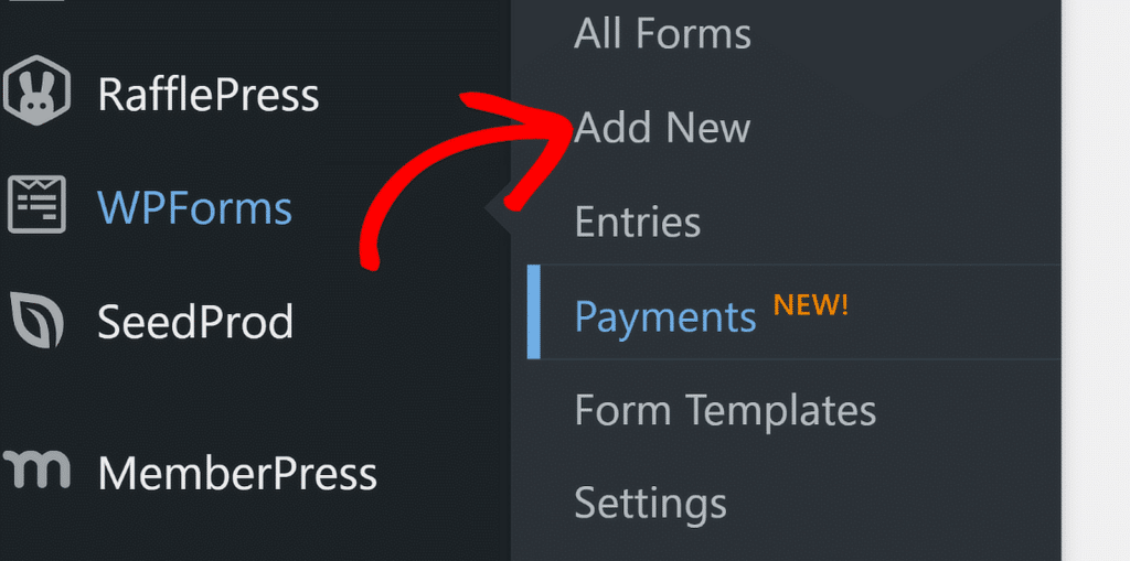
With your WPForms Pro plugin installed and activated on your WordPress site, navigate to WPForms » Add New from the admin menu.
When the form builder screen opens, you can enter a name for your form and select a lead form. For this example, I’m going to use the Lead Magnet Download form template.
Note: I’m assuming you have the WPForms Lead Forms addon installed. Here’s a guide on installing WPForms addons if you need assistance.
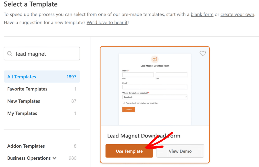
This is a fairly simple form template, just like a lead capture form should be. The form should take just a few seconds to load and appear on your screen.
I’ll use the lead form mode to give this form a sleek appearance, similar to the distinctive style of most lead forms on the web. You can enable the lead form mode by going to Settings » Lead Forms and using the toggle button labeled Enable Lead Form Mode.
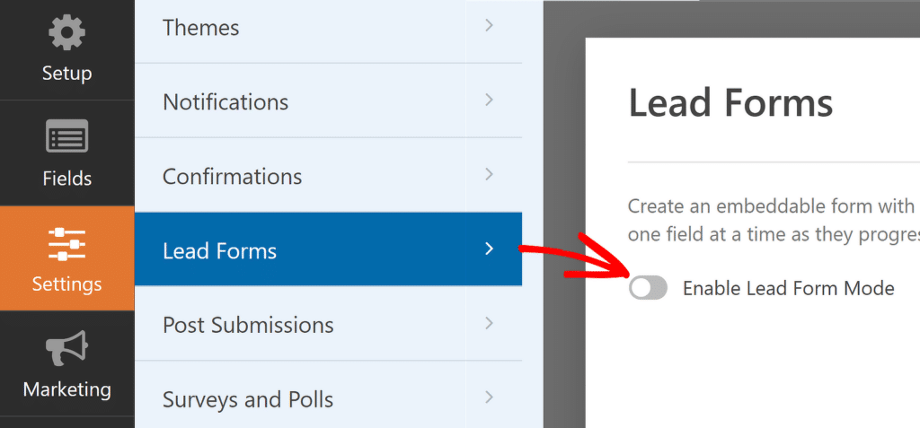
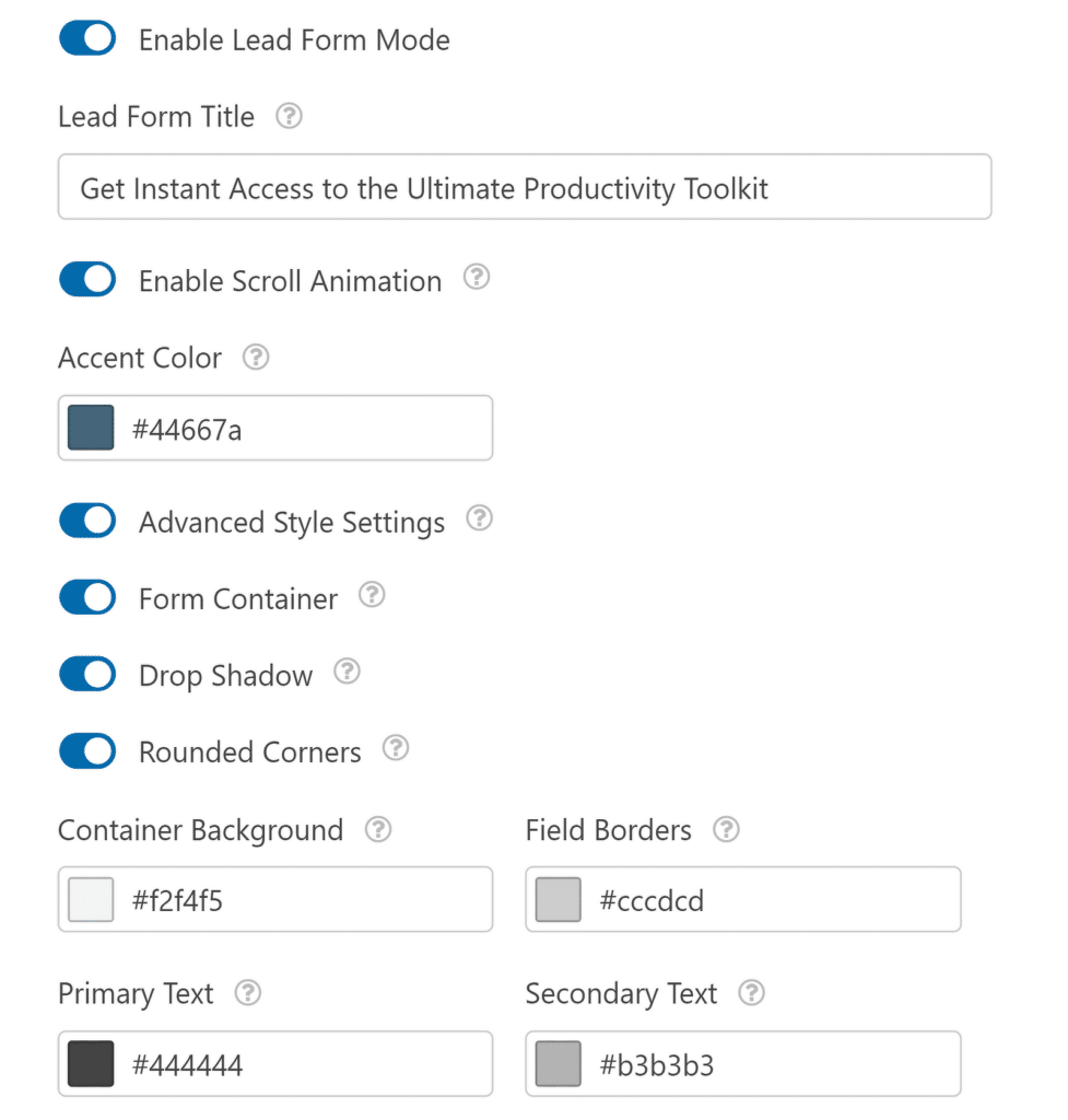
You’ll see additional options appear as soon as you enable this mode. Don’t forget to give your form a compelling and engaging title. Also, I recommend enabling all of the styling options here, which will make your form look much sharper and visually impressive.
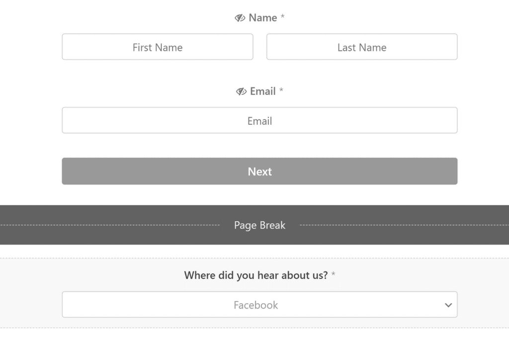
With the Lead Form Mode now enabled, you’ll notice that a page break has been added next to each field in your form. You can go back to your form by clicking on Fields on the sidebar. I’ve made several adjustments here by adding the Name and Email fields above the first Page Break (so they both appear together in the same step).
On the next page, there’s just one final question before the lead can complete the form and receive something in return for their email address.
I also prefer using placeholder text for some of the field names and hiding their main labels. This gives the form a clean look, but that’s entirely up to you.
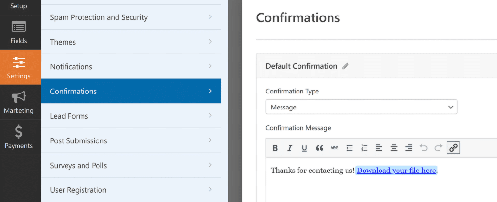
When you’re done customizing the form fields, go to Settings » Confirmations. This is where you can insert a link to a download for your leads in exchange for their email address.
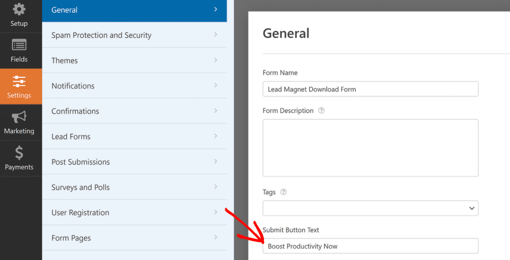
Remember to change your submit button text by replacing it with a super specific and action-oriented message. You can change the submit button text by going to the General menu inside Settings.
Great! You’re on your way to publish this form now. Go ahead and press Save and then click the Embed button to start the process.

A lead form is usually embedded inside a post or page with supporting content for your lead generation strategy. You can either embed the form in a new page or in an existing one–WPForms makes both options easy.
While the embedding process is fairly straightforward and form builder will guide you through the necessary steps, you can read this article on embedding a form for additional details.
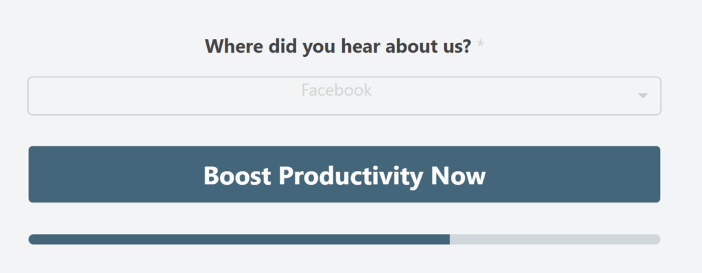
Here’s what the embedded form looks like on my test site:
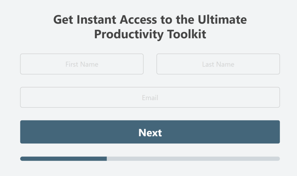
The CTA button will appear on the next page since this specific form is split into two steps.
💡 Pro Tip: I always test my forms thoroughly before making them live. You can use the Preview feature (either directly via the form builder or through the WordPress block editor) to review your form and fill out a test entry to confirm proper functionality (once, I accidentally used the wrong title for a form that didn’t match the download I was offering, much to the frustration of many site visitors…)
Advanced Lead Form Strategies
Once you’re comfortable with the basics, there are some advanced strategies you can employ to take your lead generation to the next level. And WPForms is fully equipped to make it easy for you to implement these tactics:
Multi-Step Forms
I’ve found that breaking longer forms into multiple steps can increase completion rates. It’s less intimidating for users and can create a sense of progress.
It bears mention, though, that multi-step forms are more impactful when you’re asking for additional details beyond just names and email addresses. A good rule of thumb is that if you have more than 3-4 fields on your lead form, it’s usually a good decision to split it into multiple steps, in my experience.

The Lead Form mode in WPForms does exactly that–adding page breaks automatically between each field to add multiple steps. If you have a super simple lead form with just a name and email address, there’s no reason to turn such a simple form into a multi-step form, so use your judgment wisely here!
Conditional Logic
Smart logic in WPForms is a powerful feature that allows you to show or hide fields based on user input. It’s great for creating more personalized, relevant forms that adapt based on the given response. For example, if your form includes questions like “Are you filling this form as a business or an individual?”, you can then show different additional fields relevant to the provided answer.
Exit-Intent Popups
Exit intent popups are arguably the highest converting tools you can use on your website. This type of lead form appears only when a visitor is about to leave your website, similar to the lead forms used by WPBeginner and many other successful sites.

I recommend giving Exit Intent lead gen popups a whirl. You might be surprised how well they actually perform. But at the same time, be careful not to overdo it–nobody likes an overly pushy website!
You can avoid annoying visitors by setting reasonable display rules to prevent these popups from appearing repeatedly for uninterested visitors or on areas of your site where they may not be a good fit (such as customer support pages).
For a full tutorial, check out building WordPress popup forms to get started.
And there you have it! I hope this article helped you learn about lead forms, get inspired by some of the examples I shared, and build your own lead gen strategies to grow your email list.
Reader Questions About Lead Forms
What’s the ideal number of fields for a lead form?
A lead form can be effective even if it has only 2 fields. But, slightly more complex forms can also be used, having 3-5 fields, sometimes even more than that. The exact number of fields ultimately depends on your exact offer, your industry, your lead funnel, and your target audience.
Should I use a single or multi-step form?
If your form only has 2 fields, you should use a simple form with a single page. But for longer forms, adding multiple steps can increase completion rates by making your form feel less overwhelming.
How can I make my forms GDPR compliant?
Include clear consent checkboxes, link to your privacy policy, and only collect necessary information. WPForms has built-in GDPR compliance features to help with this, but I strongly encourage seeking legal counsel and have your entire site reviewed or GDP compliance by a professional.
Can I use the same lead form across my entire website?
Yes, you can strategically reuse the same lead form across different parts of your website. But it’s more effective to vary your offers and messaging in the form depending on where you’re placing it. Having different variations on important pages can enable you to execute more targeted lead generation.
How can I reduce spam submissions through my lead forms?
You can use noninvasive anti-spam methods on your lead form, such as Cloudflare Turnstile and Akismet. These spam prevention tools quietly operate in the background and block spam bots while ensuring a smooth and safe experience for real visitors.
Next, Using Lead Forms vs Landing Page
Now that you know more about lead forms and how powerful they can be, you might be wondering where landing pages fit in your marketing strategy.
It’s an interesting question, and I’ve explored it in some depth in this article on landing pages vs lead forms.
Ready to build your form? Get started today with the easiest WordPress form builder plugin. WPForms Pro includes lots of free templates and offers a 14-day money-back guarantee.
If this article helped you out, please follow us on Facebook and Twitter for more free WordPress tutorials and guides.

