AI Summary
When you run a business or manage a website, keeping your users informed is crucial, and that’s where email notifications come in.
Whether it’s confirming a purchase, sending an appointment reminder, or updating users about account activity, these notifications are the backbone of smooth customer communication.
In this guide, I’ll walk you through examples and best practices for email notifications, helping you optimize your approach and create messages that people want to open.
What Are Email Notifications?
Before I discuss the examples and best practices, I think it’s a good idea to refresh your understanding of email notifications.
In simple words, email notifications are automated messages sent to users to keep them informed about certain activities or updates.
They play a key role in business communication, often conveying critical information such as purchase confirmations, shipping alerts, or account updates.
Unlike newsletters or marketing emails, which aim to engage customers over time, email notifications are typically direct and focused on delivering specific, actionable information.
Types of Email Notifications
There are various types of email notifications, each serving a distinct purpose in business communication. These include notifications triggered by transactions, behavior, or actions on a website (like filling out a form). Below, we’ll explore two of the most common categories of email notifications.
Transactional Emails
Transactional emails are typically sent after a user completes an action, such as placing an order or updating their account.
These emails focus on providing critical details that users expect immediately after their interaction.
Examples include:
- Shipping Notifications: Alerts to let customers know their package has been shipped, often with tracking information.
- Invoice Emails: Sent to users after payments have been processed to offer a breakdown of costs and a receipt for their records.
- Order Confirmations: A receipt confirming that an order has been placed and providing an overview of the purchase.
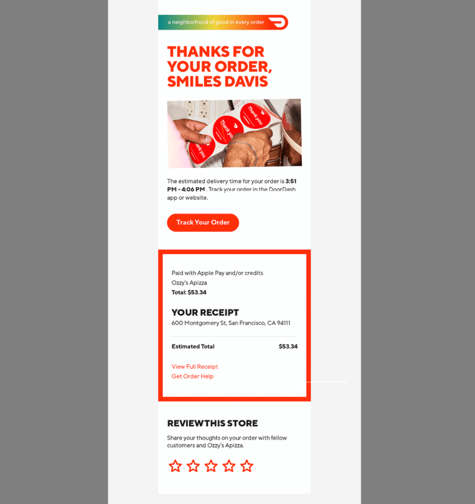
These emails ensure that users have all the necessary details about their interactions, giving them peace of mind while enhancing trust in the business.
Behavioral Emails
Behavioral emails are sent based on a user’s interactions with your platform, typically triggered by actions (or inactions) that a user takes.
They help businesses stay connected with customers, often aiming to encourage further engagement.
Examples include:
- Activity Reminders: Emails reminding users to finish setting up an account, take part in an event, or renew a subscription.
- Cart Abandonment Notifications: Messages sent to customers who add items to their shopping cart but do not complete the checkout process. These emails often include incentives like discounts to encourage users to return and complete the purchase.
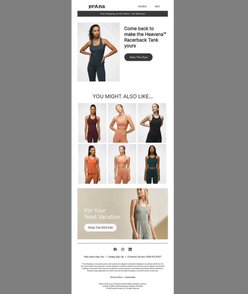
These emails personalize the customer experience by responding to user behavior and offering timely prompts to re-engage users at critical points in their journey.
Actions on a Website
Email notifications are also often triggered by specific actions a user takes on a website. These notifications help keep users informed about their activities.
For example, when someone fills out a contact or registration form, an email notification can be sent as a confirmation.
Other common website actions that might trigger email notifications include:
- Newsletter Sign-Ups: Users who sign up for a newsletter receive a welcome email letting them know their subscription was successful.
- Account Creation: After creating an account on a website, users receive an email to confirm their registration, often with instructions for setting up their profile.
- Password Resets: When a user requests a password reset, an email with a link to reset their password is sent immediately for security purposes.
- Event Registrations: Users who register for a webinar or event might receive an email with event details, dates, or a calendar invite.
By automating email notifications based on these website actions, businesses can improve user engagement and provide clarity, which builds trust with customers.
Also Read: Creative WPForms Ideas to Grow Your Business
Best Practices for Creating Effective Email Notifications
Email notifications can be a powerful tool to keep your audience engaged, informed, and satisfied.
However, to be truly effective, these notifications need to be well-crafted, clear, and designed with the user in mind.
Below are actionable tips to help ensure your email notifications meet the needs of your audience while driving meaningful engagement.
1. Keep the Subject Line Clear
The subject line is the first thing your recipient sees, so it’s crucial that it immediately communicates the purpose of the email. A clear and direct subject line increases the likelihood of the email being opened.
For example, instead of a vague subject like “Your Order,” use “Your Order #1234 Has Shipped” to tell the recipient exactly what they’ll find inside. Here are some more real-world examples:
- Your package is on the way! — Amazon.
- Password Changed Successfully — Dropbox.
- Your Appointment is Confirmed — Zocdoc.
- New comment on your post — Facebook.
- It’s Time to Renew Your Subscription — Adobe.
- Your Monthly Statement is Ready — American Express.
- Action Required: Verify Your Email Address — GitHub.
- Your recent payment was successful — PayPal.
- Update: Changes to your account settings — Spotify.
These examples demonstrate the importance of subject lines that immediately inform the reader of the email’s purpose, encouraging quick action or understanding.
2. Personalize the Content
Personalizing your email notifications is a simple yet effective way to increase engagement.
By including the recipient’s name, recent purchases, or specific actions they’ve taken, you make the email feel more relevant to them. This small touch can have a significant impact on how your emails are received.
For instance, “Hi Sarah, here’s your latest account update” feels more personal and invites the user to engage with the content.
3. Design for Mobile Responsiveness
With so many users checking emails on their phones, ensuring your email notifications are mobile-friendly is non-negotiable.
Your emails should be easy to read and navigate on any device. This means using responsive design techniques, making sure images load properly, and ensuring buttons and links are easily clickable.
A mobile-responsive design helps create a smooth user experience and ensures your emails are just as effective on small screens as they are on desktops.
4. Include a Call-to-Action (CTA)
A well-placed CTA can make all the difference in email engagement. If your email notification requires further action, such as tracking an order, scheduling an appointment, or reviewing a product, include a clear and relevant CTA.
For example, buttons like “Track Your Package” or “Review Your Purchase” make it easy for recipients to know what to do next. CTAs encourage engagement, making it simple for users to take action directly from the email.
5. Use Consistent Branding
Your email notifications should reflect your company’s brand, both in design and tone. Use consistent colors, fonts, and logos to ensure brand recognition.
Additionally, the language used in the email should align with your brand’s voice, whether it’s casual, professional, or somewhere in between.
Consistent branding builds trust and ensures your audience knows who the message is from at a glance. It also helps reinforce your brand’s identity with every touchpoint.
Also Read: WPForms Best Practices: How to Make the Perfect Form for Your Site
Email Notification Examples to Inspire You
In this section, I’ll showcase various examples of email notifications from different brands and analyze why they work so well.
1. LinkedIn
Subject Line: Your Page has been mentioned!
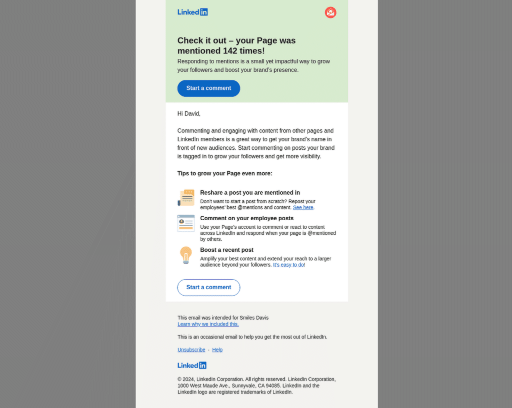
This email from LinkedIn notifies a Page admin about mentions on their LinkedIn Page. It reminds them to stay engaged with followers by responding to comments or sharing content.
Why It Works
- The email is direct and provides immediate value by showcasing specific numbers, like “142 mentions,” which taps into a sense of urgency.
- The call to action (CTA) button, “Start a comment,” stands out and is clear, encouraging the recipient to engage without hesitation.
- LinkedIn includes actionable advice, offering practical ways to leverage the mentions (resharing posts, commenting, or boosting), adding more value.
- Each tip has its own clickable CTA, allowing for easy next steps without overwhelming the recipient with too much information.
2. Trustpilot
Subject Line: 16 people have read your review!
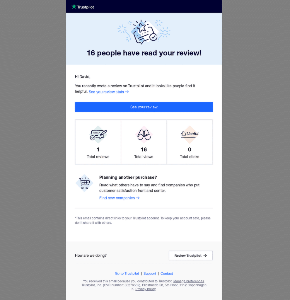
This email notification from Trustpilot is designed to update the user on the visibility and performance of their review. At the same time, it subtly prompts users to revisit their reviews or explore additional companies on Trustpilot.
Why It Works
- By highlighting that 16 people have read the review, it acknowledges user contribution, reinforces engagement, and encourages further action.
- The email provides a quick summary with visuals for reviews, views, and clicks, making it easy for users to understand at a glance.
- The primary CTA button, “See your review,” is bold and visible, encouraging users to take immediate action.
- The email includes a secondary CTA, “Find new companies,” promoting further interaction with the platform without being pushy.
3. PayPal
Subject Line: Thanks for contacting us
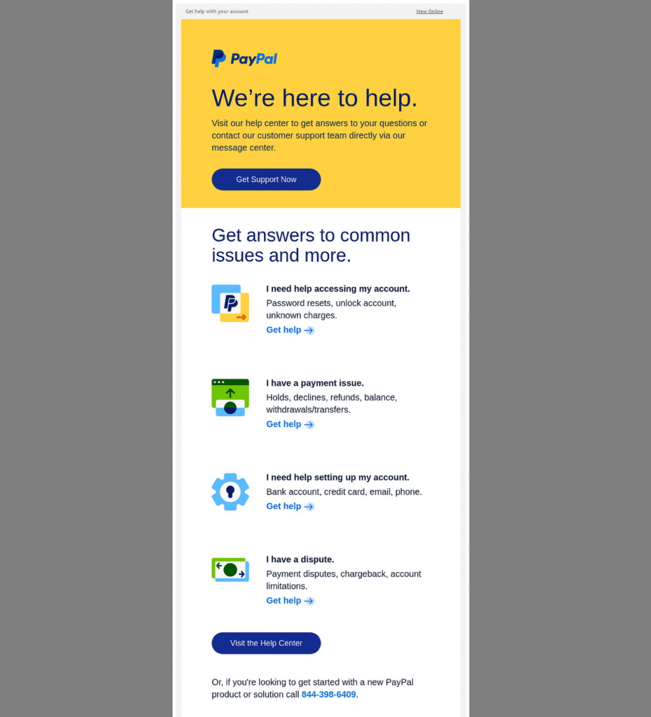
This PayPal email notification aims to assist customers by providing helpful links and guidance for common account-related issues.
Why It Works
- The email opens with an offer to help, directly addressing the customer’s potential need.
- Issues are categorized (account access, payment, disputes), making it easy for users to find the information they need quickly.
- Each issue section has a “Get help” link, encouraging users to act based on their specific problem.
- Icons next to each category provide a quick visual cue to enhance comprehension and improve user experience.
- A final link to the Help Center provides a broader array of support options for users with more complex questions.
4. Netflix
Subject Line: A new device is using your account
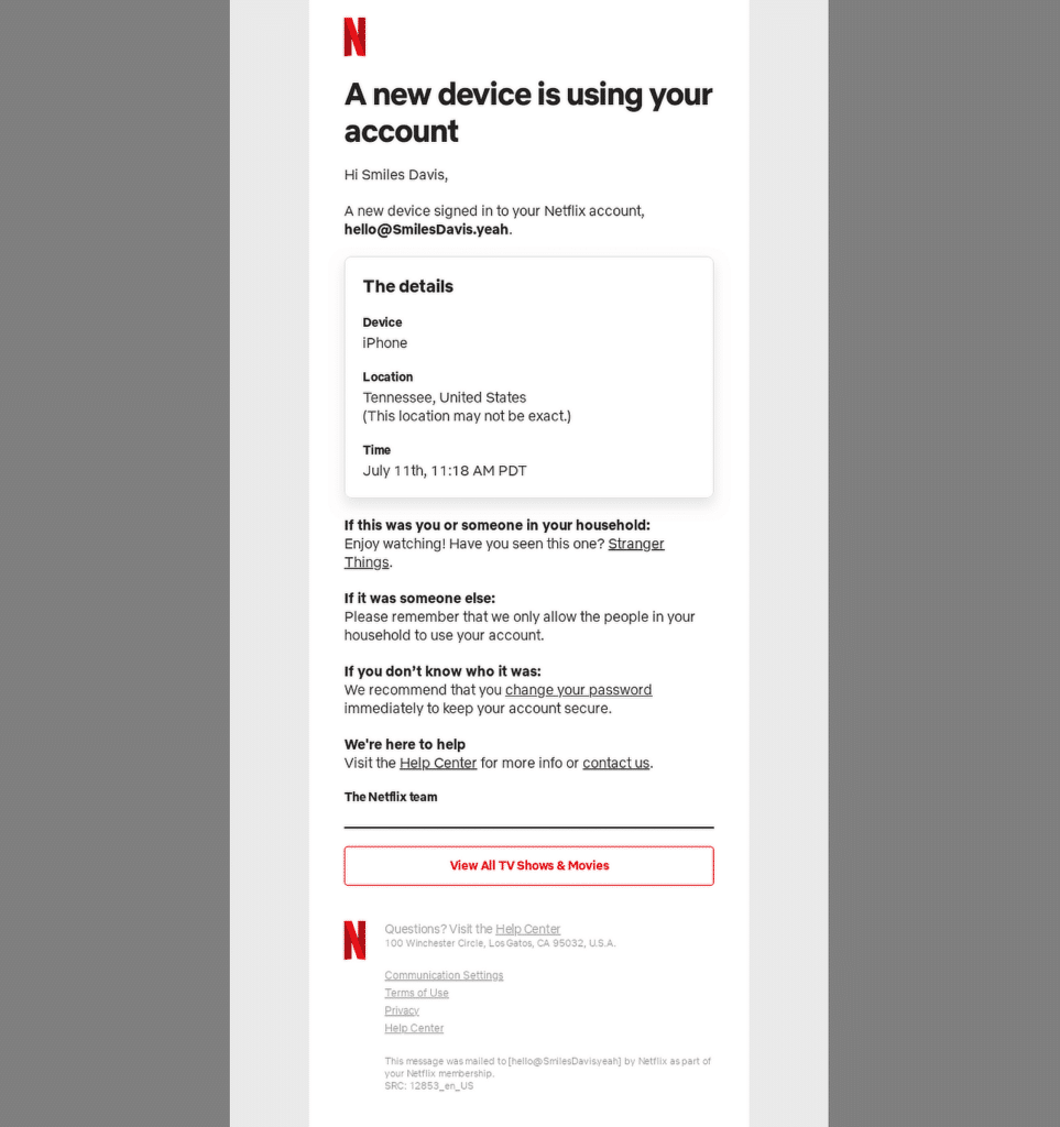
This email from Netflix is designed to alert the user about an important security event: a new device has been signed into their account. It also provides steps on what to do next, depending on whether the activity was authorized or not.
Why It Works
- The subject line clearly communicates that a new device has accessed the account, prompting users to check the email right away.
- Details such as the device, location, and time are displayed prominently, helping users make a quick decision.
- Netflix includes specific actions for different scenarios—whether the user recognizes the activity, someone else in the household is logged in, or it’s suspicious.
- There are links to change the password and access the Help Center, offering quick resolutions.
- Netflix smartly includes a recommendation for a show (“Stranger Things”), blending security with a touch of personalization.
5. Shopify
Subject Line: Your free trial ends tomorrow
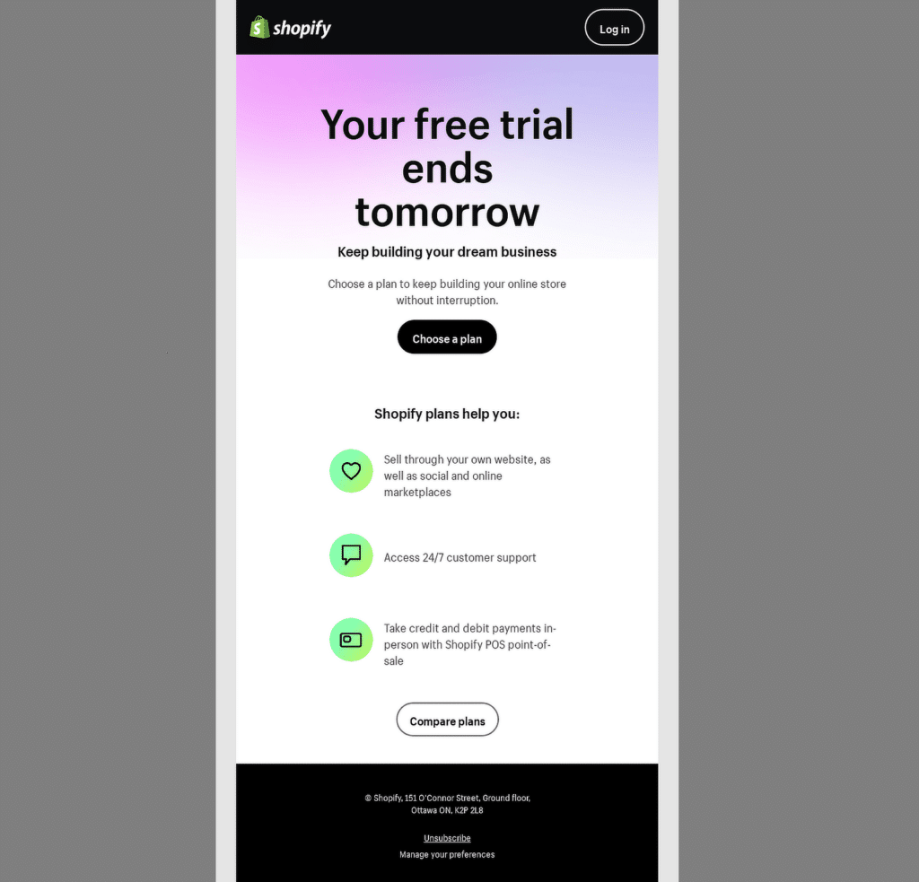
This email from Shopify serves as a timely reminder that the user’s free trial is ending the next day. It emphasizes the benefits of choosing a plan before the trial period expires.
Why It Works
- The subject line immediately creates a sense of urgency, reminding the user that action is required to avoid disruption to their service.
- The prominent “Choose a plan” button simplifies the user’s decision-making process, offering a quick path to upgrade.
- Shopify outlines how its plans can help the user—by providing essential features such as selling across multiple platforms and accessing 24/7 customer support.
- The “Compare plans” button gives users another option if they want to explore more detailed information before upgrading.
6. Meiro
Subject Line: We have received your application 💚
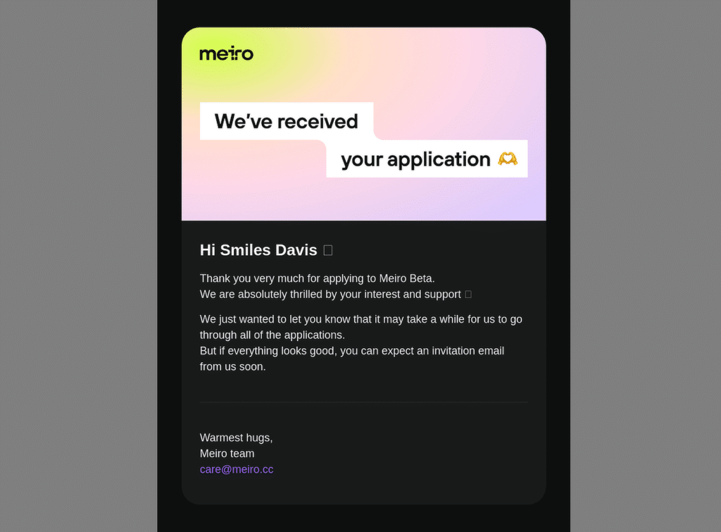
This email notification from Meiro informs the applicant that their application has been successfully received. It expresses gratitude for the user’s interest in the Meiro Beta program and sets expectations for the next steps.
Why It Works
- The subject line and opening sentence confirm receipt of the application, providing instant reassurance to the recipient.
- The email uses a warm, human tone, making the recipient feel valued and appreciated with phrases like “We are absolutely thrilled by your interest.”
- The email prepares the recipient for potential wait time by mentioning that going through the applications may take a while.
- The use of the recipient’s name and the heart emoji creates a personalized, informal connection, reinforcing a sense of community.
7. VSCO
Subject Line: We’re updating our Privacy Policy
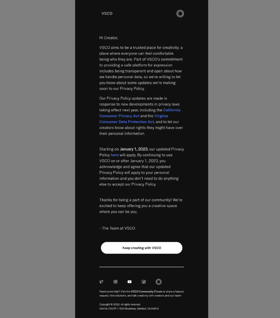
This email from VSCO informs users about upcoming changes to the platform’s Privacy Policy, which will take effect on January 1, 2023. The message emphasizes VSCO’s commitment to transparency and user privacy, especially in response to new privacy laws.
Why It Works
- The subject is concise, immediately letting recipients know that an important update is coming to the Privacy Policy.
- VSCO is clear about why the changes are happening, mentioning the California Consumer Privacy Act and the Virginia Consumer Data Protection Act.
- The friendly and inclusive tone reinforces VSCO’s branding as a platform for creativity and self-expression, helping users feel connected to the company.
- The call-to-action button at the bottom of the email is simple and stands out, encouraging users to keep engaging with the platform by “Keep creating with VSCO.”
8. Roku
Subject Line: Reset your password
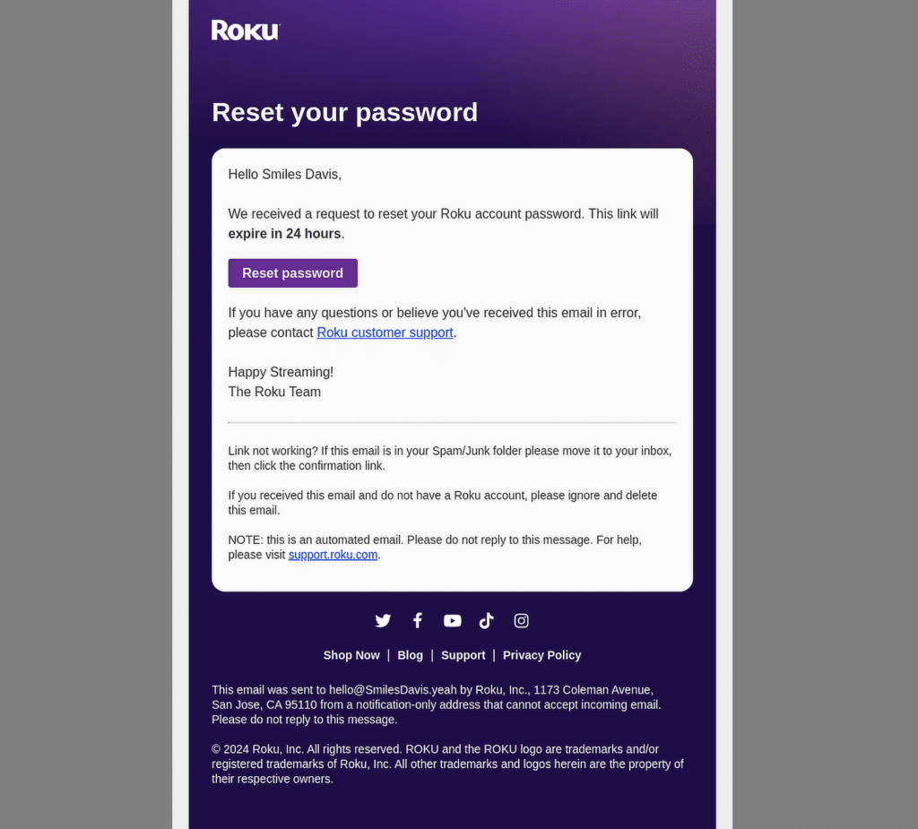
This email from Roku informs users that they have been requested to reset their account passwords. The email includes a clear call-to-action (CTA) button to reset the password and a reminder that the link will expire in 24 hours.
Why It Works
- The email sets a 24-hour expiration for the reset link, encouraging immediate action while emphasizing security.
- The “Reset password” button is highly visible and actionable, making it easy for the user to complete the process.
- By offering guidance on what to do if the user did not initiate the request, Roku reassures users that their account security is being prioritized.
- A clear link to customer support is provided, ensuring that users can quickly resolve any issues if they didn’t request the reset.
How to Customize Form Email Notifications
The above notifications fall under the segment of transactional and behavioral emails. However, if you want to create an email notification for someone performing an action on your website, like filing out a form, you’ll be pleased to hear that WPForms offers numerous customization options.
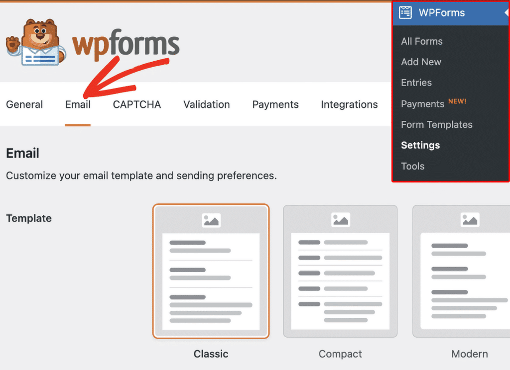
WPForms enables you to add custom fields, tailor your email content to fit specific form submissions, and even use Smart Tags to include dynamic data. This flexibility ensures that your emails always feel relevant and personal. Check out this detailed guide on how to customize form email notifications!
FAQs — Email Notifications: Examples and Best Practices
What is an example of notification emails?
A notification email is a message sent to inform users about specific activities or changes related to their accounts, orders, or actions. Examples include order confirmations, shipping updates, or password reset emails.
For instance, when you place an order online, you’ll typically receive an order confirmation email with the details of your purchase.
How do you write a notifying email?
To write a notifying email, keep the message clear and concise. Start with a straightforward subject line that tells the recipient exactly what the email is about (e.g., “Your order has been shipped”).
In the email body, provide the necessary information, such as details of the order, status updates, or the action needed from the recipient.
Keep the tone professional but friendly, and always include a way for the recipient to get further help if needed.
How to design an email notification?
When designing an email notification, it’s important to focus on clarity and branding. Use a simple layout, include your logo, and make sure the call-to-action (CTA) stands out.
Keep the colors and fonts consistent with your brand. Avoid clutter by sticking to the essential information the user needs to know and make the email mobile-friendly to ensure easy readability.
For form notification emails, WPForms offers customization options that allow you to design branded emails. You can adjust fonts, colors, and layout to ensure your form notifications match the style of your business.
Next, Learn How to Make a Custom Email Template in WordPress
Looking for a simple way to customize your form email notifications with the WPForms custom email template feature? Through WPForms, you can easily change the look and feel of your notification emails to create a more personalized experience.
Create Your WordPress Form Now
Ready to build your form? Get started today with the easiest WordPress form builder plugin. WPForms Pro includes lots of free templates and offers a 14-day money-back guarantee.
If this article helped you out, please follow us on Facebook and Twitter for more free WordPress tutorials and guides.

