AI Summary
What are cart abandon emails and how do they convert browsers to buyers? If you operate a business online, you might’ve asked yourself that question.
A cart abandon email is a friendly message you send to website browsers who have left items in their online shopping carts. The purpose of the email is to remind these potential customers that they haven’t checked out yet, and to guide them towards completing their purchases.
In turn, these emails to browsers help your eCommerce site boost sales and increase revenue. Plus, you can gain valuable data related to the reasoning behind your customer’s cart abandonment by sending an email, which will help you improve your site and service.
In this article, we’ll explore 10 cart abandon email examples to inspire your own email conversions, and we’ll show you how to apply this knowledge to your forms, too.
Create Your Abandoned Form Email Now
What Do You Write in an Abandoned Cart Email?
Most abandoned cart emails contain specific information that is meant to grab the customer’s attention, direct them back to the shopping cart, and convert them from visitor to customer.
As with any email, an abandoned cart email should include a subject line that lets the reader know what the message is about. Then, within the email itself there should be an introduction or heading of sorts.
Usually, the abandoned cart email will list the items that have been left in the shopping cart, and may even offer a discount on these items. You will often find a CTA, or “call to action” button in this email, which directs the reader back to the shopping cart or online store.
Lastly, the abandon cart email will close with a snippet of wording or links.
Cart Abandon Email Best Practices
Aside from including specific content in your abandoned cart email, here are some additional best practices to consider:
- Timing: Be sure to send out emails with appropriate timing. The first email should remind your website browser of the items in their cart, and needs to be sent within 24 hours. Follow up with another email after a couple of days, and then send a promotional discount a few days after that.
- Subject Line: Entice your recipient to open the email with a subject line that is informative, humorous, or offers a discount.
- Personalization: Address the email recipient by name and mention the specific items left in their cart. This will add a personal touch to your message.
- Copywriting: Write your abandoned cart email with a style and tone that is interesting, persuasive, and on-brand.
- CTA Buttons: Include one or two CTA buttons that direct your customer to the checkout or that encourage them to continue shopping.
- Social Proof: Show proof of your brand or product by displaying social media comments, customer reviews, or testimonials.
- Testing: Utilize A/B testing for different types of email campaigns.
Let’s take a look at some cart abandon email examples that use these practices to convert browsers to buyers.
10 Cart Abandon Email Examples That Convert Browsers to Buyers
In This Article
1. Bluehost
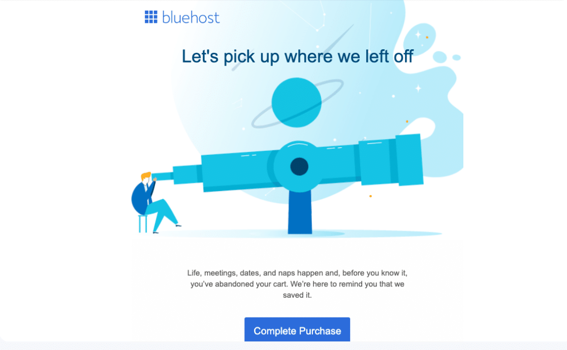
The cart abandon email sent out by Bluehost starts with a subject line that reads, “We saved your cart. Ready to check out?”
Then, the email opens with a heading of text and a large image, followed by a small bit of text and a CTA button prompting the email recipient to complete their purchase.
The email message also includes the items left in the shopping cart, the total price of the purchase, and another CTA button.
Bluehost’s cart abandon email closes with a prompt for customers to reach out with any questions, and provides a phone number to contact the support team.
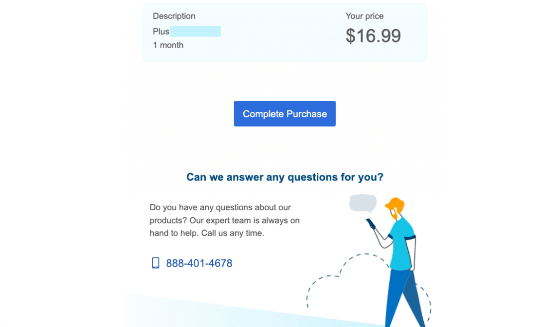
Why it converts: The subject line is straight to the point and informs the recipient of the email’s contents. The text copy snippet is relatable to the customer and is therefore persuasive, as well as the multiple CTA buttons.
2. 23andMe
The cart abandon email from 23andMe is also direct and to the point, but is even simpler than our first example.
The email message starts with a reminder to order a kit, followed by a convincing blurb of text, and a CTA button. Then, beneath all of that is a small line of text providing an online link where customers can contact the company with questions and support.
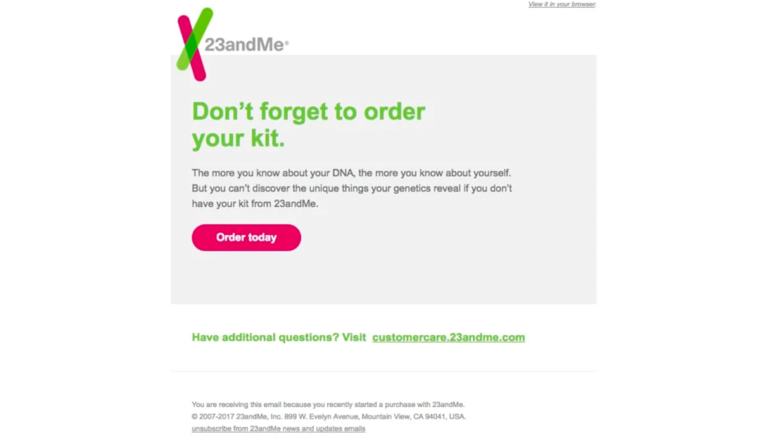
Why it converts: The copywriting is direct and convincing, and the message is memorable in its simplicity. This cart abandon email also follows the best practice of including a CTA button.
3. Chewy
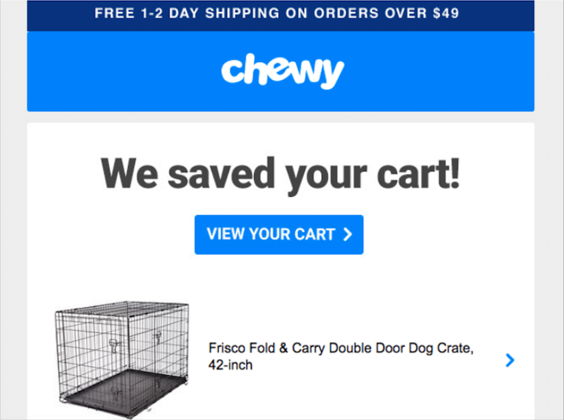
The cart abandon email sent out from Chewy has a few things going on that convert browsers to customers.
Email recipients are first met with a large exclamation that the website has saved the cart, followed by a CTA to view the cart. The items in the shopping cart are also displayed within the message, and include a link to go to that item in the cart.
The email message then includes a promotion and CTA link to prompt customers to sign up for an automated service that will save them 20% off their purchase.
The bottom of the email displays a 24/7 customer service number, and features a few of the perks that Chewy customers have access to, such as free shipping on certain orders and hassle-free returns.
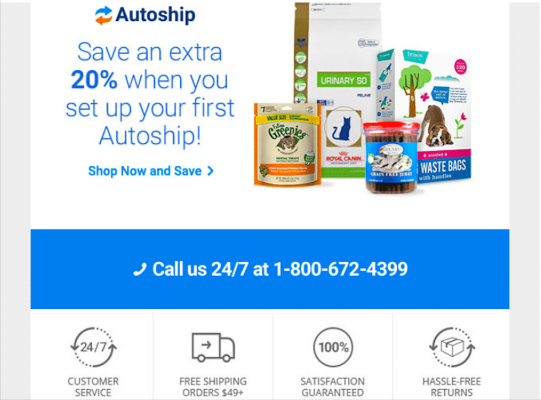
Why it converts: The Chewy cart abandon email follows the best practices of listing the items left in the cart, displaying a CTA button, and including a promotional discount as part of the message.
4. Madewell
The cart abandon email from Madewell is another example of a message that is simple yet effective in its design.
Beneath the logo and menu, customers are met with some clever copywriting and a CTA button encouraging the browser to go for the purchase. Then the contents of the shopping cart are displayed.
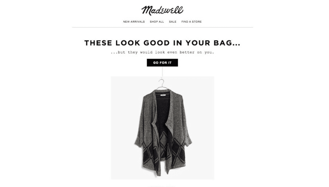
The displayed items are followed by yet another CTA button, this time prompting the potential customer to continue shopping.

Why it converts: The menu with links at the top of the message is pretty handy in terms of promoting continued shopping. Additionally, the text blurbs are short and sweet and cheeky. This email message also follows the best practices of listing the shopping cart items and including CTA buttons.
5. Google
Google’s cart abandon email begins with a persuasive heading and line of text reminding the shopper that popular items sell out fast, and displays a CTA to view the shopping cart.
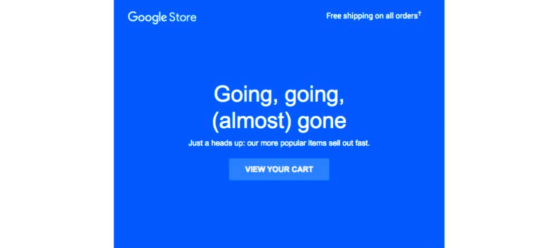
The email then shows the contents of the shopping cart, including each item’s quantity and price. Halfway down the message, customers can click on links to either start a chat or request a call.
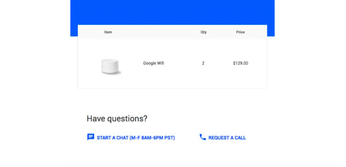
The email closes with another snippet of persuasive text, a CTA to subscribe, and the tiny fine print and terms, of course.
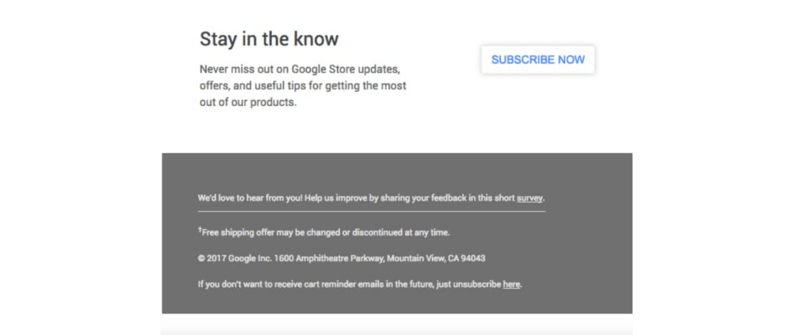
Why it converts: The email from Google features clever copywriting with a sense of urgency, includes multiple CTA buttons, displays shopping cart items with their prices, and is overall persuasive.
6. Dollar Shave Club
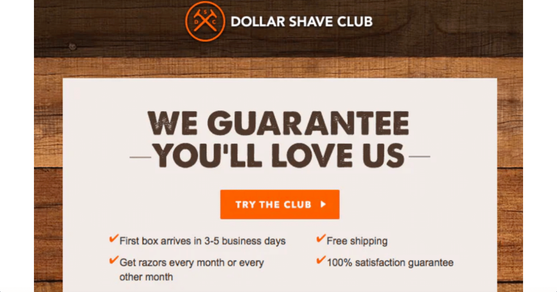
Email recipients from Dollar Shave Club are first approached with the friendly subject line of, “Where did you go?” before opening the message.
Then, potential customers are greeted with a boldly stated guarantee of satisfaction, a CTA button, and a list of advantages to joining the club.
The email message then displays a large photograph of a Dollar Shave Club product in its packaging, to give shoppers an idea of what they can expect.
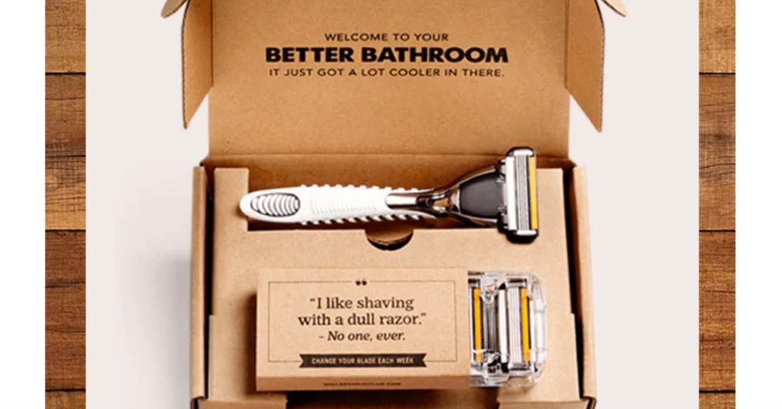
The message concludes with a convincing bit of copywriting that really lays it on thick for the shopper, and ends with a CTA link. The entire cart abandon email is also very visually striking and creatively styled.
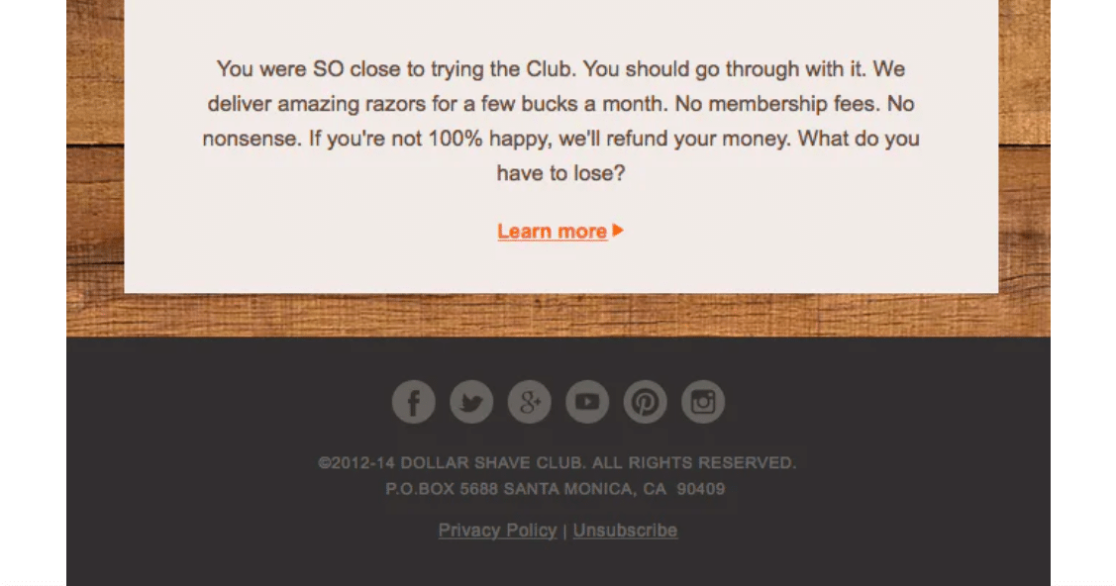
Why it converts: This email message follows the best practices of including a good subject line, killer copywriting, and multiple CTA buttons, all of which fit the branding of the company.
7. The Northface
The cart abandon email sent out by The Northface is stark and simple, yet striking and effective.
Under the recognizable logo and menu links, the message begins with an encouraging heading and line of text that match the theme of the imagery and the brand itself, followed by a CTA button.
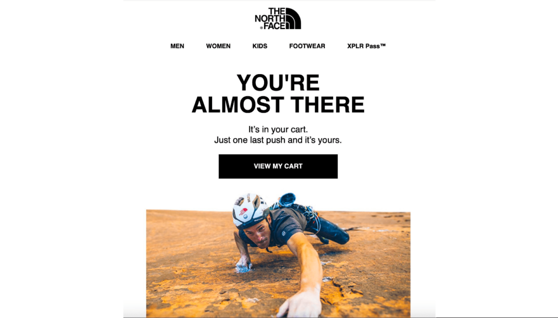
Why it converts: The stylized copywriting paired with the included image is very much on-brand for The Northface, and is also convincing in nature. This abandon cart email follows the best practices of featuring clever copywriting and including a CTA button.
8. Liquor Loot
For another abandon cart email with great copywriting, we have Liquor Loot. The email message begins with the subject line, “Your cart is sobering up” and the cheeky cleverness continues from there.
Email recipients are met with a playful heading, and are then provided with a humorous list of all the things they can do with their Liquor Loot box.
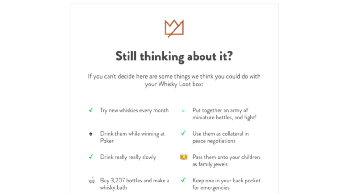
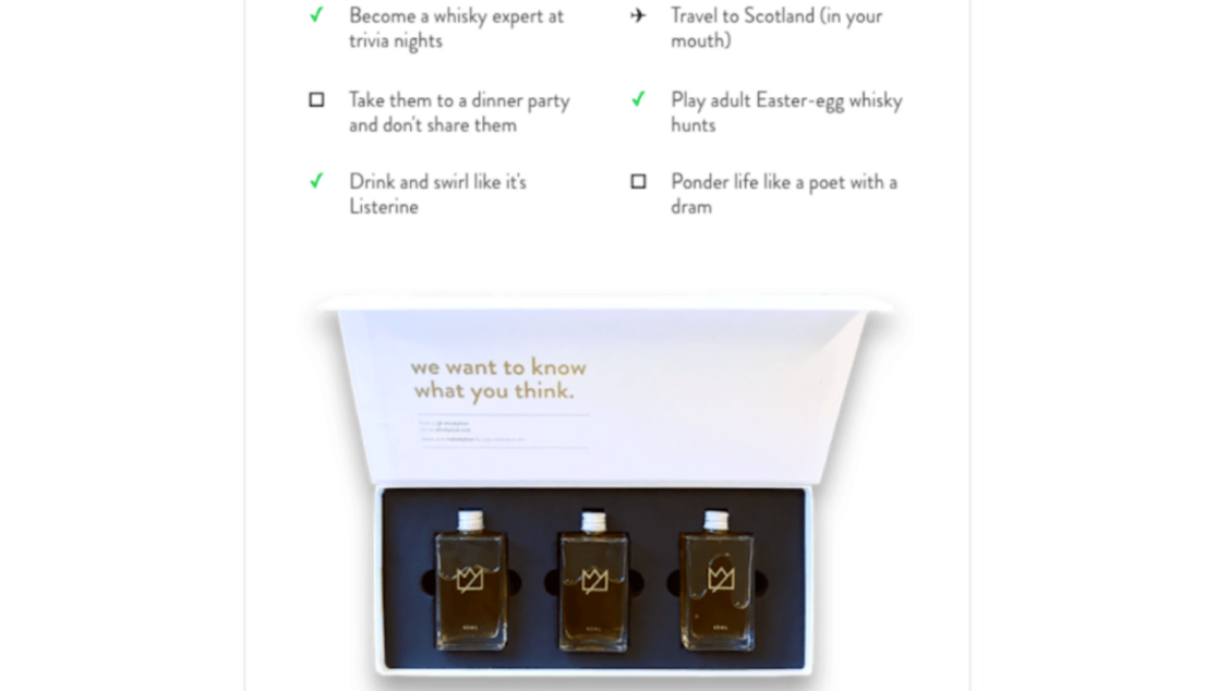
Below the long list of funny ideas is an image of a Liquor Loot box like that which a customer would receive.
The email message concludes with a section of frequently asked questions and their answers, followed by a CTA button that calls on the shopper to treat themself.
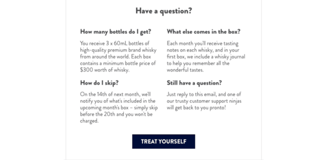
Why it converts: This cart abandon email starts with an incredibly witty subject line, and includes creative copywriting throughout. Plus, the question and answer section is informative and convincing, and the CTA is persuasive, as well.
9. Casper
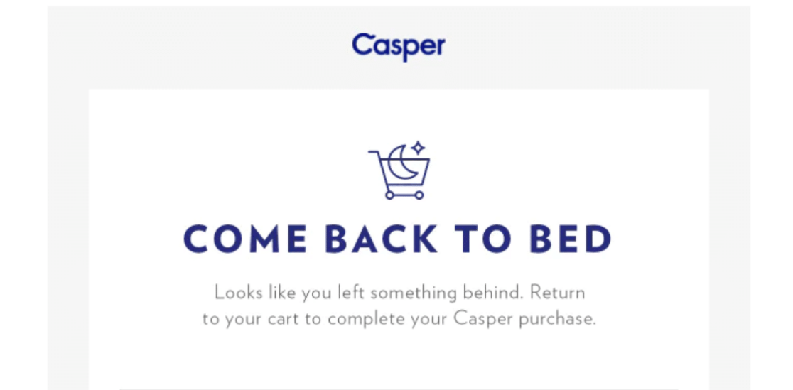
The cart abandon email sent out by Casper begins with a very on-brand heading that prompts potential customers to “come back to bed,” followed by a snippet of text reminding shoppers to complete their purchase.
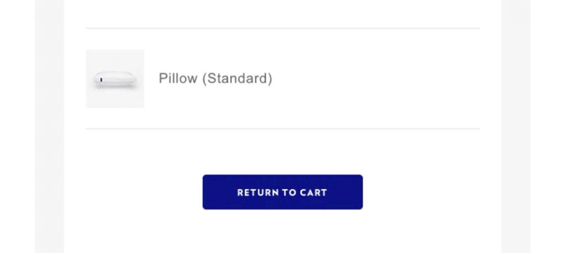
The email message then lists what’s left in the shopping cart, followed by a CTA button to return to the cart.
Then, the email displays a positive customer review at the bottom of the message, with a CTA button to read more reviews. Lastly, in very small print, customers will find an email and phone number to contact support.
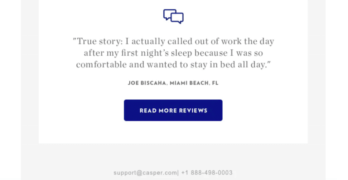
Why it converts: This cart abandon email follows the best practices of listing the items left in the shopping cart, including multiple CTA buttons, and featuring positive reviews from other happy customers.
10. Target
The cart abandon email sent out by Target is jam-packed full of content, starting with links to visit the clearance section and weekly ad, and includes an extensive menu of links running across the top of the message.
Customers are informed in bold text of new prices applied to their purchase, which they can get to by clicking the CTA button. The email also provides the items and their prices that are currently in the shopping cart.
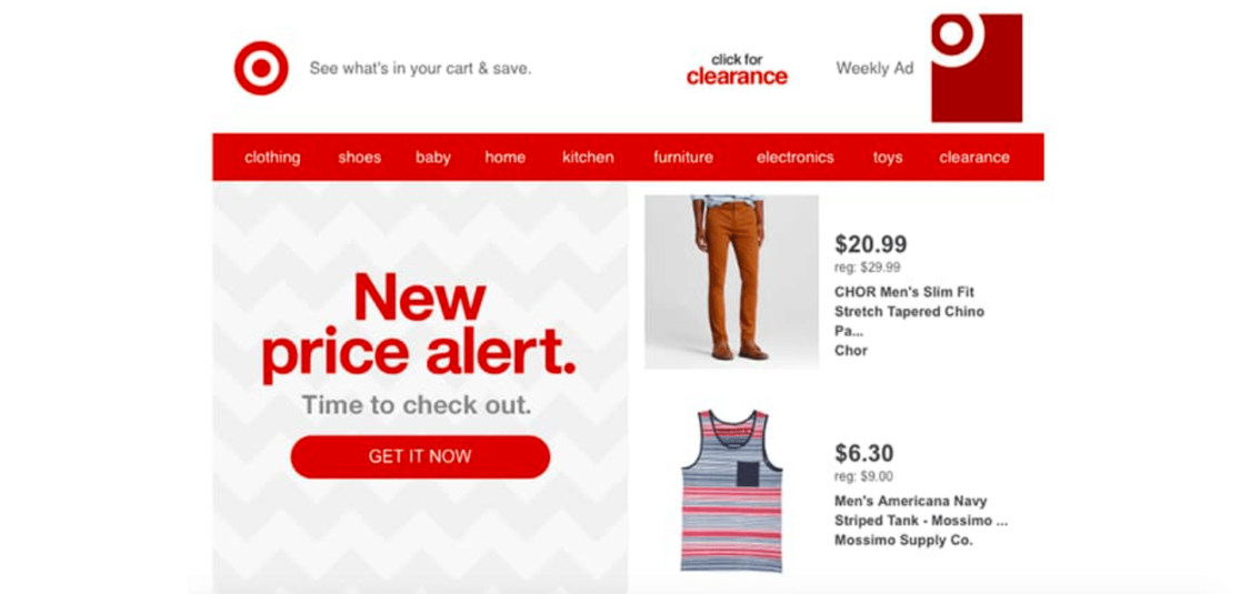
Next, the email message also features items similar to what’s in the cart that the website browser might be interested in. The email ends with a CTA button prompting shoppers to apply for a credit card, which is followed by another horizontal menu of links.
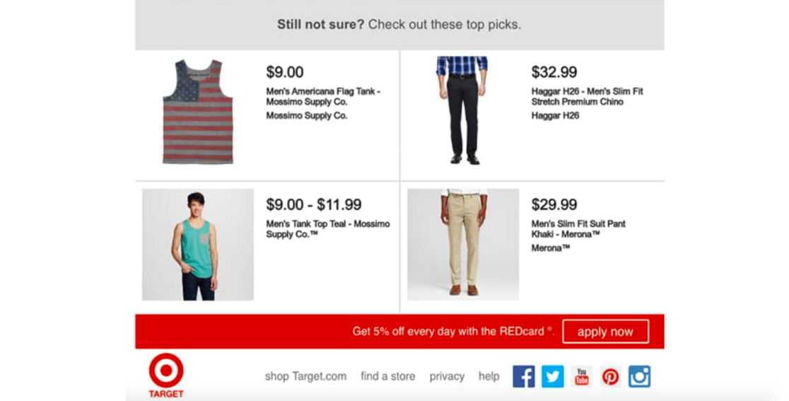
Why it converts: This cart abandon email uses a unique formatting style that places information in quadrants of the screen, and includes a lot of content in the message. This email not only follows the best practice of listing the items left in the shopping cart, but also displays their price, description, and other similar items of interest. The message also includes multiple links and CTA buttons.
Create Your Own Abandoned Cart Email Campaign
Did you know that with WPForms, you can create similar campaigns for abandoned forms on your website?
Just like a potential customer who abandons their shopping cart, a website visitor will often abandon the online form they were filling out before submitting it. And, just as you would contact a customer about their abandoned cart, you can also reach out to a website visitor that has abandoned their form.
With WPForms, you have multiple tools for integrating your forms with your email campaigns, all with a goal in mind to convert.
Get the WPForms Form Abandonment Addon
First and foremost, you’ll want to snag the Form Abandonment addon to start converting your browsers to customers.
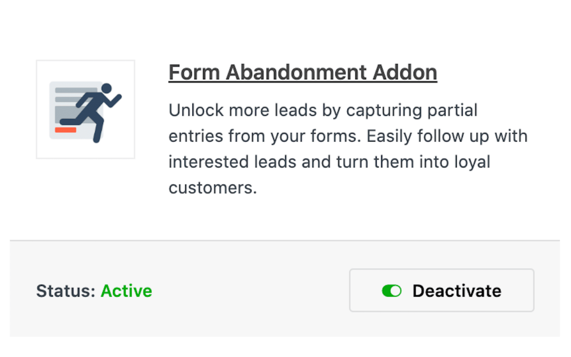
With this addon, you can generate leads even when website browsers don’t finish your forms.
In fact, one of the most useful aspects of the Form Abandonment addon is that it will capture entries no matter how far the user progresses with the form. A website visitor could’ve filled out only one field on your form and the entry will still be gathered.
Then, not only can you save the abandoned entries to your site, but you can also follow up with automatic notification emails when one of your forms has been abandoned.

Plus, when a form is abandoned, you’re able to send out as many emails as you’d like. For example, you could automatically send an email to the user who abandoned the form and send an automatic email to a colleague or employee, who can then coordinate a follow-up call or email.
You can easily configure this and many other integration features of the addon through your settings.
Take a look at our extensive documentation covering how to use the Form Abandonment addon to get the most out of this tool.
Integrate With Your CRM of Choice
In addition to the Form Abandonment addon, consider activitating a CRM addon to use with your forms.
Drip, for example, is a marketing automation platform that can be easily integrated with the forms on your WordPress site. With a Drip account linked to WPForms, you can automatically add users to your email marketing campaigns when they submit forms on your website.
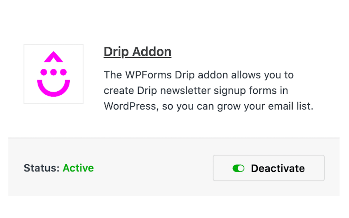
You can set up additional options such as allowing subscribers to update their email addresses, recording custom events in Drip, and more. Check out our full tutorial on how to use the Drip addon to learn more.
The HubSpot addon is another CRM integration that may be useful in conjunction with the forms on your site. If you use HubSpot for any aspect of your website marketing, then you might want to link it with WPForms.
HubSpot is well-known for helping to deliver the best customer service online, so consider using this platform to create email campaigns for website visitors who’ve abandoned your forms. For more guidance on configuring and using the HubSpot addon, take a look at our WPForms documentation.
Utilize WP Mail SMTP
Another helpful tool to utilize with your website and email integration is the WP Mail SMTP plugin.
Why do you need this plugin? Well, many WordPress sites use default mail function systems that aren’t usually configured properly. As such, lots of emails sent through WordPress are never delivered.
But, the “SMTP”, or Simple Mail Transfer Protocol, part of the WP Mail SMTP plugin fixes these delivery issues by properly authenticating your emails. SMTP is the industry standard for ensuring email deliverability, and WP Mail SMTP is the most flexible way to connect WordPress to a variety of SMTP services.
A couple of our favorite email services worth mentioning are Brevo (formerly Sendinblue) and Sendlayer.
Brevo is a platform that offers email marketing features and a free plan that is perfect for small business. And with SendLayer, you can send emails from an address on your own domain by connecting your site through our secure API.
So, when you’re integrating your Form Abandonment addon with your email service, don’t forget to activate the WP Mail SMTP plugin. That way, you can be sure that your abandoned form emails are reaching your site browsers.
Create Your Abandoned Form Email Now
Next, Design Form Layouts That Convert
In this post, we explored lots of abandoned cart email examples, with each of them uniquely created to reflect their specific branding. And now you know how to automatically send out similar email campaigns for abandoned forms.
But what about the style of the forms themselves? The forms on your website should be styled and formatted to be on-brand, as well. Have a look at our suggested best practices for creating form layouts that are styled to convert.
Ready to build your form? Get started today with the easiest WordPress form builder plugin. WPForms Pro includes lots of free templates and offers a 14-day money-back guarantee.
If this article helped you out, please follow us on Facebook and Twitter for more free WordPress tutorials and guides.

