AI Summary
Are you making it as easy as possible for your website visitors to reach you? By placing your contact form in prominent places on your site, you’ll get more leads for your business.
In this article, we’ll show you the top 6 places to include a contact form on your website for more leads.
How to Position a Contact Form to Get More Leads
In This Article
1. Sidebar
Every page on your website needs a way to guide visitors through the process toward becoming happy customers, no matter what industry you’re in.
Placing your form in key areas of your website can help make it more visible so users will submit it.
By placing a contact form in the sidebar of your site, it will be easily accessible no matter where visitors are on your site, including your blog posts. Your form can appear on the left or right side of the website like this:
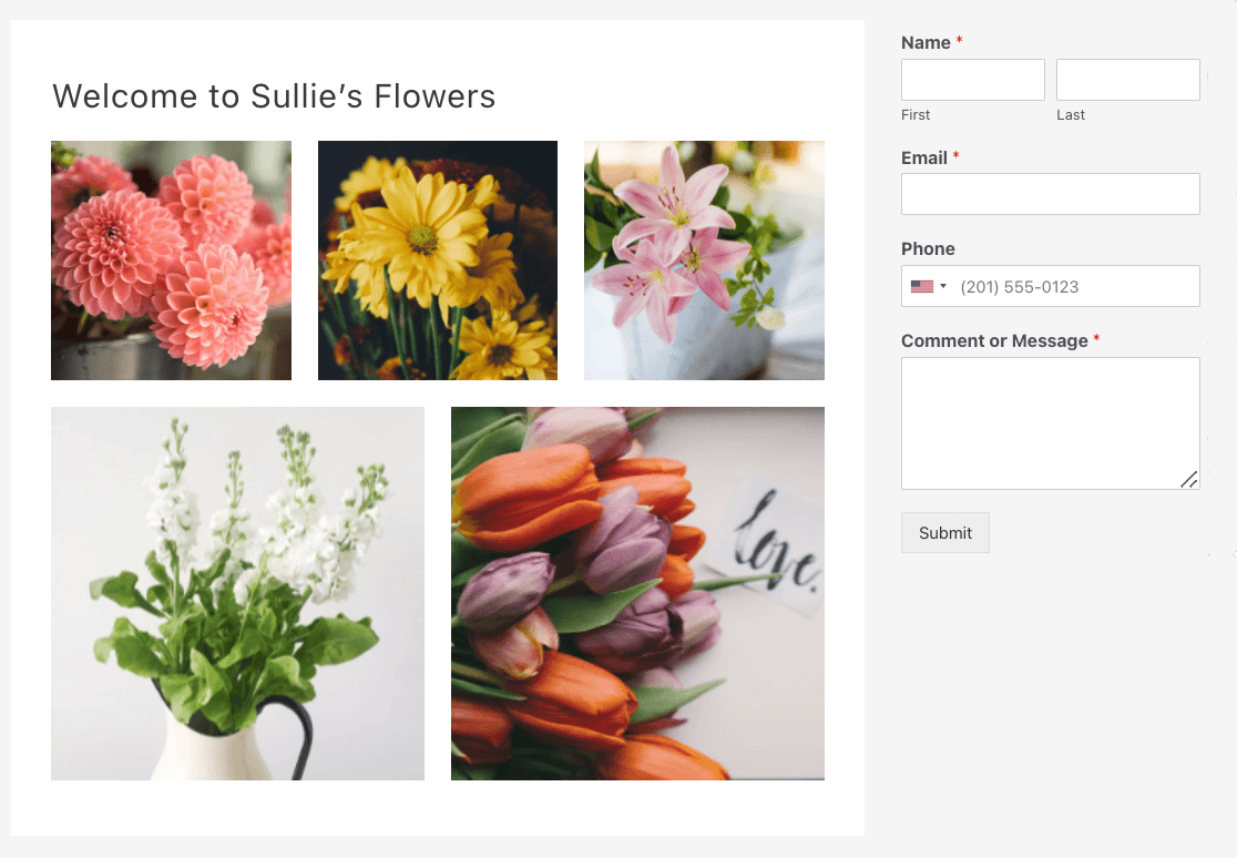
Need help placing your WordPress contact form in the sidebar? See our tutorial on how to add a contact form in a WordPress sidebar widget.
2. About Page
An often overlooked opportunity to connect with your visitors is on your About page. To make the most of this page, remember to include these details:
- What your business does, in plain language.
- What happy customers are saying about their experiences with you.
- Who works at your company and how to reach each person.
- A story about how your products and services impact people.
- A call to action that motivates visitors to do something now, such as fill out your contact form.
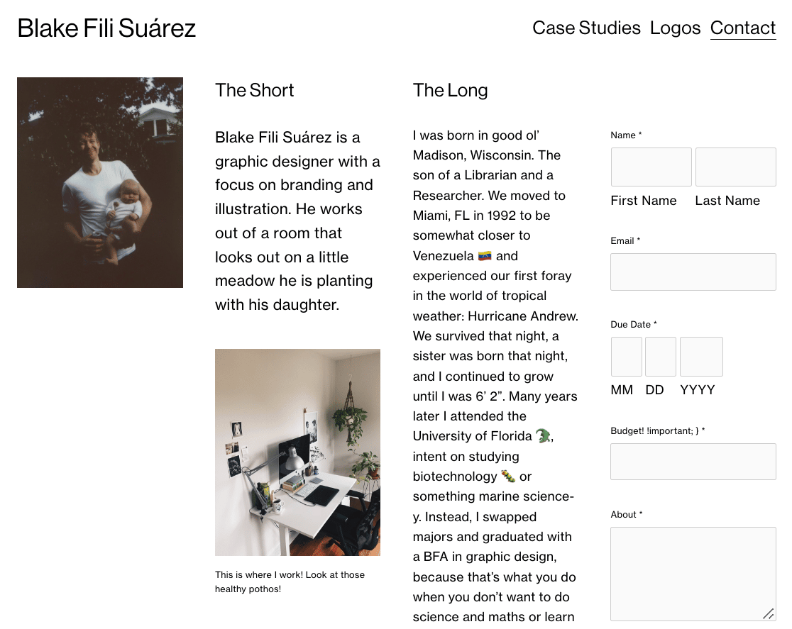
To see an example of an outstanding About Page, check out Blake Suarez’s website. The page builds trust, introduces the site owner, tells a story, and includes a contact form.
3. Contact Page
Your Contact page is one of the most important pages on your website. People visiting it are more likely to do business with you.
To help your visitor take their next step toward becoming a happy customer be sure to:
- Spell out why someone should contact you and how you can help solve their problems.
- List your phone number for visitors who prefer to get in touch by calling someone.
- Link to social media accounts like Twitter, Facebook, and Instagram to give visitors a way to engage with your brand.
- Include a short form using fields that will help you understand who’s contacting you without getting spammed.
- Redirect visitors to a Thank You page that explains when and how you’ll be contacting them.
If you make it easy for your visitors to reach you using the tips above, like Pixpa does in the example below, you’ll notice an increase in the number of leads you gather.

Did you know that WPForms has offline mode too? This lets you capture leads even if the visitor loses their internet connection.
Offline forms are just 1 of the reasons WPForms is a great Typeform alternative.
4. Above the Fold…or Below
There is a long-standing debate over whether you should place your contact form above or below the fold on your website’s homepage. And the truth is, each website will benefit from one or the other, depending on the target audience.
According to a study conducted by Nielsen Norman Group, content placed above the fold was seen by site visitors 102% more times than anything placed below the fold.
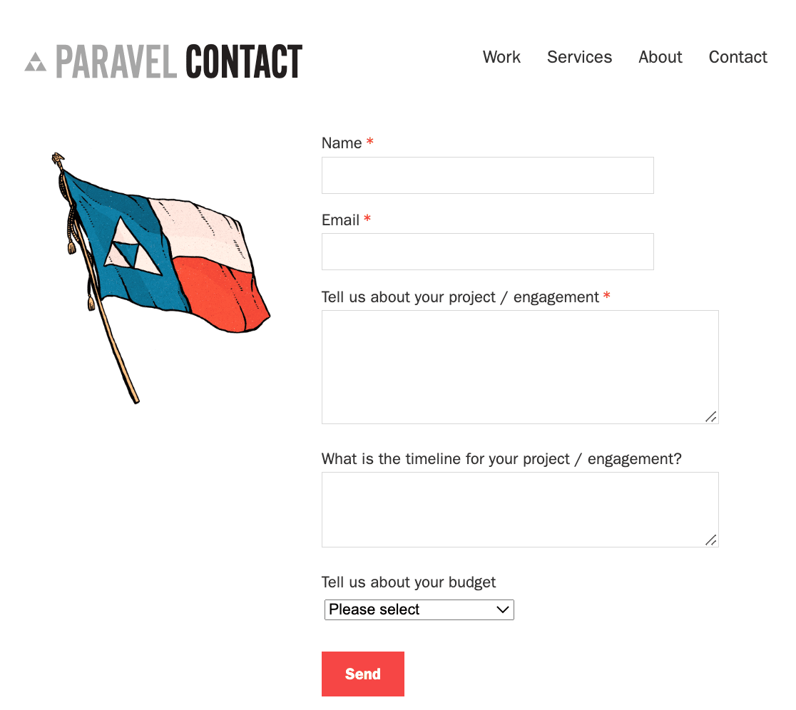
So, adding a contact form to your site like Paravel does will definitely get you action on your contact form since it’s well above the fold.
That said, there is the notion that people who scroll do so for a reason.
People scrolling down webpages are showing interest in what you have to offer, and because of this, are probably more likely to fill out and submit a contact form on your site, even if it appears below the fold.
Take for instance Beanstalk Web Solutions.

Users must scroll all the way to the bottom of the homepage to access the contact form. However, along the way, they’re viewing information about the available services, learning why Beanstalk is the company to go with, and even seeing case studies and reviews of past work.
The idea with this is that if users get far enough down a webpage and realize they need to get in touch after learning all about your business, they will.
5. After Blog Posts
Following the thinking mentioned above when it comes to placing contact forms below the fold on your site’s homepage, you might consider adding one below your site’s blog content.
Again, someone who gets through an entire blog post, whether in full or by scanning what you’ve written, is going to do one of two things:
- Leave your site forever because they didn’t like what you wrote and have no intention of ever returning.
- Or the more likely scenario, which is either opt to get in touch with you or continue to read more of your site’s content and fill out your form when they’re all done.
If you can hook readers with your site content, and want to give them a chance to contact you when they’ve seen what you have to offer, do so immediately following a blog post with a simple contact form.
Adding contact forms in multiple locations around your website, including at the end of your blog posts, can make it harder to manage your forms. Luckily, WPForms can help.
WPForms includes advanced form management features, including the option to display all your forms’ locations in the admin dashboard.
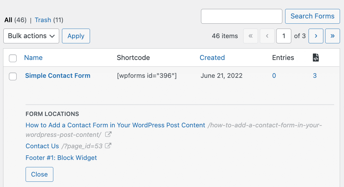
This lets you easily find each post, page, and widget where you’ve published your contact form. You can learn all about how it works in our post on the WPForms Form Locator.
Lots of people scroll to the bottom of websites looking for more information. In fact, a lot of people look for social media icons, an About Us page, maps of physical store locations, and you guessed it, contact information.
Rather than have site visitors navigate to a separate contact page, simplify the process for those who may be on the fence about your business in the first place.
For inspiration, check out Grover Web Design’s footer section.

Not only do they include a short contact form, but they also have their company’s physical address, phone number, and social media icons, which is exactly what people are looking for when they scroll to the footer of any website.
If you need help doing this with WPForms, check out our step-by-step tutorial on how to add a contact form to your WordPress footer.
And there you have it! 6 excellent places to put a contact form on your website so people can get in touch with you any time they need to.
Next, Add Your Contact Form to a Popup
Want to do even more with your contact forms?
- Check out how to create a contact form popup in WordPress so you can add a contact form anywhere on your website.
- Use your forms to give sales leads something for free.
Ready to build your form? Get started today with the easiest WordPress form builder plugin. WPForms Pro includes lots of free templates and offers a 14-day money-back guarantee.
If this article helped you out, please follow us on Facebook and Twitter for more free WordPress tutorials and guides.


