
AI Summary
Building a website takes longer than most people expect. Meanwhile, real visitors are landing on your domain, finding nothing useful, and bouncing within seconds.
A coming soon page turns that gap into an asset. It tells visitors what’s happening, captures their email if they’re interested, and gives Google something to crawl so your launch isn’t starting from zero.
Done well, it can deliver hundreds of email subscribers before your real site even goes live. So, I’ve collected 17 of the strongest coming soon page examples I could find, with notes on what each one does well.
Toward the end, I’ll walk through how to build your own page in WordPress and share some practical tips for getting the signups you actually want.
What Is a Coming Soon Page?
A coming soon page is a temporary placeholder you show visitors while your real website is being built. Instead of a 404 error or a half-finished homepage, they see a clean page that explains what’s coming, when it’s launching, and how they can stay in the loop.
The page itself can do real work. Most coming soon pages collect email signups so you can notify visitors at launch. Some add social media links, a countdown timer, or a short pitch about the product or service you’re building. The best ones treat the gap before launch as marketing real estate, not a problem to hide.
There are a few related terms worth clearing up:
- Coming soon page: A pre-launch page for a site that doesn’t exist yet, or a new product line you haven’t released.
- Under construction page: Often used interchangeably with coming soon, especially for sites being built for the first time.
- Maintenance mode page: Shown when an existing site is temporarily offline for updates. Different use case, but the same template often works.
- Launch page: Shown right after launch to highlight a specific new product or feature. Comes after the coming soon page, not before.
17 Best Coming Soon Page Examples to Inspire You (2026)
The examples below come from real sites in fashion, software, design, and hospitality.
Each one solves a slightly different problem, so look for the design strategy you want to copy: countdown timers, bold backgrounds, trust-building, strong CTAs, interactive elements, minimalist layouts, or sharp copy.
- 1. The Gold Standard (SeedProd)
- 2. Bold Background
- 3. Customized Button Copy
- 4. Building Trust
- 5. Vivid Colors
- 6. Multiple CTA Buttons
- 7. Social Proof
- 8. Bulleted List
- 9. Game (Under Construction Page Example)
- 10. Fun (Maintenance Mode Page Example)
- 11. Friendly Tone
- 12. Minimalist
- 13. Animated
- 14. Modern + Simple
- 15. Strong Copy
- 16. Bright + Simple
- 17. Color Branded
- How to Create Your Own Coming Soon Page in WordPress
- Tips for a Coming Soon Page That Actually Converts
1. The Gold Standard (SeedProd)

In this example, SeedProd’s coming soon page template uses social icons, an email list, and a countdown timer. The countdown timer creates a sense of urgency and can help reduce your form abandonment rate.
What I love most is how balanced it feels. Nothing is fighting for attention. The headline tells you what’s coming, the form asks for one thing, and the timer reinforces the deadline.

To copy this approach, lock in your launch date first, then write a single-sentence headline that explains what’s happening.
Add an email field, a button with action-oriented copy, and social links if you’re active anywhere. SeedProd makes this stupid simple because you can build a coming soon page in WordPress by dragging blocks onto the page.
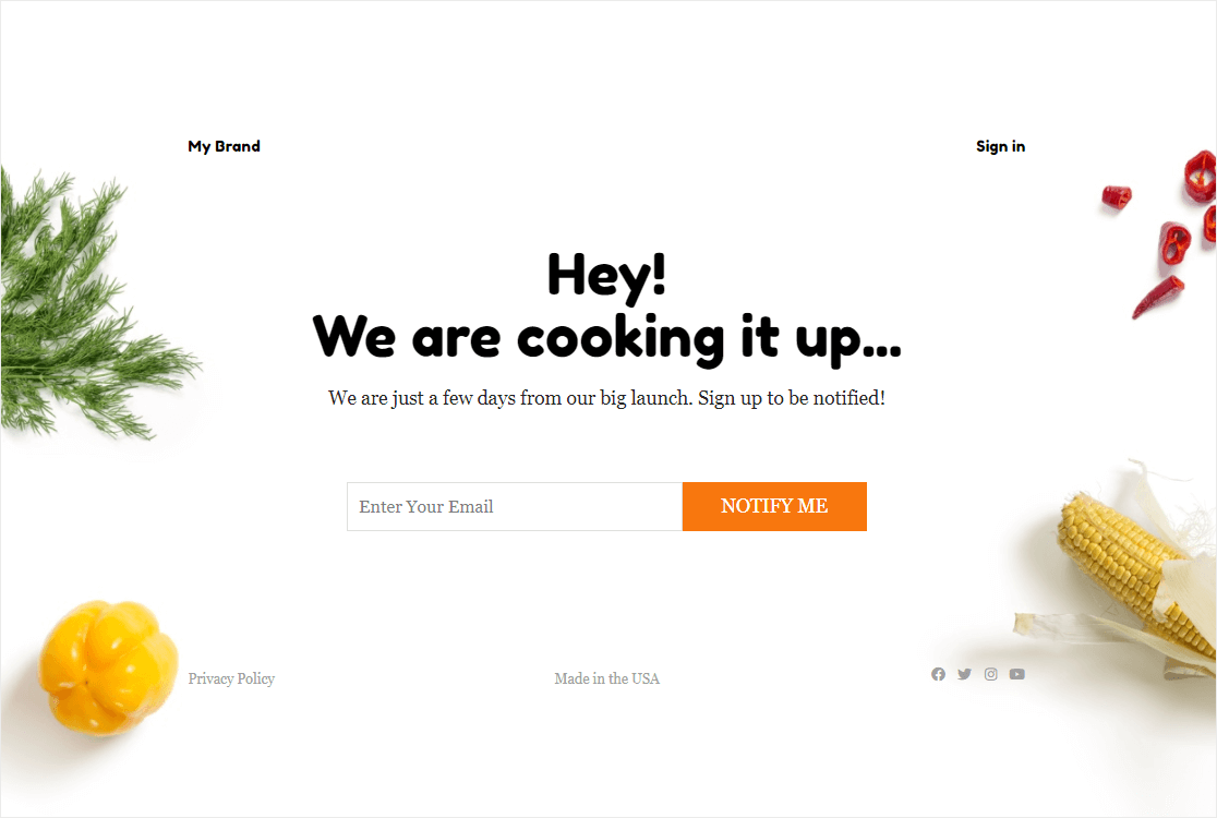
2. Bold Background

Sometimes a single striking image does more work than three paragraphs of copy ever could. This example pairs a simple contact form with a visually stunning background that sets the mood for the whole brand.
The contrast between the bold image and the minimal form keeps the signup field as the obvious next action. Nothing else on the page distracts from it. This works especially well for lifestyle, fashion, or hospitality brands where mood matters as much as message.
To copy this, find one image that captures your brand’s feel and let it carry the design. Then layer a tight headline and a one-field form on top.
3. Customized Button Copy

This page doesn’t tell you when launch day is, but it doesn’t need to. The CTA button says “Join priority list” and that single phrase does multiple things at once. It implies exclusivity, suggests early access, and gives the visitor a clear next step.
Brightly colored buttons with specific copy almost always outperform generic “Submit” or “Sign Up” buttons. The word “priority” implies a benefit, which gives the visitor a reason to type their email in.
To copy this, write CTA button copy that explains exactly what the visitor gets, not what they do. “Join the waitlist” beats “Submit.” “Get early access” beats “Sign up.” “Reserve your spot” beats “Subscribe.”
4. Building Trust

This example uses a real human face as the centerpiece, and it works for a reason. We’re wired to trust faces more than logos or product shots, especially on a brand we’ve never heard of before. A friendly face says “real people are behind this” without using a single word.
The page also pulls off a tricky balance. It tells you just enough about what’s coming to make you curious, without writing so much that the page feels like a sales pitch.
To copy this, use a real photo of yourself or your team, not a stock image. Stock images get easier to spot every year, and they undercut the trust signal you’re trying to build.
5. Vivid Colors

This one shows how a bold background image can carry a whole design. The page asks for three fields but marks two of them as optional. That’s a smart compromise: it lets curious visitors give just an email, while motivated ones can share more.
Marking fields optional matters because as a general rule, the more fields a form has, the fewer people will finish it. That’s just form conversion best practices playing out in real time.
To copy this, pick one or two fields you really need (usually just email) and label everything else optional. You’ll get more total signups than if you forced everyone to fill out the long version.
6. Multiple CTA Buttons

This page uses two CTA buttons, with one styled brighter than the other. The bright button leads to a newsletter signup form, which is what they really want visitors to do. The second button, “Learn More,” routes anyone who isn’t ready to sign up over to a longer info page.
The hierarchy here is the whole point. The brighter button gets the click from people who are ready to commit. The duller button captures people who need more convincing before they hand over an email address.
To copy this, set up two CTAs only if you have a real second destination to send people to. Otherwise, you’re splitting attention for no reason. The brighter button should be your primary goal, and the second should serve people who want more info first.
7. Social Proof

A signup form plus a testimonial is one of the most underused combos on coming soon pages. This page features a customer quote that helps convince visitors to join the beta before launch. It’s a strong social proof example, and it’s especially effective when the brand itself is unfamiliar.
Social proof works even when you’re pre-launch. You can pull testimonials from beta users, early customers, friends-and-family testers, or even from your previous product if you’re spinning up a new line.
To copy this, gather one specific quote from someone who’s already used or seen what you’re building. Add their name and a photo if you can. A vague quote with no attribution does nothing, but a specific one with a real name builds real trust.
8. Bulleted List

This landing page uses a few clever ideas at once. A countdown timer creates urgency, while a clean bulleted list of features sits cleanly on one side of the page. The list answers the obvious question every visitor has, which is “what’s actually in this thing?”
The bulleted format works because it’s scannable. Visitors who don’t want to read paragraphs of copy can absorb the highlights in a few seconds. And depending on your niche, pairing real faces with the list makes the whole thing feel less like a generic landing page and more like an invitation.
To copy this, write four to six bullets that answer “what do I get?” Keep them short, ideally six to ten words each. Skip anything generic, focus on the specific outcomes a subscriber will care about.
9. Game (Under Construction Page Example)

This example is more under-construction than pre-launch, but the strategy works for both. The team chose to put a small browser game on the page to entertain visitors and keep them engaged longer.
I love the creativity, but it’s missing a contact form, which is a real cost. In the email vs contact form conversation, contact forms have become a necessity for most sites. Without one, every visitor who enjoys the game leaves without giving you a way to follow up.
To copy this, add the interactive element as a delight, but never as a replacement for an email capture. Even one small signup field below the game would turn this from a fun page into a fun page that builds your list.
10. Fun (Maintenance Mode Page Example)

This is a maintenance mode page, not a coming soon page, but the same ideas apply when you need to put a site into maintenance mode. The brand uses a playful illustration, links visitors to external content, and gives them something to do instead of just saying “come back later.”
The takeaway is that even when your real site is offline, you can keep visitors engaged by routing them somewhere useful. Maybe that’s your social channels, your blog, a related product, or an external resource that’s still relevant.
To copy this, list two or three things visitors can do while they wait. Each one should be a real value-add, not just a “follow us on Instagram” filler link.
11. Friendly Tone

This page reads less like marketing copy and more like a casual letter from a friend. It explains what the team is building, why they’re building it, and invites visitors to join via a social media marketing hack or an email signup.
The friendly tone is doing the heavy lifting here. It signals personality, makes the brand feel approachable, and gives visitors more confidence about handing over an email address. People sign up for brands they like, and “like” usually comes from voice before product.
To copy this, write your coming soon page copy in your real voice. If you’d say “hey” not “Greetings, valued customer” in conversation, write it that way. Read it out loud before publishing. If you’d never say it like that to a friend, rewrite it.
12. Minimalist

Minimalism works when every element on the page is doing real work. This example uses a minimalist theme approach where the contact form sits cleanly at the bottom and nothing competes for attention above it.
The placement matters. Putting the form below the brand message means visitors read the pitch first, then take action. The form becomes the natural next step, not an interruption.
To copy this, strip out anything that isn’t necessary. If you’re not sure whether to include an element, remove it. Minimalist designs only work when the few elements you keep are excellent.
13. Animated

Subtle animation can give your coming soon page personality without overwhelming the visitor. This example adds light motion to the design, which catches the eye without distracting from the email signup or social links.
A little movement also tells visitors the page is alive, not abandoned. That matters more than you’d think because some visitors arrive at coming soon pages assuming the project is dead. Motion is one signal that quietly counters that assumption.
To copy this, pick one element to animate, like a fading background, a slow color shift, or a gentle pulse on your CTA. Avoid animations that demand attention or force the visitor to wait.
14. Modern + Simple

This page hits a clean modern aesthetic with plenty of white space and a single clear CTA. The design feels contemporary without being trendy, which means it’ll still look good a year from now.
I appreciate how restrained the color palette is. Two or three colors max, used consistently, can do more for a brand than ten colors trying to compete. The minimalism reads as confidence, not as a lack of effort.
To copy this, choose a tight color palette before you start designing. Use one accent color for buttons and links, and let everything else stay neutral. Restraint signals quality.
15. Strong Copy

This example doesn’t have flashy design or complex elements. It wins on copy alone. Strong, specific words do the work that visuals usually do, and the result is a page that feels punchy without being loud.
Power words are the trick. Phrases like “groundbreaking,” “exclusive,” “limited,” or specific outcomes like “save five hours a week” hit harder than generic language. The right verb in a headline can do more than a hundred-pixel-wide hero image.
To copy this, audit every line of copy on your page. For each sentence, ask if you could swap a generic word for a more specific or vivid one. “Help” becomes “rescue.” “New” becomes “first-ever.” Concrete beats abstract, every time.
16. Bright + Simple

This page asks visitors for one thing and one thing only: an email address. No phone, no name, no how-did-you-hear-about-us dropdown. Just an email field and a button.
When your only goal is building your launch list, asking for just an email gets the most signups. Every extra field reduces conversion. You can always send a welcome email and ask for a name later, when the visitor is already engaged.
To copy this, decide what’s actually essential before you ask for it. If you don’t need the phone number, don’t ask. If you can’t think of a reason you’d use the company name today, leave it off.
17. Color Branded

This page leans hard into brand colors as the design backbone. It’s a smart move because it teaches visitors who you are before they’ve seen your product. By the time your real site launches, they’ll already recognize your palette.
The single-color approach also keeps the design simple. There’s not much else to look at, so the email field is the obvious focus. Visual consistency between your coming soon page and your real site also builds trust at launch, because returning visitors instantly recognize they’re in the right place.
To copy this, pick your two or three brand colors before you build the page. Use them consistently across the coming soon page, your social profiles, and your eventual launch site. Recognition compounds over time.
How to Create Your Own Coming Soon Page in WordPress
Once you’ve picked a strategy from the examples above, the next step is actually building the page. The good news is you don’t need a developer or a designer to put one together.
The combination of SeedProd plus WPForms handles the whole thing inside WordPress, with no code. Here’s the five-step path I recommend.
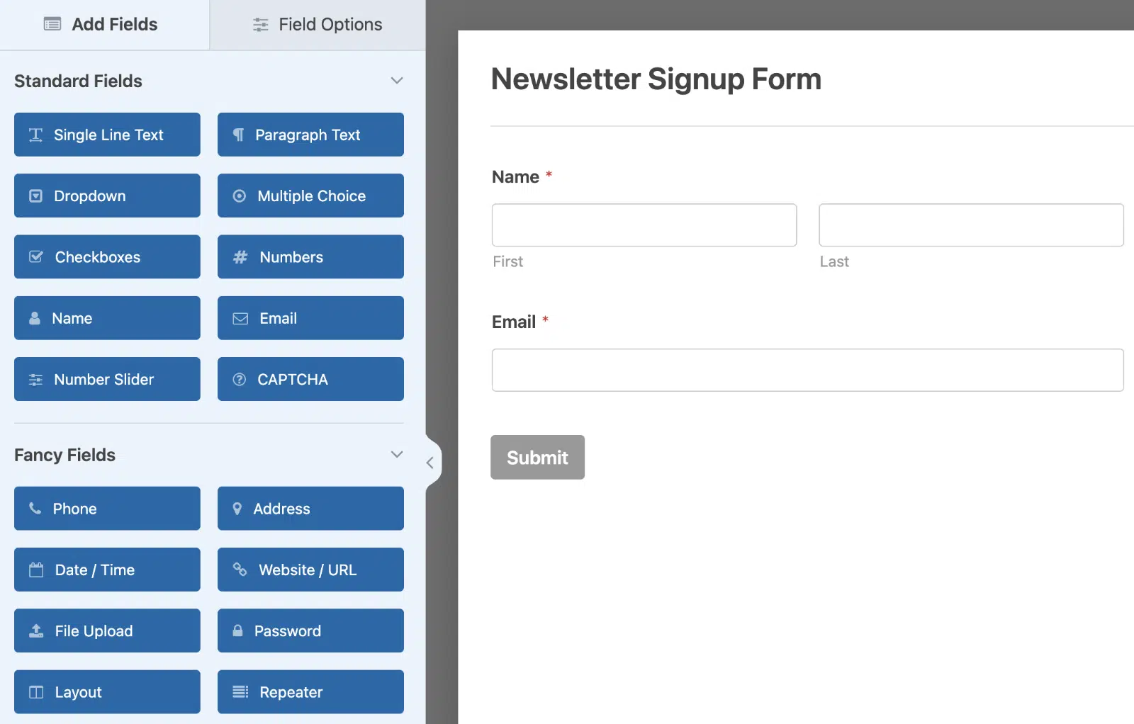
Step 1: Install SeedProd
SeedProd is the page builder I recommend for coming soon pages, and it’s what I use myself. It includes built-in coming soon and maintenance modes, hundreds of templates, and a drag-and-drop editor that’s genuinely easy to learn.
There are a few other best WordPress coming soon plugins if you want to compare options, but SeedProd is the strongest pick for most users.
Install the plugin from your WordPress dashboard, activate it, and you’re ready to start building.
Step 2: Pick a Coming Soon Page Template
SeedProd ships with dozens of pre-built coming soon templates, organized by industry and design style. Browse them, pick one that’s closest to the look you want, and open it in the editor.
Templates save you the most time in the early stages because you’re starting from a real, finished design and editing it down to your needs. Trying to design from a blank page is where most people get stuck.

Step 3: Customize Content, Copy, and Branding
Inside the SeedProd editor, you can edit every element by clicking it. Swap out the placeholder copy, upload your logo, change colors to match your brand, and rearrange blocks. The drag-and-drop interface makes this part fast, even if you’ve never built a page before.
Spend the most time on your headline. The headline is what most visitors will read first, and it’s often the only thing they’ll read. Keep it specific, short, and benefit-focused.

Step 4: Add a WPForms Signup Form
This is where the real lead capture happens. WPForms integrates with SeedProd, so you can drop a form block right into your coming soon page. Create a simple form with just an email field (or email plus first name if you want to personalize launch emails) and embed it.
For higher conversions, consider using the Lead Forms addon to turn a multi-field signup into a one-question-at-a-time experience. It feels more like a conversation than a traditional form, and the conversion lift can be significant on mobile.
If you want to take it further, connect your form to your email marketing service so new signups flow directly into your subscriber list. WPForms integrates with Mailchimp, Constant Contact, Kit, MailerLite, and most other major email tools.
Step 5: Enable Coming Soon Mode and Go Live
Once your page is ready, go to SeedProd » Pages and toggle on the Coming Soon Mode. SeedProd handles the rest, showing your custom page to all visitors while you continue working on your real site behind the scenes.
You can also exclude logged-in users so your team can see the real site while everyone else sees the coming soon page. Pages will be redirected to after submitting a form however you’ve configured them, so you can send signups to a thank you page or back to the coming soon page itself.
SeedProd has a free version that covers the basics, plus paid plans for more templates and advanced features. If you’re serious about pre-launch lead capture, the paid version pays for itself fast.

For most users, the SeedProd plus WPForms combo is all you need to put a high-converting coming soon page live in an afternoon.
Tips for a Coming Soon Page That Actually Converts
Building the page is the easy part. Making it work for you is where most coming soon pages fall short.
After looking at dozens of real examples, here are the patterns that separate the pages that build serious launch lists from the ones that barely collect a dozen signups.
- Keep the email form short: Ask for one or two fields max, ideally just an email. Every extra field cuts your conversion rate. You can always collect more information later, once the subscriber is engaged.
- Set clear launch expectations: Tell visitors when you’re launching, even if it’s just a quarter or month. “Coming Q3 2026” is more reassuring than just “Coming soon” because it tells visitors you have a plan.
- Add social proof if you have it: Even one customer quote, a press mention, or a number like “joining 500 others on the waitlist” can lift conversions.
- Use a countdown timer when you have a firm date: Countdown timers create real urgency and often increase signups by 15-30%.
Following these patterns won’t guarantee a massive launch list, but skipping them almost guarantees a small one.
FAQs about Coming Soon Pages
Coming soon pages are a popular topic among readers building or relaunching websites. Here are answers to the most common questions about them.
Why create a coming soon page?
There are some real reasons to put one up. You can grow sales and your email marketing engine by growing your email list before launch, then let past visitors know when you’re live. You can grow your social following by adding profile links. You can hold SEO ground while you build. You can generate excitement with compelling copy or a teaser video. And critically, you look professional, instead of presenting an incomplete site or a generic hosting placeholder.
What to add to a coming soon page?
To create a beautiful and effective page like the examples above, it takes more than a simple “Coming Soon!” message.
The best coming soon page may look different depending on your needs, but most strong pages include some combination of these:
- A newsletter signup form
- Clear copy explaining what’s coming
- Links to your social channels
- Extras like countdown timers, social proof, or a teaser video
- A visually strong hero image or background
The number-one priority is the email signup. Everything else is bonus.
What’s the difference between a coming soon page and a maintenance page?
A coming soon page is for sites that haven’t launched yet. It’s pre-launch marketing real estate where you build anticipation and capture email signups. A maintenance page is for live sites that are temporarily offline because you’re updating, fixing, or migrating something. The look-and-feel can overlap, but the purpose is different. Coming soon pages should sell visitors on what’s coming. Maintenance pages should reassure them you’ll be back soon.
How long should a coming soon page stay up?
There’s no fixed answer, but most coming soon pages stay live for 30 to 90 days. Less than 30 days, and you don’t have time to build a meaningful launch list. More than 90 days, and signups tend to lose interest before launch. If your build is going to take longer, plan a few “update” emails to keep your early subscribers engaged in the meantime so they’re still excited on launch day.
Do coming soon pages help with SEO?
Yes, in two ways. First, they let Google index your domain immediately, so you can start ranking for branded searches before launch. Second, they give you a chance to test meta titles, descriptions, and basic on-page SEO with a real audience before your full site goes live. Just make sure your coming soon page has a real H1, a clear meta description, and some descriptive copy. A blank “coming soon” image with no text gives Google nothing to work with.
What should I write on a coming soon page?
Three things, in this order. First, a short headline that says what’s coming (one sentence). Second, one or two sentences explaining what visitors will get from your site, product, or service when it launches. Third, a clear ask, usually “drop your email and we’ll let you know when we’re live.” Keep the copy specific, conversational, and short. Nobody reads paragraphs on a coming soon page.
Can I collect emails on a coming soon page before my real site exists?
Absolutely. In fact, this is one of the main reasons to put a coming soon page up in the first place. A WordPress site plus SeedProd plus WPForms is enough to build a fully functional email capture page in an afternoon, even if you don’t have a single product page or blog post written yet. The form does the work. Your subscribers don’t need to see anything else to sign up.
Next, Check Out These Thank You Page Examples
Now that you’ve seen what makes a strong coming soon page, the natural next step is figuring out where to send visitors after they sign up. A great thank you page can boost engagement, kick off a welcome email sequence, and even drive a second action like a social follow or a referral.
Check out our roundup of thank you page examples for ideas you can use right after your coming soon page captures a new subscriber. You might also enjoy form success message ideas for thoughtful copy that goes on the success page after every form submission.
Create Your WordPress Form Now
Ready to build your form? Get started today with the easiest WordPress form builder plugin. WPForms Pro includes lots of free templates and offers a 14-day money-back guarantee.
If this article helped you out, please follow us on Facebook and Twitter for more free WordPress tutorials and guides.

