AI Summary
I really like to experiment with new ideas and strategies in marketing. But no matter how many new “tricks” I learn, there are some fundamental marketing practices that I can only ignore at my own peril.
Lead magnets fall into that category of marketing strategies that will always outshine pretty much anything else you can come up with.
And working with business clients from a wide range of industries, I’ve had the privilege of coming across some fascinating examples of lead magnets that I’ve stolen (quite shamelessly) for some of my projects.
In this post, I’ll share some of my favorite examples of how other websites give sale leads something for free in exchange for contact information.
What Is a Freebie or Lead Magnet?
“Lead magnet” is a fancy term for a freebie that you offer in exchange for a user’s contact information. This is usually a free content download, though it could also be a webinar, giveaway, or course. Regardless of the type of content, users typically have to fill out a form to access the free tool.
The freebie gives them an idea of what they can expect from your content or product if they become customers. In return, you have their email addresses and can start moving them through your funnel and converting them to sales.
If you want to find out how to get more leads from your WordPress site that will in turn convert to sales, take a look at our full post on the topic.
Examples of Attractive Offers for Sales Leads
Before we get into some examples of lead forms, don’t forget that you can create any of them using the WPForms Lead Forms addon.
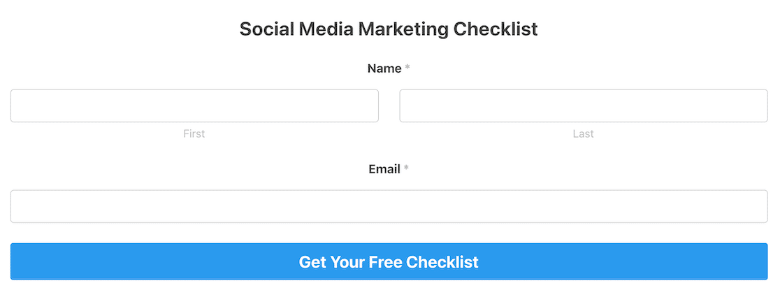
The Lead Forms addon from WPForms makes it easy to use lead magnets to attract new customers and get free leads. You can create custom single- or multi-page lead forms in minutes. All users have to do is enter their contact information to access the freebie.
If you’d like to create your lead magnet, see this guide on making lead magnet optin forms in WordPress.
Create Custom Lead Magnet Forms Now 🧲
Now let’s take a look at some examples of freebies you can offer your visitors as lead magnets.
1. Checklist
We’ve found that a checklist is a super simple way to offer a lead magnet. People often have goals they want to achieve but have no idea where to start or what steps are required to succeed.
Let’s look at this example from Isitwp.
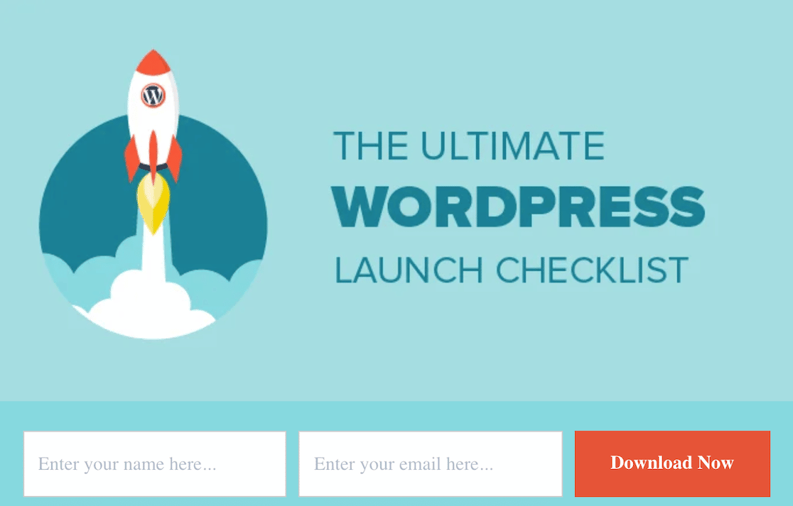
A WordPress launch is a hefty undertaking. The checklist helps ensure that you don’t forget anything. In return, the user provides an email to receive other updates, and Isitwp establishes itself as an authority, making it a go-to resource for all things WordPress.
Why I Like It:
- Eye-catching visuals: The rocket with the WordPress logo grabs attention and perfectly symbolizes the idea of launching a WordPress site.
- Clear, benefit-driven headline: “The Ultimate WordPress Launch Checklist” immediately tells visitors what they’re getting and why it’s valuable.
- Easy sign-up process: Just two fields (name and email) make it quick and painless for visitors to get the checklist.
- Contrasting CTA button: The orange “Download Now” button stands out, making it clear what action to take.
- Implied expertise: By offering a “launch checklist,” it positions the creator as an authority on WordPress site creation.
- Solves a specific problem: It targets people about to launch a WordPress site, addressing a clear pain point in the process.
Also read: what is a lead form?
2. Newsletter
There’s a reason that nearly every website you visit allows you to subscribe to a newsletter. It’s a tried-and-true lead magnet that keeps you top-of-mind.
Let’s look at this example from ProPublica.
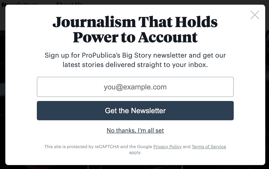
There are countless ways you can make a newsletter. Maybe you’ll share a roundup of the day’s or week’s biggest stories. Maybe you’ll do a roundup of your top blog posts. Perhaps you’ll even create entirely new content, review product features or interview experts.
Then, if you have premium content or products to sell, your subscribers will already know you as a trusted source.
Why I Like It:
- Intriguing headline: “Journalism That Holds Power to Account” immediately grabs attention and suggests hard-hitting, impactful content.
- Clear value proposition: It plainly states what subscribers get – ProPublica’s “Big Story” newsletter delivered directly to their inbox.
- Easy Opt-In: Only an email address is required, making it incredibly easy to subscribe.
- “No Thanks” Option: Providing a polite “No thanks” button reduces pressure, and has a psychological effect of persuading the person they might be missing out on something useful by not taking an action.
3. Demo
Demos are popular lead magnets because they work well for sales. Consider this example from Hubspot.
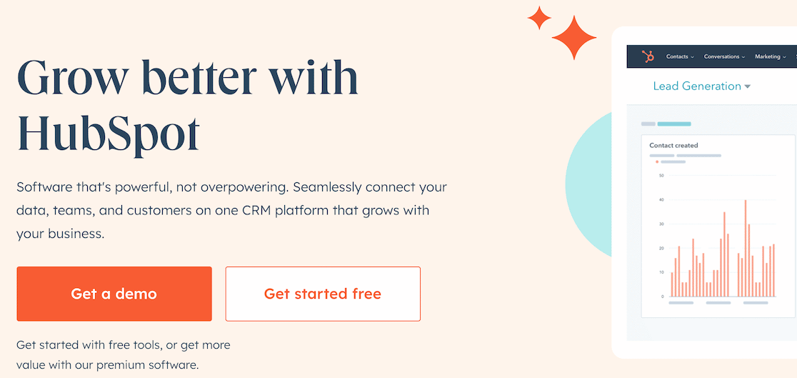
When you land on the homepage, you can’t miss the option to access a demo of the premium software. When you click on it, you end up on a landing page with a lead form required to access the demo.
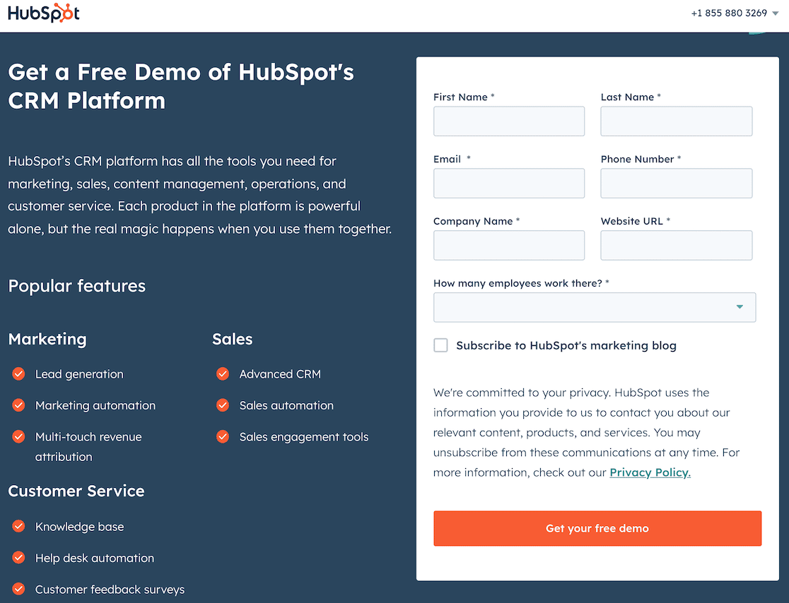
Gathering the user’s information lets you keep in touch with them as they try the product and see how valuable it is to their business, making them high-quality leads.
Why I Like It:
- Crystal-clear offer: The headline “Get a Free Demo of HubSpot’s CRM Platform” leaves no room for confusion. It’s a free trial, not a watered-down version.
- Benefit-oriented language: Instead of just listing features, it highlights what users gain, like “all the tools you need” and how the “real magic” happens when used together.
- Feature breakdown: The “Popular Features” section uses checkmarks to visually emphasize key benefits for marketing, sales, and customer service.
- Strong CTA: “Get your free demo” is clear, concise, and action-oriented.
4. Reports
If you’re research-oriented and like to compile data, you might find that creating reports is a natural fit for your lead magnets.
You don’t need much in the way of design skills to create a report. If you format it well in a word processing program, you can save it as a PDF and share it. However, you can use a site like Canva to add attractive visual elements to make it look a little more polished.
When your product is complete, you can set up a landing page and embed your lead form, like in this example from Adobe.
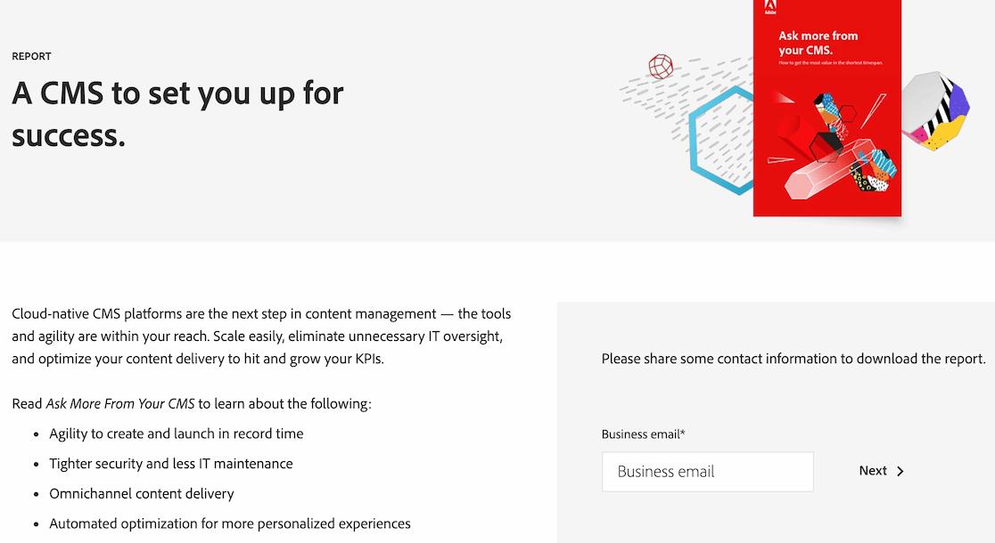
As you can see, the landing page is simple. There’s a brief overview of what the reader can expect from the report and the lead form to download it. It’s a relatively simple way to showcase your expertise and research prowess.
Why I Like It:
- Success-driven headline: “A CMS to set you up for success” uses positive framing and promises a desirable outcome, immediately appealing to the reader’s goals.
- Focus on solutions: The text emphasizes how cloud-native CMS platforms solve common pain points like scalability, IT overhead, and content optimization.
- Strong visual cue: The angled placement of the report cover image draws the eye and adds visual interest, further emphasizing the downloadable nature of the offer.
5. White Papers
Do you have a unique solution to a common problem? How about an exciting philosophy on a hot-button issue? If so, white papers could be an excellent way to create lead magnets.
Take this example from Artisan Financial Strategies, for instance.
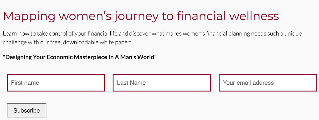
The landing page is brief, but you know the target audience and the problem or issue the white paper aims to resolve. To access the white paper, users need only provide their information to subscribe to the email list.
In doing so, they’ll receive the white paper as promised and additional content coming through the email list. That content keeps them engaged and increases their likelihood of becoming customers or clients.
Why I Like It:
- Relatable challenge: The tagline acknowledges a common pain point: the unique challenges women face in financial planning.
- Prominent value proposition: The text clearly states what users will gain – knowledge and strategies to take control of their financial lives – and that the white paper is free and downloadable.
6. eBooks
Do you have long-form content to share? eBooks are a wonderful way to demonstrate your expertise if you enjoy writing and have good advice to share, lessons to teach, or wisdom to impart.
eBooks are useful across all industries and topics, so they’re also versatile tools.
Here’s an example from ASTM.
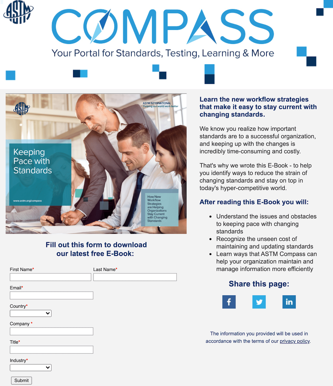
Once again, you see a landing page with the lead form embedded. ASTM also includes objectives on the landing page, letting you know what you will be able to do after reading this eBook.
Like other written documents, an eBook can establish you as an authority in your field, leading to new business. Because they’re longer than white papers, you can dive deeper into a topic and explore it more in-depth for your readers.
Why I Like It:
- Direct & conversational tone: The language is straightforward and approachable, speaking directly to the reader’s needs and concerns.
- Simple optin form: The form is clean and easy to complete, asking for only essential information.
- Social sharing: Encouraging page sharing expands the lead magnet’s reach to potentially interested individuals beyond the initial viewer.
7. Guide
Are you good at explaining processes and leading people through steps to an intended outcome? You can find lead magnet success with guides if you are thorough with your instructions.
In this example, Mama Psychologists offers a bedtime guide to help parents.

The site offers courses, workshops, and training to help parents maintain their sense of calm while raising children. This example shows that Mama Psychologists know its audience. Offering a bedtime guide for free can establish trust and lead to parents enrolling in courses.
A guide will be longer than a white paper but not as long as an eBook. You’ll have ample space to walk your potential customers through your topic.
Note that this is another instance in which design can play a key part in whether or not your lead magnet converts. If you have an overly plain or messy document, people won’t want to read it. If the guide is eye-catching but not too busy, you’ll have a larger pool of potential customers.
Why I Like It:
- Direct and empathetic tone: “Help is here!” and “We will help you with this bedtime thing mamas!!” convey understanding and offer a solution to a relatable problem.
- Focus on benefits: “Get Our FREE Bedtime Guide” leaves no ambiguity about what’s being offered, and the supporting text “Let us show you how we make bedtime that much easier” highlights the guide’s benefit.
8. Webinar
If you know how to guide people through a process or educate them on a topic, but the written word isn’t your style, you might fare well hosting webinars.
If you have video conferencing software, you can hold a webinar to teach about a specific topic or have a conversation that would benefit others in some way.
Take this example from Hootsuite.
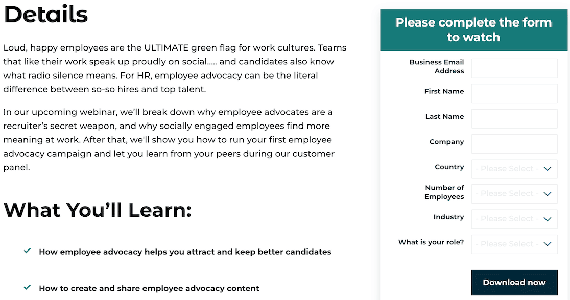
Once again, it’s a simple landing page with brief information about the event and a lead form embedded to access the download.
Hootsuite is known for social media management, but this topic also positions it as an authority beyond that. A webinar can showcase a strong company culture, expert knowledge, or fresh perspectives. It’s a strong, versatile option as a lead magnet.
Why I Like It:
- Relatable pain point: It speaks directly to HR professionals by mentioning “radio silence” and the challenge of finding “top talent,” acknowledging common hiring difficulties.
- Structured learning: The “What You’ll Learn” section uses bullet points to present specific, actionable knowledge attendees will gain, further emphasizing the webinar’s value.
- Customer success story: Mentioning a “customer panel” implies real-world success stories and insights, adding credibility to the webinar’s content.
9. Printables
Another simple way to create a lead magnet is to use printables. These are documents like worksheets, charts, or other materials that users can print out and use to organize or reach goals.
Let’s look at an example from We Are Teachers.
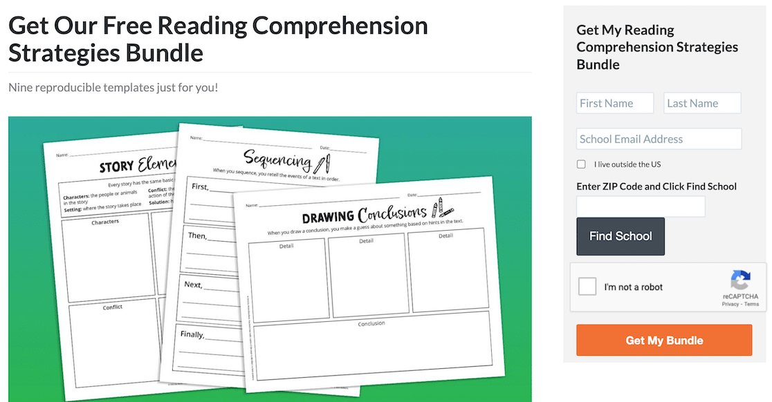
Worksheets and templates like the one’s offered here can save teachers a ton of time. It also holds true for other industries. If you have the creativity and design skills to create a printable template, they’re another example of content that helps to establish you as an authority in your field.
Why I Like It:
- Specificity builds trust: “Nine reproducible templates just for you!” highlights the exact number of resources included, making the offer more tangible and appealing.
- Visual appeal: Showcasing sample pages from the bundle allows teachers to quickly assess the resource’s quality, format, and suitability for their students.
- Focus on practicality: The templates themselves suggest ease of use and implementation. They look like resources teachers can immediately put to work in their classrooms.
10. Shopping List
A shopping list is a great freebie if you have a business that creates meal plans or sells products that require you to buy certain items or ingredients.
Take, for example, this shopping list lead magnet from Doodle Doods.
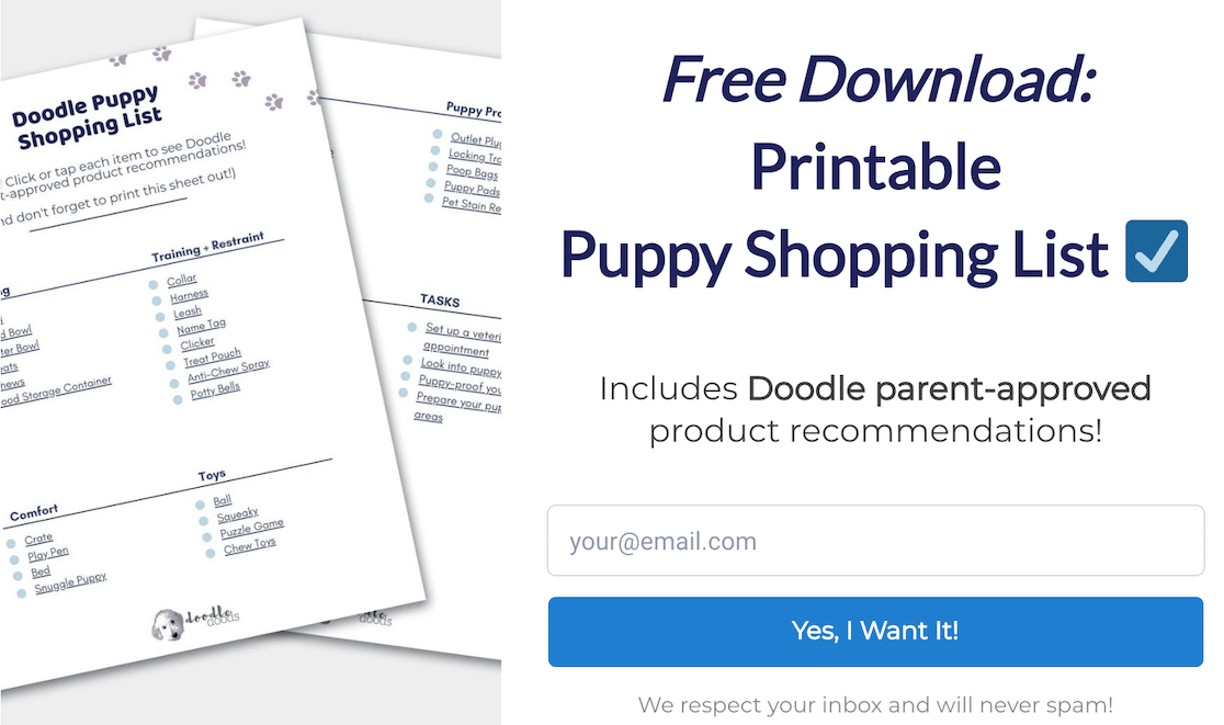
Doodle Doods is a website that gives you tips and tricks for raising a healthy Doodle puppy. It sells courses and recommended products, so creating a shopping list as a lead magnet is a smart way to get customers. You get the free download, purchase the products (which Doodle Doods sells), and then you can enroll in courses.
Shopping lists also work well for meal plans, special dietary plans, styling, and certain hobbies. You don’t need much design skill for this. It’s mostly about knowing how to format the list well.
Why I Like It:
- Solves a real problem: Addresses the common challenge of feeling overwhelmed when preparing for a new puppy, especially for first-time owners.
- Social proof & expertise: Leverages the “Doodle parent-approved” tagline to establish trust and credibility, implying the recommendations come from experienced owners.
- Low barrier to entry: Requires only an email address in exchange for the download for easy signups.
11. Spreadsheets
Are you a wiz with spreadsheets? If so, they make excellent lead magnets. In this example from Cloudberries, users can gain access to a spreadsheet to use as a puzzle tracker. It helps customers to see which of the Cloudberries puzzles they’ve completed and which they still need to buy.
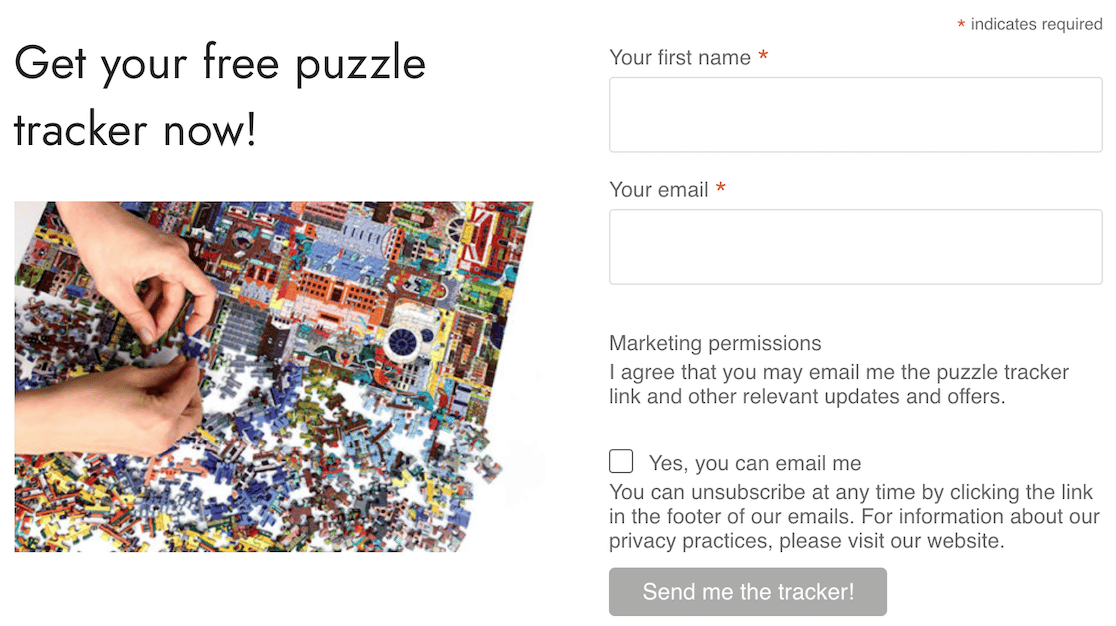
The great news is that you can create spreadsheets for just about anything, whether for a hobby or business. There is someone out there who will find that spreadsheet useful. That gets you on their radar and makes them more likely to become customers.
What I Like It:
- Speaks to a passion: It directly targets puzzle enthusiasts by offering a solution to a common problem i.e. keeping track of pieces and progress.
- Instant gratification: The word “now” in the call to action emphasizes the immediacy of receiving the tracker upon sign-up.
12. Magazine
Creating a digital magazine is a little more involved, but if you have a topic that lends itself well to the medium, it might be easier than you think. Let’s look at this example from Beyond the Bookends.
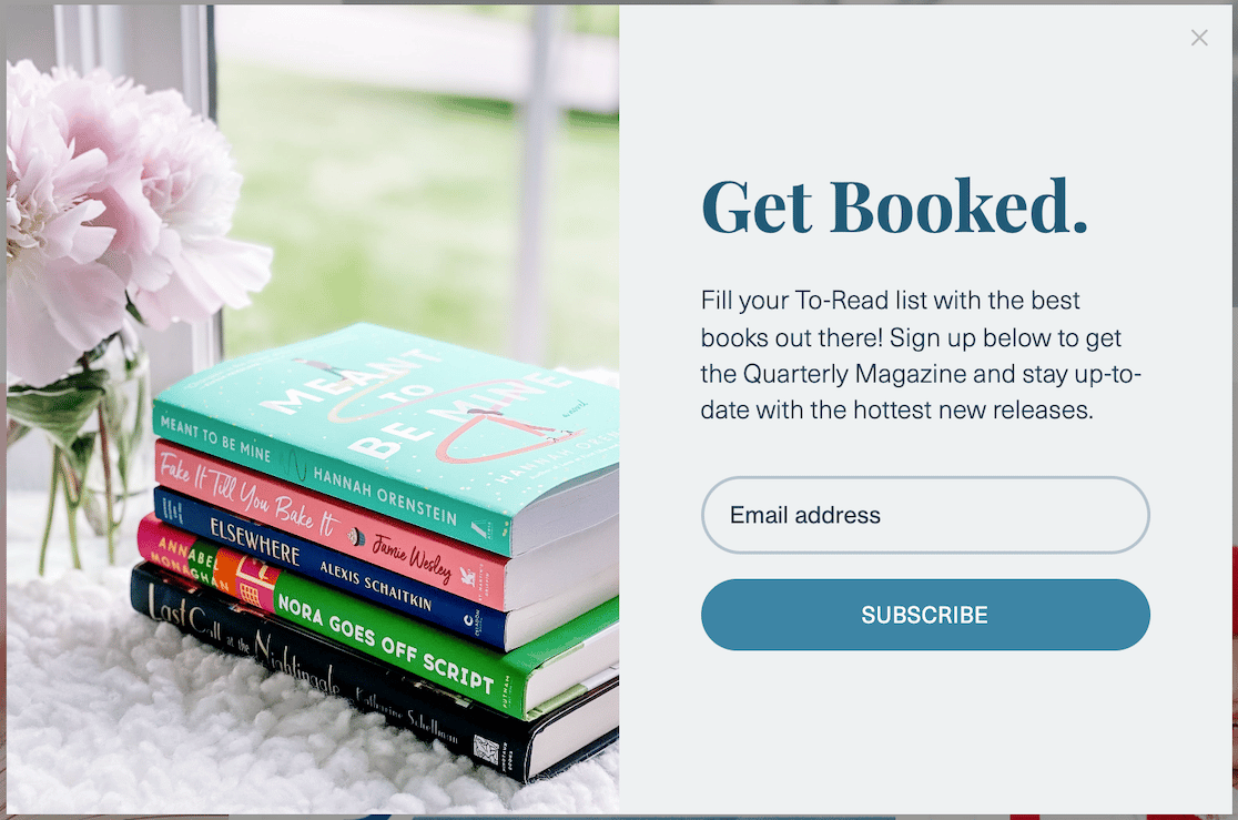
This lead form appears as a popup and at the bottom of the homepage, giving readers ample opportunity to subscribe without being too persistent.
The book industry lends itself well to a quarterly magazine lead magnet because there are always new releases. Other media industries, such as films and music, are the same. There’s lots of information to work with, and creating the magazine just means compiling it into a nice-looking document that keeps readers up-to-date.
Given the longer form of a digital magazine, some design know-how is needed. But as we said before, you can also get help from Canva.
This lead magnet is great if you want to sell potential customers on premium content.
Why I Like It:
- Direct and actionable headline: “Get Booked.” is a short, catchy phrase that immediately grabs the attention of book lovers. It uses action-oriented language that emphasizes a benefit beyond just signing up.
- Visually enticing: The image of a stack of brightly colored books with a soft, aesthetically pleasing background creates a sense of cozy anticipation and excitement for discovering new titles.
- Bold CTA: “SUBSCRIBE” is a clear and concise call to action that reinforces the commitment to receiving book recommendations.
Next, Let Visitors Subscribe to Your Blog Through Email
If you want readers to become subscribers, give them an easy way to subscribe. What’s easier than email? While WordPress doesn’t have a built-in way to subscribe by email, it can still be done. Check out our article on how to let visitors subscribe to your blog through email to find out how.
And if you’re thinking about starting a side hustle where you can use all of the lead form ideas we covered here, we’ve got some side hustle ideas for you too.
Ready to build your form? Get started today with the easiest WordPress form builder plugin. WPForms Pro includes lots of free templates and offers a 14-day money-back guarantee.
If this article helped you out, please follow us on Facebook and Twitter for more free WordPress tutorials and guides.

