AI Summary
From my own experience, the success of a newsletter often boils down to a few simple details: how it’s designed, what it says, and how it’s delivered.
It’s not just about sending content to your subscribers but rather about making sure your message resonates, engages, and ultimately drives action.
I’ve tested countless formats, styles, and ideas, and each time, I’ve learned something new about what works and what doesn’t to improve my open rates, click-through rates, and conversions.
In this post, I’ll walk you through a few ways that have helped me create better email newsletters, covering everything from writing compelling subject lines to using the right tools.
- 1. Create Segmented Lists for Personalization
- 2. Avoid Spam Triggers in Subject Lines & Preheaders
- 3. Write Engaging and Scannable Content
- 4. Include a Clear Call-to-Action (CTA)
- 5. Use Analytics to Improve Future Newsletters
- 6. Ask for Feedback from Newsletter Subscribers
- 7. Test and Optimize Your Email Campaigns
1. Create Segmented Lists for Personalization
When I start creating a newsletter, the very first thing I focus on is setting a clear, measurable goal. Whether I’m aiming to drive more traffic to my website, boost product sales, or simply nurture leads, having this clarity shapes the entire email and, ultimately, my newsletter strategy.
It helps me tailor everything, including the content, design, and even call-to-actions, to achieve that specific goal. Without a clear objective, the newsletter can feel irrelevant to the reader, which usually leads to lower engagement. It’s about understanding that not every email subscriber is the same.
And, the easiest way to cater to different needs is audience segmentation. This means creating different lists or groups based on user behavior, purchase history, or even interests. One of the best ways to manage segmentation is by using tools like the ConvertKit Addon for WPForms.
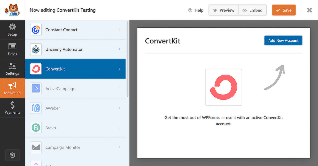
With this integration, you can easily segment subscribers based on the forms they complete on your site. Let’s say you’re offering a free guide or newsletter signup, you can automatically assign subscribers to different groups based on what they’re interested in.
2. Avoid Spam Triggers in Subject Lines & Preheaders
One of the first things I focus on when creating an email newsletter is the subject line. Why? Because it’s the very first impression the recipient gets of your email, and it can make or break your open rates. I usually try to keep it short, clear, and impactful, using a bit of curiosity or urgency to get the reader intrigued.
Most importantly, I avoid using certain words that would immediately get flagged as spam. Words like “Free,” “Cash,” “Buy Now,” or even too many exclamation points (!) can easily send your email straight to the spam folder. Always make sure the subject line stays clear and relevant to the topic of your newsletter.
The below examples work well because they use a mix of proven strategies that grab attention. Personalization elements such as addressing the user directly or implying a reward (“You Deserve It 🎉”) connect on an emotional level, which is a powerful driver for open rates.
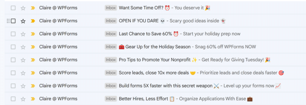
Urgency is communicated effectively with phrases like “Last Chance” and “60% Off,” which pushes readers to act quickly. Seasonal references, like Halloween-themed language or holiday prep, align the message with current events, making the email feel timely and relevant.
Similarly, actionable phrases like “Pro Tips” or “Score Leads” signal that the email contains valuable content, boosting its appeal. All these tactics combined make these examples highly effective at capturing attention and driving engagement. Make sure you’re being creative with your approach to newsletters, too!
3. Write Engaging and Scannable Content
I’ve discovered that when it comes to writing newsletters, keeping things simple is the way to go. Nobody wants to read a long email, especially when they’re just scanning through their inbox.
You want to start with something that relates to your reader, like addressing a pain point or offering a clear benefit. Breaking up your email with subheadings and bullet points helps the reader pick out the most important info without having to read through tons of text.
Personally, I’ve found that people are much more likely to engage with emails that are structured this way. You can even use AI for email marketing to make your job easier. The below example from Butter & Crust shows exactly how it’s done.
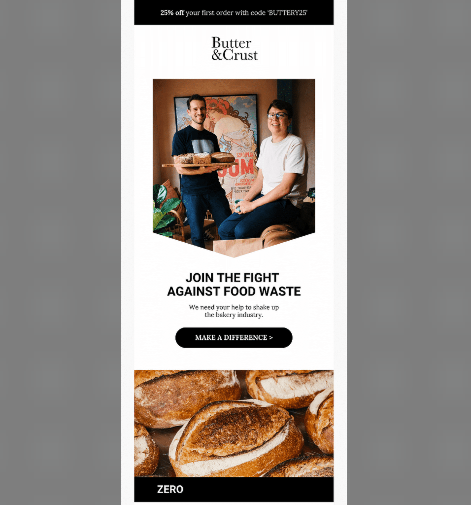
The content is also broken up into short paragraphs with clear sections like “Join the Fight Against Food Waste” and even a customer testimonial to make it more personable.
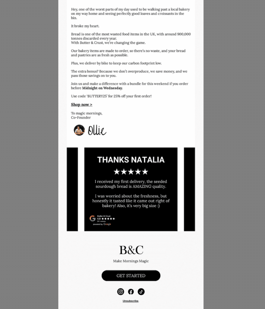
They also used strong imagery of their products, which adds to the story without overwhelming the reader. It’s important to balance visuals and text.
Adding too many can slow down load times, but a few well-placed images can prove very effective in communicating your message.
4. Include a Clear Call-to-Action (CTA)
Your CTA is where you ask your readers to take action, whether that’s making a purchase, signing up for something, or learning more. In my experience, having a single, powerful CTA can significantly boost engagement and conversion rates, but you can experiment with adding more as well.
The clearer the CTA, the better the chances of achieving the desired outcome. The email graphic below is a good example of this. The CTA “Grab Up to 60% Off” is bold, eye-catching, and offers a clear incentive to take action and benefit from a limited-time discount.
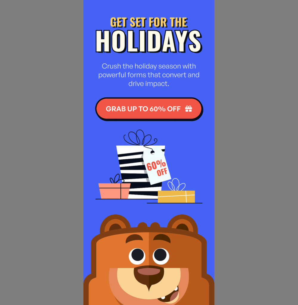
The content of the email is also simple and action-driven, and everything visually supports the message of driving the reader towards a specific action.
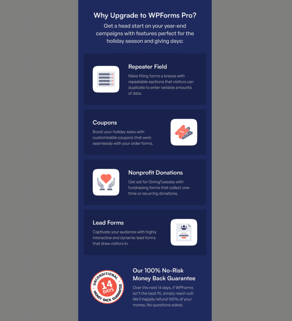
This approach works because it simplifies the reader’s journey from interest to engagement:
- Action-Oriented Text: Use strong verbs like “Shop Now,” “Get Started,” or “Claim Your Offer.”
- Visual Contrast: Make sure the button stands out from the rest of your design.
- Strategic Placement: Place the CTA where it’s most visible but doesn’t interrupt the flow of content.
5. Use Analytics to Improve Future Newsletters
Once your newsletter campaign is up and running, the next step is understanding how well it’s performing. Trust me, tracking the right metrics can make a huge difference in improving your newsletters over time.
To get the best results, it’s essential to monitor key email metrics like open rates, click-through rates (CTR), and conversions. Each of these metrics tells you how your audience is interacting with your content.
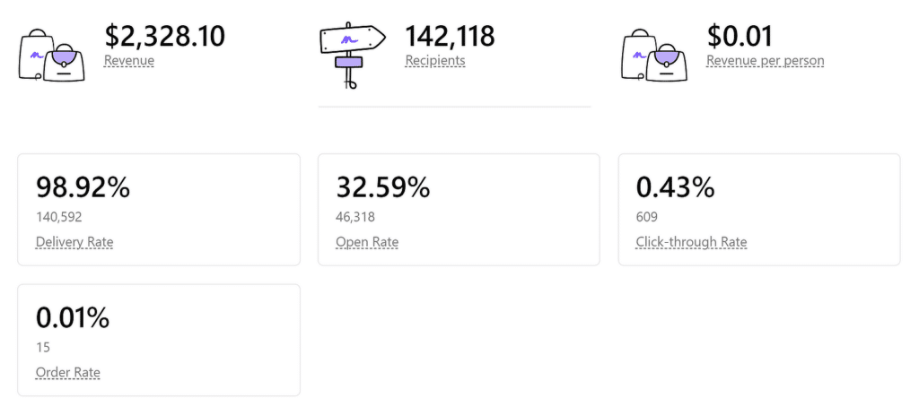
For example, if your open rates are low, it could be a sign that your subject lines need work. If CTRs aren’t where you want them to be, maybe your CTAs need to be more compelling, or the content isn’t aligned with what your audience is expecting.
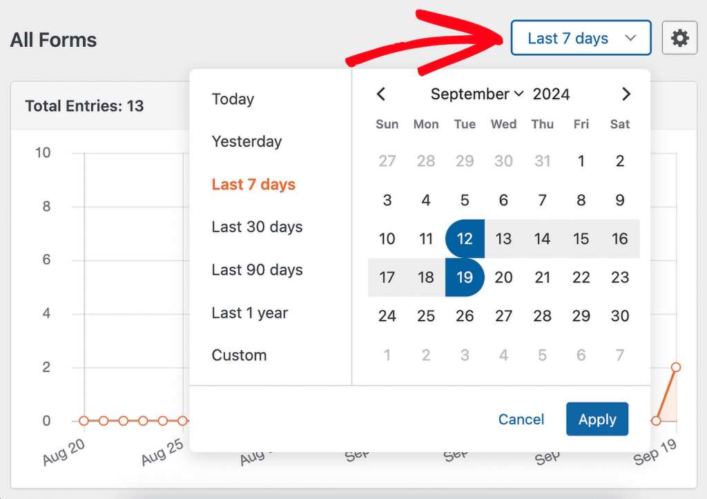
You can even use WPForms to capture more targeted data through form submissions. For example, you can track who signed up for specific offers, which forms generated the most leads, monitor how well certain subject lines performed across different campaigns and sort entries by date.
6. Ask for Feedback from Newsletter Subscribers
One of the most effective ways I’ve found to create better email newsletters is to simply ask for feedback from your subscribers. This has worked wonders for me because it gives me direct insight into how readers feel about my emails.
I usually send out a quick, easy-to-answer question like, “Are you finding our emails helpful?” Along with this, I provide a list of options for them to select, as you can see in the screenshot below. This way, subscribers can tell me exactly what’s working and what’s not, so I can make the right adjustments.
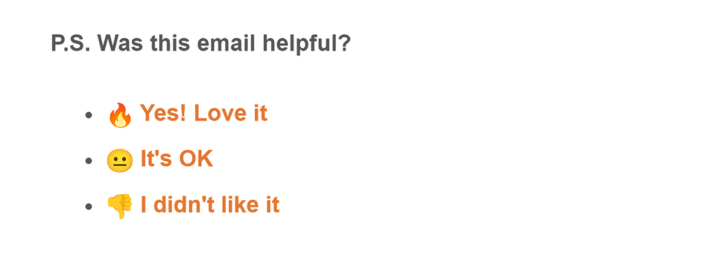
In my experience, people love to feel heard, and giving them an opportunity to share feedback goes a long way toward building trust. Plus, this feedback loop helps ensure you’re always improving based on real insights from your audience. And ultimately, the fewer complaints you get, the healthier your email list remains!
7. Test and Optimize Your Email Campaigns
A/B testing, also known as split testing, is one of the most effective ways to improve your email campaigns. The idea is simple: you create two versions of the same email, with just one element changed, and see which one performs better.
I’ve often run tests on subject lines and CTAs, and I can tell you that even small tweaks can increase open rates and click-through rates noticeably.
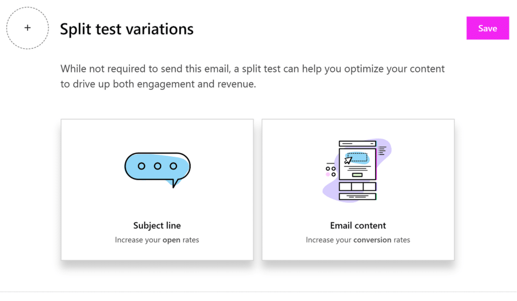
Testing different subject lines helps you understand which language resonates most with your audience, while testing email content can help you optimize what action you’re encouraging readers to take.
FAQs — How to Create Better Email Newsletters
What is the best way to create an email newsletter?
The best way to create an email newsletter is by focusing on valuable content, clean design, and clear calls to action (CTAs).
Start with a strong subject line, write concise yet engaging content, and include relevant visuals. Tools like WPForms and ConvertKit can help automate sign-ups and track your email’s performance.
What is the best format for an email newsletter?
The best format for an email newsletter includes a clear hierarchy: a headline, an engaging introduction, sections with relevant content, and CTAs.
Use a responsive design so it’s easy to read on mobile devices. Keep paragraphs short and use bullet points where necessary.
What is the best line spacing for newsletters?
The best line spacing for newsletters is typically 1.5 or 2.0 for better readability. This ensures that the content doesn’t feel too cramped and allows readers to easily scan through the text.
Ample spacing around headings and between sections also helps improve clarity.
What is the best number of words for a newsletter?
There isn’t a strict word count, but keeping it between 200-500 words works well for most newsletters. This range is enough to provide valuable information without overwhelming the reader.
Next, Email Notifications: Examples and Best Practices
Whether it’s confirming a purchase, sending an appointment reminder, or updating users about account activity, email notifications are the backbone of smooth customer communication. Check out this guide for examples and best practices for creating email notifications.
Ready to build your form? Get started today with the easiest WordPress form builder plugin. WPForms Pro includes lots of free templates and offers a 14-day money-back guarantee.
If this article helped you out, please follow us on Facebook and Twitter for more free WordPress tutorials and guides.

