AI Summary
Do you need a logo for your small business or eCommerce website?
Creating a logo may seem like a daunting task, especially if you’re not comfortable with graphic design.
That’s where AI, artificial intelligence, comes to the rescue. With all kinds of AI-powered image generation tools available, your logo solution is here.
Using AI to generate your logo offers numerous benefits, such as affordability, speed, and convenience. AI logo generators provide a quick and cost-effective solution for creating professional logos without requiring design expertise or hiring a designer.
And I can show you which ones are the best! Keep reading to discover which AI logo generators I suggest, plus how to use them with your website.
5 Best AI Logo Generators (Plus How to Use Them)
Midjourney
Midjourney is an AI generative tool that you can access via a Discord login. It uses machine learning algorithms to interpret your text input and generates unique images based on your description.
So, you could use Midjourney to generate logo designs by providing detailed prompts that describe the desired logo elements, colors, and style.
For example, here’s what Midjourney came up with for me when I asked for a different rendition of our WPForms logo, Sullie.
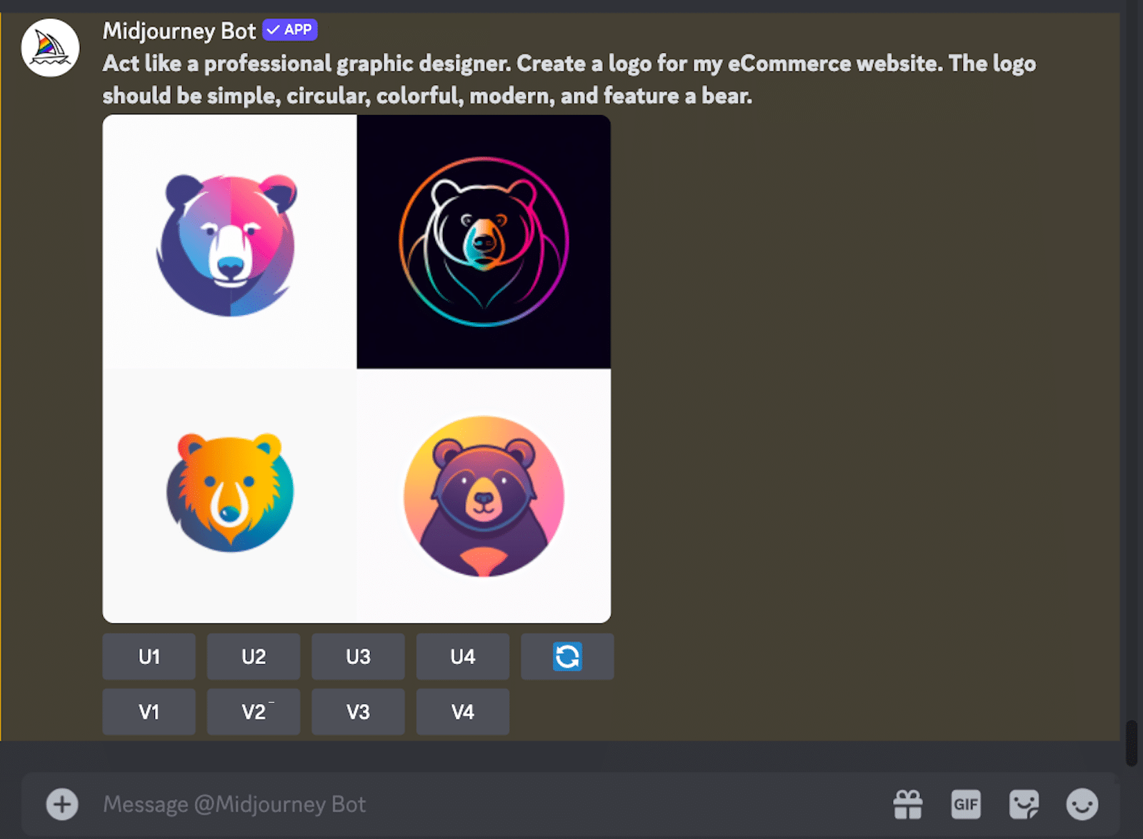
Here’s a quick breakdown of how you might use Midjourney to generate your logo:
- Describe your desired logo: Begin by typing a detailed description of your desired logo, including any specific elements, colors, or styles you want to incorporate.
- Generate images: Midjourney will generate several unique images based on your description, each offering a different interpretation of your ideas.
- Refine your results: If the initial results aren’t quite what you had in mind, you can refine your description or add specific keywords to guide Midjourney toward creating a more accurate representation of your logo.
Midjourney could also be a helpful tool for brainstorming logo designs and generating ideas, especially if you’re struggling to visualize your concept or are looking for inspiration.
Display Your Logo on Forms Now
DALL-E
Developed by OpenAI, DALL-E is another AI tool that creates images from textual descriptions. It’s a really simple way to generate logos, concepts, and ideas.
You can use DALL-E through ChatGPT by asking for an image. This is by far the most popular way to access DALL-E; ChatGPT currently has 60% market share, so most people are already familiar with it.
There’s also an official DALL-E GPT that gives you more control over the output, without having to include all of the directions in your prompt.
Pro Tip
DALL-E is limited to 1 image per day in the free version of ChatGPT. If you want to generate more than one image each day, you can access DALL-E for free via Microsoft Copilot instead.
Personally, I think DALL-E is easier to use than Midjourney, especially if you’re somewhat familiar with ChatGPT. For instance, you can see the logos it generated for me from the same prompt I used before.
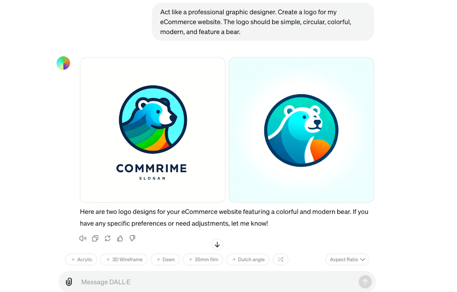
Speaking of prompts, check out all of our AI prompt examples and practical tips for additional guidance.
These are some of the helpful ways you can use DALL-E to generate logos:
- Brainstorming ideas: You can input various textual prompts describing the desired logo design, and DALL-E will generate multiple images based on your descriptions. This can be helpful for exploring different concepts and visualizing your ideas.
- Iterative design: Once you have some initial designs generated by DALL-E, you can refine the results by adjusting the text prompts or combining elements from different images. This iterative process allows you to gradually improve the logo design until it meets your requirements.
- Finalizing the logo: After you’ve found a satisfactory logo design using DALL-E, you can further polish and finalize the design using traditional graphic design software like Adobe Illustrator or Photoshop, ensuring that the final logo is professional and meets your brand’s needs (more on that later!).
I like DALL-E because you can integrate it with WPForms to automatically generate images. When you get a form entry, you can pass the data to the OpenAI API using the Zapier addon (no coding needed!). Then, have DALL-E create an image from the form data.
Runway
Runway, also known as RunwayML, focuses on developing generative AI technologies for art, entertainment, and human creativity. Like Midjourney and DALL-E, its tools could be used to generate images and multimedia content, including potential logo designs, using text-based descriptions or prompts.
Here are the colorful logos that Runway created for me when I prompted it with the same task as the others:
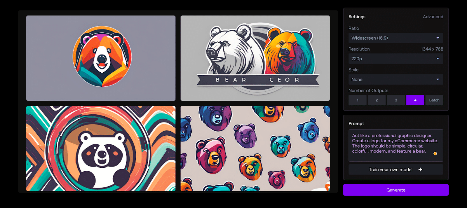
As you can see, you’re given lots of customization options — like ratio and style — right there in the generator. This way, you don’t have to do additional styling later.
Pro Tip
If you have a Canva Pro account, you’re in luck: Runway is available through Canva’s Magic Studio, so you can generate images in your existing Canva account.
These are just a few of the ways you could use Runway to generate logos:
- Use text-to-image tools: Runway offers text-to-image tools that can generate images from textual descriptions. You can use these tools to create logo concepts and ideas by describing your desired logo design in words as I did above.
- Upload and animate images: You can upload your existing logo or design elements to Runway’s platform and use its animation tools to add motion and visual interest to your logo.
- Create custom generators: Runway allows you to train custom AI generators using a small set of images, which can help you create unique and tailored logo designs based on your preferences and style.
- Explore pre-made templates and assets: Runway offers a variety of pre-made templates and assets that you can use as a starting point for your logo design. You can customize these templates to fit your brand’s identity and style.
What sets Runway apart from the generators listed before it might be the accessibility to its templates. We’re big lovers of templates here at WPForms, and appreciate any effort towards simplicity for users.
Adobe Firefly
The Adobe suite of products is another option that offers multiple tools for creating or generating a logo. You might already be familiar with Adobe Photoshop or Adobe Illustrator, both of which are great for creating logos.
But now, with Adobe Firefly, AI takes these programs to another level.
Just look what it was able to do with Sullie in celebration of his birthday!

With the many programs and subscriptions available through Adobe, the creative options are endless. Imagine, then, what it could do for your logo.
There’s also a business version of Firefly called Sensei.
These are just a few of the key features from Adobe Firefly/ Sensei that could help you create your logo:
- Object Selection: This tool uses AI to identify and select objects within an image automatically. With it, you can quickly isolate elements for your logo design.
- Content-Aware Fill: This allows you to remove unwanted elements from an image and replace them with content that matches the surrounding area. This feature can help you create clean, distraction-free logos.
- Color Matching: Adobe Sensei helps you generate custom color palettes based on uploaded images or artwork. With it, you can create logos with harmonious color combinations that align with your brand’s style.
- Neural Filters: Photoshop’s Neural Filters use AI to generate advanced image manipulation effects, such as changing facial expressions, coloring, and more. Experiment with these filters to create unique logo elements.
Most Adobe products are priced for professionals, but you can use Firefly for free.
Canva
Canva is an online graphic design platform that allows you to create and edit all kinds of visual content like social media posts, presentations, videos, websites — and logos, of course.
It has customizable templates, design tools, and a vast library of stock images, fonts, and design elements. Basically, Canva is for folks who want to create professional-looking designs but don’t have extensive design skills or software.
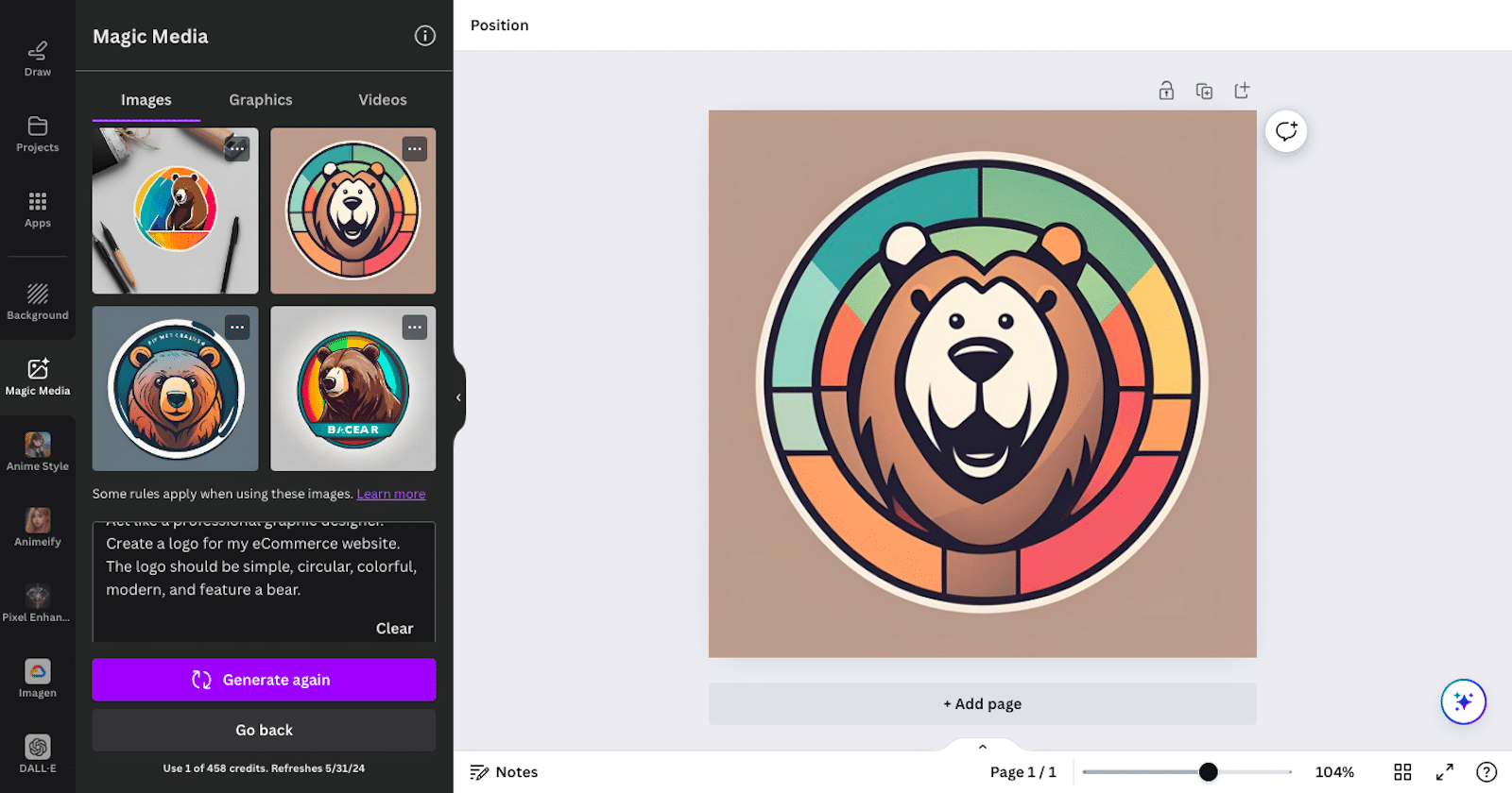
I used Canva Pro’s Magic Media tool to generate a logo for me, but I love the fact that it accesses additional AI platforms to utilize with your design. You can use AI image generation tools from Google, Runway, and others.
Canva might be my (current) favorite tool of all those that I’ve listed here. There are just so many creative offerings all in one place! So, this is a very small sampling of the various ways to use Canva for your logo:
- Magic Media: Canva’s AI-powered feature allows you to input a prompt describing your desired logo design. The AI then generates a collection of designs that match the given description. You can further customize these designs to suit their brand’s needs.
- AI-powered design suggestions: Canva’s AI analyzes your logo and suggests design elements like fonts, colors, and images that complement your creation. This feature helps you make visually appealing and effective changes to your logo quickly and easily.
- Automated layout creation: Using generative AI, Canva enables you to create custom logo templates by selecting a design type and choosing from various design elements. The AI then generates an optimized layout, saving you time and effort.
- Image recognition and sorting: Canva’s AI allows you to search for images using natural language queries. This way, you can find the perfect images for your logos without spending hours browsing through endless options.
Canva also offers an incredible slew of templates for logos (and other projects), as they have been long before they introduced AI to the site. But now, with its AI capabilities, Canva easily rivals Adobe and the others.
Where Should I Put My New Logo?
Once you have your logo ready to go, there are lots of things you can do with the image. For starters, you’ll want to display it on your website in a few different areas.
WordPress Login Page
The WPForms User Registration addon makes it easy to create custom login forms for WordPress. You can use this to display your logo on your website’s login page instead of showing the default WordPress logo.
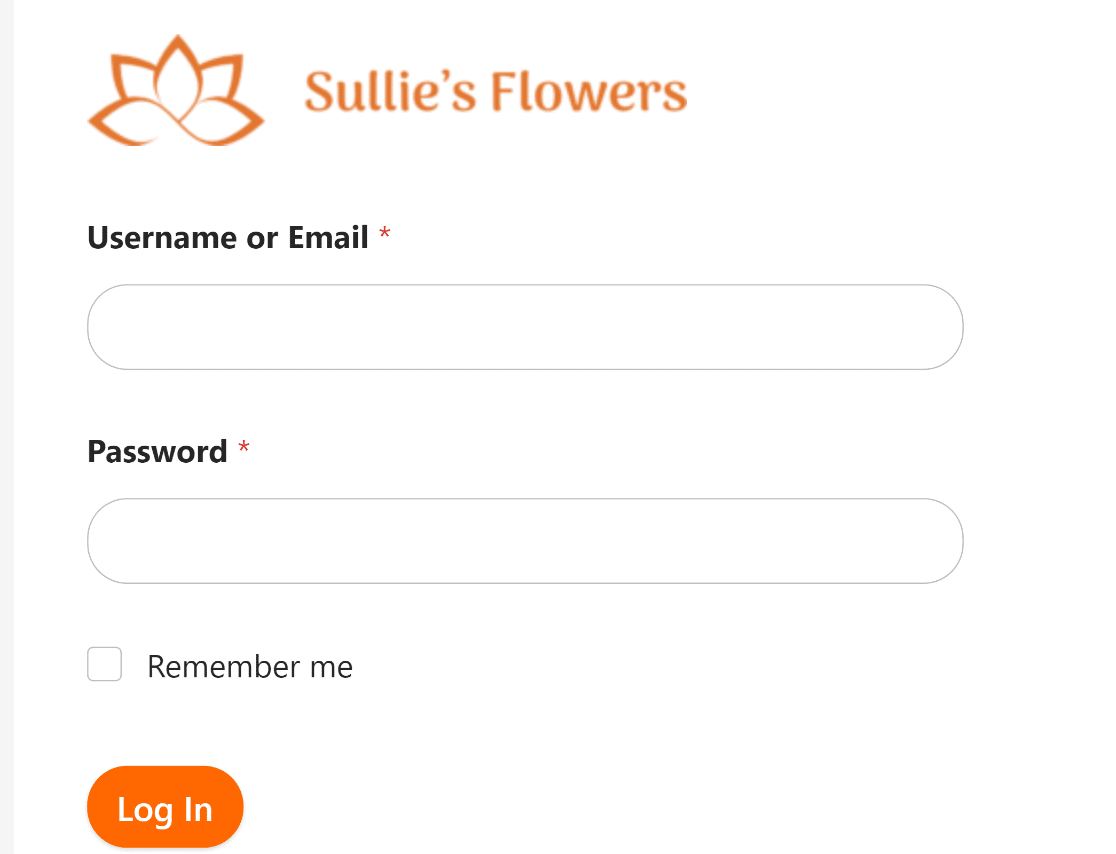
Creating a personalized login page offers an excellent opportunity to showcase your branding and make your site look more professional.
For a refresher, take a look at these steps covering how to make a WordPress custom login page.
Pro Tip
Using images that are too large can slow down your site. We have some more advice on choosing a good logo size for your WordPress login page.
Form Header
WPForms has a Content field that you can use to include your logo on any form on your site.
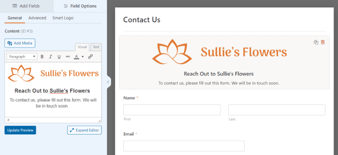
Keep in mind that the Content field is accessible with the WPForms Pro license, among multiple other additional fields and functionality.
You simply open up the form builder page for your form of choice and drag over the Content field to drop where you’d like. Then you can upload whatever type of media you want displayed there. In this case, the media would be your logo.
That’s pretty much all there is to it, but check out my full tutorial for more information: how to add a header image to a WordPress form.
Email Templates
You might also want to display your logo at the top of your form confirmation emails. These are the email messages users receive after they submit a form on your site.
Once again, WPForms makes this an easy option by allowing you to customize the email templates you use with your forms.
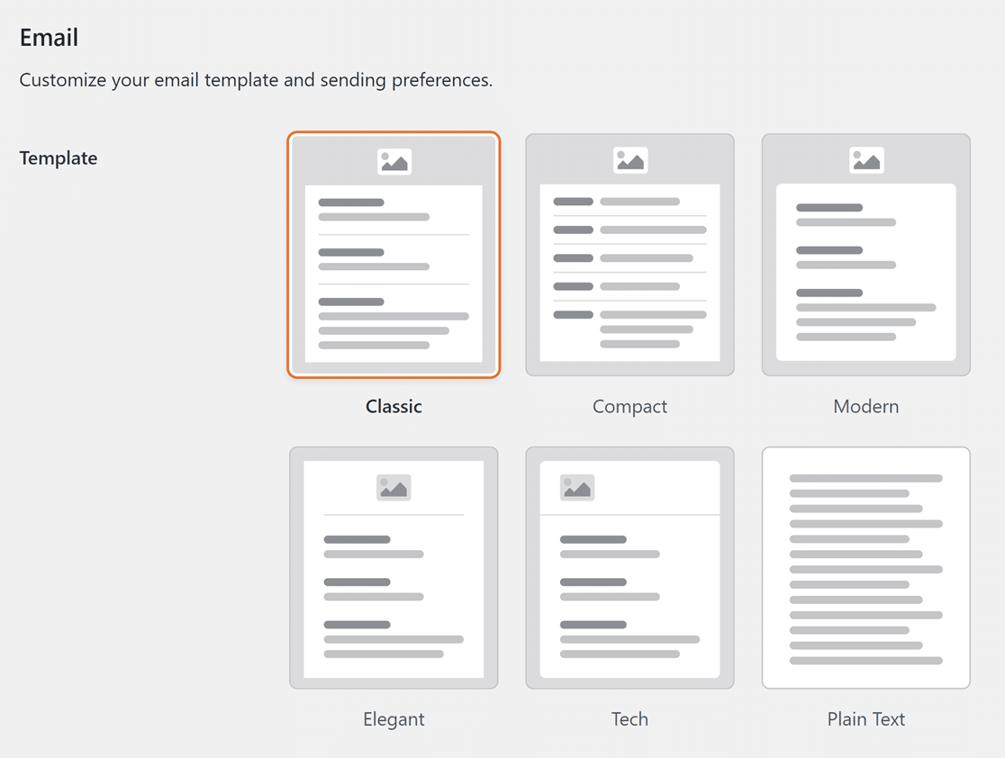
Not only do you have multiple style options for the layout of your email template, but you also have lots of customization choices for your sizing, background colors, fonts, and more.
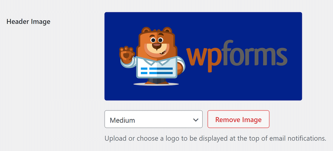
You can access these settings through the form builder and a few different places throughout WPForms. So, I suggest following our helpful tutorial on how to make a custom email template.
Create Your WordPress Form Now
WordPress Logos and Guidelines
The appropriate logo size for your website header depends on your site theme, which is why logo sizes are highly variable across the web.
Many WordPress themes will suggest the appropriate logo size you should use for the best results. In fact, most themes will automatically resize your logo to ensure the best fit.
If you’re unsure, the best approach is to start with the general guideline of using a logo that is 250 x 100 pixels and then make adjustments as needed.
Let’s examine the general guidelines for logos and how they are used in different parts of a site.
Header
The header of your site is the most natural place for your logo to appear. Here are a few important things you should pay attention to when adding your logo to the header:
- Proportions: The best logo is well-proportioned relative to other elements in your header. Avoid chasing an arbitrary magic number for your logo size; instead, aim for a size that suits your site theme and header.
- Maximum dimensions: Logos aren’t meant to take up the full width of your site’s header. To leave enough space for your navigational elements, try not to make your logo bigger than 500 px in width and 200 in height.
- File format: Use the SVG file format for your logos. SVG logos are ideal for responsive design as they can scale up or down flawlessly without appearing pixelated.
- File size: The file size (not to be confused with dimensional size) of modern logos rarely exceeds 50 KB. If you can’t keep it that low, aim for a maximum of 100 KB to avoid slowing down your page load speed.
- Link homepage: Logos are always linked to your website’s homepage, serving as a helpful navigational component for user experience.
Favicon
A favicon is a tiny version of your website’s logo that shows up in browser tabs. Visitors see favicons as a sign of trust since most professional and legitimate websites have them.
Favicon sizes are also much more standardized, so following a general rule here is easier. Typically, websites use these sizes for their favicon:
- 16 x 16 px
- 32 x 32 px
- 48 x 48 px.
Footer
Having a logo in your footer isn’t imperative. There are many examples of well-designed websites that feature no logo in the footer.
However, if you want to use a logo in the footer, the same advice applies here for headers—focus on proportions and theme fit.

Logos in footers are usually the same size as or smaller than those in your header. However, the important thing is to give your logo the right proportions within the context of your overall footer.
FAQ About AI-Generated Logos
Looking for more information about generating logos with AI? These are some of the most frequently asked questions on the topic.
Can ChatGPT generate logos?
Yes, it can. The free version allows you to create 1 AI-generated image each day. To increase those limits, you can either upgrade to ChatGPT Plus.
As an alternative, try using Microsoft Copilot (specifically, its Designer tool). Copilot uses the same DALL-E algorithms, but it’s free.
Are there any drawbacks to using AI-generated logos?
AI-generated logos may not offer the same level of creativity and personalization as logos designed by professional designers. You may also face limitations in customization options or encounter issues with design originality.
Sometimes it can be difficult to get text to appear correctly, too. Some AI tools have difficulty with slogans or brand names.
That’s why it’s important to weigh these potential drawbacks against the benefits and choose the best approach for your specific needs.
Are AI logo generators free to use?
Some AI platforms offer free versions with limited features, while others may require a paid subscription for full access to their services. Pricing varies between platforms, so you’ll need to compare the features and costs before choosing one that fits your needs and budget.
As a starting point, try using Microsoft Copilot, which uses DALL-E to generate images for free.
Can I trademark a logo created with an AI?
Yes, in most cases, logos created with AI can be trademarked, provided they meet the necessary legal requirements and are unique enough to avoid infringing on existing trademarks. However, some AI tools prohibit commercial use.
Always consult with a legal professional for guidance on the trademark process.
What’s the best logo size for WordPress websites?
For WordPress websites, a logo size of 250 x 100 pixels is generally considered standard. However, website logo sizes vary considerably in practice, both on WordPress sites and elsewhere.
In this post, I’ll cover the best practices for choosing the right logo sizes for your WordPress site and provide real examples of logos used by popular websites for reference.
Next, Explore These Additional AI Topics
You’re now ready to start showing off your new AI-generated logo. Be sure to share it all over your website and social media!
But, what else can AI do for you? Take a look at our additional articles covering these hot AI topics to find out.
- How to Leverage AI in Your Email Marketing Campaigns
- How to Use AI Translation in WPForms
- Best Text-to-Image AI Tools (Free & Paid)
- 10 Ways to Use OpenAI on Your WordPress Site
- AI Prompt Examples & Practical Tips for Beginners
- 30+ AI Tools For Small Businesses
Ready to build your form? Get started today with the easiest WordPress form builder plugin. WPForms Pro includes lots of free templates and offers a 14-day money-back guarantee.
If this article helped you out, please follow us on Facebook and Twitter for more free WordPress tutorials and guides.


