
AI Summary
Data is everywhere in your business, but raw numbers sitting in a spreadsheet rarely tell you much at a glance. That’s where survey data visualization tools come in.
I’ve spent plenty of time buried in survey results, and honestly, nothing beats seeing your data laid out as a clean chart or graph. It’s the difference between guessing what your audience wants and actually knowing.
There are dozens of these tools out there, and I’ve tried a good number of them. So I put together this list of the best ones for turning your survey responses into visuals you can actually use, right on your WordPress site.
Whether you’re a seasoned analyst or you’re just getting started, there’s a tool here for you.
Let’s get into it.
Best Survey Data Visualization Tools for WordPress
There are tons of data visualization tools that let you make survey forms and view reports so you can visualize your survey data. But not all of them let you embed your forms into WordPress.
To get the most out of your website surveys and all the info they collect, you’ll want the right tool for your business needs.
- 1. WPForms
- 2. UserFeedback
- 3. RafflePress
- 4. Visualizer
- 5. Zoho Survey
- 6. Tableau
- 7. Sisense
- 8. Venngage
- 9. PiktoChart
- 10. SurveyPlanet
- 11. Microsoft Power BI
- 12. Infogram
- 13. SurveyMonkey
- 14. Domo
- 15. ChartBlocks
- 16. KeySurvey
- 17. Flourish
- 18. QuestionPro
- 19. Alchemer (formerly SurveyGizmo)
- 20. Google Charts
- 21. Metabase
- Bonus: Google Looker Studio
- What is the Best Data Visualization Tool?
- FAQs About Survey Data Visualization Tools
Before we dig into all 21, here’s a quick side-by-side so you can jump straight to the tool that fits how you work.
| Tool | Best for | Free version? | Starting price |
|---|---|---|---|
| WPForms | Running surveys and visualizing results inside WordPress | Yes (surveys need Pro) | From $199.50/yr |
| UserFeedback | On-site WordPress feedback widgets and NPS | Yes | From $49.50/yr |
| RafflePress | Boosting survey responses with giveaways | Yes | From $39.50/yr |
| Visualizer | Embedding charts and tables in WordPress posts | Yes | From $99/yr |
| Zoho Survey | Survey building inside the Zoho suite | Yes | From $35/mo |
| Tableau | Deep, interactive enterprise dashboards | Yes (Public) | From $15/user/mo |
| Sisense | Enterprise BI on very large datasets | Trial only | Custom quote |
| Venngage | Infographic-style survey reports | Yes | From $10/user/mo |
| PiktoChart | Shareable visual stories and infographics | Yes | From $14/user/mo |
| SurveyPlanet | Simple survey building with clean charts | Yes | From $20/mo |
| Microsoft Power BI | Connecting many data sources at once | Yes | From $10/user/mo |
| Infogram | Interactive charts and dashboards | Yes | From $19/mo |
| SurveyMonkey | A popular, all-round survey platform | Yes | From $30/user/mo |
| Domo | Cloud BI with auto-updating dashboards | Trial only | Custom quote |
| ChartBlocks | Quick, web-embeddable charts | Yes | From $10/mo |
| KeySurvey | Secure, compliance-focused reporting | Trial only | Custom quote |
| Flourish | Beautiful, story-driven visualizations | Yes | Custom (premium) |
| QuestionPro | A capable free tier for basic reporting | Yes (200 responses) | From $99/user/mo |
| Alchemer | Advanced enterprise survey reporting | Trial only | From $315/user/yr |
| Google Charts | Free, developer-friendly charts | Yes | Free |
| Metabase | Open-source BI dashboards | Yes (open-source) | From $85/mo |
| Google Looker Studio | Free Google dashboards from Sheets and Analytics | Yes | Free |
1. WPForms
If you’ve ever wondered how to make a chart or summarize survey results, you’ll love WPForms because it does all that for you automatically. WPForms Pro comes bundled with the Surveys and Polls addon to function as a survey data visualization tool.
Once the addon is activated, you can view your survey data in visually appealing graphs. It’s one of the best survey reporting forms around and uses a real-time insights feature to automatically build reports from your data, which saves you a ton of time and manual effort.
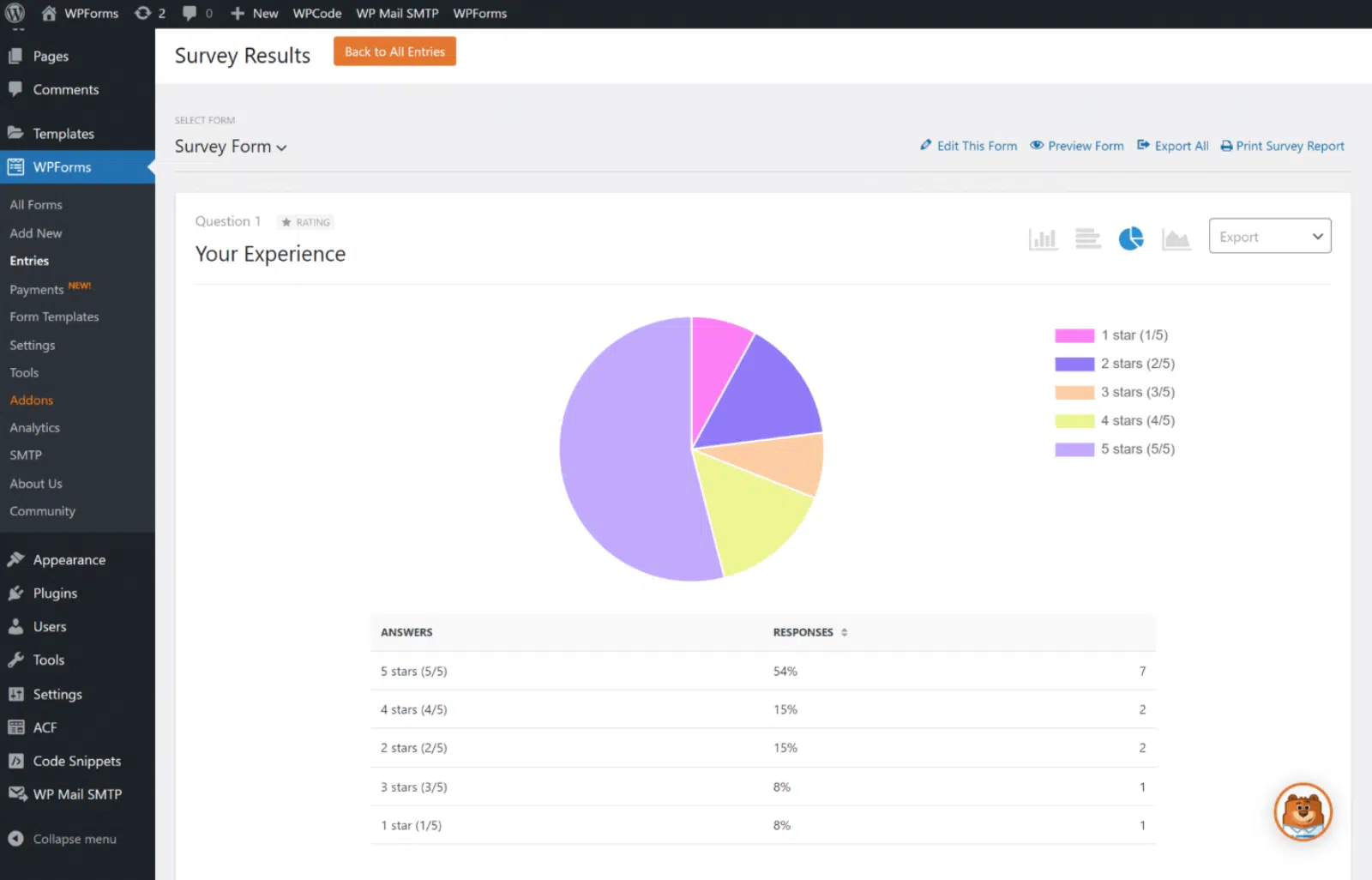
If your surveys include multiple choice, checkboxes, dropdowns, or Likert Scale questions, then WPForms is an excellent tool for you. It works nicely for measuring customer engagement, employee satisfaction, and tons of other important metrics.
Moreover, you can customize the data view using its advanced column options. You can also export the graphs for your presentations and back up your form data into Google Sheets, all while accessing your survey data right from your WordPress dashboard.
What I Liked:
WPForms is a complete solution for any survey-related task. On top of visually displaying your survey results, you can also create survey forms in minutes and collect the responses in the first place.
You don’t need to import any data to create visual reports. WPForms and the Surveys and Polls addon fetch and display your data in a structured format automatically. If you want a one-stop solution to run a survey and see the results, WPForms is the perfect fit.
WPForms pricing: To use the Surveys and Polls addon, you need the Pro or Elite version of WPForms. The Pro version costs $199.50 for the first year (introductory pricing). You can learn more about its survey reporting features before you buy.
Create Your WordPress Survey Form Now
2. UserFeedback
UserFeedback is one of the best feedback tools on the market, specifically designed to run engaging surveys on WordPress. It has a remarkably easy interface for creating, running, and analyzing survey data.
With just a few clicks, you can have various surveys up and running using different question types, such as multiple-choice, Likert scales, star ratings, radio buttons, long answers, and more. You can choose from their extensive library of templates for common surveys like customer satisfaction, NPS, and product feedback.
Once your surveys are live and collecting feedback, visualizing the responses is extremely easy and happens right inside your WordPress dashboard. The data is presented in visually appealing graphs and tables that make analysis a breeze:

The reports are automatically generated using real-time data integrated with Google Analytics, allowing you to track survey responses alongside user behavior.
One of my favorite reporting features is the innovative NPS survey report. It automatically tracks promoters, passives, and detractors of your brand and calculates your NPS score for you. I find this incredibly useful as it saves hours of time and lets you effortlessly track how your NPS score evolves:

I’m also very impressed with how UserFeedback has taken data visualization to the next level by incorporating AI into their reporting features. The AI summaries feature is a game-changer, letting you see your survey responses quickly at a glance, especially helpful when dealing with lots of written responses and you need to analyze trends.

What I Liked:
UserFeedback is the ultimate solution for anyone looking to understand their users fully. The interface and setup are extremely intuitive, allowing you to create and launch surveys in minutes. You get unlimited surveys and responses, plus access to a vast library of question types and premade templates.
The innovative reporting and data visualization features make survey analysis effortless. I’m especially impressed with the NPS survey report and the AI summaries technology that saves users countless hours.
UserFeedback pricing: Paid plans start at $49.50 a year, with a free version available to get started.
3. RafflePress

RafflePress is a simple but effective way to conduct surveys and boost your online growth while hosting a giveaway on your WordPress site. You can boost engagement by giving visitors extra entries to complete your survey or poll.
This way, you can get the valuable insights you need to grow your business while also using one of the best giveaway plugins around. Plus, the data visualization interface is straightforward and easy to understand.

What I Liked:
RafflePress is loaded with features that you can use to run giveaways and conduct surveys. If you want to promote your survey by asking participants to enter a raffle, you can do it easily with RafflePress. You can drive engagement through social sharing and referral features and build momentum for your survey. RafflePress also has a built-in reports feature that you can use to draw inspiration from the results.
RafflePress pricing: RafflePress starts at $39.50 per year, and the entries report feature comes with the Growth version, which costs $199.50 for the first year.
4. Visualizer

Visualizer is a table and chart manager WordPress plugin for data visualization on your website. You can import existing data from Google Spreadsheets, CSV files, or directly from URLs in CSV or JSON formats. It allows you to transform your data into responsive, customizable charts, tables, and graphs that can be displayed interactively right on your posts and pages.
This tool is useful for bloggers and small business owners. You’ll find the basic chart options like bar, line, pie, and table in its free version. To get the advanced chart options like scatter, area, and geo, you’ll need its pro version.
What I Liked:
I loved how Visualizer integrates with Google Spreadsheets and CSV files, which makes data import super easy. I was able to create and customize interactive charts and tables without much fuss, adding a professional touch to my posts. Its responsive design means visuals look great on any device, which is perfect for my needs as a blogger.
Visualizer pricing: Visualizer costs $99 per year for the personal plan and goes up to $399 per year for the Infinite plan.
5. Zoho Survey
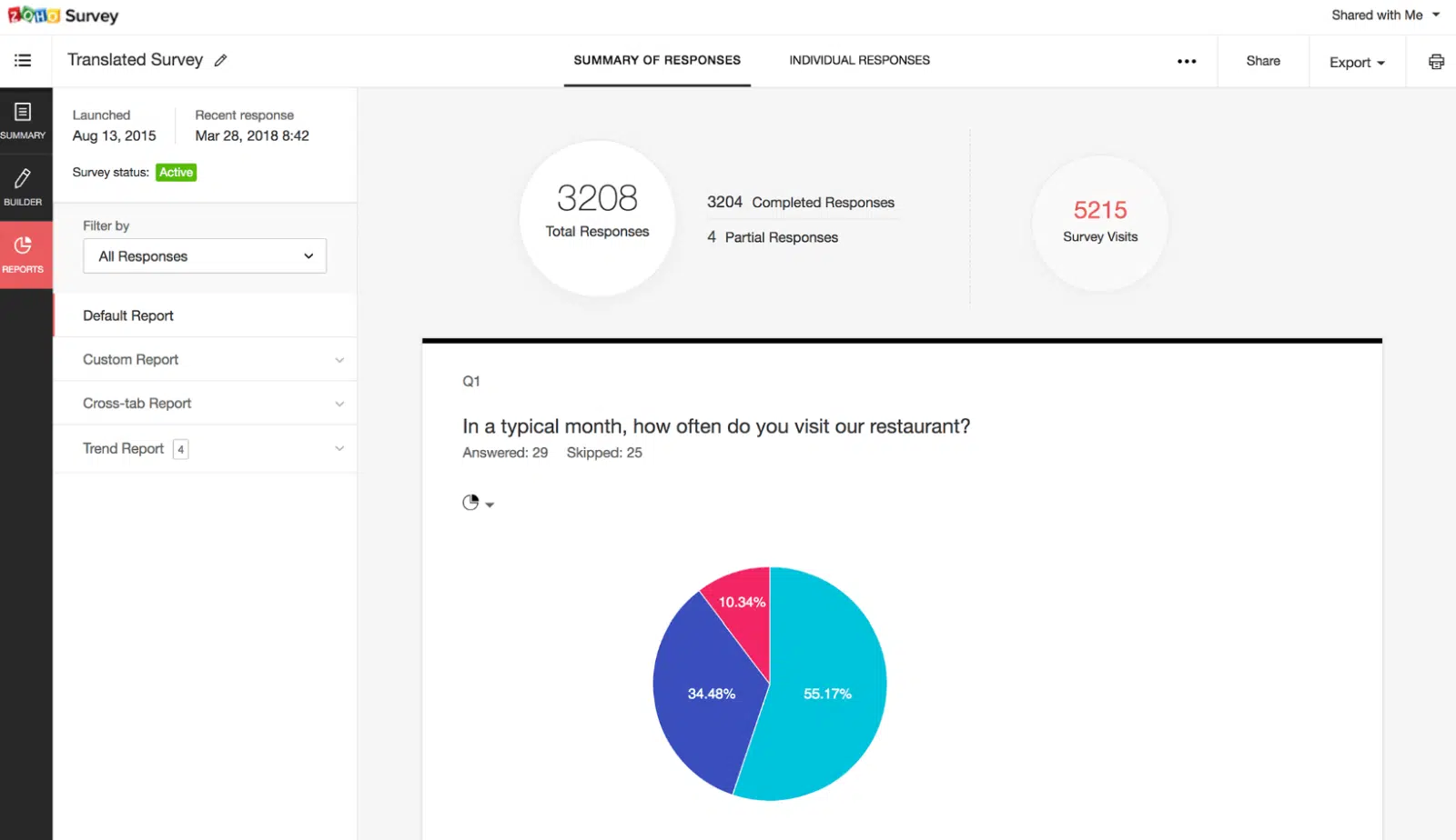
Zoho Survey is a user-friendly and scalable survey data visualization tool. It lets you customize your reports so you can check out response trends. You can also import the survey results into Google Sheets for a deeper understanding of the results.
Zoho provides multi-language support, which helps with global reach. Plus, it lets you send survey reports to your team so they can see the results too. If you’re dealing with massive data reporting, Zoho is a good option, since it also lets you import big data from major databases and applications.
What I Liked:
I found Zoho Survey’s drag-and-drop interface really easy to use. The variety of question types and customizable templates let me create surveys quickly. I liked the real-time reporting and detailed analytics too. Plus, its integration with other Zoho apps makes it a natural fit for small businesses already in that ecosystem.
Zoho Survey pricing: The paid plans for Zoho Survey start at $35 per month. You can also try the paid features with their free trial.
6. Tableau

Tableau is a famous data analytics tool that lets you visualize survey results. This tool turns your complex database into stunning visuals. It allows you to connect to a lot of data sources, so you can create almost any sort of chart or graph with it. Plus, one of the coolest features in Tableau is the instant geocoding that turns location data into interactive maps.
Tableau is popular among large companies, but they also offer a personal license called Tableau Creator and a completely free version called Tableau Public. It’s mobile-friendly, easy to use, and has a large community.
What I Liked:
Tableau impressed me with its powerful data visualization capabilities. I liked how it let me create detailed, interactive dashboards from complex data sets without much effort. Its integration with various data sources and real-time collaboration features made it a valuable tool for detailed analysis and sharing insights.
Tableau pricing: Tableau’s price starts at $15 per user per month and goes up to $75 per user per month. You can only purchase the plan by contacting sales.
7. Sisense
When it comes to visualizing survey data, Sisense is one of the better tools. The survey analytics dashboard from Sisense is super in-depth. Sisense provides interactive data visualization features, and you can present any data in beautiful, interactive graphical representations.
You can easily share the dashboards via URL from the Sisense web application or send them via email. You can also create customized PDF reports and send them to your team members. With Sisense, you can make informed decisions for your business using its interactive dashboard that delivers real-time data.
What I Liked:
Since it’s built for enterprises, I was impressed by Sisense’s ability to handle large datasets and deliver fast, interactive visualizations. The AI-powered insights and detailed analytical capabilities give deep, useful insights, making Sisense a strong choice for advanced data users.
Sisense pricing: Sisense has no public pricing plans, so you need to request a quote from their sales team based on your requirements.
8. Venngage
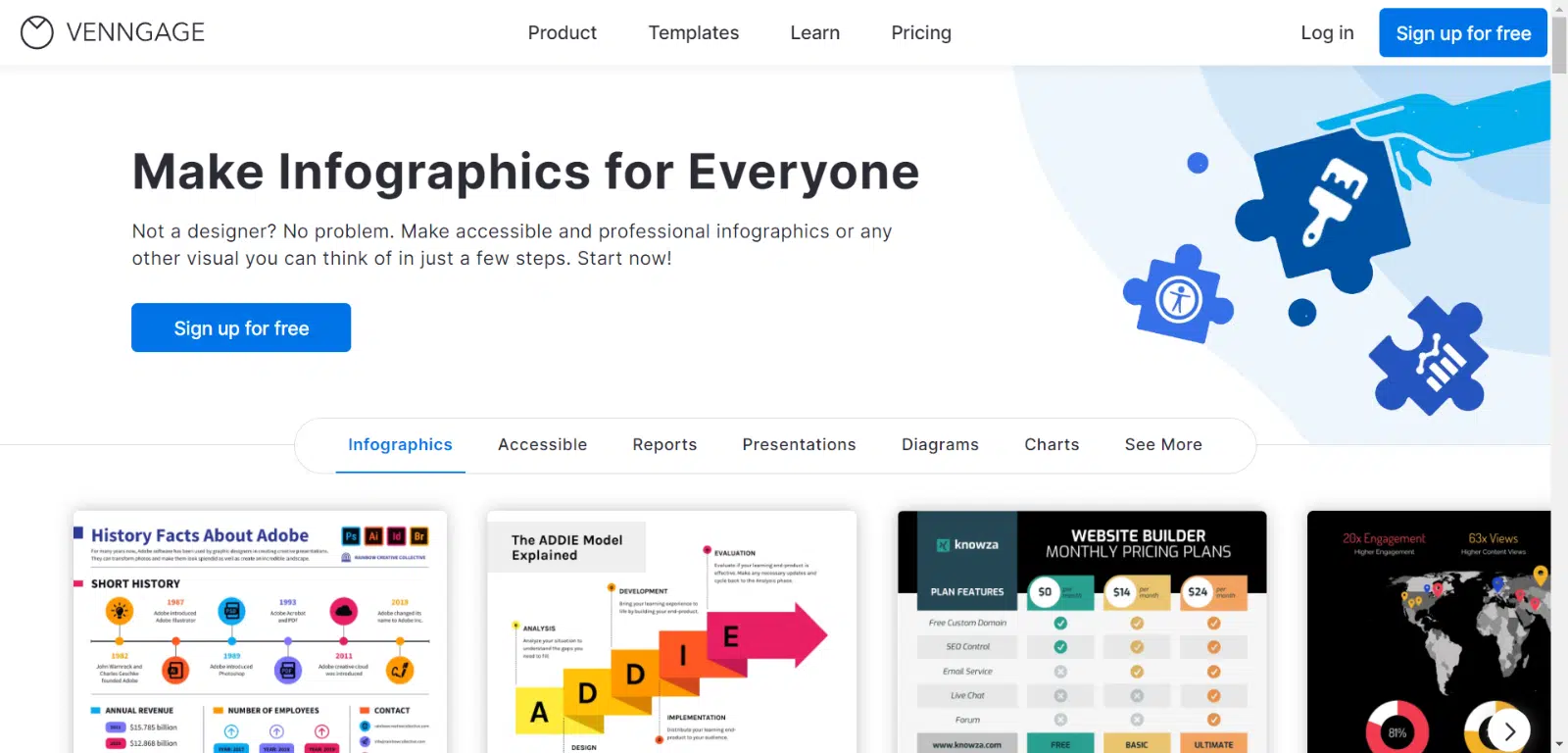
Venngage lets you visualize survey results with beautiful infographics, diagrams, and charts. It also lets you design engaging reports with customized fonts, colors, icons, and images. Venngage provides a plethora of pre-made templates that you can use to create a visually appealing survey report, making your work easier.
All you have to do is copy and paste your data from a spreadsheet directly into the software. With just a few clicks, you can turn your plain data into stunning visuals. From there, you can present your data in meetings using impressive, better-looking graphs. It’s a simple yet powerful tool for everyone, from non-designers to experts.
What I Liked:
I found Venngage’s emphasis on storytelling elements, such as maps and icons, particularly engaging. It helped me create visually compelling narratives. The collaboration features, including real-time editing and commenting, made working with teams much easier.
Venngage pricing: There’s a free version with limited access, and the premium plans start at $10 per user per month and go up to $24 per user per month for the business plan.
9. PiktoChart
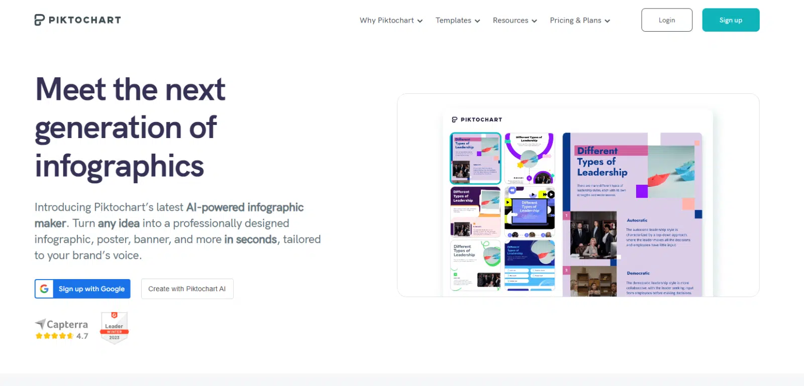
For digital brands, a viral infographic can be a great way to get targeted visitors to your website. PiktoChart helps you put together a visual story without needing much design knowledge. All you need to do is upload a CSV or Excel file or copy-paste your data into its graph maker.
You can even send it to your email list to keep them engaged and boost your email marketing efforts. You can also simply download it in PNG or PDF formats. The tool also comes with AI capabilities to help you create captivating visuals with simple AI prompts.
What I Liked:
PiktoChart’s extensive library of customizable templates and drag-and-drop interface made designing graphics super easy. I liked the intuitive chart editor, which allowed for easy customization of charts and graphs. The integration with Google Sheets and other data sources made the data import process smooth.
PiktoChart pricing: PiktoChart has a free plan that offers limited access to tools and AI features. You can also get access to all features with the premium version, which costs $14 per user per month, billed annually.
10. SurveyPlanet

SurveyPlanet is a simple tool for visualizing your survey data. It’s easy to use and has a clean, organized interface. You can select the chart type, such as pie, line, or bar chart, to display your results.
With its Survey Insights feature, you can see the performance of your surveys in real time. You can learn about your participants’ information, like their location, devices, and the average time they took to complete the survey. You can share the survey results and export them into PDF, CSV, or DOCX files.
What I Liked:
SurveyPlanet’s intuitive interface made designing surveys super easy, even for someone like me with limited technical skills. I liked the variety of question types and customization options, which let me tailor surveys to my specific needs. I found the interactive charts particularly insightful, letting me drill down into the data for deeper analysis.
SurveyPlanet pricing: SurveyPlanet has a free version that gives you unlimited surveys and basic reporting. You can create advanced visual reports with the Pro version, which costs $20 per month.
11. Microsoft Power BI
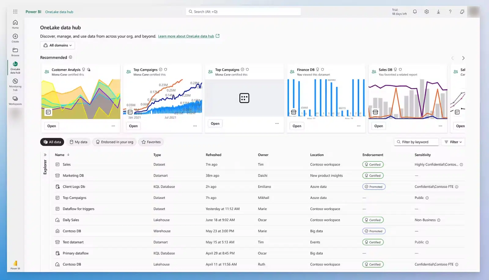
Microsoft Power BI is one of the most powerful and well-known data visualization tools. Power BI lets you connect any survey data and visualize the results. This tool allows you to create almost all kinds of visually appealing reports.
Plus, you can view and interact with your data on any mobile device by using the Power BI Mobile app available in the App Store, Google Play, or the Microsoft Store. It gives you the flexibility to access reports from any of your devices. Power BI also has a vast community, and it offers free training resources.
It’s an all-in-one data visualization tool that integrates with a broad range of backend databases, from Teradata and Salesforce to PostgreSQL, Oracle, Google Analytics, GitHub, Adobe Analytics, Azure, SQL Server, and even Excel.
What I Liked:
I found Microsoft Power BI to be an ideal tool for users with large data sets. The diverse range of visualization options let me generate survey insights easily, adding depth to my analysis. The integration with other Microsoft tools made it easier to pull everything together.
Microsoft Power BI pricing: Power BI has a free version that lets you create visual reports. If you want to share those reports, you can get the pro version for $10 per user per month.
12. Infogram
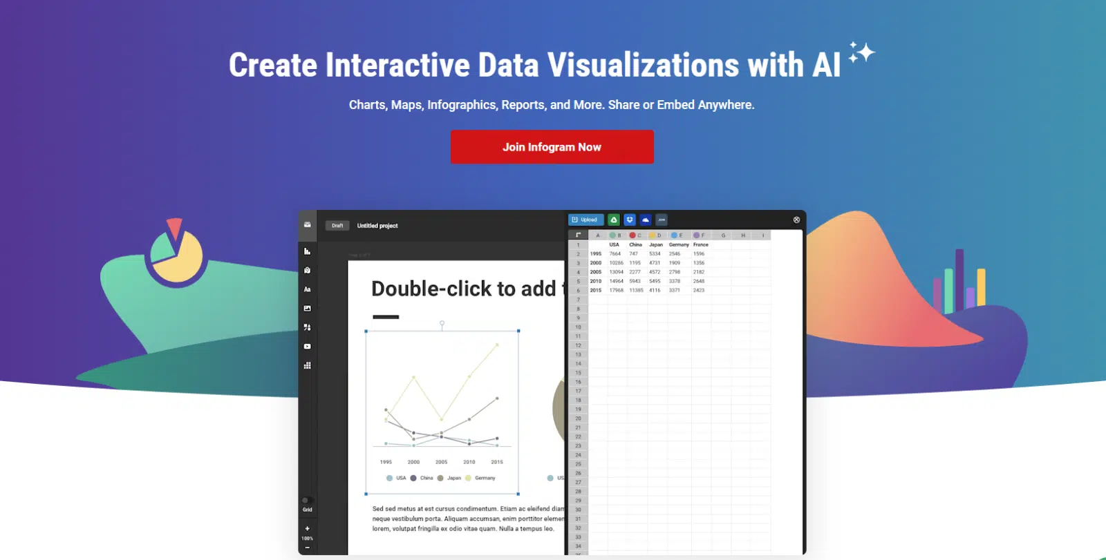
You can create engaging, interactive survey reports in almost no time with Infogram. You’ll find a plethora of pre-made templates for reports and charts to help you get started. You can also customize these templates to match your brand’s look, which saves you time. You can turn your results into dashboards and slides, then share them with your team and see how your surveys performed.
It offers a variety of collaboration options. It’s also mobile-friendly, so you can comfortably view the data from your phone and share visuals on social media.
What I Liked:
Infogram’s diverse visualization options made it a standout tool for me. Although there was a learning curve, it was easy to create engaging charts, graphs, and even maps. The ability to customize every aspect of my visualizations, from colors to fonts, let me keep brand consistency.
Infogram pricing: The free version gives you access to 37+ interactive chart types. If you want more features, you can get the pro version, which starts at $19 per month and goes up to $149 per month.
13. SurveyMonkey
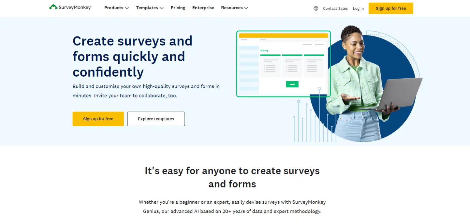
SurveyMonkey is one of the most popular survey data visualization tools. With millions of active users, this tool makes it easy to create surveys and analyze the results in a visually appealing way. You’ll find a vast library of survey templates that you can use and customize. SurveyMonkey also lets you share results with your team members easily.
With its built-in reports and advanced dashboards, you can gain valuable insights about your surveys. With the graphical, interactive data, you can act on what you learn and make informed decisions for your business.
What I Liked:
SurveyMonkey is a highly scalable tool that you can use if you’re looking for a solution that can process a lot of data. I liked that SurveyMonkey comes with pre-designed templates, which makes conducting surveys super easy.
SurveyMonkey pricing: SurveyMonkey Team Advantage plans start at $30 per user per month, billed annually with a three-user minimum.
14. Domo
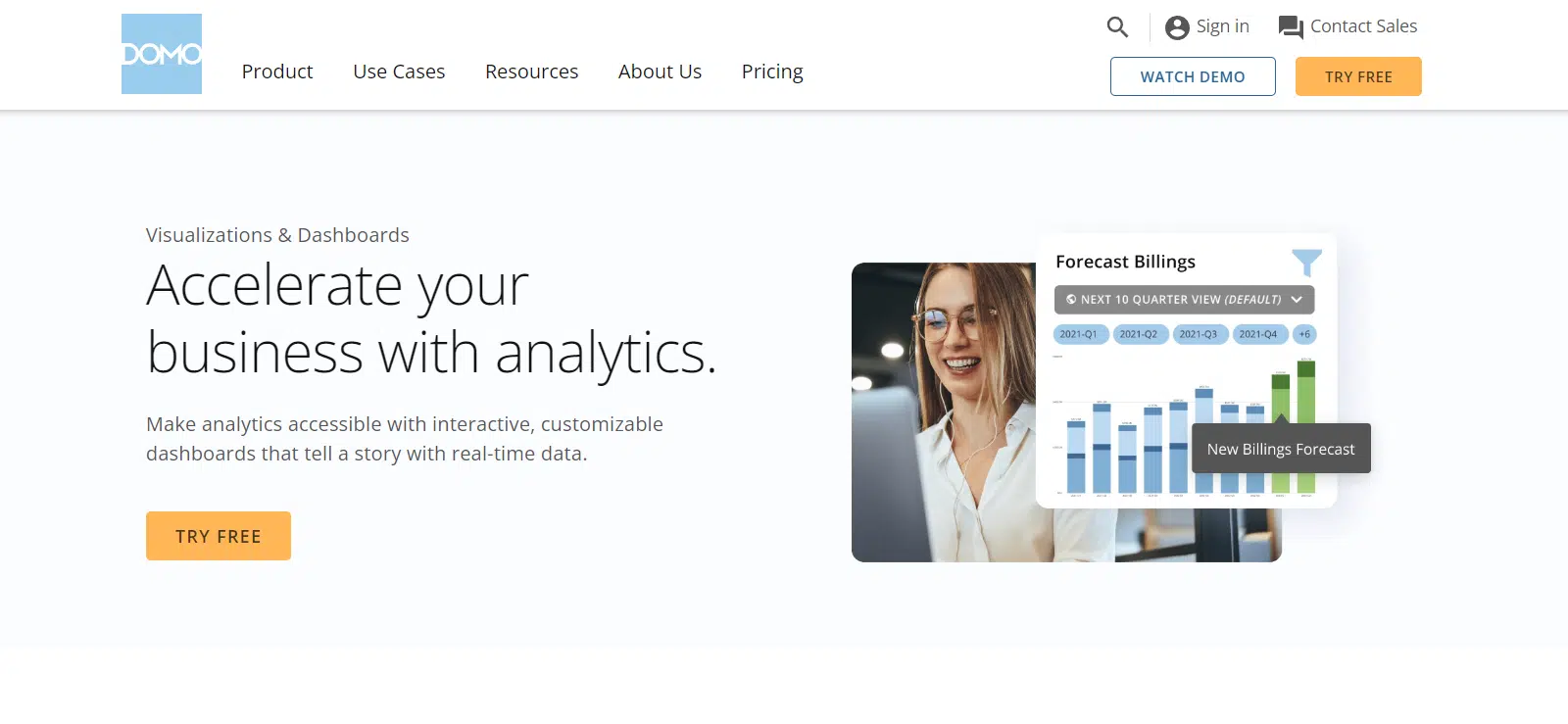
Domo is cloud-based Business Intelligence software that lets you visualize your survey data. It has more features than some of the others on this list, including the ability to connect with tons of other survey software, making it a versatile data visualization tool. You can turn your simple spreadsheets into dashboards that update automatically as the data changes. It also offers collaboration options so you can analyze the results with your team members.
You can create alerts to automatically notify your team when important data changes. Domo helps you transform raw data into interactive visuals, helping you spot trends and patterns in the survey, and you can customize the reports to your business’s preferences.
What I Liked:
If you’re looking for an enterprise solution that can handle the processing of large data sets, Domo is a great option. I liked that the pricing depends on usage, though it can get expensive if you’re really after a simple solution for regular use.
Domo pricing: Domo has a 30-day free trial and no fixed pricing. You can get a quote by contacting the support team.
15. ChartBlocks
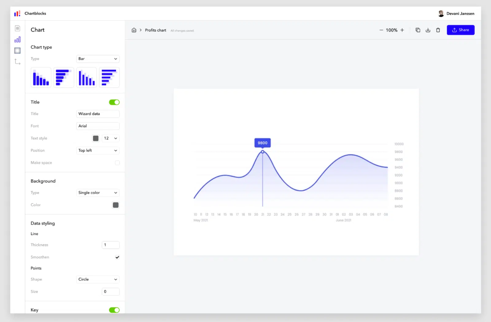
ChartBlocks lets you easily create intuitive charts for your survey data. It provides a variety of chart types to analyze the survey results. You’ll find various customization options for the charts, letting you tweak and change the design to match your brand style.
Since this is a cloud-based solution, you can import data or charts from virtually any location using their API. You can also import the data from your spreadsheets or other databases and share the graphs with your teammates.
What I Liked:
ChartBlocks caught my attention with its simplicity and effectiveness in creating visually appealing charts. Like most tools in the list, you don’t need any coding skills to generate your charts. I tried adding a chart to my website and was impressed with how easy it was to share a chart with just a public link.
ChartBlocks pricing: ChartBlocks pricing plans start at $10 per month and go up to $65 per month with access to additional enterprise features.
16. KeySurvey
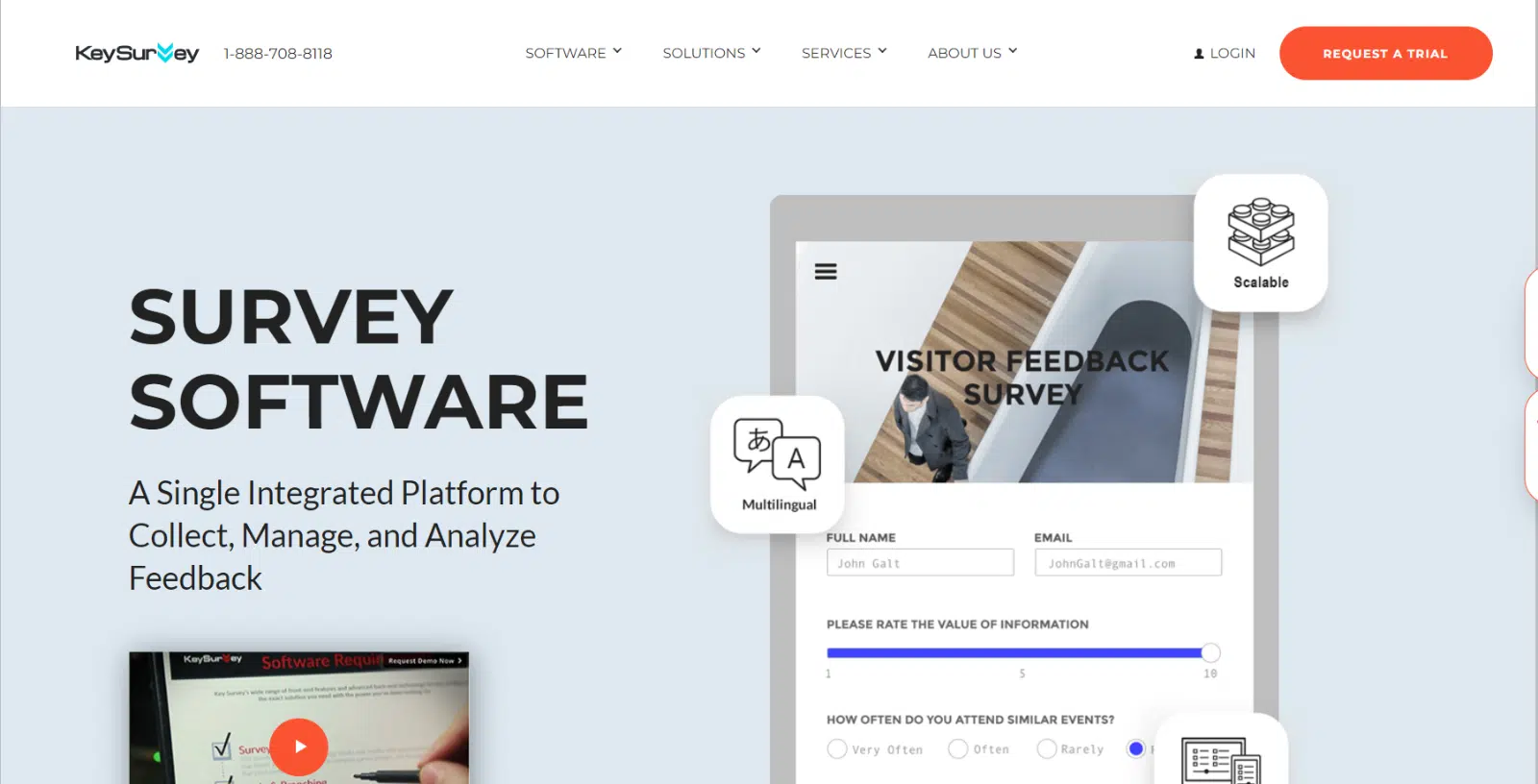
KeySurvey has a straightforward, customizable dashboard for viewing your survey results, with a lot of different chart types. You can configure the survey reports to track the specific metrics that matter most for your data. KeySurvey offers multilevel reporting, so you can analyze even the finest details of your data.
Plus, it lets you compare different sets of data to analyze variations, correlations, or trends across various time periods, regions, products, or other dimensions. It’s got a bit of a learning curve, though. Once you’ve figured out how to use the software, you’ll likely find it incredibly helpful.
What I Liked:
I tested the available charts and graphs and was impressed by how easy it was to generate charts with KeySurvey. What stood out for me was the platform’s emphasis on data security and compliance. If you’re dealing with sensitive data and want a secure analysis tool, KeySurvey is a good option.
KeySurvey pricing: KeySurvey is focused on enterprises and has no standard pricing plans. You get a 30-day free trial with the option to request a quote based on your requirements.
17. Flourish
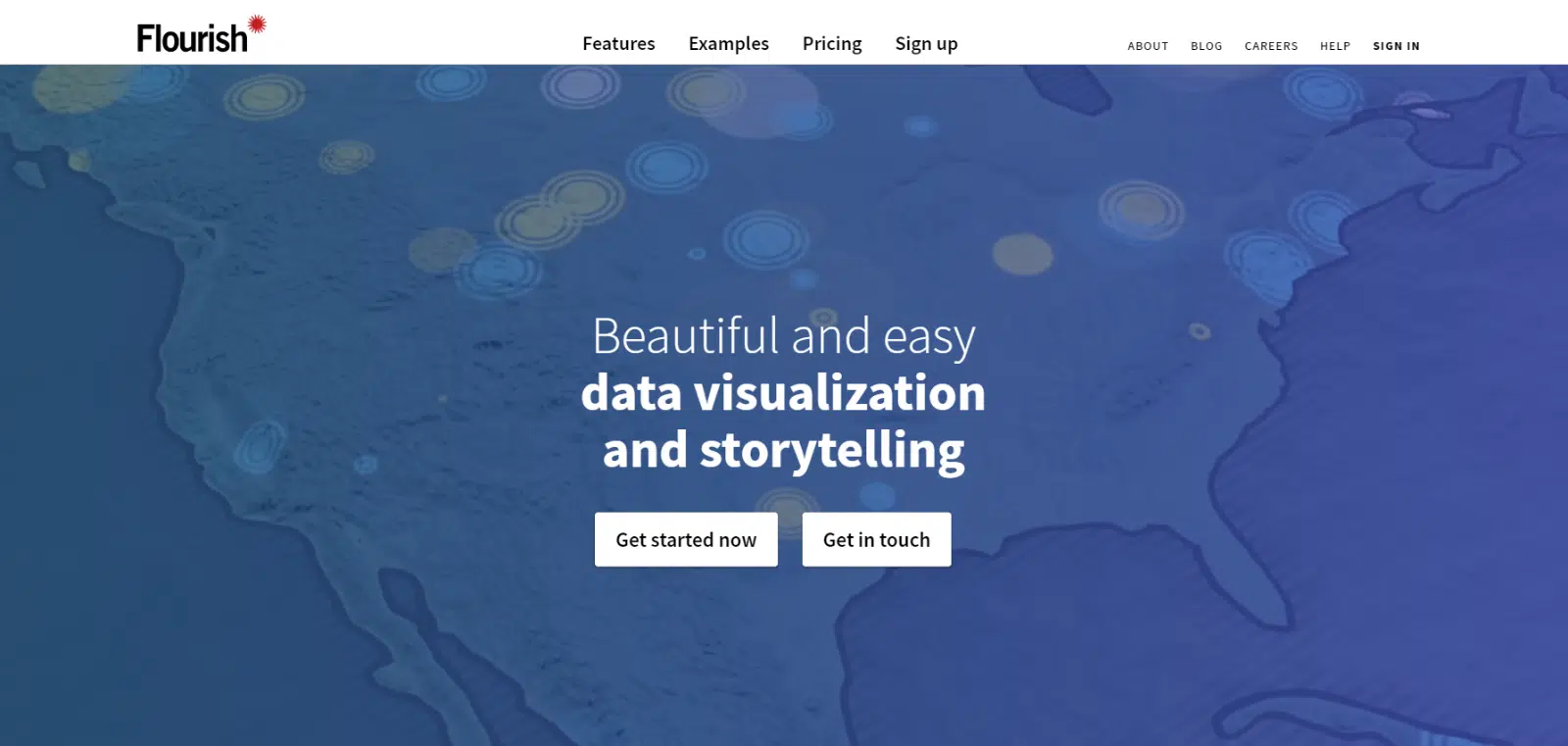
Flourish is a powerful data visualization platform that lets you create beautiful, engaging visualizations with ease.
Flourish offers a wide range of chart types, from bar and line charts to more complex options like Sankey and tree diagrams. This flexibility lets you choose the visualization that best suits your data and messaging. Plus, the visualizations are fully customizable, with options for colors, fonts, and labels, so your final product matches your brand identity.
What I Liked:
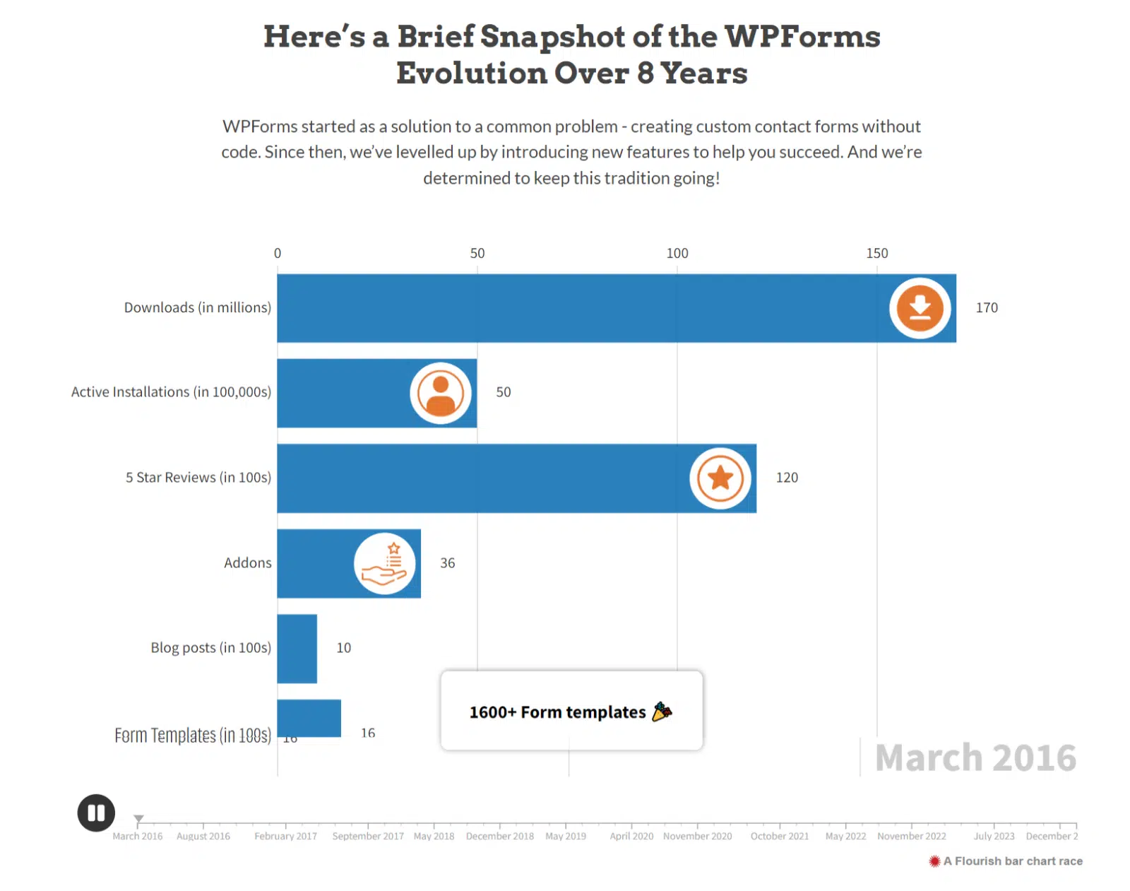
When we celebrated WPForms’ 8th birthday, we displayed a Flourish chart on the sale landing page to show the progress we’d made over those eight years. In my experience, creating and integrating that chart on the landing page was super easy, and I got it onto the page without any issues.
Flourish pricing: Flourish has a free version that comes with loads of features for building interactive visual reports. If you want more, you can contact their sales team for a quote on the premium plan.
18. QuestionPro

QuestionPro offers a real-time summary that gives you a quick overview of your data. QuestionPro is also known for fantastic customer service and for being super user-friendly. This tool converts your data into digestible, easy-to-understand visualizations. You can customize the reports with your preferred type of charts, graphs, or visual elements.
It integrates with various tools and platforms to help with your workflow. You can export survey data in Excel and SPSS for further analysis or sharing. It also provides collaboration options, so you can share the results with your team members and act on insights together.
What I Liked:
QuestionPro stood out for its blend of powerful features and user-friendly design. I was particularly impressed by the ability to transform raw data into visually captivating representations using just the free version. You’re limited to collecting 200 survey responses on the free version, though, which can feel a bit tight.
QuestionPro pricing: QuestionPro has a free version that lets you collect 200 survey responses and perform basic reporting. The premium plans cost $99 per user per month.
19. Alchemer (formerly SurveyGizmo)

Previously known as SurveyGizmo, Alchemer is an easy-to-use tool for creating surveys and generating reports to visualize your data sets. With Alchemer, you can transform complex survey data into simple, visually appealing reports. It lets you create advanced reports like TURF, cross tabs, and comparisons. You can even export your data into Excel to dig deeper into the survey results.
Alchemer lets you create as many reports as you want, catering to each stakeholder in your company. All the survey results update in real time, helping you make the right decisions. Alchemer also integrates well with third-party apps like Salesforce, Microsoft Dynamics, and Google Sheets.
What I Liked:
Alchemer is one of the more expensive solutions on the list, but it has loads of features you can benefit from. If you’re looking for an enterprise solution, I’d recommend checking it out. I liked that you can create detailed reports like Conjoint Analysis, Crosstab, and TURF reports all with the same tool.
Alchemer pricing: Alchemer is built for enterprises and costs $315 per user per year for the Collaborator plan. The higher-tier Professional and Full Access plans are priced for larger teams, so you’ll want to check their site for current rates.
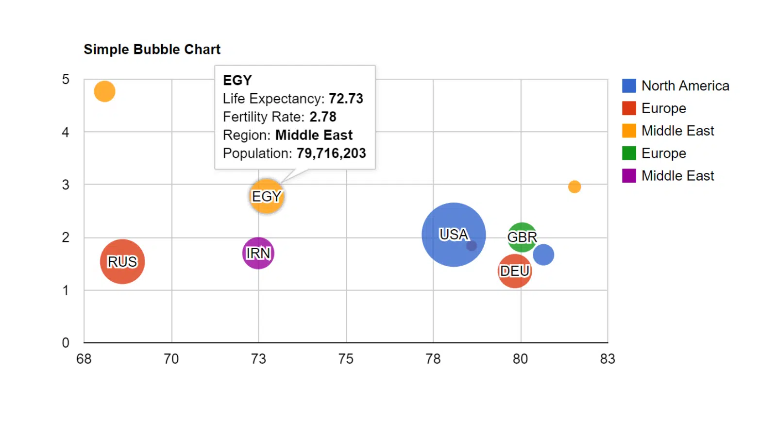
20. Google Charts
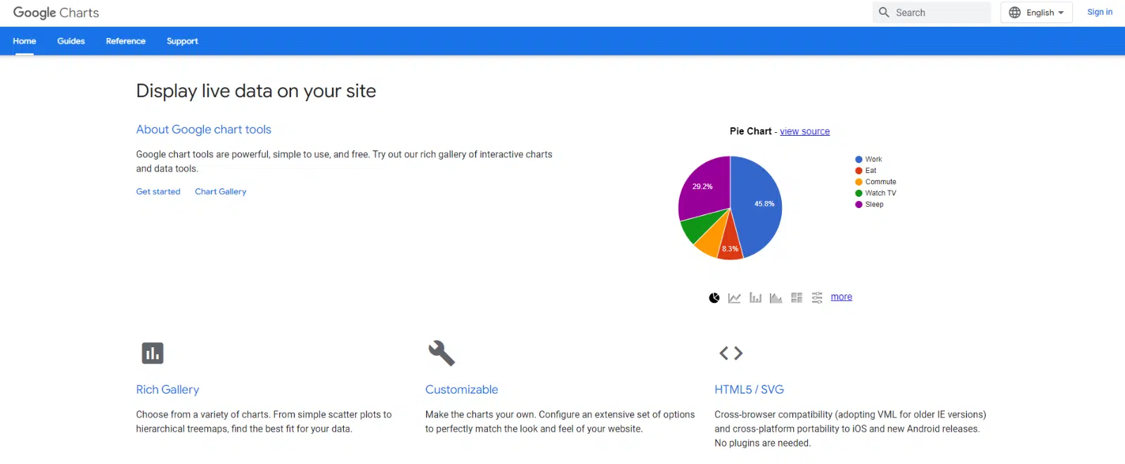
Although basic, another simple data visualization tool to check out is Google Charts. It comes with interactive charts and data tools for visualization if you’ve already got the data you need and just want to see it visually. It provides a rich charts gallery, including geo charts, scatter charts, histograms, bubble charts, treemaps, and more. Plus, it’s open-source and completely free.
What I Liked:
This might not be the most power-packed tool on the list, but I liked how easy it is to make simple charts. It’s also completely free, which makes it very helpful for small businesses.
Google Charts pricing: Google Charts is completely free.
21. Metabase
Metabase is a powerful, open-source business intelligence tool known for its user-friendly interface. Metabase setup is quick and simple, and it’s easy to use even for those without technical knowledge. The tool supports a range of visualizations, from basic charts to more complex graphs like pivot tables and funnel charts.
You can create filters to quickly narrow down and view data within charts that have multiple dimensions, focusing on the results for a particular user or entity. This allows for more targeted analysis and helps you extract relevant information from complex datasets. It lets you build analytics dashboards in just a few steps, and you can customize the prebuilt dashboards to your preferences.
What I Liked:
I tested Metabase and liked that the analytics dashboard updates charts and graphs in real time. I was able to filter, segment, and tweak the reports to display only the data I wanted.
Metabase pricing: Metabase’s Starter plan costs $85 per month for 5 users, with an additional $5 for every new user. The Pro plan costs $500 per month and includes 10 users, with the option to add more at $10 each. The open-source edition is free to self-host.
Bonus: Google Looker Studio
I couldn’t put this list out without mentioning Google Looker Studio (formerly Google Data Studio). It’s free, and it connects directly to Google Sheets, Google Analytics, BigQuery, and a long list of other sources.
That last part is why it pairs so well with WPForms. If you already export your survey entries to Google Sheets, you can plug that sheet straight into Looker Studio and build a drag-and-drop dashboard from it. You get interactive charts, filters, and shareable reports without paying a cent.
It does take a bit of setup compared to a tool that collects and visualizes in one place. But for a free dashboard builder that updates as your spreadsheet updates, it’s hard to beat.
What is the Best Data Visualization Tool?
With WPForms, you can run surveys on your own website without relying on 3rd-party servers or spending a ton of money.
With the powerful Surveys and Polls addon, you can easily create surveys on your website in minutes.
On top of that, WPForms is a fantastic data visualization tool that automatically builds beautiful reports from your survey data, so you can display your survey results without any extra work.
Take a peek at the video below to see it in action.
The WPForms Surveys and Polls addon includes:
- Powerful drag-and-drop form builder to create surveys.
- Smart survey fields like Rating, Likert Scale, and others.
- Support for Net Promoter Score (NPS) Surveys.
- Conditional logic to display different survey fields based on user input.
- Gorgeous interactive survey reports with bars, graphs, charts, and tables.
- Export survey graphs in JPEG, PDF, or Print formats.
- Export survey results as CSV to use elsewhere.
So there you have it. I hope this list of the best data visualization tools helps you find the right one for you.
FAQs About Survey Data Visualization Tools
Survey data visualization tools come up a lot when people are trying to make sense of their results. Here are answers to some of the most common questions we get asked about visualizing survey data.
What is data visualization?
Data visualization is a way to help people understand the meaning and impact of their text-based data by placing it into a visual context, such as a pie chart or a bar graph.
Using data visualization in business helps expose and recognize data trends and patterns, which can lead to more effective decision-making.
Data visualization tools can range from complex Business Intelligence (BI) software suites for huge companies to simple, user-friendly website plugins like WPForms.
How do you visualize survey data with survey data visualization tools?
To visualize survey data effectively, start by choosing the right type of chart for your data. Use pie charts for percentage distributions, bar charts to compare different groups, and line charts to show changes over time.
Tools like Google Sheets, Excel, and more advanced platforms like Tableau or Power BI can help you create these visualizations. Remember to keep your charts simple and clear for easy interpretation.
What is the best graph to use for survey results?
It depends on what you’re trying to show. Bar charts are great for comparing answers across groups, pie charts work for showing how a whole splits into percentages, and line charts are ideal for tracking responses over time.
For rating-scale or Likert questions, a stacked bar chart often reads best because it shows the full spread of opinion in one view.
What are the best survey data visualization tools for distribution?
The best visualization for showing distribution depends on your data type and what you want to communicate. Histograms are ideal for showing the distribution of numerical data, letting you see patterns, skewness, and outliers.
Box plots are great for comparing distributions between several groups or datasets. Both types give you clear insight into your data’s distribution and help identify trends and anomalies.
Next, Learn How to Write a Summary of Survey Results
Now, learn how to write a summary of survey results so you can use your exported WPForms charts to show your findings.
Want to see even more data that can help you grow your website’s revenue? Check out this awesome list of amazing online form statistics and facts.
Create Your WordPress Survey Form Now
Ready to build your form? Get started today with the easiest WordPress form builder plugin. WPForms Pro includes lots of free templates and offers a 14-day money-back guarantee.
If this article helped you out, please follow us on Facebook and Twitter for more free WordPress tutorials and guides.

