AI Summary
Would you like to make changes to the appearance of the Date / Time field in your WordPress forms? The Date / Time field is an easy, intuitive way to let your users schedule appointments and more.
This tutorial will show you how to tailor this field in WPForms.
Before you dive into the tutorial below, make sure WPForms is installed and activated on your site. Then verify your license if you haven’t already.
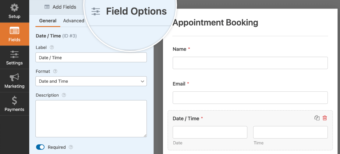
You’ll also need to create a new form or open an existing one for editing and add a Date / Time field to it. Once you’ve done so, click on the field in the preview area of the builder to open its Field Options panel.
Editing the Field Label and Description
In the Date / Time field options, you can customize the field labels and their visibility, as well as add a description.
Customizing the Field Label and Sublabels
By default, the field label will be Date / Time. Additionally, if you have both the Date and Time sub-fields displayed, there will also be a sublabel beneath each field.

You can customize the field label by entering your text in the field provided.

The Date and Time sublabels are not customizable.
Hiding the Field Label and Sublabels
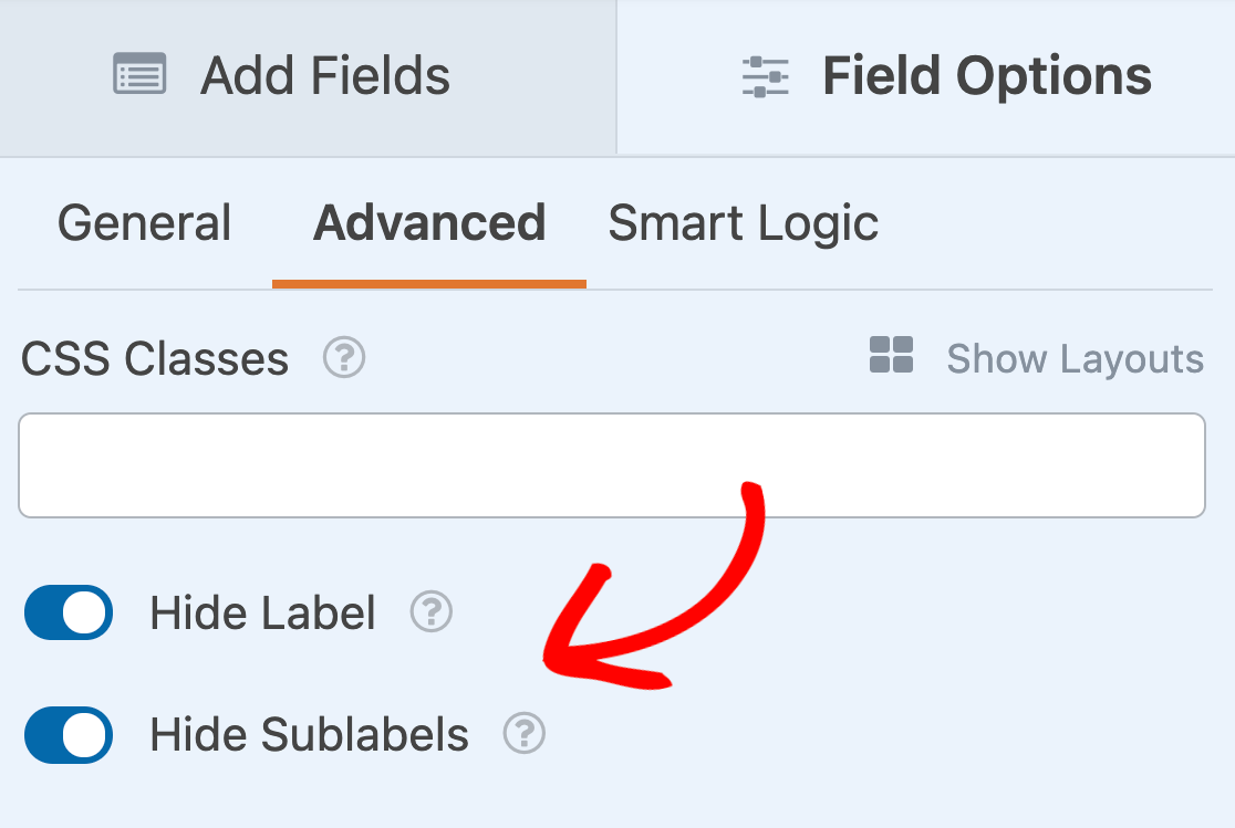
You can remove any of the labels in your Date / Time field from within the Field Options panel. To do so, click on Advanced, then scroll to the bottom of the panel and toggle on the Hide Label and Hide Sublabels settings.
Adding a Description
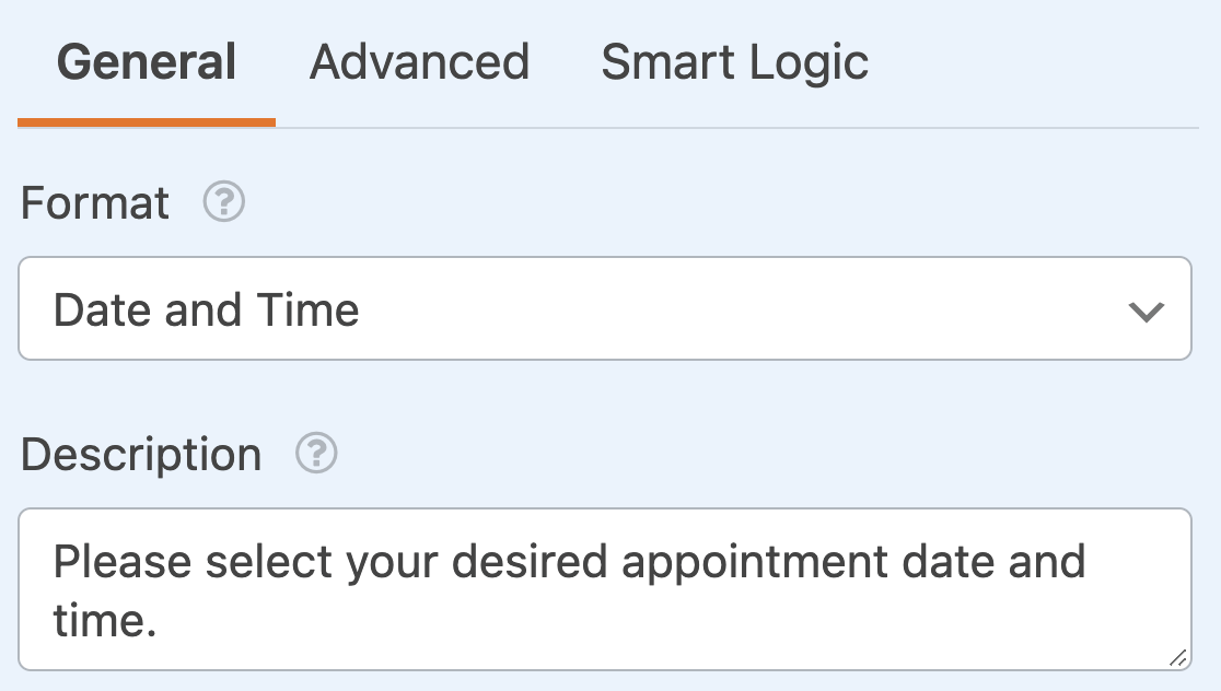
You can also add a description to your Date / Time field to provide more context or information to your users. Just enter your desired text in the field provided in the General field options.
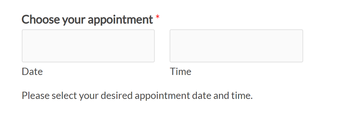
This description will appear directly below the input boxes on the frontend of your site.
Displaying the Date, Time, or Both
Within the Date / Time field, you have the option to display just the Date sub-field, just the Time sub-field, or both sub-fields.
You can change which sub-field(s) you want to display using the Format dropdown in the Field Options panel.
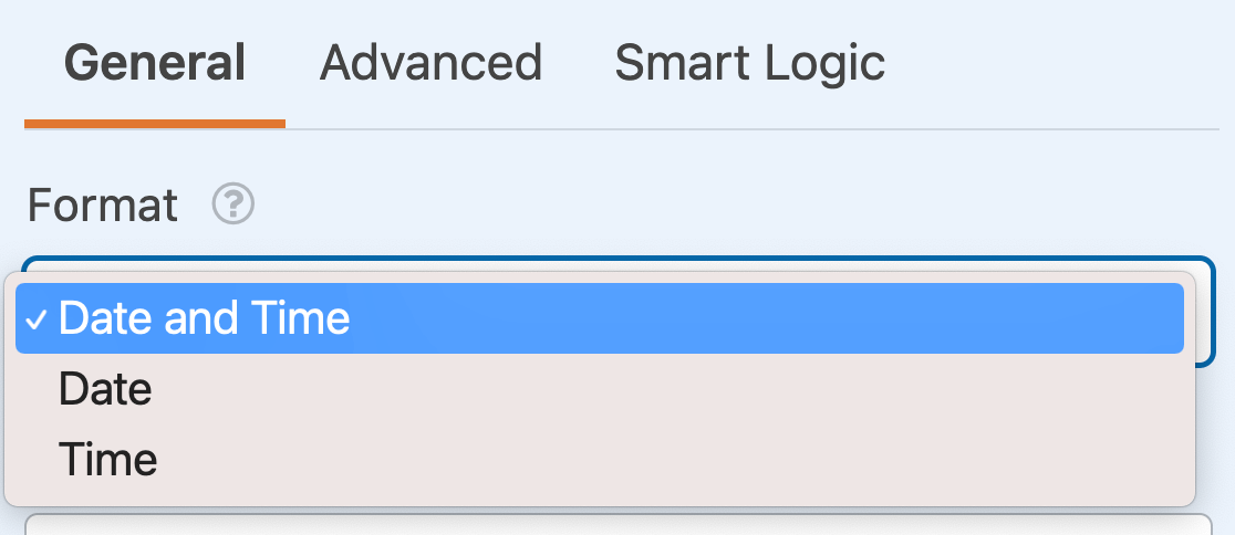
Within this dropdown, you can choose from the following options:
- Date and Time
- Date
- Time
Requiring the Field
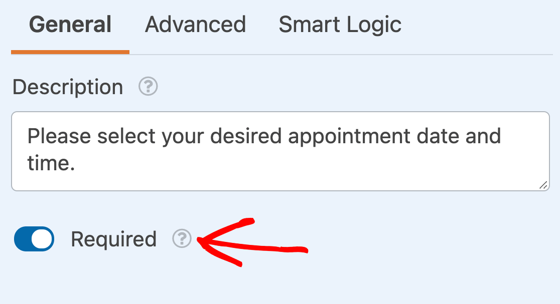
To make sure your users must select a date or time before submitting your form, turn on the Required setting in the field options.
Selecting a Field Size
The Field Size option is in the Advanced tab of the Field Options panel. It determines the width of the Date and Time sub-fields. You can select from Small, Medium, or Large.
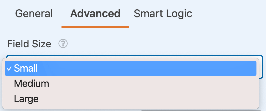
This option is especially useful when setting up a multi-column form.
Changing the Date Display
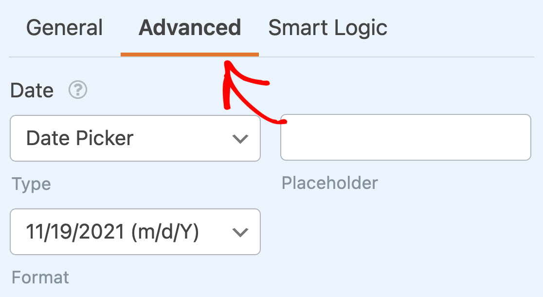
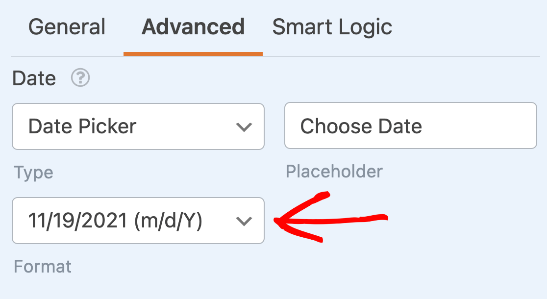
There are several display options that you can customize for the Date sub-field: Type, Placeholder, and Format. To access these options, open the Advanced tab in the Field Options panel.
Type
The Date sub-field has two different display types you can choose from: Date Picker or Date Dropdown.
Date Picker
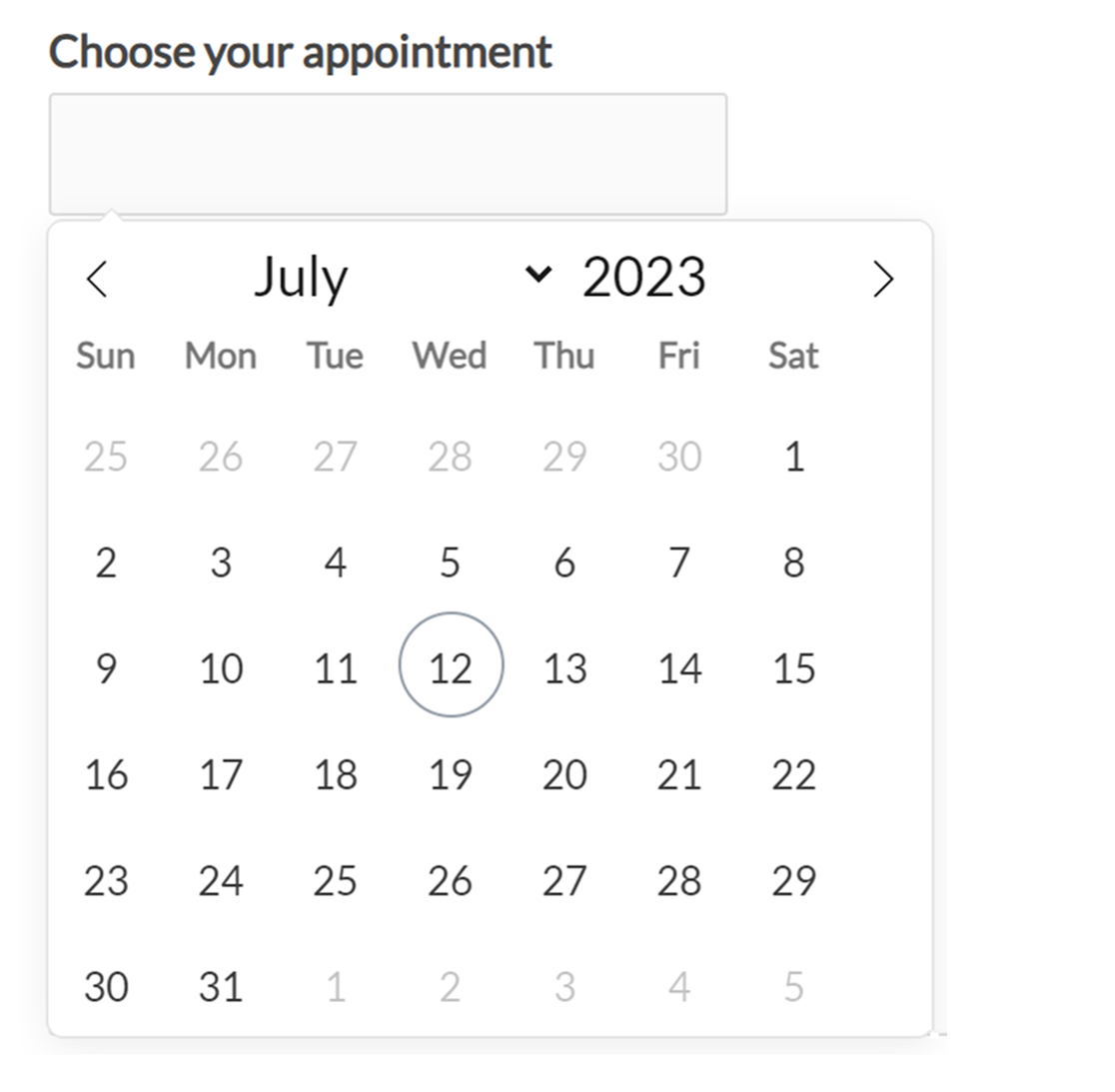
The Date Picker option will create a calendar popup from which your users can select a date.
Date Dropdown
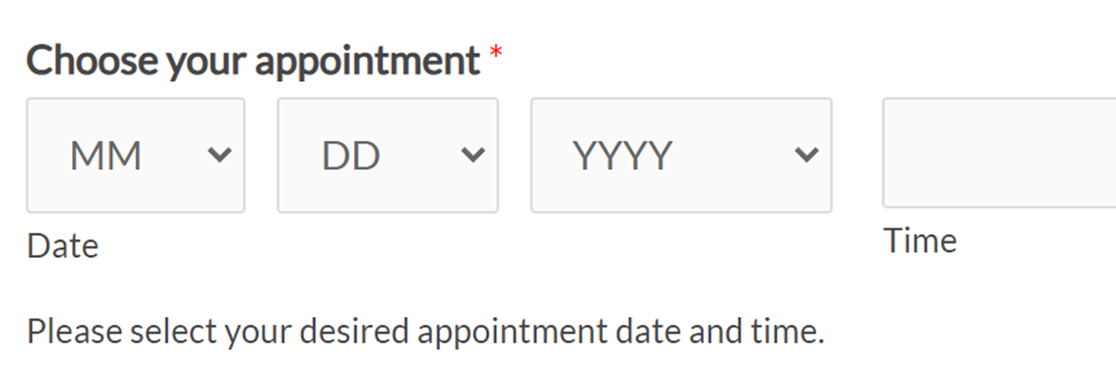
The Date Dropdown option will show 3 dropdowns from which users can select values for the month, day, and year.
Placeholder
The Placeholder option allows you to set placeholder text that will be shown in the Date / Time field if you use the Date Picker type.
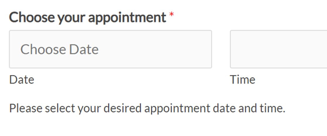
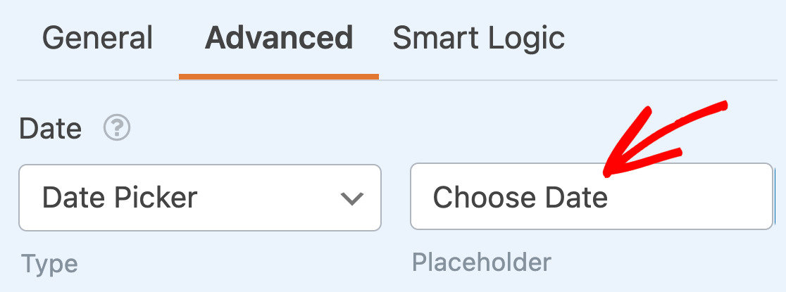
You can customize this text to add further clarity to your forms, such as directing users to select a date. Just enter your placeholder in the field provided in the Advanced tab of the Field Options panel.
Format
By default, the Date sub-field has several built-in options for how it can format a date. These include:
- M/D/Y: Formats the date numerically by Month/Day/Year.
- D/M/Y: Formats the date numerically by Day/Month/Year.
- Y/M/D: Formats the date numerically by Year/Month/Day.
- M.D.Y, D.M.Y, Y.M.D: The same formats as above, but using periods instead of slashes as separator.
- Month, Day, Year: Formats the date in a string containing the full Month, Day, and Year.
Select your preferred format from the dropdown.
Changing the Time Display
The Time sub-field also has options that you can customize, including the Interval, Placeholder, and Format.
Interval
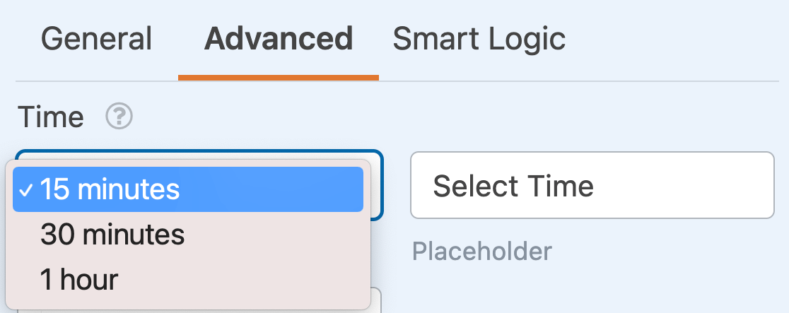
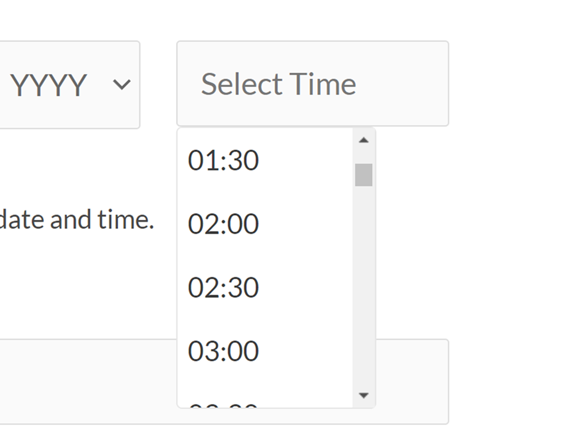
This setting allows you to choose what intervals time options appear in. Built-in options for this setting allow times to be shown in 15, 30, or 60-minute increments.
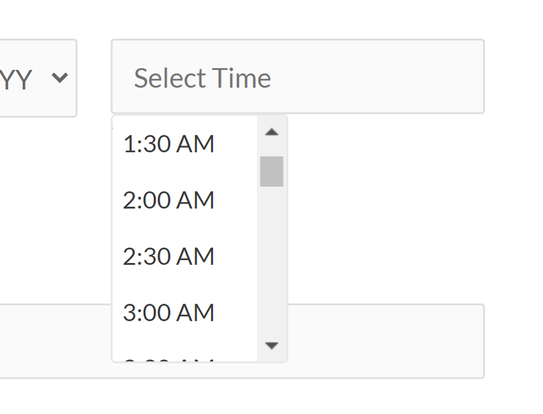
By default, the interval will be set to 30 minutes. Use the dropdown in the Advanced tab of the Field Options panel to change it if you wish to.
Placeholder
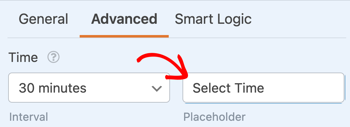
The Placeholder option allows you to set placeholder text that will appear in the Time sub-field when your users open your form. For example, you can use this setting to direct your users to select a time.

To customize the Time placeholder, simply enter your desired text in the field provided in the Advanced tab of the Field Options panel.
Format
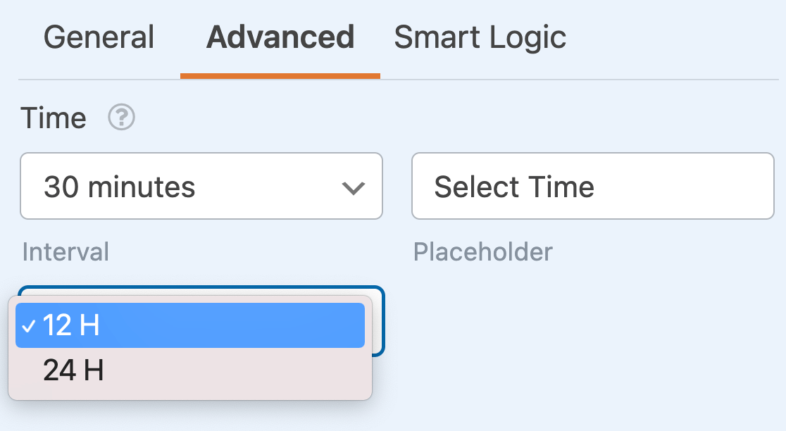
The Time sub-field has two different options for how the time is formatted: 12-hour or 24-hour.
12h Format
Choosing a 12-hour format will show available hours as 12:00am to 12:00pm.

24h Format
The 24-hour format will show available hours as 0:00 to 23:00.
Limiting Available Dates and Times
If you’d like more control over which dates your users can choose from, you can customize the available options in several ways, including limiting the available days, disabling past dates, and limiting the available hours. These settings are all available in the Advanced field options.
Limiting Available Days
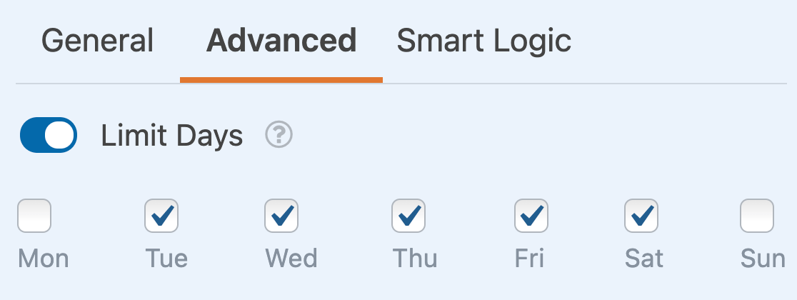
In order to choose which days of the week are available for your users to select, toggle on the Limit Days setting.
This will reveal a set of checkboxes for the days of the week. If you want to prevent users from choosing a specific day of the week, simply uncheck its box to disable it.
Disabling Past Dates
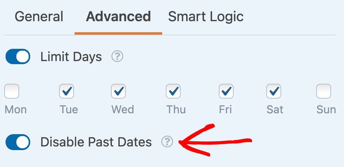
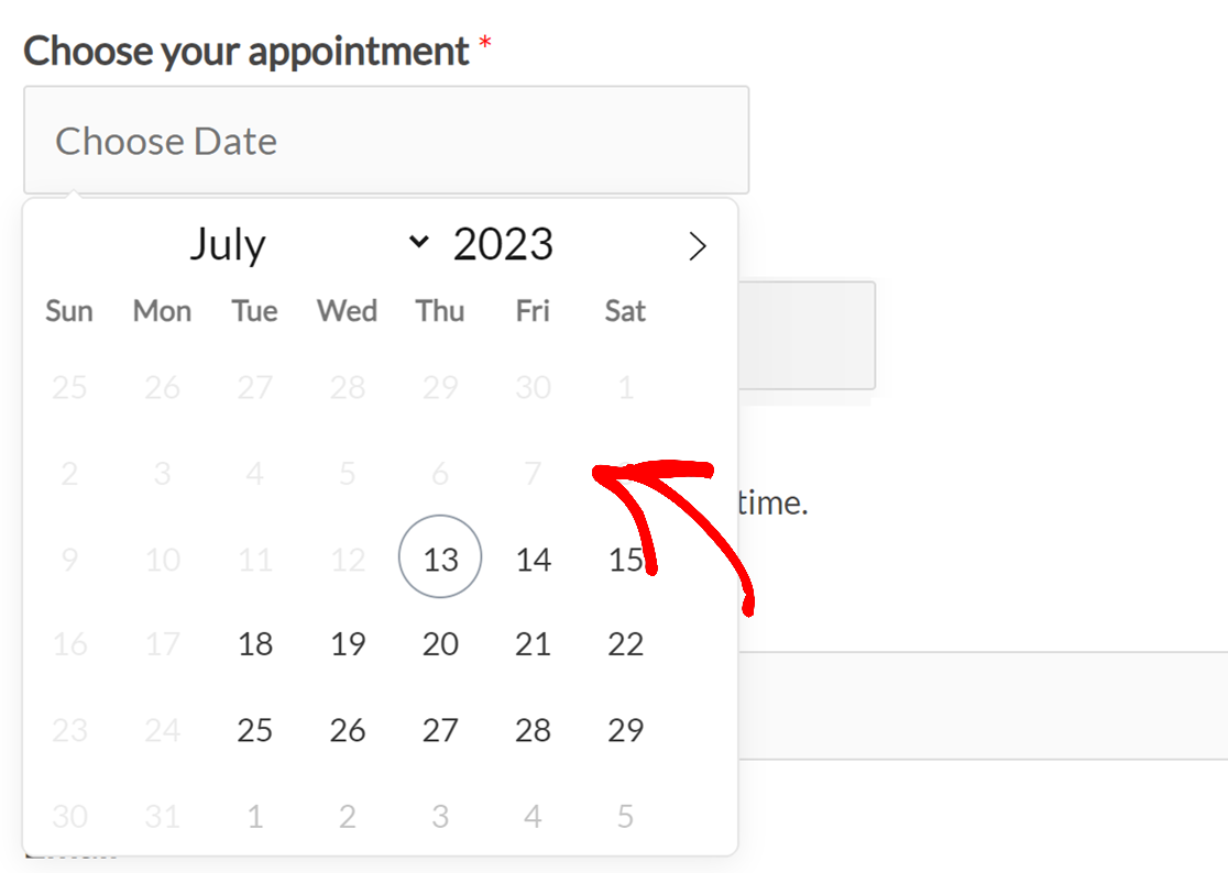
In addition to limiting available days, you can also stop users from selecting past dates within your forms. To do this, toggle on the setting labeled Disable Past Dates.
When a date is disabled, it will be greyed out on your site and will not be clickable.
Limiting Available Hours
If you’d like, you can customize which hours your users can select from within your forms. To do this, toggle on the Limit Hours option.
This will reveal dropdowns for the Start Time and End Time of your available hours. Choose your preferred times to set the available range.
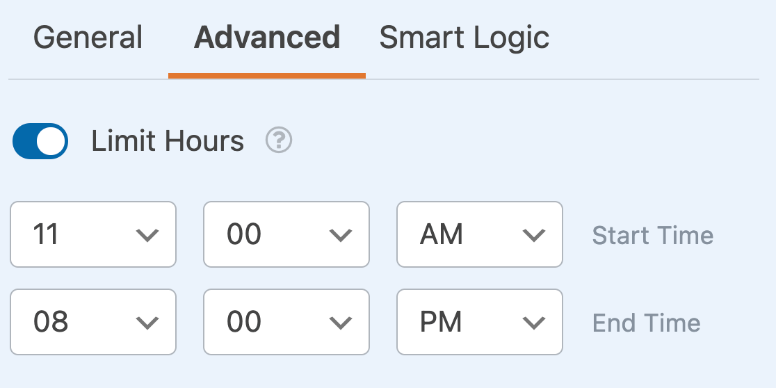
On the frontend of your site, only times between your selected Start Time and End Time will be available for your users to choose from.
That’s it! Now you can customize the Date / Time field for all your forms.
Next, would you like to learn about the advanced customization options available for other field types in WPForms? Check out our tutorials on the Dropdown, Checkboxes, and Multiple Choice fields for all the details!
