AI Summary
Would you like to change how your forms’ Dropdown fields look or function? There are many ways to customize this type of field to suit your needs.
This tutorial will show you all the ways you can customize the Dropdown field in WPForms.
- Editing the Field Label and Description
- Editing, Adding, and Removing Choices
- Generating Choices with WPForms AI
- Requiring the Field
- Enabling Multiple Options Selection
- Choosing a Dropdown Field Style
- Changing the Field Size
- Adding Placeholder Text
- Using Dropdown Dynamic Choices
- Hiding the Field Label
- Frequently Asked Questions
Before you get started, make sure WPForms is installed and activated on your WordPress site. Then you can create a new form or edit an existing one to open the form builder.
If you haven’t already, add a Dropdown field to your form by clicking on Dropdown in the Standard Fields section of the builder, or dragging and dropping this field into the form preview area.

Editing the Field Label and Description
First, you may choose to edit the label and description for your Dropdown field. Click on the Dropdown field you wish to customize in the form preview area to open its field options.
Note: Want to learn more about all the field options available in WPForms? See our complete guide for additional customization tips.
Changing the Field Label
By default, the field label will be “Dropdown.” In the Field Options panel, you can enter your own custom label to make this text whatever you want it to be.

Adding a Description
Field descriptions can provide users with more details and instructions for filling out your form. You can add one to your Dropdown field in the Description field in the Field Options panel.

Note: Want to learn more ways to add instructions to your forms? Check out our tutorial on how to add extra text to your forms.
Editing, Adding, and Removing Choices
Dropdown fields enable users to select from multiple options. You can customize these choices in the Field Options panel.
Editing Dropdown Choices
To customize the text for each of your Dropdown choices, type your desired label into the field provided.

Note: Want to learn how to add a conditional “Other” choice to your Dropdown field? Check out our tutorial on how to set up this type of option for selection fields.
To reorder your Dropdown choices, simply drag and drop them into the order in which you want them to appear.
You can preselect a choice by clicking on the radio button to the left of its label.

Note: For more details on preselecting a choice from your Dropdown field, see our tutorial on adding default values to your form fields.
Adding or Removing Dropdown Choices
To add a new choice to your Dropdown field, click on one of the blue plus (+) buttons next to an existing choice in the field options.

The new choice will appear immediately after the one whose plus (+) button you clicked.
If you would like to add multiple choices all at the same time, click on Bulk Add.

Then enter each of your new choices on its own line. Once you’ve entered all of the options you want to include, click on Add New Choices.

Your new choices will be added after the last existing choice.
Note: Looking for more guidance on adding choices to your Dropdown fields? See our guide on how to bulk add options to selection fields.
To remove a choice from your Dropdown field, click on the red minus (-) button next to it.

Generating Choices with WPForms AI
You can also add choices to your Dropdown field using WPForms AI. This feature allows you to quickly generate relevant choices based on your prompt. To use WPForms AI, simply click the Generate Choices button below the Choices section.
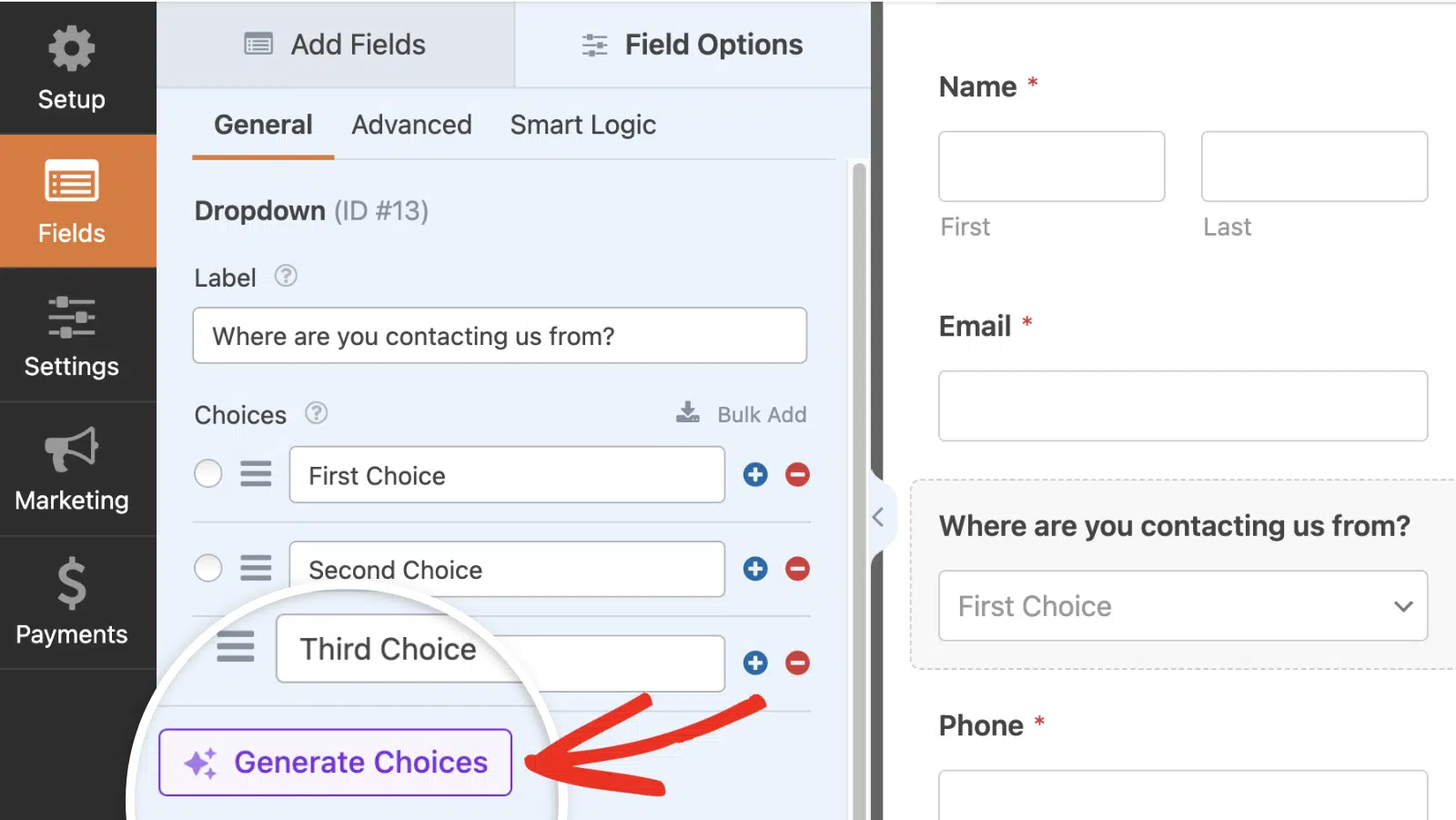
Note: To learn more about generating choices with WPForms AI, be sure to check our tutorial on using AI Choices.
Requiring the Field
By making your Dropdown field required, you can ensure users make a selection before they submit your form.
To require your Dropdown field, toggle on the Required setting at the bottom of the field options.

If a user tries to submit your form without making a selection from this Dropdown field, they will see a message that reads, “This field is required.”

Note: Would you like to modify the message users will see if they try to submit a form without filling out a required field? Our tutorial on customizing validation messages has all the details.
Enabling Multiple Options Selection
Typically, users can only choose one option from a Dropdown field. However, you can allow them to choose multiple options by configuring some settings in the advanced field options.
To enable multiple options selection for your Dropdown field, click on the Advanced tab in the Field Options panel.

Then toggle on the Multiple Options Selection setting.

Note: Need some extra help configuring multiple options selection? Check out our full tutorial on this setting for more details.
Choosing a Dropdown Field Style
There are two styles available for the Dropdown field: Modern and Classic.
Modern Dropdown Style
The Modern style appears with a small, filled-in arrow that users can click on to expand the field’s choices.

No choice is preselected by default in a Modern Dropdown field.
If you enable multiple options selection, users will see the typical Dropdown field. When they click on the arrow to expand the available choices, they will be able to click on as many as they like to add their selections to the field.

Each selected choice will have an X button users can click to remove it.
Note: To further customize the Modern Dropdown field, such as controlling the number of search results displayed, see our developer documentation for additional configuration options.
Classic Dropdown Style
The Classic style Dropdown field appears with an open arrow that users can click to expand the available choices.

By default, the first choice listed in the General tab of the Field Options panel will be selected unless you preselect a different option or add placeholder text to the field.
If multiple options selection is enabled, users will see this field as a list of choices. They can click on a single option to select it, or press the Shift key on their keyboard and select multiple items.
Selected choices will appear shaded.

Changing the Field Size
You can adjust the width of your Dropdown field in your published form by selecting Small, Medium, or Large from the Field Size dropdown.

This option is especially helpful when creating a multi-column layout.
Note: For more details on field sizes, please see our complete guide to field options in WPForms.
Adding Placeholder Text
You can add placeholder text to your Dropdown field to give users additional instructions about how to make their choices. This option also prevents a Classic Dropdown from preselecting the first choice.
To add placeholder text to your Dropdown field, enter your custom text in the Placeholder Text field in the advanced field options.

Note: Need more guidance on adding placeholder text to your Dropdown fields? See our tutorial on using placeholder text in WPForms for more information.
Using Dropdown Dynamic Choices
Dropdown fields can pull data from your site such as taxonomies and content titles to use as choices. These options will automatically update in your forms as you change them elsewhere on your WordPress site.
To enable dynamic choices, open the advanced field options. Then select Post Type or Taxonomy from the Dynamic Choices dropdown.

Note: Do you need more help setting up your Dropdown field’s dynamic choices? See our complete guide to using dynamic values in WPForms for additional details.
Hiding the Field Label
Finally, you may toggle on the Hide Label setting to hide your Dropdown field’s label in your embedded form.

Note: We recommend that you add a field label in the general field options for your Dropdown field even if you hide its label on the frontend. This will ensure your Dropdown field is still labeled in your form’s entries.
Frequently Asked Questions
Below, we’ve answered some of the top questions about customizing the Dropdown field in WPForms.
Can I style the appearance of the Dropdown field?
Yes. With custom CSS, you can customize the look and feel of the Dropdown field on your site. However, this involves adding CSS code to your site and is intended for users who are tech-savvy. To learn more, be sure to check our tutorial on styling the Dropdown field.
That’s it! You can now customize your forms’ Dropdown fields so they look and work the way you want them to.
Next, want to add conditional logic to your Dropdown fields? Check out our tutorial on using smart conditional logic in WPForms.