AI Summary
Would you like some easy-to-use options to customize your form fields? Each WPForms field comes with a bunch of built-in ways to let you build forms to meet your specific needs.
This tutorial will discuss the many options available to customize fields in your forms.
Before you get started, make sure WPForms is installed and activated on your site. Then you’ll need to create a new form or edit an existing one.
General Field Options
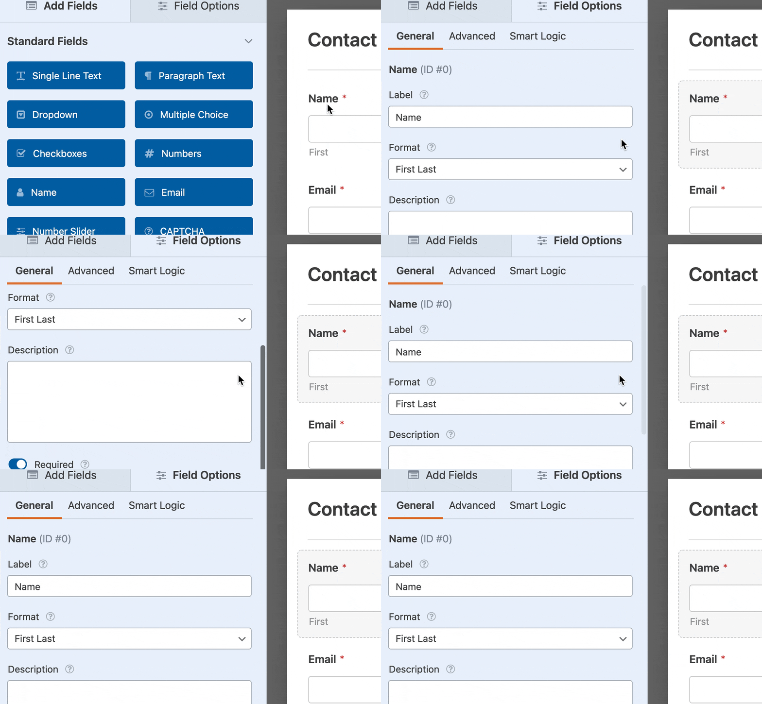
Once the form builder is open, you can add, remove, and edit fields. To open the options for a field, simply click on it in the preview area.
Changing Field Label Text
When you first add a field to your form, the label will match the field type (for example, “Checkboxes” or “Multiple Items”). However, you can edit the Label text and make it whatever you’d like.

Adding Description Text
You can also choose to add Description text to your form fields.
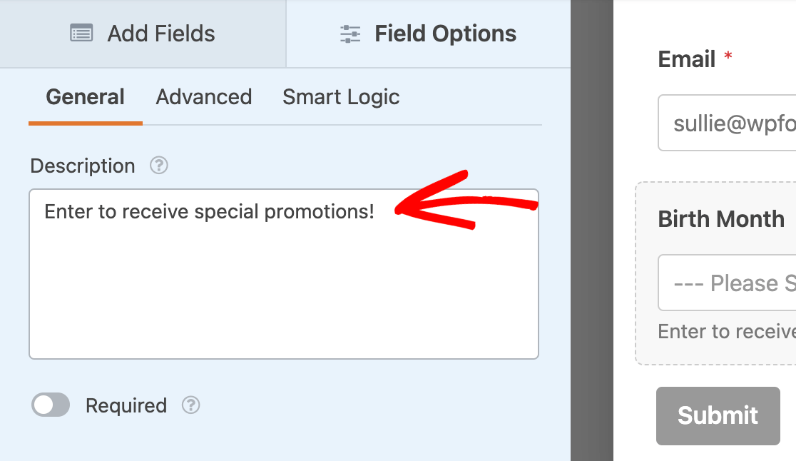
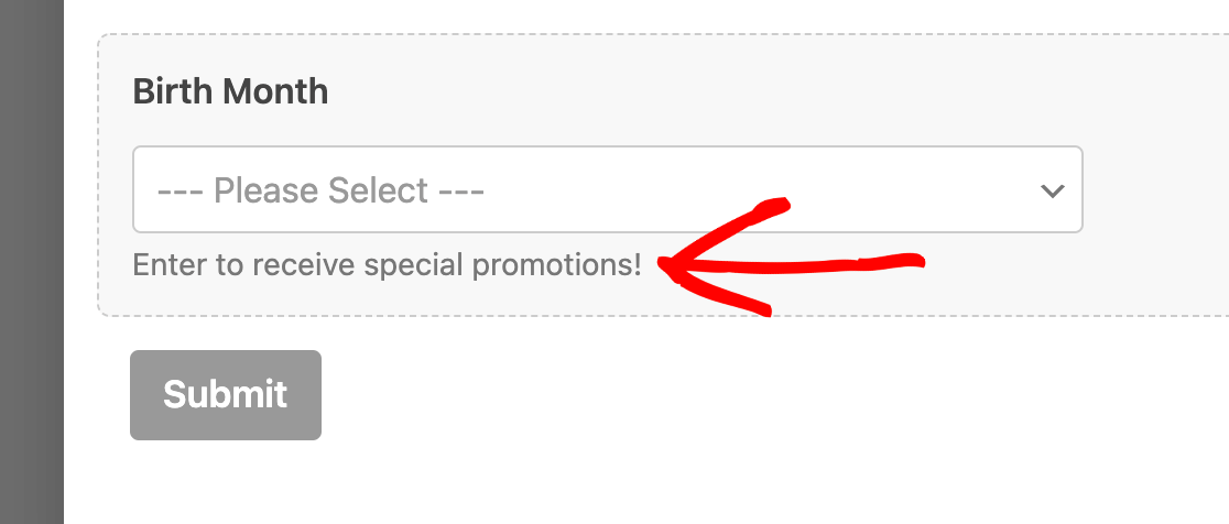
This text will display below the input area.
For more details, please see our tutorial on adding extra text to your forms.
Requiring a Field
Under the Description option, you can toggle on the Required option to make a field mandatory.
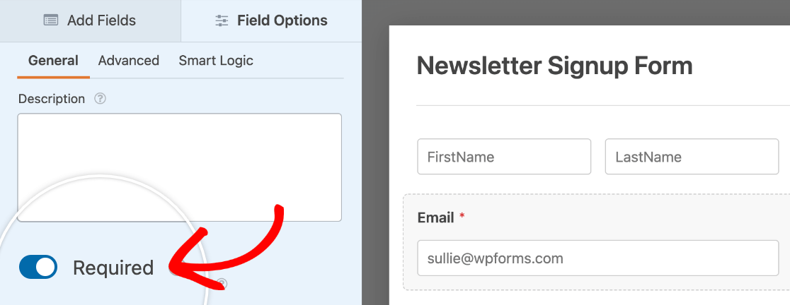
If a user skips a required field and tries to submit the form, a validation message will display, reminding them to fill out that field.

Note: Did you know that you can customize validation message text? For details, please see our validation message tutorial.
Advanced Field Options
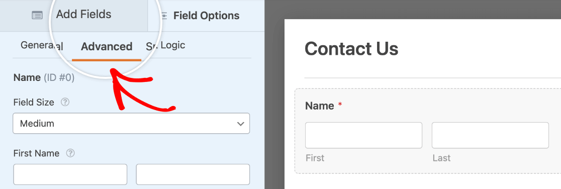
Advanced Field Options offer even more customization settings for your fields. To locate these, you’ll need to click on the Advanced tab.
Selecting a Field Size
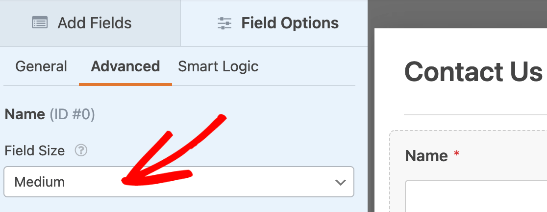
Most fields will include an option to change the field size, which can be super useful when customizing the appearance of your forms.
If this option is available for the type of field you’re editing, you’ll see a Field Size dropdown. Options will include Small, Medium, and Large.
In most cases, the Field Size will determine the width of the field within your form.
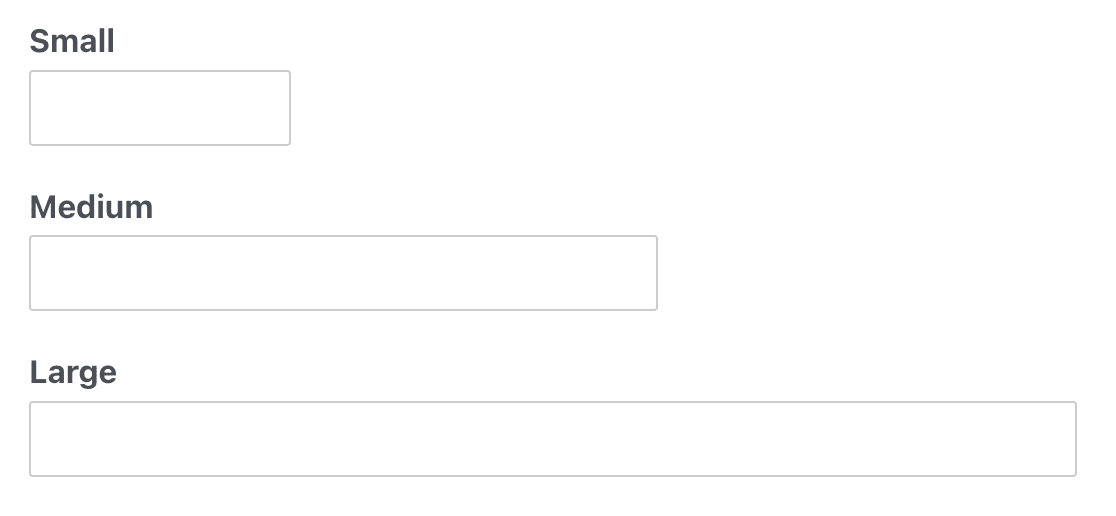
However, there’s an exception for 2 fields. For Paragraph Text and Rich Text fields, the Field Size will set the height of the input area.
Note: If you’d like to place more than one field in the same row, please see our tutorial on multi-column form layouts.
Adding Placeholder Text
Many fields will allow you to add Placeholder Text, which displays until the user starts typing their own text.
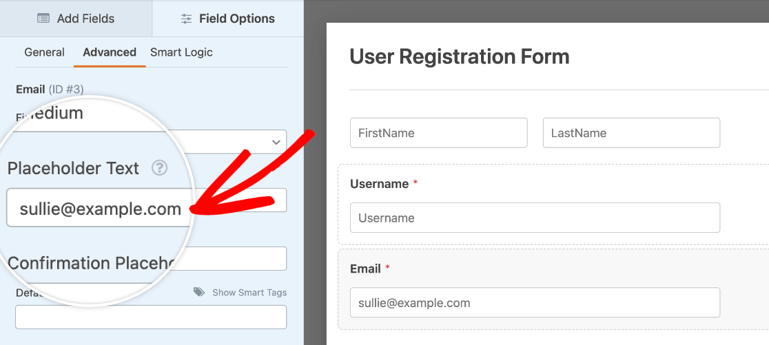
You can use placeholder text to provide instructions or even to change the design of a form. If you’d like to know more, we’ve shared additional details and examples in our placeholder text tutorial.
Setting a Default Value
In some cases, you may want parts of a form to be pre-filled for users. That way you can save users a little effort, but they can still change the input or selection if they need to.
If this option is available for the type of field you’re editing, you’ll see a Default Value field in the Advanced tab.
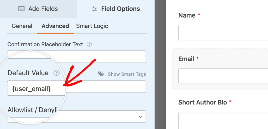
For more details and examples, including defaults for Checkboxes and Multiple Choice fields, be sure to check out our guide to adding default values to fields.
Note: Want to pull user data or information from your site into your forms as default values? Check out our tutorial on using Smart Tags to learn how.
Adding Custom CSS Classes
You can easily customize the appearance of your form’s field to make your fields look how you’d like. To do so, simply enter the CSS class names for the form field in the CSS Classes text field. For multiple classes, separate the class names with spaces.
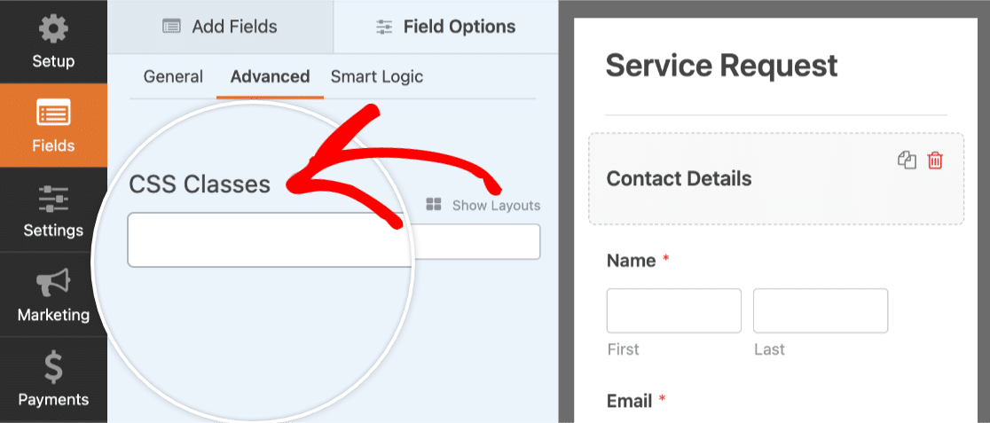
For a more detailed guide, be sure to check out our tutorial on using your own custom CSS classes as well.
Note: We recommend using the Layout field for a simpler, drag-and-drop approach to building advanced multi-column layouts. However, the layout CSS classes covered in this tutorial are still supported.
Hiding a Field Label
If you’d like a more compact or simplified form, you may want to consider hiding your fields’ labels.
To do this, you’ll need to toggle on the Hide Label option.
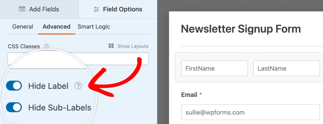
Note: If you choose to hide field labels, please still be sure to enter a relevant name into the label of the field. Since the label will still appear in your entry details, this will help you identify each field.
Setting a Field as Read-Only
If you’d like to display information in your form without letting users edit it, you can make the field read-only. This option is available for most fields in WPForms.
To enable it, toggle on the Read-Only option.
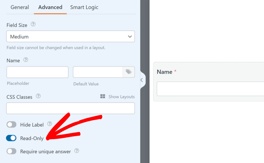
When this option is turned on, the field will remain visible in your form but users won’t be able to change its value. The data will still be included in the form entry when it’s submitted.
For more details and additional use cases, check out our tutorial on setting fields to read-only.
Note: Read-only fields are especially useful for showing pre-filled values, such as user details added with Smart Tags, or displaying totals and other information that shouldn’t be changed.
Special Options for Checkboxes and Multiple Choice Fields
Below, we’ll discuss a few additional options available specifically for Checkboxes and Multiple Choice fields.
Adding Image Choices
You can easily add images to any Checkboxes, Multiple Choice, Checkbox Items, or Multiple Items field. To do so, you just need to toggle on the Use image choices option.
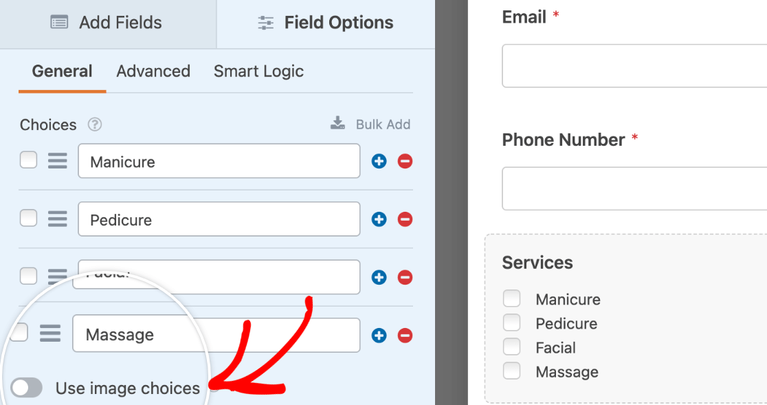
After this setting is turned on, you’ll be able to upload images for each option within your field.
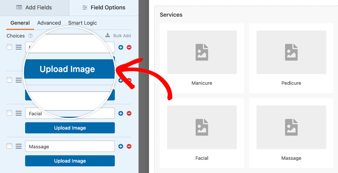
For more details, please see our tutorial on adding image choices to your forms.
Adding Icon Choices
You can also add icons to any of the choices in a Checkboxes, Multiple Choice, Checkbox items, or Multiple Items field. To enable this feature, toggle on the Use icon choices option.
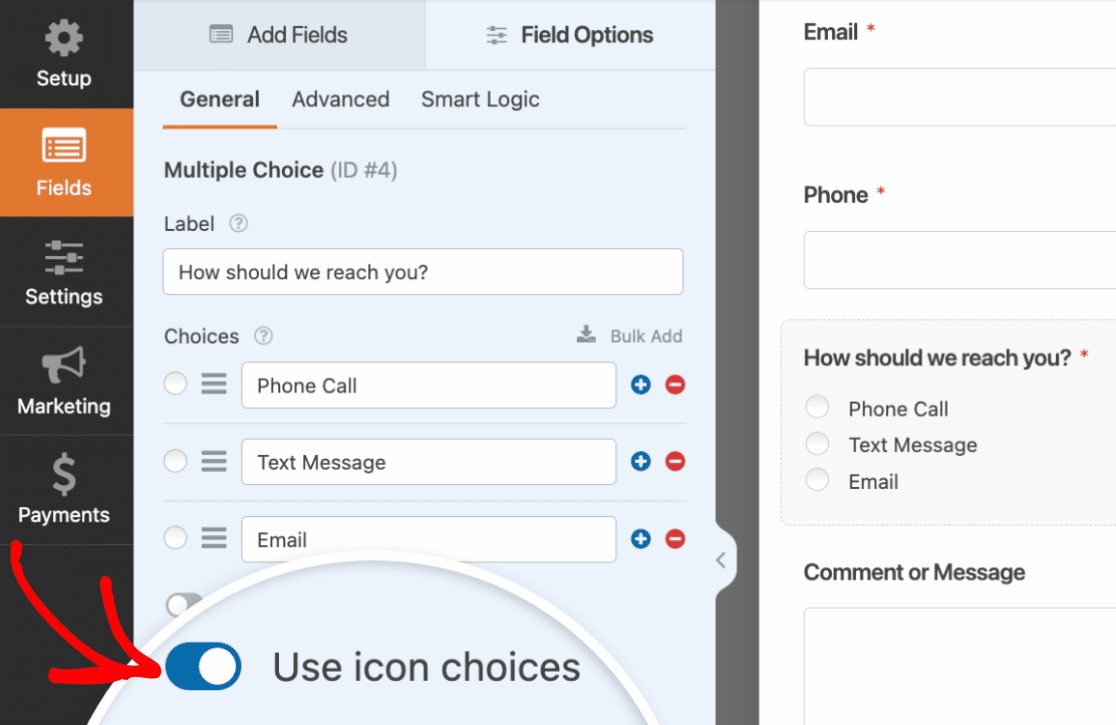
Once you’ve enabled icon choices, you’ll see default icons added to each choice in your Multiple Choice field. When you click on the default icon, an Icon Picker will appear where you can select from over 2,000 icons.
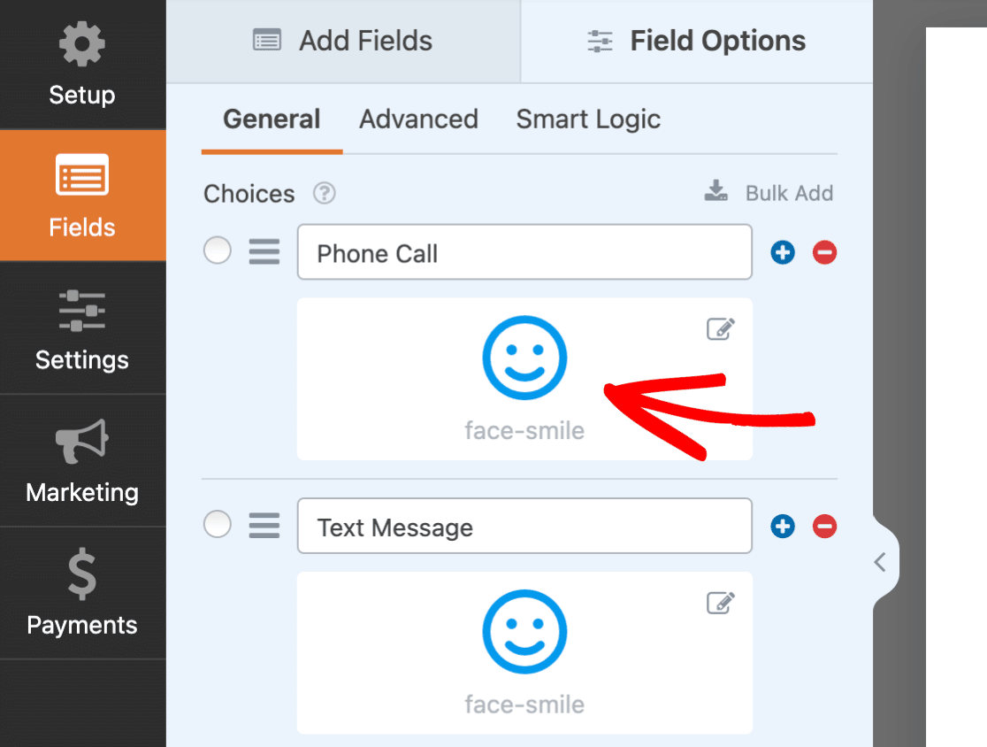
To learn more about icon choices, be sure to check out our tutorial on using icon choices in WPForms.
Randomizing Options
Randomizing the options you provide can help to avoid order bias, which is especially beneficial if you’re using our Surveys and Polls addon.
In the Advanced tab for any Checkboxes or Multiple Choice field, you can toggle on the Randomize Choices option.

Displaying Dynamic Choices
The Dynamic Choices option is super useful if you want choices in a Checkboxes, Multiple Choice, or Dropdown field to be the names of pages, posts, categories, or tags on your site. When enabled, this option will automatically populate the choices for the field (and keep them updated if you add or remove content or taxonomies).
To set up this option, open the Advanced tab and select options from the Dynamic Choices and Dynamic Source dropdowns.
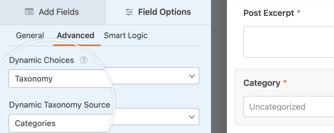
For more details, please see our tutorial on setting up dynamic choices.
That’s it! You can now customize your form fields with tons of built-in options in WPForms.
Next, would you also like to add smart logic to customize your forms even further? Be sure to check out our tutorial on conditional logic for details and lots of examples.
