AI Summary
Would you like to add icon options to your forms? Using icons in Multiple Choice, Checkboxes, Multiple Items, and Checkbox Items fields is a simple way to enhance your form’s visual appeal and user experience.
This tutorial will show you how to add icon choices to existing or new fields in WPForms.
Before getting started, you’ll first need to make sure WPForms is installed and activated on your WordPress site and that you’ve verified your license. Then you can create a new form or edit an existing one to access the form builder.
Setting Up Your Form
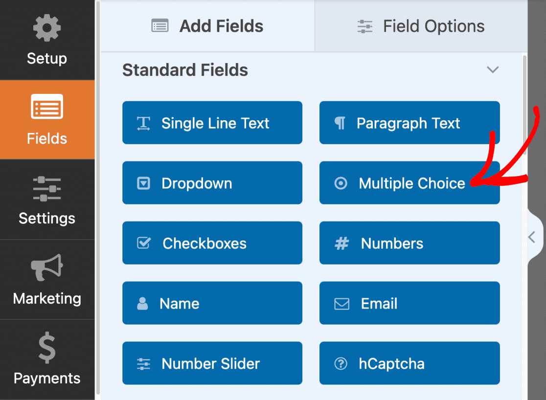
Once you’ve opened the form builder, you’ll be able to add icon choices to any of the following field types:
- Multiple Choice
- Checkboxes
- Multiple Items
- Checkbox Items
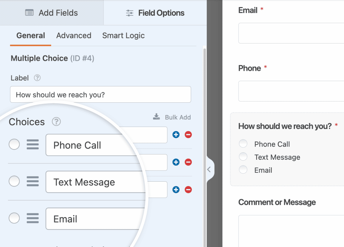
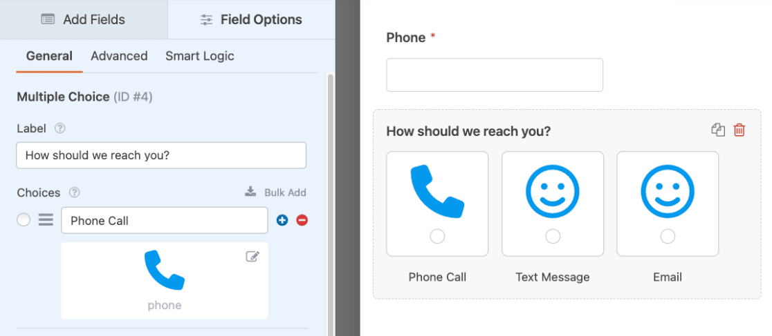
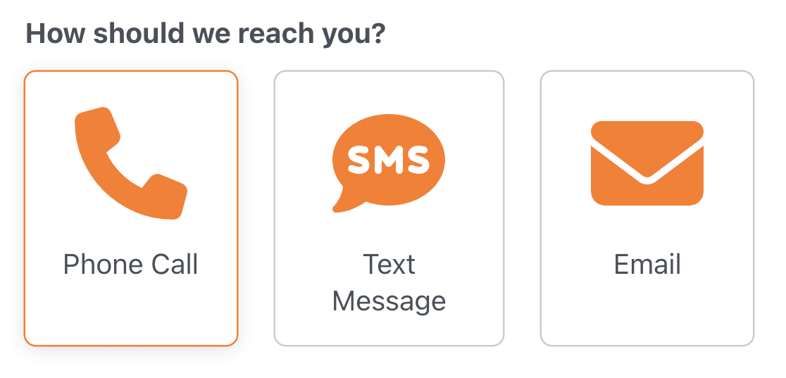
For our example, we’ll create a simple contact form that allows users to choose their preferred contact method, including phone call, text message, or email.
To get started, we’ll add a Multiple Choice field to our form by clicking on it or dragging and dropping it to the form preview area.
Next, we’ll change the labels of our choices to include the following: Phone Call, Text Message, and Email.
Note: Want to add a long list of choices to your form? Check out our guide to adding choices in bulk to learn how to add multiple icon choices to your form at once instead of creating each choice individually.
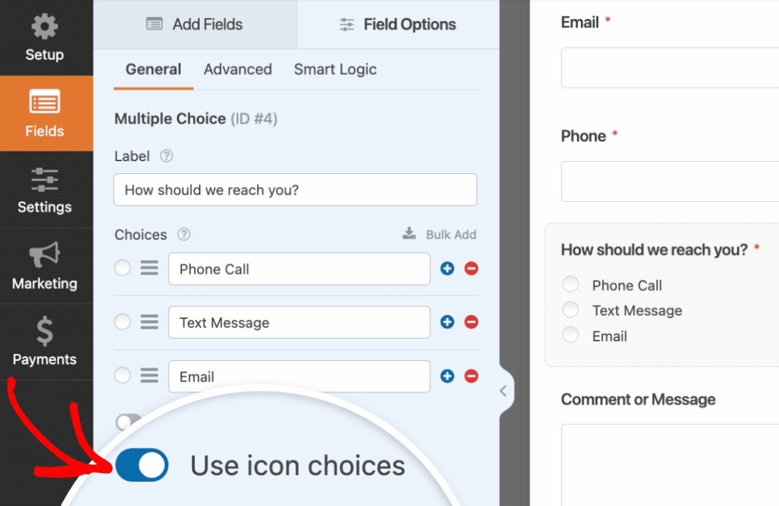
Enabling Icon Choices
Once this basic setup is ready to go, we’ll enable icon choices by toggling on the Use icon choices option.
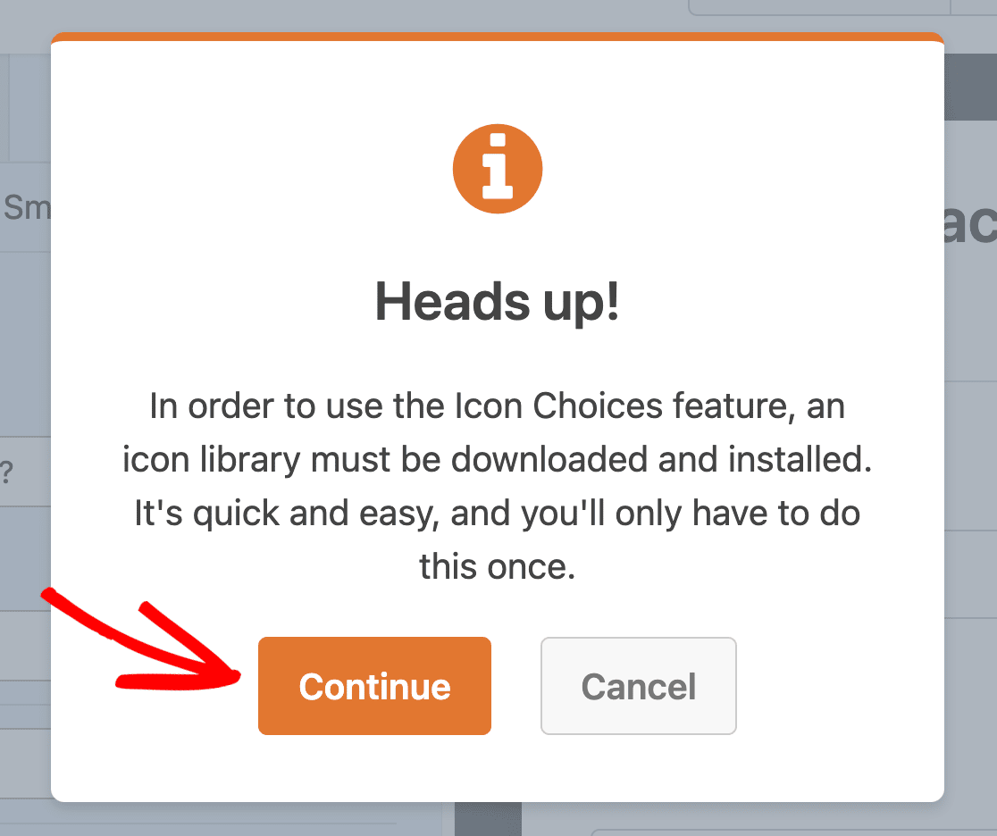
If it’s your first time setting up icon choices, you’ll see an overlay with a message asking you to download an icon library. Downloading the icon library is a required step that grants you access to over 2,000 icons to use in your forms.
To proceed with the download, click the Continue button.
Note: WPForms uses the latest version of the Font Awesome icon library for icon choices.
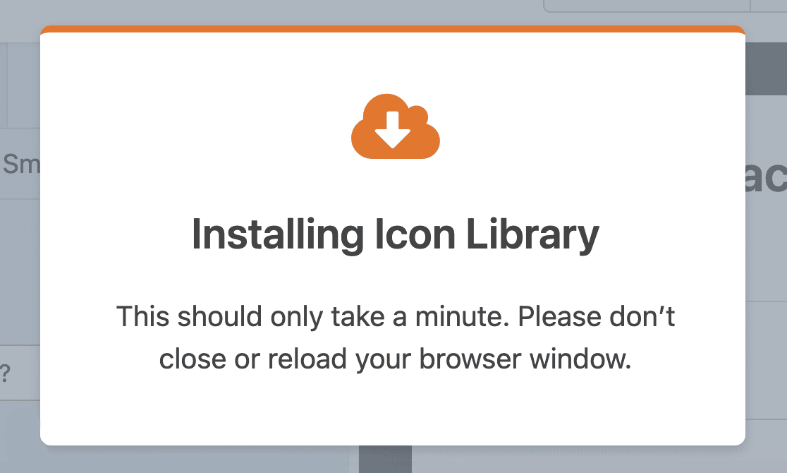
Next, you’ll see another overlay notifying you that the download is in progress. To prevent any interruption during the installation, make sure you don’t close or reload the browser window.
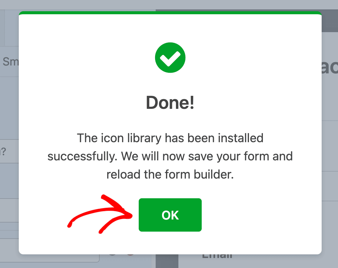
Once the icon library has been installed successfully, click the OK button to save your form and reload the form builder.
Selecting Icons
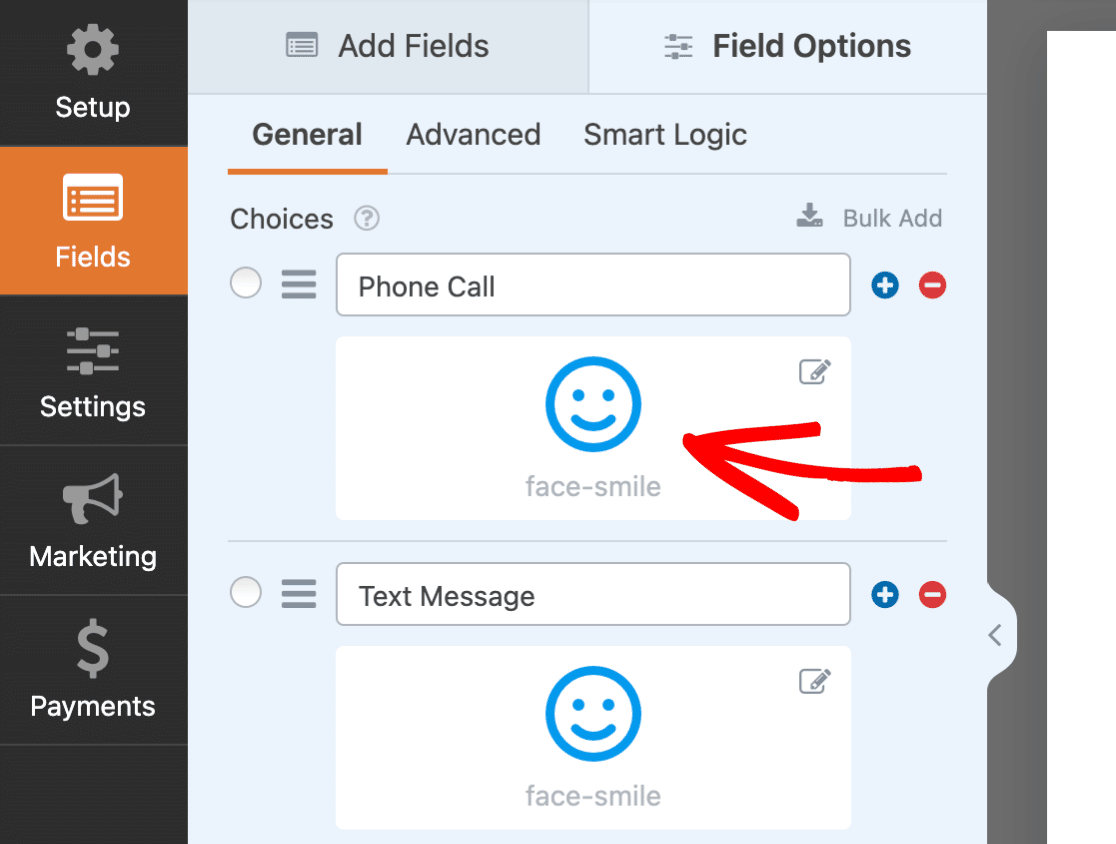
Now that we’ve enabled icon choices, default icons are added to our form. We’ll select new icons to replace the default ones by clicking on each icon in the left side of the form builder.
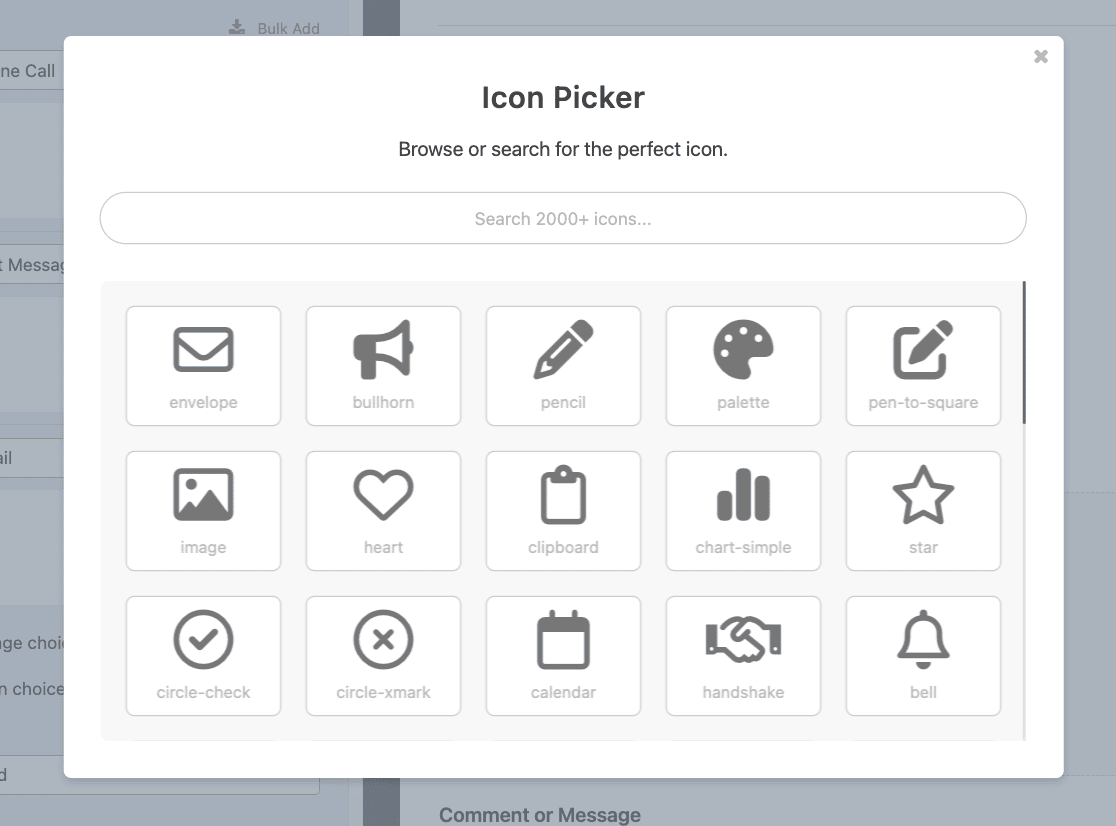
Next, the Icon Picker modal will appear. Here you can browse or search for the perfect icon to use in your form.
We’ll go ahead and search for a phone icon by typing “phone” into the search bar.
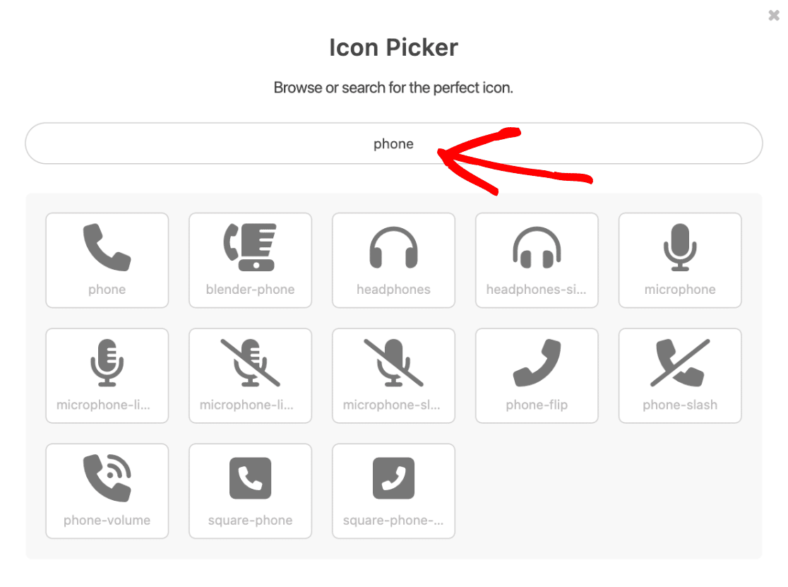
The search results will display all icons containing “phone” in the icon name. We’ll go ahead and click the phone icon to select it as our first icon choice.
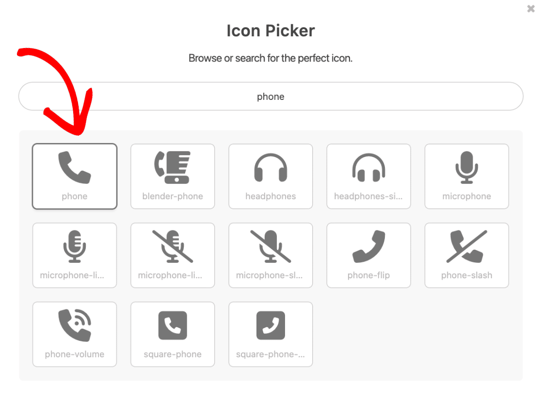
After selecting an icon from the Icon Picker, it will appear in the form builder.
Go ahead and select other icons to use for the remaining choices in your form by repeating this process.
Customizing Icon Choices
Once you’ve selected the icons you’d like to use in your form, it’s time to customize how they look. WPForms makes it easy to customize the icon color, size, and style, right from the form builder. We’ll cover each of these options below.
Note: Customizations are applied to all icon choices within the same form field.
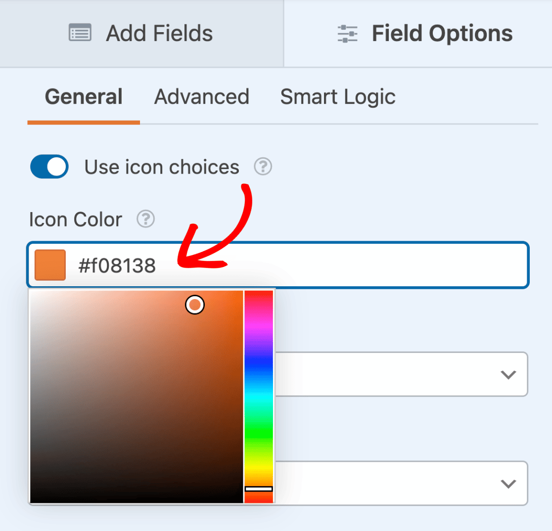
Icon Color
By default, the icon color is set to blue. You can easily select your preferred icon color by clicking the Icon Color option and using the color picker tool.
The selected color will apply to all icon choices for the given field.
Note: If you’re using icon choices with the Conversational Forms addon, take note that the color scheme you select for your conversational form will overwrite the icon color.
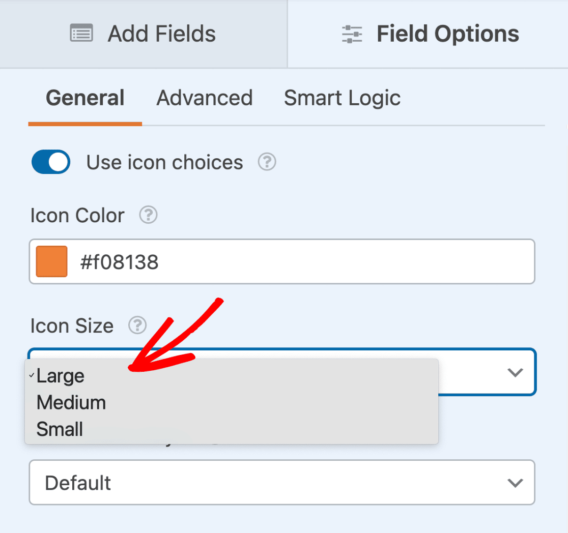
Icon Size
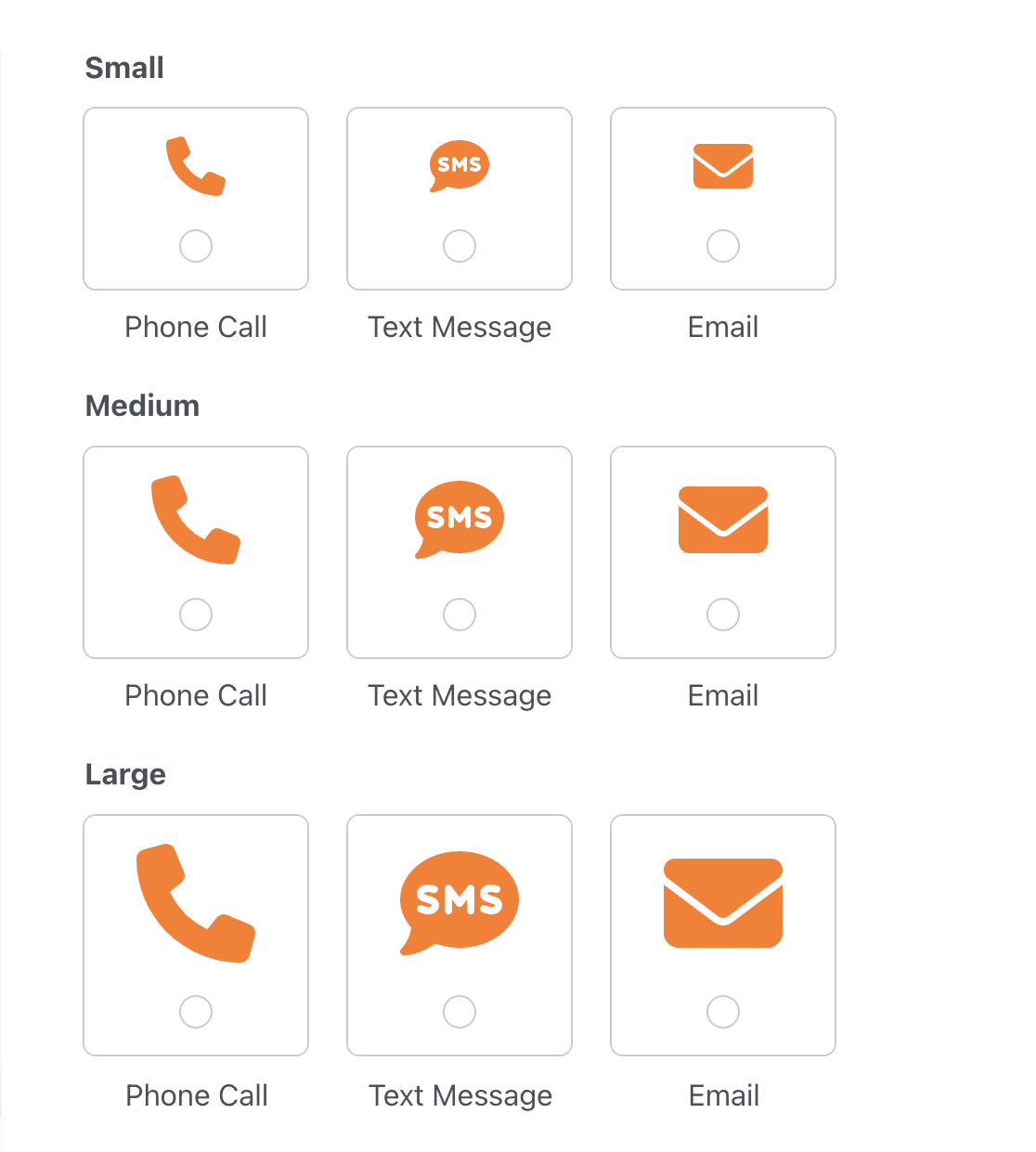
There are 3 size options for icon choices, including Small, Medium, and Large. To change the size, click the Icon Size dropdown and select your preferred size.
Here’s how the size options compare on the frontend:
The selected size will apply to all icon choices for the given field.
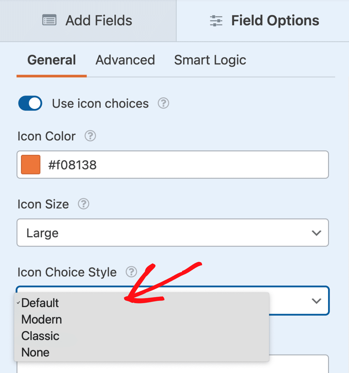
Icon Choice Style
There are 4 options for styling icon choices, including Default, Modern, Classic, and None. To change the icon style, click on the Icon Choice Style dropdown and select your preferred style.
The selected icon choice style will apply to all icon choices for the given field.
We’ll go over each of the available style options below:
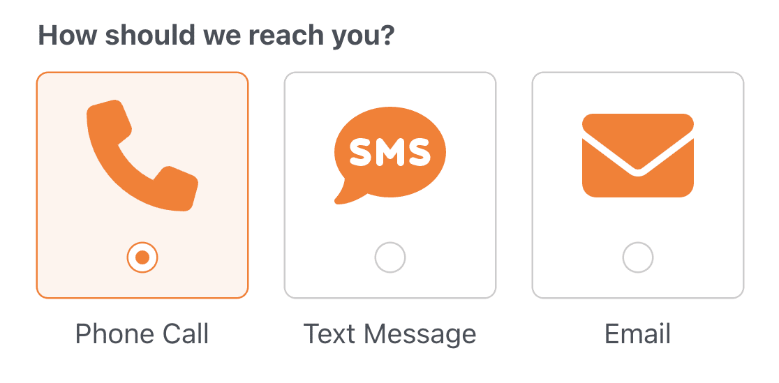
Default
The Default style adds a rounded border, includes a visible checkbox or radio button, has a colored background and border when selected, and displays the choice label outside the border.
Modern
The Modern style adds a rounded border, displays the choice label inside the border, and has a box shadow and colored border when selected.
Classic
The Classic style adds a square and colored border when selected. The choice label is displayed inside the border of the selected choice.
None
If you don’t want to include any special styling, select the None option. This option displays a checkbox or radio button in a single line below the icon.
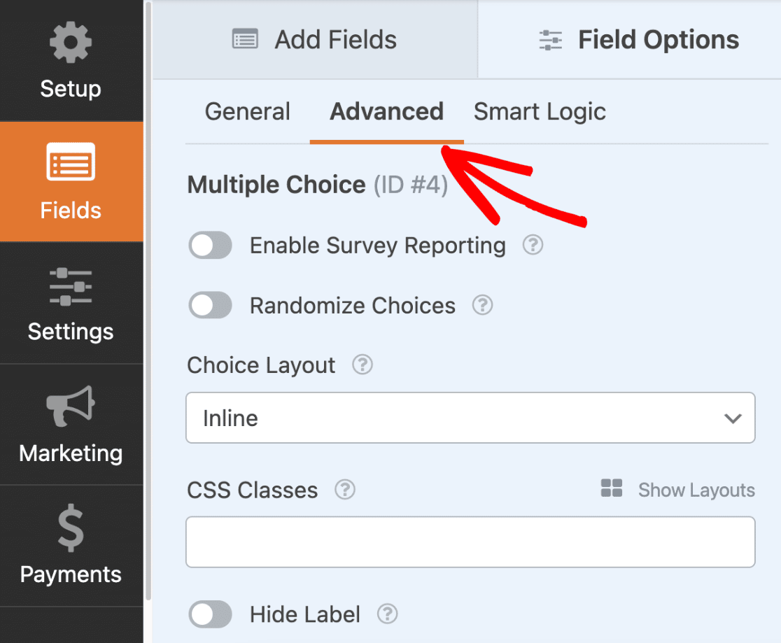
Selecting a Choice Layout
To select a layout for how icon choices are displayed in your form, open the Advanced tab within the Field Options panel.
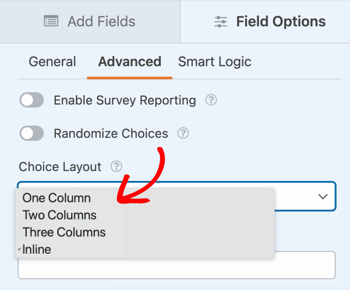
You can choose between the following 4 layout options for displaying the choices: One Column, Two Columns, Three Columns, and Inline. The layout you select will determine the number of columns used to display the choices.
Go ahead and click the Choice Layout dropdown and select your preferred layout.
Here’s how the form will look on the frontend of the site:
Frequently Asked Questions
Below are some of the top questions we receive about using icon choices.
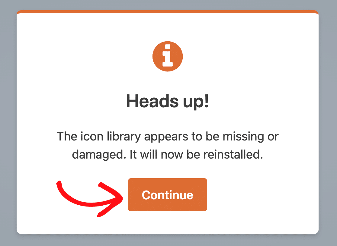
Why aren’t the icons displaying in my form?
If the icon choices you’ve added to your form aren’t displaying, there’s likely an issue with the folder containing the icon library. To fix this issue, simply open your form in the form builder and follow the prompts to reinstall the icon library.
Why aren’t icons displayed in entries, email notifications, printed entries, etc.?
Icons are used to enhance the appearance of a form and provide visual cues to users, making it easier for them to complete the form quickly. However, they should not be relied upon as a replacement for labels or descriptions, as the interpretation of an icon’s meaning can vary. Only the value of a selected icon is included in entries and email notifications to effectively communicate information submitted through your form.
That’s it! Now you know how to add icon choices to your form.
Next, would you like to add extra content to your forms? Be sure to check out our guide to using the Content field to learn how to add headings, lists, media, and more to your forms.