AI Summary
Do you want to customize the previous and next buttons in your multi-page forms? Customizing your forms’ buttons can be a great way to add personality and style to your site.
This tutorial will go over how to customize the style of your multi-page form’s previous and next buttons.
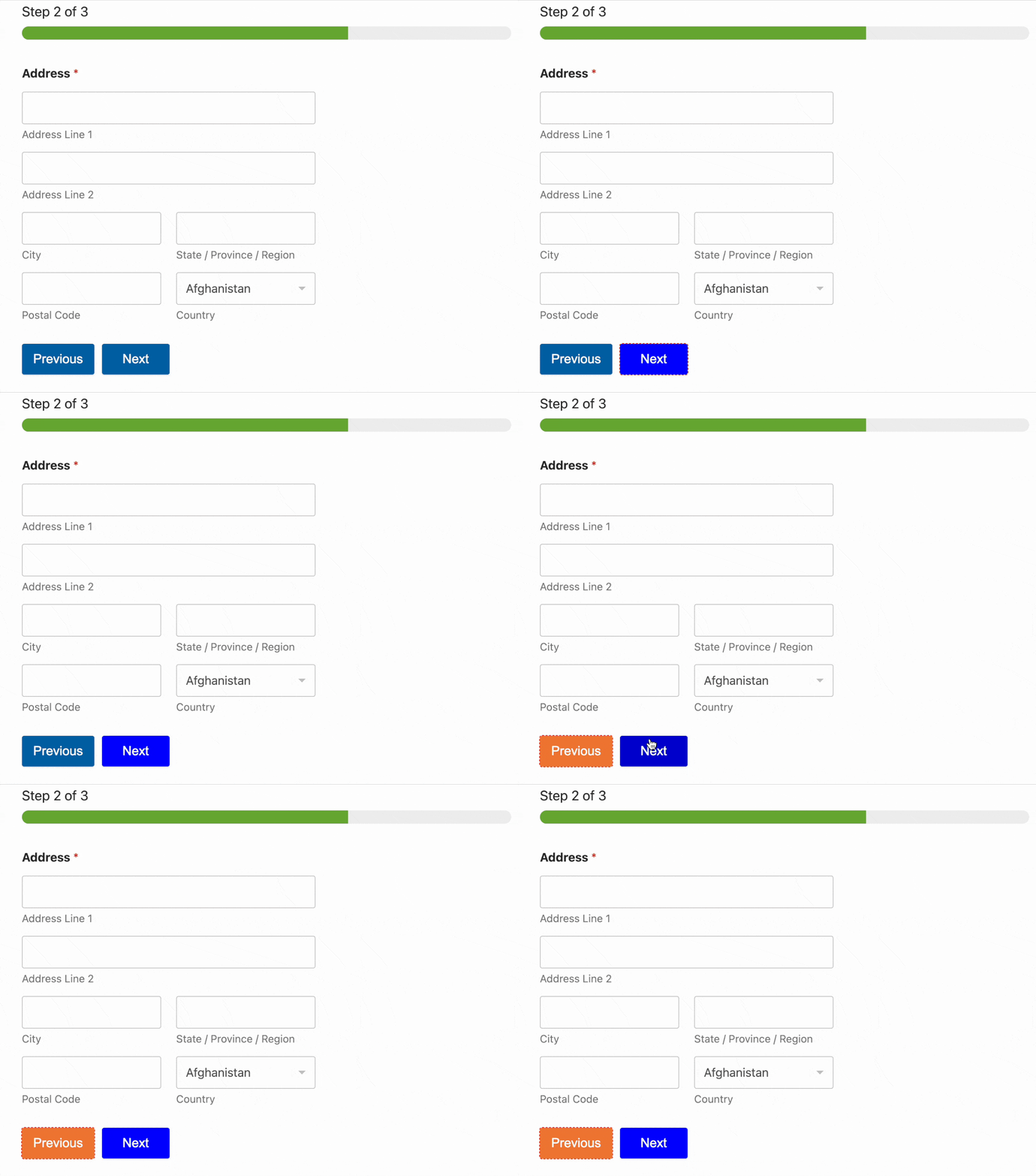
Note: If you’d prefer to style your form without using code, check out our form styling tutorial.
Before you get started, make sure WPForms is installed and activated on your site and that you’ve verified your license. Then, create a multi-page form to add previous and next buttons.
Note: To see a multi-page form in action and get started quickly, you can use our pre-built Blue Badge Application Form Template as a foundation for your own form. You can then apply the customizations we’ll cover in this tutorial to style the previous and next buttons.
Styling the Previous and Next Buttons
CSS provides incredible flexibility to customize the previous and next buttons in WPForms and any other aspect of your form.
If you’re new to CSS or would like a refresher, the best place to start is with our introductory guide to CSS.
Here’s the default CSS for WPForms’ previous and next buttons, as well as comments to note what each line of CSS does:
div.wpforms-container-full .wpforms-form .wpforms-page-button {
    background-color: #eee; /* Grey background */
    border: 1px solid #ddd; /* Dark grey border */
    color: #333; /* Black text color */
    font-size: 1em; /* Size of text */
    padding: 10px 15px; /* Distance between text and border */
}
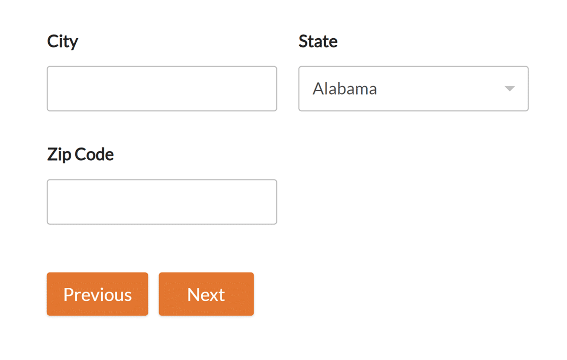
You can change each of these values to style your buttons in different ways. As an example, we’ll start by changing our buttons’ background color to orange, and the text to white.
First, we’ll need to find the hex codes for the colors we want to use. htmlcolorcodes.com and Adobe Color CC are helpful free tools that can help your choose your colors.
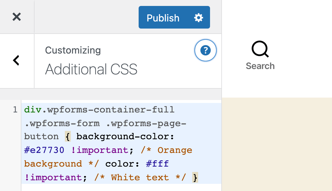
Once we have the hex codes for the colors we want, we can add them to our CSS:
div.wpforms-container-full .wpforms-form .wpforms-page-button {
    background-color: #e27730 !important; /* Orange background */
    color: #fff !important; /* White text */
}
Note: When adding CSS to your site, it might be necessary to include !important before the semicolon to make sure your custom styles are applied successfully. Check out our guide to troubleshooting CSS for more details.
Next, we need to add this CSS to our site. The easiest way to do this is by using the WordPress CSS Editor. To do this, go to Appearance » Customize and select Additional CSS.
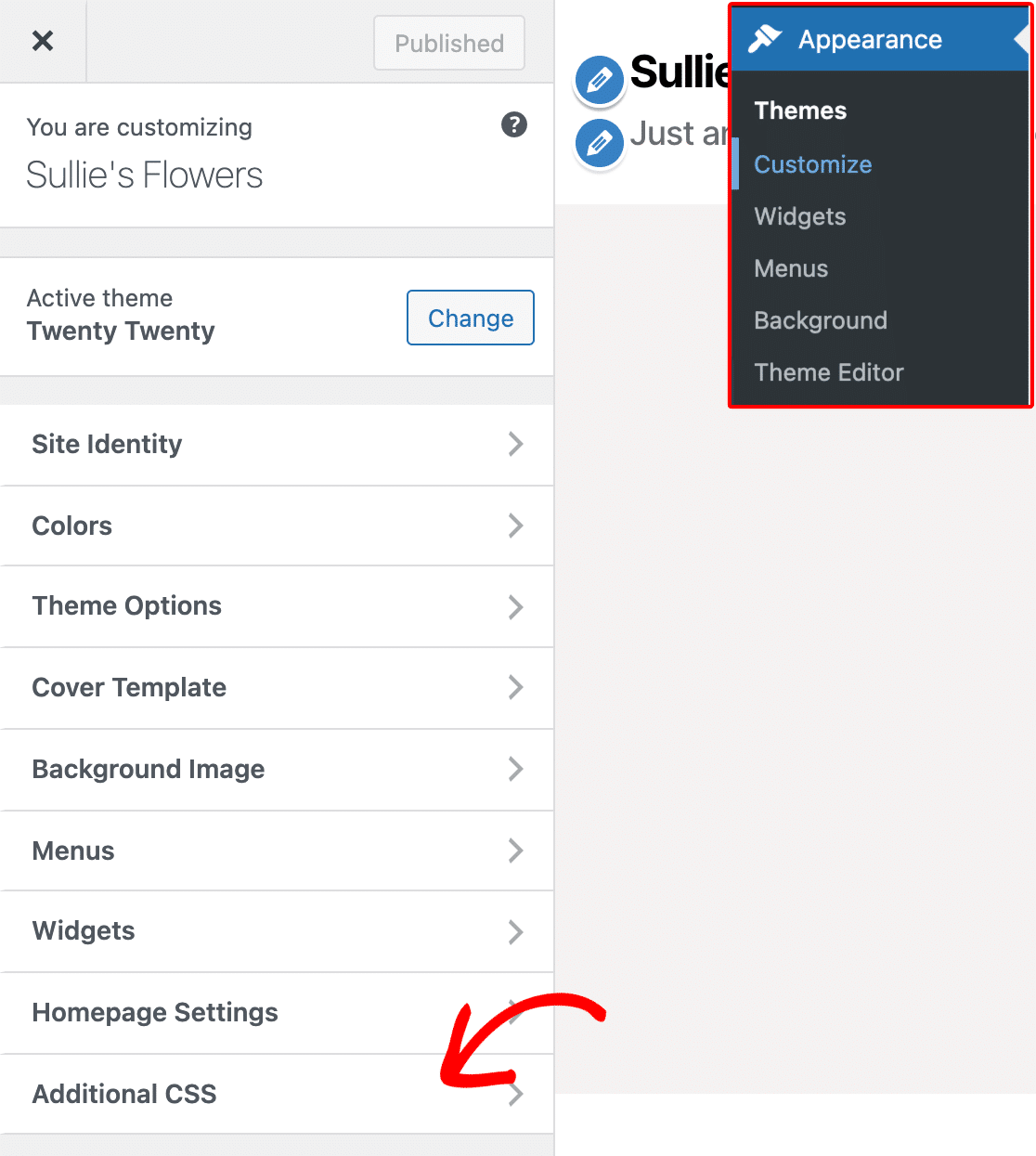
Once you’ve opened the Additional CSS section, you can add your new CSS. Then click the Publish button, and you’re all set!
Here’s what our buttons will look like now, with our example CSS applied:
Note: Having trouble getting your newly added CSS to show up on your site? Check out our tutorial on troubleshooting this issue.
Customizing Hover Styles
CSS also allows you to apply completely different styles when users hover their cursors over a button. This change helps improve the user experience because it lets users know that the button is clickable.
Below is the default CSS for WPForms button hover styles. As noted in the comments, the background color becomes a little darker and the border color becomes a little lighter:
div.wpforms-container-full .wpforms-form .wpforms-page-button:hover, div.wpforms-container-full .wpforms-form .wpforms-page-button:active {
    background-color: #ddd; /* Darker grey background */
    border: 1px solid #ccc; /* Lighter grey border */
}
You might notice this is much less CSS than you saw for the button when it’s not hovered over. This is because CSS will apply all of the earlier styles to your hovered button unless told otherwise.
For example, if you leave the default styles in place, the text color will remain black when users hover over the button. This is because the button’s text color would normally be black, and we haven’t told it to change upon hover.
As with the previous custom CSS example, you can modify any of these values to change the button’s hover styles. For our example, we’ll give the button a darker orange background when it’s hovered over.
div.wpforms-container-full .wpforms-form .wpforms-page-button:hover, div.wpforms-container-full .wpforms-form .wpforms-page-button:active {
    background-color: #cd631d !important; /* Darker orange background */
}
Here’s what the buttons will look like with the CSS applied:
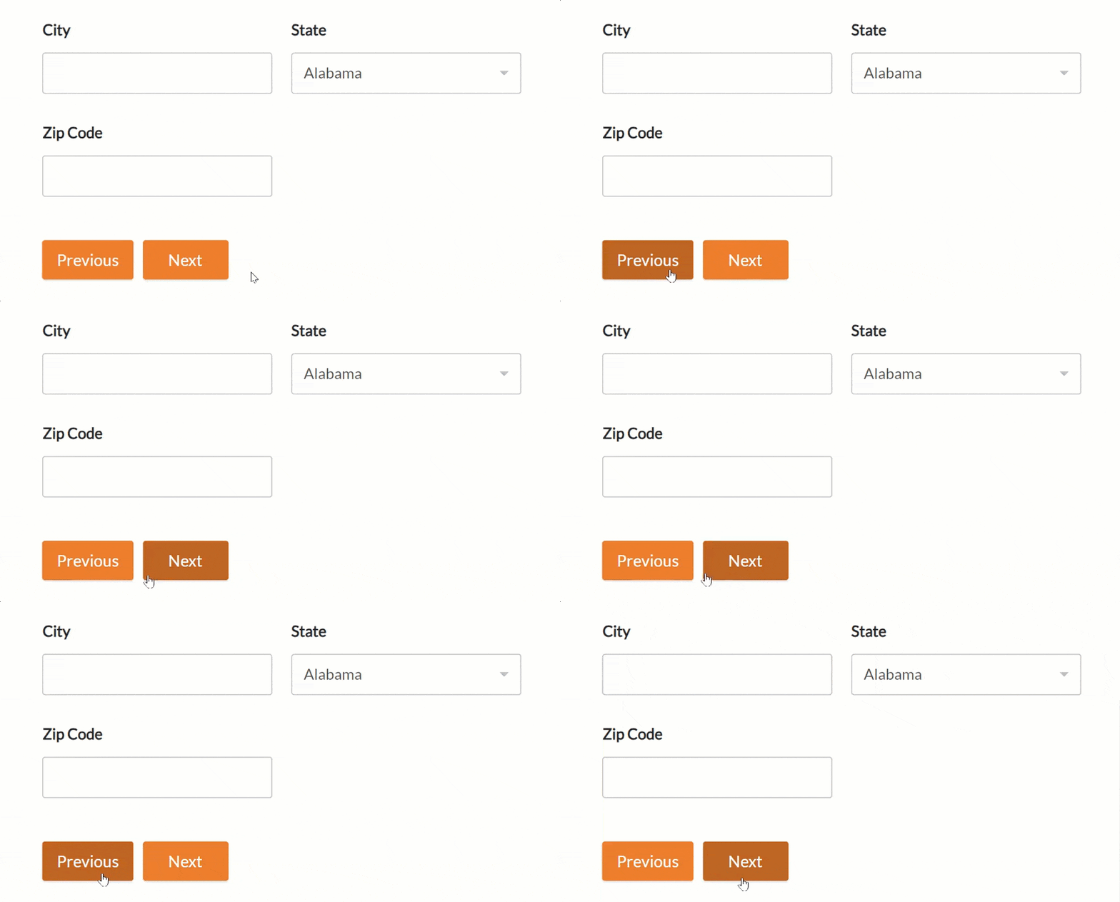
Example CSS
Now that we’ve covered the basics, let’s go through a complete example of custom CSS for the previous and next buttons.
Note: The code below will change the previous and next buttons for all of the multi-page forms created on your site with WPForms.
If you want to style the previous and next buttons only for a single form, you’ll need to find the unique ID for that form. For more details, see our complete guide to styling contact forms with CSS.
Here’s the CSS we’ll add for this example, which includes style changes on hover:
/* New button styles */
div.wpforms-container-full .wpforms-form .wpforms-page-button {
    background-color: #003B6D !important; /* Dark blue background */
    border: 2px solid #BDBDBD !important; /* Gray border */
    color: #fff !important; /* White text */
    font-size: 1em !important; /* Increase text size */
    font-weight: bold !important; /* Bold text */
    padding: 16px !important; /* Increase distance between text and border */
    width: 25% !important; /* Make the button quarter-width */
}

/* New button hover styles */
div.wpforms-container-full .wpforms-form .wpforms-page-button:hover, div.wpforms-container-full .wpforms-form .wpforms-page-button:active {
    background-color: #BDBDBD !important; /* Gray background */
    border: 2px solid #003B6D !important; /* Dark blue border */
}
Below is what our customized buttons will look like with this CSS applied:

And here’s what our buttons will look like when hovered over. Remember, the only changes are the background and border colors:

That’s it! You can now customize your previous and next buttons using custom CSS.
Want to add even more custom styles to your forms? Check out our tutorial on how to customize individual form fields.
