AI Summary
Would you like to condense your forms by displaying fields in multiple columns? WPForms makes it easy to split forms into halves, thirds, or even more complex layouts.
This tutorial will show you how to use our multi-column layout settings to help your forms look their best.
Note: We recommend using the Layout field for a simpler, drag-and-drop approach to building advanced form layouts. However, the layout CSS classes covered in this tutorial are still supported.
Before getting started, you’ll first need to make sure WPForms is installed and activated on your WordPress site and that you’ve verified your license. Then you can create a new form or edit an existing one to access the form builder.
Creating Multi-Column Forms With Visual Layouts
WPForms includes a visual layout tool that enables you to create multiple columns without code.
To access this tool, click on any field in the builder to open its Field Options panel. Then click on the Advanced tab.
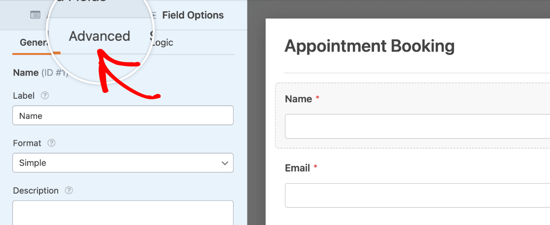
Open the visual layouts tool by clicking Show Layouts next to the CSS Classes option.
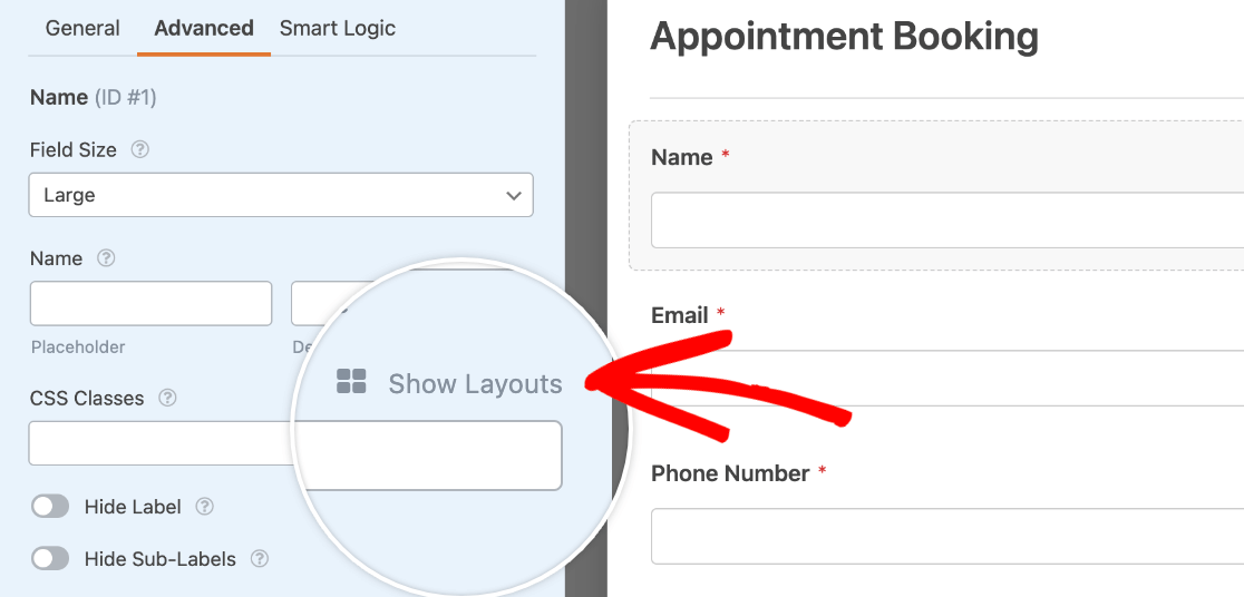
This will reveal several pre-made layout options that you can use in your form.
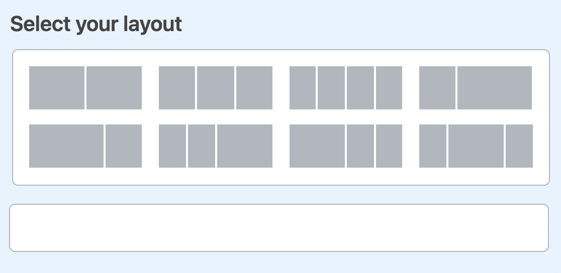
Note: The Show Layouts option is only available to WPForms Lite users. If you’re using the WPForms Pro plugin, you’ll be required to use the Layout field to create multi-column form fields.
For our example, we want our Name and Email fields to appear next to each other, and for each to take up half of the form’s width. To create this layout, we’ll select the option that shows two evenly sized boxes.
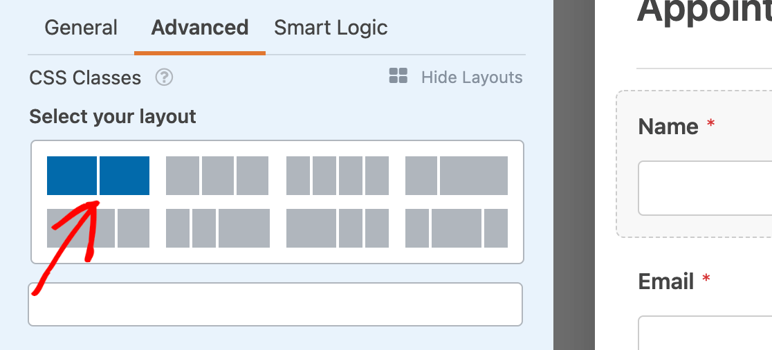
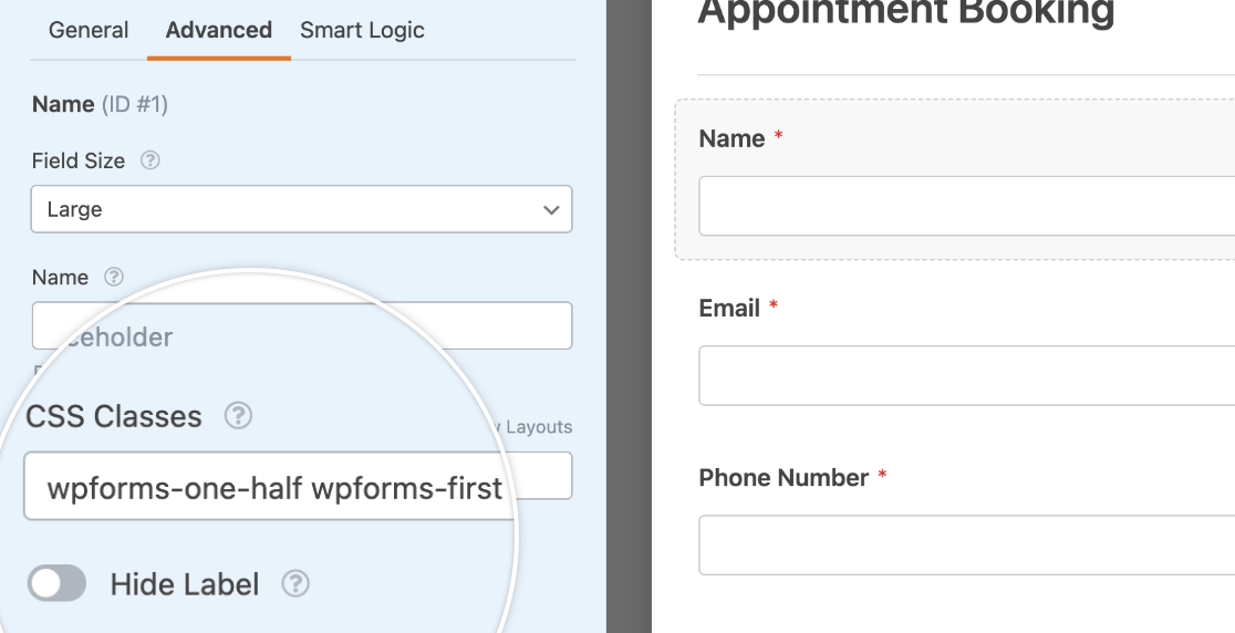
Once we select this layout, we need to choose which column we want this particular field to appear in. Since our Name field is first in our form, we want it to appear in the left column.
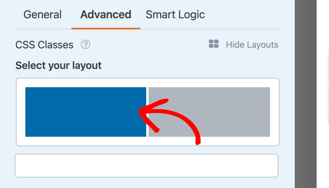
When you click on a column in the visual layouts tool, the corresponding classes are automatically added to the field’s CSS Classes setting. The wpforms-one-half class tells the field to take up half of the available width, while the wpforms-first class tells the field that it needs to start a new row.
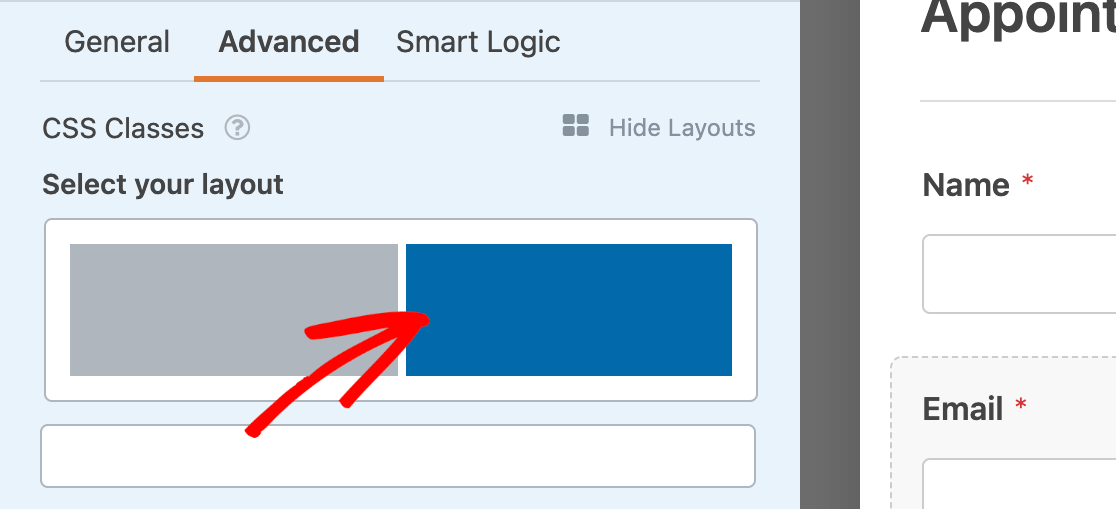
Next, we need to carry out the same process for our Email field. However, we’ll put it in the right column.
When you’re done adding your fields to your layout, be sure to save your changes in the form builder.
Here’s how our multi-column layout example looks on the frontend of our site:

Adding Multi-Column CSS Classes Manually
If you’d prefer not to use the visual layouts tool, you can manually type CSS classes into the relevant field in the Advanced tab of the Field Options panel.
Here are all of the available CSS classes for multi-column layouts:
- wpforms-one-half
- wpforms-one-third
- wpforms-one-fourth
- wpforms-one-fifth
- wpforms-one-sixth
- wpforms-two-thirds
- wpforms-two-fourths
- wpforms-two-fifths
- wpforms-two-sixths
- wpforms-three-fourths
- wpforms-three-fifths
- wpforms-three-sixths
- wpforms-four-fifths
- wpforms-four-sixths
- wpforms-five-sixths
The image below shows 3 different common multi-column layouts. The labels indicate which CSS classes were used from the list above.
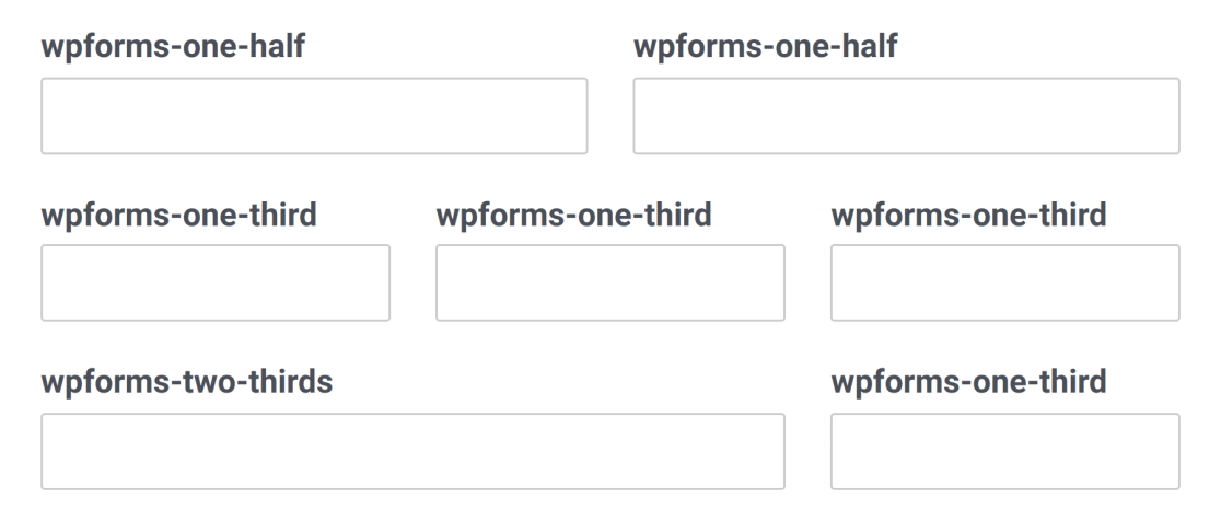
Note: The first field in each row in the image above also uses the wpforms-first class.
Note: The first field in each row in the image above also uses the wpforms-first class.
Additional Notes for Using Multi-Column Layouts
When using column classes, there are a few important things to note:
- Columns do not apply in the form builder. They are only visible when viewing the form on the frontend of your site. Always test your forms before publishing them to make sure you’re happy with their layouts.
- The first field in each row must have the
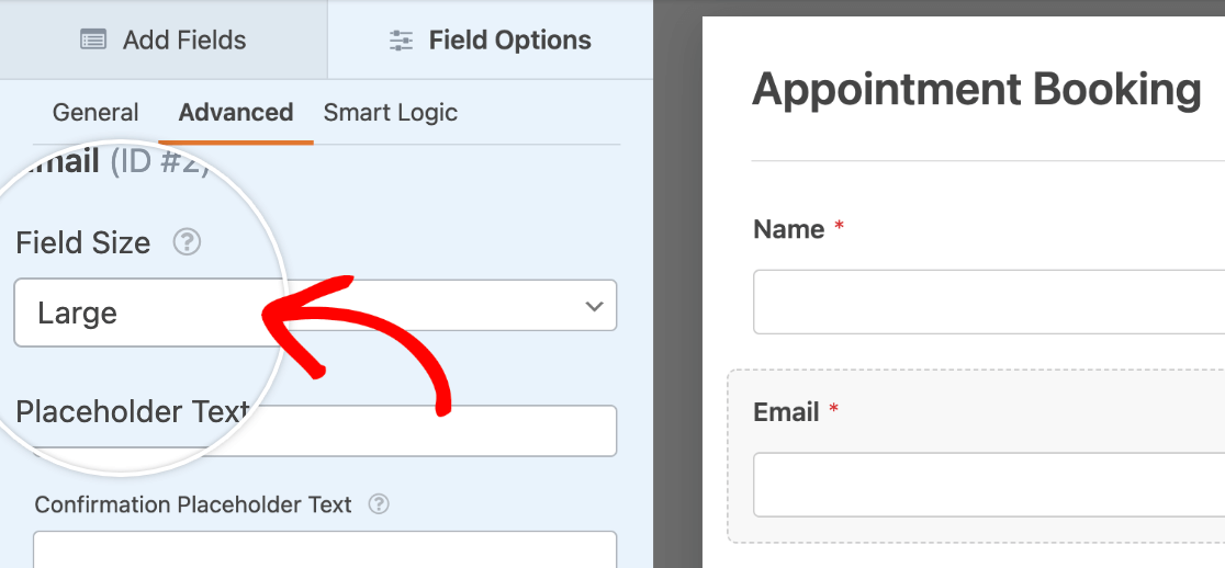
wpforms-firstclass in addition to its column class. This tells the plugin it’s the first item and resets any previous columns in the form. - In most cases, when using column classes you should set the Field Size (also in the Advanced tab of the Field Options panel) to Large. This lets the field fill all available space in its column and keeps right and left spacing even against neighboring fields.
- If you use a multi-column layout with conditional fields, any fields that are conditionally shown will be aligned to the left. To keep these fields aligned according to your preferred layout, you can use this CSS snippet:
Note: If you are unfamiliar with using CSS in WPForms, please check out our CSS guide for beginners and our doc on using custom classes with WPForms.
Frequently Asked Questions
These are answers to some top questions about creating multi-column form layouts.
Why is the multi-column layout not working when I preview my form?
If Modern Markup is enabled in your WPForms settings, the multi-column CSS classes won’t work when you view your form in the frontend. To fix this issue, you’ll need to disable Modern Markup.
Note: Disabling Modern Markup prevents you from styling forms in the block editor. We recommend using the Layout field to create multi-column form fields if you still want to style your form in the block editor.
For this, go to WPForms » Settings and select the General tab.
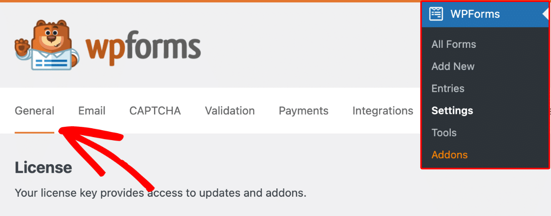
After that, scroll down and uncheck the Use Modern Markup option.

Be sure to save your changes once you’re done.
Note: If you can’t find the Modern Markup settings, you’ll need to add a filter to force WPForms to show this option. Please see our form styling guide for more details.
That’s it! You can now optimize your forms with multi-column layouts.
Next, would you also like to make your forms look great on mobile devices? You can configure your form to have a multi-column layout that changes to display fields in a single column on mobile, so it’s user-friendly on every device.

