AI Summary
Introduction
Interested in utilizing CSS to personalize the Submit button? CSS holds immense potential for various aspects of your site, and in this tutorial, we’ll furnish you with practical instances of harnessing CSS’s capabilities to transform the appearance of your Submit button.
For this tutorial, we won’t delve into form creation. If you require guidance on creating your form, refer to this informative guide.
New to CSS? Our friends at WPBeginner provide an excellent definition and useful examples. Discover more on this topic through their informative glossary page.
All examples in this tutorial will give you the CSS to change your button for all forms, but also for individual forms.
To learn how to incorporate CSS into your website, refer to this tutorial. If you need guidance on finding your form ID, consult this tutorial.
Full-width button
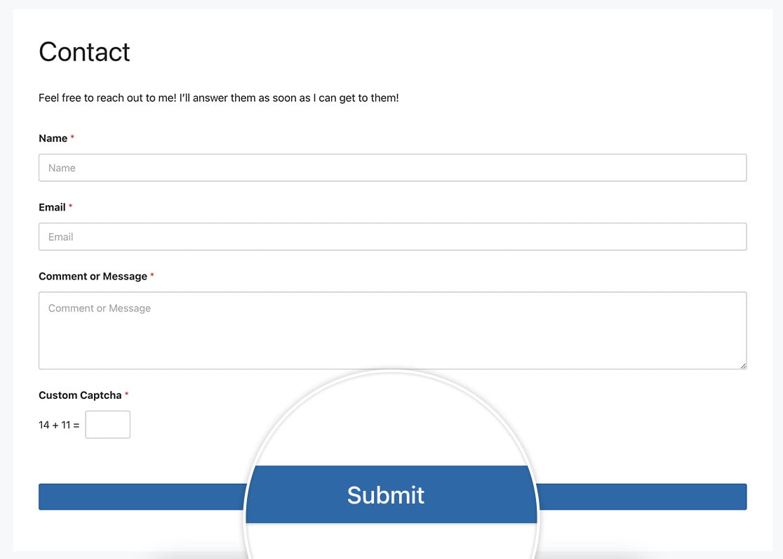
In this instance, we aim to match the width of the Submit button with our form fields. To accomplish this, we’ll apply the following CSS.
For single form
This example targets only the form with the ID of 23.
button#wpforms-submit-23 {
    width: 100%;
}
For all forms
This example targets all WPForms.
button.wpforms-submit {
    width: 100% !important;
}
Pressed button effect for a single form
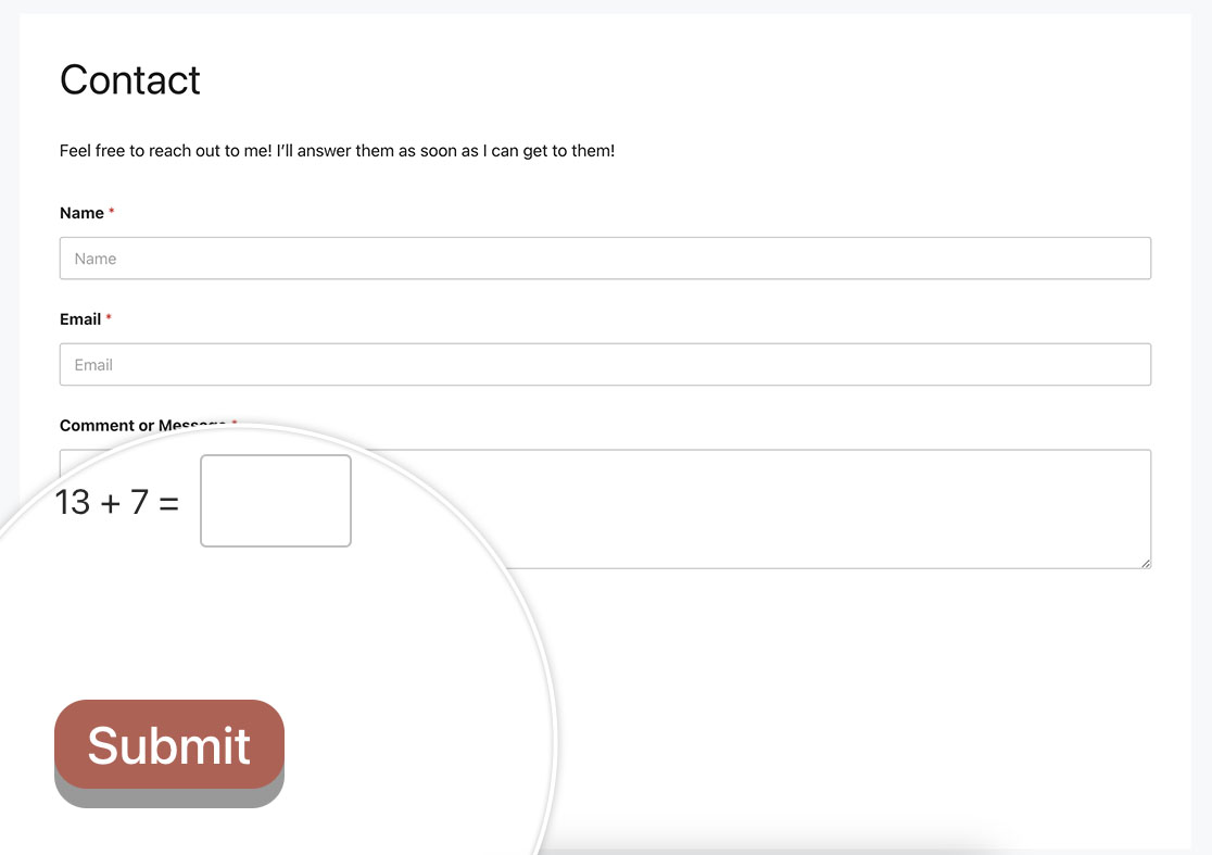
Using the following CSS, we’ll make the button looked pressed down when it’s clicked.
For a single form
This example targets only the form with the ID of 23.
button#wpforms-submit-23 {
  display: inline-block;
  font-size: 24px;
  cursor: pointer;
  text-align: center;
  text-decoration: none;
  outline: none;
  color: #fff;
  background-color: #b95d52;
  border: none;
  border-radius: 15px;
  box-shadow: 0 9px #999;
}

button#wpforms-submit-23:hover {
	background-color: #55555e;
}

button#wpforms-submit-23:active {
  background-color: #55555e;
  box-shadow: 0 5px #666;
  transform: translateY(4px);
}
For all forms
This example targets all WPForms.
button.wpforms-submit {
  display: inline-block !important;
  font-size: 24px !important;
  cursor: pointer !important;
  text-align: center !important;
  text-decoration: none !important;
  outline: none !important;
  color: #fff !important;
  background-color: #b95d52 !important;
  border: none !important;
  border-radius: 15px !important;
  box-shadow: 0 9px #999 !important;
}

button.wpforms-submit:hover {
	background-color: #55555e !important;
}

button.wpforms-submit:active {
  background-color: #55555e !important;
  box-shadow: 0 5px #666 !important;
  transform: translateY(4px) !important;
}
Submit with 2 lines of text
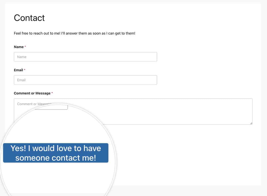
For this example, we’re going to have button with 2 lines of text.
For a single form
This example targets only the form with the ID of 23.
button#wpforms-submit-23 {
    max-width: 20%;
    line-height: 1.2em;
    height: auto;
}
For all forms
This example targets all WPForms.
button.wpforms-submit {
    max-width: 20% !important;
    line-height: 1.2em !important;
    height: auto !important;
}
Animation on hover
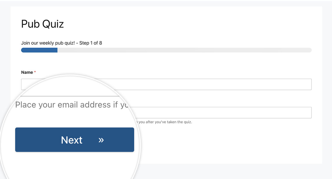
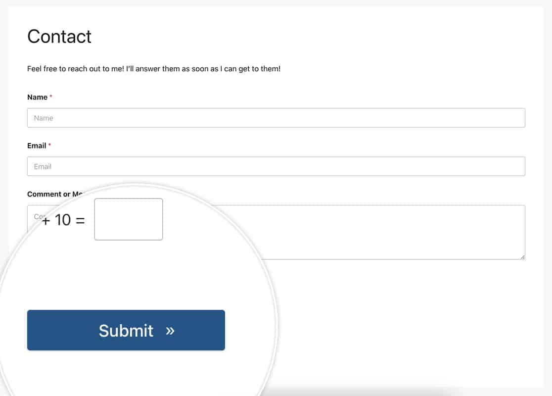
For this example, we’re bringing in a double arrow on hover for the button by the content: '\00bb'; in the CSS. For more information on finding the right HTML code for your symbol, please see the W3C Schools documentation.
You could change this icon to any font-based icon such as can be found in this tutorial.
For a single form
This example targets only the form with the ID of 23.
button#wpforms-submit-23 {
  border-radius: 4px;
  border: none;
  color: #FFFFFF;
  text-align: center;
  width: 200px;
  transition: all 0.5s;
  cursor: pointer;
  margin: 5px;
  cursor: pointer;
  display: inline-block;
  position: relative;
  transition: 0.5s;
}

button#wpforms-submit-23:after {
  content: '\00bb';
  position: absolute;
  opacity: 0;
  top: 11px;
  right: 0;
  transition: 0.5s;
}

button#wpforms-submit-23:hover {
  padding-right: 25px;
}

button#wpforms-submit-23:hover:after {
  opacity: 1;
  right: 50px;
}
For all forms
This example targets all WPForms.
button.wpforms-submit {
  border-radius: 4px !important;
  border: none !important;
  color: #FFFFFF !important;
  text-align: center !important;
  width: 200px !important;
  transition: all 0.5s !important;
  cursor: pointer !important;
  margin: 5px !important;
  cursor: pointer !important;
  display: inline-block !important;
  position: relative !important;
  transition: 0.5s !important;
}

button.wpforms-submit:after {
  content: '\00bb' !important;
  position: absolute !important;
  opacity: 0 !important;
  top: 11px !important;
  right: 0 !important;
  transition: 0.5s !important;
}

button.wpforms-submit:hover {
  padding-right: 25px !important;
}

button.wpforms-submit:hover:after {
  opacity: 1 !important;
  right: 50px !important;
}
Changing the color
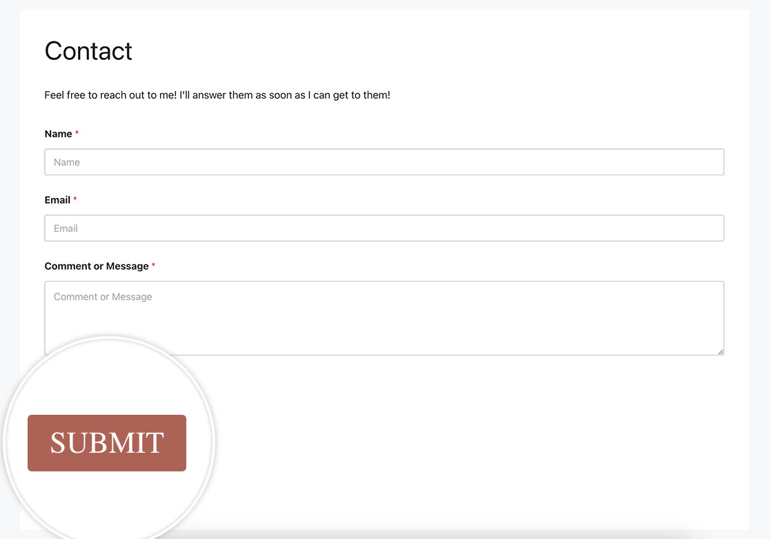
For this example, we’re going to change the color of the button. We’re also going to change the text size, text color and font-family in this example as well.
For a single form
This example targets only the form with the ID of 23.
button#wpforms-submit-23 {
    font-family: roboto;
    font-size: 22px;
    background-color: #b95d52;
    text-transform: uppercase;
    color: #ffffff;
    box-shadow: unset;
    border: 1px solid transparent;
    background: unset;
    background-color: #b95d52;
}

button#wpforms-submit-23:hover {
    background-color: #ffffff;
    border: 1px solid #b95d52;
    opacity: 1;
    color: #b95d52;
}
For all forms
This example targets all WPForms.
button.wpforms-submit {
    font-family: roboto !important;
    font-size: 22px !important;
    background-color: #b95d52;
    text-transform: uppercase;
    color: #ffffff !important;
    box-shadow: unset !important;
    border: 1px solid transparent !important;
    background: unset !important;
    background-color: #b95d52 !important;
}

button.wpforms-submit:hover {
    background-color: #ffffff !important;
    border: 1px solid #b95d52 !important;
    opacity: 1 !important;
    color: #b95d52 !important;
}
Box-shadow button
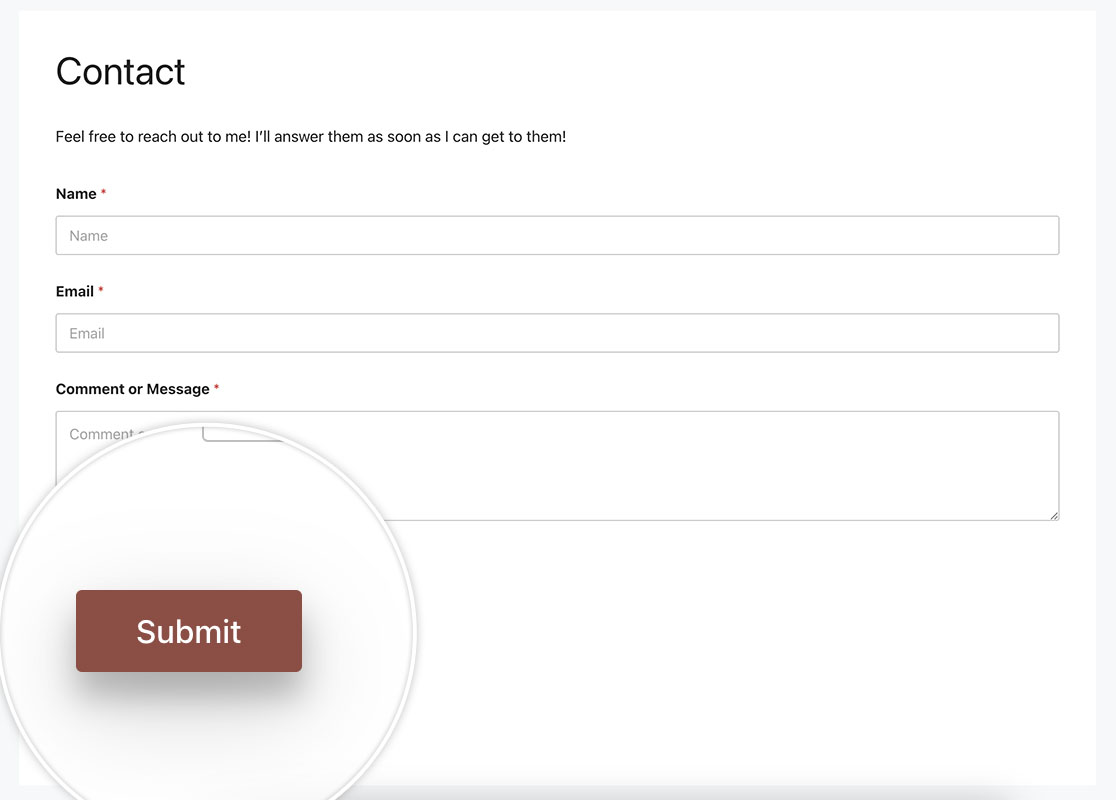
This example will show you how to place a box-shadow on the button using the following CSS.
For a single form
This example targets only the form with the ID of 23.
button#wpforms-submit-23 {
  background-color: #b95d52;
  border: none;
  color: white;
  padding: 10px 30px;
  text-align: center;
  text-decoration: none;
  display: inline-block;
  font-size: 16px;
  margin: 4px 2px;
  cursor: pointer;
  -webkit-transition-duration: 0.4s; /* Safari */
  transition-duration: 0.4s;
  box-shadow: 0 8px 16px 0 rgba(0,0,0,0.2), 0 6px 20px 0 rgba(0,0,0,0.19);
}
Alternatively, you could provide the box-shadow only on hover using this CSS for the form.
button#wpforms-submit-23 {
  background-color: #b95d52;
  border: none;
  color: white;
  padding: 10px 30px;
  text-align: center;
  text-decoration: none;
  display: inline-block;
  font-size: 16px;
  margin: 4px 2px;
  cursor: pointer;
  -webkit-transition-duration: 0.4s; /* Safari */
  transition-duration: 0.4s;
}

button#wpforms-submit-23:hover {
  box-shadow: 0 12px 16px 0 rgba(0,0,0,0.24),0 17px 50px 0 rgba(0,0,0,0.19);
}
For all forms
This example targets all WPForms.
button#wpforms-submit-23 {
  background-color: #b95d52;
  border: none;
  color: white;
  padding: 10px 30px;
  text-align: center;
  text-decoration: none;
  display: inline-block;
  font-size: 16px;
  margin: 4px 2px;
  cursor: pointer;
  -webkit-transition-duration: 0.4s; /* Safari */
  transition-duration: 0.4s;
  box-shadow: 0 8px 16px 0 rgba(0,0,0,0.2), 0 6px 20px 0 rgba(0,0,0,0.19);
}
And again, as with the above example, you could put the box-shadow only on hover.
button.wpforms-submit {
    background-color: #b95d52 !important;
    border: none !important;
    color: white !important;
    padding: 10px 30px !important;
    text-align: center;
    text-decoration: none !important;
    display: inline-block;
    font-size: 16px !important;
    margin: 4px 2px !important;
    cursor: pointer !important;
    -webkit-transition-duration: 0.4s !important;
    transition-duration: 0.4s !important;
}

button.wpforms-submit:hover {
    box-shadow: 0 12px 16px 0 rgba(0,0,0,0.24), 0 17px 50px 0 rgba(0,0,0,0.19) !important;
}
And these are just some examples of how easy it is to personalize the submit button using CSS. Would you also like to personalize your form labels? Take a look at our tutorial on How to Add Images Before or After Your Form Labels.
FAQ
Q: Can I use this CSS for Page Break buttons as well?
A: Absolutely, to use any of these examples with standard buttons when using the Page Breakbutton.wpforms-page-button.
Alternatively, if you wanted to target just a single form, you would use the form#wpforms-form-3221 button.wpforms-page-buttonCSS class instead, and just remember to update the form ID to match your own form ID.
For example, Animation on hover example as shown above for the Submit button, we’re going to do the same for the page break buttons as well.
This CSS is for a specific form, the form ID 3221. If you want to keep this to a single form, you’ll need to update the 3221 to match your own ID. For help in how to find your form ID, please review our useful documentation.
form#wpforms-form-3221 button.wpforms-page-button {
  border-radius: 4px;
  border: none;
  color: #FFFFFF;
  text-align: center;
  width: 200px;
  transition: all 0.5s;
  cursor: pointer;
  margin: 5px;
  cursor: pointer;
  display: inline-block;
  position: relative;
  transition: 0.5s;
}

form#wpforms-form-3221 button.wpforms-page-button:after {
  content: '\00bb';
  position: absolute;
  opacity: 0;
  top: 11px;
  right: 0;
  transition: 0.5s;
}

form#wpforms-form-3221 button.wpforms-page-button:hover {
  padding-right: 25px;
}

form#wpforms-form-3221 button.wpforms-page-button:hover:after {
  opacity: 1;
  right: 50px;
}
This CSS would be for all forms.
button.wpforms-page-button {
  border-radius: 4px;
  border: none;
  color: #FFFFFF;
  text-align: center;
  width: 200px;
  transition: all 0.5s;
  cursor: pointer;
  margin: 5px;
  cursor: pointer;
  display: inline-block;
  position: relative;
  transition: 0.5s;
}

button.wpforms-page-button:after {
  content: '\00bb';
  position: absolute;
  opacity: 0;
  top: 11px;
  right: 0;
  transition: 0.5s;
}

button.wpforms-page-button:hover {
  padding-right: 25px;
}

button.wpforms-page-button:hover:after {
  opacity: 1;
  right: 50px;
}
