

AI要約
はじめに
送信ボタンをパーソナライズするためにCSSを活用することに興味がありますか?CSSはあなたのサイトの様々な側面に大きな可能性を秘めており、このチュートリアルでは、送信ボタンの外観を変換するためにCSSの機能を活用する実践的な例を提供します。
このチュートリアルでは、フォームの作成については詳しく説明しません。フォームの作成方法についてガイダンスが必要な場合は、この情報豊富なガイドを参照してください。
CSSは初めてですか?WPBeginnerの仲間が優れた定義と役立つ例を提供しています。彼らの情報豊富な用語集ページでこのトピックについてさらに詳しくご覧ください。
このチュートリアルのすべての例では、すべてのフォームのボタンを変更するためのCSSを提供しますが、個々のフォームにも対応します。
CSSをウェブサイトに組み込む方法については、このチュートリアルを参照してください。フォームIDを見つける方法についてガイダンスが必要な場合は、このチュートリアルを参照してください。
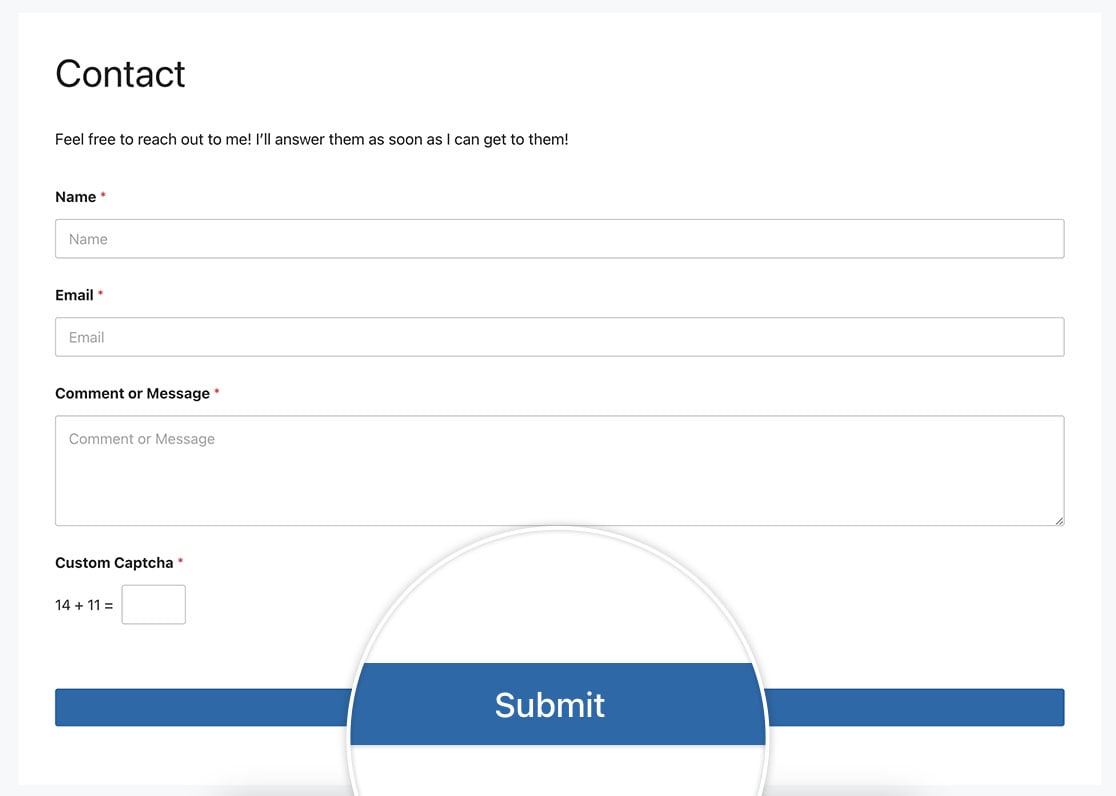
フル幅ボタン
この例では、送信ボタンの幅をフォームフィールドの幅に合わせることを目指します。これを達成するために、次のCSSを適用します。
単一フォームの場合
この例は、IDが23のフォームのみを対象としています。
button#wpforms-submit-23 {
    width: 100%;
}
すべてのフォームの場合
この例は、すべてのWPFormsを対象としています。
button.wpforms-submit {
    width: 100% !important;
}
単一フォームのボタン押下時のエフェクト
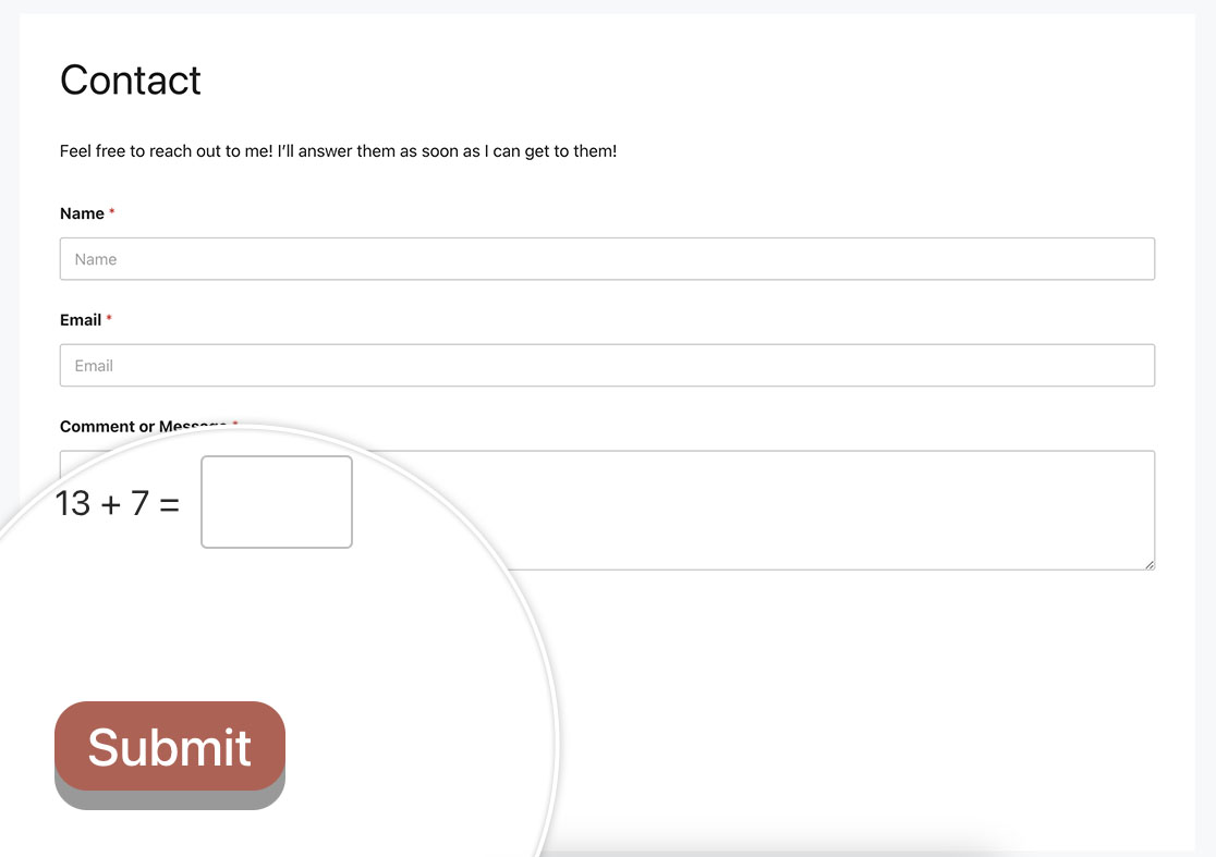
次のCSSを使用して、ボタンをクリックしたときに押されたように見せます。
単一フォームの場合
この例は、IDが23のフォームのみを対象としています。
button#wpforms-submit-23 {
  display: inline-block;
  font-size: 24px;
  cursor: pointer;
  text-align: center;
  text-decoration: none;
  outline: none;
  color: #fff;
  background-color: #b95d52;
  border: none;
  border-radius: 15px;
  box-shadow: 0 9px #999;
}

button#wpforms-submit-23:hover {
	background-color: #55555e;
}

button#wpforms-submit-23:active {
  background-color: #55555e;
  box-shadow: 0 5px #666;
  transform: translateY(4px);
}
すべてのフォームの場合
この例は、すべてのWPFormsを対象としています。
button.wpforms-submit {
  display: inline-block !important;
  font-size: 24px !important;
  cursor: pointer !important;
  text-align: center !important;
  text-decoration: none !important;
  outline: none !important;
  color: #fff !important;
  background-color: #b95d52 !important;
  border: none !important;
  border-radius: 15px !important;
  box-shadow: 0 9px #999 !important;
}

button.wpforms-submit:hover {
	background-color: #55555e !important;
}

button.wpforms-submit:active {
  background-color: #55555e !important;
  box-shadow: 0 5px #666 !important;
  transform: translateY(4px) !important;
}
2行のテキストを持つ送信ボタン
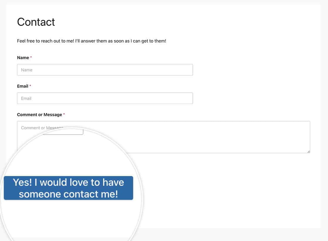
この例では、2行のテキストを持つボタンを作成します。
単一フォームの場合
この例は、IDが23のフォームのみを対象としています。
button#wpforms-submit-23 {
    max-width: 20%;
    line-height: 1.2em;
    height: auto;
}
すべてのフォームの場合
この例は、すべてのWPFormsを対象としています。
button.wpforms-submit {
    max-width: 20% !important;
    line-height: 1.2em !important;
    height: auto !important;
}
ホバー時のアニメーション
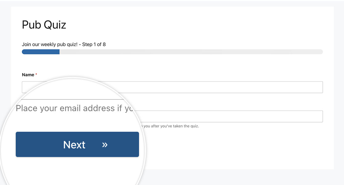
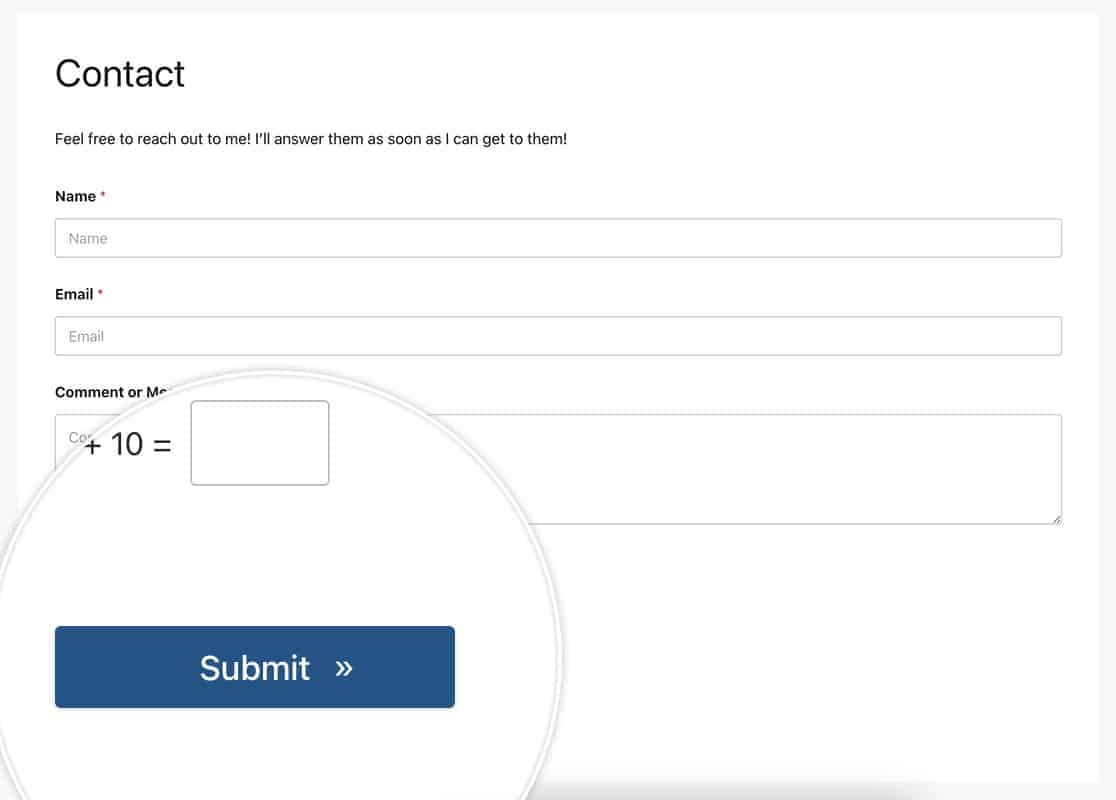
この例では、CSSのcontent: '\00bb';を使用して、ホバー時にボタンに二重矢印を表示します。記号の適切なHTMLコードを見つける方法については、W3C Schoolsのドキュメントを参照してください。
このアイコンは、このチュートリアルで見つけられるようなフォントベースのアイコンに変更できます。
単一フォームの場合
この例は、IDが23のフォームのみを対象としています。
button#wpforms-submit-23 {
  border-radius: 4px;
  border: none;
  color: #FFFFFF;
  text-align: center;
  width: 200px;
  transition: all 0.5s;
  cursor: pointer;
  margin: 5px;
  cursor: pointer;
  display: inline-block;
  position: relative;
  transition: 0.5s;
}

button#wpforms-submit-23:after {
  content: '\00bb';
  position: absolute;
  opacity: 0;
  top: 11px;
  right: 0;
  transition: 0.5s;
}

button#wpforms-submit-23:hover {
  padding-right: 25px;
}

button#wpforms-submit-23:hover:after {
  opacity: 1;
  right: 50px;
}
すべてのフォームの場合
この例は、すべてのWPFormsを対象としています。
button.wpforms-submit {
  border-radius: 4px !important;
  border: none !important;
  color: #FFFFFF !important;
  text-align: center !important;
  width: 200px !important;
  transition: all 0.5s !important;
  cursor: pointer !important;
  margin: 5px !important;
  cursor: pointer !important;
  display: inline-block !important;
  position: relative !important;
  transition: 0.5s !important;
}

button.wpforms-submit:after {
  content: '\00bb' !important;
  position: absolute !important;
  opacity: 0 !important;
  top: 11px !important;
  right: 0 !important;
  transition: 0.5s !important;
}

button.wpforms-submit:hover {
  padding-right: 25px !important;
}

button.wpforms-submit:hover:after {
  opacity: 1 !important;
  right: 50px !important;
}
色の変更
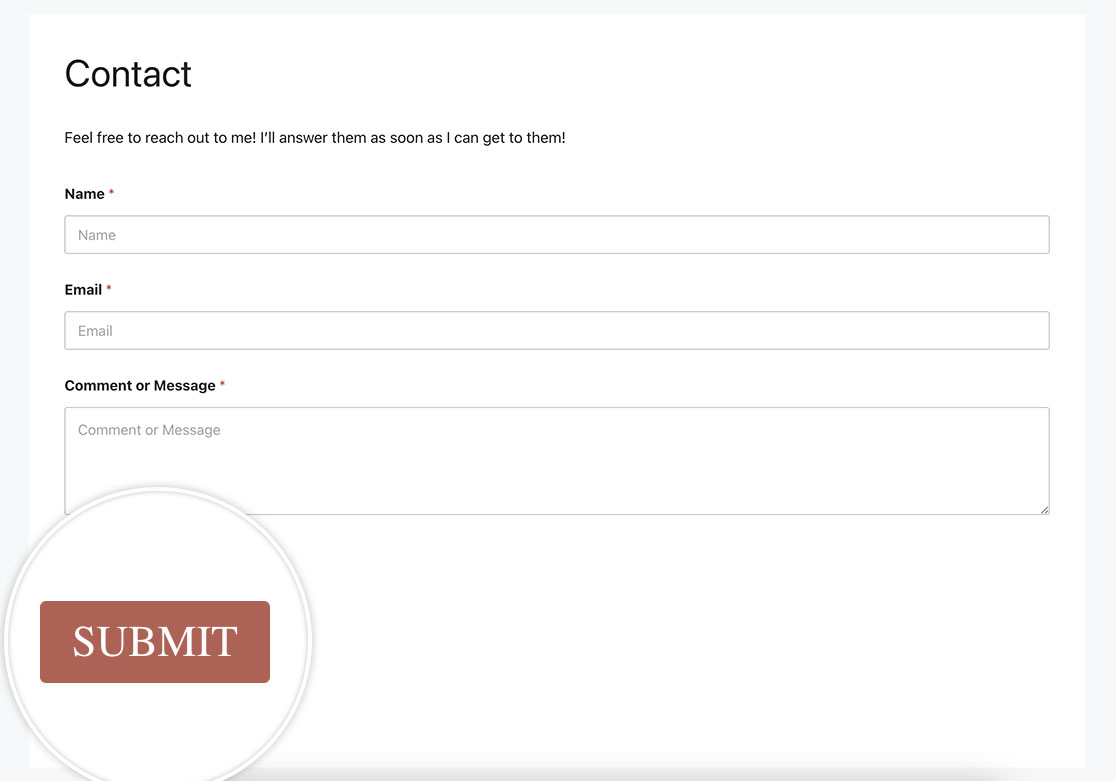
この例では、ボタンの色を変更します。また、テキストサイズ、テキストの色、フォントファミリーも変更します。
単一フォームの場合
この例は、IDが23のフォームのみを対象としています。
button#wpforms-submit-23 {
    font-family: roboto;
    font-size: 22px;
    background-color: #b95d52;
    text-transform: uppercase;
    color: #ffffff;
    box-shadow: unset;
    border: 1px solid transparent;
    background: unset;
    background-color: #b95d52;
}

button#wpforms-submit-23:hover {
    background-color: #ffffff;
    border: 1px solid #b95d52;
    opacity: 1;
    color: #b95d52;
}
すべてのフォームの場合
この例は、すべてのWPFormsを対象としています。
button.wpforms-submit {
    font-family: roboto !important;
    font-size: 22px !important;
    background-color: #b95d52;
    text-transform: uppercase;
    color: #ffffff !important;
    box-shadow: unset !important;
    border: 1px solid transparent !important;
    background: unset !important;
    background-color: #b95d52 !important;
}

button.wpforms-submit:hover {
    background-color: #ffffff !important;
    border: 1px solid #b95d52 !important;
    opacity: 1 !important;
    color: #b95d52 !important;
}
ボックスシャドウ付きボタン
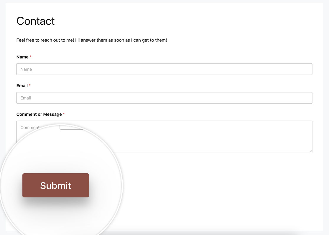
この例では、次のCSSを使用してボタンにボックスシャドウを配置する方法を示します。
単一フォームの場合
この例は、IDが23のフォームのみを対象としています。
button#wpforms-submit-23 {
  background-color: #b95d52;
  border: none;
  color: white;
  padding: 10px 30px;
  text-align: center;
  text-decoration: none;
  display: inline-block;
  font-size: 16px;
  margin: 4px 2px;
  cursor: pointer;
  -webkit-transition-duration: 0.4s; /* Safari */
  transition-duration: 0.4s;
  box-shadow: 0 8px 16px 0 rgba(0,0,0,0.2), 0 6px 20px 0 rgba(0,0,0,0.19);
}
あるいは、フォーム用のこのCSSを使用して、ホバー時のみボックスシャドウを提供することもできます。
button#wpforms-submit-23 {
  background-color: #b95d52;
  border: none;
  color: white;
  padding: 10px 30px;
  text-align: center;
  text-decoration: none;
  display: inline-block;
  font-size: 16px;
  margin: 4px 2px;
  cursor: pointer;
  -webkit-transition-duration: 0.4s; /* Safari */
  transition-duration: 0.4s;
}

button#wpforms-submit-23:hover {
  box-shadow: 0 12px 16px 0 rgba(0,0,0,0.24),0 17px 50px 0 rgba(0,0,0,0.19);
}
すべてのフォームの場合
この例は、すべてのWPFormsを対象としています。
button#wpforms-submit-23 {
  background-color: #b95d52;
  border: none;
  color: white;
  padding: 10px 30px;
  text-align: center;
  text-decoration: none;
  display: inline-block;
  font-size: 16px;
  margin: 4px 2px;
  cursor: pointer;
  -webkit-transition-duration: 0.4s; /* Safari */
  transition-duration: 0.4s;
  box-shadow: 0 8px 16px 0 rgba(0,0,0,0.2), 0 6px 20px 0 rgba(0,0,0,0.19);
}
そして、上記の例と同様に、ホバー時のみボックスシャドウを適用することもできます。
button.wpforms-submit {
    background-color: #b95d52 !important;
    border: none !important;
    color: white !important;
    padding: 10px 30px !important;
    text-align: center;
    text-decoration: none !important;
    display: inline-block;
    font-size: 16px !important;
    margin: 4px 2px !important;
    cursor: pointer !important;
    -webkit-transition-duration: 0.4s !important;
    transition-duration: 0.4s !important;
}

button.wpforms-submit:hover {
    box-shadow: 0 12px 16px 0 rgba(0,0,0,0.24), 0 17px 50px 0 rgba(0,0,0,0.19) !important;
}
これらは、CSSを使用して送信ボタンを簡単にパーソナライズできるほんの一例です。フォームラベルもパーソナライズしたいですか?フォームラベルの前後に画像を追加する方法に関するチュートリアルをご覧ください。
よくある質問
Q: このCSSはページ区切りボタンにも使用できますか?
A:もちろんです。標準ボタンでこれらの例のいずれかを使用するには、Page Breakbutton.wpforms-page-button. を使用します。
あるいは、単一のフォームのみを対象としたい場合は、代わりにform#wpforms-form-3221 button.wpforms-page-buttonCSSクラスを使用し、フォームIDを自分のフォームIDに合わせて更新することを忘れないでください。
例えば、上記の送信ボタンの例のようにホバー時のアニメーションを使用しますが、ページ区切りボタンにも同様のことを行います。
このCSSは特定のフォーム、フォームID3221用です。これを単一のフォームに保持したい場合は、3221をご自身のIDに合わせて更新する必要があります。フォームIDの見つけ方のヘルプについては、便利なドキュメントをご覧ください。
form#wpforms-form-3221 button.wpforms-page-button {
  border-radius: 4px;
  border: none;
  color: #FFFFFF;
  text-align: center;
  width: 200px;
  transition: all 0.5s;
  cursor: pointer;
  margin: 5px;
  cursor: pointer;
  display: inline-block;
  position: relative;
  transition: 0.5s;
}

form#wpforms-form-3221 button.wpforms-page-button:after {
  content: '\00bb';
  position: absolute;
  opacity: 0;
  top: 11px;
  right: 0;
  transition: 0.5s;
}

form#wpforms-form-3221 button.wpforms-page-button:hover {
  padding-right: 25px;
}

form#wpforms-form-3221 button.wpforms-page-button:hover:after {
  opacity: 1;
  right: 50px;
}
このCSSはすべてのフォーム用です。
button.wpforms-page-button {
  border-radius: 4px;
  border: none;
  color: #FFFFFF;
  text-align: center;
  width: 200px;
  transition: all 0.5s;
  cursor: pointer;
  margin: 5px;
  cursor: pointer;
  display: inline-block;
  position: relative;
  transition: 0.5s;
}

button.wpforms-page-button:after {
  content: '\00bb';
  position: absolute;
  opacity: 0;
  top: 11px;
  right: 0;
  transition: 0.5s;
}

button.wpforms-page-button:hover {
  padding-right: 25px;
}

button.wpforms-page-button:hover:after {
  opacity: 1;
  right: 50px;
}