AI Summary
Introduction
Would you like to customize the number of columns displayed on mobile view for multiple-choice fields? By default, multiple-choice fields in WPForms display as single columns. However, you’ll be able to customize it with a custom CSS snippet.
In this tutorial, we’ll show you how to use a 2-column display on mobile view for WPForms multi-choice (Checkboxes and Multiple Choice) fields.
Creating Your Form
To follow along with this tutorial, you’ll need to create a new form or edit an existing one to access the form builder. In the form builder, be sure to add either the Checkboxes or Multiple Choice field to your form.
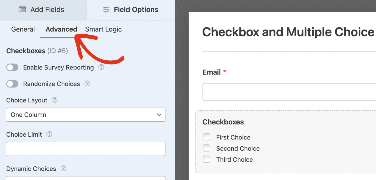
After that, click on the multiple-choice field to access its Field Options panel. Then, navigate to the Advanced tab.

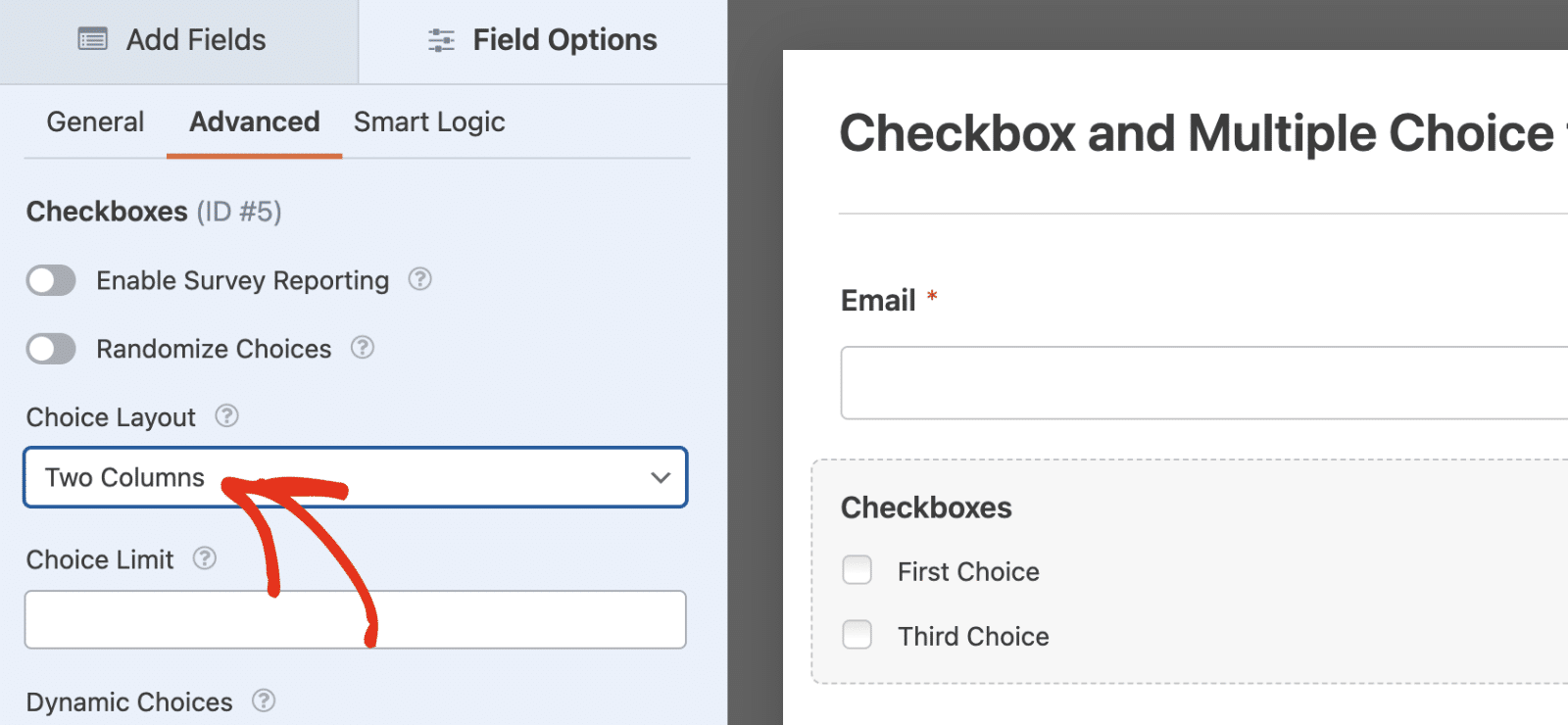
Here, select the Choice Layout option and choose the Two Columns option.

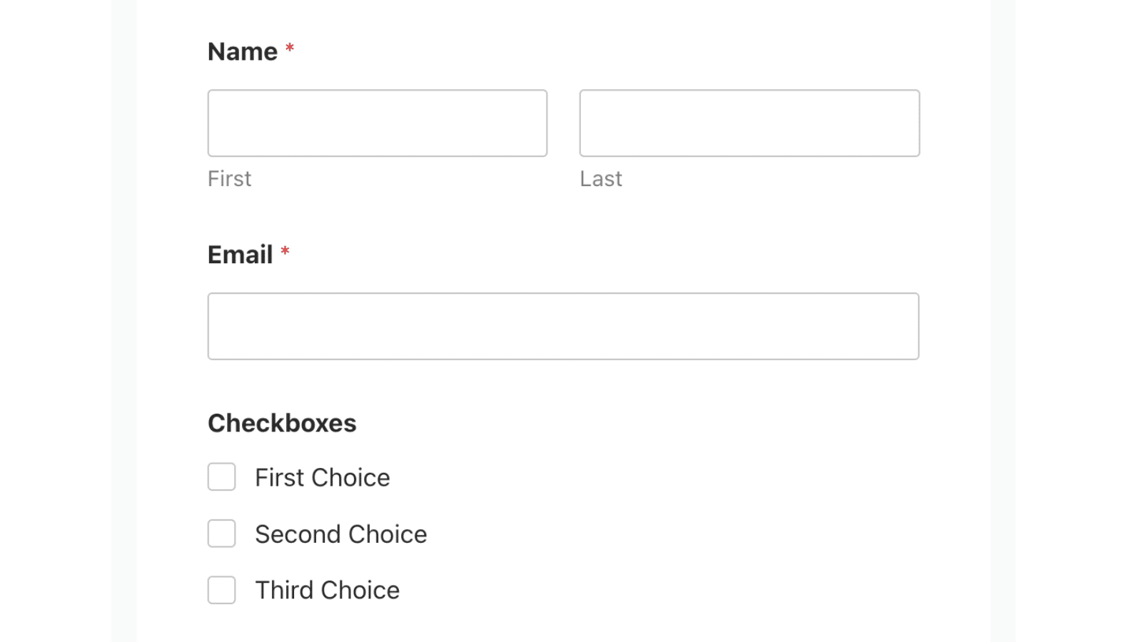
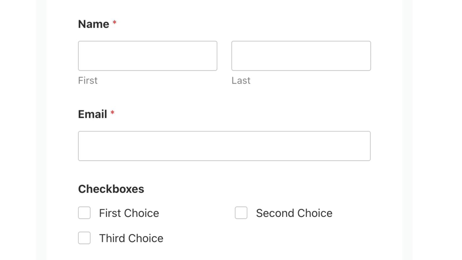
When you view your form, it’ll display 2-columns for the Checkboxes or Multiple Choice field. However, on mobile devices, it will display each choice in a single column.

In this tutorial, we’ll show you how to use custom CSS to force Multiple Choice and Checkboxes fields to retain column layout on a mobile display.
Adding the Snippet
To begin, we’re going to add the snippet to the site first. If you need any help with how and where to add snippets, please be sure to review this helpful documentation.
/**
 * Customizing Multiple Choice Field Column on Mobile Display
 *
 * @link   https://wpforms.com/developers/customizing-multiple-choice-field-columns-on-mobile-devices/
 */

 /* Checkboxes and Radio Buttons */
 @media screen and (max-width: 600px) {
    /* Target both checkbox and radio fields */
    #wpforms-form-2525 .wpforms-field-checkbox ul,
    #wpforms-form-2525 .wpforms-field-radio ul {
        display: flex;
        flex-wrap: wrap;
        margin: 0; /* Reset any default margins */
        padding: 0; /* Reset any default padding */
    }

    /* Target list items in 2-column layouts */
    #wpforms-form-2525 .wpforms-list-2-columns ul li {
        width: calc(50% - var(--wpforms-field-size-input-spacing));
        margin-right: var(--wpforms-field-size-input-spacing);
        box-sizing: border-box; /* Ensure padding doesn't affect width */
    }

    /* Remove margin from every second item to prevent overflow */
    #wpforms-form-2525 .wpforms-list-2-columns ul li:nth-child(2n) {
        margin-right: 0;
    }
}
Be sure to replace #wpforms-form-2525 with the ID of the specific form to which you wish to apply these changes. See our tutorial to learn how to retrieve Form ID and Field ID if you need help with it.
This snippet will ensure that Checkboxes and Multiple Choice fields that use the 2-column layout retain the layout on mobile view.

That’s it! Now you’ve learned how to customize column layout for multi-choice (Checkboxes and Multiple Choice) fields on mobile view.
Want to learn more ways to customize WPForms fields? Check out our tutorial on adding a Select All option to Checkboxes field in WPForms.
