AI Summary
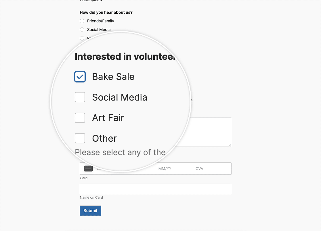
Would you like to customize the Checkbox field color? By default, this field will use standard web styling to display the field in your form. In this article, we’re going to walk you through how easy it is to do this with the power of CSS!

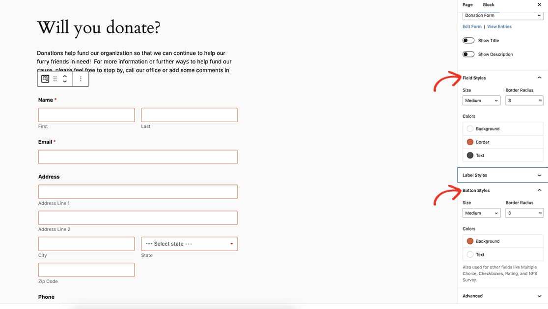
However, if you are using the WPForms Block Editor, you can easily adjust these styles without the need of custom CSS. To read more about that, please take a look at this useful guide. When you change the Field Styles and the Button Styles, you can achieve the exact same in the block editor that you can with the custom CSS in this article.

Using the block editor Button Styles not only changes the Submit button and Checkbox field but will also change the Multiple Choice field colors as well.
In this article, we’re going to be working through using the magic of custom CSS to make these changes.
Creating the form
To begin you’ll create your form and add the fields you need which will include at least one Checkbox field.
If you need any assistance with creating your form, you can easily review this useful guide.
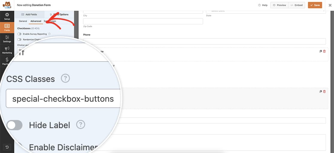
Once you’ve added the Checkbox field, click the Advanced tab and inside the CSS Classes add special-checkbox-buttons. We’ll use this as a trigger to call in our custom CSS.

Customizing the style of the Checkbox field
Once you’ve saved the form, you can now add your CSS. If you’re not sure where or how to add custom CSS to your site, please review this tutorial for assistance.
.special-checkbox-buttons input[type="checkbox"] {
  -webkit-appearance: none !important;
  appearance: none !important;
  background-color: #fff !important;
  margin: 0 !important;
  font: inherit !important;
  color: #e27730 !important;
  width: 1.15em !important;
  height: 1.15em !important;
  border: 0.15em solid #e27730 !important;
  border-radius: 0.15em !important;
  transform: translateY(-0.075em) !important;
  display: grid !important;
  place-content: center !important;
}

.special-checkbox-buttons input[type="checkbox"]::before {
  content: "" !important;
  width: 0.65em !important;
  height: 0.65em !important;
  transform: scale(0) !important;
  transition: 120ms transform ease-in-out !important;
  box-shadow: inset 1em 1em #e27730 !important;
	transform-origin: bottom left !important;
  clip-path: polygon(14% 44%, 0 65%, 50% 100%, 100% 16%, 80% 0%, 43% 62%) !important;
}

.special-checkbox-buttons input[type="checkbox"]:checked::before {
    transform: scale(1) !important;
    position: relative !important;
    top: 0 !important;
    left: 0 !important;
}

.special-checkbox-buttons input[type=checkbox]:checked:after {
	content: none !important;
}
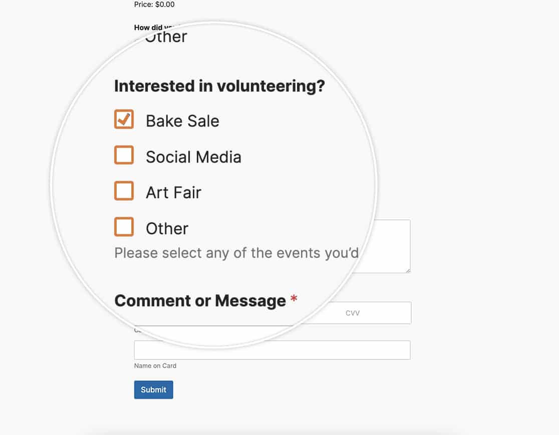
This CSS will change the color of the border and selection to #e27730 but will also add a tiny animation as selections are made.

Whether you use the block editor styling or the custom CSS you can easily customize the Checkbox field colors. Are you looking for the same functionality for the Multiple Choice field? Take a look at our article on How to Customize the Multiple Choice Field Styles.
