AI Summary
Would you like to require a specific format for a form field? Custom input masks allow you to set rules for the values users are allowed to enter into a field. This can be useful for international phone numbers, zip codes, and more.
This tutorial will show you how to create and add a custom input mask to a form field.

Before you get started, make sure WPForms is installed and activated on your WordPress site. Then create a new form or edit an existing one.
Adding a Custom Input Mask
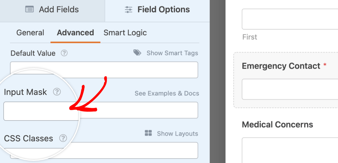
You can add a custom input mask to any Single Line Text field. After you’ve added this field type to your form, click on it to open its Field Options panel.
Within the field options, you’ll need to click on the Advanced tab. Then you can add your rule to the Input Mask field.

Basic Input Masks
To create the rules for a custom input mask, you’ll need to use a specific set of special characters.
9: Numeric (0–9)a: Alphabetical (a–z or A–Z)A: Uppercase alphabetical (A–Z)*: Alphanumeric (0–9, a–z, or A–Z)&: Uppercase alphanumeric (0–9 or A–Z)
For example, if you’d like to require a 5-digit number you would enter 5 9s into the Input Mask field.

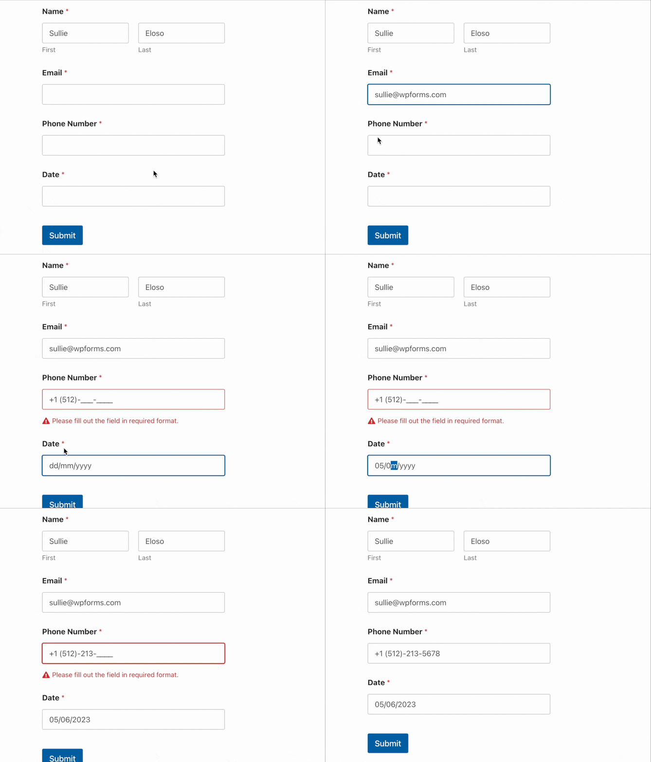
When users click in this form field on the frontend, they will see an underscore or “blank” for each required character to help guide their input. Additionally, since we used the 9 symbol, the input mask will only accept numeric values (no letters or other characters).

You can also include symbols such as hyphens (-) or parentheses in your input mask. For example, you could use the following input mask to require a phone number format with the US country code:
+1 (999)-999-9999
When a user clicks within this field, they will see blanks in place of the 9s. The +1, parentheses, and hyphens are automatically entered into the field, so users only have to fill in the numbers.

It’s important to note that users cannot submit a form if they’ve only partially filled an input mask. They must enter the number and type of characters required by the input mask or they will see a validation message reading, “Please fill out all blanks.”

Note: Want to change the validation message users will see if they don’t complete an input mask? See our tutorial on customizing validation messages.
However, adding an input mask to a field does not make the field required. Users can still submit the form if the input mask in a non-required field is completely empty.
Adding Optional Characters to Your Input Masks
Sometimes you may want to require a specific format for a field, but also need to allow for a flexible number of characters. For example, in many countries, phone numbers in different regions may contain different numbers of digits.
Place any optional characters inside square brackets like so:
99 9999-9999[9]
Since the last digit is optional, this input mask would accept 10 digits, such as 98 7654-3210, or 11 digits, such as 98 7654-32109.
Additional Examples of Optional Characters in Input Masks
Username with 6–8 Letters (first letter uppercase, others lowercase)
- Mask:
Aaaaa[a][a] - Example Input: Sullie or Sulliewp
US Zip Code with Optional +4:
- Mask:
99999[-9999] - Example Input: 98765 or 98765-4321
Note: Users must still fill in all the blanks for optional characters in input masks. For example, users could not enter “33409-40” in the zip code +4 input mask above and submit the form.
To create input masks with flexible ranges of optional characters, please see the advanced input mask options below.
Escaping Special Mask Characters
Due to the special characters input masks use to create required formats, there are certain letters, numbers, and symbols that can appear as blanks when you don’t mean for them to.
To avoid converting any of the special input mask characters into blanks on the frontend, you can simply add two backslashes (\\) in front of the character.
As an example, let’s create an input mask for an Instagram URL.
If we enter the input mask as https://instagram.com/*{1,30}, all of the a characters will be converted into blanks that users must fill on the frontend.

To fix this, we just need to add a double backslash in front of any a that we don’t want to convert to a blank. So, for this example, we would enter the input mask as https://inst\\agr\\am.com/*{1,30} in the field options.

Now when we view this field within the embedded form, blanks will only appear where we intended.

Additional Examples of Escaping Special Characters in Input Masks
Product SKU (2 9s followed by 3 additional numbers or uppercase letters)
- Mask:
\\9\\9-&&& - Example Input: 99-654 or 99-BC8
Gmail Address
- Mask:
*{1,50}@gm\\ail.com - Example Input: [email protected]
Advanced Input Masks
If you’d like even more control over your form’s input masks, you can use advanced formatting options as well. They work in combination with all the special mask characters described above.
Repeating Characters
You can use any of the special characters in front of {n} (where n is a numeric value) to require a repeating character.
Examples of Input Masks with Repeating Characters
US Zip Code with Optional +4
- Mask:
9{5}[-9{4}] - Example Inputs: 33409 or 33409-4053
12-Character Order Number with Numbers and Uppercase Letters
- Mask:
&{12} - Example Inputs: 29X483HK8192 or 10G7382ZR638
Flexible Ranges of Characters
You can use any of the special characters in front of {n,m} (where n and m represent numeric values) to allow users to enter a range of characters.
Examples of Input Masks with Flexible Ranges
Facebook URL (allows 5–50 characters):
- Mask:
https://f\\acebook.com/*****[*{0,45}] - Example Inputs: https://facebook.com/wpforms or https://facebook.com/monsterinsights
Twitter Handle (allows 4–15 numbers, uppercase letters, or lowercase letters)
- Mask:
@****[*{0,11}] - Example Input: @easywpforms or @WPBeginner
Email for a Specific Domain (allows 1–51 characters):
- Mask:
*[*{0,50}]@mysite.com - Example Input: [email protected] or [email protected]
Product SKU with 8–11 Characters (allows numbers or uppercase letters):
- Mask:
&{4}-&{4}[&{0,3}] - Example Input: A987-BC65 or A987-BC65D43
Masking for Multiple Possible Input Values
Another option is to create an input mask that will accept multiple possible input values. To do so, enter a backslash followed by the allowed values in parentheses separated by vertical slashes as in \(x|y).
Note: This advanced input mask option does not work with the special characters listed at the beginning of this post. x and y should be specific numbers or letters you want users to include in their input.
Examples of Masks That Allow Multiple Possible Inputs
Phone Number with Country Code for the US (+1), Australia (+61), or Mexico (+52)
- Mask:
+\(1|61|52) 9999999999 - Example Inputs: +1 2127893920 or +52 3307490285
Account Number Staring in TN or KY
- Mask:
\(TN|KY)9{10} - Example Inputs: TN3756284765 or KY2975387529
Date / Time Masks
You can also use custom input masks to require a specific date or time format.
Note: If you’d like to provide a datepicker calendar or dropdown options for date or time, the Date / Time field will likely be a better fit than a custom input mask.
To set up an input mask for either date or time, you’ll need to start with date: followed by the format you’d like to require.
Date Masks
Using the options below, you can create custom date input masks that fit your needs.
d: Day of the month as digits; no leading zero for single-digit days.dd: Day of the month as digits; leading zero for single-digit days.m: Month as digits; no leading zero for single-digit months.mm: Month as digits; leading zero for single-digit months.yy: Year as last 2 digits; leading zero for years less than 10.yyyy: Year as 4 digits
As an example, date:dd/mm/yyyy will require a date such as 12/08/2021. When a user visits your form and hovers over the field, they’ll see placeholders for the required format.

Time Masks
Using the options below, you can create custom time input masks that fit your needs.
Note: Remember to add date: before your time input mask.
h: Hours; no leading zero for single-digit hours (12-hour clock).hh: Hours; leading zero for single-digit hours (12-hour clock).H: Hours; no leading zero for single-digit hours (24-hour clock).HH: Hours; leading zero for single-digit hours (24-hour clock).M: Minutes; no leading zero for single-digit minutes. Uppercase M to avoid conflict with months.MM: Minutes; leading zero for single-digit minutes. Uppercase MM to avoid conflict with months.s: Seconds; no leading zero for single-digit seconds.ss: Seconds; leading zero for single-digit seconds.l: Milliseconds. 3 digits.L: Milliseconds. 2 digits.t: Lowercase, single-character time marker string: a or p.tt: Two-character time marker string: am or pm.T: Single-character time marker string: A or P.TT: Two-character time marker string: AM or PM.
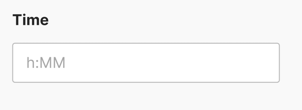
As an example, date:h:MM will allow users to enter a time such as 8:30. On the frontend, users see will placeholders in the field when they hover over it.

Using Aliases to Add Input Masks
You can enter an alias in the Input Mask field in the advanced field options to use a pre-packaged input mask.
The available input mask aliases in WPForms include:
alias:numeric: Allows users to enter any numeric value.alias:currency: Allows users to enter numeric values in the format 0.00.
Note: alias:currency only formats Single Line Text fields. To change the currency format used in payment fields (like decimals or separators), check out our developer doc: How to Create a New Currency Symbol for WPForms.
alias:decimal: Lets users enter any numeric value with or without a decimal.alias:integer: Lets users enter any whole number value.alias:percentage: Allows users to enter any number 1–100 as a percentage.alias:url: Adds an input mask for a URL beginning withhttp://.alias:email: Adds an input mask for an email address.

Note: Keep in mind that alias:email and alias:URL don’t check to ensure users have entered a valid email or web address format. If you would like to validate users’ input for this information, consider using the Email and Website / URL fields instead.
Frequently Asked Questions
Here, we’ll discuss some of the most common questions we receive about input masks in WPForms.
I can’t find the Input Mask option in my field settings. Where is it?
The Input Mask option is only available for the Single Line Text field. You won’t find it on other field types such as Phone, Email, Numbers, or Paragraph.
To use a custom input mask, add a Single Line Text field to your form, click on it to open its Field Options, then go to the Advanced tab where you’ll find the Input Mask field.
Will using Limit Length with an input mask restrict character input in Single Line Text fields?
Yes. When you add character limits and input masks together in Single Line Text fields, the limit counts everything, including symbols like dashes, as part of the limit. To make sure users can enter their information without trouble, adjust the character limit to include these extra symbols.
For more information on adjusting character limits, refer to our guide on limiting character and word limits.
Why are my escaped special characters being stripped from the input mask field?
By default, WordPress strips backslashes when form data is processed. If you’re escaping special mask characters (like \9 or \*) and notice they disappear, you can preserve them by enabling form data slashing.
To do this, add the following line to your site’s wp-config.php file, just before the line that says /* That's all, stop editing! */:
define( 'WPFORMS_ENABLE_FORM_DATA_SLASHING', true );
This will ensure that backslashes are retained and your input masks work correctly. If you’re not sure how to edit your site’s wp-config.php file, check out WPBeginner’s guide on editing wp-config.php file in WordPress.
That’s it! You can now create custom input masks to require specific formats in your forms’ fields.
Next, would you like to make your forms more compact? Be sure to check out our tutorial on using multi-column layouts to learn how to arrange fields into rows in your form.
