AI Summary
Introduction
Are you eager to give your WPForms a unique touch by customizing the Page Break buttons? Look no further! In this tutorial, we’ll guide you through the process of using CSS to personalize the appearance of your buttons. With a range of CSS snippets, you can easily achieve the look you desire for a more tailored and visually appealing form.
Creating your multi-page form
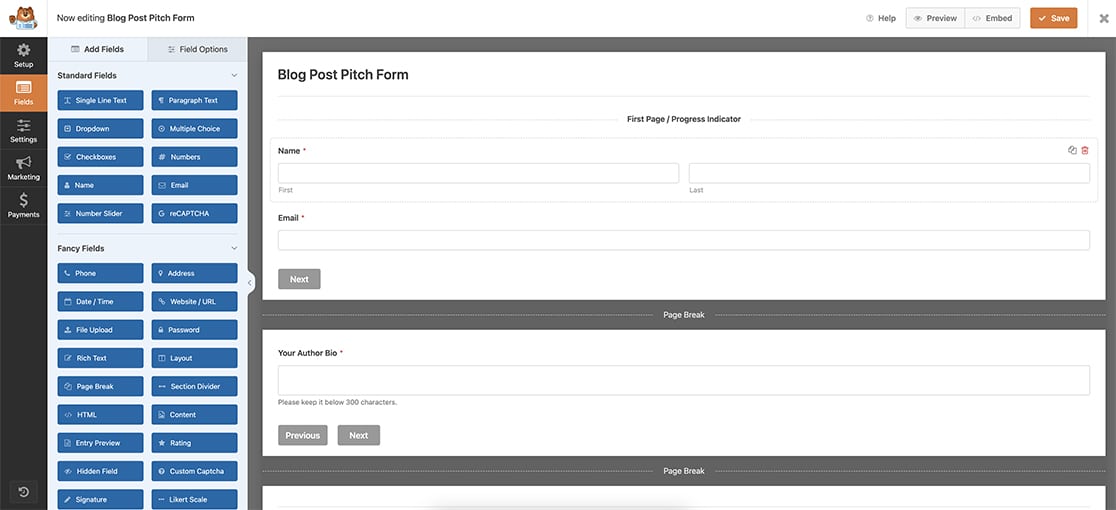
Let’s kick off by crafting a multi-page form. If you’re unsure about the process and could use some guidance, feel free to refer to this handy documentation on Creating Multi-Page Forms.
In today’s tutorial, we’re focusing on building a form designed to gather blog post ideas.
Enabling Display Previous
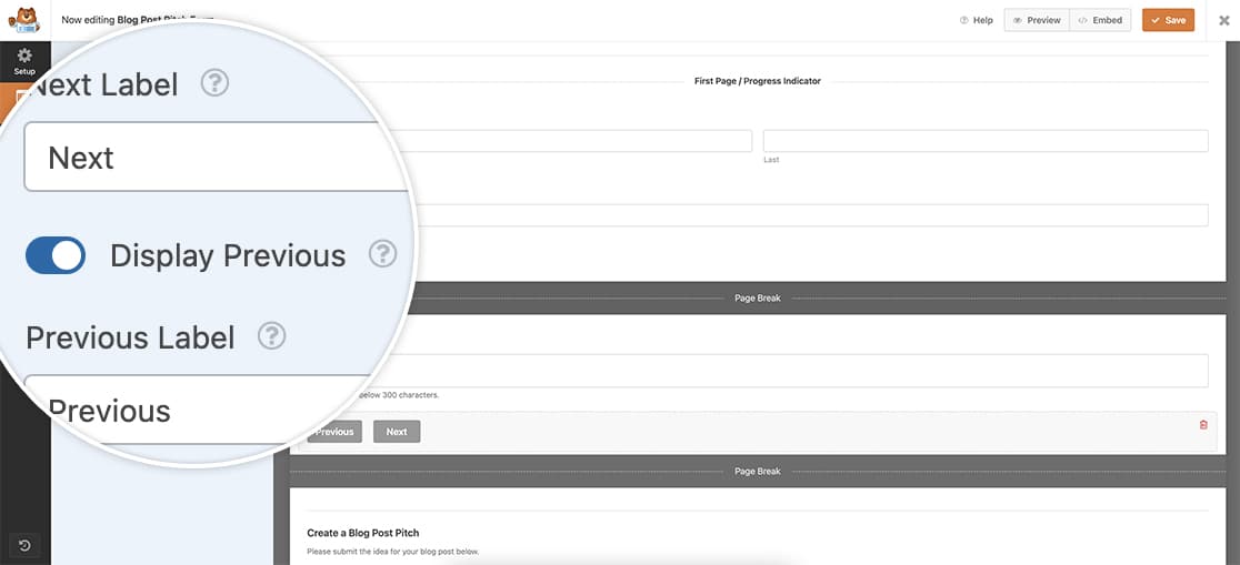
After incorporating your Page Break buttons, don’t forget to activate the Display Previous option on each of these breaks. This ensures that your visitors can navigate back to review and make edits before finalizing the form.
Note that the first Page Break field doesn’t showcase this option. However, it’s available for every subsequent page break, including the last one.
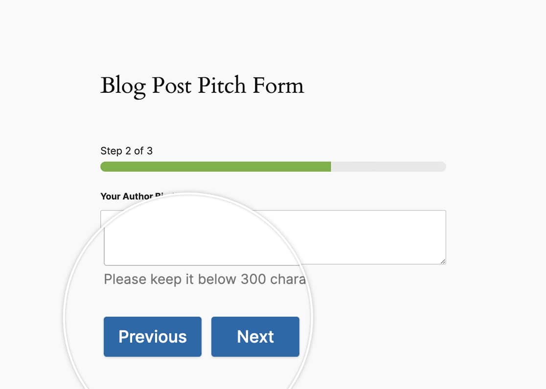
When using the Next and Previous buttons for your form, by default, these buttons will already appear on the same line.
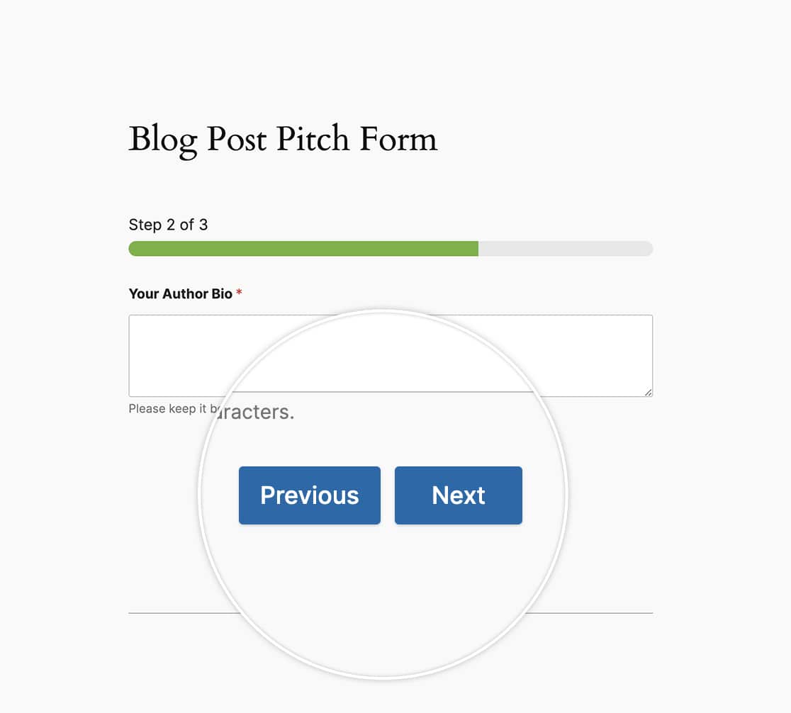
But what if we wanted to center them, or make them larger buttons? This is where CSS comes into play!
Centering the buttons
Let us now add some CSS to center the Next and Previous buttons on our form.
If you’re not sure where or how to add CSS to your site, please review this tutorial.
form#wpforms-form-605 .wpforms-pagebreak-left {
text-align: center;
}
This CSS will only be applied to the form ID 605. You will need to update this form ID to match your own ID. If you’re not sure where to find your form ID, please review this guide.
If you wanted to use CSS such as this to be applied to all forms, you would use this CSS instead.
.wpforms-pagebreak-left {
text-align: center !important;
}
Creating larger buttons
For this section, we’re going to make our buttons larger while also using the CSS above to keep the buttons centered.
form#wpforms-form-605 .wpforms-pagebreak-left {
text-align: center;
}

form#wpforms-form-605 .wpforms-page-next {
width: 48% ;
float: right ;
margin: 0px ;
}

form#wpforms-form-605 .wpforms-page-prev {
margin-right: 0px ;
width: 48% ;
float: left ;
margin: 0 ;
padding: 0 ;
}
To make this change for all forms, use this CSS instead.
.wpforms-pagebreak-left {
text-align: center !important;
}

.wpforms-page-next {
width: 48% !important;
float: right !important;
margin: 0px !important;
}

.wpforms-page-prev {
margin-right: 0px !important;
width: 48% !important;
float: left !important;
margin: 0 !important;
padding: 0 !important;
}
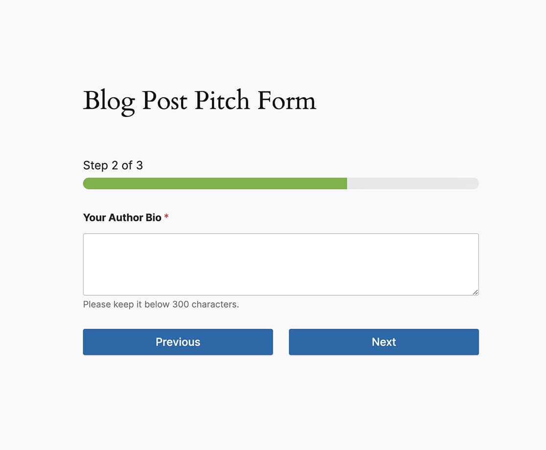
Aligning the last buttons
With the multi-page form and using the Previous buttons, the final page of the form will show the final Previous button is above the Submit button. For our tutorial, we want to align these buttons to be on the same line.
So using all of the CSS we’ve used so far, let’s pull this all together.
form#wpforms-form-605 .wpforms-page-next {
width: 48% ;
float: right ;
margin: 0px ;
}

form#wpforms-form-605 .wpforms-page-prev {
margin-right: 0px ;
width: 48% ;
float: left ;
margin: 0 ;
padding: 0 ;
}

form#wpforms-form-605 .wpforms-submit-container {
float: right ;
width: 48% ;
margin: 0 ;
padding: 0 ;
clear: none ;
}

form#wpforms-form-605 .wpforms-submit-container button {
width: 100%;
}

form#wpforms-form-605 .wpforms-page.last .wpforms-field-pagebreak {
float: left;
display: block;
width: 48%;
padding: 0;
}

form#wpforms-form-605 .wpforms-page.last .wpforms-pagebreak-left {
width: 100%;
}

form#wpforms-form-605 .wpforms-page.last .wpforms-page-prev {
width: 100%;
}
And as with the other CSS above, if you want this for all forms, you would use this CSS.
.wpforms-page-next {
width: 48% !important;
float: right !important;
margin: 0px !important;
}

.wpforms-page-prev {
margin-right: 0px !important;
width: 48% !important;
float: left !important;
margin: 0 !important;
padding: 0 !important;
}

.wpforms-submit-container {
float: right !important;
width: 48% !important;
margin: 0 !important;
padding: 0 !important;
clear: none !important;
}

.wpforms-submit-container button {
width: 100% !important;
}

.wpforms-page.last .wpforms-field-pagebreak {
float: left !important;
display: block !important;
width: 48% !important;
padding: 0 !important;
}

.wpforms-page.last .wpforms-pagebreak-left {
width: 100% !important;
}

.wpforms-page.last .wpforms-page-prev {
width: 100% !important;
}
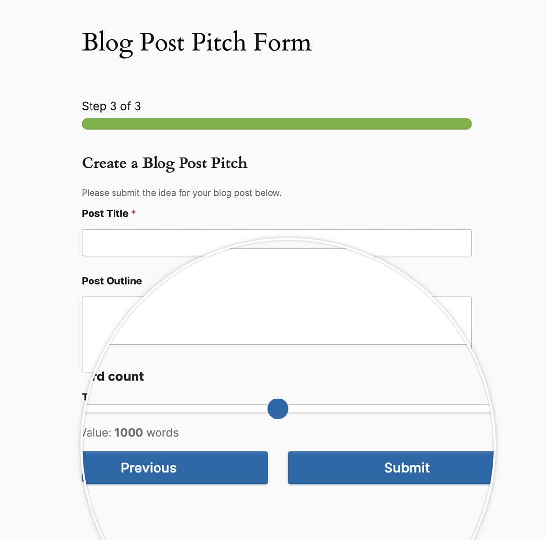
And that’s all you need to customize the look and feel of the multi-page buttons. Would you like to also move to the next page automatically based on a question for your form? Take a look at our tutorial on How to Move to the Next Page Automatically.
