AI Summary
Want to enhance the visual appeal of your Image Choice labels in WPForms? Whether you’re using Image Choices for Checkboxes or Multiple Choice fields, you can create engaging hover effects and style your labels using CSS.
This guide will show you several ways to customize your Image Choice labels to create a more interactive and visually appealing form experience.
Setting Up Your Form
Let’s begin by creating a form and adding our fields. We will also include a Checkbox field that is using Image Choices as well.
If you need help creating a form with Image Choices, please review our guide on setting up Image Choices.
Customizing Image Choice Labels
These CSS examples will help you create various visual effects for your Image Choice labels. For all examples, remember to replace form#wpforms-form-1000 with your own form ID. If you need help finding your form ID, please check our guide on finding find form and field IDs.
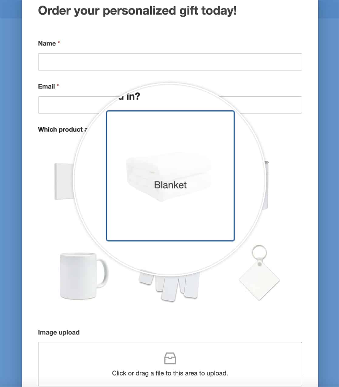
Overlay Labels on Hover
This style creates an elegant overlay effect where labels appear over the image when users hover:
Add Border and Box Effects
Use border and box properties to create frames, borders, or rounded corners around the labels.
form#wpforms-form-1000 .wpforms-field .wpforms-image-choices-label {
    border-radius: 5px;
    border: 1px solid #ccc;
    padding: 5px;
}

Rotate Images on Hover
By applying the CSS rule transform, we’ll introduce a delightful twist to your images. Upon hovering, they’ll elegantly rotate, injecting a playful interactive element into your form. This engaging effect captivates visitors as they navigate through your selection of images.
form#wpforms-form-1000 .wpforms-field .wpforms-image-choices-item:hover {
    transform: rotate(10deg);
}

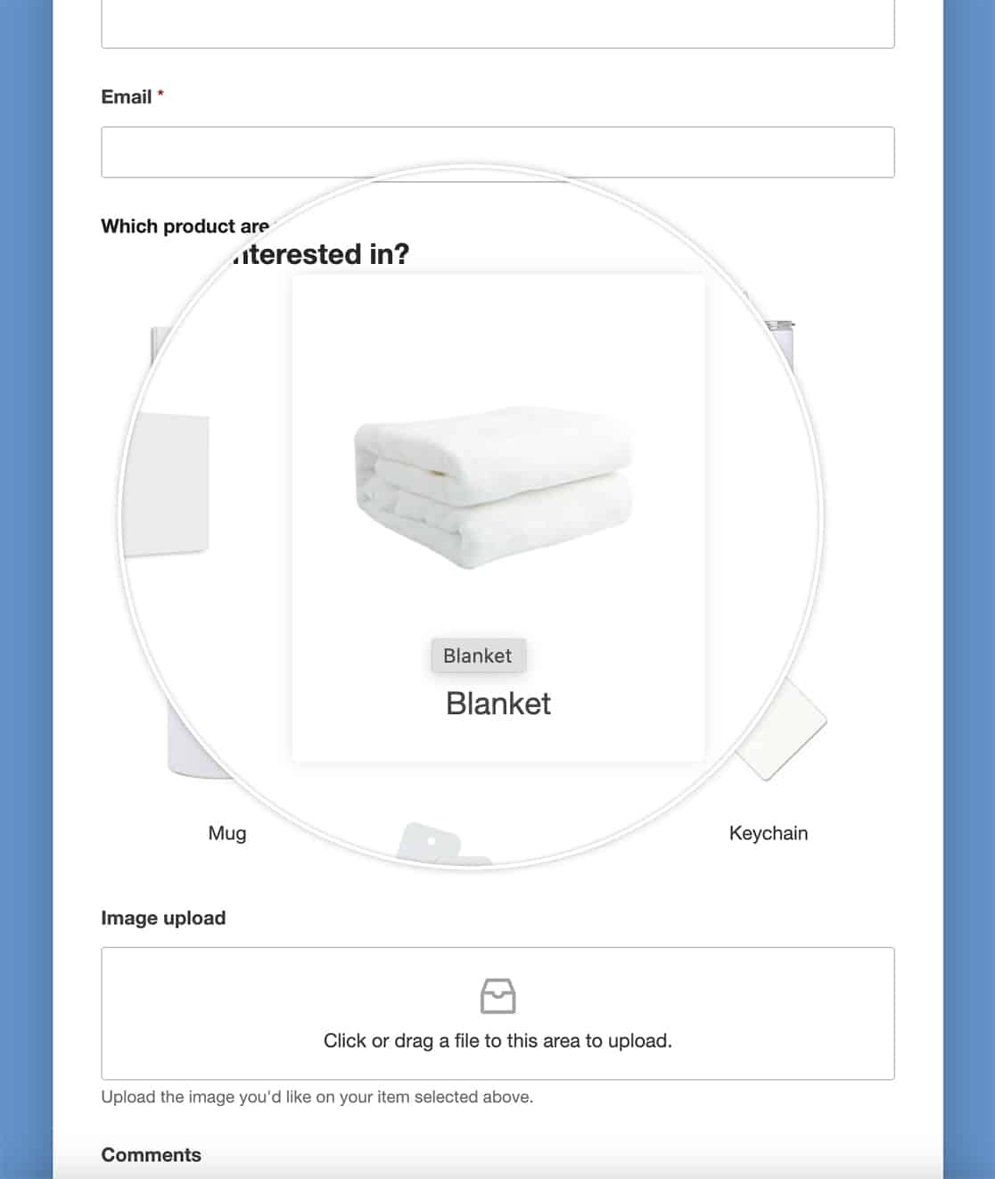
Box Shadow on Hover
Enhancing your images with a touch of depth and dimension, we’re implementing a box shadow effect on hover and removing the default border on hover. As your visitors glide over each image, a subtle shadow gracefully emerges, imbuing your form with a captivating sense of depth and interactivity.
form#wpforms-form-1000 .wpforms-image-choices label:hover {
    border: none;
    box-shadow: 0 0 10px rgba(0, 0, 0, 0.1);
}
Combine Multiple Effects (Border, Labels and Box Shadow on Hover)
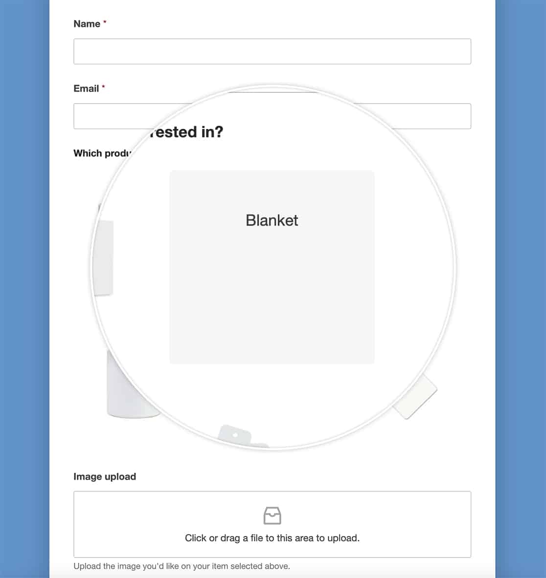
In this last example, we’re going to combine some of the CSS we’ve already used.
When you hover over the image now, you’ll see the label over the image.
And those are just some examples how easily you can customize the labels for Image Choices. Would you like to also remove the whitespace you see around the images? Take a look at our article on How to Remove the Whitespace From Around Image Choices.
