AI Summary
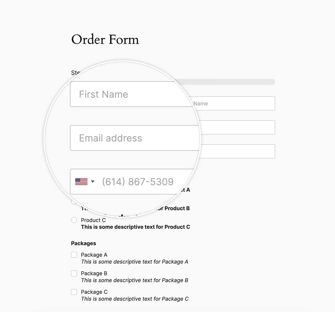
Are you interested in customizing the appearance of placeholder text in your WPForms form fields? With a few lines of custom CSS, you can easily achieve this. Placeholder text serves as temporary information within a field and disappears when a user interacts with the field. In the following article, we’ll guide you through the process of styling placeholder text for your form fields.
Keep in mind that the default styling for placeholder text may be inherited from different sources, including your WordPress theme, WPForms settings (depending on your settings), or the user’s browser settings.

Before beginning styling the placeholders, we must first create a form that utilizes this text. Once you’ve created your form, you’ll need to add your Placeholder text for each field from the Advanced tab of the field settings.

If you need help in adding placeholder text, please review this documentation.
Styling the placeholder text
When styling placeholder text, it’s essential to include several selectors, each with its own vendor prefix. This ensures that the styles are applied consistently across different browsers and versions. While the CSS may seem repetitive, including all selectors is crucial for comprehensive browser support.
To implement these styles on your site, simply add the following CSS. If you’re unsure about where or how to add custom CSS, you can refer to our tutorial on the subject.
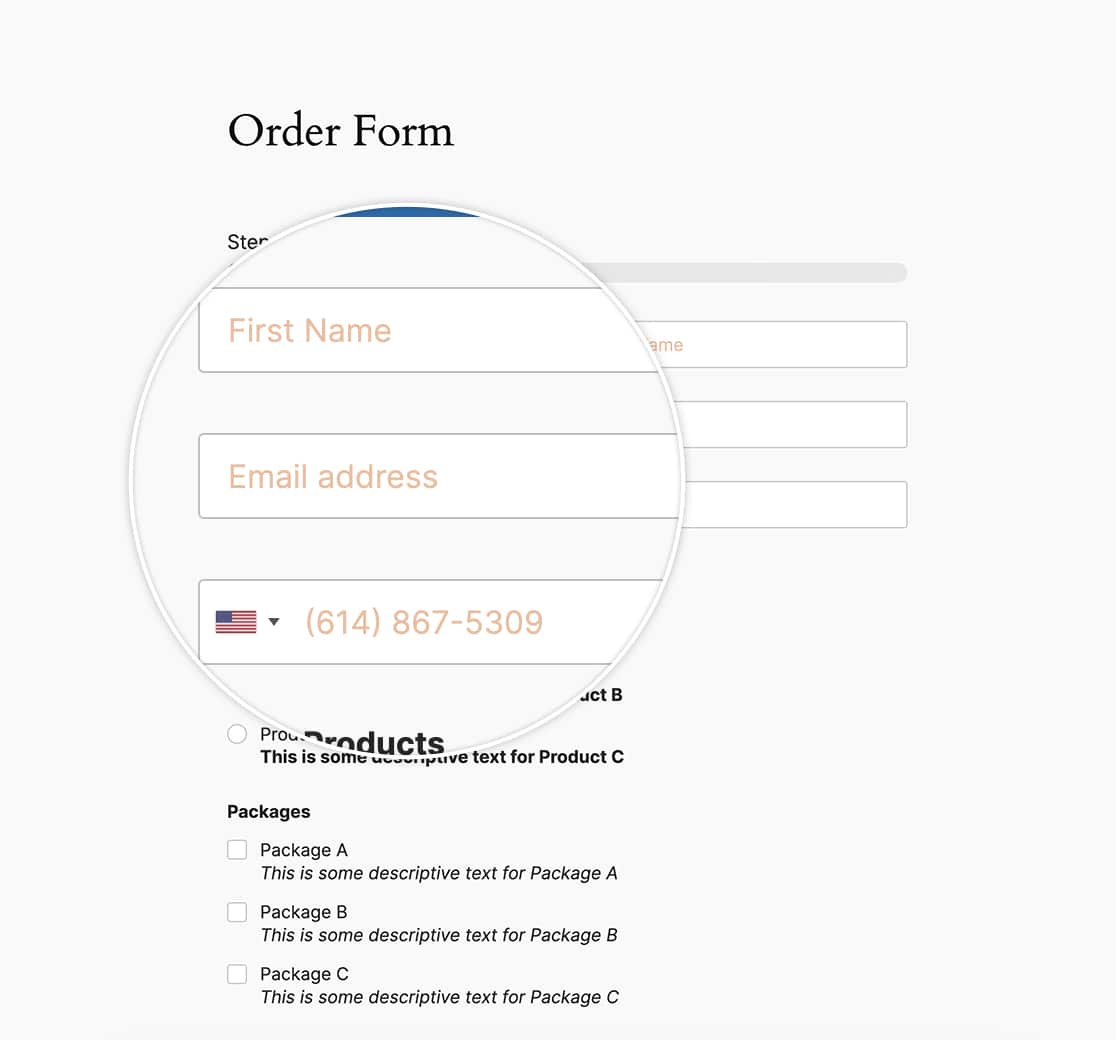
The CSS provided below will change all WPForms placeholder text to an orange color (#e27730):
.wpforms-container ::-webkit-input-placeholder { /* Chrome and Safari */
   color: #e27730 !important;
}

.wpforms-container :-moz-placeholder { /* Mozilla Firefox 4 to 18 */
   color: #e27730 !important;
   opacity: 1 !important;
}

.wpforms-container ::-moz-placeholder { /* Mozilla Firefox 19+ */
   color: #e27730 !important;
   opacity: 1 !important;
}

.wpforms-container :-ms-input-placeholder { /* Internet Explorer 10-11 */
   color: #e27730 !important;
}

.wpforms-container ::-ms-input-placeholder { /* Microsoft Edge */
   color: #e27730 !important;
}

.wpforms-container ::placeholder {
   color: #e27730 !important;
}
Firefox will automatically apply a lower opacity to all form field placeholder’s, making it more transparent than other browsers.
That is already addressed in the above CSS by setting the opacity for Firefox-specific CSS to opacity: 1;

And that’s all you need to style the placeholder text. Would you like to change the confirmation message styling using CSS? In our tutorial, How to Remove Confirmation Message Box Styling, we’ll show you how to change this styling.
FAQ
Q: Can I use this CSS to style a dropdown field?
A: If you’d like to style the Dropdown field, please take a look at this article instead.
